Usando o aplicativo Event Visualizer
Sobre o aplicativo Event Visualizer
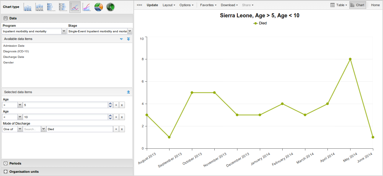
With the Event Visualizer app, you can create charts based on event data.
Crie um gráfico
-
Open the Event Visualizer app and select a chart type.
-
No menu à esquerda, selecione os metadados que deseja analisar.
-
Clique em ** Layout ** e organize as dimensões.
Você pode manter a seleção padrão, se desejar.
-
Clique em ** Actualizar **.
Selecione um tipo de gráfico
The Event Visualizer app has eight different chart types, each with different characteristics. To select a chart type:
-
Em ** Tipo de gráfico **, clique no tipo de gráfico de que você precisa.
Chart types Chart type Description Column chart Displays information as vertical rectangular columns with lengths proportional to the values they represent.
Useful when you want to, for example, compare performance of different districts.Stacked column chart Displays information as vertical rectangular columns, where bars representing multiple categories are stacked on top of each other.
Useful when you want to, for example, display trends or sums of related data elements.Bar chart Same as column chart, only with horizontal bars. Stacked bar chart Same as stacked column chart, only with horizontal bars. Line chart Displays information as a series of points connected by straight lines. Also referred to as time series.
Useful when you want to, for example, visualize trends in indicator data over multiple time periods.Area chart Is based on line chart, with the space between the axis and the line filled with colors and the lines stacked on top of each other.
Useful when you want to compare the trends of related indicators.Pie chart Circular chart divided into sectors (or slices).
Useful when you want to, for example, visualize the proportion of data for individual data elements compared to the total sum of all data elements in the chart.Radar chart Displays data on axes starting from the same point. Also known as spider chart. -
Clique em ** Actualizar **.
Selecione os itens de dimensão
An event chart is always based on a program and you can do analysis based on a range of dimensions. For programs with category combinations, you can use program categories and category option group sets as dimensions for tables and charts. Each dimension item can have a corresponding filter. You select dimension items from the left-side menu.
-
Selecione os elementos de dados:
-
Clique em ** Dados **.
-
Selecione um programa e uma fase do programa.
The data elements associated with the selected program are listed under Available. Each data element acts as a dimension.
-
Select the data elements you need by double-clicking their names.
Data elements can be filtered by type (Data elements, Program attributes, Program indicators) and are prefixed to make them easily recognizable.
After selecting a data element, it is visible under Selected data items.
-
(Optional) For each data element, specify a filter with operators such as "greater than", "in" or "equal" together with a filter value.
-
-
Selecione os períodos.
-
Clique em ** Períodos **.
-
Selecione um ou vários períodos.
You have three period options: relative periods, fixed periods and start/end dates. You can combine fixed periods and relative periods in the same chart. You cannot combine fixed periods and relative periods with start/end dates in the same chart. Overlapping periods are filtered so that they only appear once.
-
Fixed periods: In the Select period type box, select a period type. You can select any number of fixed periods from any period type. Fixed periods can for example be "January 2014".
-
Relative periods: In the lower part of the Periods section, select as many relative periods as you like. The names are relative to the current date. This means that if the current month is March and you select Last month, the month of February is included in the chart. Relative periods has the advantage that it keeps the data in the report up to date as time goes.
-
Start/end dates: In the list under the Periods tab, select Start/end dates. This period type lets you specify flexible dates for the time span in the report.
-
-
-
Selecione unidades de organização.
-
Clique em ** Unidades organizacionais **.
-
Clique no ícone da caixa de engrenagens.
-
Selecione um ** Modo de seleção ** e uma unidade organizacional.
Existem três modos de seleção diferentes:
Selection modes Selection mode Description Select organisation units Lets you select the organisation units you want to appear in the chart from the organization tree.
Select User org unit to disable the organisation unit tree and only select the organisation unit that is related to your profile.
Select User sub-units to disable the organisation unit tree and only select the sub-units of the organisation unit that is related to your profile.
Select User sub-x2-units to disable the organisation unit tree and only select organisation units two levels down from the organisation unit that is related to your profile.
This functionality is useful for administrators to create a meaningful "system" favorite. With this option checked all users find their respective organisation unit when they open the favorite.Select levels Lets you select all organisation units at one or more levels, for example national or district level.
You can also select the parent organisation unit in the tree, which makes it easy to select for example, all facilities inside one or more districts.Select groups Lets you select all organisation units inside one or several groups and parent organisation units at the same time, for example hospitals or chiefdoms.
-
-
Clique em ** Actualizar **.
Selecione série, categoria e filtro
You can define which data dimension you want to appear as series, category and filter. Each data element appears as individual dimensions and can be placed on any of the axes. Series and category panels can only have one dimension at the time.
Note
Data elements of continuous value types (real numbers/decimal numbers) can only be used as filters, and will automatically be positioned as filters in the layout dialog. The reason for this is that continuous number cannot be grouped into sensible ranges and used on columns and rows.
-
Clique em ** Layout **.
-
Drag and drop the dimensions to the appropriate space. Only one dimension can be in each section.
-
Clique em ** Actualizar **.
Alterar a exibição de seu gráfico
Você pode personalizar a exibição de um relatório de evento.
-
Clique em ** Opções **.
-
Defina as opções conforme necessário.
Chart options Option Description Data Show values Displays values as numbers on top of each series. Use 100% stacked values Displays 100 % stacked values in column charts. Use cumulative values Displays cumulative values in line charts. Hide n/a data Hides data tagged as N/A from the chart. Include only completed events Includes only completed events in the aggregation process. This is useful when you want for example to exclude partial events in indicator calculations. Hide empty categories Hides the category items with no data from the chart.
None: doesn't hide any of the empty categories
Before first: hides missing values only before the first value
After last: hides missing values only after the last value
Before first and after last: hides missing values only before the first value and after the last value
All: hides all missing values
This is useful for example when you create column and bar charts.Trend line Displays the trend line which visualizes how your data evolves over time. For example if performance is improving or deteriorating. Useful when periods are selected as category. Target line value/title Displays a horizontal line and title (optional) at the given domain value. Useful for example when you want to compare your performance to the current target. Base line value/title Displays a horizontal line and title (optional) at the given domain value. Useful for example when you want to visualize how your performance has evolved since the beginning of a process. Sort order Allows you to sort the values on your chart from either low to high or high to low. Output type Defines the output type. The output types are Event, Enrollment and**Tracked entity instance**. Program status Filters data based on the program status: All, Active, Completed or Cancelled. Event status Filters data based on the event status: All, Active, Completed, Scheduled, Overdue or Skipped. Axes Range axis min/max Defines the maximum and minimum value which will be visible on the range axis. Range axis tick steps Defines the number of ticks which will be visible on the range axis. Range axis decimals Defines the number of decimals which will be used for range axis values. Range axis title Type a title here to display a label next to the range axis (also referred to as the Y axis). Useful when you want to give context information to the chart, for example about the unit of measure. Domain axis title Type a title here to display a label below the domain axis (also referred to as the X axis). Useful when you want to give context information to the chart, for example about the period type. General Hide chart legend Hides the legend and leaves more room for the chart itself. Hide chart title Hides the title (default or custom) of your chart. Chart title Type a title here to display a custom title above the chart. If you don't enter a title, the default title is displayed. Hide chart subtitle Hides the subtitle of your chart. Chart subtitle Type a subtitle here to display a custom subtitle above the chart but below the title. If you don't enter a subtitle, no subtitle is displayed in the chart. -
Clique em ** Actualizar **.
Baixe um gráfico como imagem ou PDF
After you have created a chart you can download it to your local computer as an image or PDF file.
-
Clique em ** Download **.
-
Em ** Gráficos **, clique em ** PNG (.png) ** ou ** PDF (.pdf) **.
The file is automatically downloaded to your computer. Now you can for example embed the image file into a text document as part of a report.
Baixar fonte de dados do gráfico
You can download the data source behind a chart in HTML, JSON, XML, Microsoft Excel or CSV formats. The data document uses identifiers of the dimension items and opens in a new browser window to display the URL of the request to the Web API in the address bar. This is useful for developers of apps and other client modules based on the DHIS2 Web API or for those who require a plan data source, for instance for import into statistical packages.
Para baixar formatos de fonte de dados simples:
-
Clique em ** Download **.
-
Em ** Fonte de dados simples **, clique no formato que deseja baixar.
Available formats Format Description HTML Creates HTML table based on selected meta data JSON Downloads data values in JSON format based on selected meta data XML Downloads data values in XML format based on selected meta data Microsoft Excel Downloads data values in Microsoft Excel format based on selected meta data CSV Downloads data values in CSV format based on selected meta data
Gerenciar favoritos
Saving your charts or pivot tables as favorites makes it easy to find them later. You can also choose to share them with other users as an interpretation or display them on the dashboard.
You view the details and interpretations of your favorites in the Pivot Table, Data Visualizer, Event Visualizer, Event Reports apps. Use the Favorites menu to manage your favorites.
Abra um favorito
-
Clique em ** Favoritos ** > ** Abrir **.
-
Enter the name of a favorite in the search field, or click Prev and Next to display favorites.
-
Clique no nome do favorito que deseja abrir.
Salvar um favorito
-
Clique em ** Favoritos ** > ** Salvar como **.
-
Insira um ** Nome ** e uma ** Descrição ** para seu favorito. O campo de descrição oferece suporte a um formato de rich text, consulte a seção de interpretações para obter mais detalhes.
-
Clique em Salvar.
Renomear um favorito
-
Clique em ** Favoritos ** > ** Renomear **.
-
Digite o novo nome do seu favorito.
-
Clique em ** Actualizar **.
Escreva uma interpretação para um favorito
An interpretation is a link to a resource with a description of the data at a given period. This information is visible in the Dashboard app. To create an interpretation, you first need to create a favorite. If you've shared your favorite with other people, the interpretation you write is visible to those people.
-
Clique em ** Favoritos ** > ** Interpretação de gravação **.
-
In the text field, type a comment, question or interpretation. You can also mention other users with '@username'. Start by typing '@' plus the first letters of the username or real name and a mentioning bar will display the available users. Mentioned users will receive an internal DHIS2 message with the interpretation or comment. You can see the interpretation in the Dashboard app.
It is possible to format the text with bold, italic by using the Markdown style markers * and _ for bold and italic respectively. Keyboard shortcuts are also available: Ctrl/Cmd + B and Ctrl/Cmd + I. A limited set of smilies is supported and can be used by typing one of the following character combinations: :) :-) :( :-( :+1 :-1. URLs are automatically detected and converted into a clickable link.
-
Search for a user group that you want to share your favorite with, then click the + icon.
-
Altere as configurações de compartilhamento para os grupos de usuários que deseja modificar.
-
Pode editar e visualizar: todos podem visualizar e editar o objeto.
-
Pode visualizar apenas: Todos podem visualizar o objeto.
-
None: The public won't have access to the object. This setting is only applicable to Public access.
-
-
Clique em ** Compartilhar **.
Inscreva-se em um favorito
When you are subscribed to a favorite, you receive internal messages whenever another user likes/creates/updates an interpretation or creates/update an interpretation comment of this favorite.
-
Abra um favorito.
-
Clique em ** > > > ** no canto superior direito da área de trabalho.
-
Clique no ícone de sino superior direito para se inscrever neste favorito.
Crie um link para um favorito
-
Clique em ** Favoritos ** > ** Obter link **.
-
Selecione um dos seguintes:
-
Open in this app: You get a URL for the favorite which you can share with other users by email or chat.
-
Open in web api: You get a URL of the API resource. By default this is an HTML resource, but you can change the file extension to ".json" or ".csv".
-
Excluir um favorito
-
Clique em ** Favoritos ** > ** Excluir **.
-
Clique OK.
Veja as interpretações com base em períodos relativos
Para ver as interpretações de períodos relativos, como um ano atrás:
-
Abra um favorito com interpretações.
-
Clique em ** > > > ** no canto superior direito da área de trabalho.
-
Click an interpretation. Your chart displays the data and the date based on when the interpretation was created.To view other interpretations, click them.
Visualize um gráfico como uma tabela dinâmica
Depois de criar um gráfico, você pode abri-lo como uma tabela dinâmica:
Clique em ** Gráfico ** > ** Abrir este gráfico como tabela **.