Configurações visuais
Local Analytics
Data Visualizations
The DHIS2 Android App can now render analytics that have been created in the Data Visualizer app in DHIS2. Analytics to be displayed require to be configured using the Android Settings WebApp where administrators will be able to decide the charts and tables to be displayed for end users.
To configure analytics open the Android Settings WebApp on your DHIS2 server and follow the steps below:
- Select Home, Program or Data set from the Analytics menu
- Select the visualization type "Data visualization"
- Click on the "Add Visualization" button
- Search by typing the name of the visualization and select it by clicking on it
- Add an alternative title, otherwise, the app will display the name of the visualization


Analytics are created and configured using the web tools, however, the data aggregation happens offline using only data stored in the device.


Analytics Types and Filters
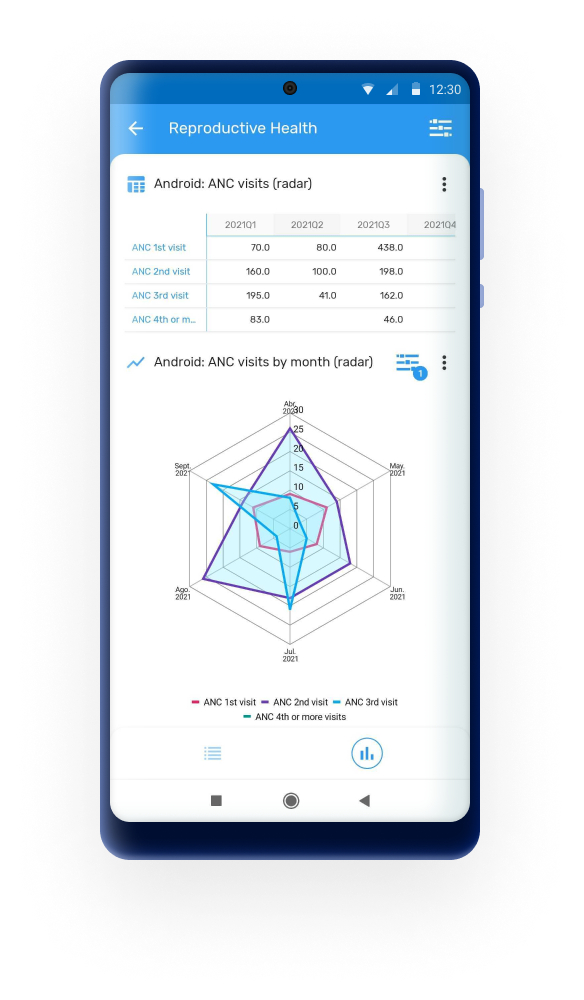
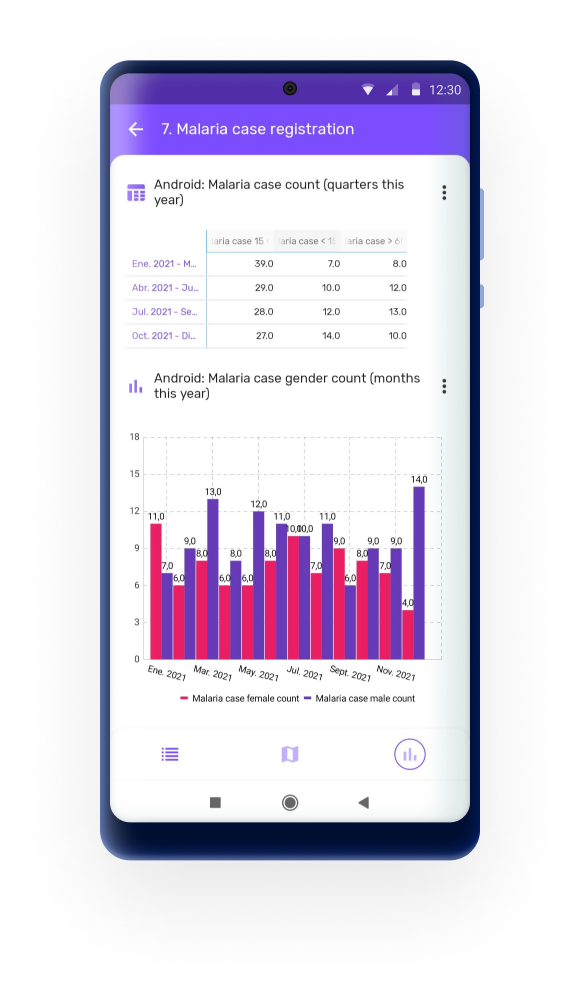
As análises com suporte no aplicativo Android são:
- Tabelas Dinâmicas
- Gráfico de colunas
- Gráfico de linha
- Gráfico de pizza
- Gráfico de radar
- Valor unico
For each visualization object, the user will be able to filter in the app by:
- Relative Period: Daily, Weekly, Monthly, Yearly, This Quarter, Last Quarter, Last 4 Quarters and Quarter this year.
- OrgUnit: selecione "Todos" para exibir todas as unidades organizacionais disponíveis para o utilizador ou "Seleção" para especificar uma ou várias unidades organizacionais.


A reset button will be displayed if a filter is applied. Select Reset to display the default visualization.

Users can also change The anlytics type between chart, table or single value.
Legends
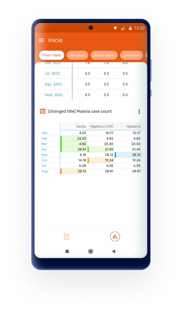
Legends are displayed in pivot tables by enabling the feature "Use legends for chart color" in the Data Visualizer App.
The Android app will color the cells using either the pre-defined legend per data item or a single legend for the entire pivot table, depending on the settings in Web.
The style for legends in tables has a new design which ensures good contrast and visibility independently from the selected colour for the legend.
Groups
All these visualizations can be organised and displayed in groups. Groups are also configured using the Android Settings Webapp following the steps below:
- Open the Android Settings App
- Click to Add a new visualization in the Analytics Menu (Home, Program or Data set)
- Select a visualization
- Mark the "Use a group visualization" checkbox
- Create or select a created group
- Save the visualization
You can name your different groups, they will be displayed as a button in the top bar of the analytics screen.

Limitations
Android uses tables and charts created using the web Visualizer app, however only the configuration parameters of the object are used by the Android App: data elements, indicators, chart type, title, periods...; all the aggregations are calculated offline by the android application. The results will be based on the data stored in the device at that exact moment.
Since the aggregations and calculations displayed are calculated in the device, the implementation of analytics is limited compared to web. In summary the compatible and suported objects and features are:
- Well formed analytic objects (series, categories, filters)
- Use of relative periods (Fix periods are not supported)
- User has view access
- Limitations for Pivot Tables
- Number of header lines: 1 or 2 (from 2.3)
- Number of header columns: 2
- Limitations for Charts
- Number of Series: No limit (but remember you are rendering in a small screen)
- Number of Categories (doesn’t apply for pie chart): No limit
There are many more restrictions which apply to Android Analytics regarding the many configuration options available in the Web Visualizer as well as the supported functions and calculations related to indicators and program indicators. This table summarises all supported features.
Note
The following aggreagation functions are supported now in local analytics: LAST, FIRST, AVERAGE_SUM_ORG_UNIT, LAST_AVERAGE_ORG_UNIT, LAST_IN_PERIOD, LAST_IN_PERIOD_AVERAGE_ORG_UNIT, FIRST_AVERAGE_ORG_UNIT
Event Visualizations
The DHIS2 Android App can now render analytics that have been created in the line listing app.Analytics to be displayed require to be configured using the Android Settings WebApp where administrators will be able to decide the tables to be displayed for end users.
To configure analytics open the Android Settings WebApp on your DHIS2 server and follow the steps below:
- Select Home or Program from the Analytics menu
- Select the visualization type "Event visualization"
- Click on the "Add Visualization" button
- Search by typing the name of the visualization and select it by clicking on it
- Add an alternative title, otherwise, the app will display the name of the visualization
In the app, the users will be able to search by period, Org. unit, or any of the columns added in the Line List.


From 3.1.0, the Android App introduces support for the Category Option Dimension in line listings. Additionally, it has been improved the text alignment within the Line Listing tables to support left alignment. This enhancement ensures better readability and a cleaner presentation of data, making it easier for users to review and analyze their information quickly.
Limitations
To add an event visualization in the Android Settings WebApp, the table must:
- be created in the Line Listing app
- use relative periods
- not exceed 15 columns
Interface language
The language of the interface will corespond to the language set in the DHIS2 user configuration. If the language is not available in the app, it will pick the language of the device.
If none of the language configurations are available, the app will default to English.
Translations set up in DHIS2 for metadata will also be shown according to the language in the user configuration.
Personalize o seu ícone
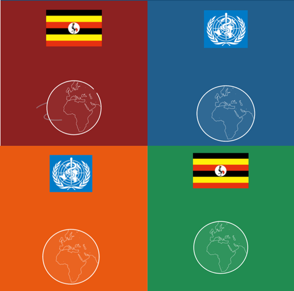
Você pode definir seu ícone no papel de parede usando o DHIS 2 App Widget. O ícone será a bandeira configurada em seu servidor.

** Nota **
Como adicionar um widget:
- Pressione e segure em seu papel de parede
- Selecione Widgets
- Procure o widget DHIS 2
- Selecione
Isso adicionará um atalho ao seu aplicativo.
Personalize a cor do aplicativo
Você pode definir o tema genérico do aplicativo configurando-os em nosso servidor:

Note
How to set the server theme and flag:
Go to System Settings > Appearance > Style
- Select your style
- Green,
- India (Orange),
- Light Blue,
- Myanmar (red),
- Vietnam
- Select your flag
Biblioteca de ícones para metadados
There are currently 134 icons available that you can choose from. You can search by name in the icon picker widget. Icons are available in positive, negative and outlined shapes.
Os ícones podem ser associados a programas, etapas, elementos de dados e opções de um conjunto de opções. Isso é configurável por meio do aplicativo de manutenção.
** Nota **
Este recurso está disponível a partir do DHIS 2 2.30
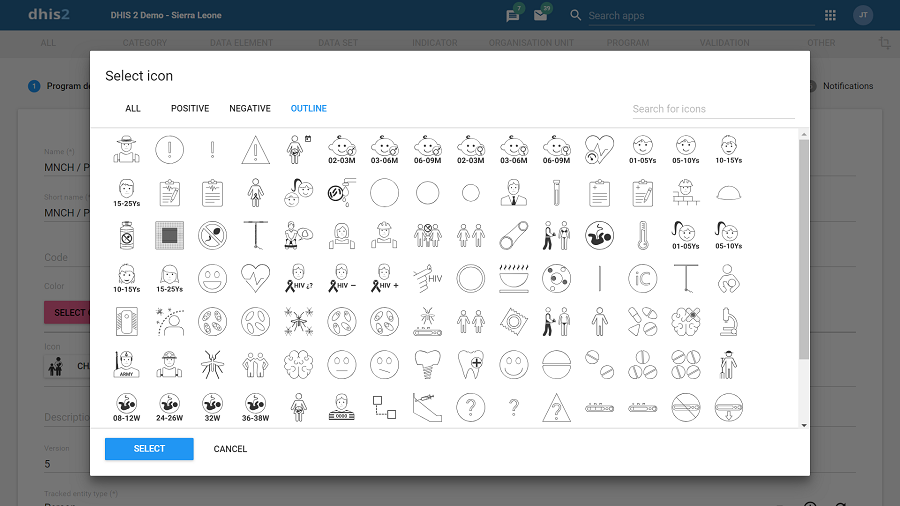
In the DHIS2 Android App icons render in the home screen to illustrate all the programs available to a user, or while adding an stage. For data elements and options, the icons render for single event programs, when a section contains a single or more DEs, showing the option set as a matrix or sequence of images.
The icon based data entry can now be used in enrollment forms. When an enrollment section contains one or more Tracked Entity Attributes with option sets and icons assigned, the app is able to display them as a matrix or sequence based on the section rendering type. In previous sections of the App this feature was only available for Data elements.

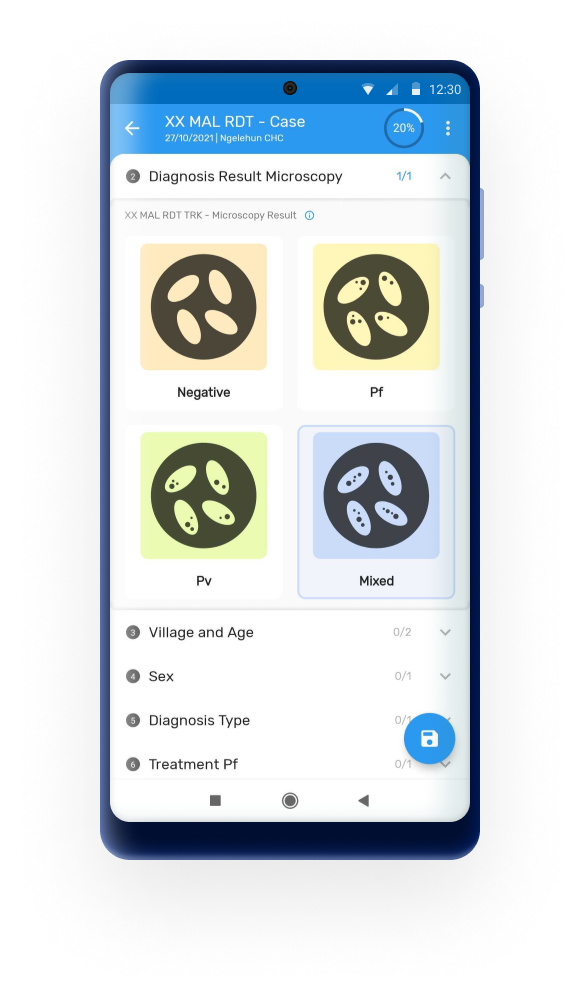
From 3.0 it is possible to display custom icons in the Android App. DHIS2 (41 version) now allows uploading custom Icons to be used in addition to the built-in Icon library. This is useful for use cases not related to health or that require very specific iconography. The Android App will render the custom icons that need to be uploaded and configured using the Maintenance DHIS2 Web App.
To upload and assign the custome icons through the instance, the admin must:
- Open the object (program, data element, option, etc.)
- Click on the "Select icon"
- Click on the "Choose file to upload"
- Add a key and description
- Salve

From 3.1 it is possible to disply the custom icon when a relationship is displayed.
** Nota **
Os ícones inicialmente serão renderizados apenas no novo aplicativo Android. O novo Capture App baseado na web irá incorporá-los em um futuro próximo.
We plan to expand the collection of icons on each future version of DHIS2 for that we need your help: we are seeking ideas for new icons - please submit yours using this form.
Paleta de cores para metadados
O rastreador e a captura de eventos agora têm a capacidade de renderizar cores para programas, fases, elementos de dados e opções em conjuntos de opções. Um seletor de cores está integrado no aplicativo de manutenção, que é exibido como uma paleta, exceto para opções que permitem a seleção de qualquer cor.
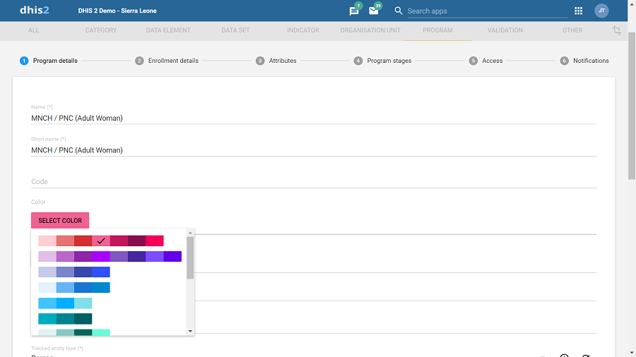
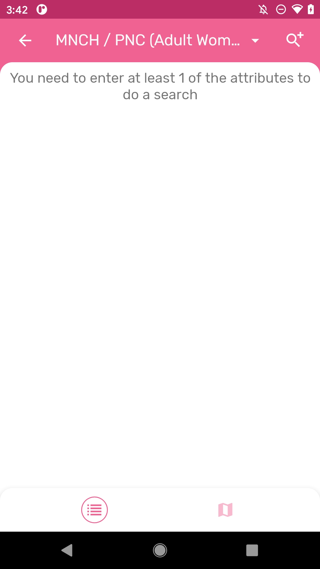
No aplicativo Android, a cor será processada como cor de fundo para programas e fases combinadas com um ícone (se selecionado). Para opções, ele renderiza como a cor de fundo durante o formulário de entrada de dados para programas de eventos únicos. Quando o utilizador seleciona um programa com uma cor atribuída, essa cor se torna o tema de fundo para todas as telas no domínio do programa.
** Nota **
As cores estarão primeiro disponíveis no novo aplicativo Android, seguido em versões futuras pelo novo Capture App baseado na web.
Tipos de renderização para seções do programa
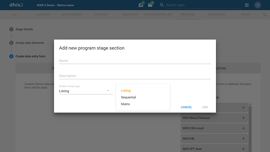
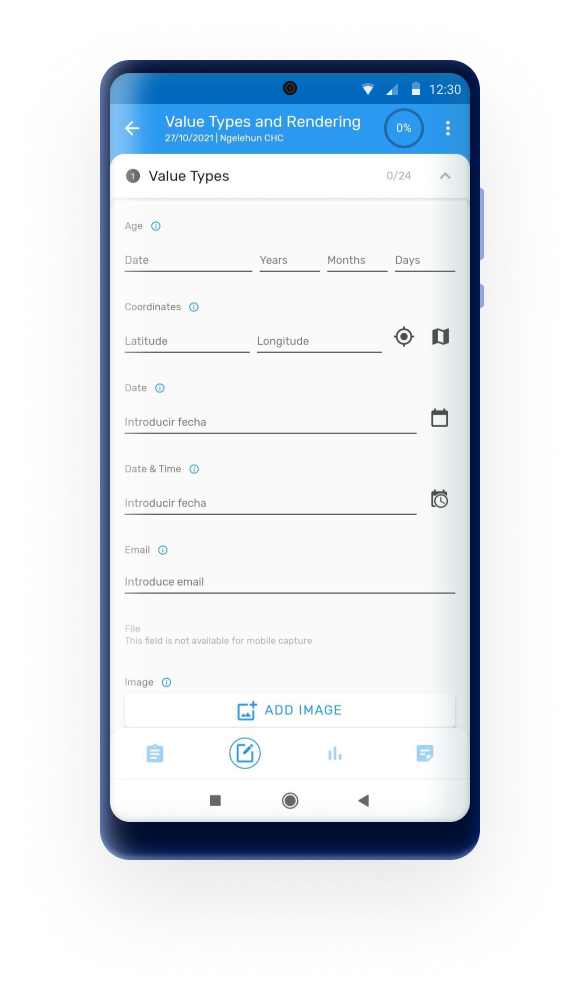
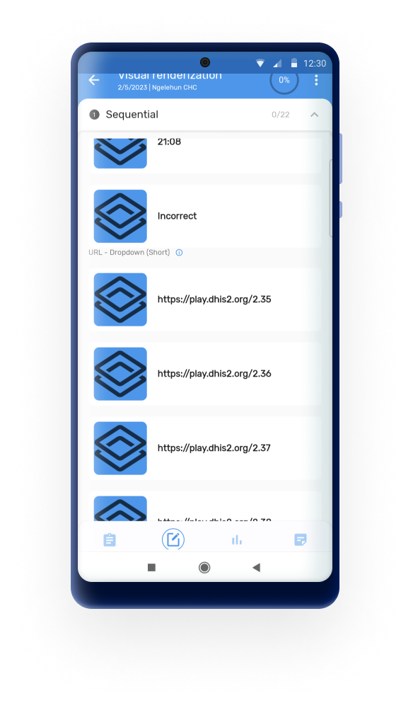
Program Section: when used in combination with icons, a Program Section with one or more data elements and associated Option Sets can render the options in sequential or matrix layout (see screenshots). If the icon is not found, the app displays the DHIS logo.

From 2.8, the app will render option set with any value type as matrix or sequential layout.

** Nota **
O tipo de renderização para seções estará disponível primeiro no aplicativo Android, seguido em versões futuras pela nova IU do aplicativo Capture baseado na web.
Calendário
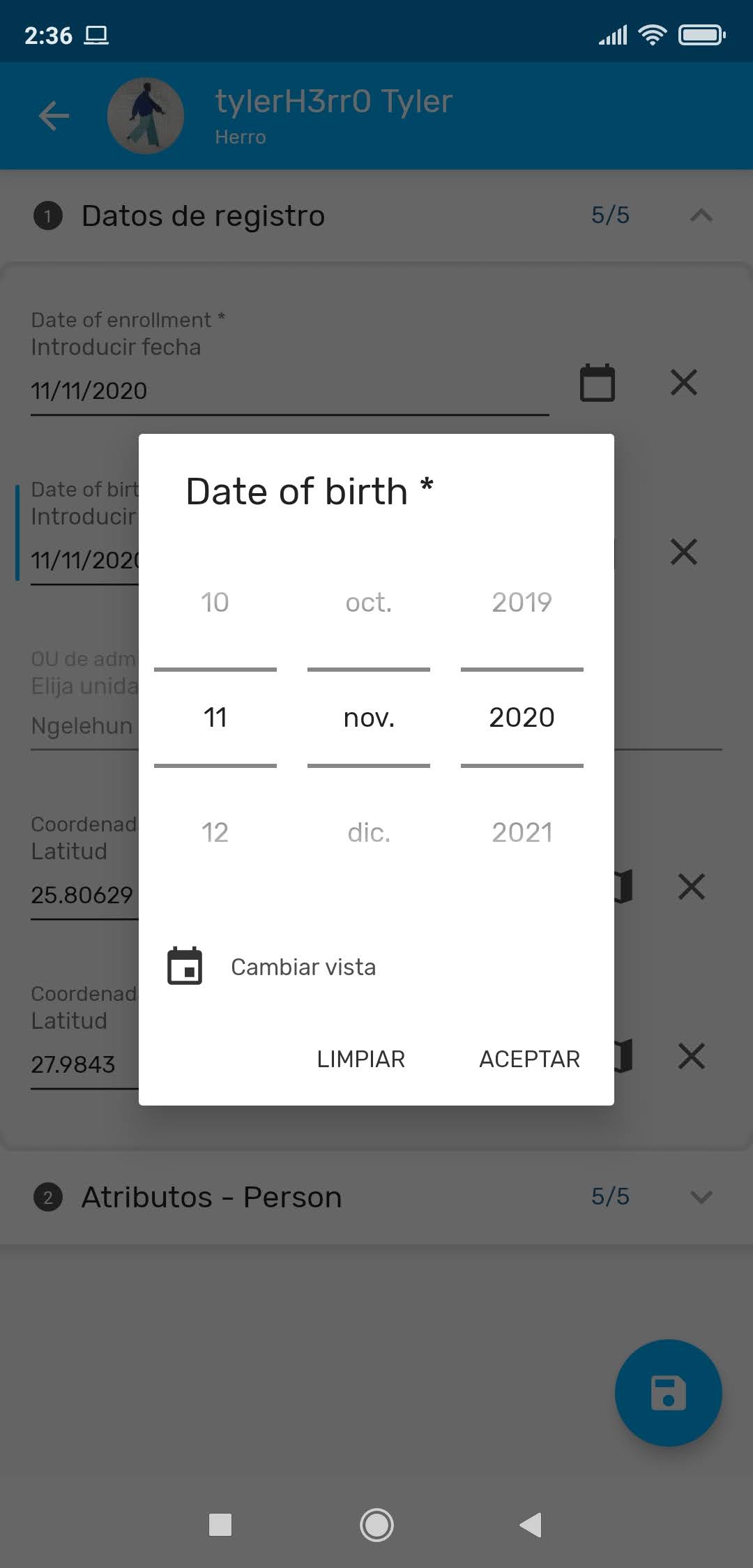
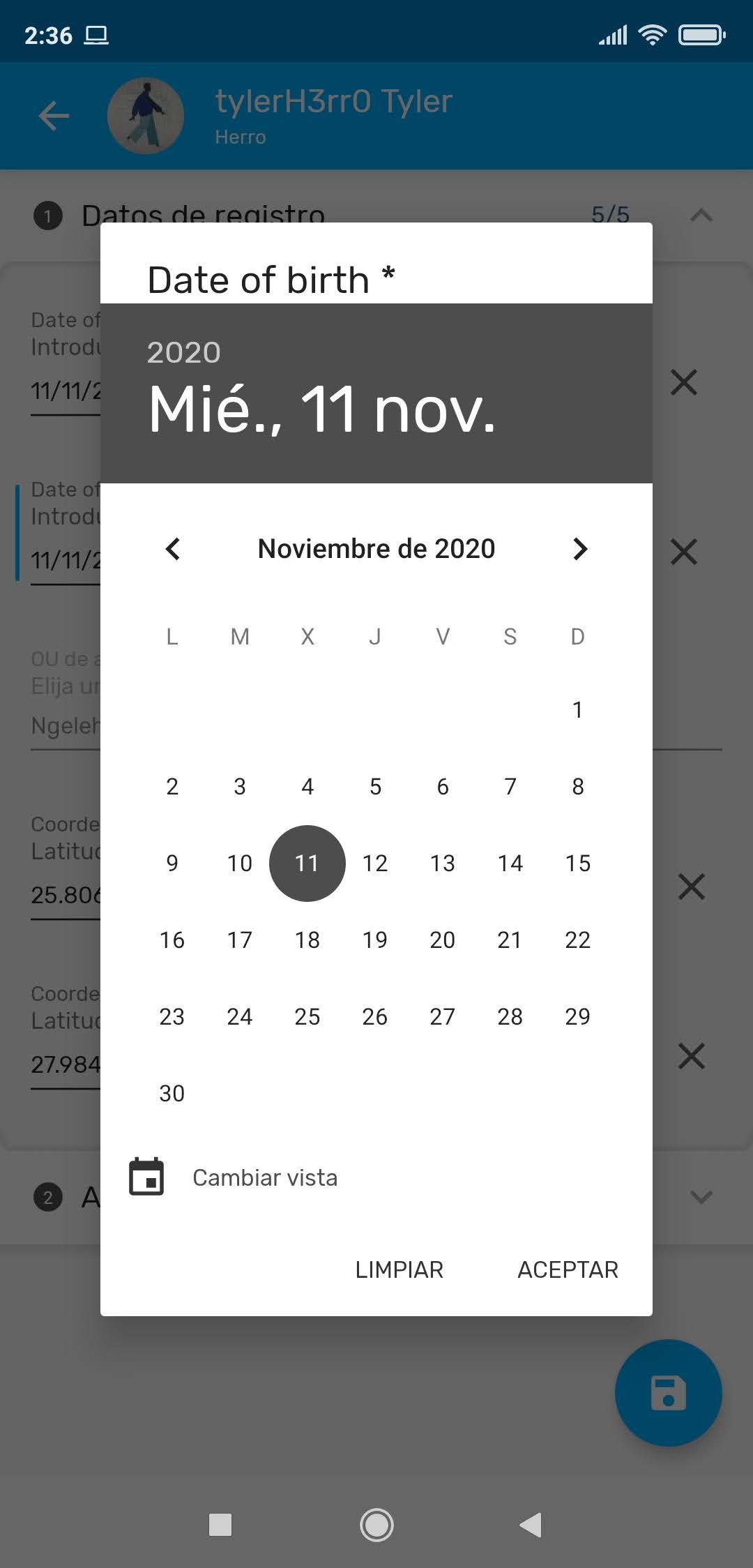
Agora é possível usar dois calendários diferentes. O da esquerda é o primeiro a aparecer, mas você pode alterá-lo clicando no ícone de calendário no canto esquerdo inferior.
Disponível quando:
- Fazendo uma nova inscrição.
- Criação de um novo evento (Programas com e sem inscrição).
- Usando filtros de período em conjuntos de dados e programas com e sem registro.
** Nota **
Para as versões Android 4.4, 5.1 e dispositivos pequenos, a opção Aceitar não está visível na segunda visualização do calendário.
Tipos de renderização
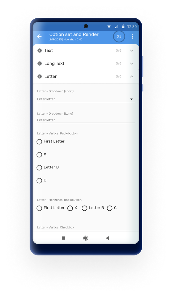
The available rendering options have been expanded to include horizontal and vertical radio buttons, checkboxes and toggles for any value type.

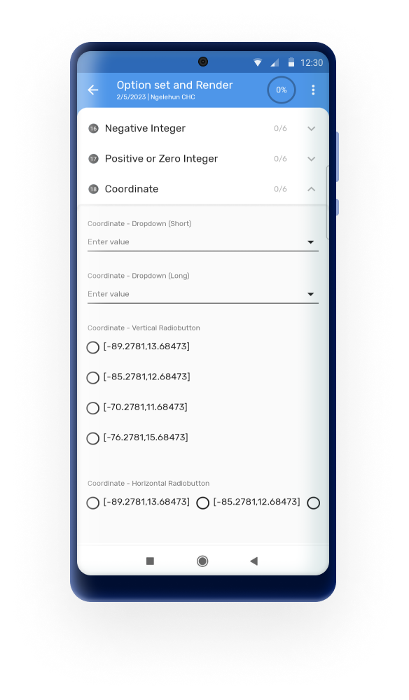
Note
The default rendering option will automatically display a search box whenever there are more than 15 elements in the option set to ease the selection.
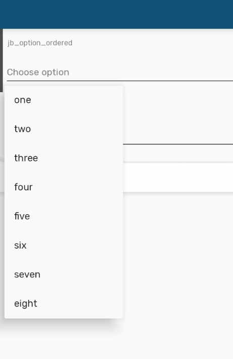
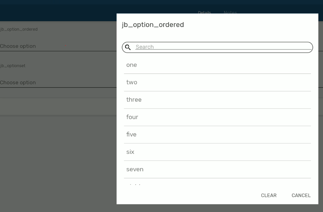
Render types are available in event and registration forms
QR e códigos de barras
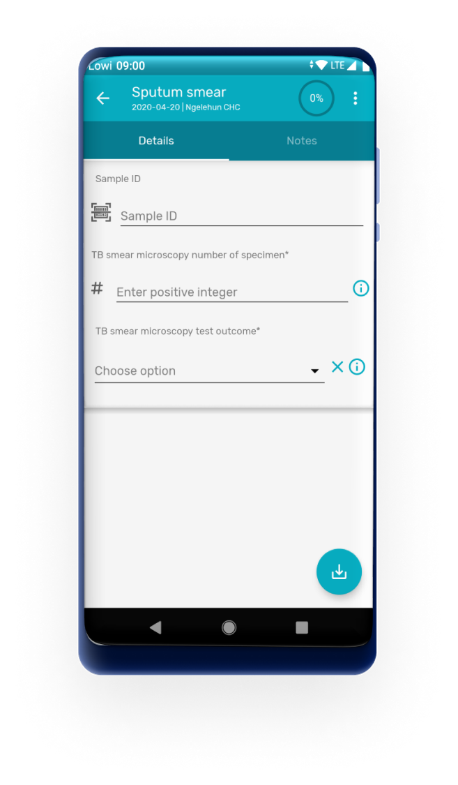
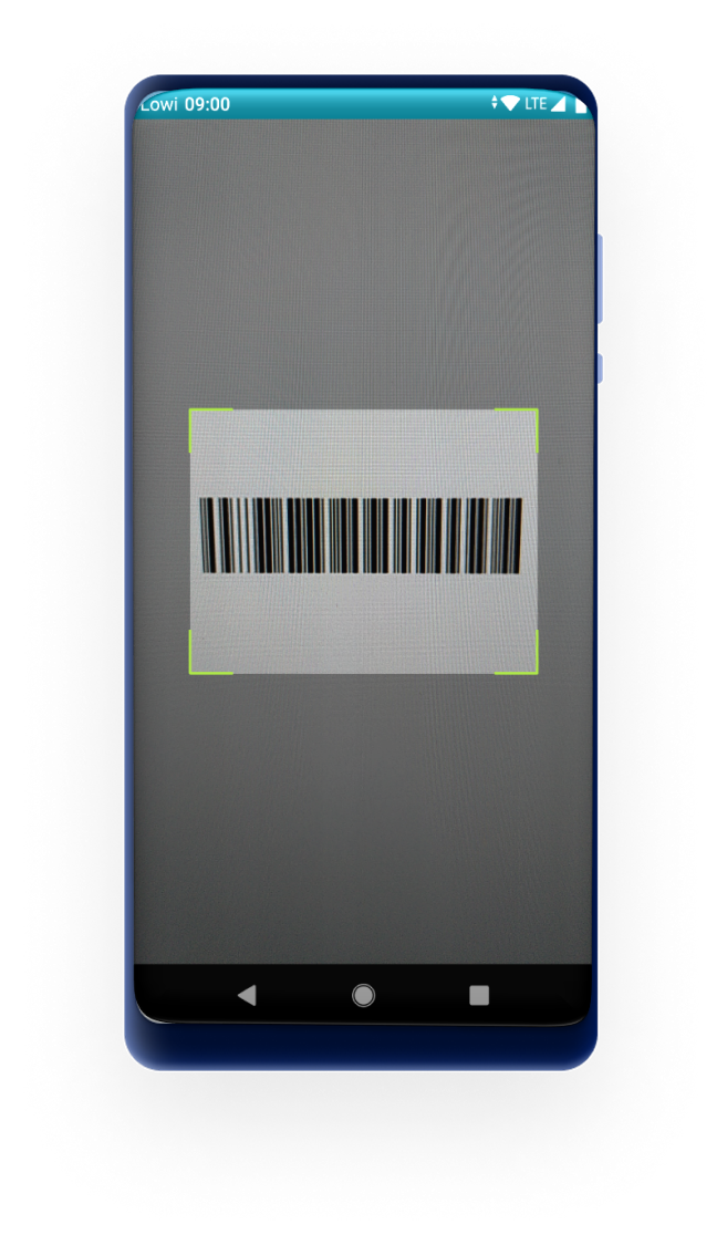
Data elements or attributes of value type Text can be rendered as QR codes or barcodes. When a data element or attribute is rendered as QR/Barcode, the app opens the device camera to read the code, and the decoded text is stored as the value. When the QR/Barcode is a tracked entity attribute configured as searchable, the user can scan the code to search for and identify the tracked entity. This also works for option sets.
Barcodes also allow the user to enter the value manually.
Important
Using it to encode sensitive or personally identifiable information, such as names, phone numbers, passport or national ID numbers, or health data can result in data exposure if the QR code is printed and shared outside of the DHIS2 Capture App. We recommend using an identifier that has no meaning outside DHIS2, for example an auto-generated tracked entity attribute. The code then only points to the record, and the data itself stays protected by DHIS2 authentication and sharing settings.
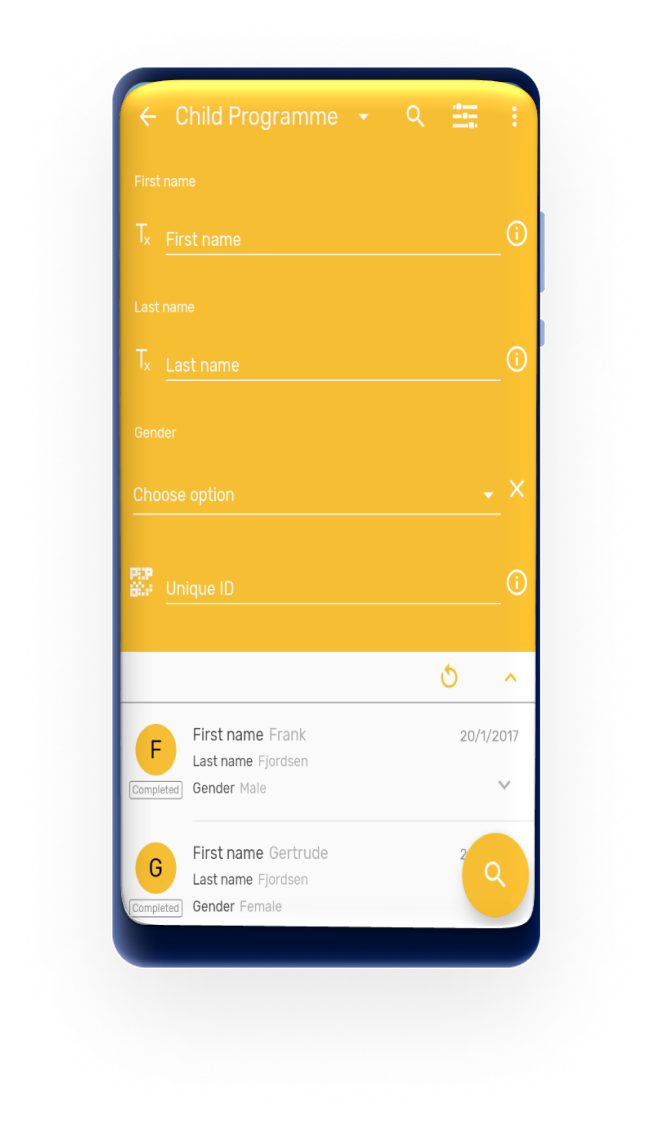

Export/Share
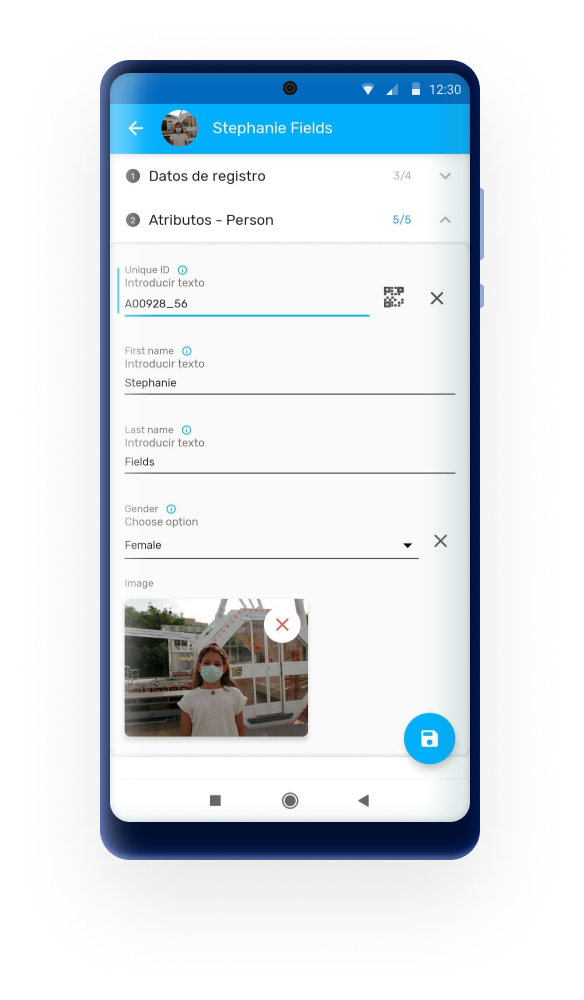
Users are now able to display a bar or QR code in an image so that it can be shared for printing, take a screenshot or show it on the screen for scanning.
Non-editable fields can still share the bar or QR code, but will prevent the user from capturing a new one.

GS1 Data Matrix codes
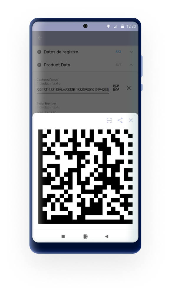
If an attribute or data element rendering type is configured as QR code, the Android App will be able to read and process the string as GS1 Data Matrix codes.
Combined with the use of d2 functions in program rules, the different fields of a GS1 code can be saved into different data elements or attributes (d2:extractDataMatrixValue(key, dataMatrixText)).

Signature
This feature allows users to collect handwritten signatures from the device. The signatures will be saved as an image data element in the app.
This configuration must be done in web ( available from 2.40 version) by selecting the "canvas" rendering type on an image value type.

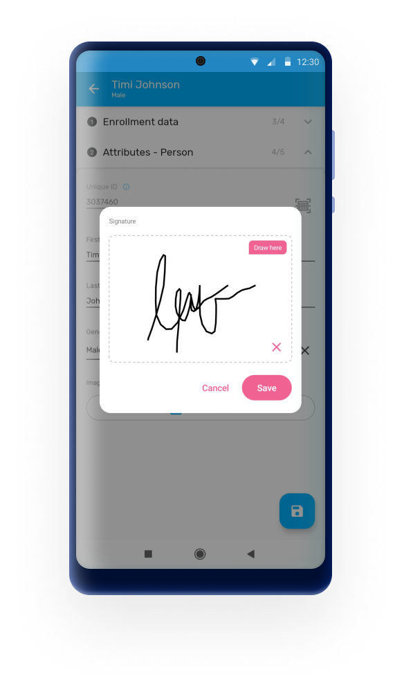
From 3.0, signatures are allowed to be opened in full screen for better visibility.
User Experience
Tappable areas in icons and buttons
Some buttons or tappable labels of the Android App had small sensitive areas for the user to tap. The whole user interface was reviewed and the tappable areas has been increased. For example the "+" button to create a new stage or the "˅" icon to open TEI details or expand a section.

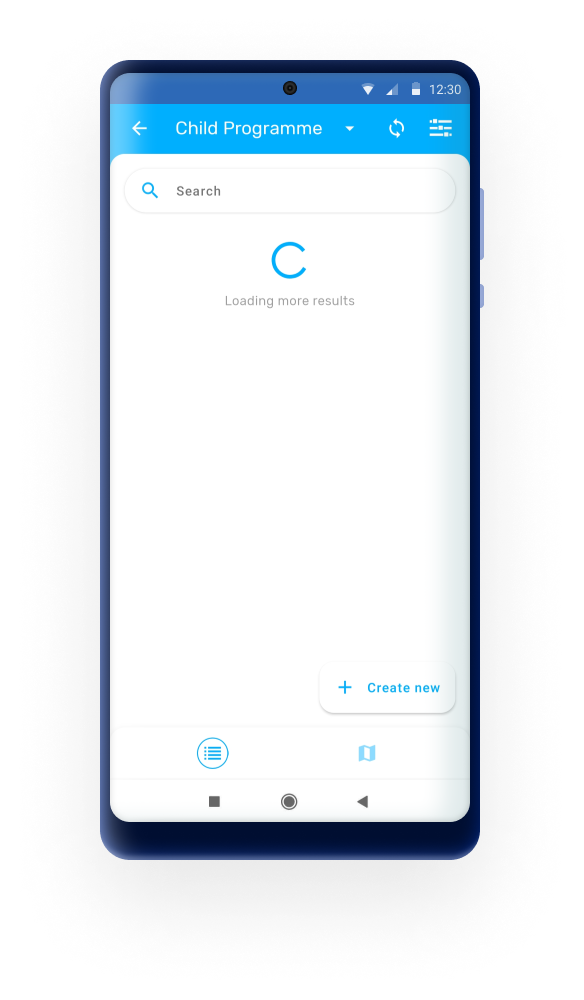
Loading Banners
The Android App provides visual animations to users when they perform actions that take longer than usual to complete, such loading maps or searching, so that they know that the system is processing their request.
Offline Buttons
This feature enhances the functionality of the app when it is used offline, ensuring that menus are disabled when the online actions are not available.
Long Texts Management
The Android App enables users to view long text in fields that are limited in size, such as a stage names or datasets headers.
Legends
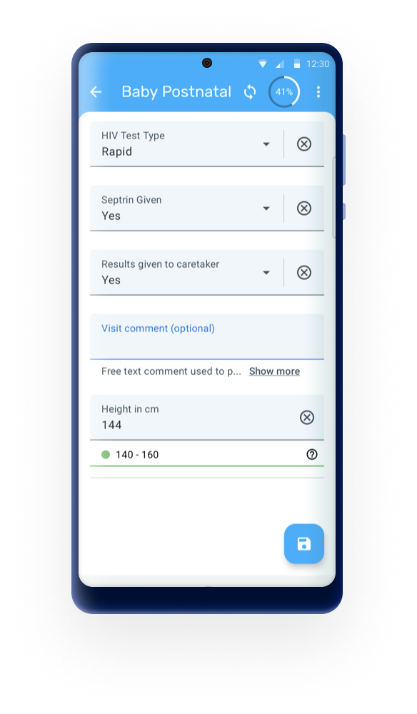
The Android App displays the full description of the legend when tapping on the information icon once a legend is active. These feature is available only in event and registration forms.
From 3.1.0, the legend in a data element will now automatically update after seconds of inactivity. This means that users no longer need to move to the next field to prompt the legend update, making the process smoother and more efficient.

Input fields
The new input fields are now displayed by default in the Android app and admin users are able to opt-out to use the old forms through the Android Settings web app.

Menus and Navigation bar
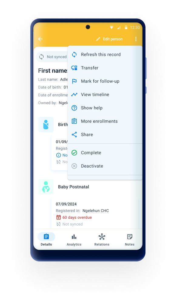
A revamped of the menus and navigation bar has been made to be more user-friendly and accessible. It includes a cleaner, more modern look that improves readability and usability. These updates are designed to provide a more efficient and enjoyable user experience.