Denominators
The quality of denominators is a critical part of data quality to assess. While this is often not a DHIS2 specific problem, DHIS2 has several tools that allow you to make comparisons of your denominators over time.
Why are denominators important?
- The reliability of routine coverages depends upon the reliability of denominators
- As coverage rises, estimates are increasingly sensitive to errors in denominators
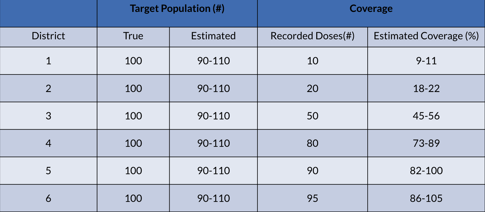
An an example, see the effect that 10% error in target population estimates has on estimated coverage
For more background on denominators and how they can be assessed, please refer to the following resources:
Assessing population data in DHIS2
What we have attempted to do is take existing guidelines for assessing denominators and demonstrate ways in which these can be performed directly in DHIS2. The methods we will highlight are the following:
- Compare your DHIS2 population with other sources (totals, births, by age/sex etc.)
- Highlight differences that are ≥ 10%
- Compare implied rates (ex. crude birth and infant mortality) with other sources
- Highlight differences that are ≥ 20%
- Assess the annual growth rate
- Highlight differences that are ≥ 10%
- Compare routine coverage estimates to survey coverage estimates
- Highlight differences that are ≥ 10%
- Compare national targets (ex. births, total population, etc.) with the sum of subnational targets
- Highlight when national targets ≠ the sum of subnational targets
- Review the trends of your data over time
- Plot your numerator and denominator data together and look for inconsistencies in reporting
Sources of data for comparison
In order to assess your existing data (this could be national data, census data, etc.) in DHIS2, you will need data from an external source. Some examples of sources where you can obtain comparison data include:
- World Population Prospects
- https://population.un.org/wpp/
- World Bank (uses a variety of sources, does not calculate on their own)
- https://data.worldbank.org/indicator/
- IGME (UN Inter-agency Group for Child Mortality Estimation)
- https://childmortality.org/
Importing data for comparison
In order to make these comparisons possible in DHIS2, you will need to export data from one or more of these (or similar) sources into DHIS2.
It is also possible to download the data from DHIS2 as well as another source into something like Excel in order to make these comparisons.
This guide will use examples in which data has been imported into DHIS2 from different sources; however you can see examples of similar analyses being performed via the use of Excel in this presentation.
Comparing your DHIS2 population data with other sources
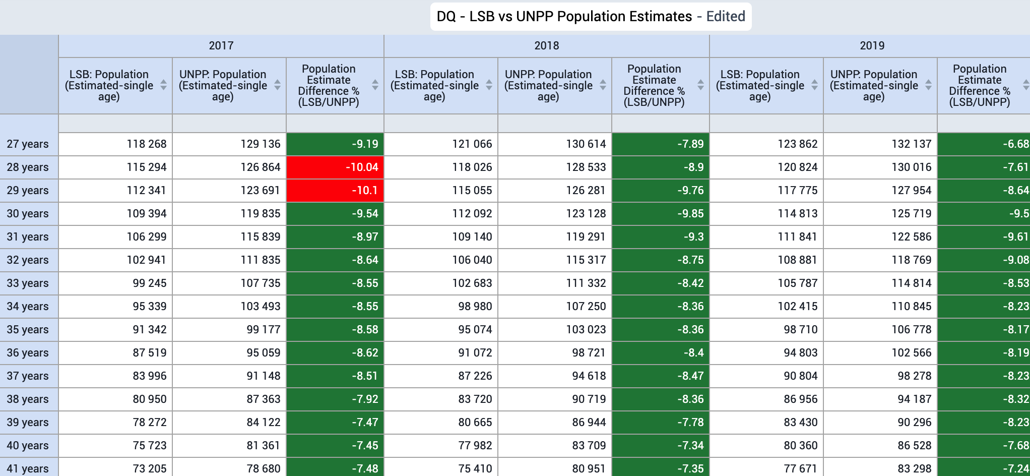
The first method we will outline is comparing your existing DHIS2 population data with data from an external source. In this example, our external data is taken from the UN World Population Prospects that has been imported into our DHIS2 instance, while our existing data is taken from the Lao Statistics Bureau - an internal source used by the Ministry of Health in Lao PDR that is already in their local DHIS2 instances (also via import).
A couple notes on readying your data before making these comparisons:
- Keep in mind the age disaggregations that are in your existing data. Externally sourced data may provide data in 1-year age/sex groupings that you will have to aggregate to match your own, internally used disaggregations
- Check the geography of the data; external sources may only have national data that you can use for comparison - but the more granular you can make this comparison (for example, province, district, etc.) - the better
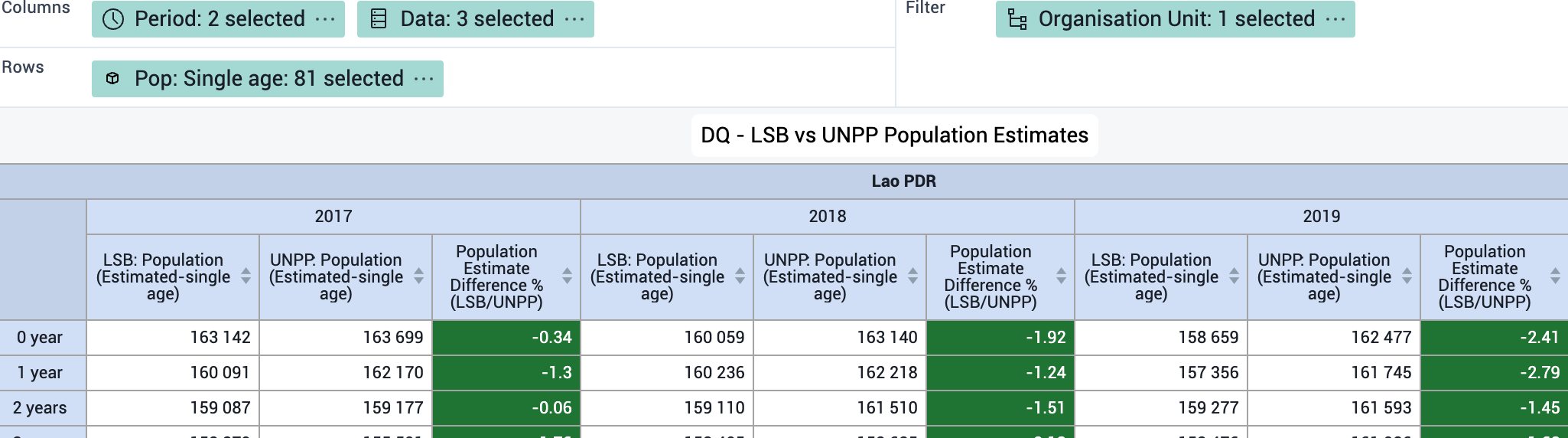
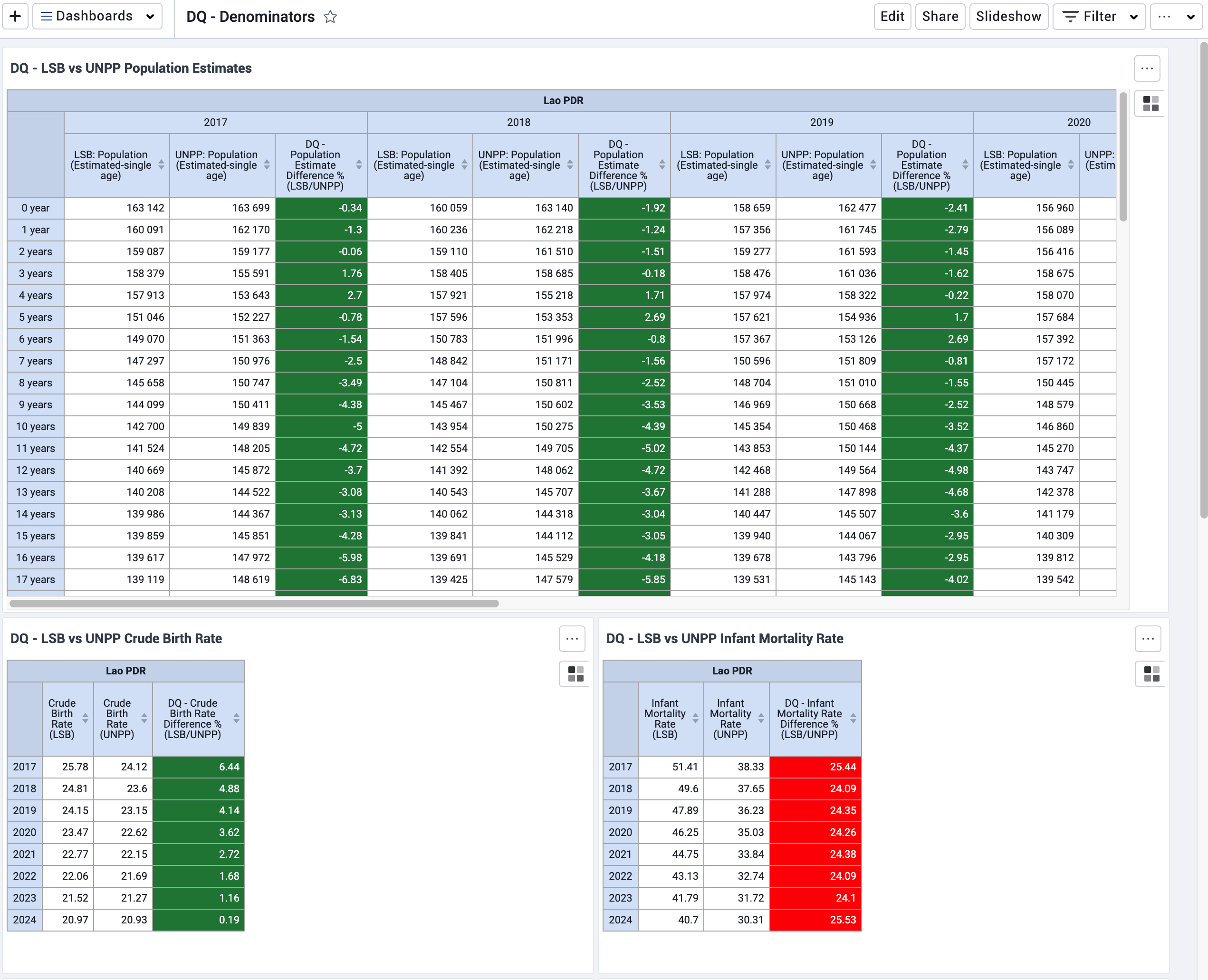
Here is an example of this comparison in DHIS2 using a pivot table in data visualizer:
Some rules for when we make this comparison:
- Highlight differences ≥ 10%
- Discuss possible reasons for large inconsistencies (ex. the method used by your statistics office to project population, change in parameters based on new studies, etc.)
The main reason in performing this analysis is to determine the confidence you can have in your population/denominator figures. This can be used as evidence internally, but also with partners, if you have little variation when compared to external sources that use a different method of calculating estimates for the same location.
If you identify significant differences consistently throughout your data, then this may require you to re-consider the estimates you are using.
Steps for making this visualization
First, ensure you have both your existing data as well as your external data available in DHIS2.
To calculate the difference between the two populations, make an indicator with the following formula:
Example
Indicator type : percentage (factor of 100)
Numerator: Population 1 - Population 2
Denominator: Population 1
\[ Indicator = {\frac{Population1-Population2}{Population1}} \times 100 \]
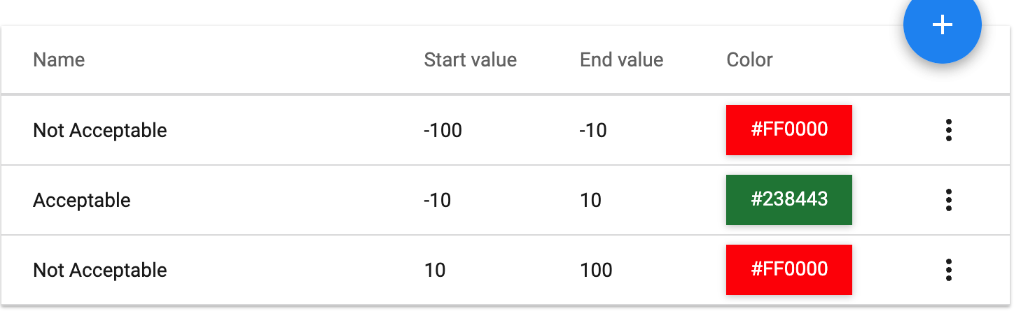
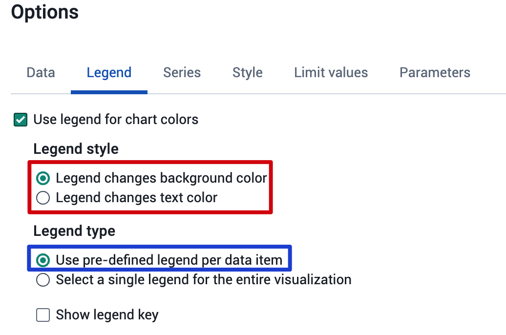
To highlight differences ≥ 10%, make a legend and apply it to your indicator
Make the legend via maintenance
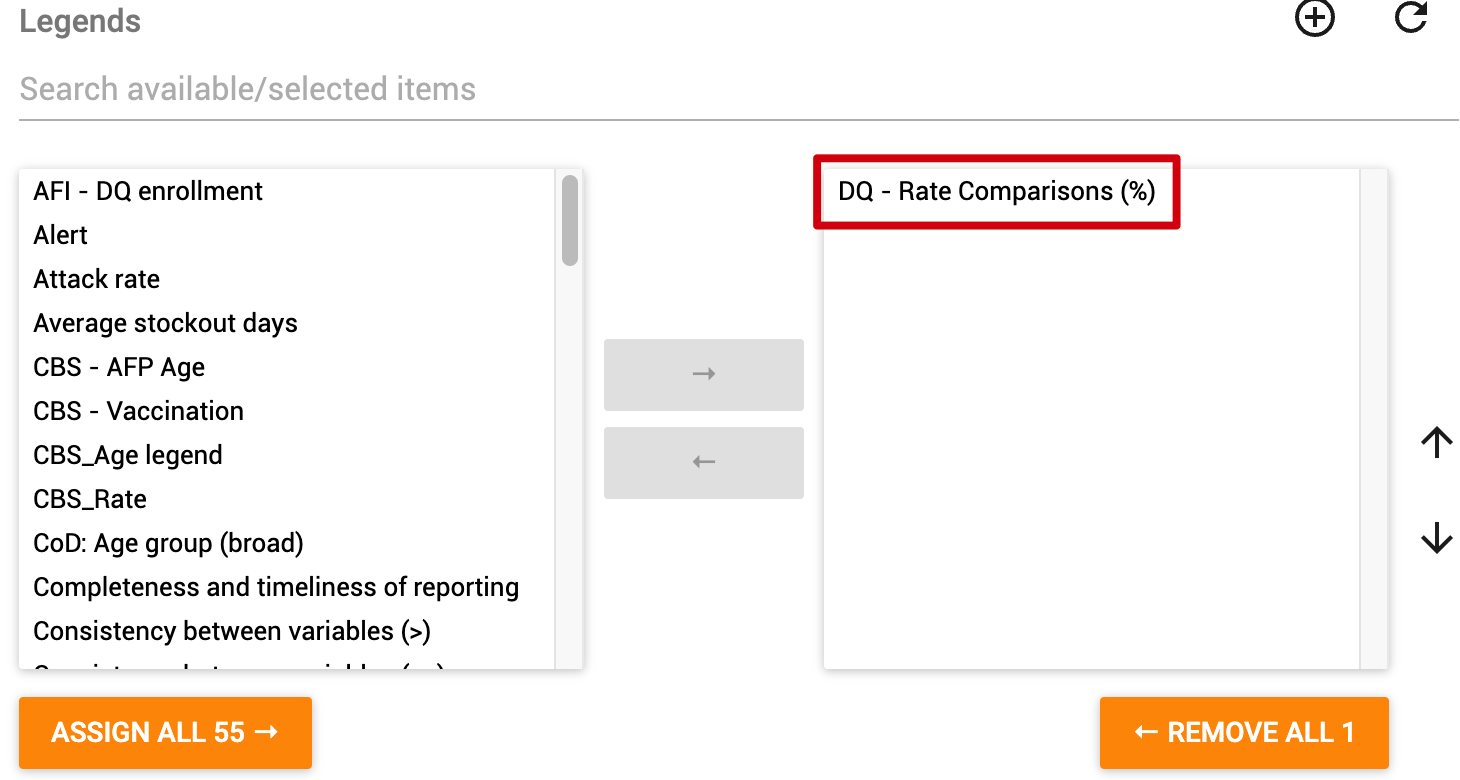
Apply it to your indicator in the "legends" section of the indicator
Make a pivot table in data visualizer. Add your 2 population data elements you are comparing, along with your comparison indicator. If you are using disaggregations, add these to the table as well. Filter by org unit, or show all of them, depending on your needs.
Ensure you apply the legend to your table
An example layout, along with the output, can be seen below.
Comparing your implied rates with other sources
Implied rates are a calculated rate that are not directly measured but is derived from available data. Examples of this include crude birth rate and infant mortality rate.
We can use the UN World Population Prospects as our source for our external data in this example.
We can import this information into a DHIS2 data element in the event the rates are already calculated for you without providing the numerator and denominator; or create an indicator if we are able to obtain the numerator and denominator for the purposes of import.
An example of this comparison can be seen here:
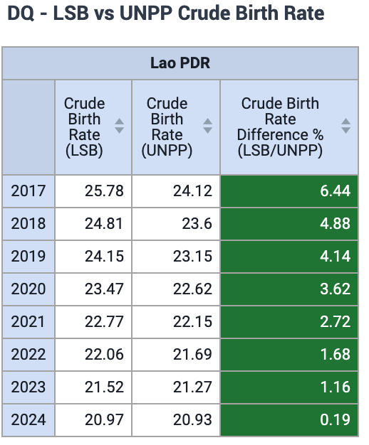
Some rules when making this comparison:
- Highlight differences that are ≥ 20%
- Compare your implied rate over time with global trends. Are the trends over time similar to global ones or not?
If you are seeing large differences that are ≥ 20%, it is worthwhile checking both the numerator and the denominator for its consistency in these cases.
Steps for making this visualization
First, ensure you have both your existing data as well as your external data available in DHIS2.
To calculate the difference between the two populations, make an indicator with the following formula:
Example
Indicator type : percentage (factor of 100)
Numerator: Rate 1 - Rate 2
Denominator: Rate 1
\[ Indicator = {\frac{Rate1-Rate2}{Rate1}} \times 100 \]
To highlight differences ≥ 20%, make a legend and apply it to your indicator
Make the legend via maintenance
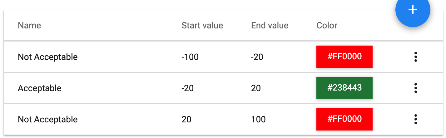
Apply it to your indicator in the "legends" section of the indicator
Make a pivot table in data visualizer. Add your 2 implied rates that you are comparing, along with your comparison indicator. Filter by org unit, or show all of them, depending on your needs.
Assessing your annual growth rate
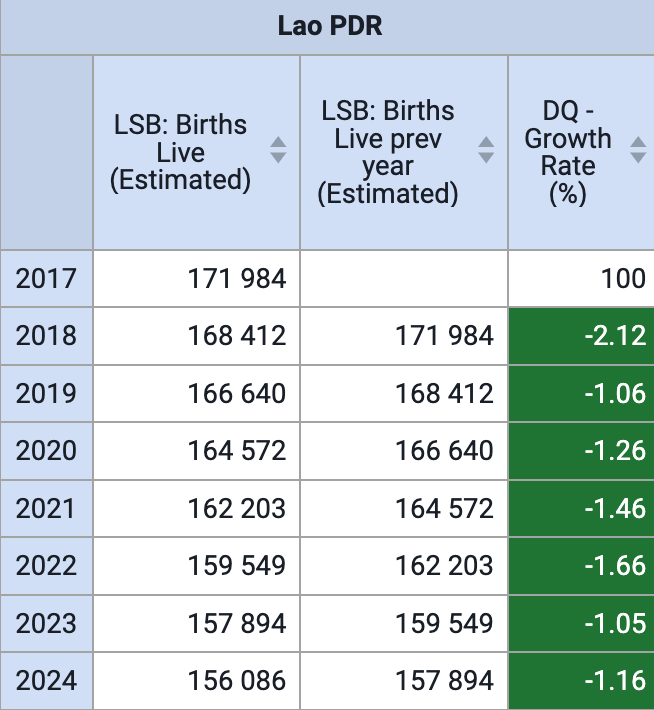
The growth rate will allow you to determine if your denominators are within an accurate range when comparing years. When you are calculating this, ensure the denominators you are comparing between years are from the same source (ie. a denominator from 2024 taken from the census and a denominator from 2023 taken from the UN population prospects should not be used to calculate your growth rate).
An example of the growth rate in DHIS2 can be seen here:
Some rules when making this comparison:
- Highlight differences that are ≥ 10%
- Your growth rate should be fairly steady; not erratic and changing significantly from year to year (ie. you should not see any large increases or decreases when comparing from year to year)
- If you see a negative growth rate, this means the population is contracting/decreasing (at least based on births alone, this may also be affected by other factors such as immigration)
Steps for making this visualization
First, ensure your population data is available in DHIS2
To calculate the difference between the two populations, make an indicator with the following formula:
Example
Indicator type : percentage (factor of 100)
Numerator: Population/Births in Year 2 - Population/Births in Year 1
Denominator: Population/Births in Year 1
\[ Indicator = {\frac{Population/Births in Year 2 - Population/Births in Year 1}{Population/Births in Year 1}} \times 100 \]\[ Indicator = {\frac{live births in 2024 - live births in 2023}{live births in 2023}} \times 100 \]
In order to make an indicator using data from the previous year in DHIS2 do the following:
- Create your new indicator
- The indicator type is percentage (x 100)
- Create the numerator formula as follows:
-
{DEUID} - #{DEUID}.periodOffset(-1)
- The denominator is : #{DEUID}
Here is an example of the numerator configuration:
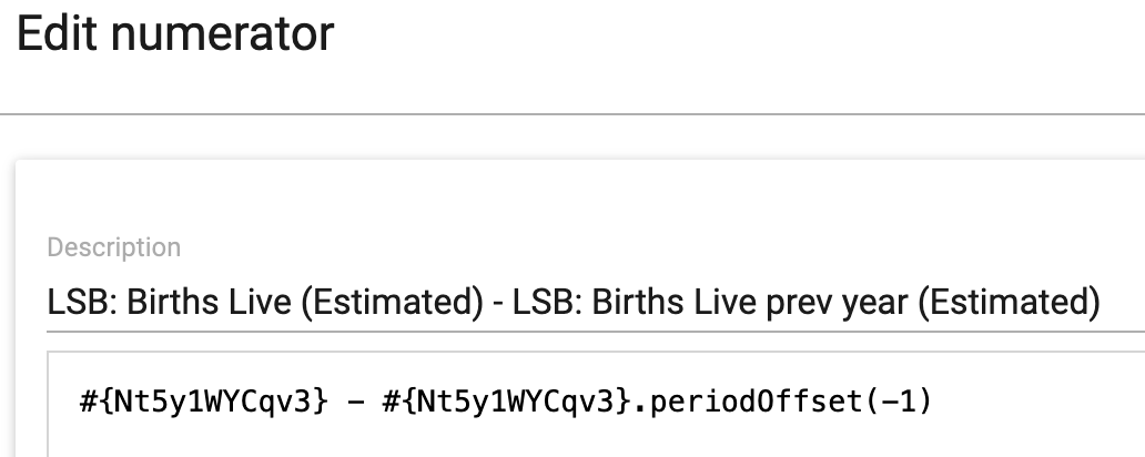
The .periodOffset(-1) function is taking the value from the previous period, in this case likely to be the previous year.
From here, you can use this indicator in data visualizer to make necessary visualizations.
Compare routine coverage estimates to survey coverage estimates
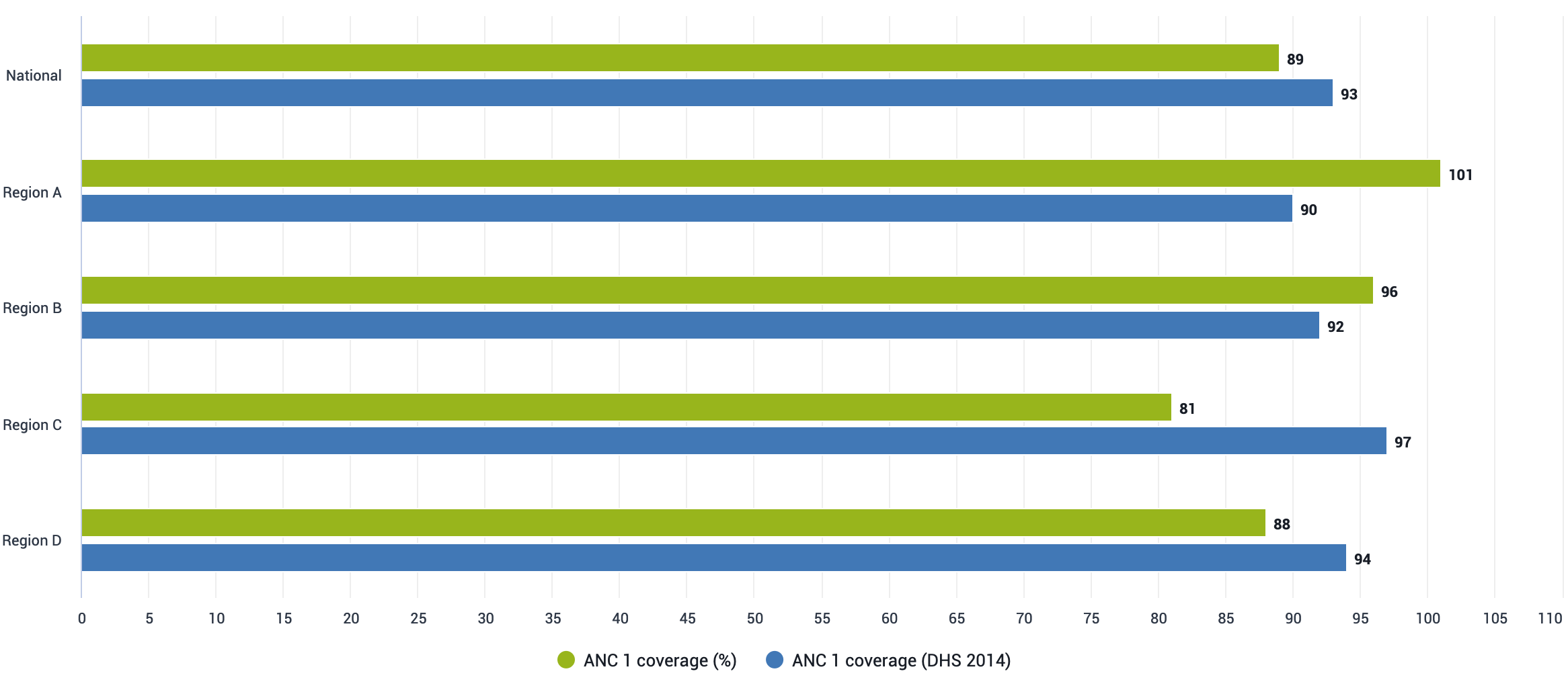
To get an idea of the accuracy of your coverage estimates, it can be useful to compare coverages that have been calculated using a different methodology in estimating both the numerator and denominator. Due to the rigourous nature of a survey's design, they are often considered accurate; and if your routine estimates line up with your survey data this can be useful in determining the accuracy of your routine estimates.
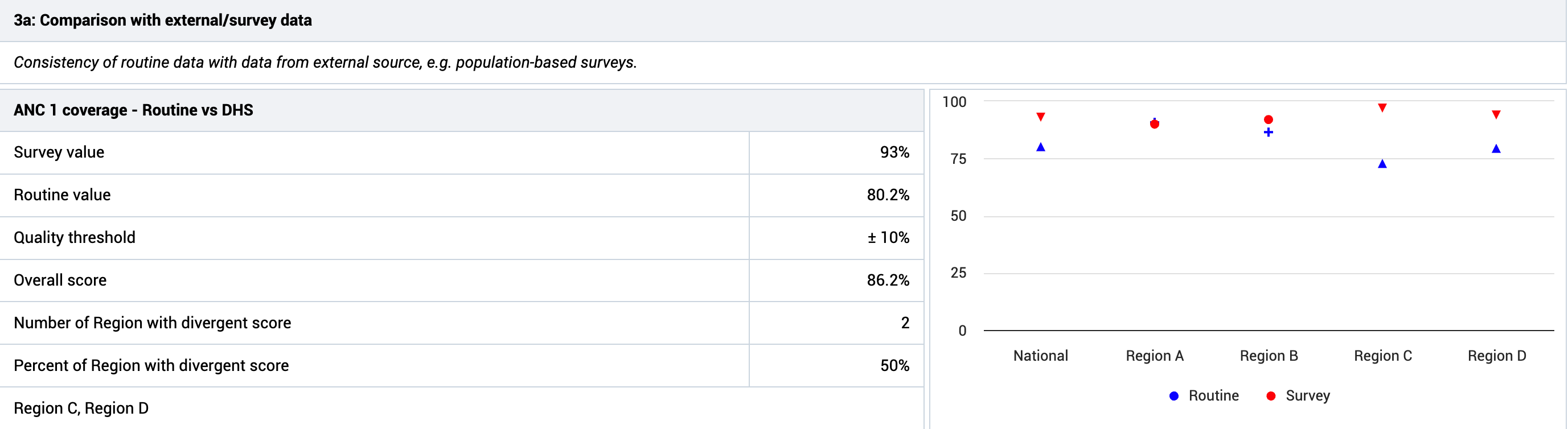
We can perform this type of comparison both directly in data visualizer, as well as by using the data quality annual report app
Here is an example of this comparison from the data visualizer app:
And an example from the DQ annual report app:
Some rules when making this comparison:
- You are able to set a quality threshold in terms of what is an acceptable difference between your routine and survey coverage estimates; we can use ≥ 10% as a general rule however
If you are seeing large differences that are ≥ 10%, it is worthwhile checking both the numerator and the denominator for its consistency. In particular, when you are comparing denominators, it will be useful to understand the method the survey used to estimate its denominators and if this can support you in making your internal targets more accurate.
Steps for making this visualization
First, ensure you have both your existing data as well as your external data available in DHIS2.
If you are using data visualizer, you can make a bar, column or line chart and visually identify differences that exceed your threshold. You can also create a pivot table in order to calculate (using an indicator and legend you create) and highlight any significant differences if needed.
If you are using the DQ annual report app, you will need to configure your comparisons under the "external data comparison" tab.
Compare national targets with the sum of subnational targets
NB: Use this comparison when targets/denominators are not being used consistently nation-wide to identify the extent of the problem and have programs rationalize when possible. This can be the case when programs create their own denominators for example.
In scenarios in which you are calculating/estimating your subnational and national denominators seperately, ideally your subnational totals should add up to, or be within range, of your national total.
An example of this can be seen in the table below:
| 2022 | 2023 | 2024 | Adjusted 2024 | |
|---|---|---|---|---|
| Program Estimate: Province 1 | 10166 | 10037 | 10243 | 9636 |
| Program Estimate: Province 2 | 19678 | 19426 | 20167 | 18971 |
| Program Estimate: Province 3 | 28467 | 26689 | 29329 | 27589 |
| Program Total | 58401 | 56152 | 59739 | 56196 |
| Census Total | 49654 | 51876 | 52654 | 56196 |
| Ratio: Program/Census | 1.17 | 1.08 | 1.13 | |
| Average value: Program and Census | 54027 | 54014 | 56196 | |
| Ratio: Average/Program | 0.925 | 0.962 | 0.941 |
In this example, we are comparing population data generated by a program at the provincial level with the census estimates. We can see that the program total does not match the census estimate. The last column of the table adjusts the data at the subnational level for one year.
When we identify this mismatch, we have a couple options to consider
- Is one method more accurate then the other, with data available at the subnational level you are reviewing? In this scenario, as an example, if the census is determined to be more accurate based on its method of estimation, and if provincial values from the census are available, we could use the census' provincial values instead of the program based denominators in our calculations.
- Is one method more accurate, but estimates are not available at the same subnational level(s) the program is interested in? In this scenario, you could adjust your subnational totals based on the more accurate method. The method above does the following:
- Calculate the average between your census and program estimates at the national level
- Divide this average by your program total to get a ratio for adjustment
- Adjust your subnational program estimates by multiplying them by this ratio
Once you decide on your method, you may need to subsequently update your indicator formulas to use a new denominator. It is worthwhile to compare calculations using your previous and new denominators (keep the old indicators, make new indicators, and compare them in data visualizer) to determine how much possible error was being contributed to your indicator values as well.
Review the trends of your data over time
Reviewing your data over time, including review of your numerators and denominators on different axes, or reviewing multiple indicators together over time, can give you insight into when trends are incorrect based on the normal patterns you identify in the data.
Here is an example of a visualization in DHIS2 where we are looking at BCG coverage.
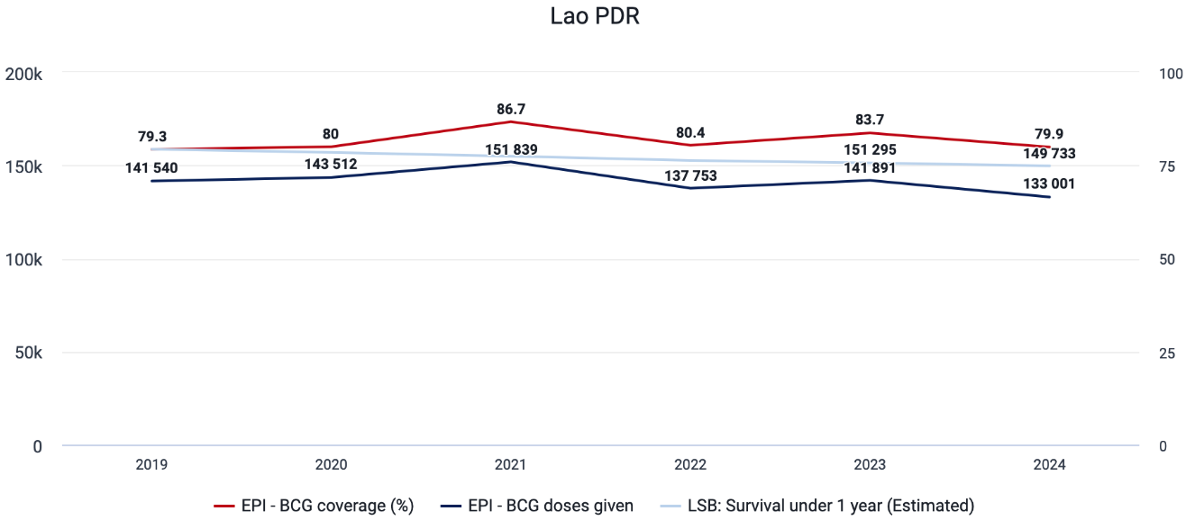
It includes the number of doses given and surviving infants on the left y-axis, and the BCG coverage % on the right y-axis, with the years displayed along the x-axis.
We are looking for inconsistencies in the data that may need some further explanation. In the above image from DHIS2, the data follows a fairly consistent pattern and does not seem to cause any concern.
Here is another example with the same information
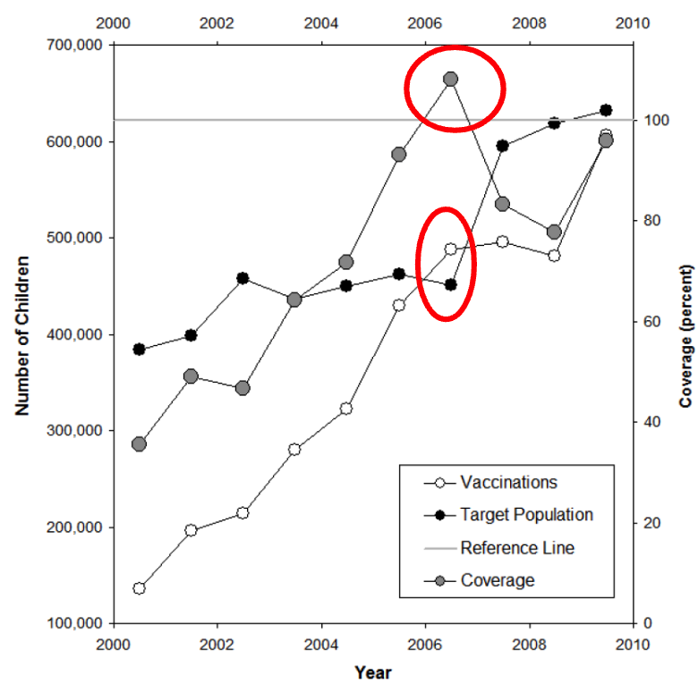
Here, we see the number of vaccinations and coverage increasing rapidly, but the coverage ends up > 100% in 2006, with the population decreasing this same year. After 2006, we see a sharp rise in the population, correlating with a sharp decline with the coverage, then increasing sharply again in 2009.
This type of erratic behaviour in our data indicates that the population estimates seem to be incorrect. Given what we know about growth rates, it is unlikely to see such a rapid increase in population naturally, and the denominator therefore may need adjustment or modification, as this would lead us to incorrect conclusions regarding the performance of our health system and the coverage of this vaccine.
There are unfortunately no set rules for reviewing this data, as you are trying to spot trends that do not make sense given the context of the information presented to you. Generally speaking though you want to know:
- Are there coverage rates > 100%
- Is the population steadily increasing/decreasing or are there sudden increases/decreases. If so, how are these explained
- Is a rapid increase/decrease in coverage a result of measures introduced by the program (increase) or challenges with the program (decrease), or some type of issue with the population estimate
Steps for making this visualization
You can make this chart in data visualizer.
- Chart Type : Line
- Data : Numerator, Denominator and the Indicator you want to use
- Period: Whichever periods you want to compare
- Org Unit : Whichever org unit(s) you want to review
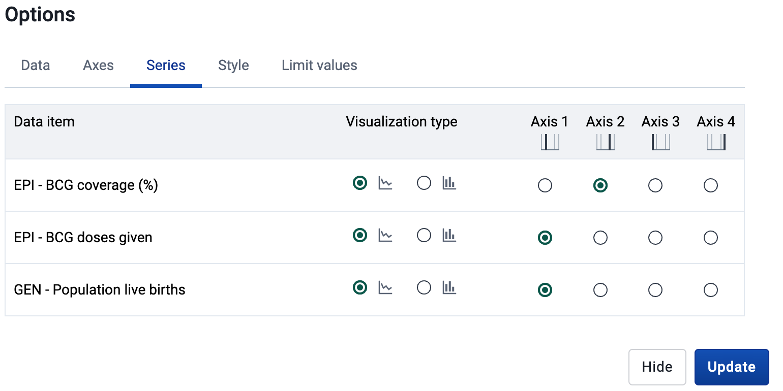
- To create the difference axes, go to options-> series
- Layout (modify as needed)
- Series : Data
- Category : Period
- Filter : Org Unit
Creating a Dashboard
As you have seen, you are able to perform these analyses directly in DHIS2. So you can easily review them, it is recommended that you create a dashboard and add these visualizations to it.
Revising your Estimates
If after you have made your various comparisons and determined there is a need to improve your denominators, you can consider the following:
- Revise your national estimates of your population
- Revise your subnational estimates of your population
- Revise other related estimates, such as surviving infants and estimated number of pregnant women, at the subnational level [add them together to get your national totals]
Please consult the WHO guidance document on denominators - Assessing and improving the accuracy of target population estimates for immunization coverage for more information. You may also want to speak with your statistics unit, and, if available, a demographer, who could support you in revising these estimates if needed.