Visualize usage statistics
About the Usage Analytics app
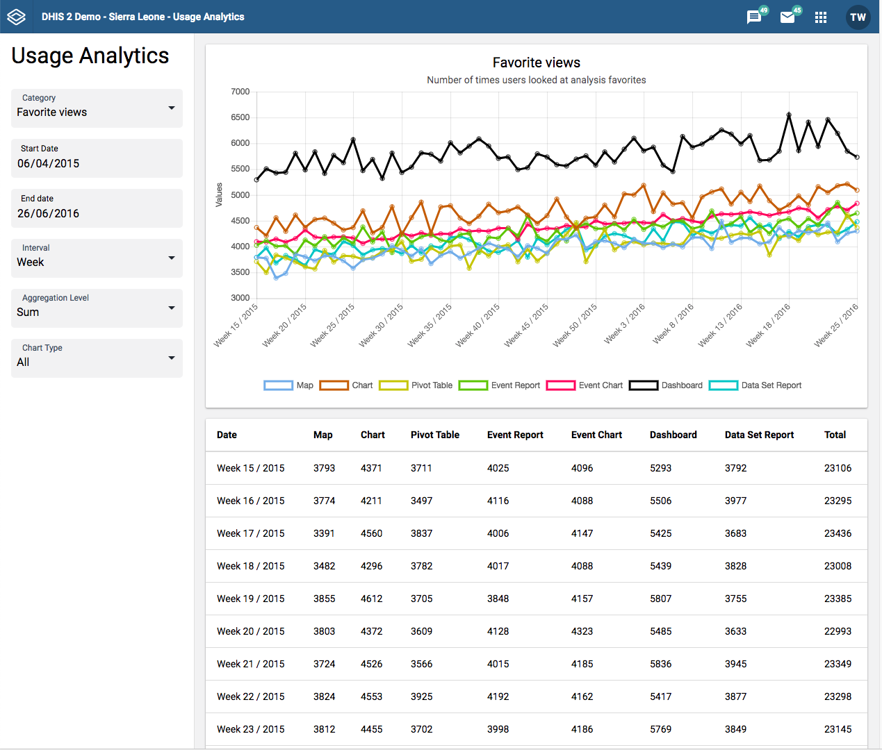
The Usage Analytics app lets you visualize statistics on how users are working with the Dashboard, GIS, Event Visualizer, Data Visualizer and Event Reports apps within DHIS2. With this statistics you can answers questions such as:
-
How many times people have loaded visualizations and dashboards?
-
How many favorites have users created?
-
How many users that are logging in versus total number of users?
-
What are the most viewed favorites?
Create a usage analytics graph
-
Open the Usage Analytics app.
-
Select a Start date and End date.
-
Select an Interval: day, week month or year.
-
Select a Category.
There are five analytics categories:
-
Favorite views: Provides the number of times various types of favorites have been viewed, such as visualizations and dashboards, over time. This analysis lets you switch between all types of favorites, the total across all types and the average number of views.
-
Favorites: Provides the number of favorites which have been created and stored in the system over time.
-
Users: Provides the number of active as well as total number of users over time.
-
Top favorites: Shows the most viewed favorites in the system by type.
-
Data values: Provides the number of data values stored in the system over time.
-
-
Click Update.