Using the Maps app
About the Maps app
The Maps app was introduced in release 2.29 as a replacement for the original GIS app, offering a more intuitive and user-friendly interface. Since version 2.34, the mapping engine is based on WebGL technology, capable of showing thousands of features on a map simultaneously.
Note
The Maps app requires WebGL. Visit get.webgl.org to verify that WebGL is working in your browser or to troubleshoot display issues.
With the Maps app, you can overlay multiple layers and choose from different basemaps. Supported layer types include thematic maps, events, tracked entities, facilities, org unit boundaries, and Earth Engine data such as population, elevation, or climate indicators. You can label features, search and filter data, and save or share maps with other users, or download them as an image. Saved maps can be added to dashboards in the Dashboard app. Thematic layers also integrate with the Data Visualizer app, letting you open the same data as a chart.
Note
To use predefined legends in the Maps app, you need to create them first in the Metadata Management app.

Layers panel
The layer panel on the left side of the workspace shows an overview of the layers for the current map:
-
As layers are added, using the (+) Add layer button, they are arranged and managed in this panel.
-
The basemap card is always shown at the bottom of the panel. See Basemaps for available options.
-
The small arrow button to the right of the layer panel, at the top, allows the panel to be hidden or shown.
Each layer is represented by a card in the panel. Along the top of the card are a grab handle for reordering layers with the mouse, the layer title, and an arrow to collapse or expand the card. The middle of the card shows the layer legend where applicable. Along the bottom of the card from left to right are:
-
An edit (pencil) button opens the layer configuration dialog.
-
An eye symbol toggles the visibility of the layer.
-
A slider modifies the layer transparency.
-
A more actions (three dots) button provides additional options, including showing or hiding the data table, downloading the layer data, duplicating the layer, and removing the layer.
Map controls
-
The + and - buttons on the map allow you to zoom in and out of the map respectively. The mouse scroll wheel zoom is continuous, allowing you to fit the map perfectly to your content.
-
The rotate map button (triangle arrows) allows you to rotate and tilt the map to enhance the view of your data. Press and hold the button (or hold the Control key on your keyboard) while moving your mouse to change the map view. Click the button again to reset the view.
-
Fullscreen (four arrows) allows you to view the map in fullscreen. To exit fullscreen, click the button again or press the escape key on your keyboard.
-
Zoom to content (bounded magnifying glass symbol) automatically adjusts the zoom level and map center position to put the data on your map in focus.
-
Search (magnifying glass symbol) allows searching for and jumping to a location on the map.
-
The ruler button allows you to measure distances and areas on the map.
-
Right-click on the map to display the longitude and latitude of that location.
File menu
-
The File button near the top left allows you to open and save maps. See using the maps file menu for more detailed information.
-
The Download button next to the File button allows you to download the current map as a PNG image.
-
The Interpretations button at top right opens an interpretations panel on the right side of the workspace. See viewing interpretations for more information.
Create a new map
When you open the Maps app, you start with an empty map canvas and the default basemap selected. If a map is already open, start a new one using File > New. You can change the basemap at any time from the basemap card in the layer panel (see Basemaps).
To add a layer, click the (+) Add layer button in the top left. The layer selection dialog opens:
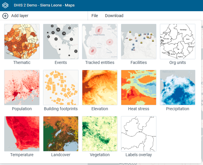
Available layer types are:
- Thematic: Visualize data values (indicators or data elements) aggregated by org unit.
- Events: Display individual events from event or tracker programs.
- Tracked entities: Display tracked entities and their relationships on the map.
- Facilities: Display facilities as icons based on their coordinates.
- Org units: Display org unit boundaries.
In addition, several layers may be provided by Google Earth Engine (such as population, elevation, or climate indicators) and other external services. Various Google Earth Engine layer sources are available if the Google Earth Engine API key has been set up (see documentation).
Note
The Maps app administrator can:
- Select the sources for Google Earth Engine layers available to other users via the Manage available layer sources button.
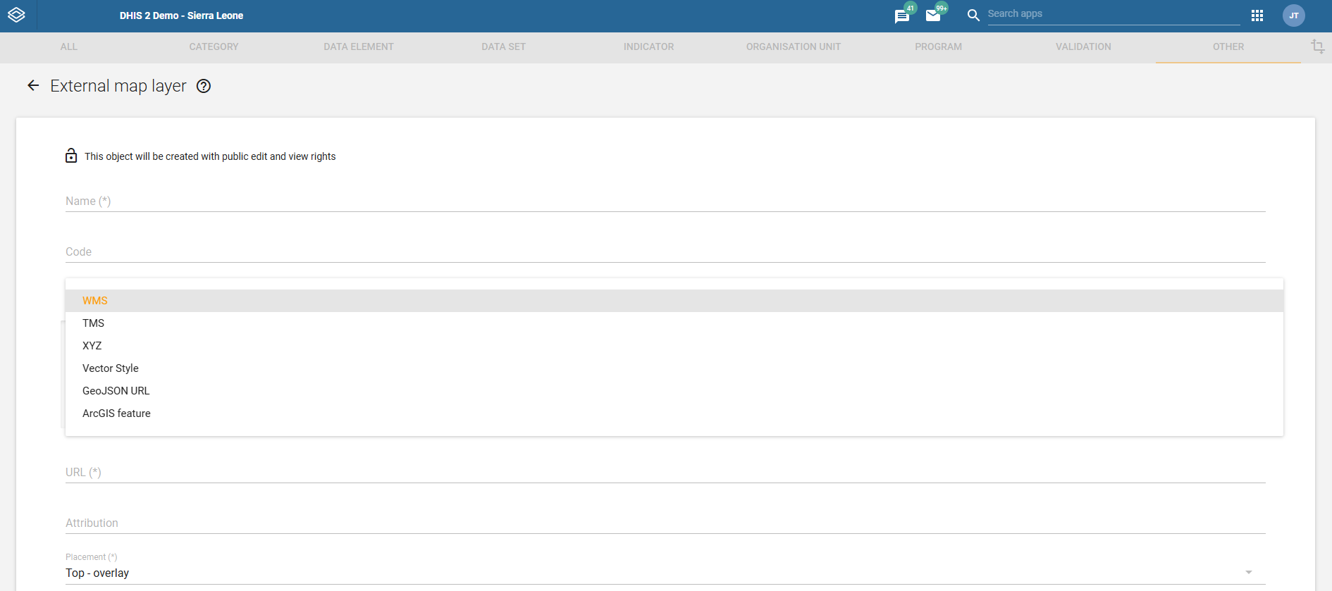
- Add external layer sources in the Maintenance app.
Basemaps
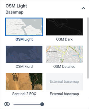
A basemap provides the background map on which your data layers are displayed. You can select and configure the basemap from the basemap card at the bottom of the layer panel.
The following basemaps are available by default:
- OSM Light: A minimal, light-colored map based on OpenStreetMap data. This is the default basemap.
- OSM Dark: A dark-themed map based on OpenStreetMap data. Useful when the colors on your data layers are bright.
- OSM Fiord: A muted, blue-toned map based on OpenStreetMap data.
- OSM Detailed: Contains more map features and place names.
- Sentinel-2 EOX: Cloud-free satellite imagery showing natural-color views of the Earth's surface at 10m resolution.
If a Bing Maps or Azure Maps API key has been configured by a system administrator, four additional basemaps become available from each provider. Both providers offer the same four styles, prefixed with the provider name — for example, Bing Road and Azure Road:
- Road: Shows roads, borders and places.
- Dark: A dark-themed road map. Useful when the colors on your data layers are bright.
- Aerial: Satellite and detailed aerial imagery.
- Aerial Labels: Aerial imagery with place name labels.
A Maps app administrator can also add external basemaps via the Maintenance app. These appear in the basemap card alongside the default basemaps.
Basemap layers are represented by a card in the layer panel. The card shows the list of available basemaps with the current one highlighted. Controls at the bottom allow you to toggle the basemap visibility and adjust its transparency.
Note
Bing Maps is being retired. See the Bing Maps Blog for the retirement announcement. For migration to Azure Maps, consult the Bing Maps Migration Overview.
Manage thematic layers
Thematic maps represent spatial variation of geographic distributions. They display aggregated data values for a selected data item (such as an indicator or data element), period and org unit level. Org units with coordinates and matching data values will appear on the map.
Note
You must generate the DHIS2 analytics tables to have aggregated data values available.

Thematic layers are represented by layer cards in the layer panel. The middle of the card shows a legend indicating the value ranges displayed on the layer. The more actions (three dots) button includes options to show or hide the data table, download the data, and open the data as a chart in the Data Visualizer app via Open as chart.
Create a thematic layer
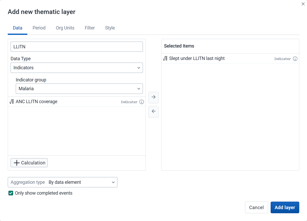
To create a thematic layer, choose Thematic on the Add layer selection. This opens the Thematic layer configuration dialog.
1. Data
-
Select a data item.
-
Select a value from the Aggregation type field for the data values to be shown on the map. By default, "By data element" is selected. Alternative values are: Count, Average, Sum, Standard deviation, Variance, Min, Max. See also Aggregation operators.
-
Only show completed events: Includes only completed events in the aggregation process. This is useful when you want to exclude partial events in indicator calculations. Available for indicators, program indicators and event data items.
2. Period
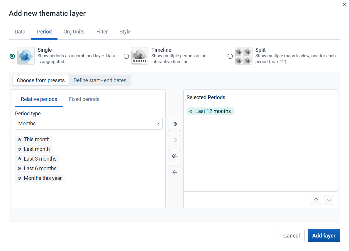
Select the time span over which the thematic data is mapped.
-
Period display mode: Select how the selected periods will be visualized on the map:
-
Single (default): Displays all selected periods as a single combined layer with aggregated data. Required when only one period is selected or when using start–end dates.
-
Timeline: Displays multiple periods as an interactive timeline ordered chronologically. Multiple timeline layers can be added to a map (they will all share the same periods).
-
Split: Displays multiple periods side by side for comparison. Supports up to 12 periods (including multi-period presets) and can only be combined with other split layers (they will all share the same periods).
-
-
After selecting a display mode, choose how to define the periods:
-
Choose from presets: Available for all display modes. You can combine one or more relative and fixed periods.
-
Relative period: Select Relative periods, then the Period type (Years, Months, etc.) and choose one or more relative periods, such as This year and Last year or Last 12 months. A default relative period for analysis can be set in the System Settings app.
-
Fixed period: Select Fixed periods, then choose the Period type (Yearly, Monthly, etc.) and choose one or more fixed periods, such as 2024 or January 2025 and February 2025.
-
-
Define start–end dates: Available only when the Single display mode is selected. Specify exact start and end dates. Both dates are inclusive and will be reflected in the outputs.
-
3. Org units
-
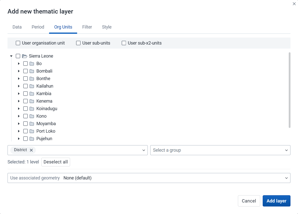
Select the org units you want to include in the layer. You can freely combine specific org units, org unit levels, org unit groups, and relative user org units (User organisation unit, User sub-units, User sub-x2-units). When user org units are selected, the map data will appear according to the assigned org units for each user in the org unit hierarchy.
Tip: Levels and groups act as filters within the org units you select - combining them will show only org units at those levels or in those groups that are descendants of your selected org units.
-
Use associated geometry: This dropdown will only show if there are any additional geometries available for your org units. This is typically used to show facility catchment areas.
4. Filter

-
Click Add filter and select an available data item to add a new filter to the data set.
-
Select a data dimension from the dropdown box. You can reduce the number of dimensions shown by using the search field. Click the name to select a dimension.
-
When a dimension is selected you get a second dropdown with dimension items. Check the items you want to include in the filter.
Multiple filters may be added. Click the trash button on the right of the filter to remove it.
-
5. Style
-
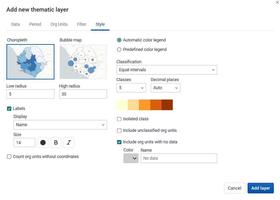
Select either Choropleth or Bubble map.
-
A choropleth map assigns a color to each org unit shape according to the data value. This is the recommended technique if the data is normalized (per capita).
-
A bubble map shows data values as proportional circles. Use this technique if the data is not normalized (absolute numbers). The circles are placed in the center of each org unit. Set the Low radius and High radius for the proportional circles. The circles will be scaled between low and high radius according to the data value. The radius must be between 0 and 50 pixels.
-
-
Labels: Show org unit names and/or values on the layer. Select Name, Name and value, or Value. Font size, weight, style and color can also be modified.
-
Count org units without coordinates: Org units without map coordinates are counted and shown in a Data quality section of the legend. They also appear in the data table. These org units may or may not have data.
-
Select the legend type:
-
Automatic color legend: A legend is automatically created based on the classification method, number of classes and color scale you select. Set Classification to one of:
- Equal intervals: Divides the value range into equally-sized intervals, each spanning (highest value − lowest value) ÷ number of classes.
- Equal counts: Org units are distributed as evenly as possible across classes (also known as quantile classification). Some datasets cannot be evenly partitioned, particularly when values are heavily repeated or the number of distinct values is small.
- Natural breaks (intervals) and Natural breaks (clusters): Class boundaries are placed at the largest gaps in the data distribution, based on the ckmeans algorithm. Both methods group values similarly; intervals produces contiguous class ranges, while clusters may leave gaps between classes where no values fall.
- Pretty breaks: Break points are rounded to clean, human-readable numbers. Based on R's pretty algorithm.
- Logarithmic scale: Uses a logarithmic scale. Values must be positive; zero or negative values are left unclassified.
- Standard deviation: Classes are defined as multiples of standard deviations from the mean. The number of standard deviations per class depends on the number of classes chosen; values further from the mean are left unclassified.
Decimal places: Number of decimal places shown in legend labels. Auto lets the app decide based on the data range, or choose a fixed value from 0 to 6 (also available for single color legends).
Isolated class: Define a value range (min–max) with a fixed color and optional label. Org units in that range are shown separately and excluded from automatic classification.
-
Predefined color legend: Select from the predefined legends.
-
Single color legend: Select the color of the bubbles or circles. Only available for bubble maps.
-
-
Include unclassified org units: Org units whose values fall outside all classification ranges are shown with a configurable color and label (default: "Unclassified").
-
Include org units with no data: Org units with no data value are shown with a configurable color and label (default: "No data").
Note: All legend items and their counts - including No data and Unclassified - only include org units with coordinates.
Note
Most classes use half-open intervals (
startValue ≤ value < endValue): a value sitting exactly on a boundary belongs to the upper class, not the one whose label ends there. The exceptions - where the upper bound is inclusive - are the last class, isolated classes, single-value classes, and clusters (natural breaks).If the exact class a boundary value belongs to matters for your analysis, use Labels to overlay values directly on each feature. If it still matters after that, consider whether a different legend, maybe with more classes or higher decimal precision, is the right tool for the decision you are trying to make.
Click Add layer.
Modify a thematic layer
-
In the layer panel, click the edit (pencil) icon on the thematic layer card.
-
Modify the settings on any of the tabs as desired.
-
Click Update layer.
Filter values in a thematic layer
Thematic layers have a Show/hide data table option that can be toggled on or off from the thematic layer card.
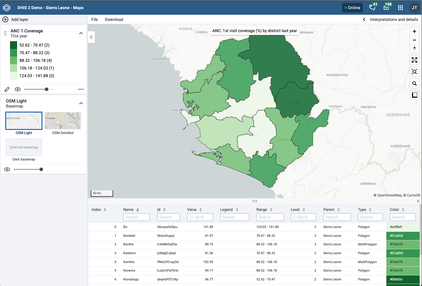
The data table displays the data associated with the thematic layer. Click the arrow buttons in a column header to sort by that column. Type in the filter fields below each column header to filter the displayed rows.
The name filter field is an effective way to search for individual org units.
For numeric columns, you can filter using comparison operators: >, <, >=, and <=. Use , for OR logic and & for AND logic — for example: 2,>3&<8 matches the value 2 or any value greater than 3 and less than 8.
Note
Data table filters are temporary and are not saved with the map.
Open org unit profile
You can open the org unit profile in three ways:
-
Click an org unit on the map, then click the View profile button in the popup.
-
Right-click one of the org units on the map, and select View profile from the menu.
-
Click an org unit row in the data table.
Navigate between org unit hierarchies
When there are visible org units on the map, you can easily navigate up and down in the hierarchy without changing the org unit selection.
-
Right-click one of the org units.
-
Select Drill up one level or Drill down one level.
The drill down option is disabled if you are on the lowest level or if there are no coordinates available on the level below. Likewise, the drill up option is disabled from the highest level.
Remove a thematic layer
To remove a thematic layer from the map, in the layer card to the left, click the more actions (three dots) icon and then click Remove layer.
Manage event layers
The event layer displays the geographical location of events recorded in DHIS2 programs. While in thematic layers you can visualize event data aggregated to org unit level, with event layers you can display the individual events or cases when they have their own point or polygon coordinates. Alternative coordinate fields also let you plot events using locations other than the event itself, such as the org unit or enrollment location.
To display aggregated event statistics at the org unit level, use a thematic layer with event data items instead.
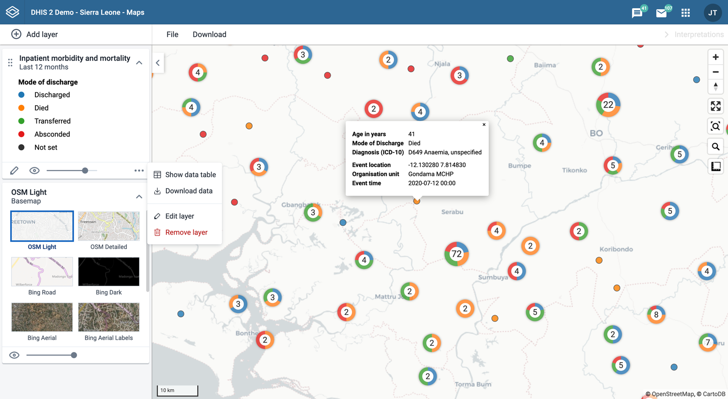
Event layers are represented by layer cards in the layer panel. The middle of the card shows a legend indicating the styling of the layer. The more actions (three dots) button includes options to show or hide the data table and to download the data in GeoJSON format.
Create an event layer
To create an event layer, choose Events on the Add layer selection. This opens the Events layer configuration dialog.
1. Data
-
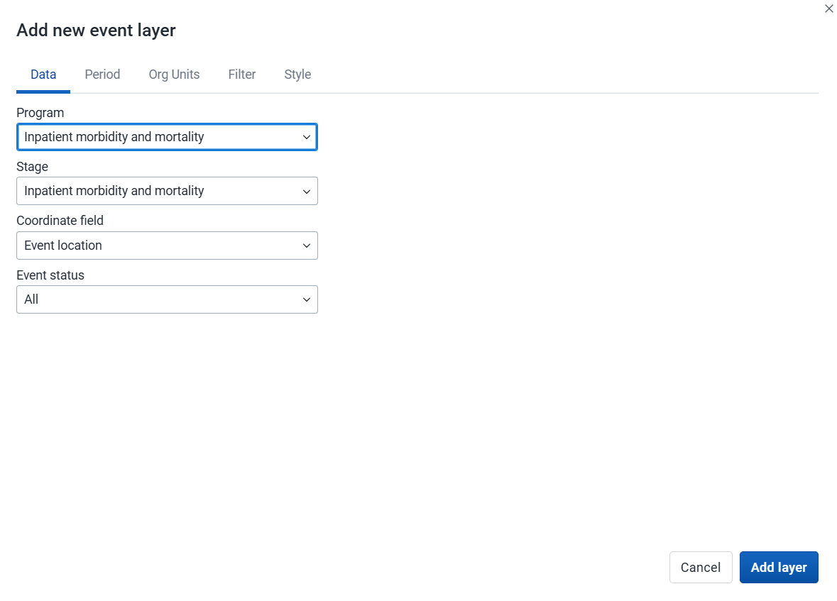
Select a program and then select a program stage. The Stage field is only shown once a program is selected.
If there is only one stage available for the selected program, the stage is automatically selected.
-
Select a value from the Coordinate field to determine which positions are displayed on the map. By default, "Event location" is selected. You can also choose "Org unit location". Depending on the selected program, additional options may include "Tracked entity location", "Enrollment location", and coordinate or org unit type data elements or attributes, such as "Household location" or "Referral facility". The number of events represented on the map may vary depending on the selected option and the availability of coordinates. When org unit location is used, polygons are represented by their centroids.
-
By default, all events with coordinates are shown on the map. Use the Event status field to only show events having one status: Active or Completed.
2. Period
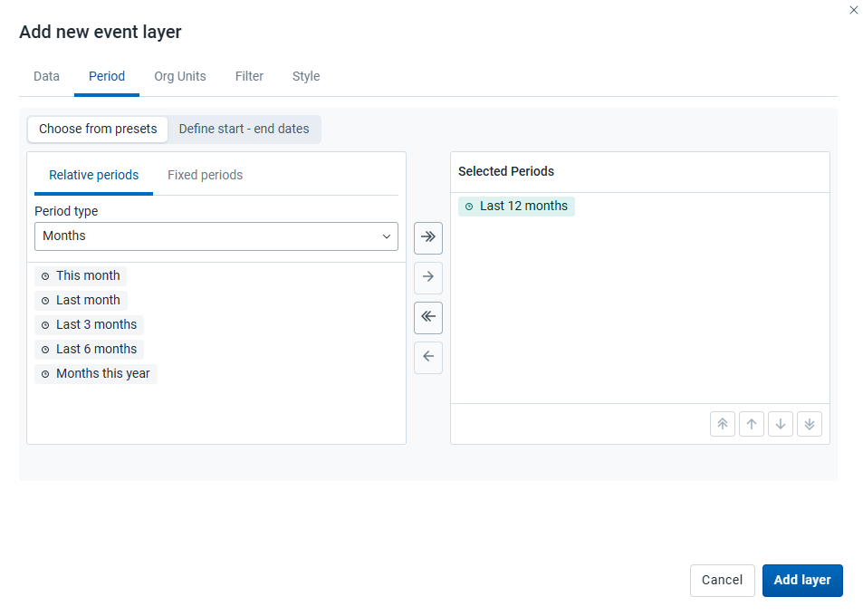
Select the time span for when the events took place.
-
Choose from presets: You can combine one or more relative and fixed periods.
-
Relative period: Select Relative periods, then the Period type (Years, Months, etc.) and choose one or more relative periods, such as This year and Last year or Last 12 months. A default relative period for analysis can be set in the System Settings app.
-
Fixed period: Select Fixed periods, then choose the Period type (Yearly, Monthly, etc.) and choose one or more fixed periods, such as 2024 or January 2025 and February 2025.
-
-
Define start–end dates: Specify exact start and end dates. Both dates are inclusive and will be reflected in the outputs.
3. Org units

- Select the org units you want to include in the layer. You can combine specific org units and relative user org units (User organisation unit, User sub-units, User sub-x2-units). When user org units are selected, the map data will appear according to the assigned org units for each user in the org unit hierarchy. Data from all org units within and below the selected org units is included (Selected and all below).
4. Filter
-
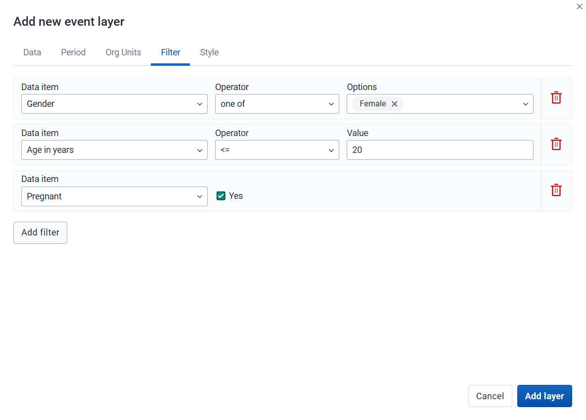
Click Add filter and select an available data item to add a new filter to the data set.
-
For data item of type option set, you can select any of the options from the dropdown box, or type to filter.
-
For data item of type number, you can select operators like equal, not equal, greater than or less than.
-
For data item of type boolean (yes/no), you can check the box if the condition should be true.
-
For data item of type text, select Contains (matches any value containing the search text) or Is exact (matches only identical values).
Multiple filters may be added. Click the trash button on the right of the filter to remove it.
-
5. Style
-
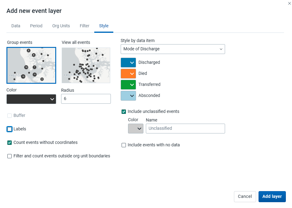
Select Group events to group nearby events (cluster), or View all events to display events individually.
-
Select a color and radius for the event or cluster points.
-
Select Show buffer to display a visual buffer around each event. The radius of the buffer can be modified here. Only available when View all events is selected.
-
-
Count events without coordinates: Events without coordinates are counted and shown in a Data quality section of the legend. They also appear in the data table. These events may or may not have data.
-
Filter and count events outside org unit boundaries: Events falling outside the boundaries of the selected org units are excluded from the map, and counted in the Data quality section of the legend, which also flags when some or all of the selected org units lack boundary data. These events remain in the data table, but can be identified by their empty Org unit boundary column value. Events inside a boundary are tagged with the name of their containing org unit in that same column.
-
Label: Select a data element or attribute to show on the layer. Font size, weight, style and color can also be modified.
-
Select Style by data item (data element or attribute) to colorize the events according to a data value. If events are grouped, clusters are displayed as small donut charts showing the distribution of the data values. The available options vary for different data types:
-
Option sets: Select a color for each option in an option set. You can set default colors for an option in the Metadata Management app.
-
Numbers: You can style a numeric data item in the same way as thematic layers using automatic or predefined legends.
-
Booleans: Select a color for true/yes and another for false/no.
Include unclassified events: Events whose values fall outside all classification ranges are shown with a configurable color and label (default: "Unclassified").
Include events with no data: Events with no data value are shown with a configurable color and label (default: "No data").
-
Note: All legend items and their counts - including No data and Unclassified - only include events with coordinates.
Click Add layer.
Modify an event layer
-
In the layer panel, click the edit (pencil) icon on the event layer card.
-
Modify the settings on the Data, Period, Filter, Org units and Style tabs as desired.
-
Click Update layer.
Filter events
Event layers have a Show/hide data table option that can be toggled on or off from the event layer card.

The data table displays the data associated with the event layer. Click the arrow buttons in a column header to sort by that column. Type in the filter fields below each column header to filter the displayed rows.
Additional columns appear for data elements configured to display in reports, and for any data item used to style the events — both the data value and the color can be filtered in those columns. Numeric columns support comparison operators: >, <, >=, and <=, with , for OR and & for AND logic — for example: 2,>3&<8.
Note
Data table filters are temporary and are not saved with the map.
Modify information in event data table and popups
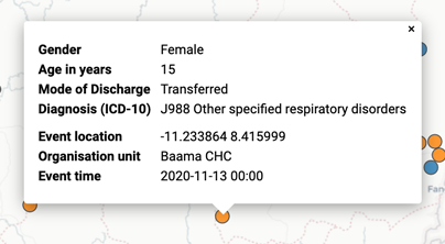
If you have access to the selected program in the Metadata Management app, you can modify the information displayed in the event popup window.
-
Open the Metadata Management app.
-
Select Programs.
-
Click the program you want to modify and select Data or the stage first then Data in the case of a Tracker program.
-
For every data element you want to display in the popup window, select corresponding Display in reports.
-
Click Save.
Download raw event layer data
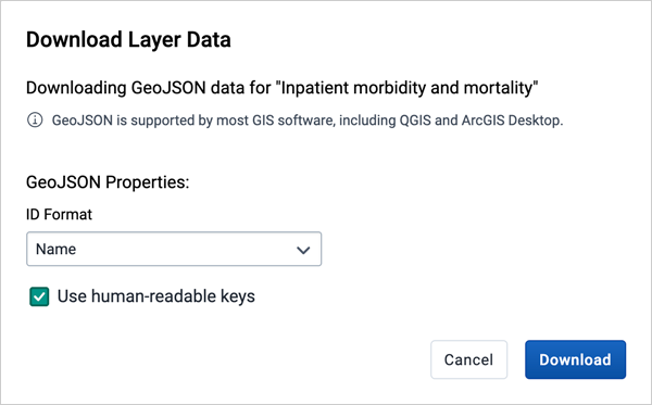
The raw data for event layers can be downloaded in GeoJSON format for more advanced geo-analytics and processing in desktop GIS software such as QGIS. The downloaded data includes all individual events as GeoJSON features, including attributes for each data element selected for Display in reports.
-
In the layer card to the left, click the more actions (three dots) icon and then click Download data.
-
Select the ID format to use as the key for data element values in the downloaded GeoJSON file:
- ID: Use the unique ID of the data element.
- Name: Use the human-friendly name of the data element (translated).
- Code: Use the code of the data element.
-
Select whether or not to Use human-readable keys for other event attributes, such as Program Stage, Latitude, Longitude, Event Data, and Org Unit ID, Name, and Code. When this option is not selected, these values will be computer-friendly IDs instead of human-readable (translated) names.
-
Click the Download button to generate and download a GeoJSON file. The data will be requested from the DHIS2 server and processed by the maps application. This operation may take several minutes to complete.
-
Once the GeoJSON file has been downloaded, it can be imported into most standard GIS software.
Note
The downloaded data does not include style information as it is not natively supported by the GeoJSON format. Styles can optionally be recreated in external GIS applications using the attributes of each feature.
Remove an event layer
To remove an event layer from the map, in the layer card to the left, click the more actions (three dots) icon and then click Remove layer.
Manage tracked entity layers
The tracked entity layer displays the geographical location of tracked entities registered in DHIS2. Tracked entities with associated point or polygon coordinates appear on the map.
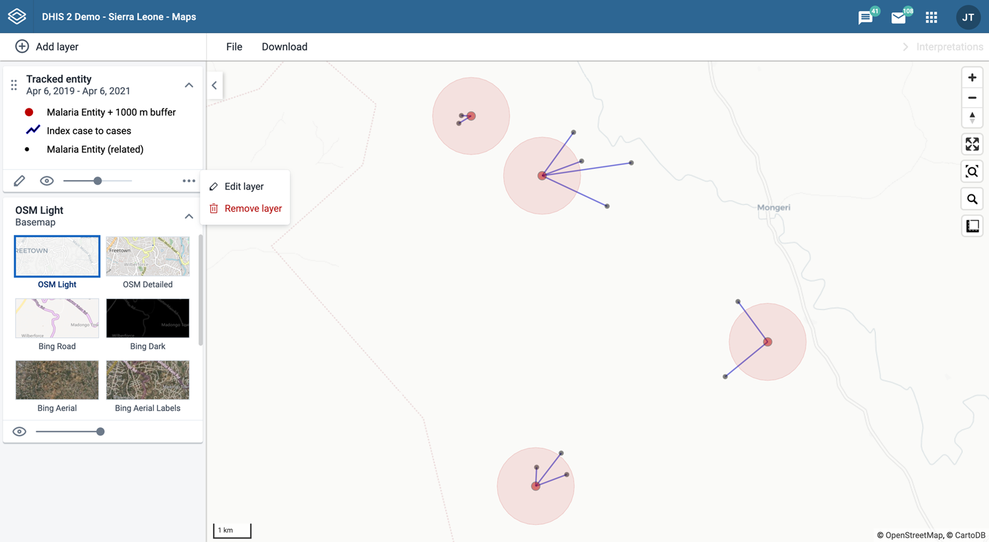
Tracked entity layers are represented by layer cards in the layer panel. The middle of the card shows a legend indicating the styling of the layer.
Create a tracked entity layer
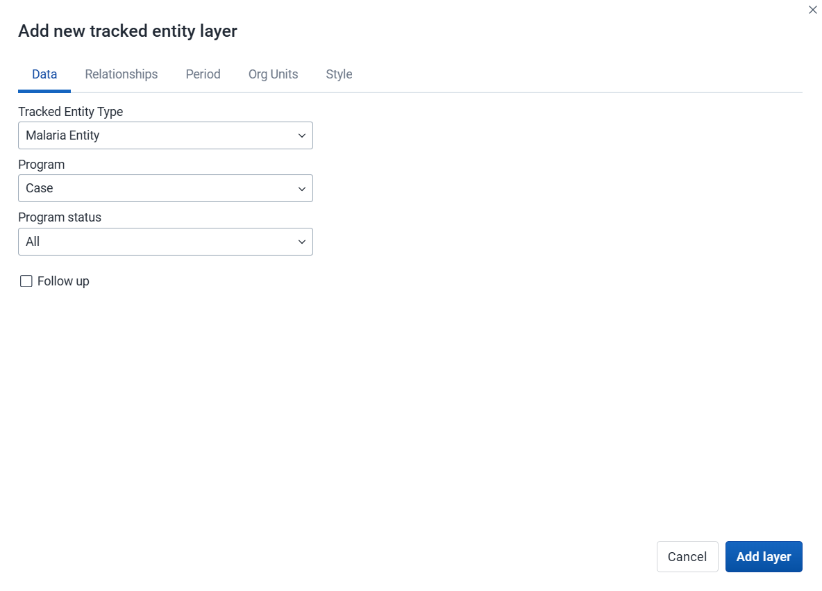
To create a tracked entity layer, choose Tracked entities on the Add layer selection. This opens the Tracked entity layer configuration dialog.
1. Data
-
Select the Tracked entity type you want to show on the map.
-
Select a Program to filter tracked entities by enrollment.
-
Use the Program status field to select the enrollment status of tracked entities to include: All, Active, Completed, or Cancelled.
-
Filter by the Follow-up flag to include only tracked entities marked for follow-up.
2. Relationships

Caution
Displaying tracked entity relationships in Maps is an experimental feature.
-
Select the Display tracked entity relationships checkbox to show relationships on the map.
-
Select the Relationship type to display from the dropdown list. Only relationships defined for the selected tracked entity type are available.
3. Period
-
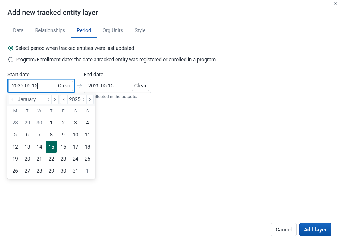
If no program is selected, you can set start and end dates for when the tracked entities were last updated.
-
If a program is selected, you can set the period when tracked entities were last updated or when they were enrolled in the program.
4. Org units

-
Select the org units you want to include in the layer. Only specific org units can be selected. A selection mode determines how the org unit tree is traversed:
-
Selected only: Include tracked entities belonging to selected org units only.
-
Selected and below: Include tracked entities in and right below selected org units.
-
Selected and all below: Include tracked entities in and all below selected org units.
-
5. Style

-
Select a Color for tracked entity points and polygons.
-
Select the Point size for the points.
-
Select Buffer to display a visual buffer around each tracked entity. The buffer distance in meters can be modified here.
-
If a relationship type has been selected on the Relationships tab, you can select a Color and Point size for related tracked entities and a Line color for the relationship lines.
Click Add layer.
Modify a tracked entity layer
-
In the layer panel, click the edit (pencil) icon on the tracked entity layer card.
-
Modify the settings on the Data, Relationships, Period, Org units and Style tabs as desired.
-
Click Update layer.
Modify information in tracked entity popups
If you have access to the selected program in the Metadata Management app, you can modify the information displayed in the tracked entity popup window.
-
Open the Metadata Management app.
-
Select Program.
-
Click the program you want to modify and select Enrollment: Data.
-
For every attribute you want to display in the popup window, enable Display in list.
-
Click Save.
Remove a tracked entity layer
To remove a tracked entity layer from the map, in the layer card to the left, click the more actions (three dots) icon and then click Remove layer.
Manage facility layers
The facility layer displays icons representing types of facilities. Only point-type org units are shown - polygon org units such as districts or regions are not displayed.

Facility layers are represented by layer cards in the layer panel. The middle of the card shows a legend indicating the group set representation. The more actions (three dots) button includes options to show or hide the data table and to download the data in GeoJSON format.
Create a facility layer
To create a facility layer, choose Facilities on the Add layer selection. This opens the Facility layer configuration dialog.
1. Org units
-
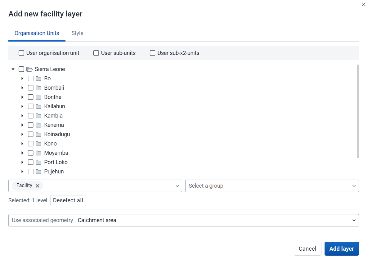
Select the org units you want to include in the layer. You can freely combine specific org units, org unit levels, org unit groups, and relative user org units (User organisation unit, User sub-units, User sub-x2-units). When user org units are selected, the map data will appear according to the assigned org units for each user in the org unit hierarchy. Only org units with a point location are displayed.
Tip: Levels and groups act as filters within the org units you select - combining them will show only org units at those levels or in those groups that are descendants of your selected org units.
-
The system administrator can set the default org unit level containing facilities in the System Settings app.
-
Use associated geometry: This dropdown will only show if there are any additional geometries available for your org units. This is typically used to show facility catchment areas.
2. Style
-
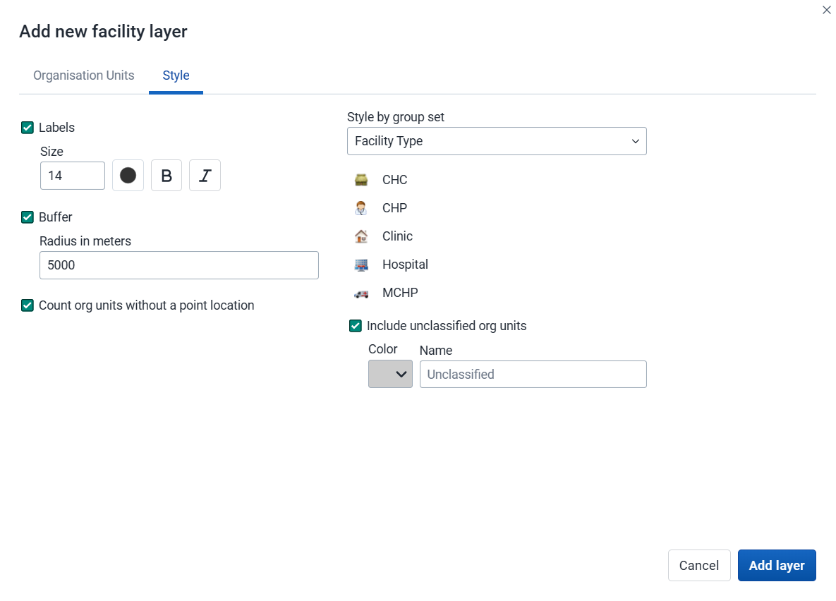
Labels: Allows labels to be shown on the layer. Font size, weight and color can be modified here.
-
Buffer: Displays a visual buffer around each facility. The radius of the buffer can be modified here. Not available if associated geometry is used.
-
Count org units without a point location: Org units without point coordinates are counted and shown in a Data quality section of the legend. They also appear in the data table.
-
Facilities with a point location can be styled with an org unit group set using different icons. Select a group set from the list of org unit group sets defined for your DHIS2 instance. The system administrator can set the default org unit group set in the System Settings app.
Include unclassified org units: Org units not belonging to any group in the selected group set are shown with a configurable color and label (default: "Unclassified").
-
If no group set is selected, the facilities will be shown as filled circles. The color and radius can be changed.
Click Add layer.
Modify a facility layer
-
In the layer panel, click the edit (pencil) icon on the facility layer card.
-
Modify the settings on the Org units and Style tabs as desired.
-
Click Update layer.
Filter values in a facility layer
Facility layers have a Show/hide data table option that can be toggled on or off from the facility layer card.

The data table displays the data associated with the facility layer. Click the arrow buttons in a column header to sort by that column. Type in the filter fields below each column header to filter the displayed rows. The name filter field is an effective way to search for individual facilities.
Note
Data table filters are temporary and are not saved with the map.
Open org unit profile
You can open the org unit profile in three ways:
-
Click an org unit on the map, then click the View profile button in the popup.
-
Right-click one of the org units on the map, and select View profile from the menu.
-
Click an org unit row in the data table.
Remove a facility layer
To remove a facility layer from the map, in the layer card to the left, click the more actions (three dots) icon and then click Remove layer.
Manage org unit layers
The org unit layer displays the borders and locations of your org units. This layer is particularly useful if you are offline and don't have access to background maps.

Org unit layers are represented by layer cards in the layer panel. The more actions (three dots) button includes options to show or hide the data table and to download the data in GeoJSON format.
Create an org unit layer
To create an org unit layer, choose Org units on the Add layer selection. This opens the Org unit layer configuration dialog.
1. Org units

-
Select the org units you want to include in the layer. You can freely combine specific org units, org unit levels, org unit groups, and relative user org units (User organisation unit, User sub-units, User sub-x2-units). When user org units are selected, the map data will appear according to the assigned org units for each user in the org unit hierarchy.
Tip: Levels and groups act as filters within the org units you select - combining them will show only org units at those levels or in those groups that are descendants of your selected org units.
-
Use associated geometry: This dropdown will only show if there are any additional geometries available for your org units. This is typically used to show facility catchment areas.
2. Style
-
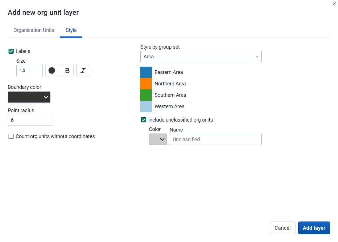
Labels: Allows labels to be shown on the layer. Font style can be modified here.
-
Boundary color: Allows the boundary or outline color of the org units to be changed.
-
Point radius: Sets the base radius when point type elements, such as facilities, are presented on the org unit layer.
-
Count org units without coordinates: Org units without coordinates are counted and shown in a Data quality section of the legend. They also appear in the data table.
-
Org units with coordinates can be styled with an org unit group set using different colors. Select a group set from the list of org unit group sets defined for your DHIS2 instance.
Include unclassified org units: Org units not belonging to any group in the selected group set are shown with a configurable color and label (default: "Unclassified").
Click Add layer.
Modify an org unit layer
-
In the layer panel, click the edit (pencil) icon on the org unit layer card.
-
Modify the settings on the Org units and Style tabs as desired.
-
Click Update layer.
Filter values in an org unit layer
Org unit layers have a Show/hide data table option that can be toggled on or off from the org unit layer card.

The data table displays the data associated with the org unit layer. Click the arrow buttons in a column header to sort by that column. Type in the filter fields below each column header to filter the displayed rows. The name filter field is an effective way to search for individual org units.
The level column supports numeric filtering using comparison operators: >, <, >=, and <=, with , for OR and & for AND logic — for example: 2,>3&<8.
Note
Data table filters are temporary and are not saved with the map.
Open org unit profile
You can open the org unit profile in three ways:
-
Click an org unit on the map, then click the View profile button in the popup.
-
Right-click one of the org units on the map, and select View profile from the menu.
-
Click an org unit row in the data table.
Navigate between org unit hierarchies
When there are visible org units on the map, you can navigate up and down in the hierarchy without changing the org unit selection.
-
Right-click one of the org units.
-
Select Drill up one level or Drill down one level.
The drill down option is disabled if you are on the lowest level. Likewise, the drill up option is disabled from the highest level.
Remove an org unit layer
To remove an org unit layer from the map, in the layer card to the left, click the more actions (three dots) icon and then click Remove layer.
Manage Earth Engine layers
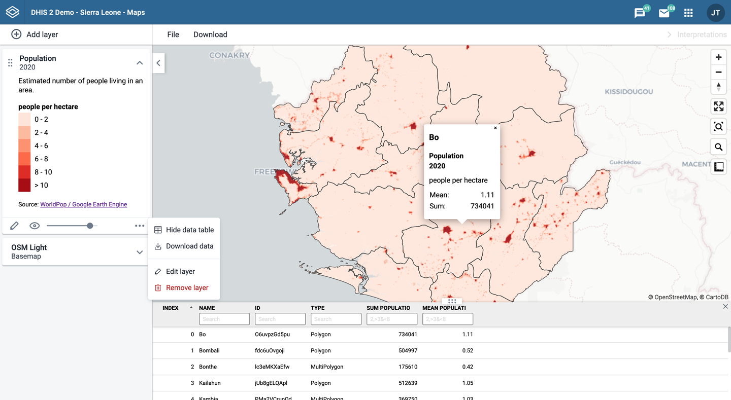
Google Earth Engine layers are enabled if a Google Earth Engine API key has been configured for your system. Contact your system administrator if you need access to these layers.
The layers from Google Earth Engine let you display and aggregate external data for your org units. Aggregated values can be viewed either in popups or in the data table.
Earth Engine layers are represented by layer cards in the layer panel. The more actions (three dots) button includes an option to show or hide the data table.

Note
The Maps app administrator can configure available layer sources.
The following layer sources are supported (sources marked with an asterisk "*" are available by default):
-
Population (group): Detailed population data from WorldPop. Estimates are provided annually and include current, historical, and projected population values. Available between 2015 and 2030.
- Population *: Total population count.
- Population age groups *: Population broken down by age and gender.
-
Building footprints *: The outlines of buildings derived from high-resolution satellite imagery. Only for sub-Saharan Africa, South and Southeast Asia, Latin America and the Caribbean.
-
Elevation *: Elevation above sea level.
-
Heat stress (group): Universal Thermal Climate Index (UTCI), a measure of the thermal stress experienced by a person in a given environment. Available from 1950.
- Heat stress daily.
- Heat stress weekly (derived from daily dataset).
- Heat stress monthly (derived from daily dataset).
-
Humidity (group): Relative humidity is the amount of water vapour present in air. Available from 1950.
- Humidity daily.
- Humidity weekly (derived from daily dataset).
- Humidity monthly.
-
Precipitation (group): Accumulated water that falls to the surface. Combines model data with observations from across the world. Two sources are available:
- ERA5-Land. Available from 1950.
- Precipitation daily.
- Precipitation weekly (derived from daily dataset).
- Precipitation monthly *.
- CHIRPS. Available from 1981.
- Precipitation daily.
- Precipitation weekly (derived from daily dataset).
- Precipitation monthly (derived from daily dataset).
- ERA5-Land. Available from 1950.
-
Temperature (group): Temperature at 2m above the surface. Combines model data with observations from across the world. Available from 1950.
- Temperature daily.
- Temperature weekly (derived from daily dataset).
- Temperature monthly *.
-
Land cover *: 17 distinct landcover types collected from satellites by NASA. Available yearly, between 2001 and 2022.
-
Vegetation: Normalized difference vegetation index (NDVI) and Enhanced Vegetation Index (EVI), used to quantify vegetation greenness. Collected from satellites by NASA. Available at 16-day intervals, from 2000.
- Vegetation 16-day
- Vegetation weekly (derived from 16-day dataset).
- Vegetation monthly (derived from 16-day dataset).
Create an Earth Engine layer
To create an Earth Engine layer, choose the desired layer from the Add layer selection. This opens the layer configuration dialog.
1. Data
-
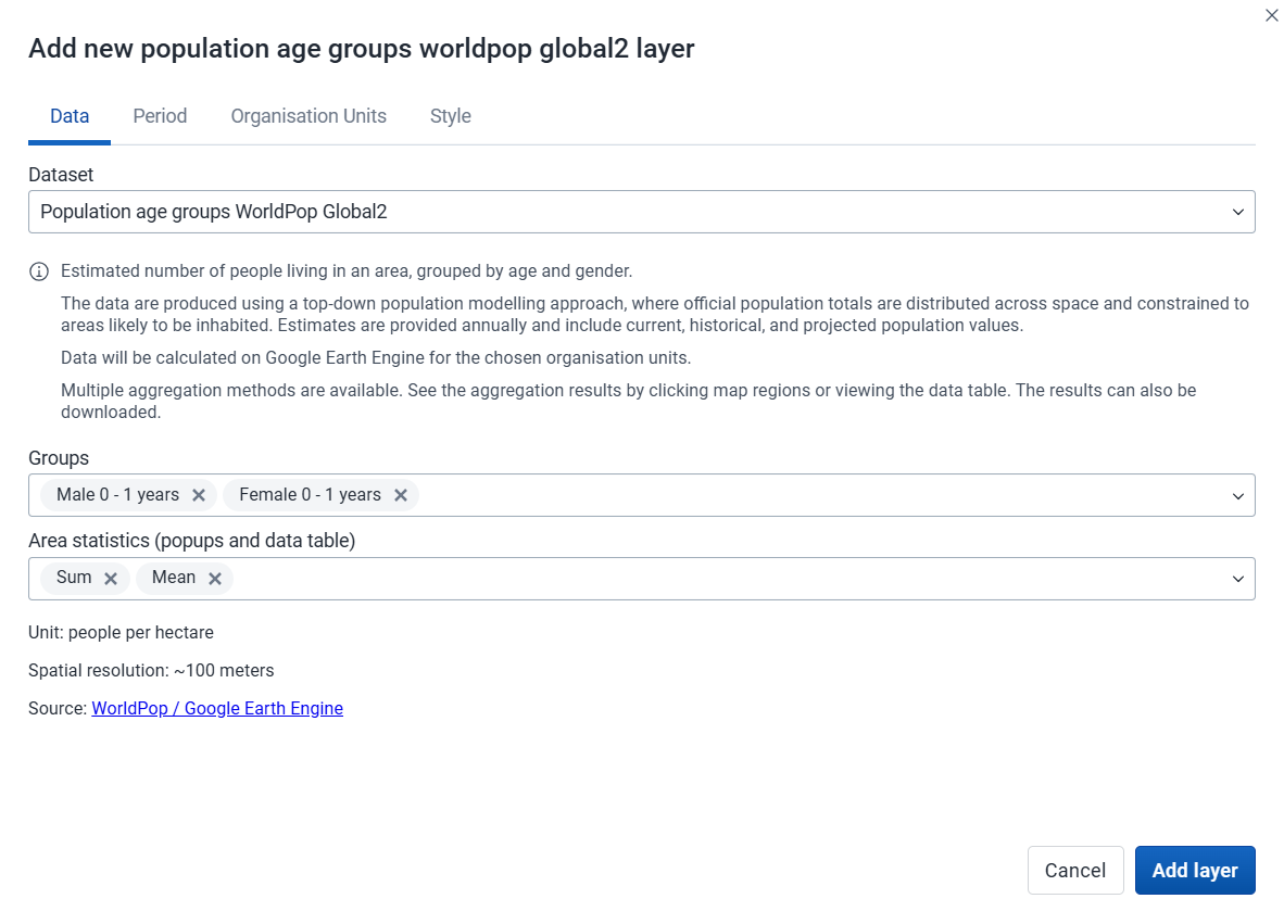
Dataset (if within a data group):
- For Population you can select either the Population or the Population age group dataset.
-
Data subset:
- For Population age groups you can select the age/gender groups you would like to include when aggregating the data.
- For Temperature or Heat stress you can select the temporal aggregation method you want to use (Mean, Min, Max).
- For Vegetation you can select the index you want to use (NDVI or EVI).
-
Select the spatial aggregation methods to use when calculating values for the selected org units. This only affects results in popups and the data table (some options might not be available depending on the layer source).
-
Sum: Calculates the total number within each org unit. Recommended to use for the population layers.
-
Min: Returns the minimum value in the layer unit displayed below the selection. For population layers it will be the minimum people per hectare. For the elevation layer it will return the lowest elevation (meters above sea level).
-
Max: Returns the maximum value in the layer unit. For population layers it will be the maximum people per hectare. For the elevation layer it will return the highest elevation for each org unit.
-
Mean: Returns the mean value in the layer unit. For population layers it will be the mean people per hectare. For the precipitation layer it will be the mean rainfall in millimeters across the org unit.
-
Median: Returns the median value in the layer unit. For population layers it will be the median people per hectare. For the temperature layer it will be the median °C across the org unit.
-
Standard deviation: Returns the standard deviation value in the layer unit.
-
Variance: Returns the variance value in the layer unit.
-
Special cases:
- For "building footprints": Count: Returns the number of buildings within each org unit. Note that building counts are only available for smaller org unit areas.
- For "landcover": Percentage, Hectare, Acres: Return the area covered by each landcover category within each org unit in different units.
-
2. Period
-
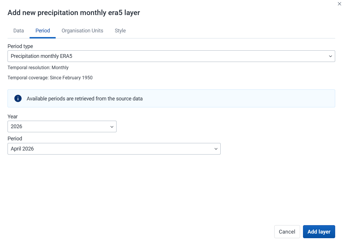
Select the period type (if multiple sources are enabled for Heat stress, Precipitation, Temperature, or Vegetation).
-
Select the period for the data source. The available periods are set by the layer source. Some sources are only available at a single point in time.
3. Org units
-
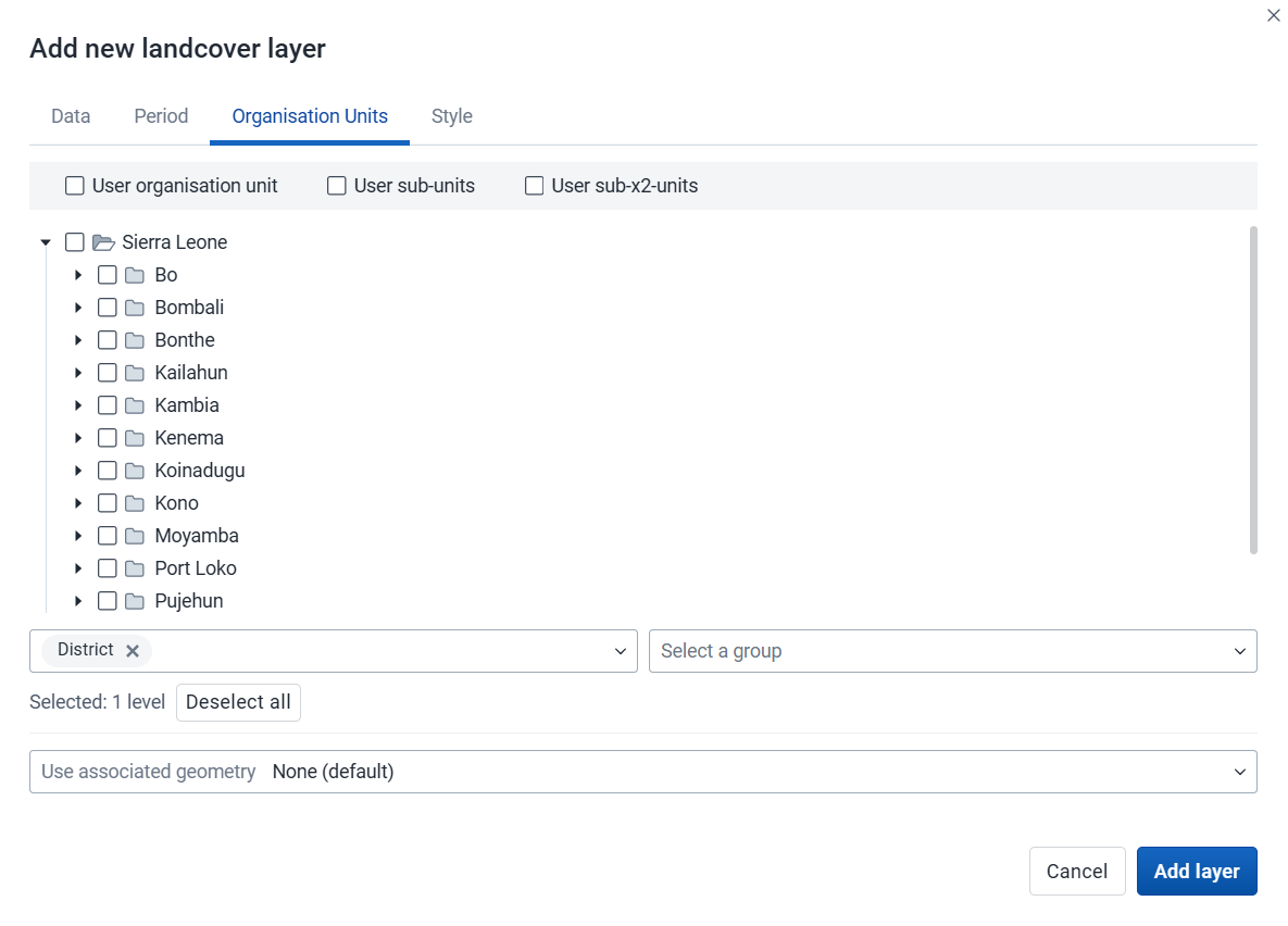
Select the org units where you want to see aggregated data values. You can freely combine specific org units, org unit levels, org unit groups, and relative user org units (User organisation unit, User sub-units, User sub-x2-units). When user org units are selected, the map data will appear according to the assigned org units for each user in the org unit hierarchy.
Tip: Levels and groups act as filters within the org units you select - combining them will show only org units at those levels or in those groups that are descendants of your selected org units.
-
Use associated geometry: This dropdown will only show if there are any additional geometries available for your org units. This is typically used to calculate values for facility catchment areas.
4. Style
-
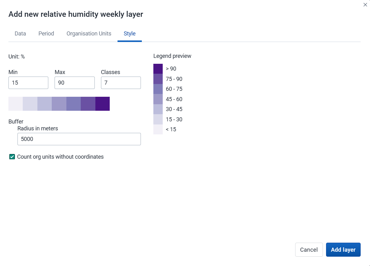
Adjust the legend Min, Max, number of Classes, and color map, as desired.
-
Buffer: If you select org units with a single point coordinate (facilities), you can set a radius buffer to calculate the data value within. A radius of 5000 meters will aggregate all values available within a 5 km distance from a facility. Buffer option is not available if associated geometry is used.
-
Count org units without coordinates: Org units without coordinates are counted and shown in a Data quality section of the legend. They also appear in the data table.
Click Add layer.
Click an org unit or facility on the map to see the aggregation result.
Modify an Earth Engine layer
-
In the layer panel, click the edit (pencil) icon on the Earth Engine layer card.
-
Modify the settings on the Data, Period, Org units, and Style tabs as desired.
-
Click Update layer.
Filter values in an Earth Engine layer
Earth Engine layers have a Show/hide data table option that can be toggled on or off from the layer card.

The data table displays all the aggregated values for the selected org units. Click the arrow buttons in a column header to sort by that column. Type in the filter fields below each column header to filter the displayed rows.
There is one column for each selected aggregation type. These numeric columns support comparison operators: >, <, >=, and <=, with , for OR and & for AND logic — for example: 2,>3&<8.
Note
Data table filters are temporary and are not saved with the map.
Open org unit profile
You can open the org unit profile in three ways:
-
Click an org unit on the map, then click the View profile button in the popup.
-
Right-click one of the org units on the map, and select View profile from the menu.
-
Click an org unit row in the data table.
Remove an Earth Engine layer
To remove an Earth Engine layer from the map, in the layer card to the left, click the more actions (three dots) icon and then click Remove layer.
Add external map layers
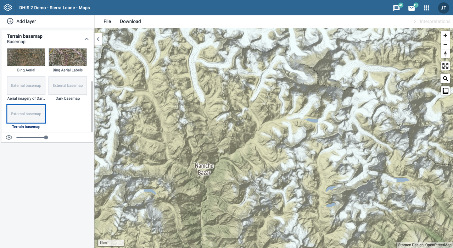
External map layers are represented as either basemaps or overlays.
Note
The Maps app administrator can add external map layers.
-
Basemaps
These are available in the basemap card in the layers panel and are selected as any other basemap.
-
Overlays
These are available in the Add layer selection. Unlike basemaps, overlays can be placed above or below any other overlay layers.
Overlay layers are represented by additional layer cards in the layer panel.
Along the top of the overlay card from left to right are:
-
A grab field to allow dragging and re-ordering layers with the mouse
-
The title of the external map layer
-
An arrow symbol to collapse or expand the overlay card
In the middle of the card is a legend if the layer has one.
Along the bottom of the overlay card from left to right are:
-
A slider for modifying the layer transparency
-
A delete icon to remove the layer from the current map
GeoJSON external layers
If you add a GeoJSON external layer to your map, you will have a few style choices:

Once the GeoJSON layer is displayed, you can view its data table:

As with other layers, you can sort and filter the data. If you want to view the data for one row, click the row to open the Feature Profile:

Org unit profile
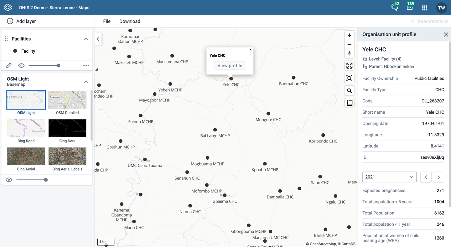
The org unit profile shows detailed information about each org unit. You can open the profile from org unit layers, facility layers, thematic layers, and Earth Engine layers.
You can open the org unit profile in three ways:
-
Click an org unit on the map, then click the View profile button in the popup.
-
Right-click one of the org units on the map, and select View profile from the menu.
-
Click an org unit row in the data table.
The profile will show on the right side of the map. The profile content is set by the system administrator.
File menu
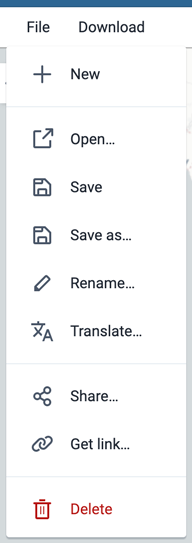
Use the File menu to manage your maps. Several menu items will be disabled until you open or save a map.
Saving your maps makes it easy to restore them later. It also gives you the opportunity to share them with other users as an interpretation or add them to a dashboard. You can save all types of layer configurations as a saved map.
Create a new map
Click File > New.
Note
This will discard the current map without saving.
Open a map
-
Click File > Open. A dialog box opens with a list of maps.
-
Find the saved map you want to open. You can either use \< and > or the search field to find a saved map. The list is filtered on every character that you enter. You can filter the list by selecting Show all, Created by me or Created by others.
-
Click the name of the map you want to open.
Save a map
When you have created a map it is convenient to save it for later use:
-
Click File > Save.
-
Enter a Name (required) and a Description (optional) the first time you save a map.
-
Click Save.
Save a copy of a map
-
Click File > Save as...
-
Enter a Name (required) and a Description (optional) for the map.
-
Click Save.
Rename a map
-
Click File > Rename.
-
Enter a new Name and/or Description for your map.
-
Click Rename. The map is updated.
Translate a map
-
Click File > Translate.
-
Select the Locale (language) for your translation.
-
Enter a translated Name and Description. The original text will show below the field.
-
Click Save.
Modify sharing settings for a map
After you have created a map and saved it, you can share the map with everyone or a user group. To modify the sharing settings:
-
Click File > Share. The sharing settings dialog opens.
-
Give access to a user or group: In the text box, search for the name of the user or group you want to share your saved map with and select it.
Select the access level and click Give access.
Repeat the step to add more users or groups.
-
Users and groups that currently have access: For each user or group, choose the access level. The options are:
-
No access: The public won't have access to the map. This setting is only applicable to All users.
-
View only: Users can view but not edit the map.
-
View and edit: Users can view and edit the map.
-
Remove access: Remove the access for groups or individuals.
-
-
Click Close to close the dialog.
Get the link to a map
-
Click File > Get link. A link dialog opens.
-
Copy the link.
Delete a map
-
Click File > Delete. A confirmation dialog is displayed.
-
Click Delete to confirm that you want to delete the saved map. Your map is deleted and the layers are cleared from the view.
Map interpretations and details
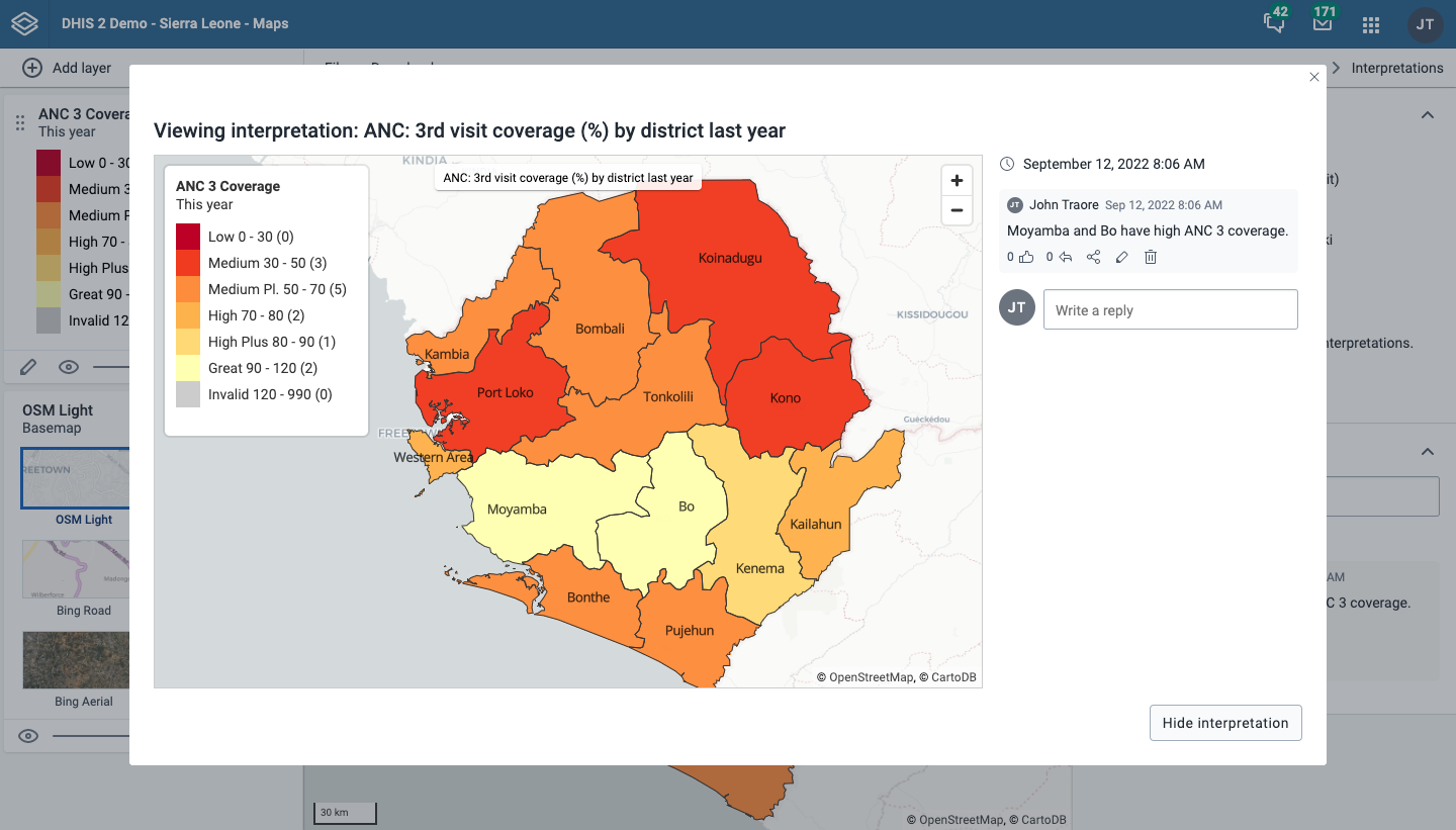
An interpretation is a description of a map for a given period. This information is also visible in the Dashboard app. Click Interpretations and details in the top right of the workspace to open the interpretations panel. The button is only available when the map has been saved.

View interpretations based on relative periods
To view interpretations for relative periods, such as a year ago:
-
Open a saved map with interpretations.
-
Click Interpretations and details in the top right of the workspace to open the interpretations panel.
-
Click See interpretation. Your map displays the data and the date based on when the interpretation was created. To view other interpretations, click them.
Write interpretation for a map
To create an interpretation, you first need to create a map and save it. If you've shared your map with other people, the interpretation you write is visible to those people.
-
Open a saved map.
-
Click Interpretations and details in the top right of the workspace to open the interpretations panel.
-
A text field appears where you can write an interpretation.
-
In the text field, type a comment, question or interpretation. You can also mention other users with '@username'. Start by typing '@' followed by the first letters of the username or real name, and a list of matching users will appear. Mentioned users will receive an internal DHIS2 message with the interpretation or comment. You can see the interpretation in the Dashboard app.
-
Click Post interpretation to save the interpretation.
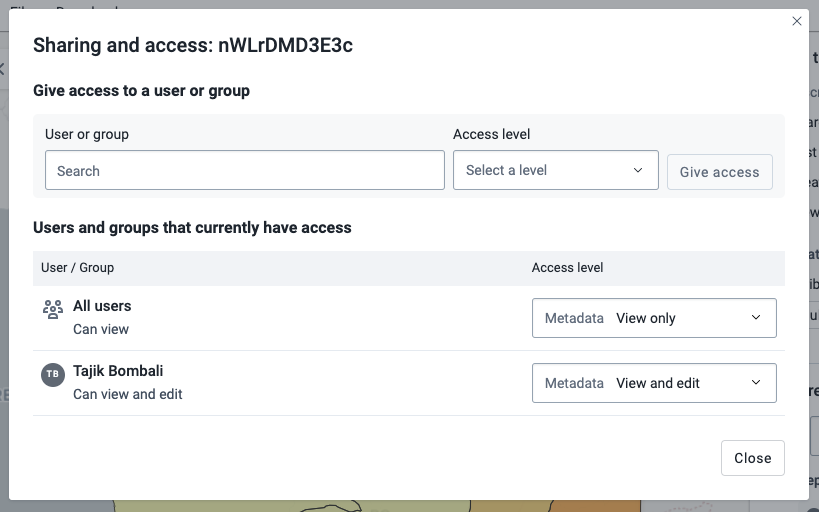
Change sharing settings for an interpretation
-
Click an interpretation (see how to view an interpretation above).
-
Click the share icon below the interpretation. The sharing settings dialog opens.
-
Search for and add users and user groups that you want to share your map with, and set the access level. Click Give access.
-
Change the access level for the users you want to modify:
-
No access: The public won't have access to the map. This setting is only applicable to All users.
-
View only: Users can view but not edit the map.
-
View and edit: Users can view and edit the map.
-
Remove access: Remove the access for groups or individuals.
-
-
Click Close when sharing settings are updated.
Save a map as an image
You can download your map as an image by clicking the Download button in the top menu.

You will enter Download mode where you can adjust the map layout before you download the image. The left column gives you the following options:
- Show map name: Select if you want to include the map name or not. This option is only available if the map is saved. To change the name, exit download mode and select File > Rename.
- Show map description: Select if you want to include the map description or not. This option is only available if a map description was added when the map was saved. To change the map description, exit download mode and select File > Rename.
- Show legend: Select if you want to include the map legend. If the map includes more than one layer, you can select the visibility for each legend.
- Show overview map: Select if you want to include an overview map (often named inset map). This option will be disabled if there is not enough room for it in the right column.
- Show north arrow: Select to include a north arrow on the map. The default position is the lower right corner of the map, but you can change it to another corner.
Click Download to download your map.
Resize your browser window to change the map dimensions. You can also reposition both the main map and the overview map.
Search for a location
The place search function allows you to search for almost any location or address. This is useful to locate sites, facilities, villages or towns on the map.
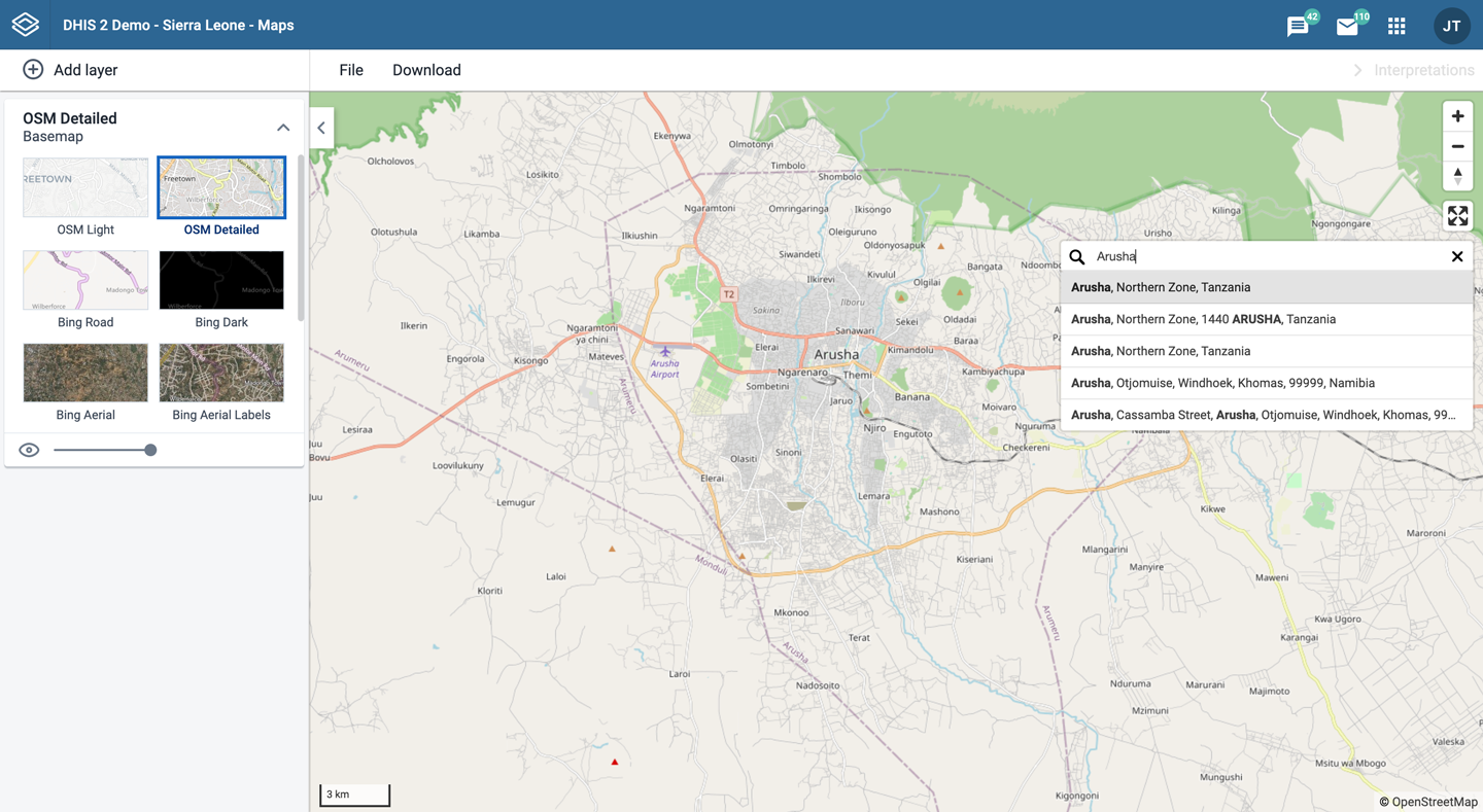
-
On the right side of the Maps window, click the magnifier icon.
-
Type the location you're looking for.
A list of matching locations appear as you type.
-
From the list, select a location. A pin indicates the location on the map.
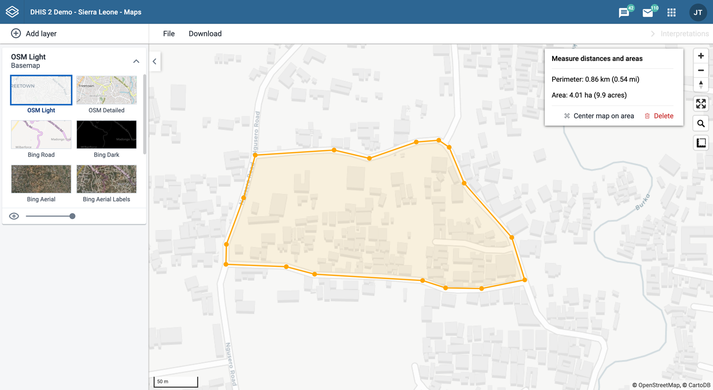
Measure distances and areas in a map
-
In the upper left part of the map, put the cursor on the Measure distances and areas (ruler) icon and click Create new measurement.
-
Add points to the map.
-
Click Finish measurement.
Get the latitude and longitude at any location
Right-click a point on the map and select Show longitude/latitude. The values are displayed in a popup window.
Maps app administrator
A Maps app administrator can be defined by the system administrator assigning the F_EXTERNAL_MAP_LAYER_PUBLIC_ADD authority.
The Maps app administrator is able to:
- Select the sources for Google Earth Engine layers available to other users via the Manage available layer sources button.

- Add new external layer sources via the Maintenance app.
See also
-
Configuration:
- Configure DHIS2 Maps
- Accessing map layers from Google Earth Engine
- Geo-enabled microplanning, including details about facility catchment areas
-
Settings:
-
Metadata management:
-
Training: