Using the Data Visualizer app
Note
Data Visualizer app is not optimised for mobile devices.

Creating and editing visualizations
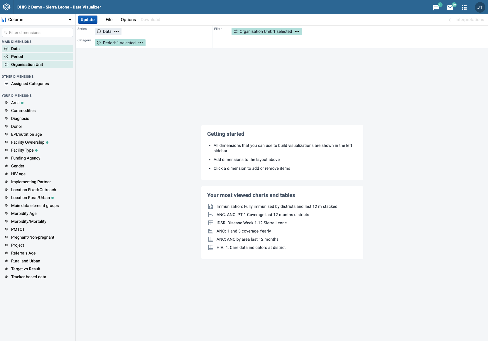
When you open the data-visualizer app from the dhis2 menu, you are presented with a blank slate and you can start creating your visualization right away.
Select visualization type
Select the desired visualization type from the selector in the upper left corner. For each visualization type there is a brief description with suggestions about where to use the main dimensions in the layout.

| Visualization type | Description |
|---|---|
| Column | Displays information as vertical rectangular columns with lengths proportional to the values they represent. Example: comparing performance of different districts. Layout restrictions: exactly 1 dimension as series, exactly 1 dimension as category. |
| Stacked column | Displays information as vertical rectangular columns, where bars representing multiple categories are stacked on top of each other. Example: displaying trends or sums of related data elements. Layout restrictions: same as Column. |
| Bar | Same as Column, only with horizontal bars. |
| Stacked bar | Same as Stacked column, only with horizontal bars. |
| Line | Displays information as a series of points connected by straight lines. Also referred to as time series. Example: visualizing trends in indicator data over intervals of time. Layout restrictions: same as Column. |
| Area | Is based on a line (above), with the space between the axis and the line filled with colors and the lines stacked on top of each other. Example: comparing the trends of related indicators. Layout restrictions: same as Column. |
| Stacked area | Same as Area, but the areas of the various dimension items are stacked on top of each other. Example: comparing the trends of related indicators. Layout restrictions: same as Area. |
| Pie | Circle divided into sectors (or slices). Example: visualizing the proportion of data for individual data elements compared to the total sum of all data elements. Layout restrictions: exactly 1 dimension as series, has no category. |
| Radar | Displays data on axes starting from the same point. Also known as spider chart. Layout restrictions: same as Column. |
| Gauge | Semi-circle which displays a single value, typically out of 100% (start and end values are configurable). Layout restrictions: exactly 1 dimension with exactly 1 item as series, data dimension is locked to series. |
| Year over year (line) | Useful when you want to compare one year of data to other years of data. Based on calendar years. Layout restrictions: period dimension is disabled. |
| Year over year (column) | Same as Year over year (line), only with columns. |
| Single value | Displays a single value in a dashboard friendly way. If the dimension displayed has an indicator type assigned, a % symbol or a string (per thousand, per hundred thousand, etc...) is appended to the value. If an icon is assigned to the dimension in the Maintenance app, it can be shown on the side of the value, the icon can be toggled in the Options panel. Layout restrictions: same as Gauge. |
| Pivot table | Summarizes the data of a more extensive table and might include sums, averages, or other statistics, which the pivot table groups together in a meaningful way. Layout restrictions: none. |
| Scatter | Scatter plots enable users to chart organisational units as points against two variables for a single fixed or relative period. Layout restrictions: exactly 1 item each as vertical and horizontal, data dimension is locked to vertical and horizontal, organisation unit is locked to points. |
| Outlier table | Displays a list of outliers based on historical data. Layout restrictions: organisation unit, period and data dimensions are locked to columns, no other dimensions can be added. |
Select dimensions
From the dimensions menu on the left you can select the dimensions you want to show in your visualization, including data, period, organisation units and dynamic dimensions. These can be added by clicking on a dimension, by dragging and dropping a dimension to the layout area or by hovering over a dimension and using on its context menu (three dots).
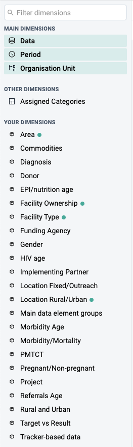
Just like in the dimensions menu, in the layout area you can also change the selections by clicking on a dimension, dragging and dropping a dimension or by using a dimension's context menu (three dots).

- Series: A series is a set of continuous, related elements (for example periods or data elements) that you want to visualize in order to emphasize trends or relations in its data. Also known as Columns for Pivot table visualizations.
- Categories: A category is a set of elements (for example indicators or organisation units) for which you want to compare its data. Also known as Rows for Pivot table visualizations.
- Filter: The filter selection will filter the data displayed in the visualization. Note that if you use the data dimension as filter, you can only specify a single indicator or data set as filter item, whereas with other dimension types you can select any number of items.
Select dimension items
A dimension refers to the elements that describe the data values in the system. There are three main dimensions in the system:
-
Data: Includes data elements, indicators, datasets (reporting rates), event data items, program indicators and calculations, describing the phenomena or event of the data.
NOTE: Clarification of display of reporting rates:
- If a report is expected but not yet submitted, then "0" will be displayed.
- If a report is not expected because the metadata (e.g. category option, OU) date is outside of the start-end date range, then no value is displayed. (e.g. "blank")
- Periods: Describes when the event took place.
- Organisation units: Describes where the event took place.
Data Visualizer is highly flexible in terms of allowing you to use these dimensions as series, categories and filter.
To select items for a dimension, open the dimension modal window by clicking on a dimension. This window will also be opened automatically when adding a dimension without selected items to the layout. Select which items to add to the visualization by double-clicking an item or by selecting an item with a single click and using the arrows in the middle. The order of appearance will be the same as the order in which they are selected. Selected items can be reordered by dragging and dropping them in the Selected section.
Select data items
When selecting data items, there are different ways to filter the displayed items. By using the search field at the top, a global search by item name, id or code is performed across the currently selected Data Type. By selecting a Data Type from the dropdown, items can be filtered by type and subtype, where the subtype available depends on the selected data type. The name search and the type/subtype filtering can be combined as well for a more detailed filter. The type of each displayed item is indicated on the right and a corresponding icon is shown on the left of the item.

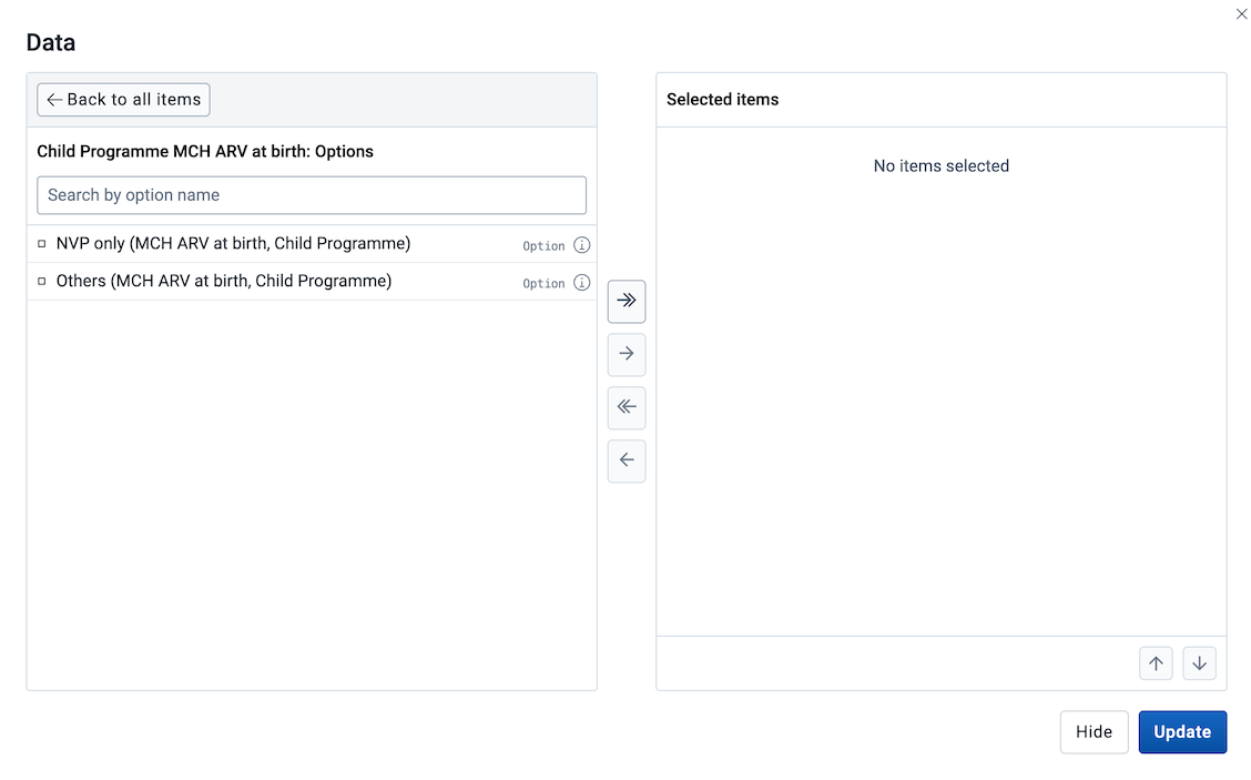
Select options from an option set
For data items that have an option set assigned it's possible to select specific options from the option set. For such data items, an icon is shown besides the data item name.
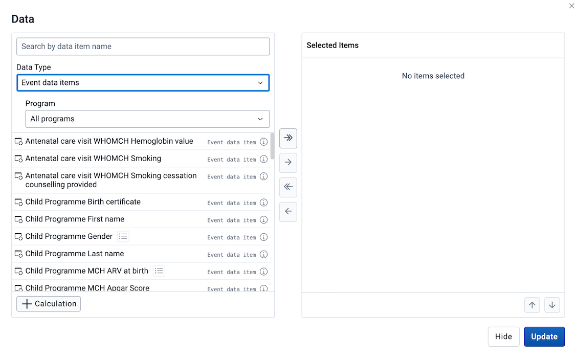
By clicking it the list of data items is replaced with the list of options from the option set. The selection of options is done in the same way as any other data item, by double clicking or using the transfer buttons. To exit the options mode, use the "Back to all items" button.
Display information about a data item
On the right of each data item there is an information icon that can be clicked and a table with relevant information is shown. The information displayed depends on the item's data type.

Using custom calculations
A new personal indicator, also known as a custom calculation, can be created by clicking the + Calculation button at the bottom-left of the Data modal. This will open the Calculation modal.
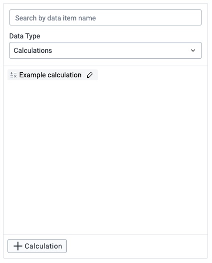
Previously created custom calculations can be found in the list of dimensions in the Data modal, either by scrolling, searching or using the Data Type filter Calculations. To edit a custom calculation, click the edit button (indicated by a pen icon) on the item itself.

The Calculation modal has similar data element filters as seen in the Data modal, where items can be found by either scrolling, searching or filtering by groups. To add a data element or a math operator to the formula field (seen on the right), either double-click the item or drag it to the formula field.
Items in the formula field can be rearranged by drag-and-drop and removed by either double-click or by selecting an item and clicking the Remove item button.
All calculations require a name before saving.
The formula will be validated on save. Note that only valid formulas can be saved. The formula can also be validated on request by clicking the Check formula button.
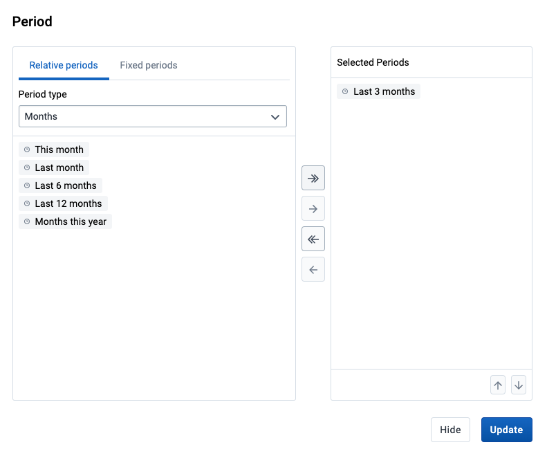
Select periods
When selecting a Period you have the option to choose between fixed periods and relative periods. These can also be combined. Overlapping periods are filtered so that they only appear once. For relative periods the names are relative to the current date, e.g. if the current month is March and Last month is selected, the month of February is shown in the visualization.
Select organisation units
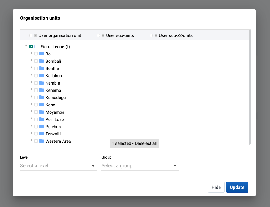
The organisation units dialog is flexible, offering essentially three ways of selecting organisation units:
-
Explicit selection: Use the tree to explicitly select the organisation units you want to appear in the visualization. If you right-click on an organisation unit you can easily choose to select all org units below it.
-
Levels and groups: The Level and Group dropdowns are a convenient way to select all units in one or more org unit groups or at specific levels. Example: select Chiefdom (level 3) to get all org units at that level.
Please note that as soon as at least one level or group has been selected the org unit tree now acts as the boundary for the levels/groups. Example: if you select Chiefdom (level 3) and Kailahun org unit (at level 2) in the tree you get all chiefdom units inside Kailahun district.
-
The user's organisation units:
-
User organisation unit: This is a way to dynamically select the org units that the logged in user is associated to.
-
User sub-units: Selects the sub-units of the user organisation unit.
-
User sub-x2-units: Selects the units two levels below the user organisation unit.
-
Select dynamic dimensions
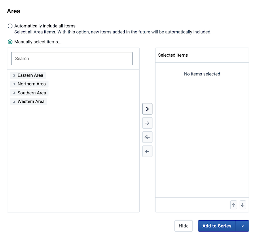
When selecting a dynamic dimension, either individual or all items can be selected. By default, the Manually select items option is selected, which allows for individual items to be picked out of a list, similar to how the Data and Period dimensions are selected above. To automatically select all items for a dimension, the Automatically include all items option can be selected. This will also include any additional items that are added in the future if the available dimension items are updated.
Two category charts
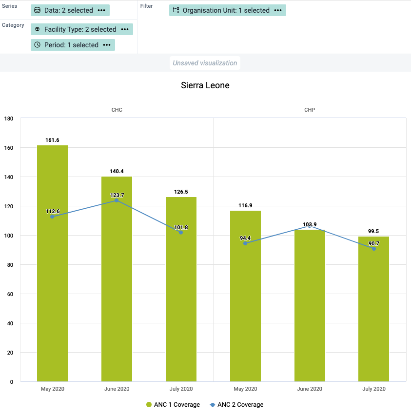
Most chart visualization types can show two categories. When switching from Pivot Table to Column, Bar, Area (and their stacked versions), or Line charts, the first two dimensions remain in Category while any additional dimensions are moved to Filter. The labels for the first dimension in Category are shown at the top of the chart, and the ones for the second dimension at the bottom. The resulting visualization is composed of separate charts, one for each item in the first dimension.
Change the display of your visualization
The display of a visualization can be changed by enabling/disabling and configuring several options. Each visualization type can have a different set of available options. The options are organised in tabs in the Options dialog and in sections within each tab.
-
Click Options to open the Options dialog.
-
Navigate the tabs in the dialog to see the available options.
-
Configure the desired options as required.
-
Click Update to apply the changes to the visualization.
List of available options
| Option | Description |
|---|---|
| Data tab — Charts | |
| Stacked values add up to 100% | Displays 100 % stacked values in Stacked column and Stacked bar visualizations. |
| Cumulative values | Displays cumulative values in the visualization. Not available for Gauge, Pie, Single value, Scatter and Outlier table. |
| Hide empty categories | Hides the category items with no data from the visualization. Before first: hides missing values only before the first value After last: hides missing values only after the last value Before first and after last: hides missing values only before the first value and after the last value All: hides all missing values This is useful for example when you create Column and Bar visualizations. |
| Custom sort order | Controls the sort order of the values. |
| Skip rounding | Skips the rounding of data values, offering the full precision of data values. Can be useful for finance data where the full dollar amount is required. |
| Trend line | Displays the trend line that visualizes how your data evolves over time. For example if performance is improving or deteriorating. Useful when periods are selected as category. |
| Target line | Displays a horizontal line at the given domain value. Useful for example when you want to compare your performance to the current target. |
| Base line | Displays a horizontal line at the given domain value. Useful for example when you want to visualize how your performance has evolved since the beginning of a process. |
| Aggregation type | Defines how the data elements or indicators will be aggregated within the visualization. Some of the aggregation types are By data element, Count, Min and Max. |
| Only include completed events | Includes only completed events in the aggregation process. This is useful for example to exclude partial events in indicator calculations. |
| Max results (Outlier table only) | Sets the maximum number of rows to display in an Outlier table. The allowed range is 1 to 500. |
| Data tab — Pivot table | |
| Cumulative values | Displays cumulative values in the Pivot table. |
| Dimension labels | Shows the names of dimensions (e.g., Data, Period, Organisation unit) as column and row headers in the Pivot table. |
| Skip rounding | Skips the rounding of data values, offering the full precision of data values. Can be useful for finance data where the full dollar amount is required. |
| Column totals | Displays total values in a Pivot table for each column, as well as a total for all values in the table. |
| Column sub-totals | Displays sub-totals in a Pivot table for each dimension. If you only select one dimension, sub-totals will be hidden for those columns. This is because the values will be equal to the sub-totals. |
| Row totals | Displays total values in a Pivot table for each row, as well as a total for all values in the table. |
| Row sub-totals | Displays sub-totals in a Pivot table for each dimension. If you only select one dimension, sub-totals will be hidden for those rows. This is because the values will be equal to the sub-totals. |
| Hide empty columns | Hides empty columns from a Pivot table. This is useful when you look at large tables where a large portion of the dimension items don't have data in order to keep the table more readable. |
| Hide empty rows | Hides empty rows from a Pivot table. This is useful when you look at large tables where a large portion of the dimension items don't have data in order to keep the table more readable. |
| Aggregation type | Defines how the data elements or indicators will be aggregated within the visualization. Some of the aggregation types are By data element, Count, Min and Max. |
| Number type | Sets the type of value you want to display in a Pivot table: Value, Percentage of row or Percentage of column. The options Percentage of row and Percentage of column mean that you'll display values as percentages of row total or percentage of column total instead of the aggregated value. This is useful when you want to see the contribution of data elements, categories or organisation units to the total value. |
| Only include completed events | Includes only completed events in the aggregation process. This is useful for example to exclude partial events in indicator calculations. |
| Legend tab | |
| Use legend for chart colors | Applies a legend to the visualization items, which is a value-based color for each item. The legends themselves are configured in the Maintenance app. |
| Legend style (Pivot table and Single value only) | Controls where the color from the legend is applied, either to the text or the background. You can use this option for scorecards to identify high and low values at a glance. |
| Legend type | Controls which legend is applied.Use pre-defined legend per data item applies a legend to each data element or indicator individually, based on the legend assigned to each one in the Maintenance app.Select a single legend for entire visualization applies a single legend to all data items, chosen in a drop-down list of available legends. |
| Show legend key | Displays a key for the legend on the right side of the visualization, to indicate the value ranges and their respective color. If the visualization is added to a dashboard, this option can also be toggled from the top right corner of the dashboard item. |
| Axes tab | |
| Axis title | Type a title here to display a label next to the x or y axis. Useful when you want to give context information to the visualization, for example about the unit of measure.Auto generated from axis items provides a title based on the content of the axis.None removes the title. Custom allows you to type a custom title. |
| Axis range | Defines the maximum and minimum value that will be visible on the range axis. |
| Steps | Defines the number of ticks that will be visible on the range axis. |
| Decimals | Defines the number of decimals that will be used for range axis values. |
| Labels | Controls the text styling of the value labels shown on each axis. Font size, color and italic/bold variants can be customized. |
| Series tab | |
| Options for adding more axes and changing how different series are displayed are set in this tab. Please see a detailed description of how this works in the corresponding sections below. | |
| Style tab — Charts | |
| Value labels | Shows the values above the series in the visualization. |
| No space between bars/columns | Removes the space between the columns or bars in the visualization. Useful for displaying the visualization as an EPI curve. |
| Show series key | Shows a key for the series in the visualization, identifying each data series by color and name. The series key appearance can be customized using the text styling tool. |
| Digit group separator (Single value only) | Controls which character to use to separate groups of digits or "thousands". You can set it to Comma, Space or None. |
| Show data item icon (Single value only) | Toggles the icon visibility in the Single Value visualization. |
| Chart title | Controls the title that appears above the visualization.Auto generated uses the default title generated from the visualization's dimensions/filters.None removes the title. Custom allows you to type a custom title. |
| Chart subtitle | Controls the subtitle that appears above the visualization.Auto generated uses the default subtitle generated from the visualization's dimensions/filters.None removes the subtitle. Custom allows you to type a custom subtitle. |
| Color set | Controls the colors used in the chart. A list of available color sets is shown with a preview of the colors. There is also a "Mono patterns" option which uses colored patterns instead of solid colors. |
| Style tab — Pivot table Display density, Font size, Digit group separator and Display organisation unit hierarchy also apply to the Outlier table. | |
| Table title | Controls the title that appears above the visualization.Auto generated uses the default title generated from the visualization's dimensions/filters.None removes the title. Custom allows you to type a custom title. |
| Table subtitle | Controls the subtitle that appears above the visualization.Auto generated uses the default subtitle generated from the visualization's dimensions/filters.None removes the subtitle. Custom allows you to type a custom subtitle. |
| Display density | Controls the size of the cells in a Pivot table. You can set it to Comfortable, Normal or Compact. Compact is useful when you want to fit large tables into the browser screen. |
| Font size | Controls the size of a Pivot table text font. You can set it to Large, Normal or Small. |
| Digit group separator | Controls which character to use to separate groups of digits or "thousands". You can set it to Comma, Space or None. |
| Fix column headers to top of table | Freezes column headers in Pivot Tables so they are always visible when scrolling the table content. |
| Fix row headers to left of table | Freezes row headers in Pivot Tables so they are always visible when scrolling the table content. |
| Display organisation unit hierarchy | Shows the name of all ancestors for organisation units, for example "Sierra Leone / Bombali / Tamabaka / Sanya CHP" for "Sanya CHP". The organisation units are then sorted alphabetically which will order the organisation units according to the hierarchy. When you download a pivot table with organisation units as rows and you've selected Display organisation unit hierarchy, each organisation unit level is rendered as a separate column. This is useful for example when you create Excel pivot tables on a local computer. |
| Limit values tab | |
| Limit minimum/maximum values | Allows for the data to be filtered on the server side. You can instruct the system to return only records where the aggregated data value is equal, greater than, greater or equal, less than or less or equal to certain values. If both parts of the filter are used, it's possible to filter out a range of data records. |
| Parameters tab (Pivot table only) These settings control how the pivot table behaves when embedded as a standard report in the Reports app. They have no effect within Data Visualizer itself. | |
| Reporting period | Controls whether the user is prompted to enter a report period when creating a standard report in the Reports app. |
| Organisation unit | Controls whether the user is prompted to enter an organisation unit when creating a standard report in the Reports app. |
| Parent organisation unit | Controls whether the user is prompted to enter a parent organisation unit when creating a standard report in the Reports app. |
| Include regression | Includes a column with regression values in the Pivot table. |
| Include cumulative | Includes a column with cumulative values in the Pivot table. |
| Custom sort order | Controls the sort order of the values. |
| Top limit | Controls the maximum number of rows to include in a Pivot table. |
| Outliers tab (Scatter chart and Outlier table only) | |
| Outlier analysis (Scatter) | Enables outlier detection in a Scatter chart, highlighting data points that are markedly different from the rest of the data. When enabled, the outlier detection method and extreme lines options become available. |
| Outlier detection method (Scatter and Outlier table) | Outlier analysis is a process that involves identifying anomalous observations in a dataset. In Data Visualizer outliers are detected by first normalizing the data into a linear regression line and then analysing each point's distance from regression line. For Scatter charts, three methods are supported: Interquartile Range (IQR) is based on dividing a dataset into quartiles; Modified z-score is based on the Median Absolute Deviation (MAD). IQR and MAD are considered the two most common robust measures of scale. Standard z-score is based on standard deviation and is therefore considered less robust as it is greatly influenced by outliers. For Outlier table, Modified z-score and Standard z-score are supported. |
| Threshold factor (Scatter and Outlier table) | The number that the outlier thresholds are multiplied by. Controls the sensitivity of the threshold range. Default factors are 1.5 for IQR and 3 for z-scores. |
| Extreme lines (Scatter) | Marks data points at the extreme ends of the distribution as lines on the Scatter chart. Calculated as a percentage of the total values along an axis. Only available when Outlier analysis is enabled. |
| Extreme line % detection (Scatter) | The percentage threshold used to calculate which values are shown as extreme lines. Default is 1%. |
Custom styling for text and series key in charts
The following options can be customized using the text styling tool: Chart title, Chart subtitle, Show series key, Target line, Base line, Axis title and Labels for both horizontal and vertical axes. The text styling tool allows to choose a font size, color and italic/bold variants. It's also possible to choose the position of the text.

Adding Assigned Categories
Assigned Categories is a composite dimension that represents associated category option combinations to the selected data element's category combination. This can be added by dragging the Assigned Categories dimension from the left side dimensions menu and into the visualization layout:
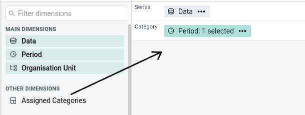
Another way of adding assigned categories is by accessing the Add Assigned Categories option from the Data dimension's context menu (not available for Gauge, Year over year or Single value).
Adding more axes
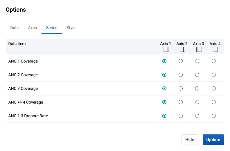
When combining data with different measurement scales you will get a more meaningful visualization by having more than a single axis. For Column, Bar, Area and Line you can do so by clicking the Series tab in the Options dialog. If the option is disabled, make sure that the Data dimension is on the Series axis and that at least two items have been added.
Four axes are available, two on the left side (axis 1 and 3) of the chart and two on the right side (axis 2 and 4). Each axis has a different color and the chart items are going to be colored accordingly.
Note
When multiple axes are in use, the
Color setoption in theStyletab will be disabled. TheTarget lineandBase lineoptions are available on theAxestab per axis.
Using multiple visualization types
It's possible to combine a Column chart with Line items and vice versa. This is done by clicking the Series tab in the Options dialog and changing the Visualization type. This can also be combined with using multiple axes (as described in the section above).
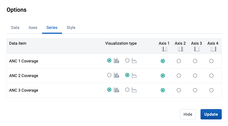
This results in a chart that combines the Column and Line types.

Data drilling
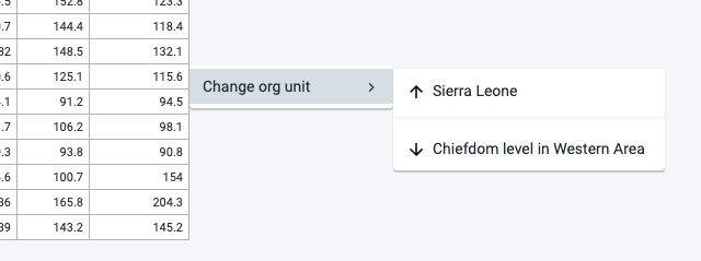
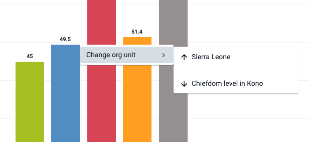
This feature is enabled for the Pivot Table, Column, Stacked column, Bar and Bar stacked visualization types and allows to drill in the data by clicking on a value cell / column / bar in the visualization. A contextual menu opens with various options.
You can drill the data by organisation unit, meaning navigating up and down the org unit tree. The data drill affects the current dimension selection in the layout area. The organisation unit dimension must thus be present on either the Columns / Series axis or the Rows / Category axis for the drill feature to be enabled.
Manage saved visualizations
Saving your visualizations makes it easy to find them later. You can also choose to share them with other users or display them on a dashboard.
Open a visualization
-
Click File > Open.
-
Enter the name of a visualization in the search field, or click the < and > arrows to navigate between different pages. The result can also be filtered by type and owner by using the corresponding menus in the top right corner.
-
Click the name of the one you want to open.

Save a visualization
-
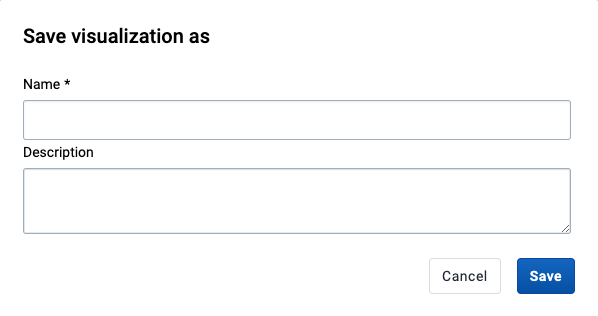
a) Click File > Save.
-
Enter a Name and a Description for your visualization.
-
Click Save.
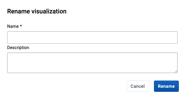
Rename a visualization
-
Click File > Rename.
-
Enter the new name and/or description.
-
Click Rename.
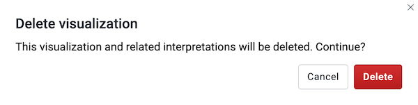
Delete a visualization
-
Click File > Delete.
-
Click Delete.
Get the link to the visualization
-
Click File > Get Link.
-
The URL can be copied via the browser's context menu that opens when right clicking on the link.
Visualization interpretations
When viewing a saved visualization, you can expand the interpretations on the right side by clicking on the Interpretations button in the upper right corner. The visualization description will also be shown. The description supports rich text format.
New interpretations can be added by typing in the text field in the bottom right corner. Other users can be mentioned with @username. Start by typing @ plus the first letters of the username or real name and a list of matching users will be displayed. Mentioned users will receive an internal DHIS2 message with the interpretation or comment. Interpretations can also be seen in the Dashboard app.
It is possible to format the text with bold, italic by using the Markdown style markers * and _ for bold and italic respectively (keyboard shortcuts are also available: Ctrl/Cmd + B and Ctrl/Cmd + I). A limited set of emojis is supported and can be used by typing one of the following character combinations: :) :-) :( :-( :+1 :-1. URLs are automatically detected and converted into a clickable link.
To view the visualization according to the date of a particular interpretation, click on the interpretation or its View button. This will regenerate the visualization with the relevant date, which is indicated next to the visualization title. Clicking on Back to all interpretations will regenerate the visualization with the current date.
To subscribe to the saved visualization, click the bell icon in the upper right corner. You will then receive internal messages whenever another user likes/creates/updates an interpretation in this saved visualization.

Share a visualization
Sharing settings can be accessed by clicking File > Share. Change sharing settings for the user groups you want to modify, the available settings are:
-
Can edit and view: Can view and edit the visualization.
-
Can view only: Can only view the visualization.
-
No access: Won't have access to the visualization. This setting is only applicable to Public access and External access. (Note that to enable access to everyone, both Public access and External access must be set to allow view.)
New users can be added by searching for them by name under Add users and user groups.

Download
Visualizations can be downloaded using the Download menu. All visualization types support Graphics and Plain data source downloads, except for the Pivot table type, which can be downloaded as Table layout and Plain data source.
Graphics download
Downloads an image (.png) or a PDF (.pdf) file to your computer.
Table layout download
Downloads a Excel (.xls), CSV (.csv) or HTML (.html) file to your computer.
Plain data source download
You can download the data source of a visualization in JSON, XML, Excel, CSV, JXRML or Raw data SQL formats with different identification schemes (ID, Code, and Name). The data document uses identifiers of the dimension items and opens in a new browser window to display the URL of the request to the Web API in the address bar. This is useful for developers of apps and other client modules based on the DHIS2 Web API or for those who require a plan data source, for instance for import into statistical packages.
Available formats
| Format | Action | Description |
|---|---|---|
| JSON | Click JSON | Downloads JSON format based on the ID, Code or Name property. |
| XML | Click XML | Downloads XML format based on the ID, Code or Name property. |
| Microsoft Excel | Click Microsoft Excel | Downloads Microsoft Excel format based on the ID, Code or Name property. |
| CSV | Click CSV | Downloads CSV format based on the ID, Code or Name property. |
| XML data value set | Click Advanced > XML | Downloads the raw data values as XML, as opposed to data which has been aggregated along various dimensions. |
| JSON data value set | Click Advanced > JSON | Downloads the raw data values as JSON, as opposed to data which has been aggregated along various dimensions. |
| JRXML | Click Advanced > JRXML | Produces a template of a Jasper Report which can be further customized based on your exact needs and used as the basis for a standard report in DHIS 2. |
| Raw data SQL | Click Advanced > Raw data SQL | Provides the actual SQL statement used to generate the data visualization. You can use it as a data source in a Jasper report, or as the basis for a SQL view. |
See visualization as map
To see how a visualization would look on map, select the Open as Map Visualization type after you're finished building your visualization.