How to use and interpret WHO’s Data Quality Tool
[Note to the facilitator: this section can best be presented using a live, online projection of the DQ TrainingLand instance of DHIS2 (https://who.-demos.dhis2.org/dq ). The document can be presented in its entirety, followed by the 3 exercises. The instructions for the 3 exercises should be printed together as a single document, a copy of which should be given to each participant. Guidance on configuration of the numerators for the Tool is provided in a separate document entitled “How to Configure the WHO Data Quality Tool.docx”. Presentation related to assessment of denominators and comparison with survey estimates is dealt with in a separate documents entitled “Quality Denominators.ppt”. ]
Contents
Contents
- Launch the Tool
- Use the Completeness dashboard
- Use the “Consistency-time” dashboard
- Use the Tool for a program-specific review of data quality
- Use the “Consistency-data” dashboard
- Use the “Outliers” dashboard
- Use the “Analysis-Consistency” function
- Use the “Analysis- Outliers and Missing Data” function
- Exercise 1: Use the dashboard and the analysis functions to identify suspicious values with your DHIS2
- Exercise 2: Discuss how to deal with very suspicious values
- Use the “Annual Report” function
- Exercise 3: Use the Tool to prepare an Annual Data Quality Report
- Annex 1: How to configure Denominators, Denominator relations and External data comparisons
- Notes
- “DPT-HepB-Hib 3 doses given < 1 year” is reported with the EPI dataset whereas “Penta 3 doses given is reported with the HMIS dataset.
Launch the Tool
-
Log into the DHIS2 instance https://who.-demos.dhis2.org/dq
Username: demo Password: District1# -
Type “WHO” on the search apps line in the upper right of the DHIS2 Home page. Click on WHO Data Quality Tool.

alt_text -
Quickly review the main menu of the DQ Tool: After you launch the DQ Tool, you will see the 5 tabs at the top of the page. These are used to select between several different functionalities. Notice that the word “Dashboard” is highlighted and the Dashboard function is selected by default.

alt_text -
Quickly review the Dashboard menu: The Dashboard has its own set of 4 tabs. The Completeness tab is selected by default.

Use the Completeness dashboard
- Review the Completeness dashboard: Scroll down and review the Completeness page of the data quality dashboard. The page shows completeness for each of 5 “core datasets”.
Note: When you review the completeness with your DHIS2 instance, if you find that completeness of one or more dataset is 0%, consider the possibility that this is because the data was imported. DHIS2 cannot be used to monitor the completeness of imported data unless you also import the completeness meta-data. For the training instance of DHIS2, the immunization dataset is quite incomplete. It is best to review the quality of the ANC data which are more complete.
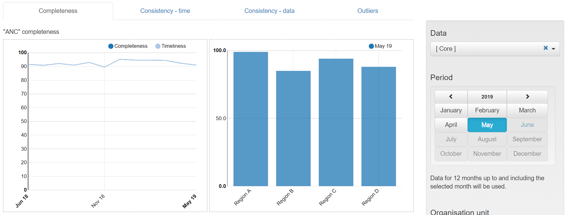
a. Review the graphs on the left side of the page: The graphs on the left show, for each dataset, the completeness and timeliness by month for each of the last 12 months. 
b. Review the graphs on the right side of the page: The graphs on the right show, for each dataset, the completeness by Region for the last month of the period being analyzed. Note: with this instance of DHIS2, the country is divided into 4 regions and each region is divided into multiple districts. Completeness for the most recent month is actually a measure of timeliness. It is often more revealing to show completeness for the month before last. Click on the menu icon.
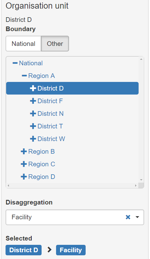
c. Change the “Organisation unit” that is being analyzed: By default, the DQ Tool analyzes all data nationwide, disaggregated by Region. The DQ Tool can also be used at district level with data disaggregated by individual health facility. In the Organisaton unit section of the menu, click on Other and select “District D” of Region A. The graphs on the left side of the completeness page now show the 12 month trend in the reporting completeness of District D. By default, the graphs on the right side of the completeness page show results disaggregated for one level below – facility. Question: Which individual facilities have not yet reported ANC data for last month? For 3 months ago? For 6 months ago? After you have experimented with changing the organization unit and the month, reset it national with disaggregation by District and period = April of this year1.
Use the “Consistency-time” dashboard
- Review the Consistency-time dashboard: Click on the tab for “Consistency-time”. Scroll down and review the page. Move the cursor around on each chart to view the pop-up details.
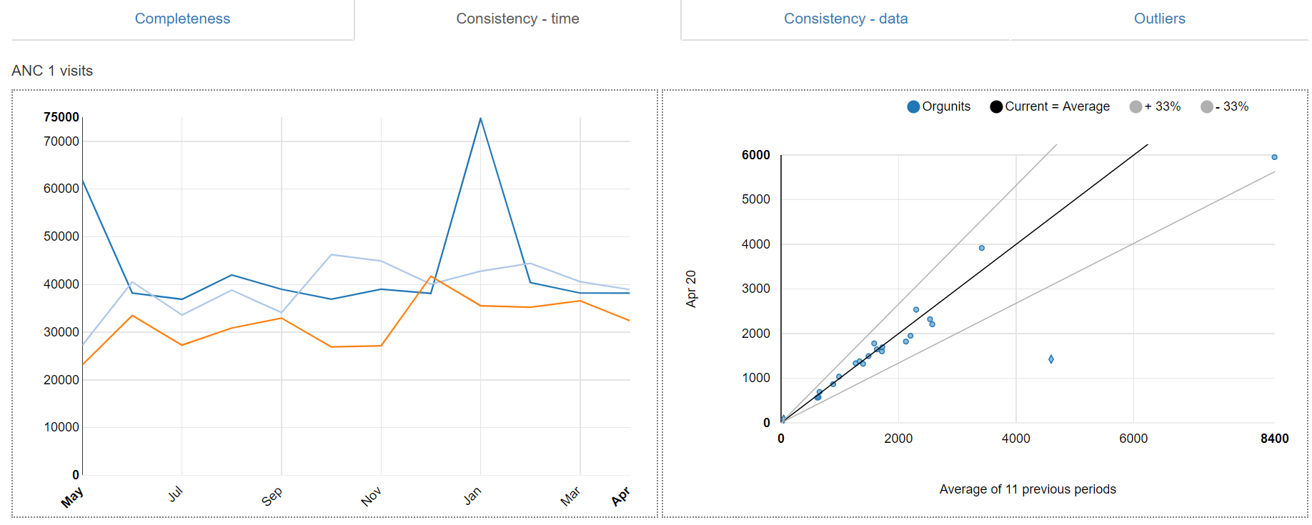
a. Review the graphs on the left side of the page: The graphs on the left show, for each core numerator, the trend in the numerator value over the period 1 to 12 months previously (dark blue in the above chart), the period 13 to 24 months previously (light blue in the above chart) and the period 25 to 36 months previously (orange in the above chart). Note the sharp rise in the value of ANC 1 in May 2018 and again in January 2019. When there is such a dramatic rise at national level, this is certainly suspicious.
b. Review the graphs on the right side of the page: Each graph on the right is an example of "scatter plot". When the Tool is set to disaggregated by District, each dot represents the value for a single district. On this chart, the position of the dot on the vertical axis represents the value of the numerator for the month selected (remember that we re-set the menu to show results for Period = April 2020). The position of the dot on the horizontal axis is the average value in the same district over the 11 previous month. Dots that appear above the lower grey line or above the upper grey line are suspicious (e.g. in the example below, the number of ANC 1st visits in District F was 1,425 in April 2020 as compared to an average of 4,596 / month from May 2019 to March 2020.

Hence, the "Completeness-time dashboard" may be useful to identify some suspicious values. However, other components of the Tool do a better job of identifying suspicious values. So this page of the Tool is not used as frequently as others2.
Use the Tool for a program-specific review of data quality
-
Review the list of “Core” data element/indicators: On the menu of the Tool, Data is now set to “Core”. As a result, the Tool presents findings for the data elements/indicators which were included in the “Core” grouping3. Scroll down the “Completeness-time” page to review the list. Notice that only two immunization indicators4 are featured.
-
Change Data to “Immunization”– On the menu (click on the icon if the menu is not open) change Data from “Core” to “Immunization”. Notice what happens to the list of data elements/indicators featured. There are now 10 immunization indicators featured on the “Completeness-time” page. In this way, the Tool can be used for a program-specific review of data quality – to review the full range of program-specific indicators. Before you continue to the next step, use the menu to change Data back to “Core”.
Use the “Consistency-data” dashboard
-
Review the Consistency-data dashboard: Click on the tab for “Consistency-data”. This page shows whether there is a plausible relationship between numerators that are related. These are the “numerator relations” that are configured using More-Administration-Numerator relations. Scroll down and review the page. Move the cursor around on each chart to view the pop-up details.
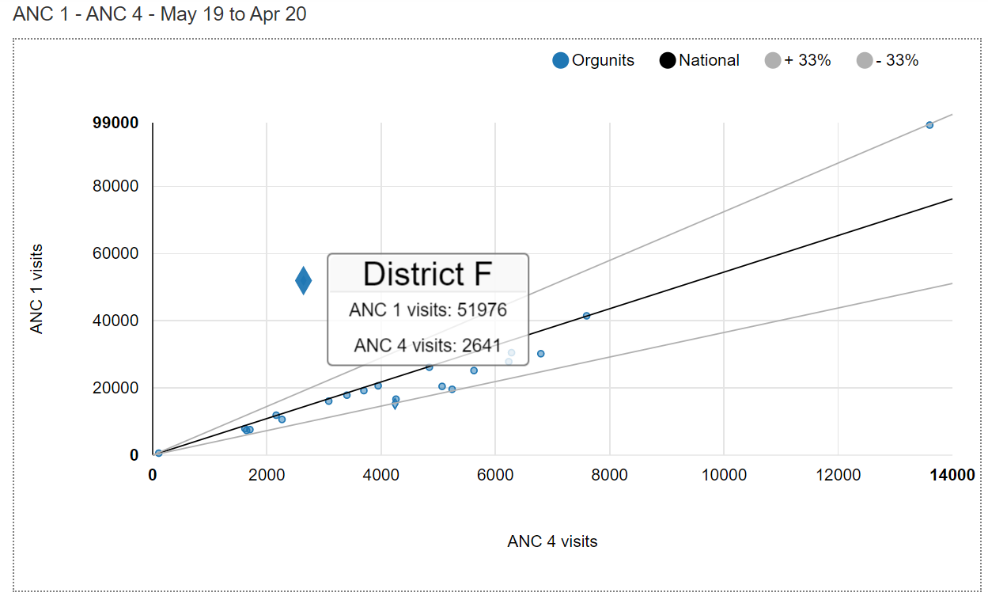
a. Review any scatterplots: The graph comparing ANC 1 to ANC 4 is a scatterplot with each dot representing the total values, over the last 12 months, for one district. Districts with values that fall outside of the grey threshold lines are represented with a diamond shape. As one example, for District F (represented by the enlarged diamond), over the last 12 months, ANC 4 was only 2,641 while ANC 1 was 51,976. The discrepancy is suspicious and should be investigated.
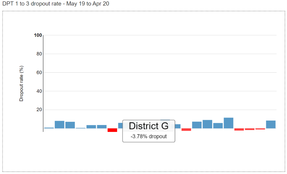
alt_text b. Review any graphs assessing dropout rates: The graph comparing DPT1 to DPT3 assesses for any “negative dropout rate”. The graph shows that there are 5 districts which, over the 12 months up to and including April 2020, had a negative DPT 1 to DPT 3 dropout rate. In other words, these 5 districts reported a higher value of DPT 3 than DPT 1. A negative DPT dropout rate for a district for an entire year is usually a sign of poor data quality. This should be investigated.
alt_text
Use the “Outliers” dashboard
-
Use the “Outliers” dashboard to identify suspicious district-level values: Click on the tab for “Outliers”. If necessary, use the menu to set Disaggregation to District. To free up space on the page, click on the menu icon to make the menu disappear. The page shows a “Result” table with a large number of rows. Each row has one or more values highlighted in red. How are the values highlighted in red different from the other values in the same row? The Tool finds the values highlighted in red to be suspicious because they are either significantly higher or significantly lower than the other values in the row. The rows are sorted in order of “weight”. The “weight” can be thought of as the difference between the suspicious value and the average of other values in the row. There are so many rows that the table will not fit on a single page. You can view the subsequent pages by clicking on the controls at the bottom of the page.

alt_text a. Investigate outliers with a weight that exceeds 5% of a district’s annual total. With so many outliers, how can you decide which ones are most important? One approach is to focus on the rows at the top which have the largest weight. As a rule of thumb, all values with a weight that is more than 5% of the district’s expected annual total should be carefully investigated because they can significantly distort the district statistic. Consider, as examples, the 1st and 2nd rows in the above table showing extreme outliers in the values of ANC 1. The expected annual number of pregnancies in districts F is 20,000 while the expected number of pregnancies in district E is 110,000. In both cases the extreme outliers must be investigated because the outlier weights greatly exceed 5% of the district’s expected annual pregnancies.
b. Investigate outliers with an extreme Z-score. There is another way to identify the outliers which are most suspicious by using their “Z-score”5. To use this method, click on the Options button to open the Options window. To see the Z-score for each row, click on the box “Include Z-score”. Review the Standard Z-score values in the Result table. Notice that the values range from less than 2 to more than 3. Next, click on the following buttons: 1) Outliers; 2) Standard Score; and 3) Extreme. If the Result table has no rows at all or only 1 or 2 rows, click on “Modified Z-Score”6 to identify more outliers.

alt_text c. Inspect each row– Questions: Review the Standard Z-scores. Notice how the Result table reduces to only a few rows. Notice that the Z-score for each row is greater than 3.0. Do you think these suspicious value might be due to an error? How would you investigate to determine whether a highlighted value is due to an error? Click on the menu icon at the end of the first row and select “Visualize” from the drop-down menu.

alt_text d. “Drill down” to investigate the source of the suspicious value – Click on the Close button to close the graph, click again on the menu icon and select “Drill down” from the drop-down menu. If necessary, again use the Options feature to filter the table to Outliers, Standard Score and Extreme. Do you think these suspicious value might be due to an error? Very large extreme outliers such as the one in the first row are very likely to be due to errors. Extreme outliers which are much less than the average monthly value, such as the one seen in the second row, may be due to missing data if they are seen at district or higher level. A small but extreme outlier seen at facility level is also likely to be due to an error.

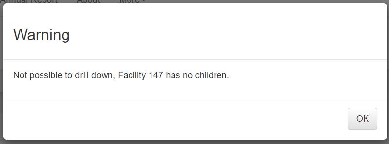
alt_text If there is another level of the organizational hierarchy below this level, you can drill down further. If, however, this is the lowest level in the hierarchy then you get a message such as the following:
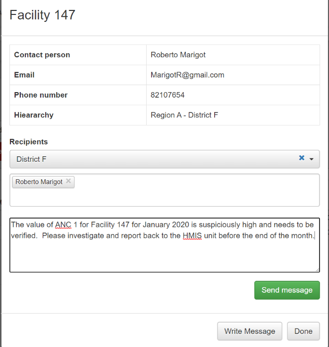
alt_text e. Consider sending a message7 to the person responsible. Click again on the menu icon and select “Contact” from the drop-down menu. A window should appear showing the Contact person for notifying of the extreme outlier. Click on “Write message”. Use the drop-down menus to fill in the information below Recipient, write a message and click on “Send message”. A message will then be sent via the DHIS2 internal messaging service.
alt_text 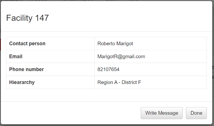
alt_text As we have seen, the dashboard of the DQ Tool is easy to use. A limitation of the dashboard, however, is that it can only be used to review those data elements/indicators for which the dashboard has been configured (see “How to configure the WHO Data Quality Tool”). Next we will learn how the Analysis function of the DQ Tool can be used to review the quality of any data element or indicator for which DHIS2 has data.
Use the “Analysis-Consistency” function
-
Review the Analysis – “Consistency” function: In addition to the Dashboard, the Tool provides a convenient way to customize your review of data quality.
-
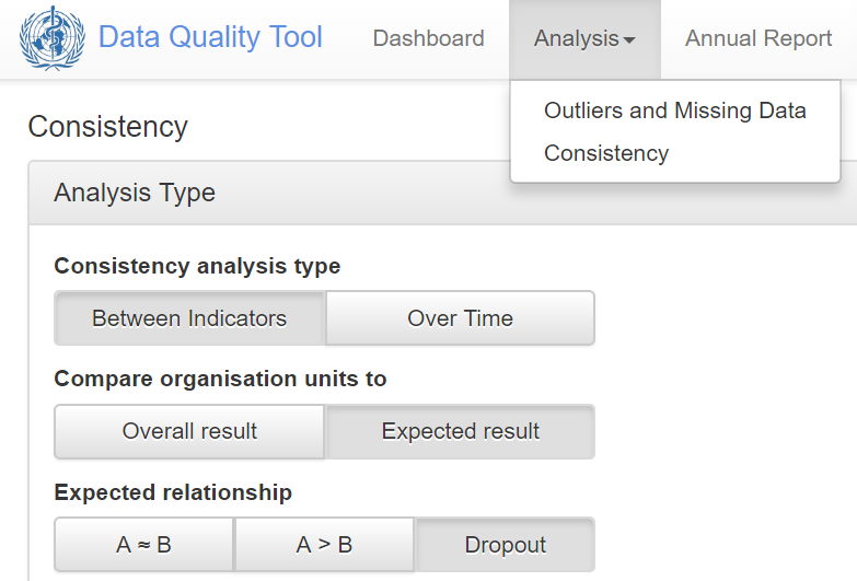
Click on the Analysis tab at the top of the page, then select Consistency.

A window appears which allows you to configure a customized assessment of consistency-over-time or consistency between related numerators. By default, consistency “Between Indicators” (between related numerators) is selected and Compare organization units to “Overall result” is selected. With this setting, A = B, A > B and Dropout cannot be selected8. Leave “Consistency analysis type” set to “Between Indicators” but click on “Expected result” and select “Dropout” (see figure).
-
Click on Data to choose your numerators. Configure the window as shown in the figure. (Note that “Indicator” is selected for both numerators. This is because, for this instance of DHIS2, data for DPT 1 is disaggregated into two separate data elements: DPT1 from fixed sites and DPT1 from outreach. To simultaneously review the data for both of these data elements, an indicator has been configured which is the sum or the two data elements. Likewise, an indicator has been configured for the sum of DPT3 from fixed sites and DPT3 from outreach.
-
Click on Period to customize the period as shown in the figure – set to last year.
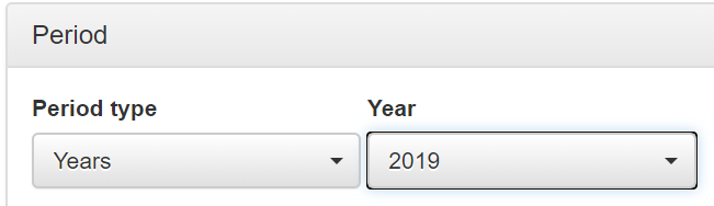
- Click on Organisation unit and set disaggregation to District.
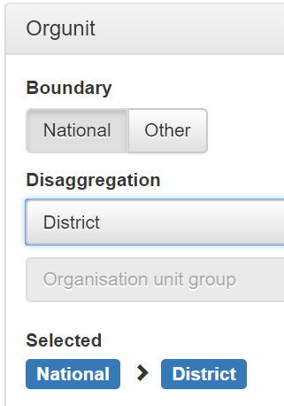
Click on the blue Analyze button in the lower right of the page and the results will appear.Note the following:
-
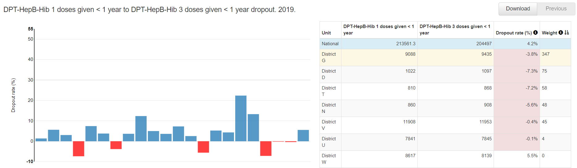
The chart on the left side of the page is similar to what we saw on the Consistency-data dashboard. There are 6 districts which had a negative DPT 1 to DPT 3 dropout rate in 2017. For details, you can move the cursor over the red bars.
-
The table on the right side of the page has a row for the entire country followed by one row for each district. The districts are sorted according to their dropout rates. The 6 districts with negative dropout rate are at the top of this list. The rows continue on two more pages but it is less important to view these other pages because the dropout rates are all positive.

alt_text -
If you click on any row, the color of the row changes to pale yellow and a one row table and another chart appear at the bottom of the page. The chart shows you the results by month. In this example, DPT 3 was greater than DPT1 during 7 of the 12 months of last year. Thus the negative dropout rate is not just the result of a single outlier – at least for 2019 for District G there was a recurrent problem.
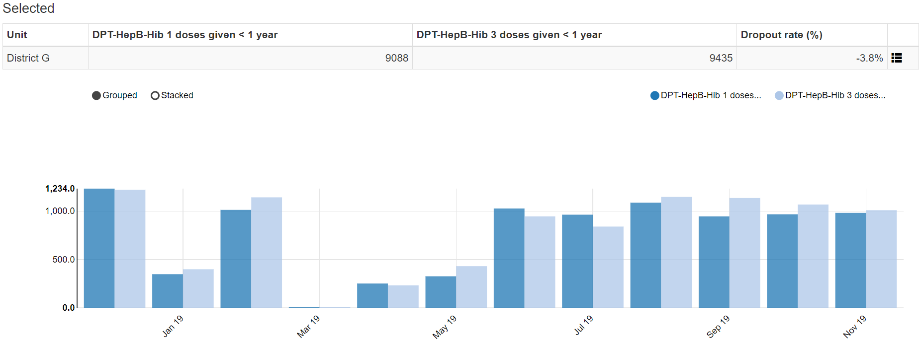
alt_text -
You can click on the menu icon at the end of this single row to “drill down” and see the results dis-aggregated to a level below. The chart shows that the negative dropout rate is not just the result of data reported by a single health facility – 11 out of 18 health facilities in district G reported more a higher DPT 3 than DPT 1 in 2018. Conclusion: District G appears to have a problem with systematic over-reporting of DPT 3. The problem affected reporting by multiple health facilities and for multiple months. This may be due to a tendency of health facilities in district G misclassifying first doses of DPT as third doses of DPT.
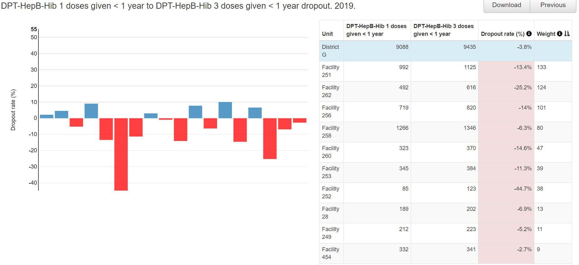
-
Use the “Analysis – Consistency” function to identify all facility values which warrant investigation
-
Set Analysis Type as shown in the figure: Consistency analysis type = “Over Time”; Compare organization units to = “Expected result”; Expected trend = “Constant”; Criteria = 0%.

- Click on Data and select a single data element or indicator. For example, select “Penta 3 doses given (HMIS)” in the data element group “HMIS”

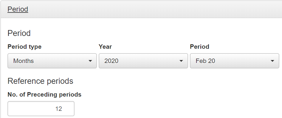
- Click on Period to customize the period as shown in the figure. With these settings, the value for February 2020 will be compared to the values for the preceding 12 months.
- Click on Orgunit, select a specific district and set disaggregation to Facility.
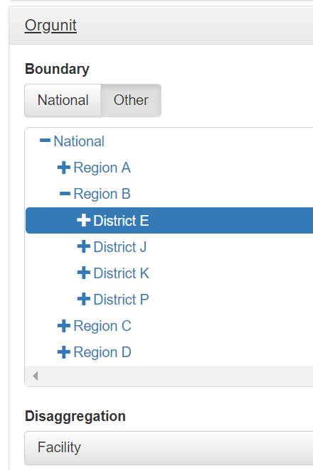
With these settings, the Penta 3 values for February 2020 for all health facilities in District E will be compared to the average values reported by these same facilities during the preceding 12 months.
- Click on “Analyze and wait for the chart to appear.
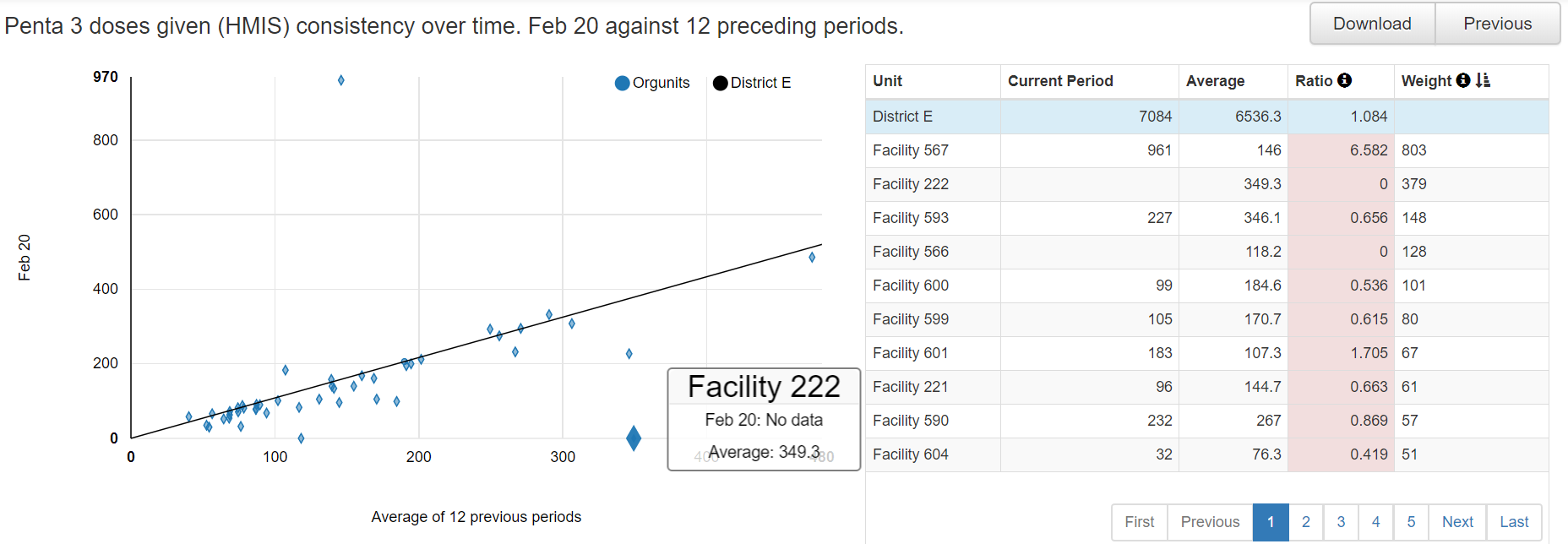
How do we interpret this chart?
- Each dot represents the data reported by one health facility in the selected district (District E);
- The chart compares the value reported in February 2020 to the average value reported by the same health facility during the preceding 12 months;
- The line represents equality. Almost none of the dots falls exactly on the line. The distance of each point from the line is given by the weight. The vast majority of dots lie so close to the line that their weight is small and we can ignore them.
- Each month, the district reports a total of 6,536 Penta 3rd doses on the HMIS form. We can use this number to determine a threshold for investigation of outliers. We could, for example, decide that we must investigate any outlier which diverges from the line by more than 5% of the district total = 325.
- Only the top two dots have a weight greater than 325. Can you spot these two dots in the chart? :
- Facility 567 reported 961 when it has previously reported an average of 146/month. Thus, this suspicious value is given a weight of 803;
- Facility 222 has failed to report any data at all when it has previously reported an average of 349/month. Thus, this missing value is given a weight of 349;
- These two values must be investigated
As a first step of our investigation we can click on each row. The selected row turns yellow and a chart appears at the bottom of the DHIS2 screen.
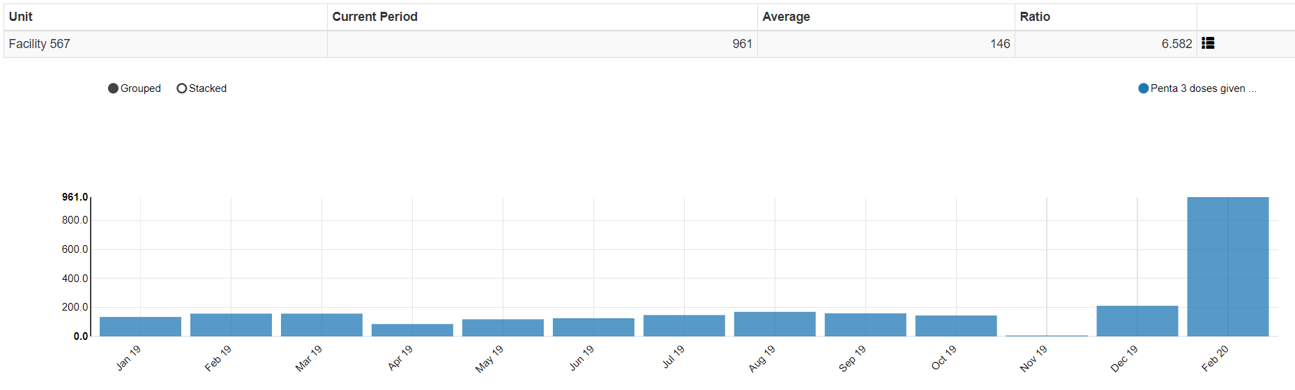
The chart shows us how different the February 2020 value for Facility 567 is from the values reported previously. This is probably due to erroneous data. How could we use DHIS2 to investigate further? What more could you do to investigate this value? ` Here is what we find when we click on the row for Facility 222.

Notice not only that the value is missing for February 2020, but there is a suspiciously high value for May of 2019. This illustrates how this analysis can not only identify extreme outliers for the month we have selected for review (February 2020) but it can sometimes identify outliers from previous months (if the outlier is so large that it increases the 12 month average by a large amount).
In summary, with this type of analysis, a district can review the most recent values from all health facilities and identify a small subset of values which require intensive investigation. The analysis needs to be carried out one data element at a time.
Use the “Analysis- Outliers and Missing Data” function
-
Review the Outliers and missing data function: Click on the Analysis tab at the top of the page, then select “Outliers and missing data”. The Analysis-Outliers function works exactly the same way as the Outliers dashboard. The advantage that it has over the dashboard is that it is much more flexible. You can configure it to assess any data element or indicator9 – not just the data elements/indicators for which the dashboard of the DQ Tool has been configured. In fact, you can configure it to simultaneously assess any combination of data elements and indicators you want. You could even choose to simultaneously assess all data elements or indicators in a data set, data element group and/or indicator group.

alt_text
You can also use it to assess data over any period.
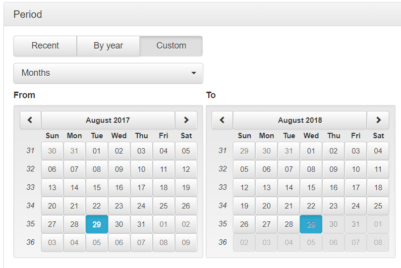
… and for any grouping of health facilities.10

Exercise 1: Use the dashboard and the analysis functions to identify suspicious values with your DHIS2
-
Review the “Consistency-time” dashboard – Click on the tab for the “Consistency-time” dashboard. Review the left and right graphs for the first data element/indicator (ANC 1).
a.Set Data to [Core], Period to April of this year, and Disaggregation to District.
b. Review the graph on the left.
Has the data element/indicator had a consistent value from year-to-year and from month-to-month. If not, how do you explain any dramatic inconsistency?
c. Quickly go to the Completeness dashboard to review the trend in Completeness of the ANC dataset over the last 12 months (the graph on the left side of the page).
To what extent is the inconsistency in the value of the data element/indicator due to a change in reporting completeness?
d. Return to the Consistency-
Time dashboard and review the graph on the right for ANC 1. This chart is a scatterplot with each dot representing one district. The position of the dot on the vertical axis shows the value of ANC 1 for one district for April of this year. The position of the dot on the horizontal axis shows the average value of ANC 1 for that district during the 11 months preceding April (i.e. May 2019 to March 2020). Move the cursor over the dots which lie above or below the two grey lines to view the suspicious values.
Question: List the districts which have values for last month which are most inconsistent with their average value for the preceding 11 months. Do you have any theory as to why the data from these districts was inconsistent over time? Could it be due to incomplete reporting for last month? Could it be due to real changes in delivery of services last month? Note that there are multiple reasons for inconsistency-in-time. Therefore inconsistency-in-time does not necessarily indicate a problem with data quality.
-
Review “Consistency-data” – Click on the tab for the “Consistency-data” dashboard. Each chart on this dashboard assesses the relationship between a pair of related data elements/indicators.
a. Review the first chart comparing ANC 1 to ANC 4:
This chart is also a scatterplot with each dot representing the values for ANC 1 and ANC 4 for one district, over the 12 months up to and including April of this year. Districts with values that fall outside of the grey threshold lines are represented with a diamond shape. Move the cursor over these dots to review the suspicious values of the related data elements/indicators.
Questions: Do you see why the Tool has flagged these related values as suspicious? List the districts which have suspicious values. Do you have any theory as to why these particular districts have suspicious values? Why would incomplete reporting NOT explain the suspicious values?
b. Review the graph assessing DPT dropout rates:
Questions: Which districts have a negative DPT 1 to DPT 3 dropout rate? Which district has a dropout rate which is the most negative? Why do you think this particular district has the most negative DPT dropout rate? Could the negative dropout rate be due to a single, large erroneous value for a single health facility for a single month? Or is the dropout rate due to multiple values from multiple health facilities and multiple months? With the “Consistency-data” dashboard we cannot really answer this question.
c. Use Analysis-Consistency to assess DPT dropout rates: Click on the Analysis tab then select “Consistency” from the drop-down menu. Under Analysis Type, click on each of the following: “Between Indicators”, “Expected result” and Dropout”.
alt_text Open the Data window then configure it as shown in the figure to the right. Note: With your DHIS2, DPT 1 < 1 year (or Penta 1 < 1 year) and DPT 3 < 1 year (or Penta 3 < 1 year) may be data elements rather than indicators.

alt_text Open the Period window and set it to year = 2019.
Open the Organisation unit window and set it to National (or the equivalent ) with disaggregation to District. Click the Analyze button.
i. Review the chart and the table (note: the top row of the table will not be shaded yellow until you complete the next step). Move the cursor over the vertical red bars in the chart to view the details. Compare the names of the districts with vertical red bars to the names of the districts in the table with Dropout rate shaded in red.
Questions: Which district has the most negative dropout rate? Find it in the chart and find it in the table. For that district, during 2019, what was the value of DPT 1 and what was the value of DPT 3 (see table)?
alt_text ii. Click on the row of the table for the district with the most negative dropout rate. A new table and chart should appear at the bottom of the page.
Question: Is the negative dropout rate due to a value for a single month or is it due to values for multiple months?
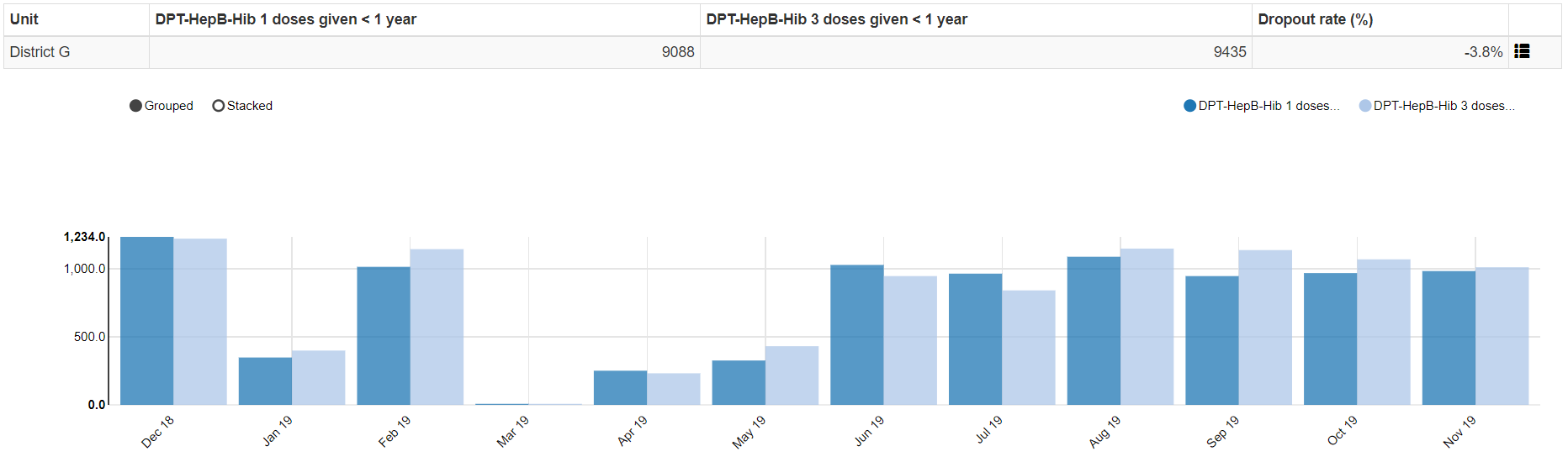
alt_text iii. Click on the menu icon at the right end of the small table and select “Drill down” (due to a bug in the Tool, the words may not all show on the screen). A new chart and table should appear showing the dropout rates for 2019 for each org sub-unit (for example, each health facility if they are immediately beneath district in the organizational hierarchy).
Questions: For the district which you have selected, is the negative dropout rate due to a value from a single facility or is it due to values from multiple facilities? Does it appear that the district you have selected has a systematic problem with over-reporting of DPT 3 – for multiple months and multiple sub-districts? How do you explain this?

alt_text -
Use the “Outliers” dashboard to Identify important outliers-- Click on the tab for the “Outliers” dashboard. Review the menu window to confirm that Disaggregation is set to District. Click on the menu icon to hide the menu window and free up space on the screen. Click on the Options button then check the box for “Include Z-score” and click on “Outliers”, “Standard Score” and “Extreme”. If the “Result” table has no rows or only 1 row, click on “Modified Z-score”.

alt_text Click on the menu icon at the end of the first row of the table and select “Visualize”. Review the graph. Question: Do you think this extreme outlier is due to an error in the data? After you have finished viewing the graph, click “Close”.
Click again on the menu icon at the end of the first row of the table and select “Drill down”. A new “Result” table should appear with 1 row for each facility in the selected district which has an extreme outlier during the 12-month period. Consider the outlier in the first row of this new table. Repeat the process of visualizing the outlier. If you want, try to drill down further. Question: Do you think this extreme outlier is due to an error in the data?
-
Use Analysis-Outliers to identify extreme outliers of additional data elements—
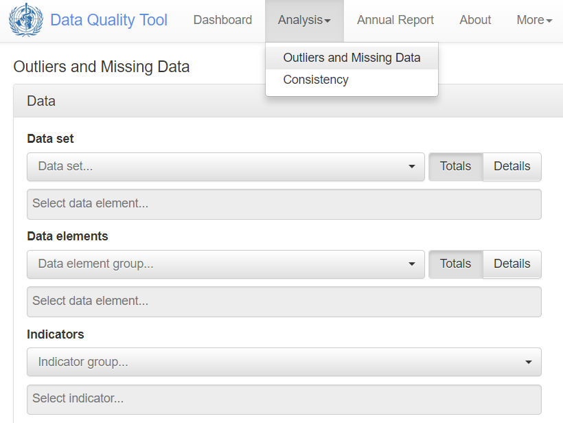
Click on the tab for Analysis, then select “Outliers and Missing Data”. Select a data element or indicator of your choice. Then set Period to 2019 and set Orgunit to national with Disaggregation by district. Click on Analyze then proceed to use the Tool to identify extreme outliers using the same steps as with the Outliers dashboard.
alt_text
Exercise 2: Discuss how to deal with very suspicious values
-
List the measures that you would take if you identified a value that was very suspicious and so large that it probably has a significant effect on a nationwide statistic.11
-
Who has authority to edit the data of your DHIS2?
-
How do you plan to use the Tool to identify extreme outliers – at district level as well as at national level -- each month or quarter as well as each year.
Use the “Annual Report” function
-
Generate the Annual Report:
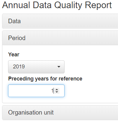
Go to the menu at the top of the DQ Tool and click on the Annual Report. Use the drop down menu to select “[Core]” under Data – Group. Under Period, select the last calendar year, then specify the number of years for which you have at least one data set with completeness greater than 50%. Ideally this would be 2 or 3 years12. Under Organization unit set Disaggregation to the equivalent of district. It is not recommended that you leave Disaggregation set to the equivalent of Region (e.g. Province), because the Annual Report will then fail to identify many important data quality problems. Click on “Generate” to view the report.
alt_text -
Quickly review the SUMMARY of the Annual Report:
The report begins with a SUMMARY section followed by a more detailed report which includes much more information. Quickly scroll through the SUMMARY and note the sub-sections devoted to Domain 1 (Completeness), Domain 2 (Internal consistency), Domain 3 (External comparisons) and Domain 4 (Consistency of population data).
-
Review the detailed report on 1a: Completeness of facility reporting:
The detailed report begins about ⅓rd of the way through the Annual Report.
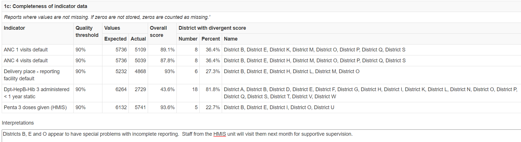
alt_text Note that table 1a shows an “Overall score” for each of the core datasets. This is the nationwide completeness of reporting for the dataset, during 2018. The column labeled “Percent” shows the percent of districts which had completeness below the threshold. The table identifies the specific districts with apparent problems with data quality.
Question: What is the threshold for ANC Reporting rate? How many and what percentage of districts had a completeness below this threshold?
-
Type something in the box for Interpretation:
Note the box where interpretations and notes on follow-up actions should be typed.
THE ANNUAL REPORT IS NOT FINALIZED UNTIL THE BOXES FOR INTERPRETATIONS AND FOLLOW-UP ACTIONS HAVE BEEN FILLED IN FOR KEY SECTIONS OF THE REPORT.
-
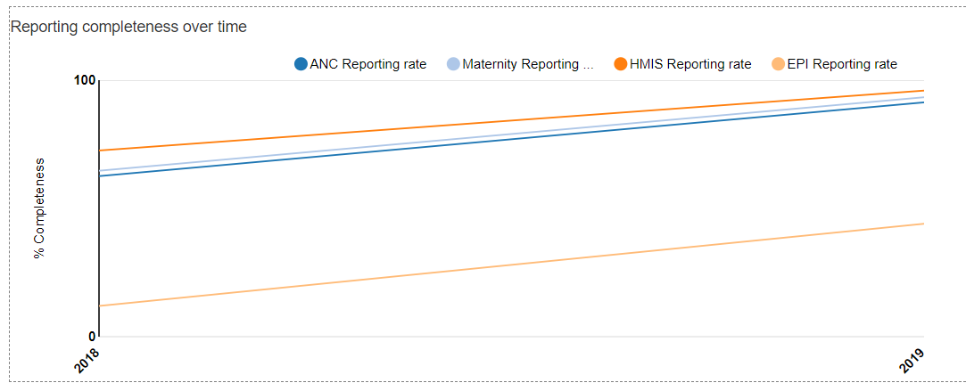
Review the graph of Reporting completeness over time: Scroll down to the graph showing “Reporting completeness over time”. For robust analysis, a dataset should be at least 75% complete. If the completeness of a dataset changes by more than 5%, then the data should be adjusted before analyzing for a year-to-year trend.
Questions: 1) For which datasets can robust analysis of 2019 data be performed? 2) To assess for trend from 2018 to 2019, should the ANC data be adjusted for a change in completeness?
alt_text -
Review table 2a: Extreme outliers:
The table shows the Threshold for an extreme outlier - A monthly value that is more than 3 SD (standard deviations) from the mean monthly value for the period being review. The table cites an “Overall score (%)”. This is the percentage of reports expected during the year (12 times the number of facilities that are expected to report) for which the value of the indicator was an extreme outlier. The “Number” is the number of districts and the “Percent” is the % of districts which, during 2019, reported an extreme outlier for the indicator.

alt_text -
Review 2d: Consistency of indicator values over time:
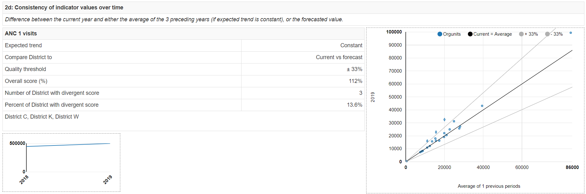
Scroll down to section 2d. This section compares, for the 5 core indicators, the total value reported in 2019 to the average annual total value for preceding years. For https://who.dhis2.net/dq , we have data that are at least 50% complete only for 2018 and 2019. So we compare the 2019 value to the 2018 value. When values of an indicator are consistent from year to year, this is reassuring. If values jump up and down erratically from year to year it can be a sign of real changes in program performance (e.g. as a result of a stock out). However, inconsistency from year to year may be a sign of a data quality problem.
Review the scatterplot showing consistency over time of ANC 1 visits:
Each dot represents the data from one district. The position of the dot on the vertical axis is the number of 1st ANC visits reported by the district in 2019. Notice from the small graph in the lower left corner that there has been a nationwide increase in reporting of ANC 1st visits (mostly due to an increase in completeness of reporting). Hence, we don’t expect the 2019 value to be equal to the 2018 value. The “Overall score” of 125% indicates that the 2019 nationwide total value of ANC 1 was 125% of the value for the preceding year. The difference between the 2018 value and the 2019 value is also reflected in the slope of the black line which represents the national relationship (e.g. when the black line crosses 60,000 on the horizontal axis, it is at roughly 67,000 on the vertical axis). The grey lines show ± 15% from the national ratio. The dots that fall outside of the grey lines have a different shape because they have suspicious values. For example, District C reported 19,988 ANC 1st visits in 2018 but the value increased to 32,522 in 2019. This increase is significantly more than the nationwide increase. This suspicious value should be investigated. Notice that District C is included in the box listing districts with “divergent scores”.

alt_text Interpret your findings-
Ask yourself whether there have been any sub-national changes in program operations (e.g. stock outs, new interventions) or reporting completeness or changes to administrative boundaries (i.e. splitting of districts) which affected the districts with divergent scores.
Consider changing the threshold for assessment of consistency over time
For some indicators, you may wish to change the threshold to identify a larger or smaller number of units with inconsistencies over time. For example, as an optional exercise, perhaps you want to focus only on the districts with the most extreme inconsistency over time. Click on “More” in the menu at the top of the DQ Tool, then “Administration” then “Numerator quality parameters” then scroll down to “Indicator parameters” and use the control arrows to raise the consistency threshold to ± 33%.
Click on the “Save changes” button. Return to the Annual Report (set up as previously – with Period set to compare to the same number of years and with district dis-aggregations), again scroll down to section 2d (about 60% of the way through the Annual Report). Note the new Quality threshold in the table on the left. Note how the grey lines of the chart are now spread further apart and more of the dots now fall between the grey lines.
Question: How many districts now have divergent scores?
alt_text Review the scatterplot showing consistency over time of DPT 3
Scroll down and find the table and chart for this indicator. Note how the dots are more scattered than for ANC 1. Ordinarily, we would not expect for DPT 3 values to be so unpredictable. However, as shown by the graph in the lower right corner, reporting of EPI data has risen dramatically. With data that are less 70% complete we should not expect consistency from year to year even in indicators such at immunizations and ANC visits which normally should be quite stable.
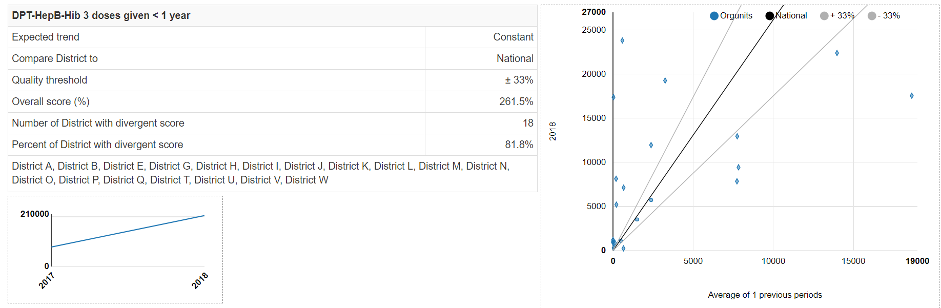
alt_text In summary, there are many reasons that data may not be consistent from year to year. However, when we find consistency-over-time, it is reassuring that the data are of better quality.
-
Review 2e: Consistency between related indicators
Scroll down to section 2e. The graphs in this section are the same as those which appear on the “Consistency-data” dashboard. The only difference is that the period is the last calendar year (i.e. 2019) rather than the last 12 months or whichever other 12-month period you selected from the dashboard menu. The Annual Report provides you with an opportunity to explain your findings and summarize your follow-up actions. For example, what will you do to supervise and support the districts which have negative DPT dropout rates?
-
Use the Tool to make external comparisons (Section 3a)
“Domain 3” of a data quality desk review involves comparison of estimates based upon routine data with estimates obtained from other sources. In particular, routine data are used to estimate coverage with maternal and infant health services: antenatal care, institutional delivery, postnatal care and immunization. These “routine estimates” of coverage can be compared with estimates obtained from surveys of representative samples of households: Demographic and Health Surveys (DHS), Multiple Indicator Cluster Survey (MICS), immunization coverage surveys and other.
Such survey estimates are sometimes considered the “gold standard” for assessing the reliability of routine data. However, it is important to keep in mind that discrepancies between routine estimates and survey estimates may be due to several factors other than problems with the reliability and completeness of routine data:
a. Other reasons that the estimate based on routine data may not be reliable: 1. The denominator (i.e. the target) may not be over-estimated or under-estimated; 2. Persons may live in one district and obtain health services in another district; 3. Person may obtain health services from private providers who do not report. For example, antenatal care and delivery services may be provided by private midwives.
b. Reasons that survey estimates may not be reliable: 1. Sampling error – too small a sample for precise estimation. Even with the largest of samples, it is seldom practical to estimate at district level. 2. Non-random sampling – this has been a problem with surveys conducted with WHO’s old EPI survey methodology 3. Non-sampling error –e.g. recall bias. This is a special problem where a home-based record is not available and immunization status is assessed based on recall of the care provider.
Review Section 3a of the Annual Report–
Note: Before the Tool can generate findings for section 3a, several steps must be completed.
These are discussed in Annexure 1:
- New DHIS2 data elements must be configured for the survey estimates and the survey estimate data must be imported. This data is typically disaggregated by region.
- The Denominators and the External comparisons pages of the Tool must be configured.
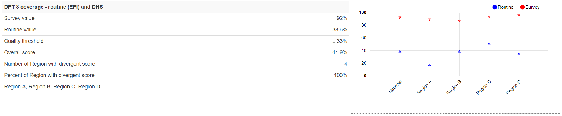
Scroll down to Section 3a to see how some coverage estimates based upon routine data compare to survey estimates. In the example, notice that the findings are now disaggregated by region rather than by district. Notice that the “Routine” estimates of coverage are each reasonably close to the “Survey” estimates. The match will seldom be this good. However, even in this example the match is not perfect. The routine estimates are consistently less than the survey estimates. The “Overall score” is 92.2%, meaning that the routine estimate at national level is 92.2% of the survey estimate at national level. Can you think of any reasons that the routine estimates would be lower? One reason is that, as we have seen, the completeness of reporting of ANC data is only about 92%. We shall see when we examine Domain 4 whether over-estimation of the denominator may be another reason.

alt_text In our example, the match is poor for the DPT 3 coverage. The reason, over course, is the low completeness of the EPI data set.
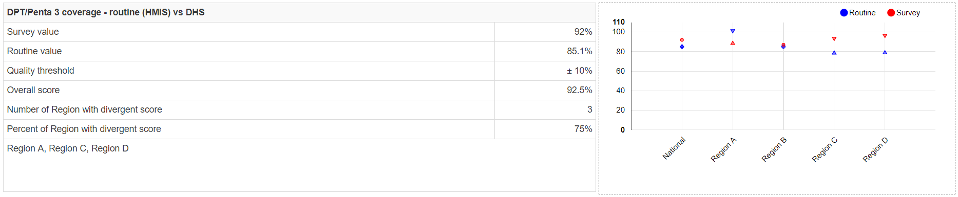
alt_text As shown by the figure below, the match is considerably better if we use as the numerator the data on Penta 3rd doses that is reported on the HMIS form rather than the data on DPT 3 that is reported on the EPI form. Again, we note some tendency for the routine estimate to be slightly lower than the survey estimate.
alt_text -
Use the Tool to assess denominators (Section 4a)–
Note: before the Tool can generate findings for section 4a, a couple of steps must be completed. Both of these steps are discussed in Annex 1:
-
A new indicator or data element must be configured for the UN estimate of live births13.
-
The denominator relations page of the Tool must be properly configured.
“Domain 4” of a data quality desk review assesses the denominators used by DHIS2. Here we discuss findings related to section 4a which compares the official estimate of the live births to the U.N. estimate of live births.

alt_text Here, with our example, we have identified one more reason why the estimates of coverage based on routine data (and based on the official estimates of pregnancies, live births or population < 1 year) are somewhat lower than the survey estimates – if we believe the U.N. estimate, the official estimate of live births may be too high. If we used the U.N. estimate as the denominator, then the routine coverage estimate would be higher.
-
Exercise 3: Use the Tool to prepare an Annual Data Quality Report
-
Generate an Annual Data Quality Review Report for 2019
a. Click on Annual Report. Set Data to Core. Set Period to 2019. Set Preceding years for reference to as many preceding years as you have a core data set that is at least 50% complete. Set Disaggregation to the equivalent of district. Click Generate.
b. Review the following sections of the detailed report. For each of these sections, in the box for Interpretations, type your interpretation and summarize your follow-up actions:
- 1a (completeness of reporting)
- Review and interpret the graph shown at the bottom of 1d (consistency of data set completeness over time
- 2a (extreme outliers)
-
2d (consistency of indicator values over time). Comment on at least the following two indicators:
i. ANC 1st visits
ii. DPT 3rd doses
-
2e (consistency between related indicators). Comment on at least the DPT 1 to DPT 3 dropout rate
Annex 1: How to configure Denominators, Denominator relations and External data comparisons
Before the Tool can generate findings for section 3a (external data comparisons) and 4a (consistency of denominator estimates) of the Annual Report the Tool must be configured properly. Configuration of Tool numerators is discussed in a separate document. This Annex explains how to configure Denominators, Denominator relations and External data comparisons.
-
New DHIS2 data elements must be configured for the survey estimates and the survey estimate data must be imported. This data is typically disaggregated by region. These data elements can be assigned to a new data element group with an appropriate name such as “External data”
-
A new data element or indicator must be configured for the UN estimate of live births.14 One approach would be to define a new indicator which calculated the live births by multiplying the official estimate of the total population times the U.N. estimate of the crude birth rate (available from https://data.worldbank.org/indicator ) divided by 1,000. This assumes that the official estimate of the total population is reliable. This new indicator can be assigned to an appropriate indicator group (either an existing group or a new one such as “Population estimates”. The other approach would be to create a new data element then for the UN estimate of live births then use the Data Entry screen to enter the value for each year. Only a single nationwide value is needed for each year – no disaggregation is required. This new data element can be assigned to the same new data element group that you created for the survey estimates.
-
Configure the denominators used by the Tool– Click on More, then Administration then Denominators.

alt_text There are no denominators set up by default. The ones you see in the example above had to be added one-at-a-time by clicking on the Add button. A window will appear for configuring the denominator (see figure to the right). Notice that a special data element group has been configured for “Population estimates”. This includes the data element “Expected pregnant women”. Data for this data element have been imported as part of the standard configuration of DHIS2 denominators. Notice that “Lowest available level” has been set to “Region”. This is because reliable DHS survey estimates are not available below the level of region. Even if you configure other outputs of the Tool to disaggregate findings by district, the external comparison findings will only be disaggregated by region.
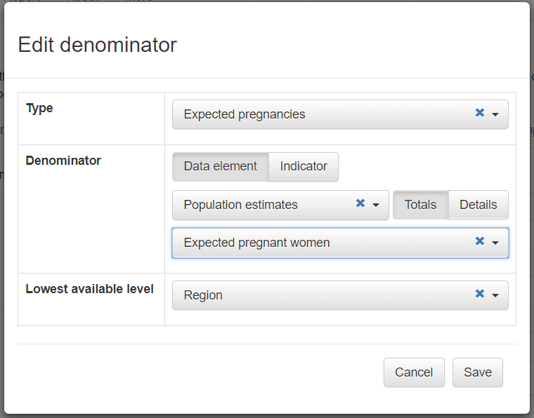
alt_text Make sure that you add to this the following denominators:
a) Expected pregnancies,
b) Live births;
c) Population < 1; and
d) the new indicator or data element that you created for the U.N. estimate of live births.
4.Configure the Tool to make external comparisons – Click on “More” then “Administration” then “External data comparison”.
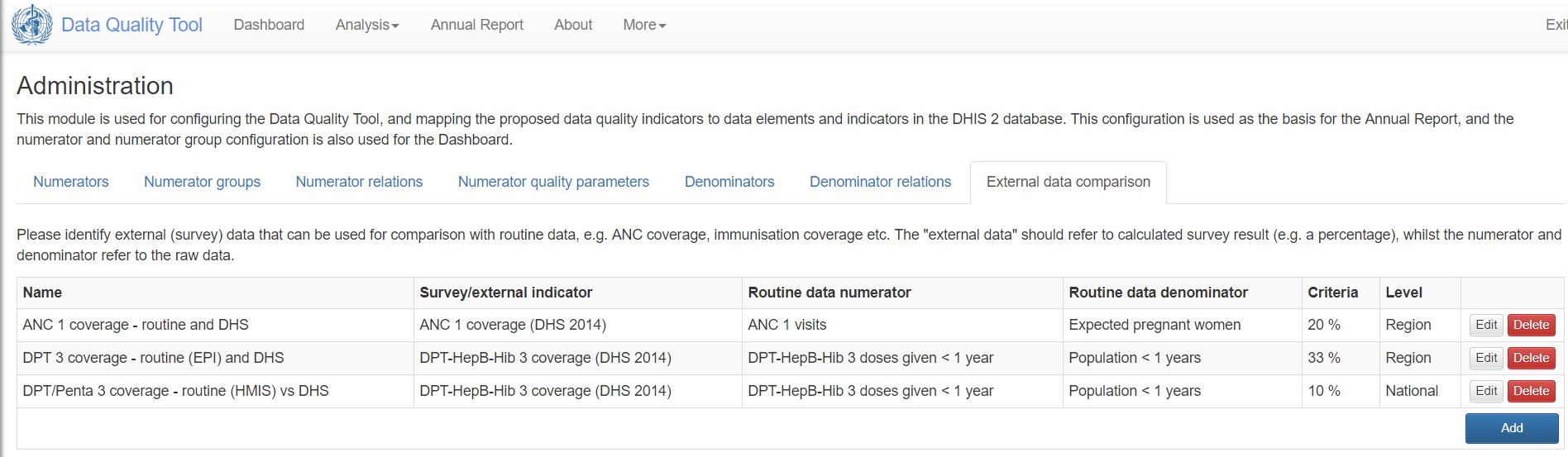
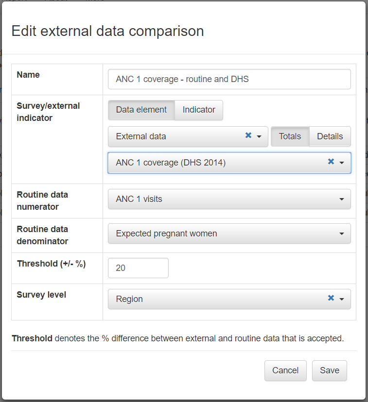
alt_text There are no default settings. The ones shown above had to be added one at a time by clicking on the Add button. A window will appear for configuring the comparison (see figure to the right). The DHS coverage estimates and the UN population estimates have been imported as part of the newly configured “External data” data set. These same data elements have also been assigned to a newly configured “External data” data element group. You see in the exmaple that this data element group has been selected, then “ANC 1 coverage (DHS 2014)” can be selected from the drop-down menu.

alt_text The “Routine data numerator” must be selected from the list of numerators that have already been configured for the Tool. The “Routine data denominator” must be selected from the list of denominators already configured for the tool. Notice that the Survey level has been set to “Region”.
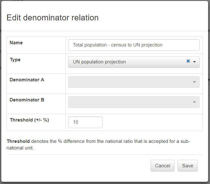
alt_text 5.Configure Denominator relations– When you click on More-Administration –Denominator relations, you should find that the table has one default row labeled “Total population – census to UN projection.

alt_text To configure this relation, click on Edit. Edit the Name to read “Live births – official to UN estimate”. Leave Type set to “UN population projection”. Click on the down arrows to the left of Denominator A and Denominator B to select from the list. The list is limited to the denominators which you configured in step 3 above. For Denominator A, choose the official estimate of live births (or the best available equivalent). For Denominator B, choose the UN estimate of live births. Save your configuration.
alt_text 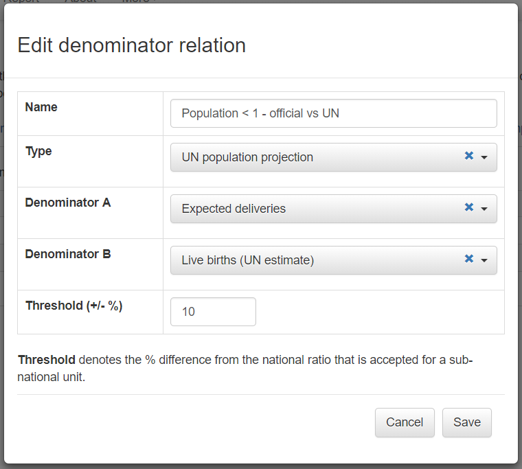
alt_text
Notes
1. Conduct further desk review.  For example, use DHIS2 to compare the suspicious value with the value for related data elements (e.g. OPV 3, DPT 1) for the same facility and same month;
2. Use DHIS2 to send a message to the person responsible for the data’
3. If you are at district level, you can inspect the paper form;
4. Telephone the person-in-charge at the health facility and ask them to check the paper form;
5. If you have authority, edit the value.
-
With the Period set this way, the screen should match the screenshots shown in this guide. ↩
-
The Outliers dashboard is usually more sensitive and more specific for identifying erroneous values. Also, as we will soon see, the Outliers dashboard permits “drilling down” to identify the specific health facility and month that was responsible for each suspicious value. The outliers tool would tell us that the suspicious rise in ANC 1 in January 2020 is an extreme outlier. We could drill down to learn that this extreme outlier is to an erroneous value reported by 1 health facility in district F. This extreme outlier is also responsible for the dot for district F that falls below the light blue line of the chart on the right above. The dot falls below the blue line because the average for value from May 2019 to March 2020 is raised by the extreme outlier for January 2020. ↩
-
For more information on how to configure the Tool, see “How to configure the WHO Data Quality Tool”. ↩
-
“DPT-HepB-Hib 3 doses given < 1 year” is reported with the EPI dataset whereas “Penta 3 doses given is reported with the HMIS dataset. ↩
-
The Z-score measures how different an outlier is compared to the “standard deviation” (variation or fluctuation) seen in the monthly values. Extreme outliers based on standard Z-scores are more than 3 standard deviations from the average value for the same health facility over the previous 12 months (i.e. Z > 3.0). ↩
-
The standard Z-score method relies on the mean and standard deviation of values over the previous 12 months. This is problematic, because the mean and standard deviation are highly affected by outliers. Another drawback of the standard Z-score method is that it behaves strangely when there are values for only a few months – in fact, the standard Z-score method will almost never detect an outlier if values are missing for several months. The modified Z-score method does not suffer from these limitations. It uses the median (half of values are above the median and half of values are below the median) as a substitute for the mean and it uses the median absolute deviation (median difference between each value and the sample median) as a substitute for the standard deviation. As a result, the modified Z-scores are not as affected by one or two extreme outliers. The few extreme values therefore stand out better and have higher modified Z scores. The Tool classifies an outlier as extreme if it has a modified Z-score greater than 5. ↩
-
[Guidance is to be developed on how to configure DHIS2 messaging] ↩
-
Leave “Compare organization units” set to “Overall result” in order to assess a ratio such as ANC1/IPT1. This is equivalent to setting numerator relations on the DQ Tool dashboard to “Equal across orgunits”. With this setting, the slope of the reference line will show the ratio of the indicators at national level and this slope will be roughly equal to the slope of the dots representing the ratio for each individual district or region. Hence, “equal across orgunits” means that the slope at national level is equal to the average slope at sub-national level. ↩
-
It is simpler if the data element is part of a data element group or the indicator is part of an indicator group. However, as an alternative, you can also select one or more data elements from any data set. ↩
-
To select “Organization unit group” (e.g. to select “Hospitals”), you must first delete any default selection for “Organization unit level” ↩
-
Note to the facilitator – some possible steps to take: ↩
-
Unfortunately, with https://who.-demos.dhis2.org/dq , the reporting rates of all data sets are below 50% prior to 2017. Data from years with such incomplete reporting should not be used to assess year-to-year consistency. ↩
-
Annex 1 discusses why estimates of live births are more important to compare than estimates of the total population. ↩
-
Note to the editors: With the current version of the Tool, section 4a is entitled “Consistency with UN population projection – Ratio of population projection from the Bureau of Statistics to a UN projection”. This wording is hard coded into the Tool, so it cannot be re-configured. This wording suggests that 4a is comparing the official estimate of total population to the UN estimate of total population. This differs from the Excel-based version of the DQR tool which compares the official estimate of live births to the UN estimate of live births. Estimates of live births are more useful to compare for several reasons: a) Estimates of live births are more likely to differ due to the challenge of estimating the crude birth rate; b) Estimated live births (and the closely related estimates of pregnancies and population < 1) are the denominators used for calculating coverage with maternal and infant services. As such coverage may approach 100%, it is essential to estimate these denominators with considerable precision. This issue has been discussed with the developers of the DHIS2-based Tool, who plan to modify accordingly the title of section 4a. ↩