DHIS2 Documentation Team
Copyright © 2008-2023 DHIS2 Team
source.revision.date: 2026-06-15
Warranty: THIS DOCUMENT IS PROVIDED BY THE AUTHORS ‘’AS IS’’ AND ANY EXPRESS OR IMPLIED WARRANTIES, INCLUDING, BUT NOT LIMITED TO, THE IMPLIED WARRANTIES OF MERCHANTABILITY AND FITNESS FOR A PARTICULAR PURPOSE ARE DISCLAIMED. IN NO EVENT SHALL THE AUTHORS OR CONTRIBUTORS BE LIABLE FOR ANY DIRECT, INDIRECT, INCIDENTAL, SPECIAL, EXEMPLARY, OR CONSEQUENTIAL DAMAGES (INCLUDING, BUT NOT LIMITED TO, PROCUREMENT OF SUBSTITUTE GOODS OR SERVICES; LOSS OF USE, DATA, OR PROFITS; OR BUSINESS INTERRUPTION) HOWEVER CAUSED AND ON ANY THEORY OF LIABILITY, WHETHER IN CONTRACT, STRICT LIABILITY, OR TORT (INCLUDING NEGLIGENCE OR OTHERWISE) ARISING IN ANY WAY OUT OF THE USE OF THIS MANUAL AND PRODUCTS MENTIONED HEREIN, EVEN IF ADVISED OF THE POSSIBILITY OF SUCH DAMAGE.
License: Permission is granted to copy, distribute and/or modify this document under the terms of the GNU Free Documentation License, Version 1.3 or any later version published by the Free Software Foundation; with no Invariant Sections, no Front-Cover Texts, and no Back-Cover Texts. A copy of the license is included in the source of this documentation, and is available here online: http://www.gnu.org/licenses/fdl.html
After reading this chapter you will be able to understand:
What is DHIS2 and what purpose it serves with respect to health information systems (HIS)?
What are the major technological considerations when it comes to deploying DHIS2, and what are the options for extending DHIS2 with new modules?
What is the difference between patient based and aggregate data?
What are some of the benefits and challenges with using Free and Open Source Software (FOSS) for HIS?
DHIS2 is a tool for collection, validation, analysis, and presentation of aggregate and patient-based statistical data, tailored (but not limited) to integrated health information management activities. It is a generic tool rather than a pre-configured database application, with an open meta-data model and a flexible user interface that allows the user to design the contents of a specific information system without the need for programming. DHIS2 is a modular web-based software package built with free and open source Java frameworks.
DHIS2 is open source software released under the BSD license and can be obtained at no cost. It runs on any platform with a Java Runtime Environment (JRE 7 or higher) installed.
DHIS2 is developed by the Health Information Systems Programme (HISP) as an open and globally distributed process with developers currently in India, Vietnam, Tanzania, Ireland, and Norway. The development is coordinated by the University of Oslo with support from NORAD and other donors.
The DHIS2 software is used in more than 40 countries in Africa, Asia, and Latin America, and countries that have adopted DHIS2 as their nation-wide HIS software include Kenya, Tanzania, Uganda, Rwanda, Ghana, Liberia, and Bangladesh. A rapidly increasing number of countries and organisations are starting up new deployments.
The documentation provided herewith, will attempt to provide a comprehensive overview of the application. Given the abstract nature of the application, this manual will not serve as a complete step-by-step guide of how to use the application in each and every circumstance, but rather will seek to provide illustrations and examples of how DHIS2 can be implemented in a variety of situations through generalized examples.
Before implementing DHIS2 in a new setting, we highly recommend reading the DHIS2 Implementation Guide (a separate manual from this one), also available at the main DHIS2 website.
The key features and purpose of DHIS2 can be summarised as follows:
Provide a comprehensive data management solution based on data warehousing principles and a modular structure which can easily be customised to the different requirements of a management information system, supporting analysis at different levels of the organisational hierarchy.
Customisation and local adaptation through the user interface. No programming required to start using DHIS2 in a new setting (country, region, district etc.).
Provide data entry tools which can either be in the form of standard lists or tables, or can be customised to replicate paper forms.
Provide different kinds of tools for data validation and improvement of data quality.
Provide easy to use - one-click reports with charts and tables for selected indicators or summary reports using the design of the data collection tools. Allow for integration with popular external report design tools (e.g. JasperReports) to add more custom or advanced reports.
Flexible and dynamic (on-the-fly) data analysis in the analytics modules (i.e. GIS, PivotTables,Data Visualizer, Event reports, etc).
A user-specific dashboard for quick access to the relevant monitoring and evaluation tools including indicator charts and links to favourite reports, maps and other key resources in the system.
Easy to use user-interfaces for metadata management e.g. for adding/editing datasets or health facilities. No programming needed to set up the system in a new setting.
Functionality to design and modify calculated indicator formulas.
User management module for passwords, security, and fine-grained access control (user roles).
Messages can be sent to system users for feedback and notifications. Messages can also be delivered to email and SMS.
Users can share and discuss their data in charts and reports using Interpretations, enabling an active information-driven user community.
Functionalities of export-import of data and metadata, supporting synchronisation of offline installations as well as interoperability with other applications.
Using the DHIS2 Web-API , allow for integration with external software and extension of the core platform through the use of custom apps.
Further modules can be developed and integrated as per user needs, either as part of the DHIS2 portal user interface or a more loosely-coupled external application interacting through the DHIS2 Web-API.
In summary, DHIS2 provides a comprehensive HIS solution for the reporting and analysis needs of health information users at any level.
The wider context of HIS can be comprehensively described through the information cycle presented in Figure 1.1 below. The information cycle pictorially depicts the different components, stages and processes through which the data is collected, checked for quality, processed, analysed and used.

DHIS2 supports the different facets of the information cycle including:
Collecting data.
Running quality checks.
Data access at multiple levels.
Reporting.
Making graphs and maps and other forms of analysis.
Enabling comparison across time (for example, previous months) and space (for example, across facilities and districts).
See trends (displaying data in time series to see their min and max levels).
As a first step, DHIS2 serves as a data collection, recording and compilation tool, and all data (be it in numbers or text form) can be entered into it. Data entry can be done in lists of data elements or in customised user defined forms which can be developed to mimic paper based forms in order to ease the process of data entry.
As a next step, DHIS2 can be used to increase data quality. First, at the point of data entry, a check can be made to see if data falls within acceptable range levels of minimum and maximum values for any particular data element. Such checking, for example, can help to identify typing errors at the time of data entry. Further, user can define various validation rules, and DHIS2 can run the data through the validation rules to identify violations. These types of checks help to ensure that data entered into the system is of good quality from the start, and can be improved by the people who are most familiar with it.
When data has been entered and verified, DHIS2 can help to make different kinds of reports. The first kind are the routine reports that can be predefined, so that all those reports that need to be routine generated can be done on a click of a button. Further, DHIS2 can help in the generation of analytical reports through comparisons of for example indicators across facilities or over time. Graphs, maps, reports and health profiles are among the outputs that DHIS2 can produce, and these should routinely be produced, analysed, and acted upon by health managers.
DHIS2 can be perceived as a platform on several levels. First, the application database is designed ground-up with flexibility in mind. Data structures such as data elements, organisation units, forms and user roles can be defined completely freely through the application user interface. This makes it possible for the system to be adapted to a multitude of locale contexts and use-cases. We have seen that DHIS2 supports most major requirements for routine data capture and analysis emerging in country implementations. It also makes it possible for DHIS2 to serve as management system for domains such as logistics, labs and finance.
Second, due to the modular design of DHIS2 it can be extended with additional software modules or through custom apps. These software modules/apps can live side by side with the core modules of DHIS2 and can be integrated into the DHIS2 portal and menu system. This is a powerful feature as it makes it possible to extend the system with extra functionality when needed, typically for country specific requirements as earlier pointed out.
The downside of the software module extensibility is that it puts several constraints on the development process. The developers creating the extra functionality are limited to the DHIS2 technology in terms of programming language and software frameworks, in addition to the constraints put on the design of modules by the DHIS2 portal solution. Also, these modules must be included in the DHIS2 software when the software is built and deployed on the web server, not dynamically during run-time.
In order to overcome these limitations and achieve a looser coupling between the DHIS2 service layer and additional software artefacts, a REST-based API has been developed as part of DHIS2. This Web API complies with the rules of the REST architectural style. This implies that:
The Web API provides a navigable and machine-readable interface to the complete DHIS2 data model. For instance, one can access the full list of data elements, then navigate using the provided URL to a particular data element of interest, then navigate using the provided URL to the list of data sets which the data element is a member of.
(Meta) Data is accessed through a uniform interface (URLs) using plain HTTP requests. There are no fancy transport formats or protocols involved - just the well-tested, well-understood HTTP protocol which is the main building block of the Web today. This implies that third-party developers can develop software using the DHIS2 data model and data without knowing the DHIS2 specific technology or complying with the DHIS2 design constraints.
All data including meta-data, reports, maps and charts, known as resources in REST terminology, can be retrieved in most of the popular representation formats of the Web of today, such as XML, JSON, PDF and PNG. These formats are widely supported in applications and programming languages and gives third-party developers a wide range of implementation options.
All computers have an Operating System (OS) to manage it and the programs running it. The operating system serves as the middle layer between the software application, such as DHIS2, and the hardware, such as the CPU and RAM. DHIS2 runs on the Java Virtual Machine, and can therefore run on any operating system which supports Java. Platform independence implies that the software application can run on ANY OS - Windows, Linux, Macintosh etc. DHIS2 is platform independent and thus can be used in many different contexts depending on the exact requirements of the operating system to be used.
Additionally, and perhaps most importantly, since DHIS2 is a browser-based application, the only real requirement to interact with the system is with a web browser. DHIS2 supports most web browsers, although currently either Google Chrome, Mozilla Firefox or Opera are recommended.
Hosting DHIS2 on a national scale is a considerable undertaking which requires planning, provisioning, monitoring and management of potentially complex hardware and/or cloud resources. For a full discussion of the various tradeoffs of different approaches see the server hosting section of the DHIS2 implementation guide.
Patient data is data relating to a single patient, such as his/her diagnosis, name, age, earlier medical history etc. This data is typically based on a single patient-health care worker interaction. For instance, when a patient visits a health care clinic, a variety of details may be recorded, such as the patient's temperature, their weight, and various blood tests. Should this patient be diagnosed as having "Vitamin B 12 deficiency anaemia, unspecified" corresponding to ICD-10 code D51.9, this particular interaction might eventually get recorded as an instance of "Anaemia" in an aggregate based system. Patient based data is important when you want to track longitudinally the progress of a patient over time. For example, if we want to track how a patient is adhering to and responding to the process of TB treatment (typically taking place over 6-9 months), we would need patient based data.
Aggregated data is the consolidation of data relating to multiple patients, and therefore cannot be traced back to a specific patient. They are merely counts, such as incidences of Malaria, TB, or other diseases. Typically, the routine data that a health facility deals with is this kind of aggregated statistics, and is used for the generation of routine reports and indicators, and most importantly, strategic planning within the health system. Aggregate data cannot provide the type of detailed information which patient level data can, but is crucial for planning and guidance of the performance of health systems.
In between the two you have case-based data, or anonymous "patient" data. A lot of details can be collected about a specific health event without necessarily having to identify the patient it involved. Inpatient or outpatient visits, a new case of cholera, a maternal death etc. are common use-cases where one would like to collect a lot more detail that just adding to the total count of cases, or visits. This data is often collected in line-listing type of forms, or in more detailed audit forms. It is different from aggregate data in the sense that it contains many details about a specific event, whereas the aggregate data would count how many events of a certain type, e.g. how many outpatient visits with principal diagnosis "Malaria", or how many maternal deaths where the deceased did not attend ANC, or how many cholera outbreaks for children under 5 years. In DHIS2 this data is collected through programs of the type single event without registration.
Patient data is highly confidential and therefore must be protected so that no one other than doctors can get it. When in paper, it must be properly stored in a secure place. For computers, patient data needs secure systems with passwords, restrained access and audit logs.
Security concerns for aggregated data are not as crucial as for patient data, as it is usually impossible to identify a particular person to a aggregate statistic . However, data can still be misused and misinterpreted by others, and should not be distributed without adequate data dissemination policies in place.
Software carries the instructions that tell a computer how to operate. The human authored and human readable form of those instructions is called source code. Before the computer can actually execute the instructions, the source code must be translated into a machine readable (binary) format, called the object code. All distributed software includes the object code, but FOSS makes the source code available as well.
Proprietary software owners license their copyrighted object code to a user, which allows the user to run the program. FOSS programs, on the other hand, license both the object and the source code, permitting the user to run, modify and possibly redistribute the programs. With access to the source code, the users have the freedom to run the program for any purpose, redistribute, probe, adapt, learn from, customise the software to suit their needs, and release improvements to the public for the good of the community. Hence, some FOSS is also known as free software, where “free” refers, first and foremost, to the above freedoms rather than in the monetary sense of the word.
Within the public health sector, FOSS can potentially have a range of benefits, including:
Lower costs as it does not involve paying for prohibitive license costs.
Given the information needs for the health sector are constantly changing and evolving, there is a need for the user to have the freedom to make the changes as per the user requirements. This is often limited in proprietary systems.
Access to source code to enable integration and interoperability. In the health sector interoperability between different software applications is becoming increasingly important, meaning enabling two or more systems to communicate metadata and data. This work is a lot easier, and sometimes dependent on the source code being available to the developers that create the integration. This availability is often not possible in the case of proprietary software. And when it is, it comes at a high cost and contractual obligations.
FOSS applications like DHIS2 typically are supported by a global network of developers, and thus have access to cutting edge research and development knowledge.
The Data Entry app is where you manually enter aggregated data in DHIS2. You register data for an organisation unit, a period, and a set of data elements (data set) at a time. A data set often corresponds to a paper-based data collection tool. You configure the data sets in the Maintenance app.
Note
If a data set has both a section form and a custom form, the system displays the custom form during data entry. Users who enter data can't select which form they want to use. In web-based data entry the order of display preference is:
Custom form (if it exists)
Section form (if it exists)
Default form
Mobile devices do not support custom forms. In mobile-based data entry the order of display preference is:
Section form (if it exists)
Default form
When you close an organisation unit, you can't register or edit data to this organisation unit in the Data Entry app.

Open the Data Entry app.
In the organisation unit tree to the left, select an organisation unit.
Select a Data set.
Select a Period.
The available periods are controlled by the period type of the data set (reporting frequency). You can jump a year back or forward by clicking Prev year or Next year.
Note
Depending on how you've configured the data entry form, you might have to enter additional information before you can open the date entry form. This can for example be a project derived from a category combination.
Enter data in the data entry form.
A green field means that the system has saved the value.
A grey field means that the field is disabled and you can't enter a value. The cursor will automatically jump to the next open field.
To move to the next field, press the Tab key or the Down Arrow key.
To move back to the previous field, press Shift+Tab or the Up Arrow key.
If you type in an invalid value, for example a character in a field that only accepts numeric values, you'll get a pop-up that explains the problem and the field will be coloured yellow (not saved) until you have corrected the value.
If you have defined a minimum maximum value range for the field and you enter a value that is outside this range, you'll get a pop-up message that says the value is out of range. The value remains unsaved until you've changed the value or updated the value range and then re-entered the value.
When you've filled in the form, click Run validation in the top right corner or below the data entry form.
All validation rules which involves data elements in the current data entry form (data set) are then run against the new data. If there are no violations of the validation rules, you'll see a message saying The data entry screen successfully passed validation. If there are validation violations, they will be presented in a list.
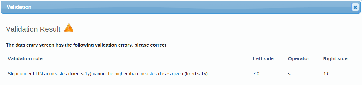
(Optional) Correct validation violations.
Note
Zero (0) will delete the value if the data element has been configured to not store zeros.
When you've corrected errors and you're done with data entry, click Complete.
The system uses this information when generating completeness reports for district, county, province or the national level.

If you for example have a suspicious value that you need to investigate further, you can keep it the system, but mark it for follow-up. In the Data Quality app you can then run a follow-up analysis to view and correct all marked values.
Open the Data Entry app.
Open an existing data entry form.
Double-click the field with the value you want to mark for follow-up.
Click the star icon.
Open the Data Entry app.
Open an existing data entry form.
Click Incomplete.
Change the relevant data values.
Note
Zero (0) will delete the value if the data element has been configured to not store zeros,
Click Complete.
You can display the last 12 values registered for a field.
Open the Data Entry app.
Open an existing data entry form.
Double-click the field with the value you want to view the history for.
Click Data element history.
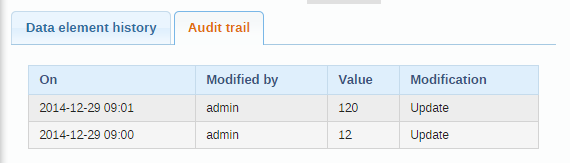
The audit trail allows you to view other data values which have been entered prior to the current value. The audit trail also shows when the data value was altered and which user who made the changes.
Open the Data Entry app.
Open an existing data entry form.
Double-click the field with the value you want to view the audit trail for.
Click Audit trail.

In the Data Entry app, open a data entry form.
Double-click the field for which you want to set the minimum maximum value range.
Enter Min limit and Max limit.
Click Save.
If values don't fall within the new value range the next time you enter data, the data entry cell will appear with an orange background.
(Optional) Type a comment to explain the reason for the discrepancy, for example an event at a facility which may have generated a large number of clients.
(Optional) Click Save comment.
Tip
Click the star icon to mark the value for further follow-up.
The Data Entry app works even if you don't have a stable Internet connection during data entry. When you don't have an internet connection, the data you enter is saved to your local computer. When the Internet connection is back, the app will push the data to the server. The total bandwidth usage is reduced since data entry forms no longer are retrieved from the server for each rendering.
Note
To use this functionality, you must login to the server while you've an Internet connection.
When you're connected to the Internet, the app displays this message at the top of the data entry form:

If your Internet connection breaks during data entry, the app detects it and displays this message:

Now your data will be stored locally. You can continue to enter data as normal.
Once you have entered all necessary data and the app detects that the Internet connection is back, you'll see this message:

Click Upload to synchronize data with the server.
When the data has successfully synchronized with the server, you'll see this confirmation message:


It can be useful to enter data for multiple organisation units in the same data entry form, for instance if there are few data elements in the form and a huge number of organisation units in the hierarchy. In that case, you can enable multi-organisation unit data entry.
Note
Multi-organisation unit data entry only works for section forms.
Open the System Settings app.
Select Enable multi-organisation unit forms.
In the Data Entry app, select the organisation unit immediately above the organisation unit you want to enter data for in the organisation unit hierarchy.
Data elements will appear as columns and organisation units as rows in the form.
Note
The data entry forms should still be assigned to the facilities that you actually enter data for, that is the organisation units now appearing in the form.
In the Capture app you register events that occurred at a particular time and place. An event can happen at any given point in time. This stands in contrast to routine data, which is captured for predefined, regular intervals. Events are sometimes called cases or records. In DHIS2, events are linked to a program. The Capture app lets you select the organisation unit and program and specify a date when an event happened, before entering information for the event. Some events are linked to a tracked entity instance, for example a person, allowing longitudinal follow-up.
Open the Capture app.
Select an organisation unit.
Select an event program.
You will only see programs associated with the selected organisation unit and programs you have access to, and that are shared with your user group through data level sharing.
If the program has a category combination set the category option will have to be selected.
Click Create new event.

Fill in the required information. If the programs program stage is configured to capture a location:
If the field is a coordinate field you can either enter the coordinates directly or you can click the map icon to the left of the coordinate field. The latter one will open a map where you can search for a location or set on directly by clicking on the map.
If the field is a polygon field you can click the map icon to the left of the field. This will open a map where you can search for a location and capture a polygon (button in the upper right corner of the map).
If desired, you can add a note by clicking the Write note button at the bottom of the form. Be aware that Event notes are attributed to a user and cannot be deleted.
If desired you can add a relationship by clicking the Add relationship button at the bottom of the form. See the section about Adding a relationship for more information.
Click Save and exit or click the arrow next to the button to select Save and add another.
Note
Some data elements in an event might be mandatory (marked with a red star next to the data element label). All mandatory data elements must be filled in before the user is allowed to complete the event. The exception to this is if the user has the authority called "Ignore validation of required fields in Tracker and Event Capture". If the user has this authority, the mandatory data elements will not be required and the red star will not be displayed next to the data element label. Note that super user that have the "ALL" authority automatically have this authority.
Tip
The data entry form can also be displayed in row view. In this mode the data elements are arranged horizontally. This can be achieved by clicking the Switch to row view button on the top right of the data entry form. If you are currently in row view you can switch to the default form view by clicking the Switch to form view button on the top right of the data entry form.
There are two different ways one can register a tracked entity instance under an organisation unit. The first way, is to register a tracked entity instance without enrolling it to a tracker program. The second option, is to register a tracked entity instance with program and enroll it.
Open the Capture app.
Select an organisation unit.
Click Create new.

You'll now be navigated to the registration page. In that page you will see a drop down menu similar to the one in the image below. From the dropdown menu you can select a tracked entity type, eg. Building, Person etc.

Select the tracked entity type which you want to create a new instance for.

The moment you select a tracked entity type, a form will be shown on the screen.
The "Profile" section will be shown. In this section you can add data relevant to the tracked entity instance. The profile section mainly contains all the tracked entity attributes linked to the tracked entity type.

Fill in the required information.
If the tracked entity type is configured to capture a location:
If the field is a coordinate field you can either enter the coordinates directly or you can click the map icon to the left of the coordinate field. The latter one will open a map where you can search for a location or set on directly by clicking on the map.
If the field is a polygon field you can click the map icon to the left of the field. This will open a map where you can search for a location and capture a polygon (button in the upper right corner of the map).
Click the Save person button to register the tracked entity instance.
You will now be prompted to the tracked entity instance dashboard.
The dashboard will show relevant information about the newly created tracked entity instance.
Open the Capture app.
Select an organisation unit.
Select a tracker program of your choice.
Click Create new person. Note that the label of this button corresponds to the tracked entity type of the program, which could vary, such as "Building," "Person," etc.

Now, you will be able to see a form similar to the image below.
The enrollment form has different layouts depending on how the program is customized. The top section has the title "Enrollment", and it holds all the relevant information about the enrollment details. This section will always be present, regardless of layout. Underneath, the different data input fields relevant to the tracked entity instance will be displayed. These fields will either be displayed within sections or as a completely custom form. The sections, or custom form, mainly contains all the tracked entity attributes linked to the program or tracked entity type.

Fill in the required information for the enrollment. If the tracked entity type is configured to capture a location:
If the field is a coordinate field you can either enter the coordinates directly or you can click the map icon to the left of the coordinate field. The latter one will open a map where you can search for a location or set on directly by clicking on the map.
If the field is a polygon field you can click the map icon to the left of the field. This will open a map where you can search for a location and capture a polygon (button in the upper right corner of the map).
Click Save person to register the tracked entity instance. The Save button shows a loading spinner and the Cancel button is disabled while the request is processing.
You will now be prompted to the tracked entity instance dashboard.
The dashboard will show relevant information about the newly created tracked entity instance.
Note
Some data elements in an event might be mandatory (marked with a red star next to the data element label). All mandatory data elements must be filled in before the user is allowed to complete the event. The exception to this is if the user has the authority called "Ignore validation of required fields in Tracker and Event Capture". If the user has this authority, the mandatory data elements will not be required and the red star will not be displayed next to the data element label. Note that super user that have the "ALL" authority automatically have this authority.
Tip
The data entry form can also be displayed in row view. In this mode the data elements are arranged horizontally. This can be achieved by clicking the Switch to row view button on the top right of the data entry form. If you are currently in row view you can switch to the default form view by clicking the Switch to form view button on the top right of the data entry form.
Events can automatically be created when enrolling in a program.
To automatically generate events, you can do the necessary configuration in the maintenance app. 1. Open the maintenance app
Select the Program tab 
Select a Tracker program 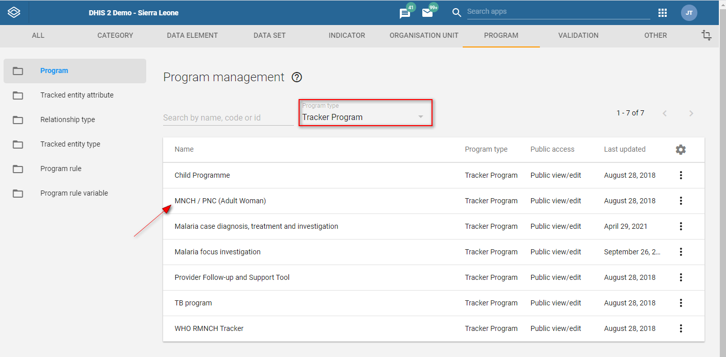
Select the Program stages tab 
Click on the program stage you would like to generate an event for 
Select "Auto-generate event" 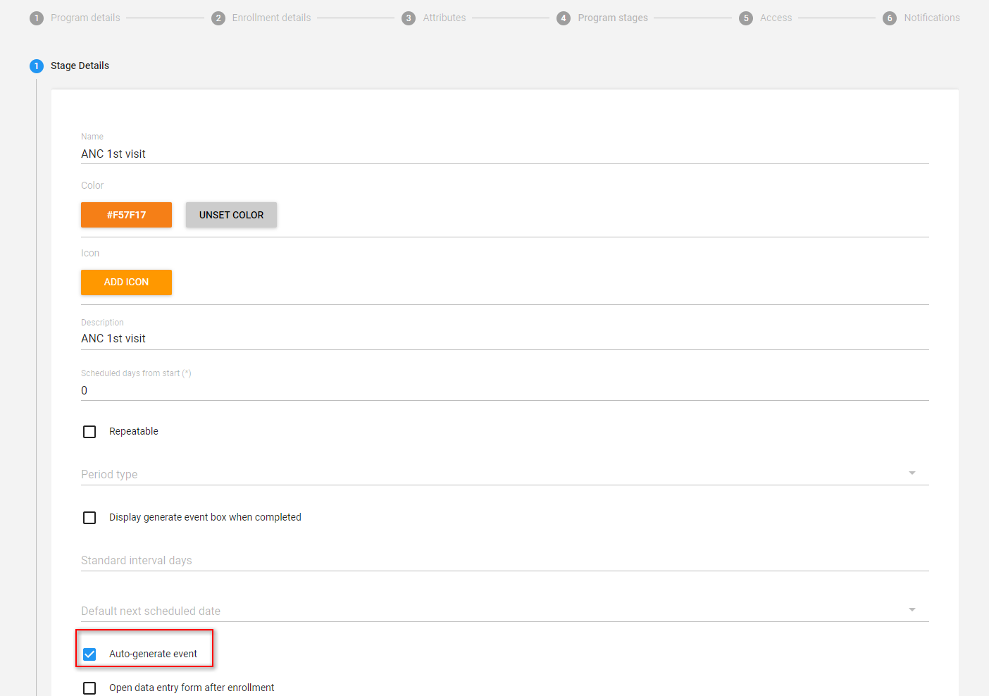
You can set multiple program stages within a program to be auto-generating (this will create an event for each program stage configured this way)
A program can be configured to automatically take the user to register a new event immediately after enrolling a tracked entity instance. To enable this behavior, the program must have at least one program stage with the "Open data entry form after registration" option checked. If more than one program stage has this option enabled, the first stage will be used.
To configure it, you must follow the steps described in the Enrollment with auto generated events section and then check the option "Open data entry form after enrollment".
For tracker programs enable the "First stage appears on registration page" flag in the Maintenance. The enrollment registration page will now display the first program stage the user has access to.

If the stage has the "Open data entry form after enrollment" selected, then the event will be generated into the ACTIVE status. Also its execution date will be calculated for the event, in addition to a due date. The generation happens based on either the enrollment date or the incident date. You can choose the reporting date from the dropdown menu "Report date to use". 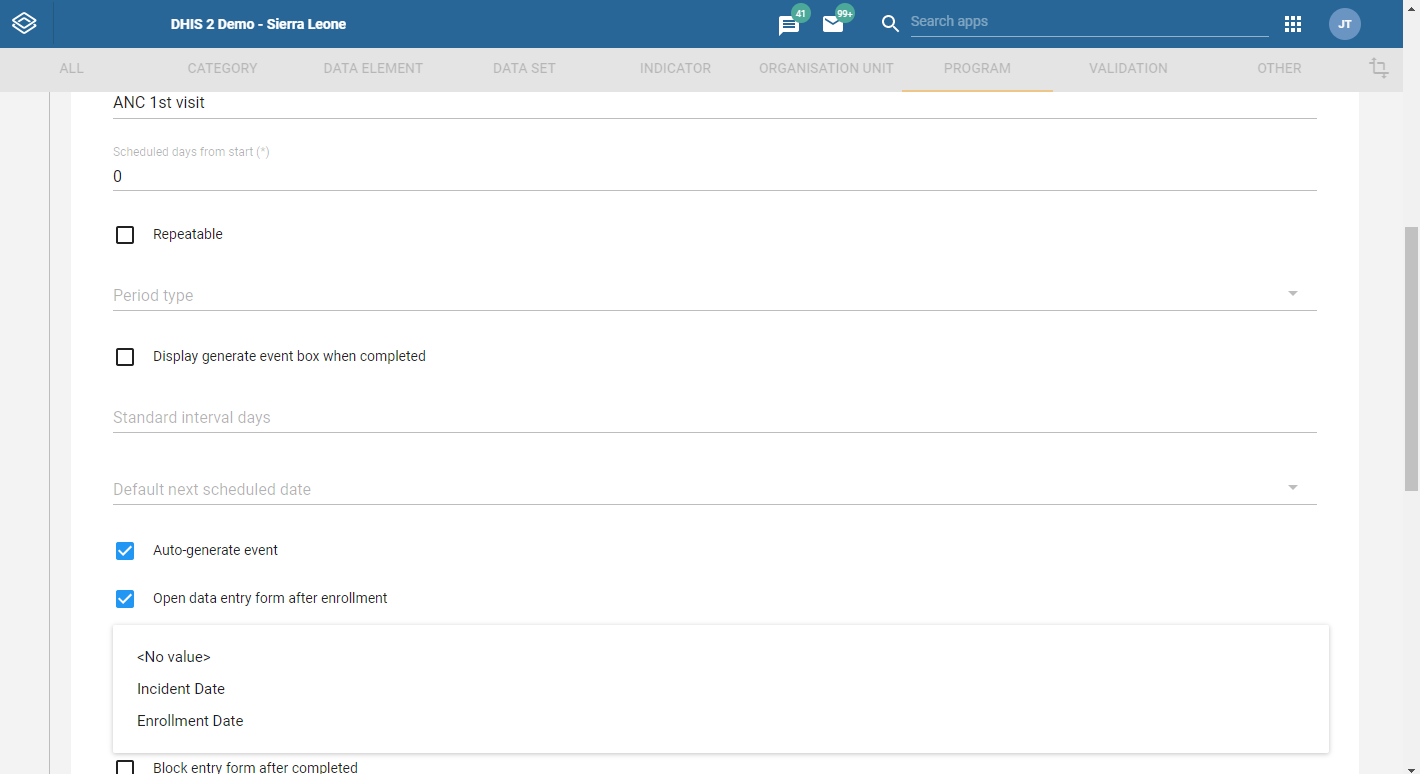
As shown in the image you have three options, a) Incident date b) Enrollment date or c) No value. Choosing reporting date as "Incident date" indicates that both the event execution date and due date will be the same as the incident date. Choosing reporting date as either "Enrollment date" or "No value" indicates that both the event execution date and due date will be the same as the enrollment date.
When the "Open data entry after enrollment" is not checked, it means that the event generated will be a SCHEDULE event. The scheduled event does not have an execution date, but only a due date. The due date for these future events are calculated based on either enrollment date or incident date. If the flag below is checked, the reference date is the enrollment date, if the flag is not checked, the incident date is used. 
When there is no incident date, the reference date will fall back on the enrollment date regardless of whether the flag above is checked.
On SCHEDULE type of events the user can also configure the "Scheduled days from start". Which means if a stage has a number in "Scheduled days from start" the reference date will increased by that number. In the example below we increase the due date by 30 days.
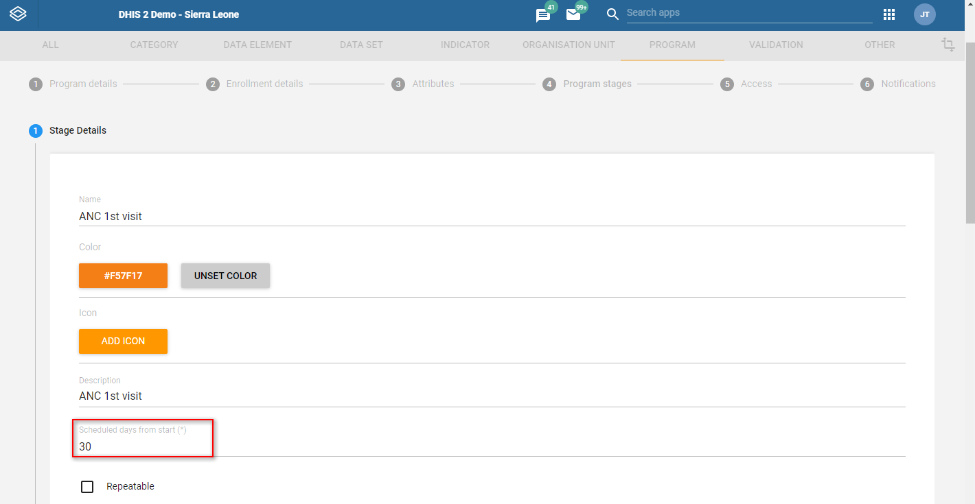
When the "Scheduled days from start" does not contain a number or contains 0 the reference date is used without adding any days to it.
In both cases of registering a tracked entity instance, (with enrollment or without enrollment) the system will start looking for possible duplicates. Note that programs need to be correctly configured through the maintenance app for the system to start detecting duplicates when enrolling a new person in a program.
To configure a program through the maintenance app you will have to:
Open the maintenance app. 
In the program section select your program. We select Child Programme for this example. 
Select the Attributes tab. 
Enable duplicates search by checking program attributes as searchable 
The attributes you have selected as "Searchable" will be the ones which the system will use to detect possible duplicates against.
Let us explain this with an example that demonstrates the detection of possible duplicates while enrolling a child in the Child Programme.
Open the Capture app. 
Select your organisation unit and program from the menu on the top. 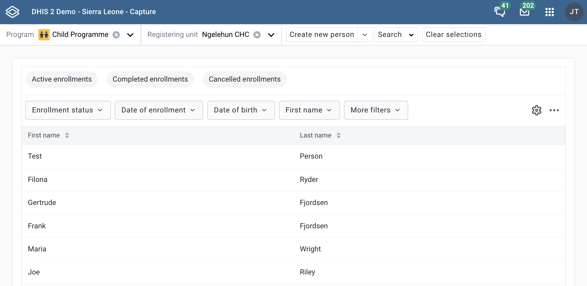
Click Create new person 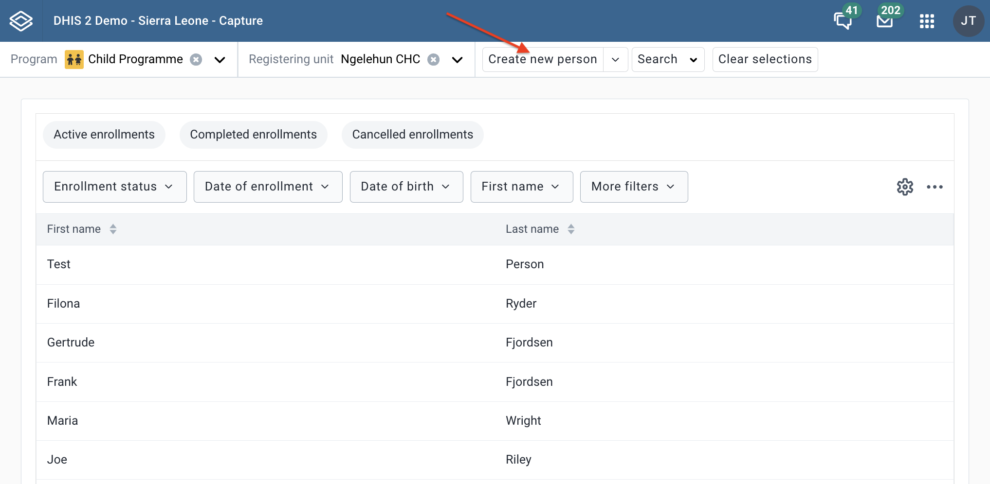
Fill in the first name in the form. Remember, the first name we have checked as "Searchable" in the maintenance app. Click Save person. The system will start looking for possible duplicates that match the name Sarah. 
The system will automatically show a list of possible duplicates if there are any. 
You can choose to make a new enrollement by clicking Save as new or if you see the right person in the list - you can view the dashboard. 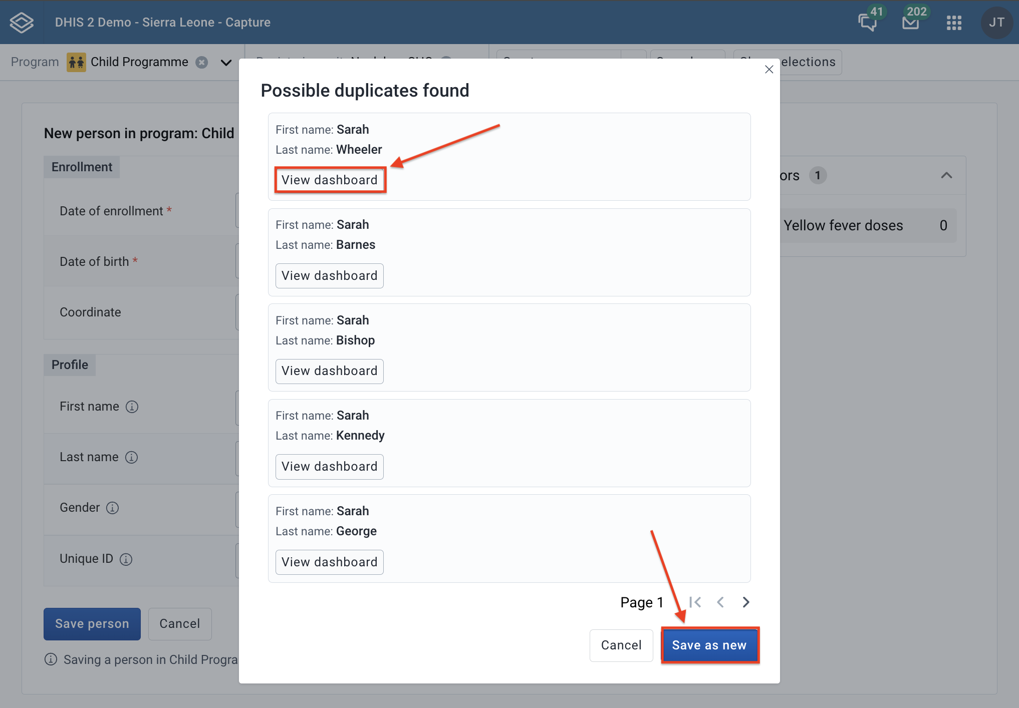
Tip
You can configure duplicates detection for tracked entity types the same way as we did for programs.
In both cases of registering a tracked entity instance (with enrollment or without enrollment), the system will run program rules you have configured. Note that rules can be configured in the maintenance app.
To see a rule being executed while enrolling a tracked entity instance you will have to take the following steps.
Configure a rule in the maintenance app. For the example below we configured a rule that throws a warning when the date of birth is less than a year.
Open the Capture app.
Select your organisation unit and program from the menu on the top. 
Fill in the date of birth with a value which is less than a year. In our case this is 27th of January 2021. 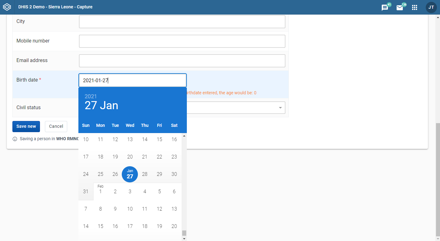
You will now be able to see the warning produced by the program rule underneath the birth date field. 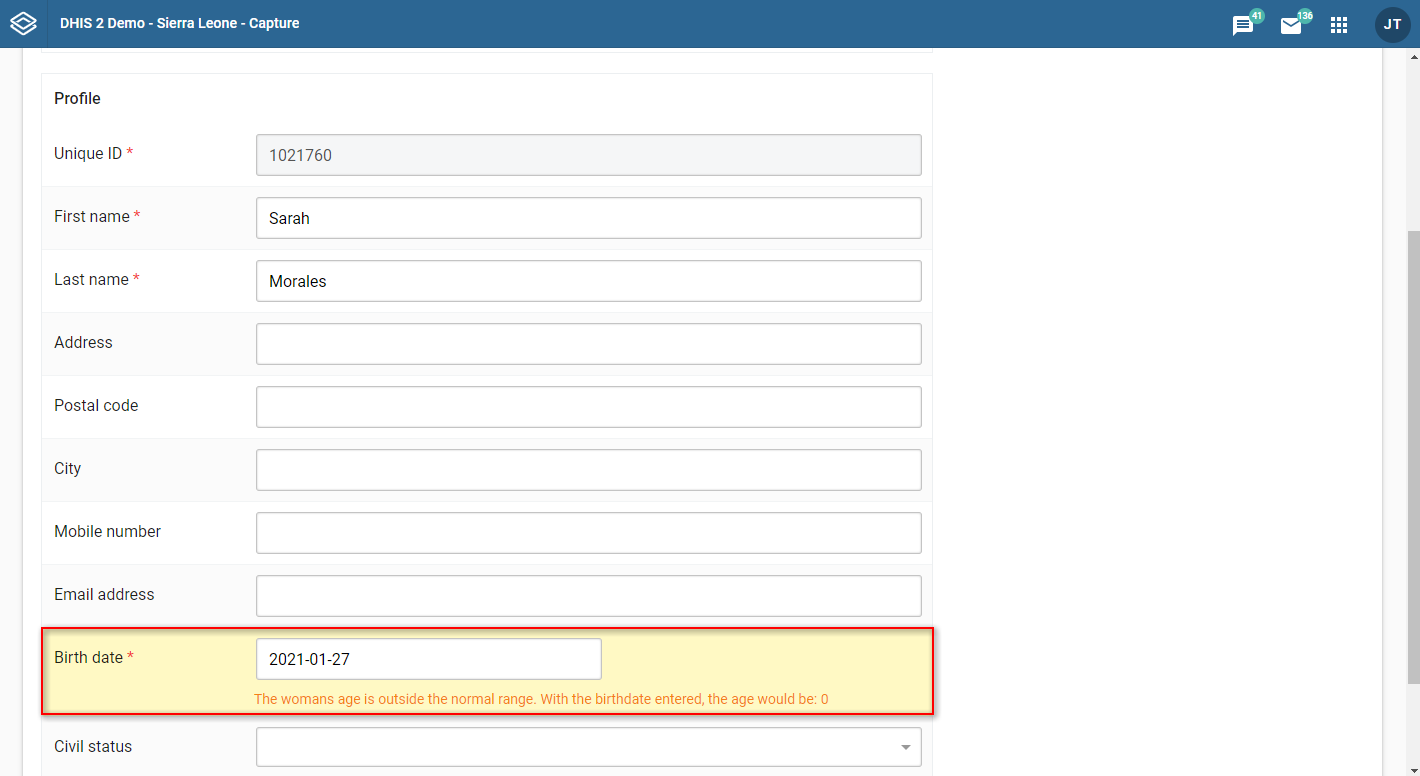
When you are on the re-enroll page, the teId will be visible in the URL parameters. The attributes of the tracked entity instance will be pre-fielded with the current values. 
Relationships can be added either during registration, editing or viewing of an event. Currently the Capture App only supports Event to Tracked Entity Instance relationships.
While in an event, click Add relationship.
Select the relationship type you want to create.
You now have two options:
Link to an existing Tracked Entity Instance or
Create new Tracked Entity Instance.
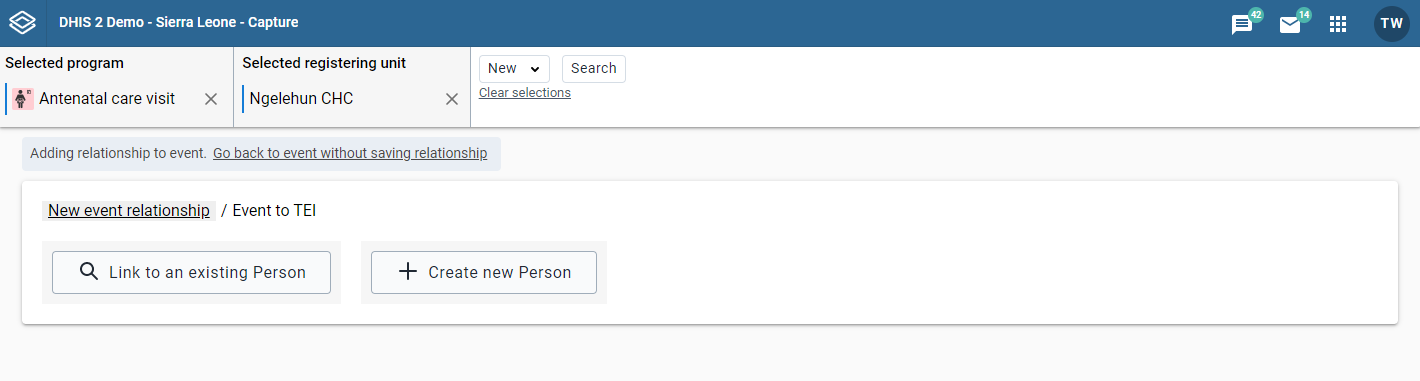
Click Link to an existing Tracked Entity Instance.
You will be presented with some options for searching for a Tracked Entity Instance. You have the option to select a program. If a program is selected the attributes are derived from the selected program. If no program is selected, only the attributes that belong to the Tracked Entity Instance will be visible.
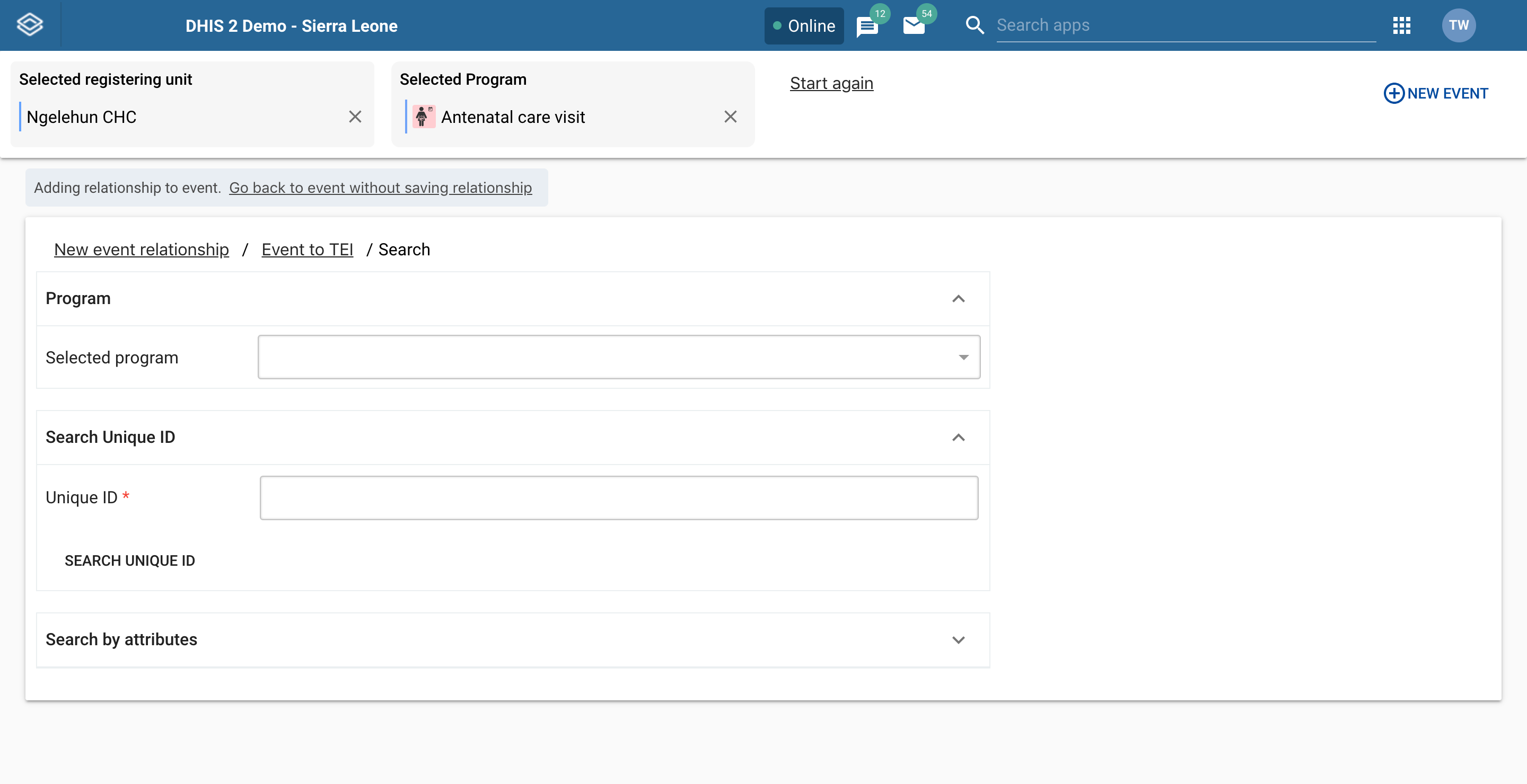
If the Tracked Entity Instance or program is configured with a unique attribute, this attribute can be used for finding a specific Tracked Entity Instance or program. This attribute should be presented alone. When the unique attribute field has been filled out, click the Search button located right below the unique attribute field.
If the Tracked Entity Instance or program has attibutes these can be used for searching by expanding the Search by attributes box. When all desired attribute fields have been filled out, click the Search by attributes button located at the bottom. You can also limit the search by setting the Organisation unit scope. If set to All accessible you will search for the Tracked Entity Instance in all organisation units you have access to. If you select Selected, you will be asked to select which organisation units to search within.
After a successful search you will be presented with a list of Tracked Entity Instances matching the search criteria. To create a relationship click the Link button on the Tracked Entity Instance you would like to create a relationship to.
If you did not find the Tracked Entity Instance you were looking for, you can either click the New search or Edit search buttons. New search will take you to new blank search while Edit search will take you back to the search you just performed keeping the search criteria.
Click Create new Tracked Entity Instance.
You are now presented with a form for registering a new Tracked Entity Instance. You can choose to either register with or without a program. If a program is selected, the new Tracked Entity Instance will be enrolled in said program. You can also change the Organisation unit by removing the one that is automatically set and selecting a new one.

Fill in the desired (and possibly mandatory) attributes and enrollment details.
Click Create Tracked Entity Instance and Link.
Note
When filling in data you might face a warning telling you that a possible duplicate has been found. You can click the warning to see these duplicates and if the duplicate is a match you can choose to link that Tracked Entity Instance by clicking the Link button. If the warning is still present when you are done filling in data, you will not see the Create Tracked Entity Instance and Link button. Instead you will be presented with a button called Review duplicates. When you click this button a list of possible duplicates will be displayed. If any of these duplicates matches the Tracked Entity Instance you are trying to create you can click the Link button, if not you can click the Save as new person button to register a new Tracked Entity Instance.
Open the Capture app.
Select a program.
Select an organisation unit or click the all events-link to view all events accessible to you.
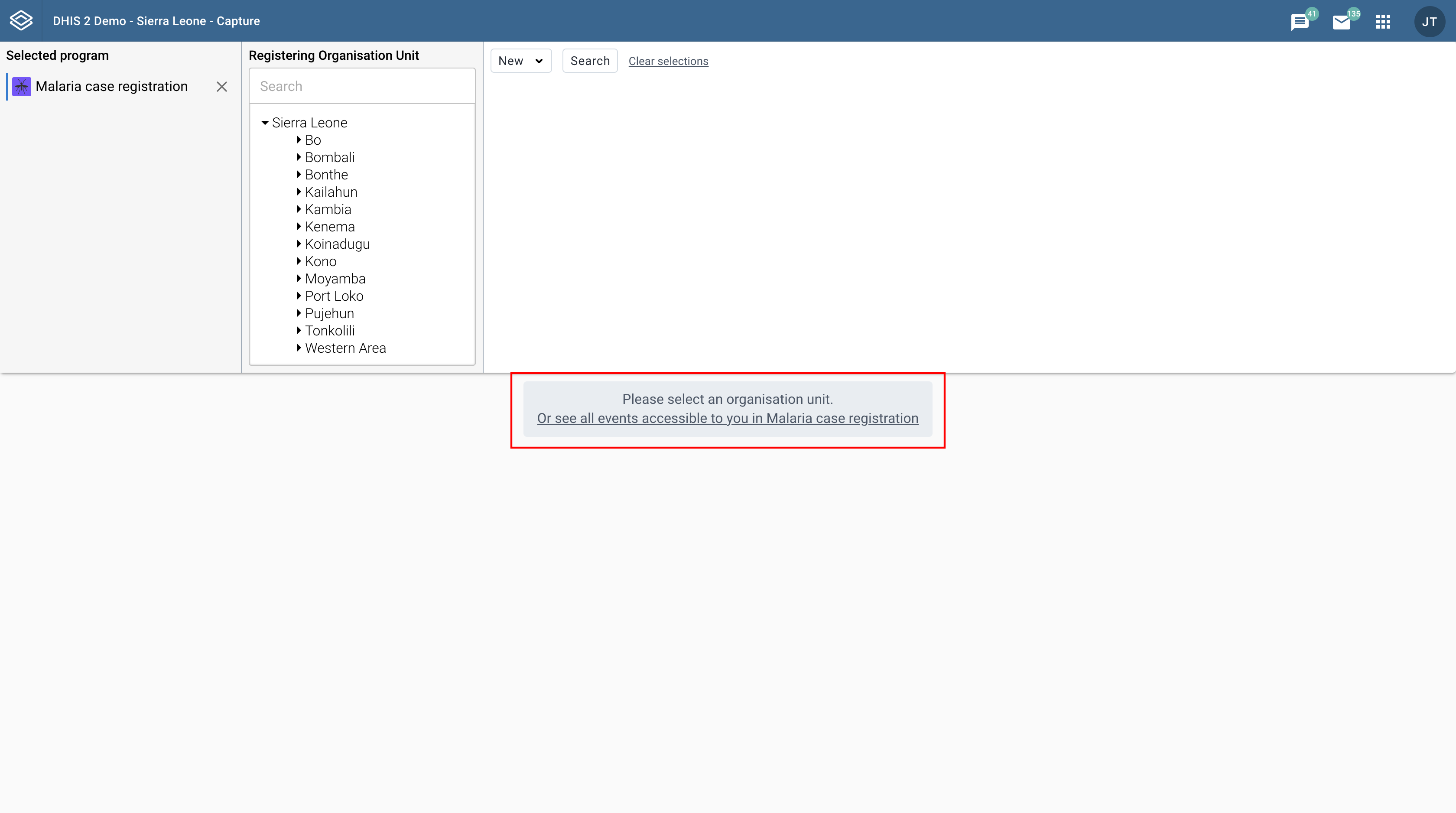 All events registered to the selected program show up in a list.
Click the event you want to modify.
Click the Edit event button.
Modify the event details and click Save.
Note
The Edit event button is disabled if the program stage has Block entry form after completed enabled and your user role does not include the Uncomplete events authority.
Open the Capture app.
Select an organisation unit.
Select a program.
All events registered to the selected program show up in a list.
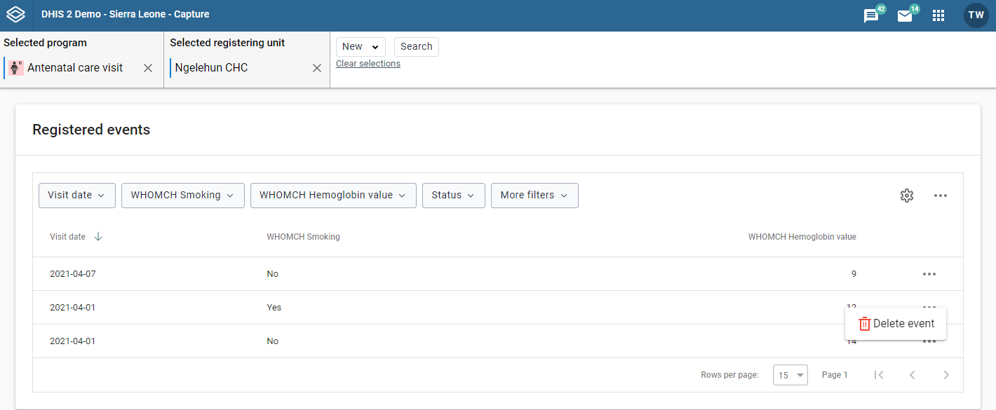
Click the triple dot icon on the event you want to delete.
In the menu that is displayed click Delete event.
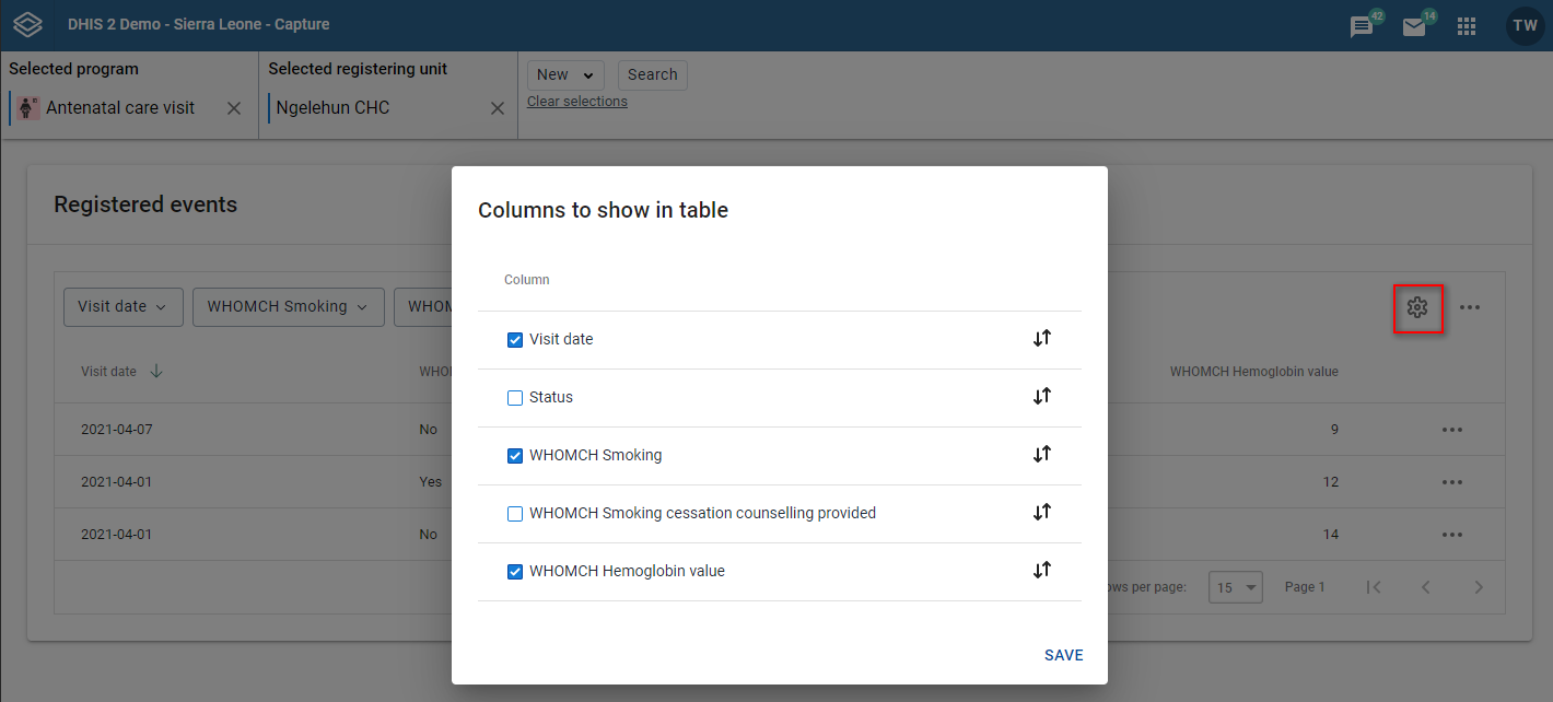
You can select which columns to show or hide in an event list. This can be useful for example when you have a long list of data elements assigned to a program stage.
Open the Capture app.
Select an organisation unit.
Select a program.
All events registered to the selected program show up in a list.
Click the gear icon on the top right of the event list.
Select the columns you want to display and click Save.
Tip
You can reorganize the order of the data elements by draging and dropping them in the list.
Open the Capture app.
Select an organisation unit.
Select a program.
All events registered to the selected program show up in a list.
Along the top of the event list are buttons with the same names as the column headers in the list.
Use the buttons on the top of the list to filter.
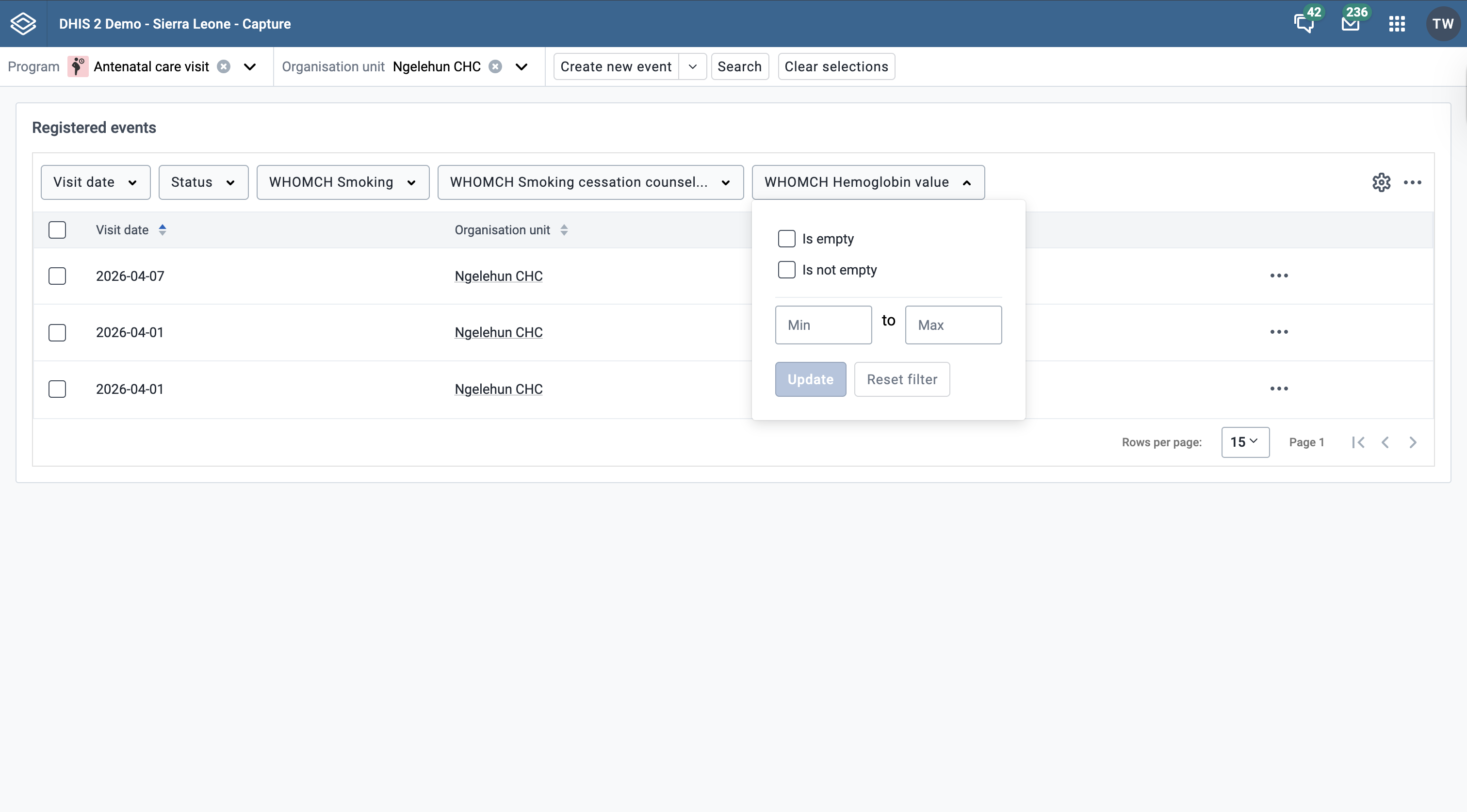
Each filter adapts to the data element's value type — for example, numeric data elements provide a range selector, text data elements a search input, and date data elements a date picker. Filtering is available for all value types except MULTI_TEXT (multi-select option sets).
Data element filters show two checkboxes at the top:
Only one option can be active at a time per filter. Selecting Is empty or Is not empty clears any value-based criteria for the filter.
For image, file and coordinate data elements, Is empty and Is not empty are the only available filter options.
Note
The empty / non-empty checkboxes are not shown on the main filters (report date, status, assignee, etc.).
Filtering on empty / non-empty values requires DHIS2 server version 2.42 or higher. On older servers the checkboxes are not shown.
Open the Capture app.
Select an organisation unit.
Select a program. All events registered to the selected program show up in a list.
Click one of the column headers to sort the list on that data element in ascending order.
A small upward arrow is displayed next to the column is marked blue to show that the list is sorted in ascending order.
Click the column header again to sort the list on that data element in descending order.
A small downward arrow is displayed next to the column is marked blue to show that the list is sorted in descending order.

Open the Capture app.
Select an organisation unit.
Select a program. All events registered to the selected program show up in a list.
Click the three dots icon on the top right of the event list.
Click Download data.
Select the format you want to download.

Note
You can download an event list in JSON or CSV formats.
You can set up your own views and save them for later use. The views can also be shared with others. A view consists of filters, column order and event sort order.
Select an organisation unit and a program.
Set filters using the filter buttons above the event list (described in detail here).

Set the column order by clicking the cog icon and then, in the pop-up, specify the layout according to your preference (how to modify the layout is described in detail here).

Sort the events by clicking on one of the column headers (described in detail here).

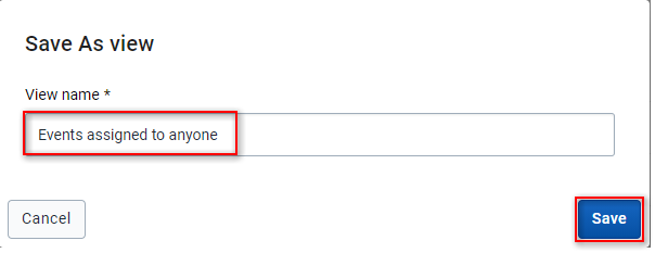
Open the more menu (three dots icon) to the right and then select "Save current view..."

Fill in a name for the view and click save.
Select an organisation unit and a program with a predefined view.
The views should be available above the event list itself. Click on a view to load it.
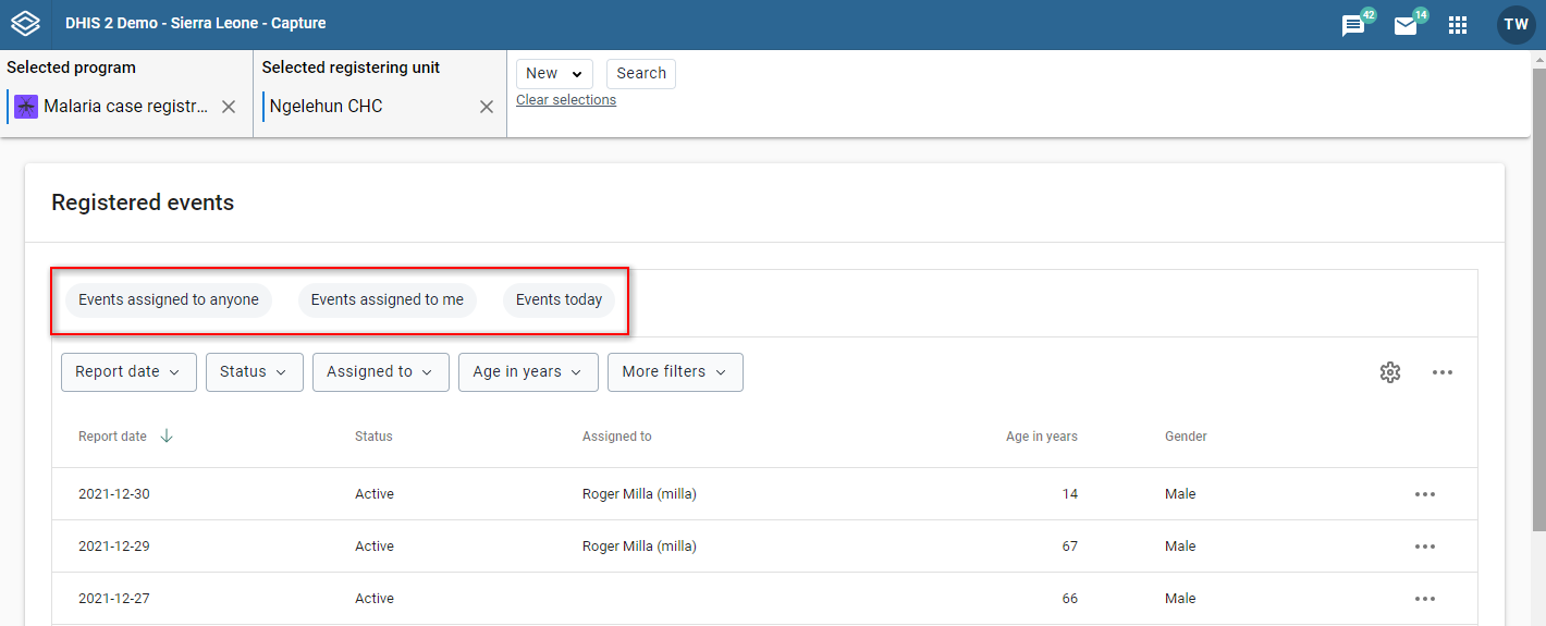
An example of a loaded view.
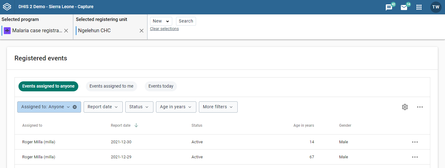
Load the view you would like to update (see loading a view).
Make your changes to filters, column order and/or event sort order.
Note
An asterisk(*) is appended to the view name when the view has unsaved changes.
Open the more menu (three dots icon) to the right and then select "Update view".

Load the view you would like to share (see loading a view).
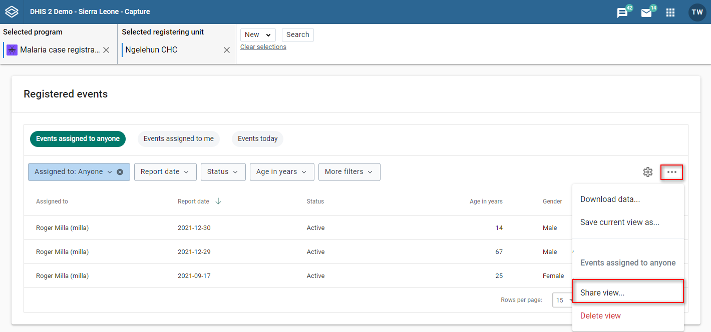
Open the more menu (three dot icon) to the right and then select "Share view..."
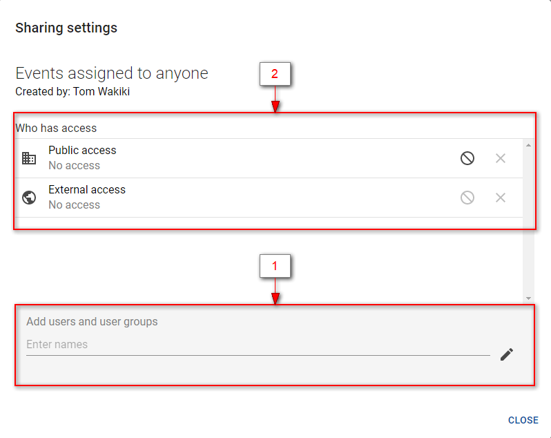
Make your changes. You would typically add users/groups (1) and/or change the access rights of users/groups added earlier (2).
Load the view you would like to delete (see loading a view).
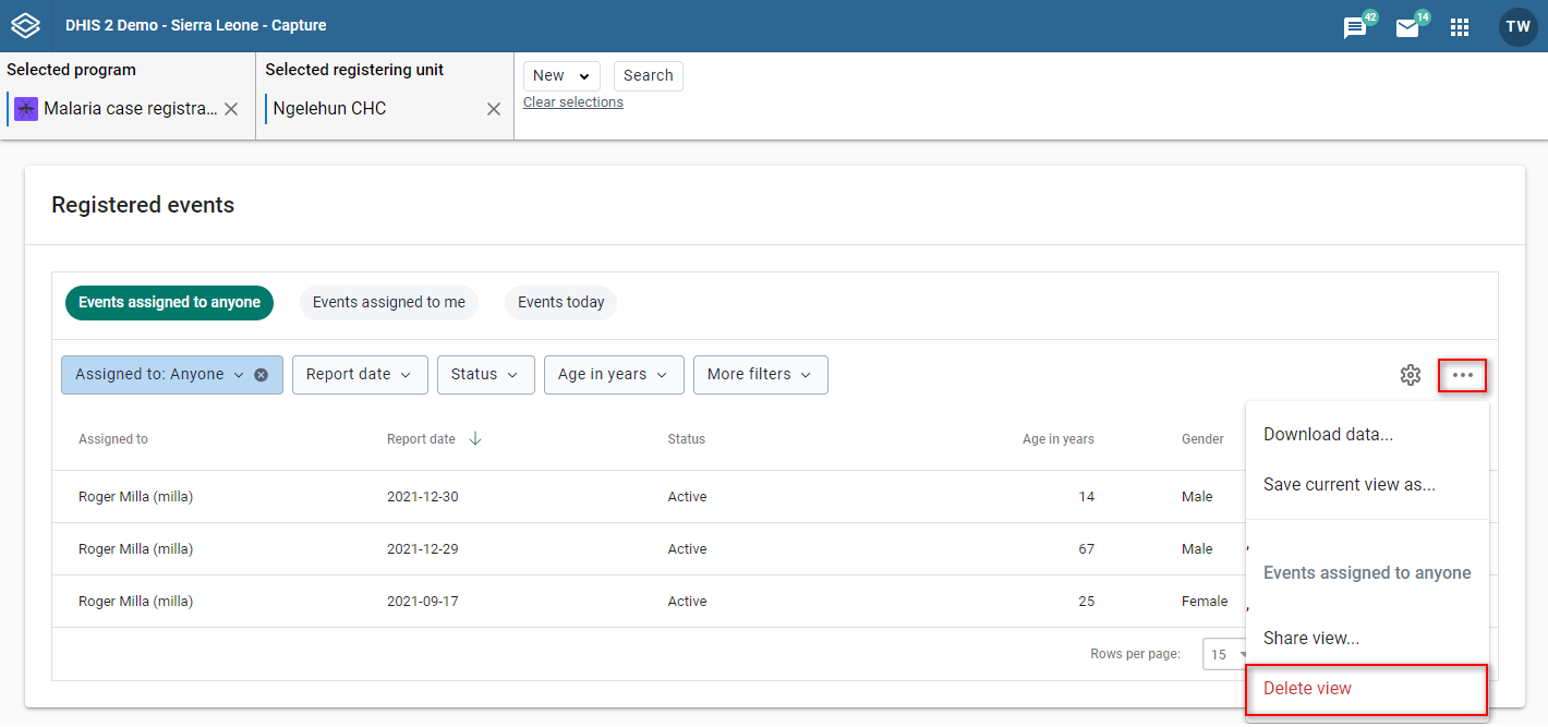
Open the more menu (three dots icon) to the right and then select "Delete view".
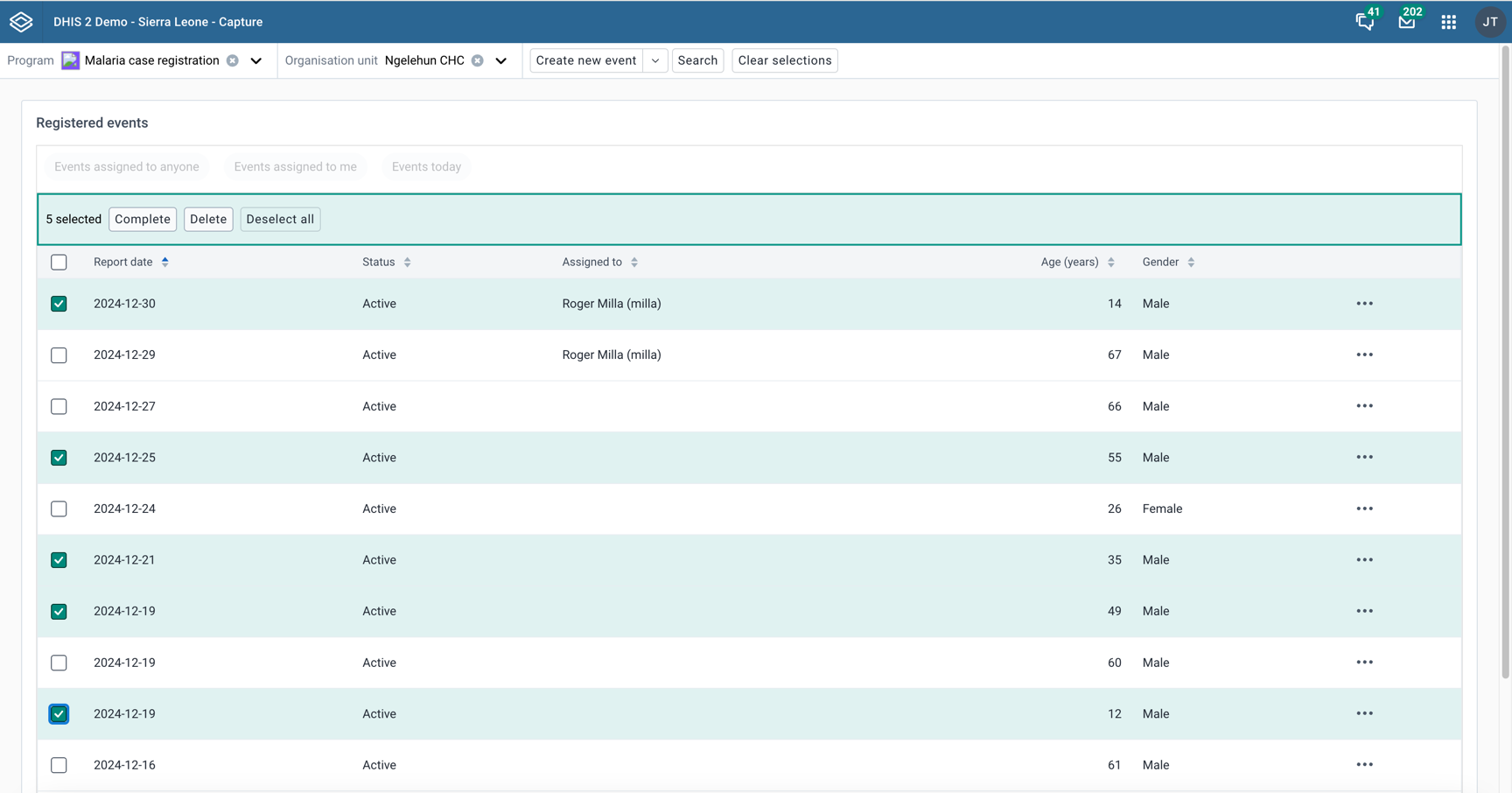
You can perform bulk actions on events in the event list.
Select the events you want to perform the action on by clicking the checkbox to the left of the event.
You can choose between quickly completing the selected events or deleting them.
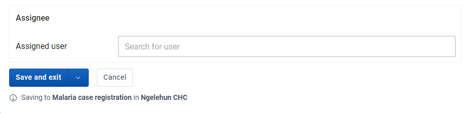
Events can be assigned to users. This feature must be enabled per program.
Select an organisation unit and a program with user assignment enabled.
Click New Event in the upper right corner.
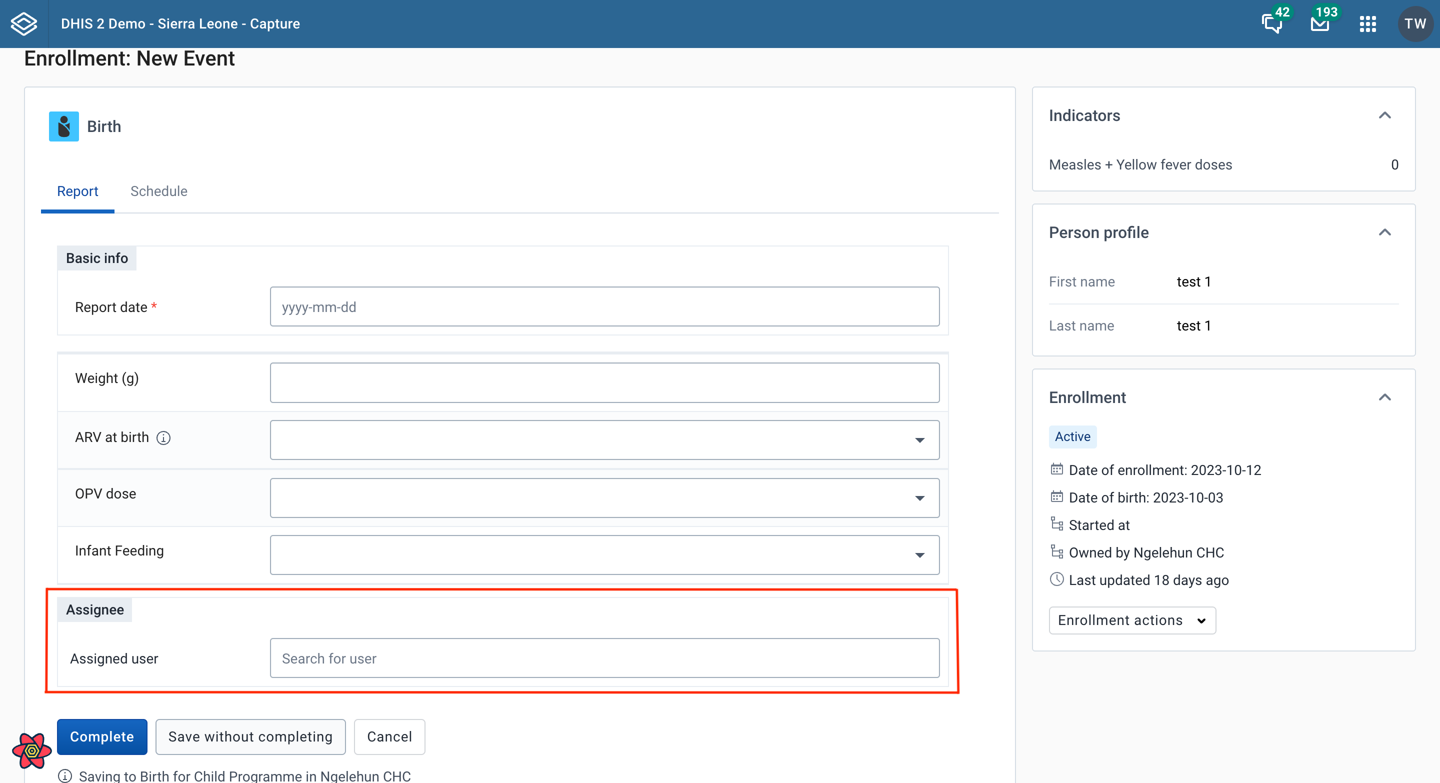
You will find the assignee section near the bottom of the data entry page. Search for and select the user you would like to assign the event to. The assignee will be preserved when you save the event.
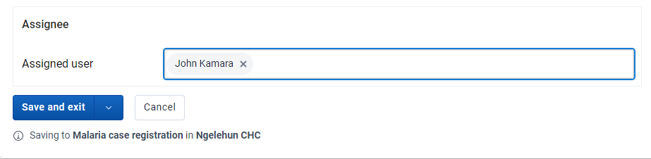
Select an organisation unit and a program with user assignment enabled.
Click an event in the list
In the right column you will find the assignee section.
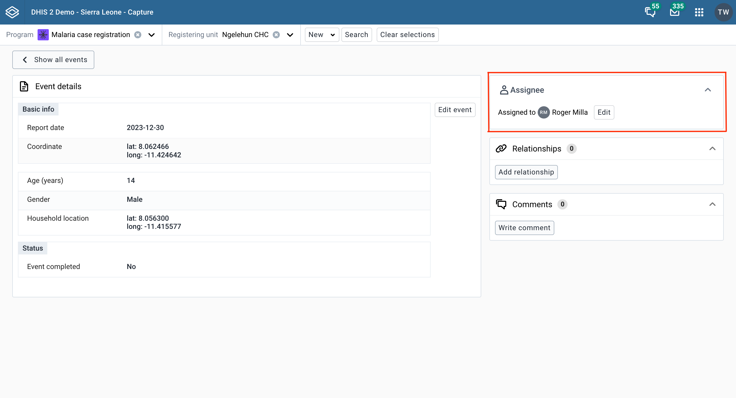
Click the Edit button, or the Assign button if the event is not currently assigned to anyone.
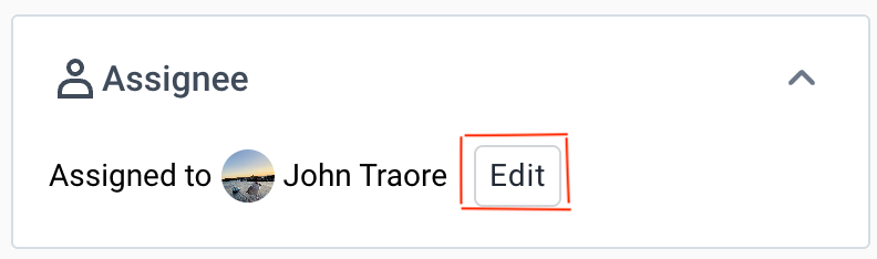
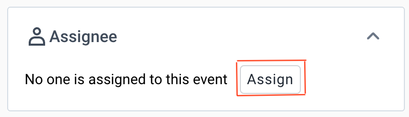
Search for and select the user you would like to reassign the event to. Click the Save button.
In the event list you will be able to view the assignee per event. Moreover, you can sort and filter the list by the assignee.
Click the Assigned to filter.

Select your preferred assignee filter and then click update.

The Capture app supports the workinglists in tracker programs, but when you open a tracked entity instance, you will be redirected to the enrollment dashboard in the Tracker Capture app.
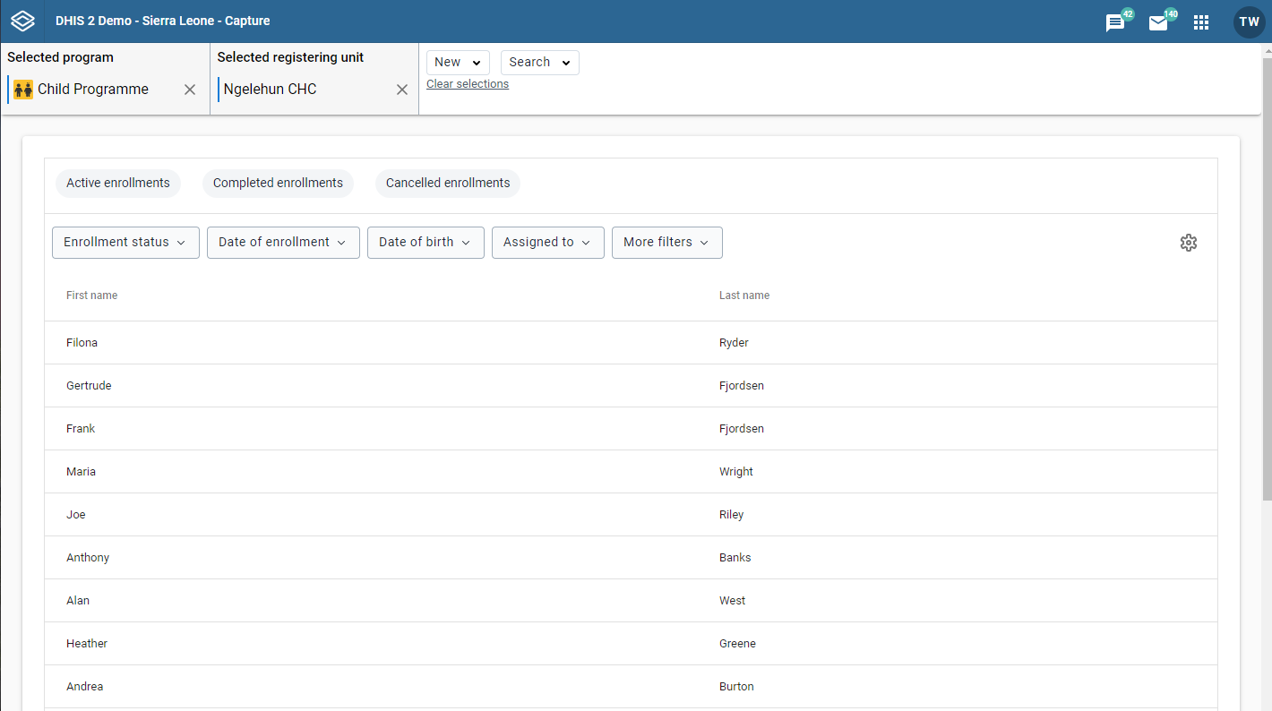
Open the Capture app.
Select a program.
You will only see programs associated with the selected organisation unit and programs you have access to, and that are shared with your user group through data level sharing.
Click the Search button.
From the dropdown menu click the first option.
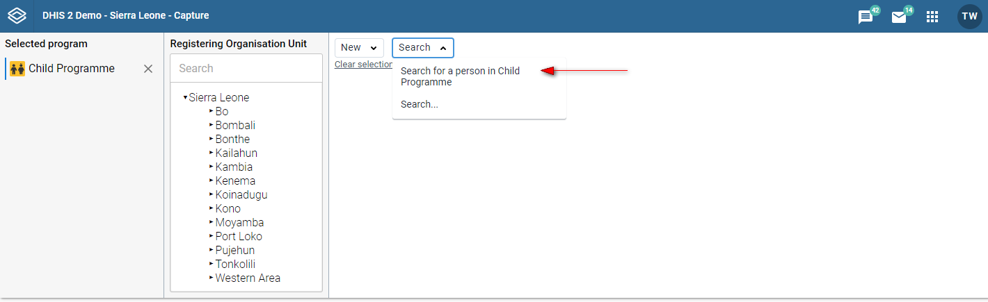
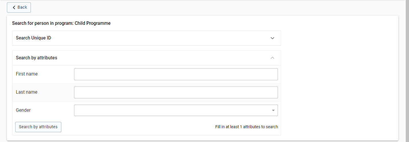
These steps will take you to the search page. There, based on the configuration of your organisation, will see the different attributes you can search with. An example of how this looks is the following.
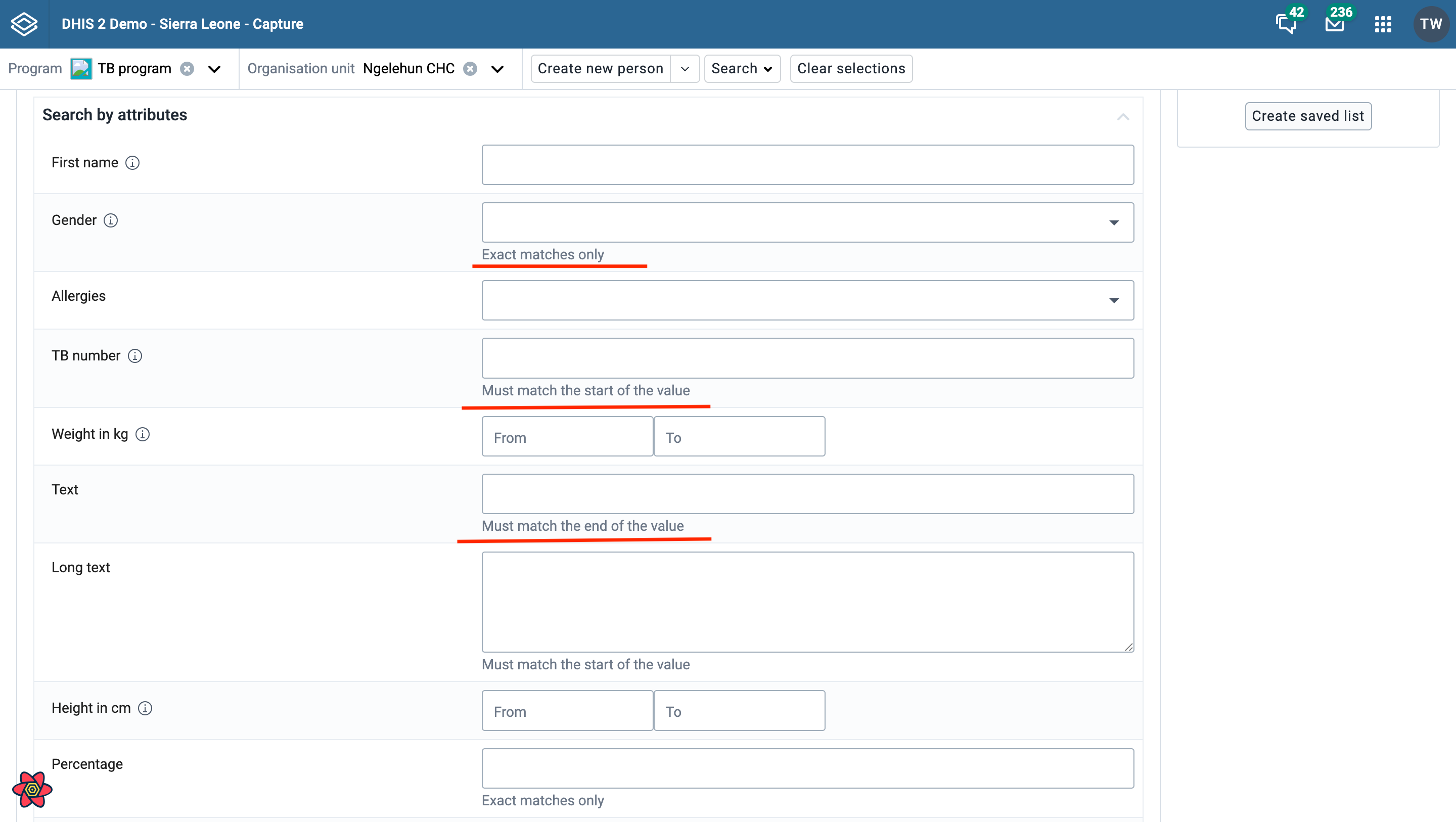
To enhance search performance, you can configure the preferredSearchOperator or blockedSearchOperators metadata in Maintenance. Tracked entity attributes with the following value types apply these settings: TEXT, LONG_TEXT, EMAIL, PHONE_NUMBER and PERCENTAGE. If preferredSearchOperator is not defined, the search falls back to the first available operator in [LIKE, SW, EQ] that is not listed in blockedSearchOperators. Attributes with other value types ignore the preferredSearchOperator. Helper text messages are displayed below the attribute search fields to guide the user.
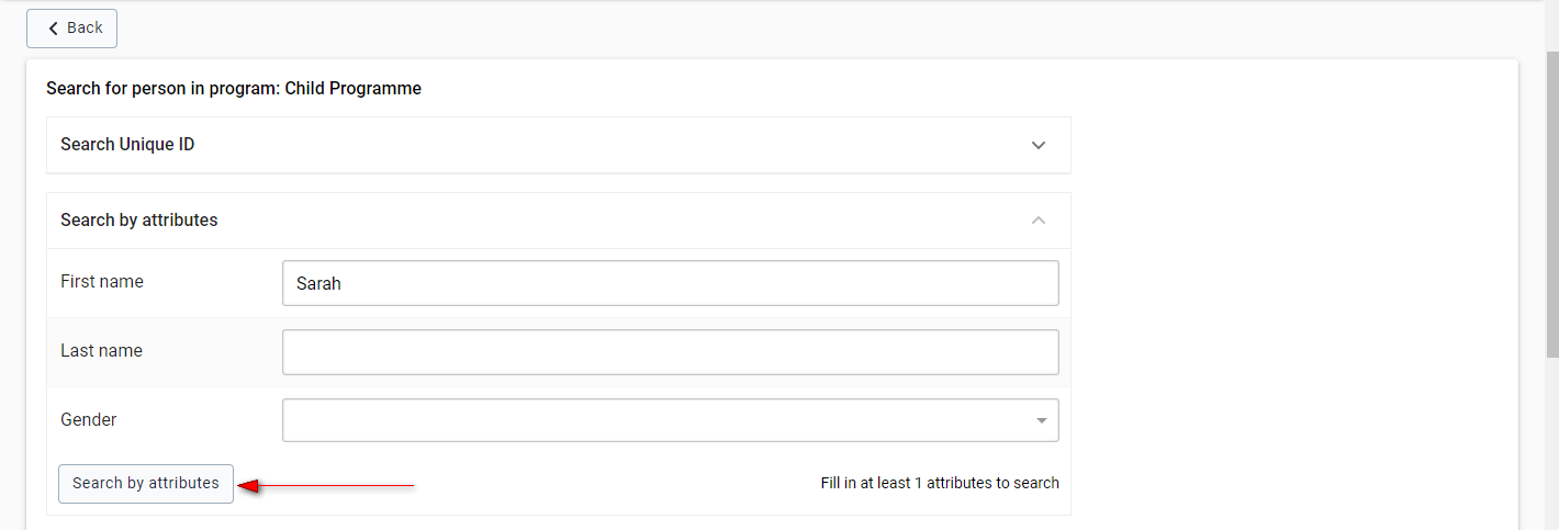
To execute a search now:
Fill in the attributes you want to search with.
Click the Search by attributes button.
The results of the search will be displayed as follows.

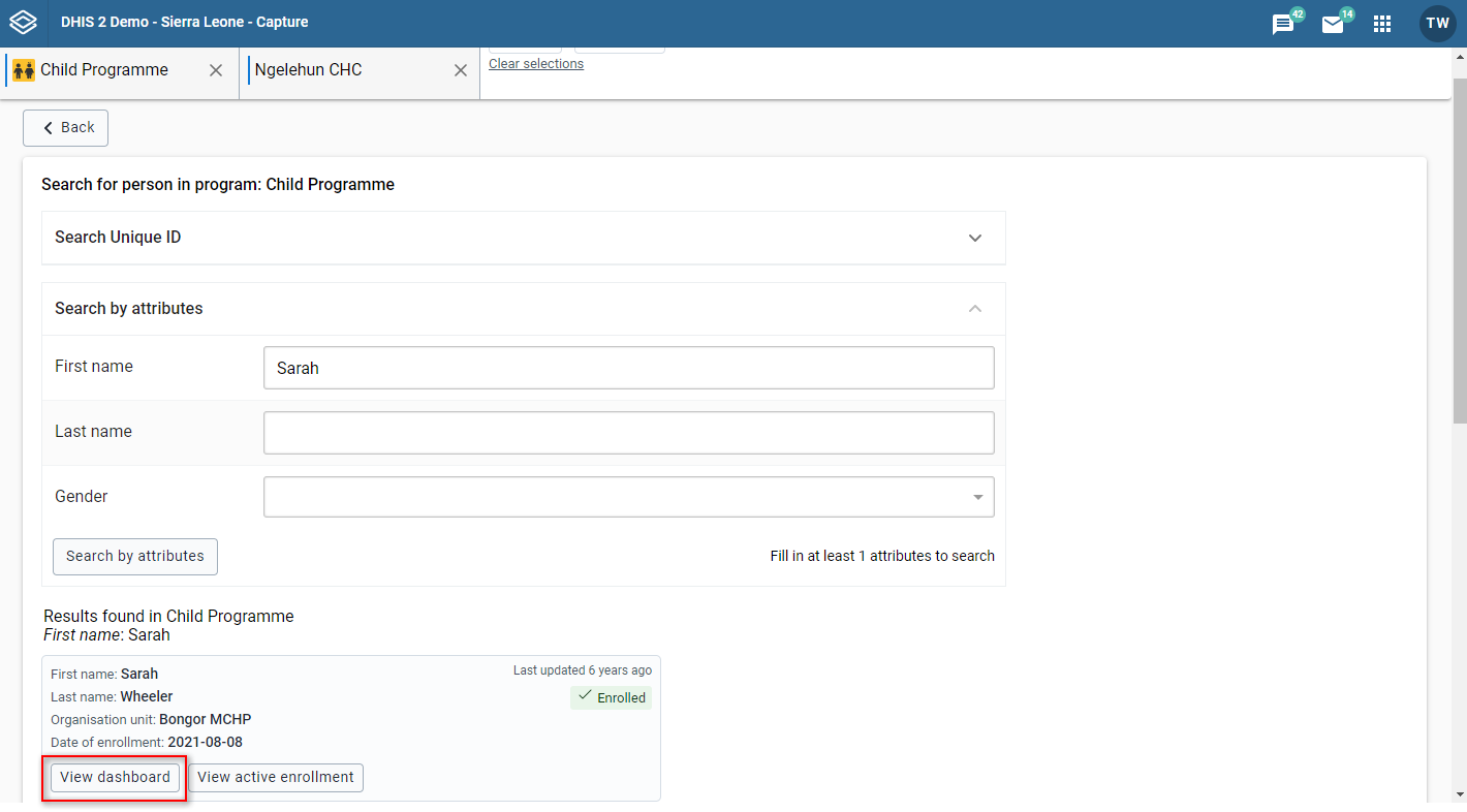
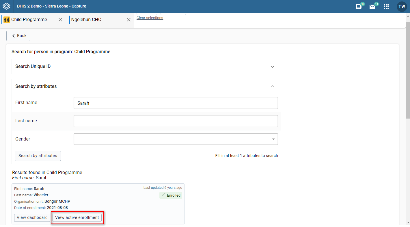
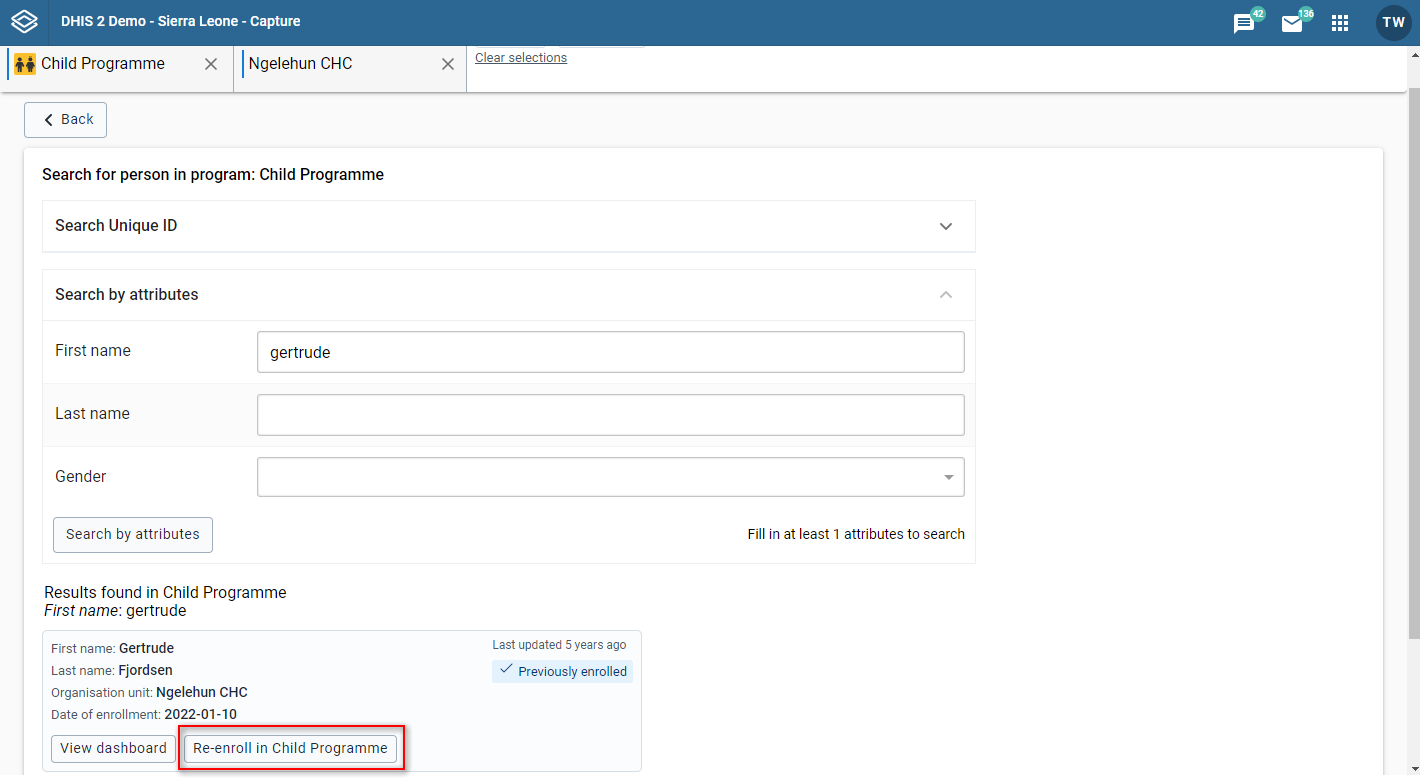
In this list you can see the entries that match your search. For each entry you can have a total of three options.
a. You can choose to view the dashboard for the Tracked Entity Instance by clicking the "View dashboard" button
b. You can view the the active enrollment of a Tracked Entity Instance by clicking the "View active enrollment" button
c. You can re-enroll a Tracked Entity Instance to the current program you are searching within.
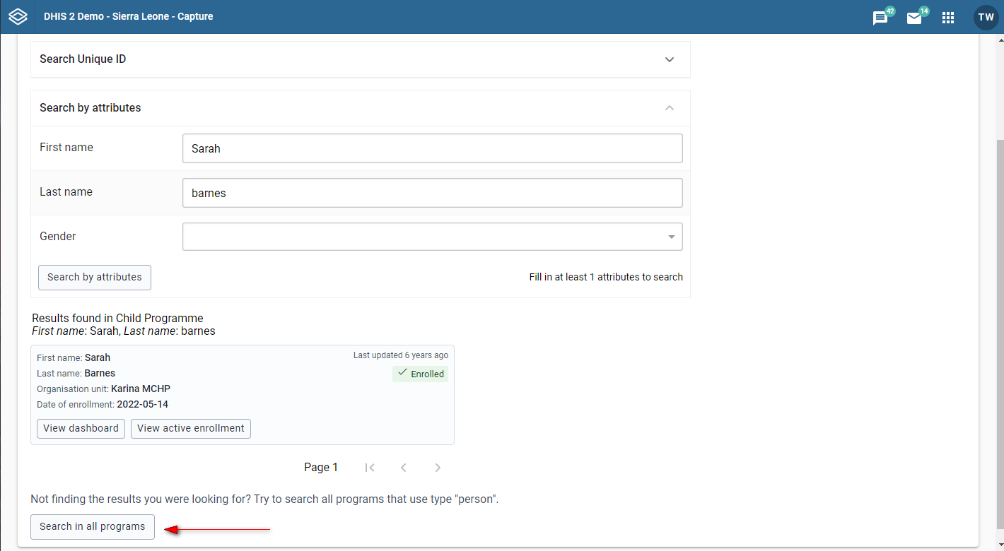
Execute a full search as described above. If the search you have made has results they will be displayed. However, the actual Tracked Entity Instance you are searching for may be within a different program. In that case, you may want to extend the search to other programs. This is known as a fallback search.
To execute a fallback search, simply press the button on the bottom saying "Search in all programs". You will see the Results in all programs be appended below the search in the current program. These two modules are collapsible to save space.
If the fallback can not be done, you will be presented with a modal to go Back to search so that you can change the search terms.
Note
The fallback search is only possible when searching within a Program.
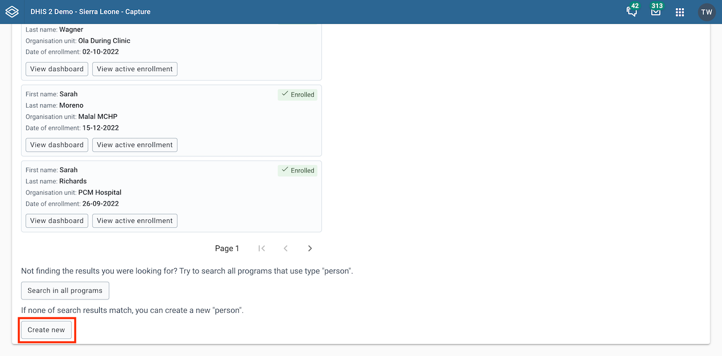
When none of the results match, you can create a new user by clicking Create new button on the bottom of the search page.
Based on the search domain, you will be navigated to the registration of the selected Tracked entity type, with or without program enrollment preselected. The search terms that you typed in before will be prefilled in the registration form.
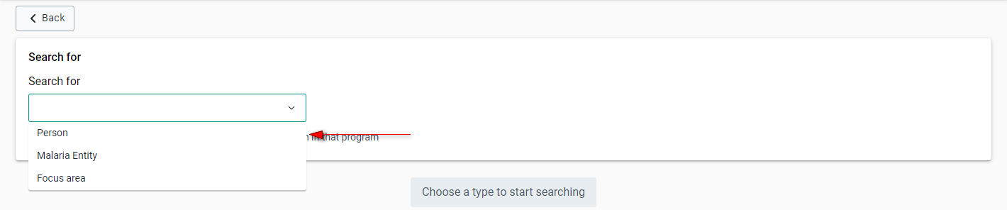
Open the Capture app.
Click the Search button to open the search page.
Click on the drop down menu and select the type of entity you want to search for.

Make a selection from the list.
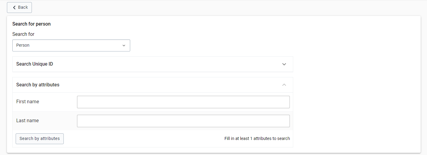
Based on the configuration of your organisation you will see the different attributes you can search with. An example of how this looks is the following.
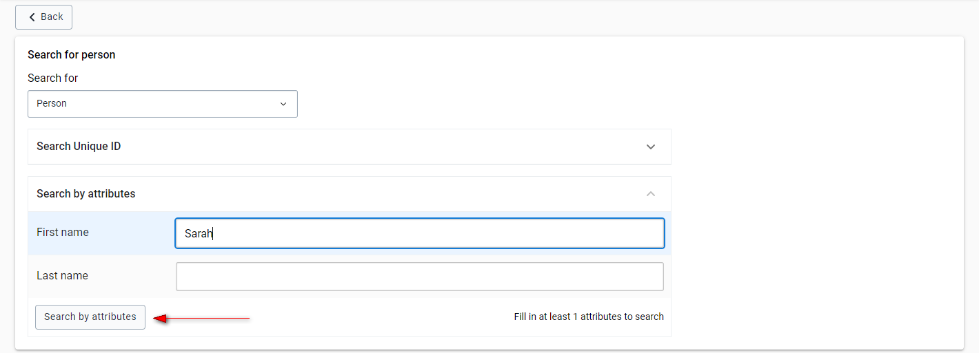
To execute a search now:
Fill in the attributes you want to search with.
Click the Search by attributes button.
The results of the search will be displayed as follows.

In this list you can see the entries that match your search. For each entry you have the option to click the "View Dashboard" button to view the dashboard for the Tracked Entity Instance.
The program or tracked entitiy type you are searching within may be configured with a limit on the number of results that are retrurned from a search. If your search results exceed this limit you will be shown a warning message like the one below.
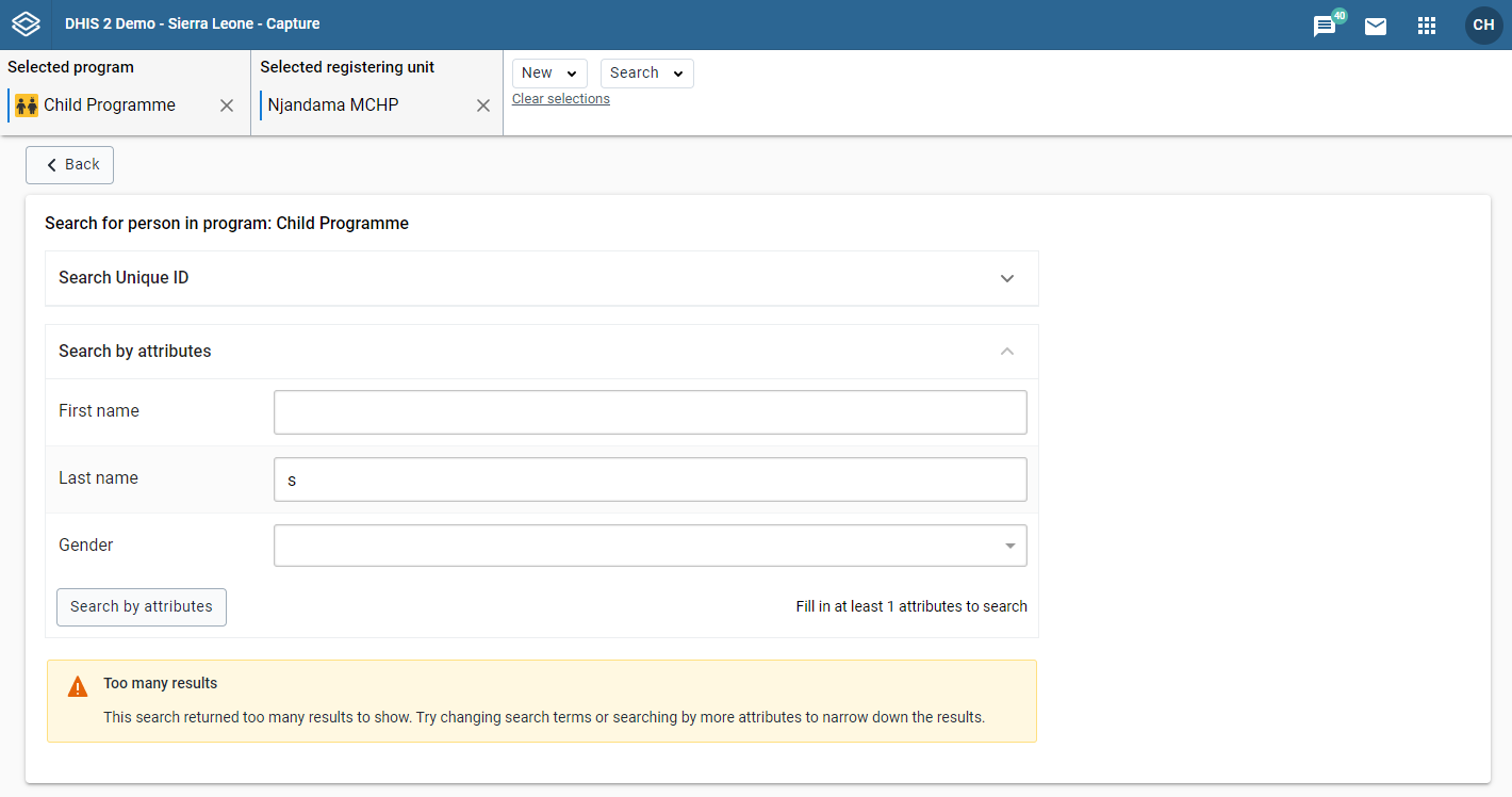
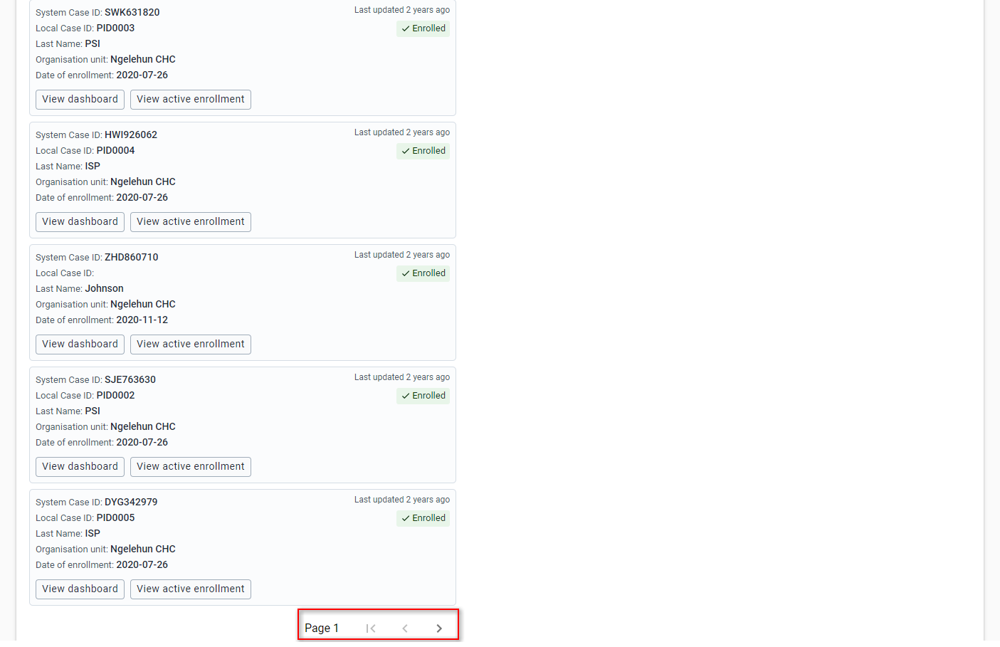
The results page shows up to five results at a time. You should try to use specific search criteria so that there are not too many matches. However, if there are more than five results, you can see the next results by using the > button at the end of the page.
Open the Capture app.
Select an organisation unit.
Select a tracker program with "Display front page list" set to true.
The program can have categories associated with it (implementing partner would be an example of such a category). If this is the case, fill them in.
Open the Capture app.
Select an organisation unit.
Select a tracker program with "Display front page list" set to false.
If the program has any custom working list you are able to click and load it.
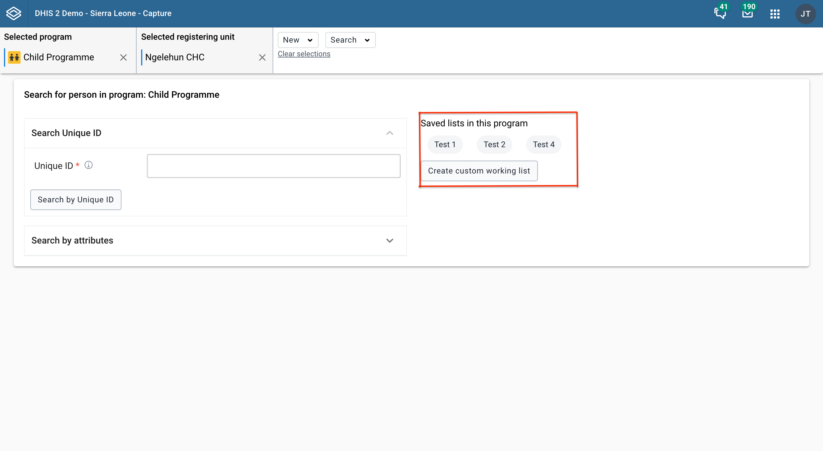
Use the buttons above the list to filter it.

As an example, you could filter the list to show only tracked entity instances where the enrollment status is "Completed": Click the "Enrollment status" filter (1), select "Completed" (2) and then "Update" the changes (3).
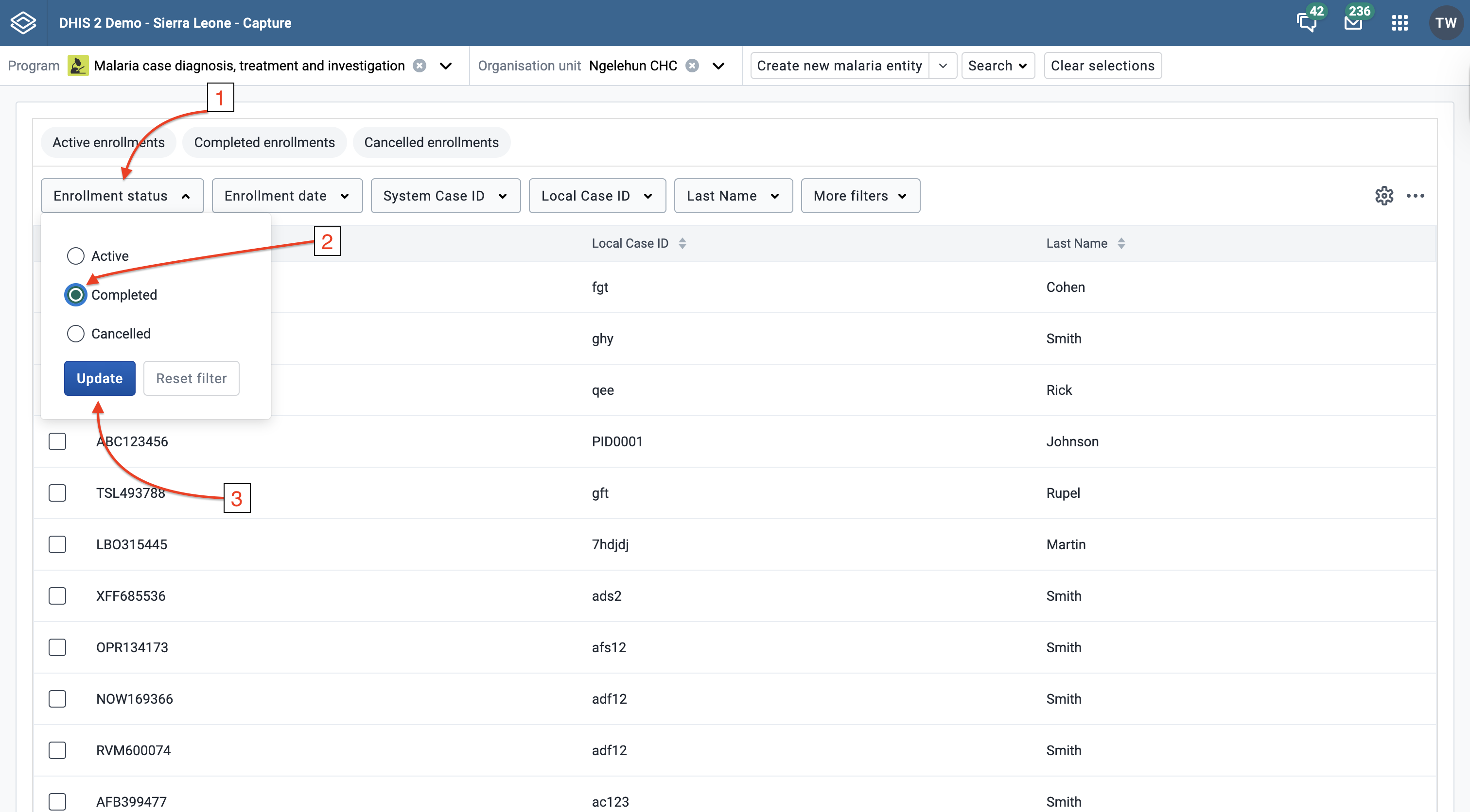
Each filter adapts to the attribute's value type — for example, numeric attributes provide a range selector, text attributes a search input, and date attributes a date picker. Filtering is available for all value types except MULTI_TEXT (multi-select option sets).
Data element filters show two checkboxes at the top:
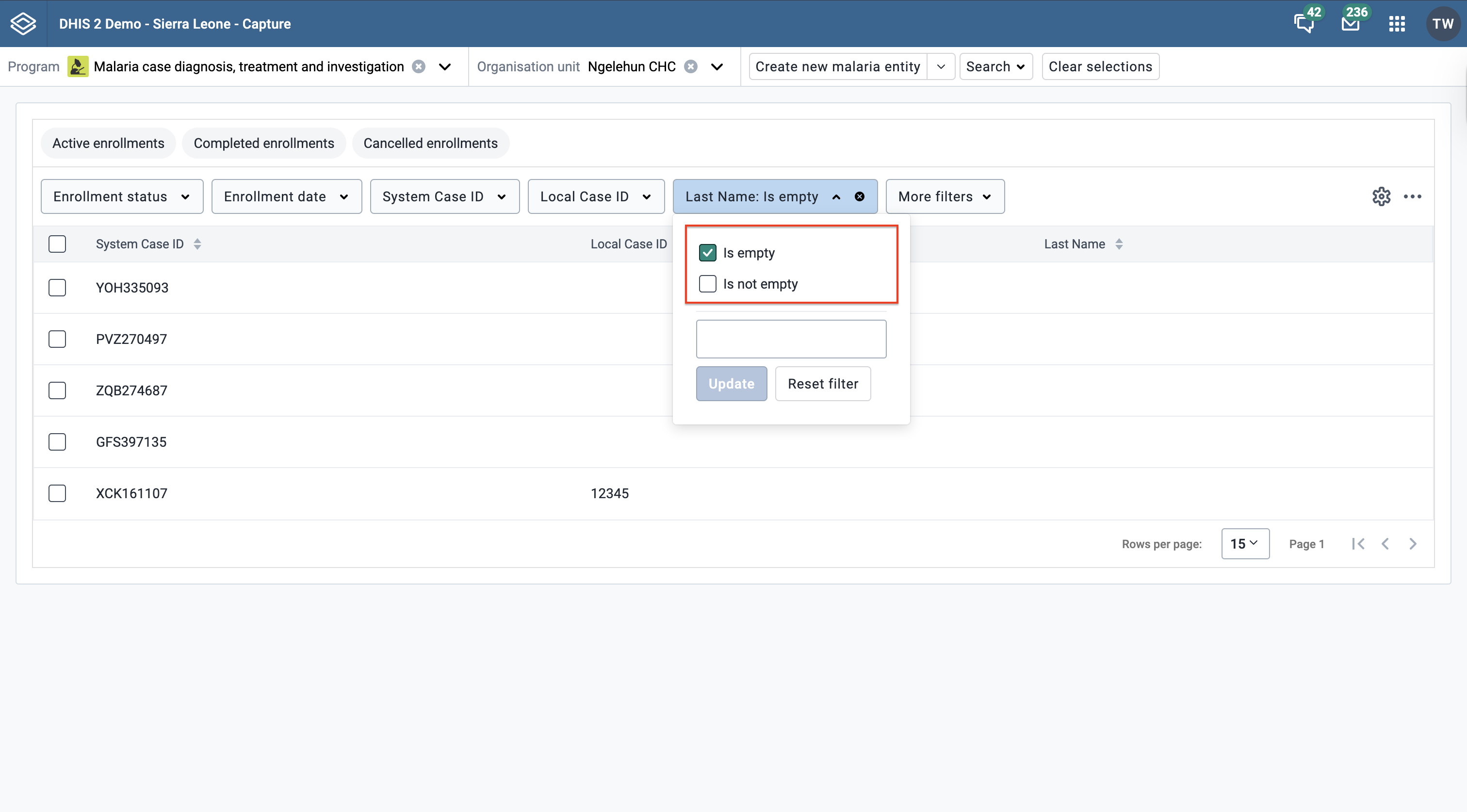
Only one option can be active at a time per filter. Selecting Is empty or Is not empty clears any value-based criteria for the filter.
For image, file and coordinate data elements, Is empty and Is not empty are the only available filter options.
Note
The empty / non-empty checkboxes are not shown on the main filters (report date, status, assignee, etc.).
Filtering on empty / non-empty values requires DHIS2 server version 2.42 or higher. On older servers the checkboxes are not shown.
Click one of the column headers to sort the list by that column. A small arrow is displayed next to the column header to indicate the current sort order. Click again to change between ascending and descending order.

You can select which columns to show in the list and also reorganize the order of the columns.
Click the gear icon in the top right corner of the list. Tick the checkboxes for the the columns you would like to display (1) and reorgainze the columns by dragging and dropping (2).

You will find the predefined list views above the filters for the list. Click to load a view.


Note You can download the tracked entities list in JSON or CSV formats.
You can perform bulk actions on tracked entities and their enrollments in the tracked entity list.
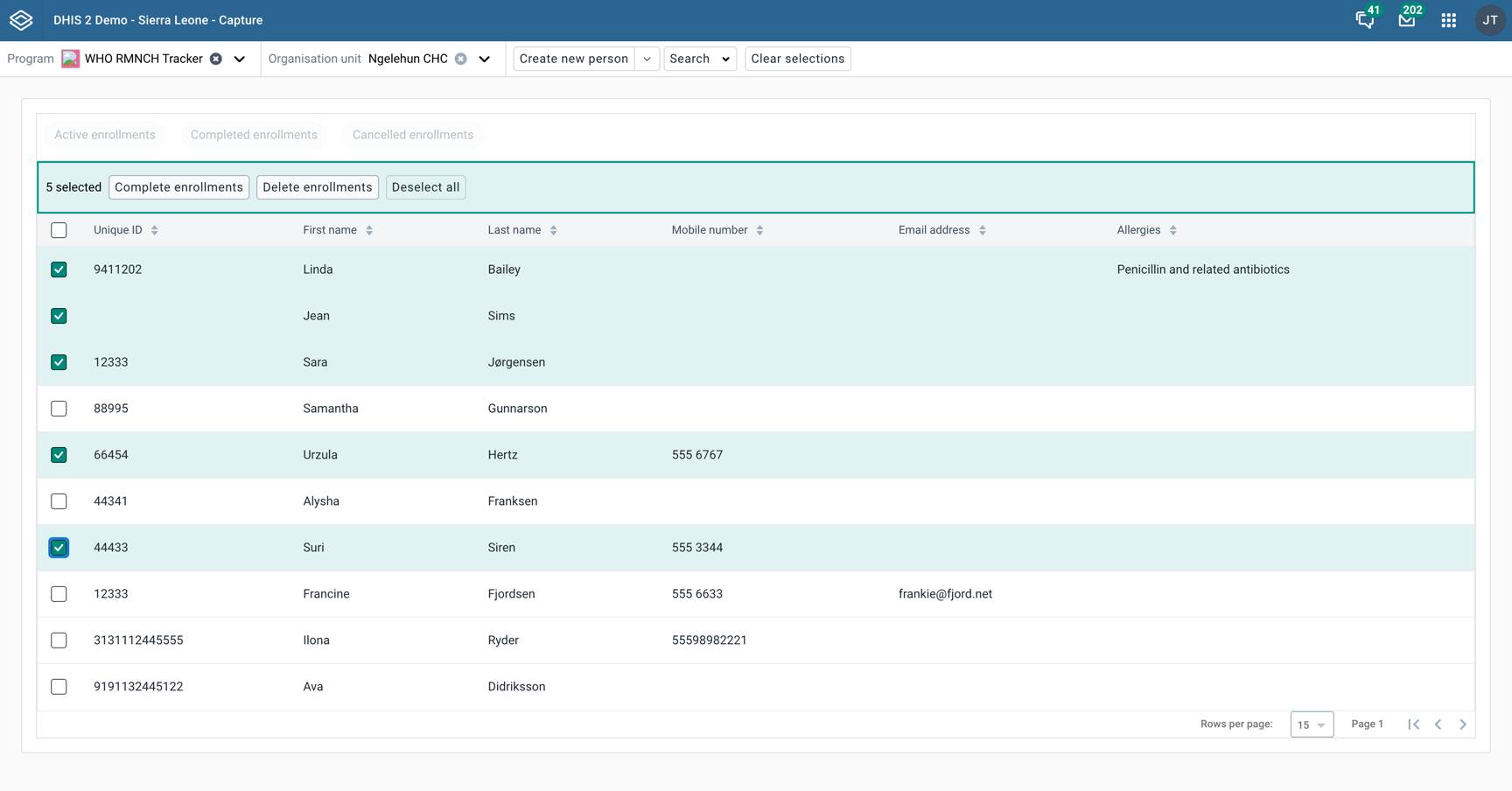
Select the tracked entities you want to perform the action on by clicking the checkbox to the left of the tracked entity.
Click the Complete enrollments button.
Confirm the action in the dialog that appears.
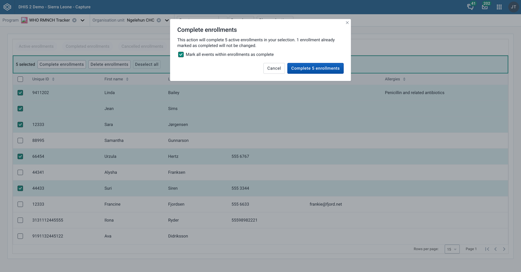
Select the tracked entities you want to perform the action on by clicking the checkbox to the left of the tracked entity.
Click the Delete enrollments button.
In the dialog that appears, select what enrollment statuses you want to delete and confirm the action.
You can choose any combination of enrollment statuses to delete.
Confirm the action in the dialog that appears.
You can show data elements from a single stage in a working list. Select the "Program stage" option from the "More filters" dropdown, then choose a program stage.
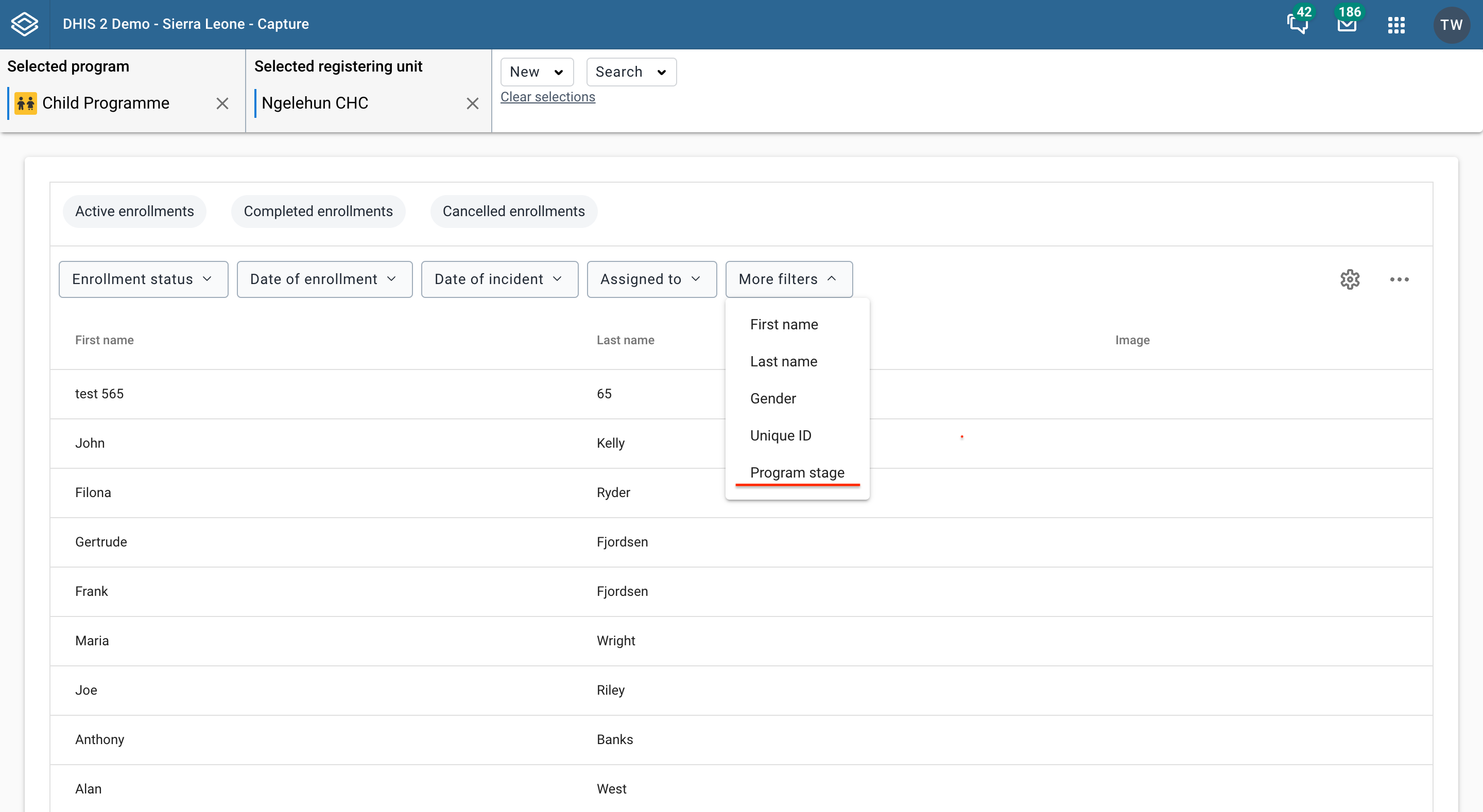
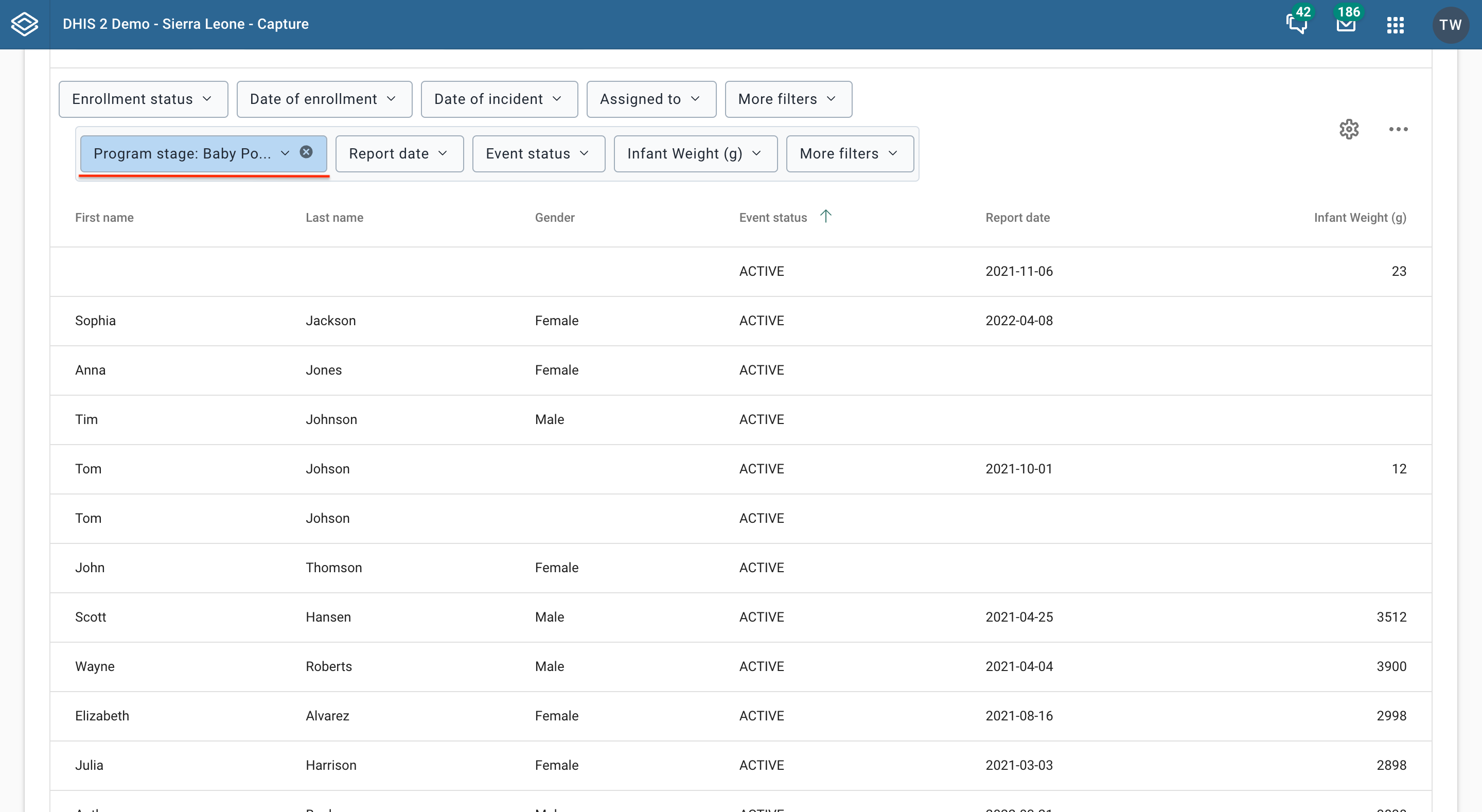
The tracker program stage list can be filtered, sorted, modified, saved, updated, deleted and shared in the same way as other working lists. Additionally, the program stage list can be filtered by assignee, just like an event program list.
For performance reasons the Capture app caches metadata in the client browser. When metadata is updated on the server the changes needs to be propagated to the clients that have already cached the metadata. Depending on the change, this is done in one of three ways:
If the change is bound to a program you will need to increase the program version for that particular program. For example, if you change the data elements in a program or a program rule, the version for the bound program needs be increased.
If the change is NOT bound to a program you will need to increase ANY program version for the change to be propagated to the clients. Examples here are changes to constants, organisation unit levels or organisation unit groups.
The exception to the two rules above is option sets. Option sets have their own version property, i.e. increasing the option set version should ensure the option set metadata are propagated to the clients.
You reach the enrollment dashboard either by typing in the address bar of your browser or using the user interface of the capture app. In this section we are focusing on the first use-case, where you type or paste the url you want to access in the Address bar.

One way to reach the enrollment dashboard and view a specific tracked entity instance's enrollment is by using only the enrollment id. For example the link .../dhis-web-capture/#/enrollment?enrollmentId=wBU0RAsYjKE will take you the dashboard for the enrollment with id wBU0RAsYjKE.
The top of the dashboard defines your context. For example in the image below the context is as follows, the selected program is "Child Programme", the organisation unit is "Ngelehun CHC", the selected person is "Anna Jones" and the selected enrollment is "2017-11-16 11:38".

You can change your context by clicking the "x" button.

When you deselect the program you see the following

When program and enrollment selections are empty, you first have to select a program. If the tracked entity instance (in this case "Anna Jones") has enrollments under the program you select you will see the following message.

If the tracked entity instance (in this case "Anna Jenkins") does not have enrollments under the program you select you will see a message explaining that there are no enrollments for that program. You will also be given the option to enroll "Anna Jenkins" in that program.

When you select an event program you will see the following. (Remember event programs do not have enrollments in the system, only tracker programs do).

You will also be given the option to either create a new event for the selected program or view the working lists for the selected program.
When your selected tracked entity type is a person, as in our example with Anna Jenkins, and you select a program that is not of type person but for example of a type Malaria case you will see the following.

You are also given the option to enroll a tracked entity instance in the program you selected.
When you deselect the organisation unit you see the following
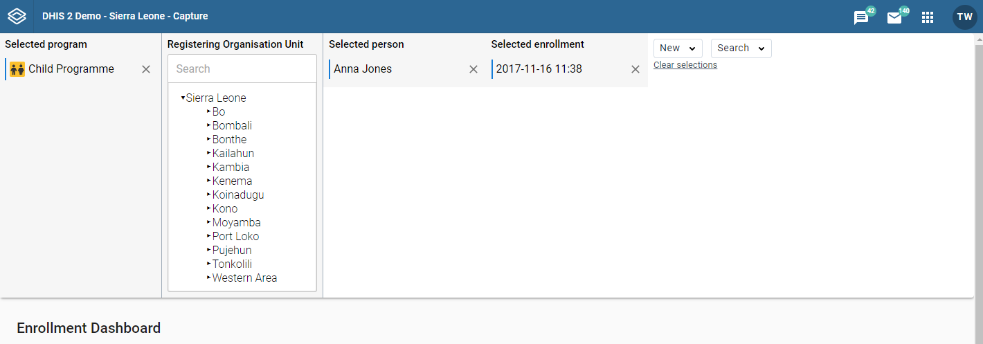
When you deselect the tracked entity instance, in this case "Anna Jones" you are taken to the working lists in that Tracker program.
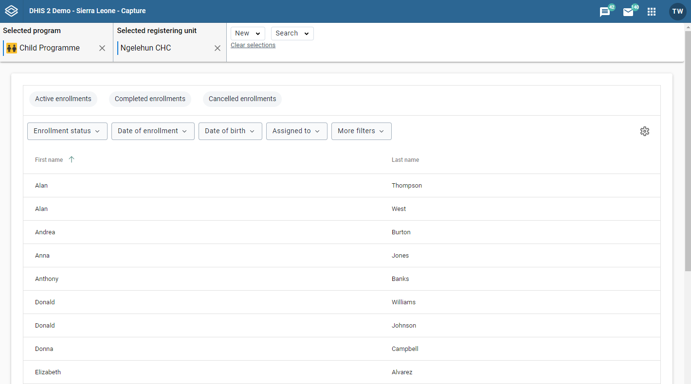
When you deselect the enrollment you see the following

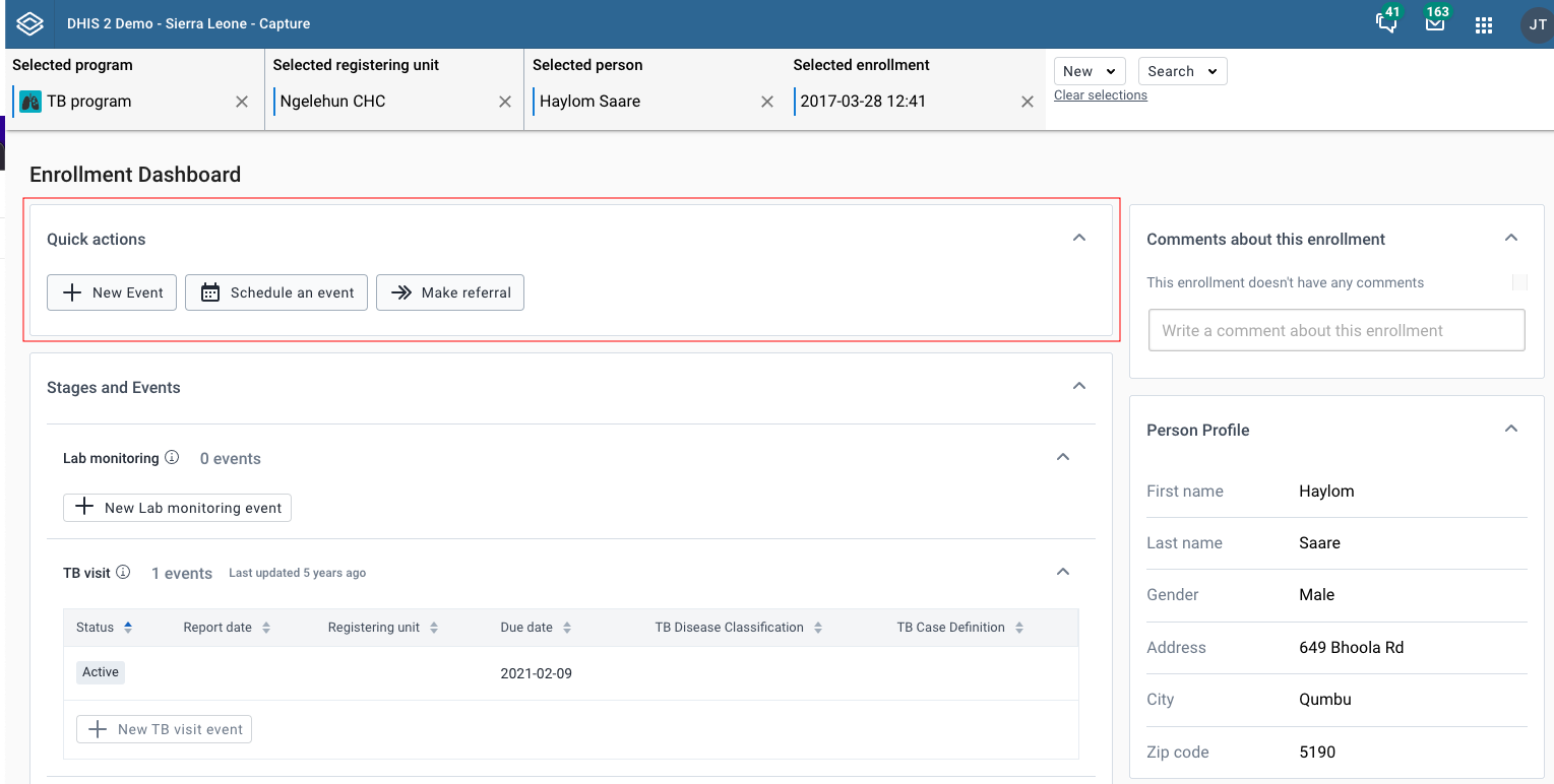
The quick actions widget offers shortcuts for frequently used actions for the current enrollment.
Stages can be collapsed or expanded to reveal the events inside.


In the collapsed state, you can view the summary information about this stage including: - Icon - Program stage name - Program stage description (on hovering the information icon) - Total number of events - Last updated date Depending on the status of events, there can be additional information regarding: total number of overdue events or total number of scheduled events.

When you expand the list, you will see the table contains the data of events in the stage. This includes mandatory columns: Status, Report date and Organization unit, the following columns depend on the data elements that have been selected as Display in list of event.
Events are sorted with most recent on top and other columns are also sortable.

When clicking New {stage event name} button, you will be redirected to the Add new event page for this selected stage.

When clicking Go to full {stage event name} button, you will be redirected to the Program stage list page for this selected stage.
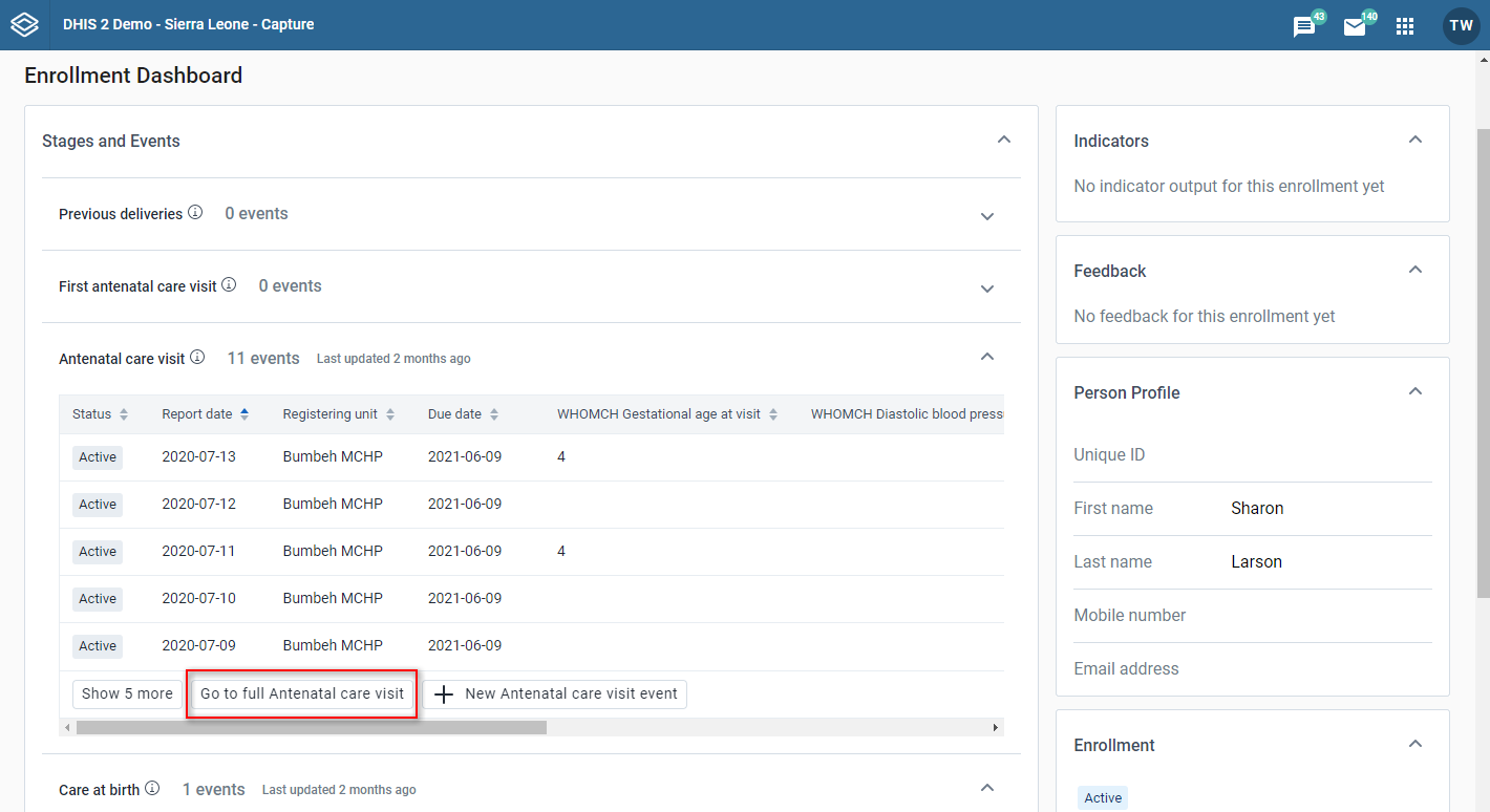
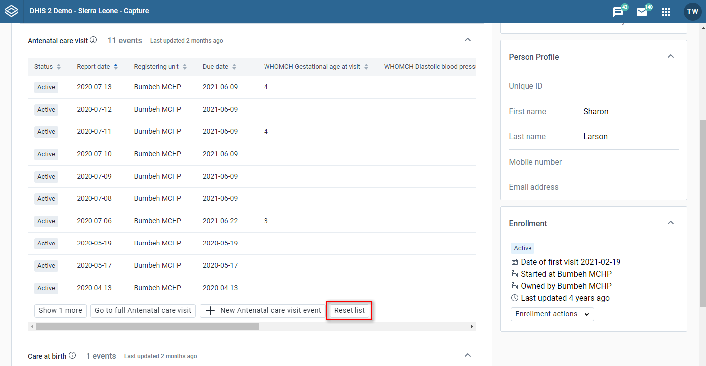
In case there are more than 5 events in the list, only the first 5 are shown. You will be able to view the rest by clicking Show more.

If you want to collapse events, you can use Reset list button which will return the table back to the default sorting and initial 5 events.
On the enrollment page you can see the enrollment widget
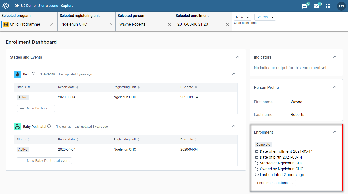
When you click on the enrollment actions button, a menu with all the available actions will open. You can:
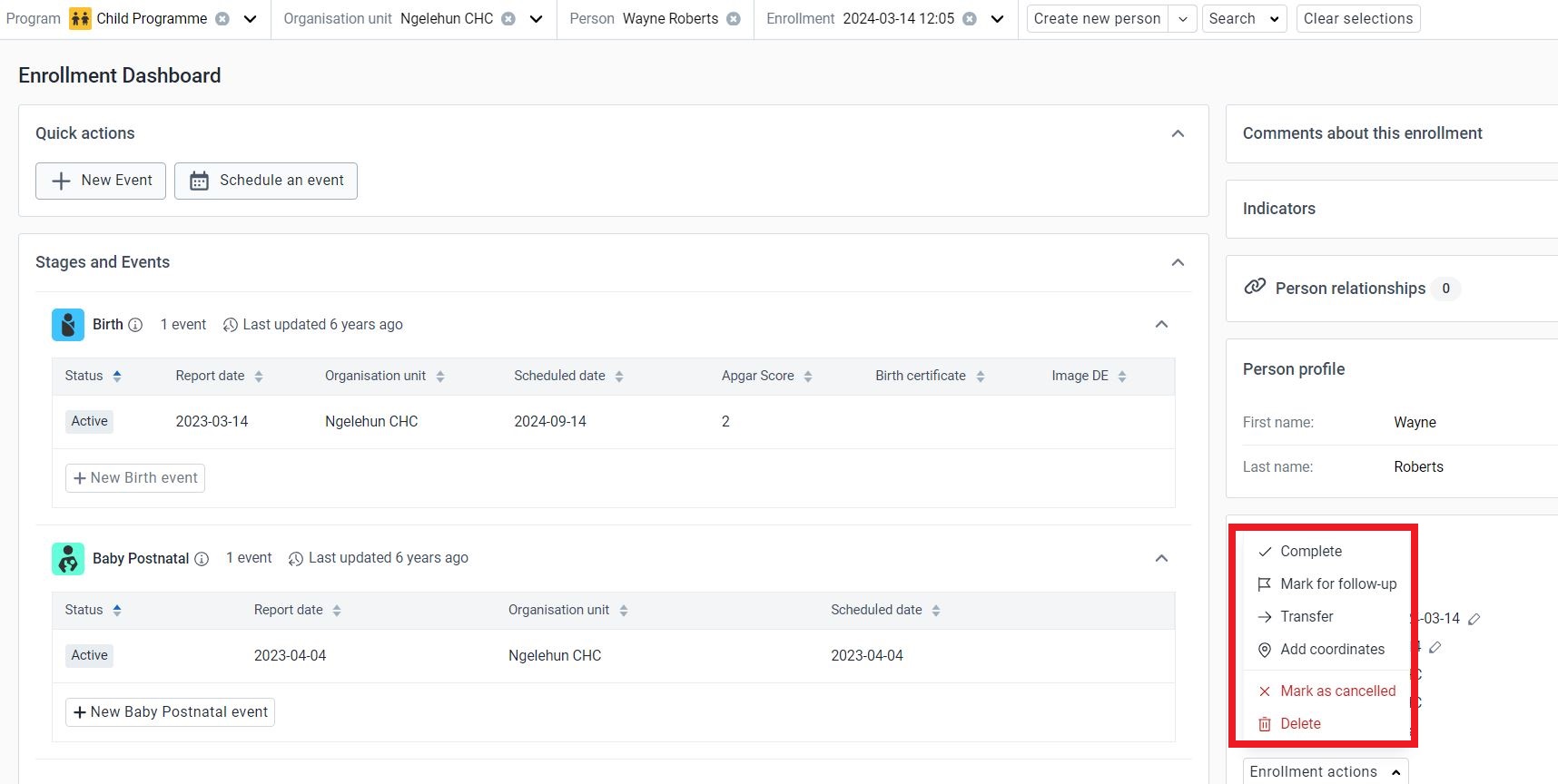
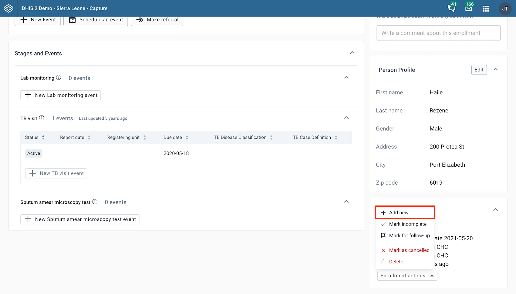
There can only be one active enrollment at a time. If there are no active enrollments, there will be a button Add new to enroll the tracked entity instance in the program again. If the program only allows one enrollment per tracked entity instance, the Add new button will be disabled with a tooltip saying Only one enrollment per {TET} is allowed in this program.
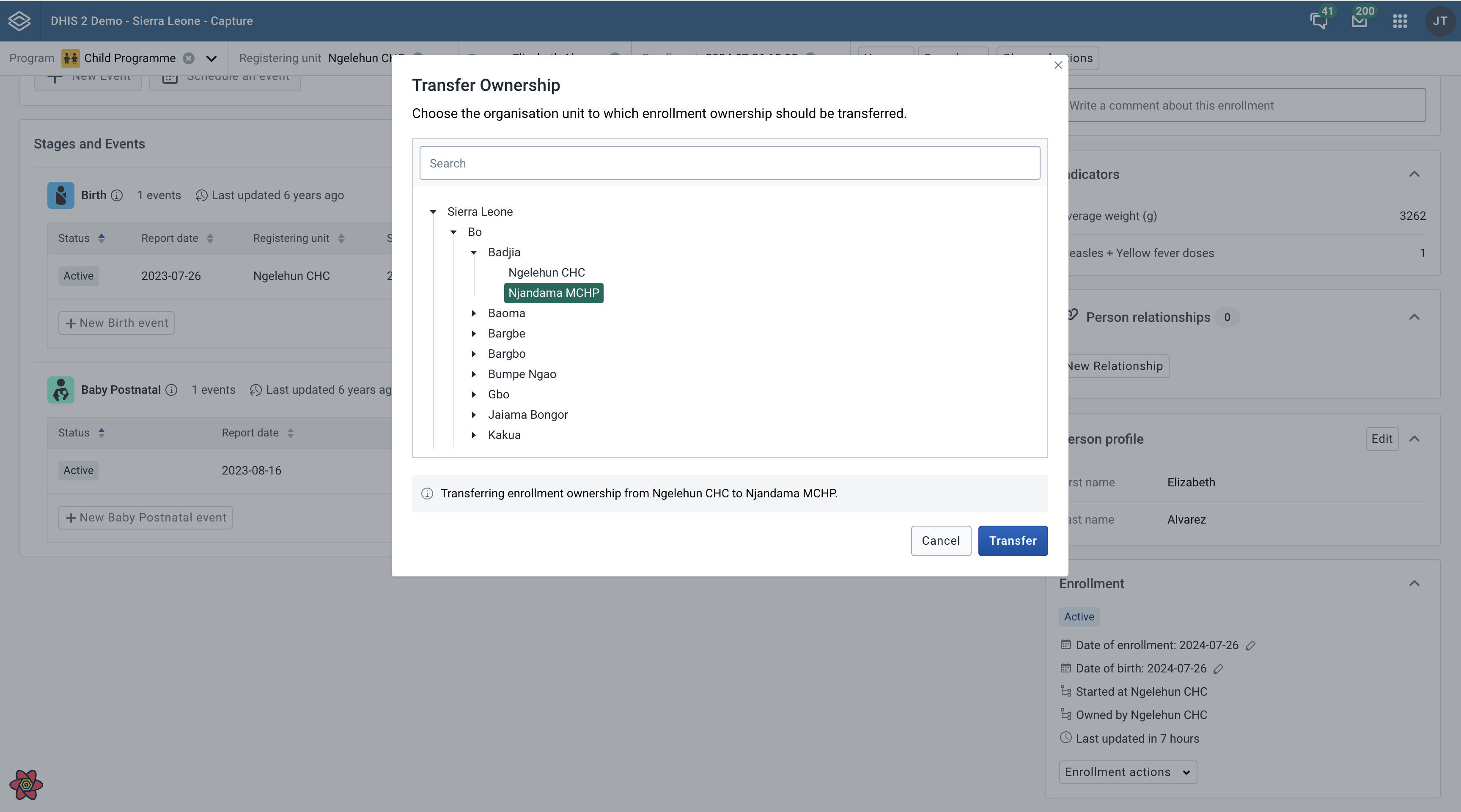
In the enrollment actions, you could also choose to transfer the enrollment to another organisation unit. Click the transfer button and select the organisation unit you want to transfer the enrollment to.
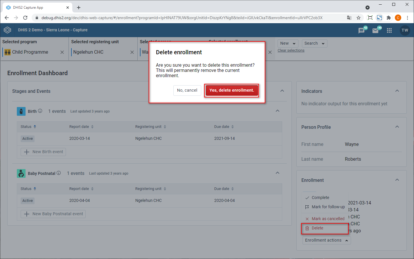
You can delete the enrollment by clicking the delete button and confirming the action in the modal.
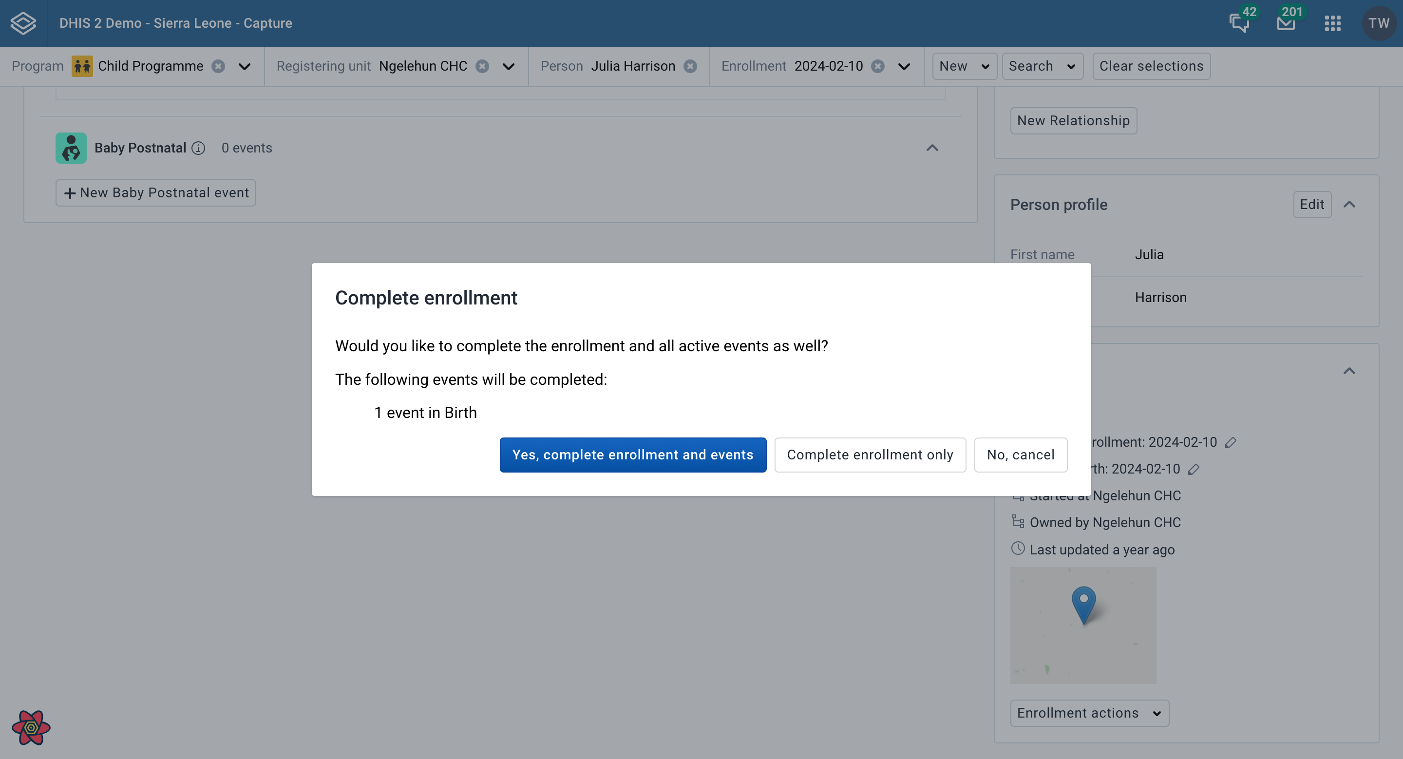
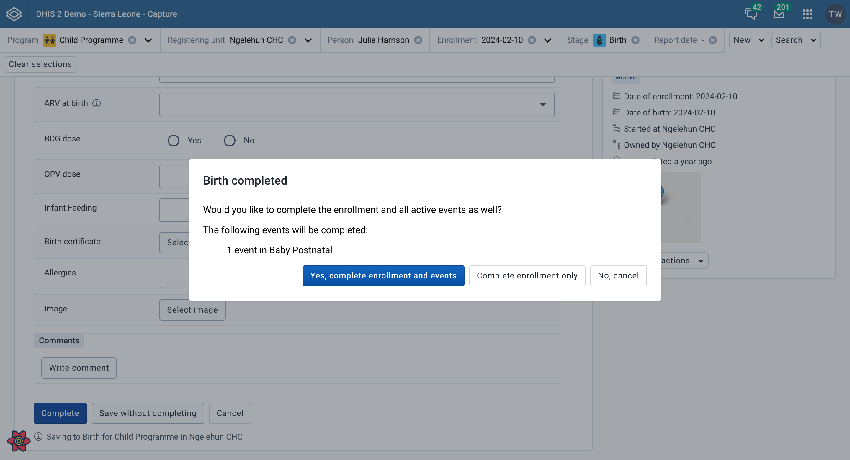
You can complete the enrollment by clicking the complete button. When there are active events, you can choose to complete the enrollment along with the events from the confirmation modal.
The enrollment note widget displays notes and allows addition of notes, associated with the current enrollment.
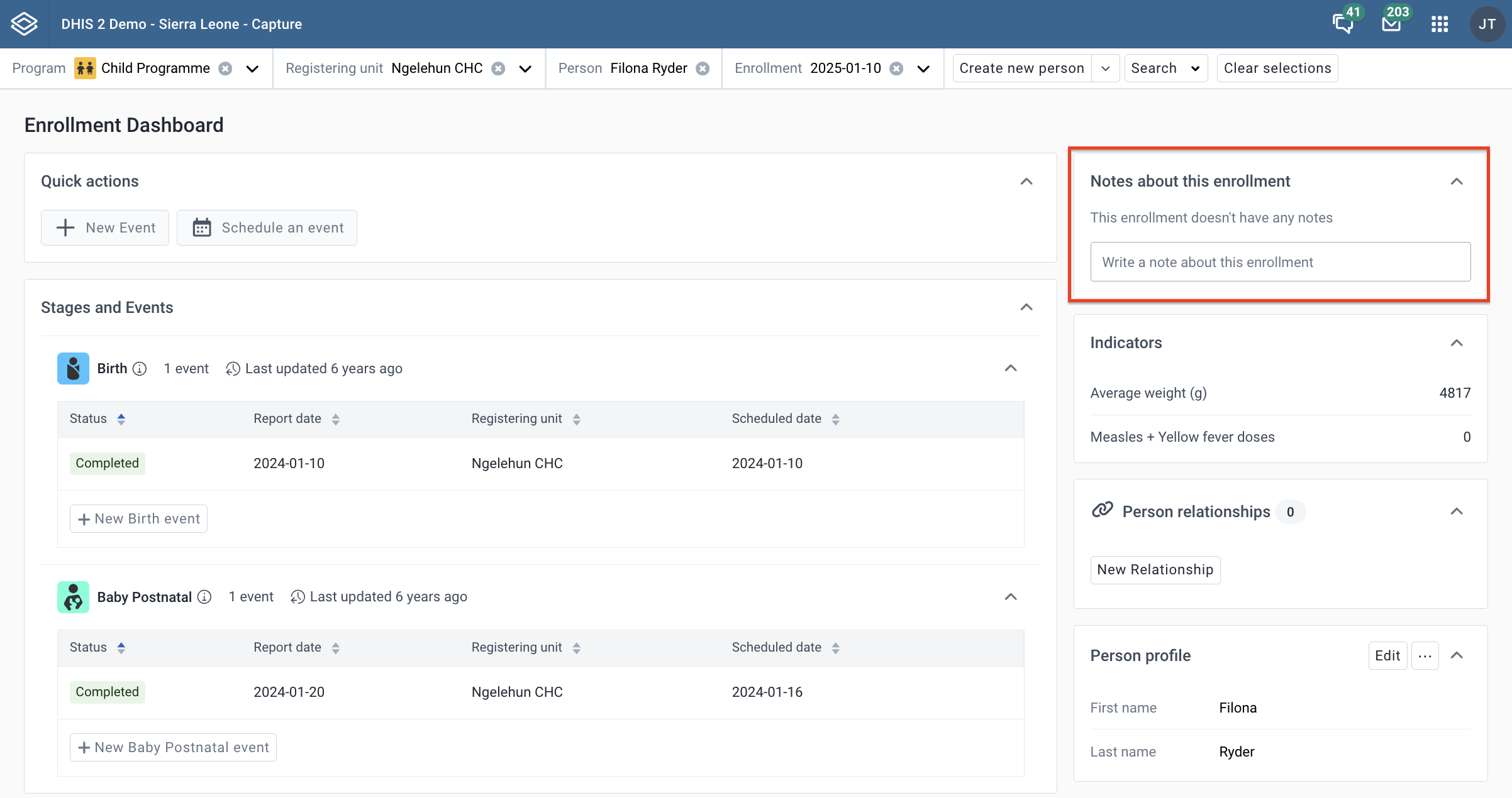
By clicking in the text field, you will be able to enter new text and see action buttons Save note and Cancel. Be aware that Enrollment notes are attributed to a user and cannot be deleted.
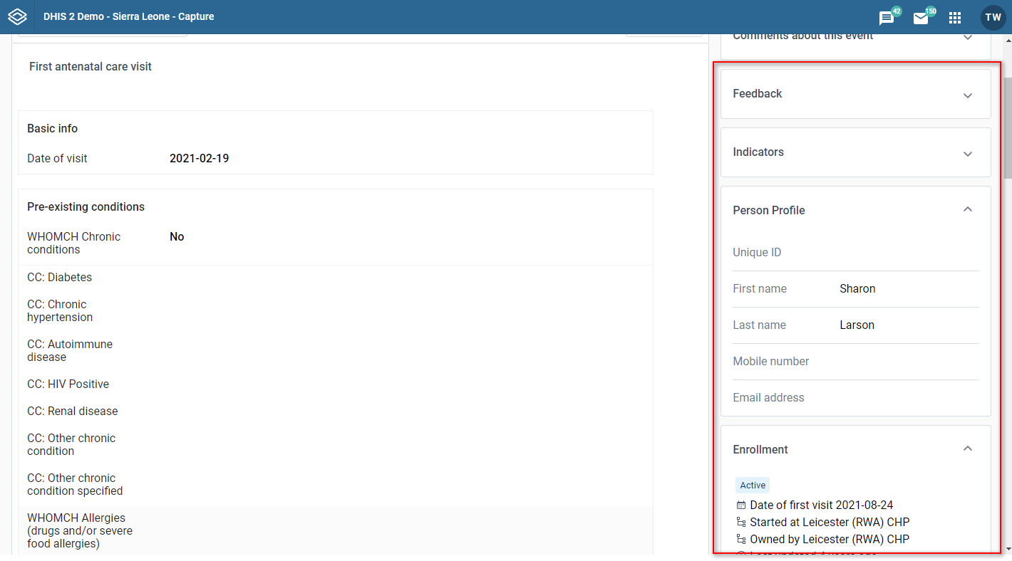
The Relationships widget on the enrollment dashboard is used for viewing the record’s linked relationships to other records. The number next to the title signifies the total number of relationships
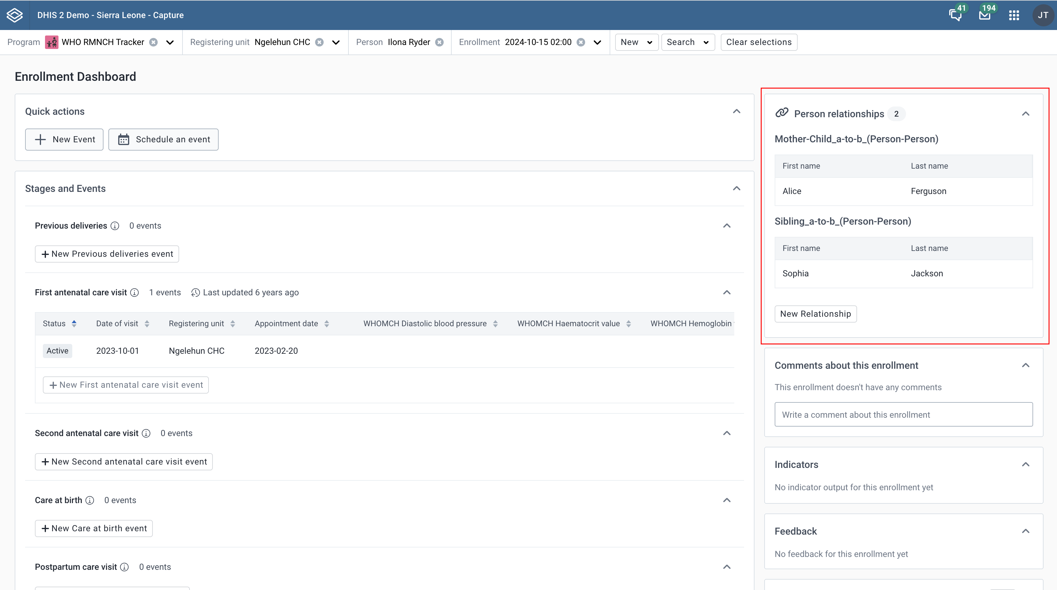
For tracked entity instance relationships, the key attributes shown in the widget are the attributes that have been selected to be displayed on the relationship type page in Maintenance.
If no attributes are selected, it will just show a row per record with tracked entity type name and relationship creation date.
When clicking a tracked entity instance you should be taken to the Enrollment Dashboard. If the relationship type includes a program, you should be taken to the latest enrollment for that program. If no program is specified, you should still be sent to the enrollment dashboard, but without a program.
Click the Add new button to add a new relationship. Adding a new relationship opens a dialog where you can select the applicable relationship type.
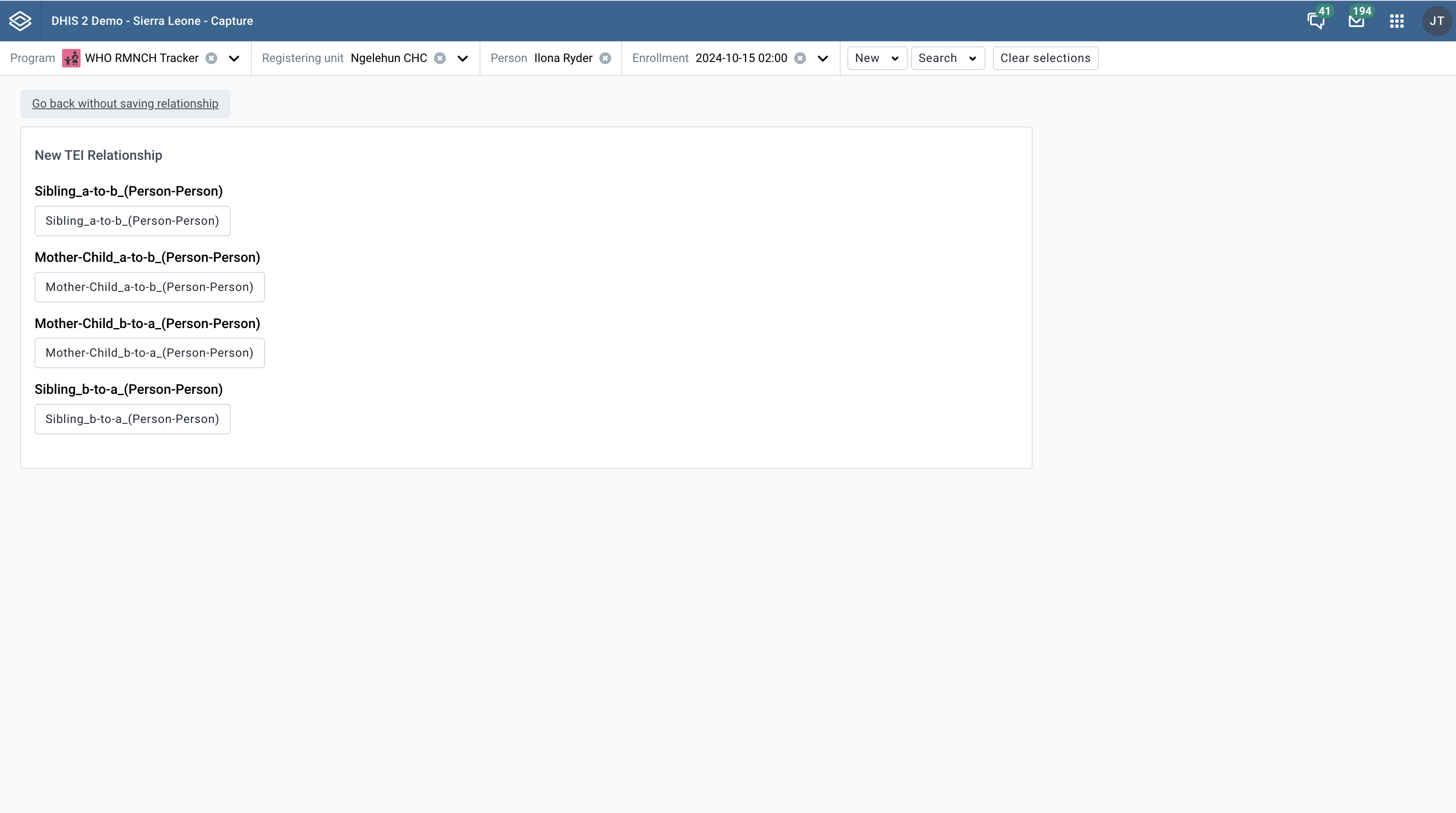
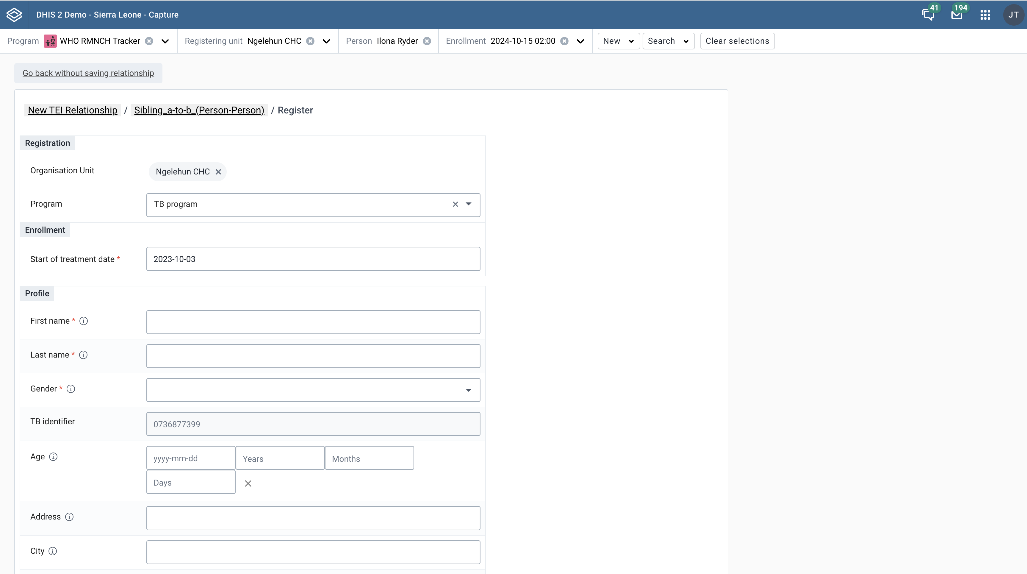
Choose between linking to an existing tracked entity instance or creating a new one.
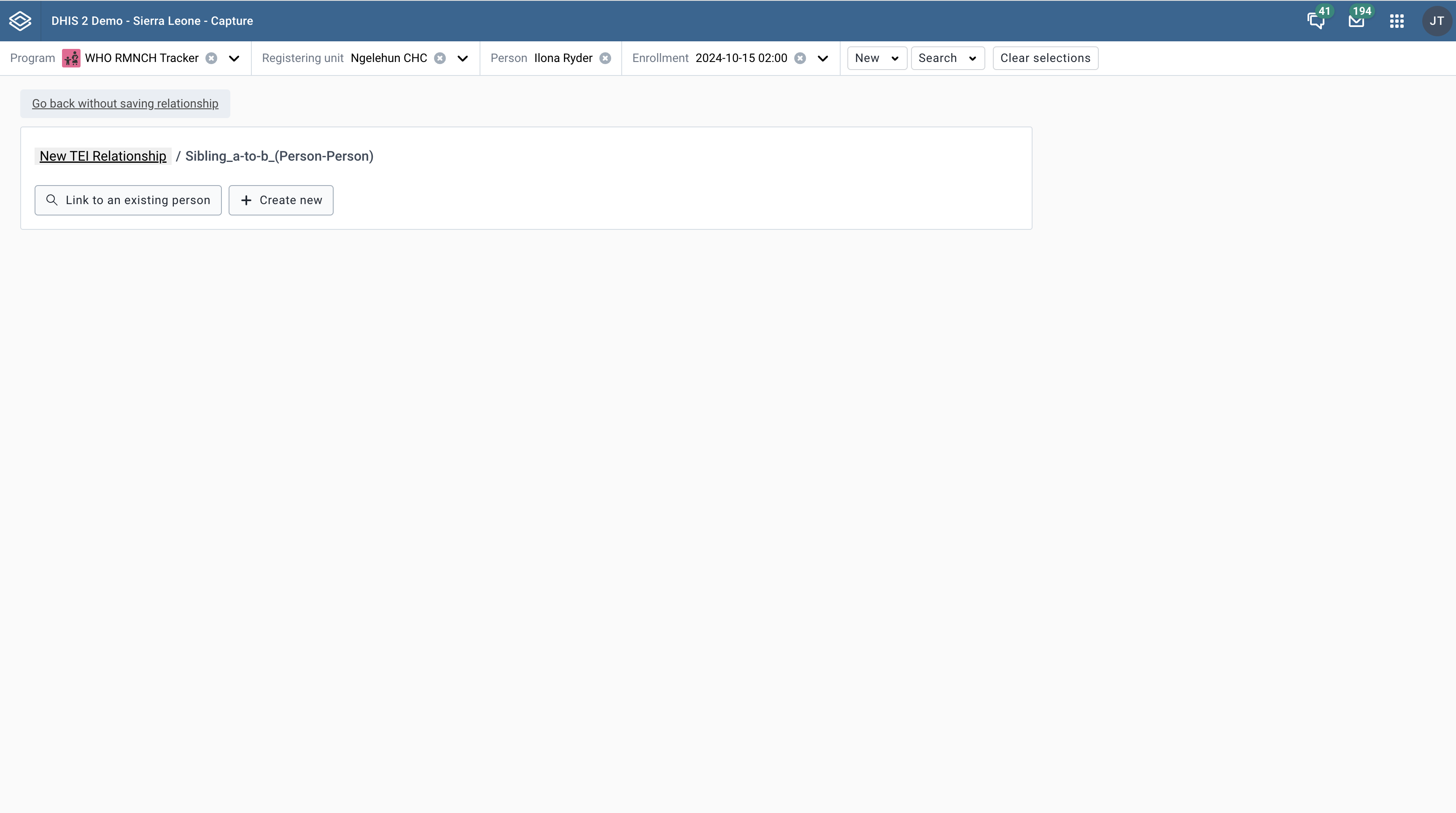
Use the search form to find any existing record to link to.
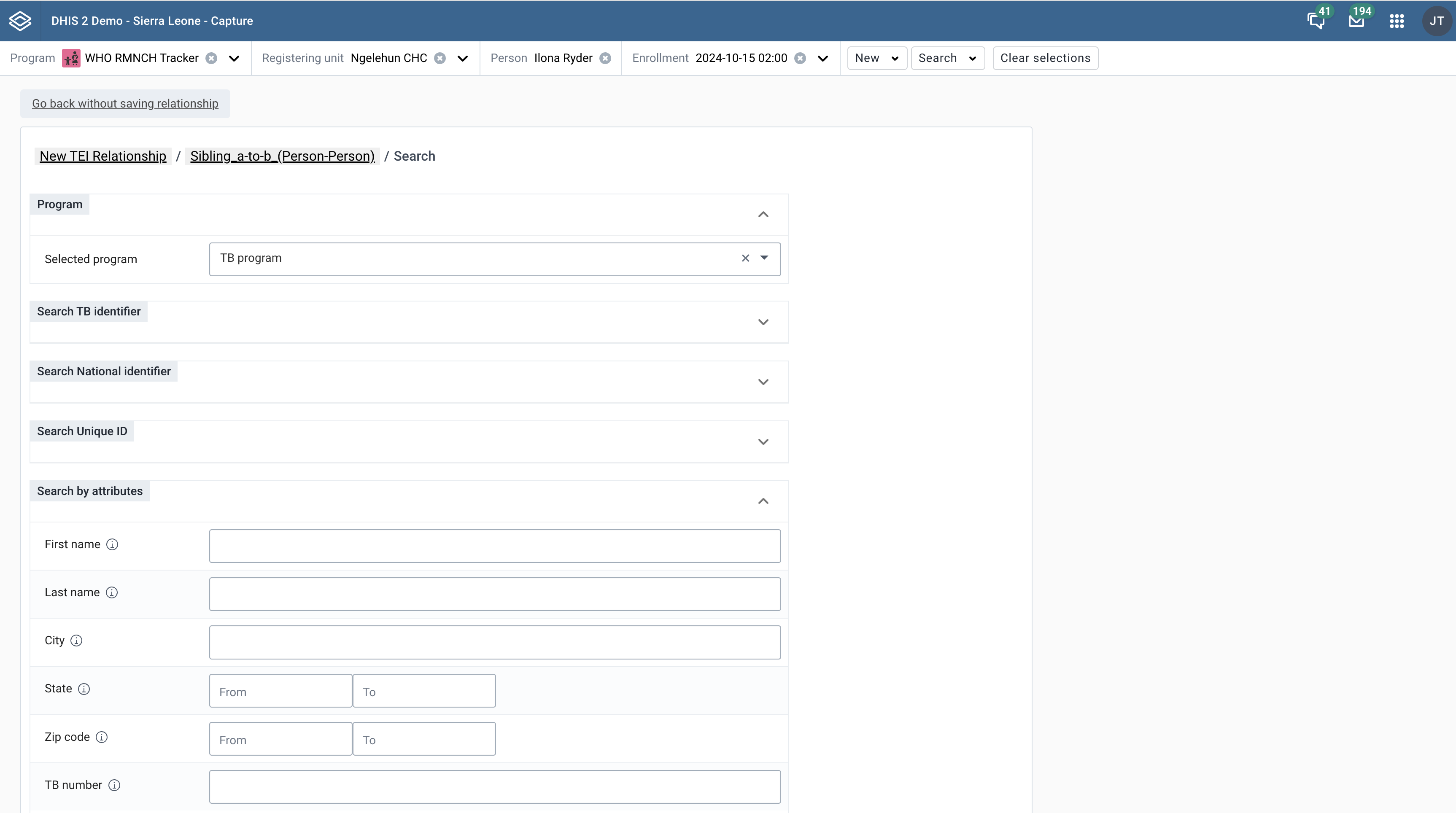
Use the form to create a new record and link.
On the enrollment dashboard, you can view the tracked entity instance profile widget. Inside the profile widget you can view the key attributes values.
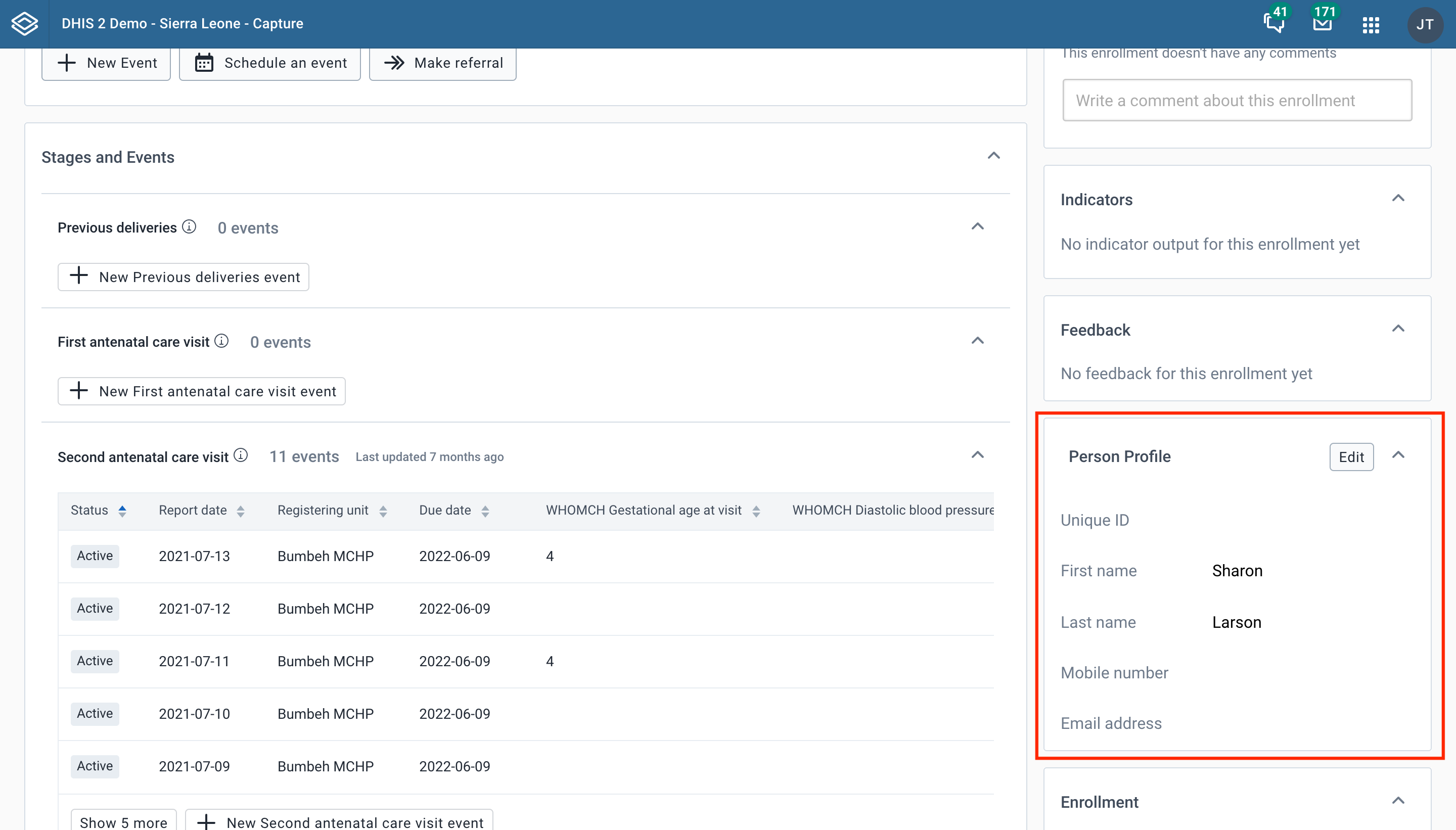
Click the Edit button to make changes to the tracked entity instance profile. Editing the profile opens a dialog where the profile attributes can be changed.
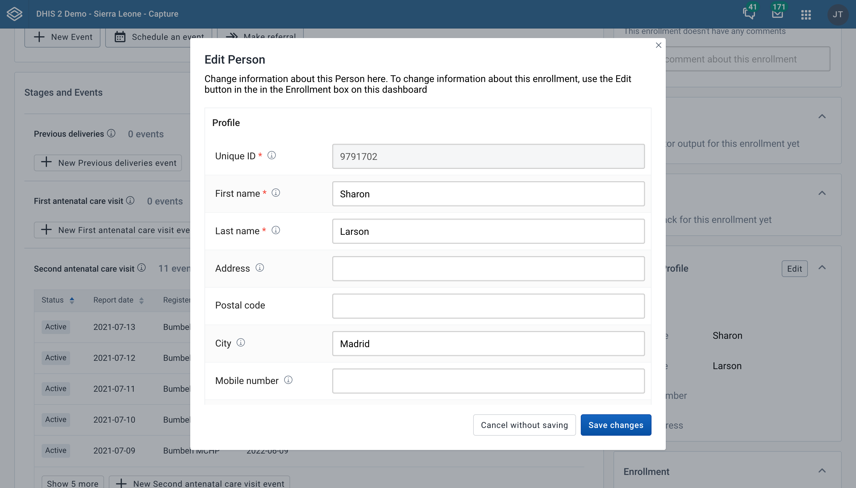
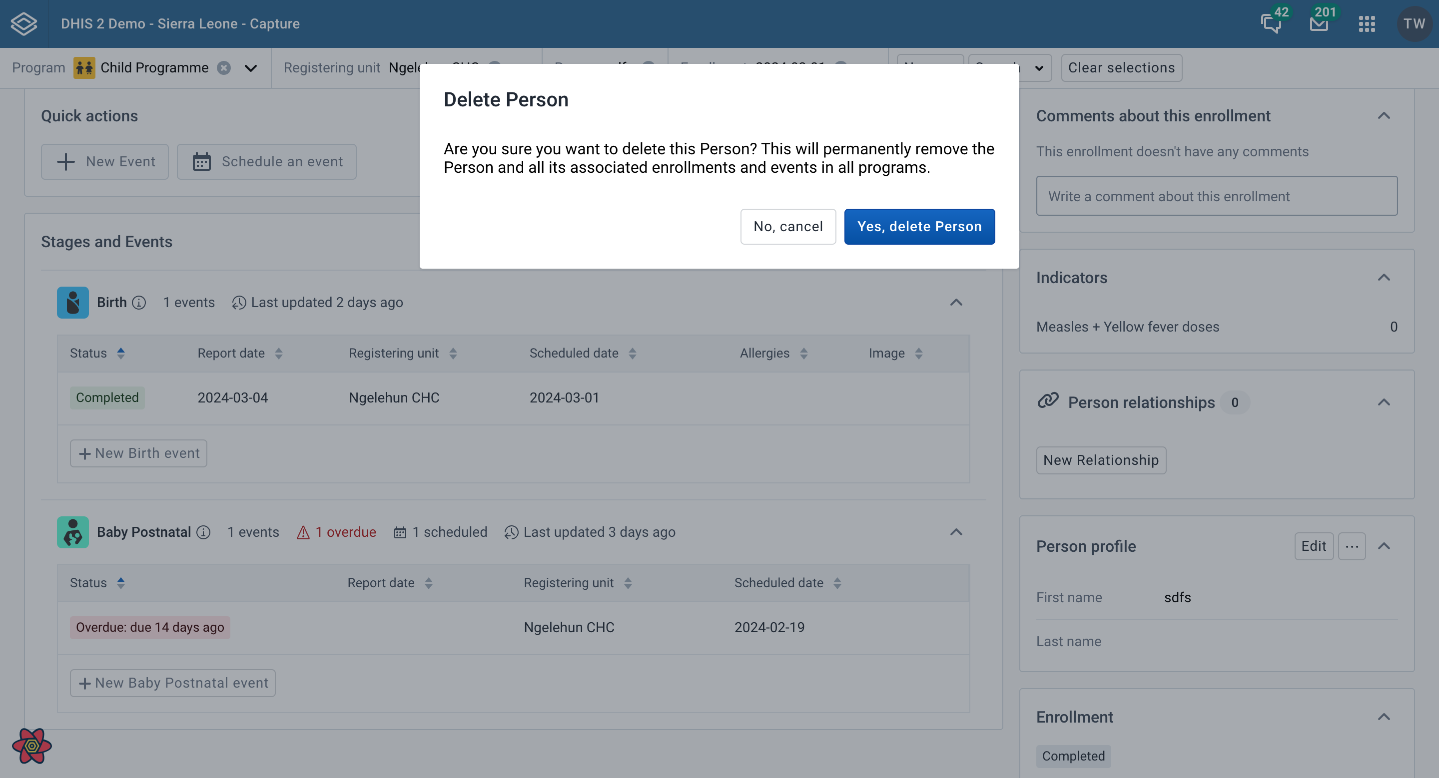
Click the Delete ${tracked entity type} button to delete the tracked entity. You can confirm the action from the dialog. Once confirmed, tracked entity and all its associated enrollment and events across all programs will be deleted. To delete a tracked entity that has any enrollments, the user needs the authority Delete tracked entity instance and associated enrollments and events.
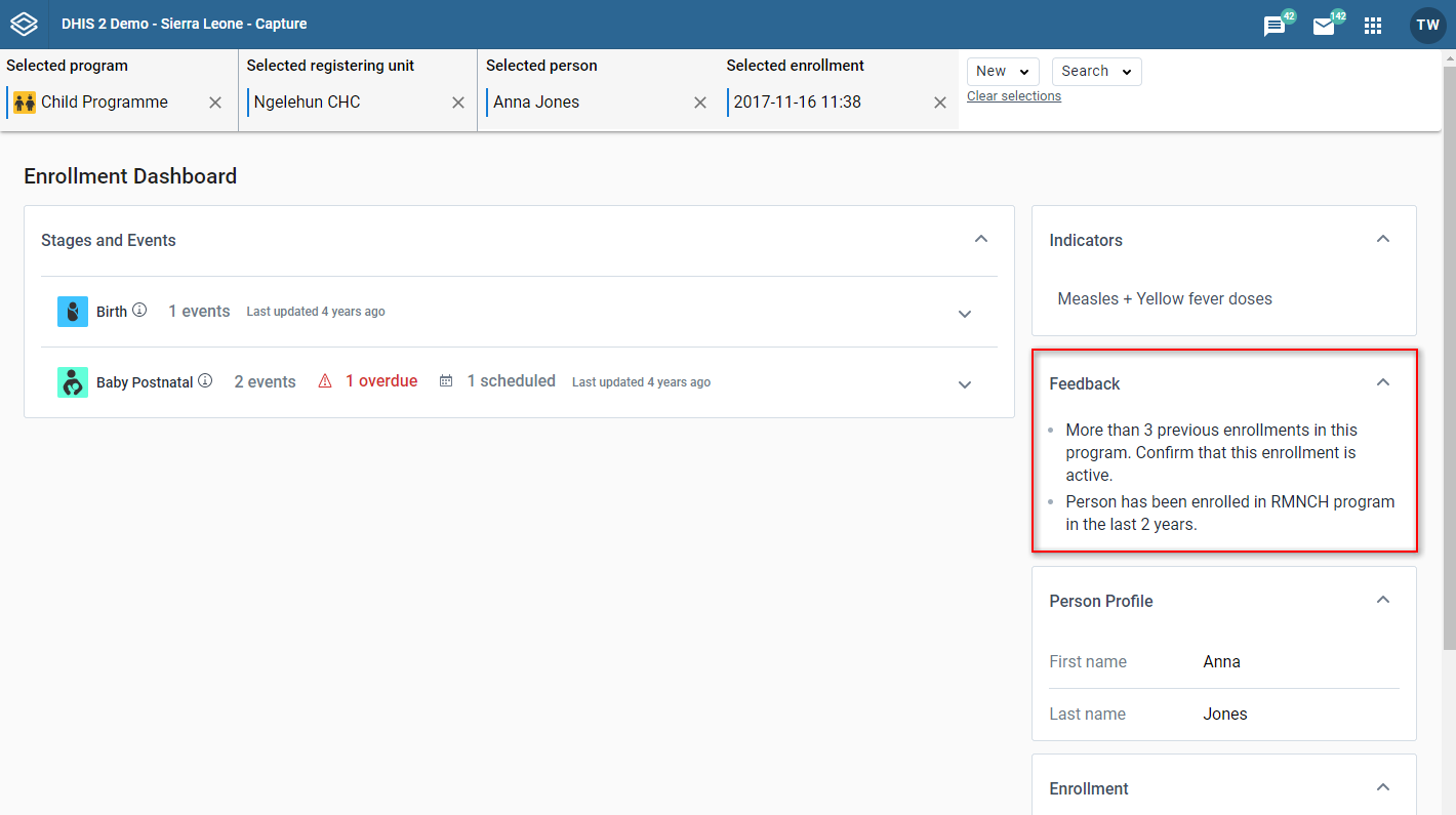
On the enrollment dashboard, the feedback widget displays text and values that are triggered by certain conditions. If the current dashboard triggers some rules set up in the program, the text or values will be automatically displayed.
If there isn't any feedback for the current dashboard, the widget shows a short empty message. If there aren't any program rules that could show feedback for the current dashboard then the widget is hidden.
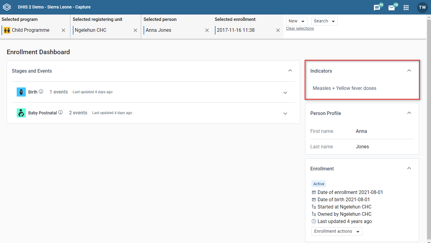
On the enrollment dashboard, the indicator widget displays indicator text and values output related to the current dashboard. The indicators will be sorted alphabetically.
If there aren't any related indicators or indicator output for the current dashboard, the widget shows a short empty message. If the current dashboard can't show any indicator output (because it has no related indicators) then the widget is hidden.
Some indicator values show a colored circle next to the value. The colored circle shows the related legend color for that indicator value. Colored legend circles are only shown for indicator values that have them set up.
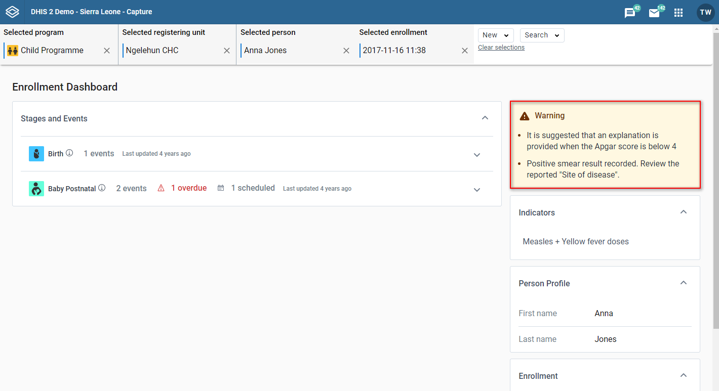
On the enrollment dashboard, the warning widget displays warnings related to the current dashboard. The widget shows warnings that are not associated with any specific data item. If there aren't any warnings to show for the current dashboard then the widget is hidden.
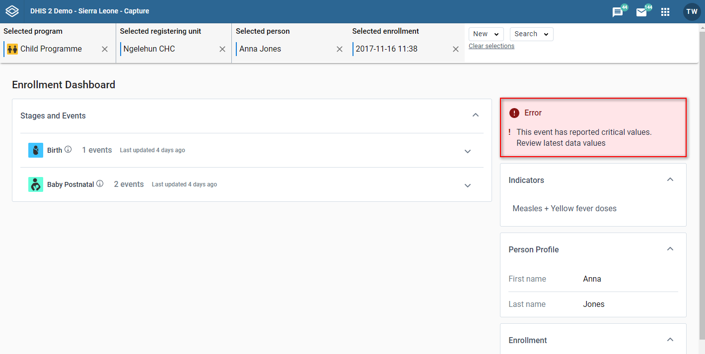
On the enrollment dashboard, the errors widget displays errors related to the current dashboard. The widget shows errors that are not associated with any specific data item. If there aren't any errors to show for the current dashboard then the widget is hidden.
You can reach the enrollment event edit page is by clicking any event in the Program stage list from the Enrollment Overview page.
At the top of the page you can see various information related to the current context. You can see the program, the organization unit, the tracked entity, the enrollment date, the stage and the enrollment event date.
To go to Enrollment Overview page you can: - click the "Back to all stages and events" button. - deselect the stage from the top bar. - deselect the event from the top bar.
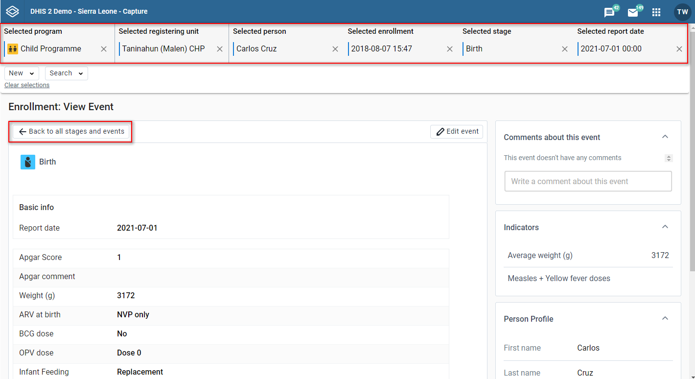
This is the form where you can see and edit the enrollment event details.
In the view/edit event form you can see the stage name and icon.
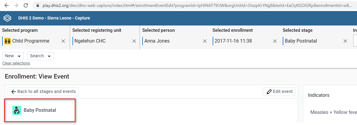
At the top of the page you can see different informations related with the current context. You can see the program, the organization unit, the tracked entity, the enrollment date, the stage.
To go to Enrollment Overview page you can: - deselect the stage from the top bar. - deselect the event from the top bar.
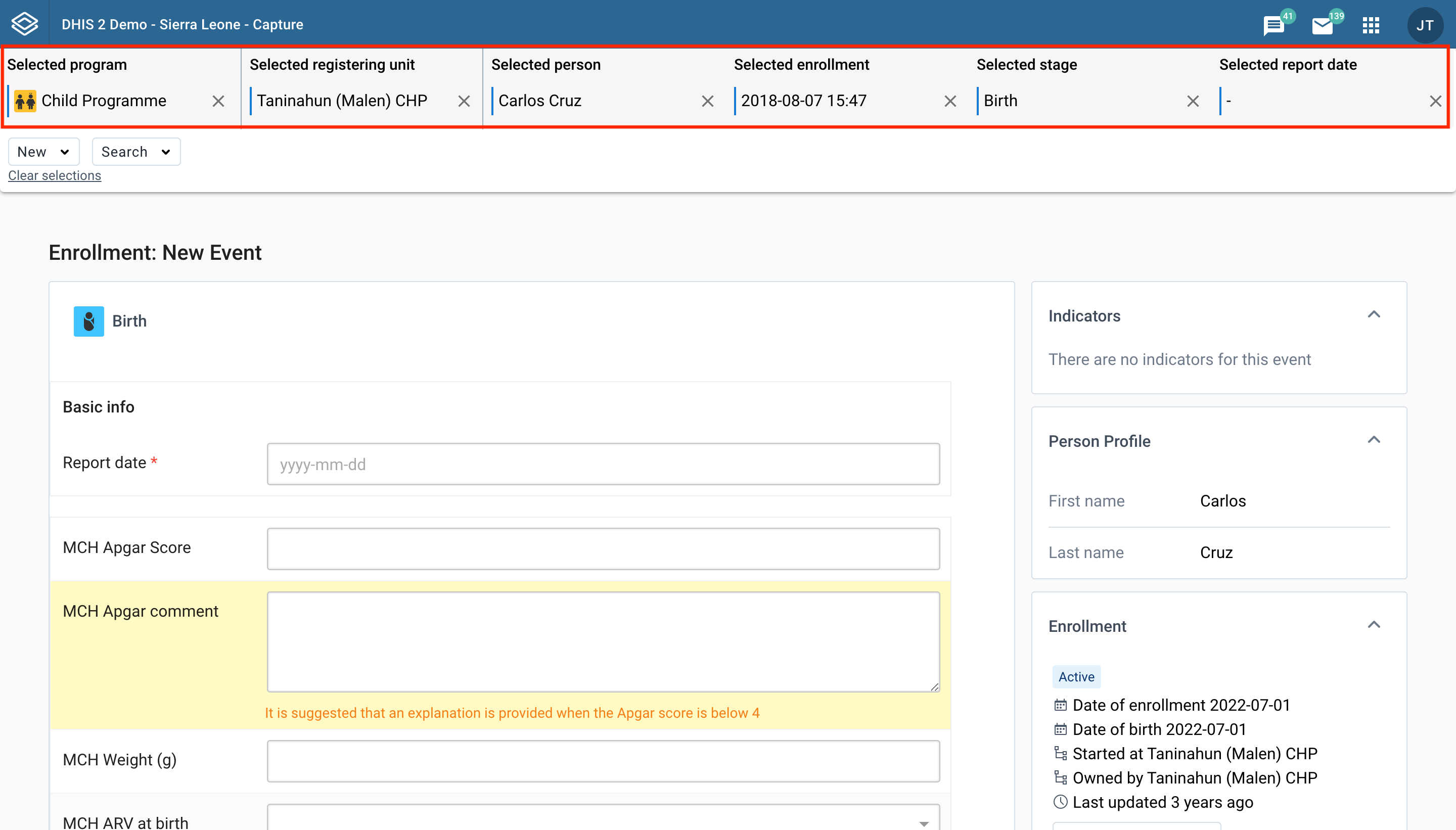
If an event has the status Scheduled or Overdue, you will be able to see the Report and Schedule tab.
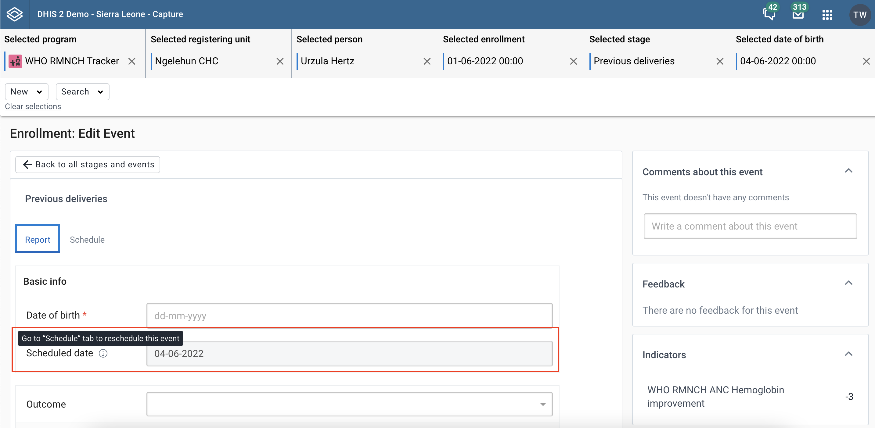
In the Report tab, the scheduled date field will still be shown, but will be greyed out, and there will be an icon next to it with a tooltip saying “Go to Schedule tab to reschedule this event”.
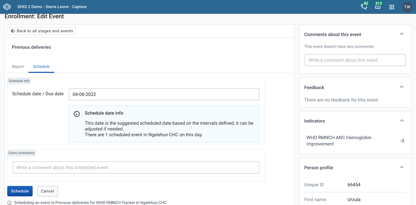
In the Schedule tab, the similar information about scheduling an event as in New event workspace will be shown. You will be able to edit the schedule date and save the change by clicking Schedule button.
If an active event has a scheduled date before becoming active or a completed event has scheduled date, this date should still be shown in the workspace. It’ll be locked with an icon next to it and a tooltip saying “Scheduled date cannot be changed for active/completed events”.
If the flag “Hide due date” in the Maintenance configuration is enabled, scheduled date will not be shown in the form.
However, you can still schedule an event, but it automatically chooses the date based on "Scheduled days from start" that has been configured in Maintenance, and this can not be changed. In the Schedule tab, there will be “Schedule info” saying “Scheduled automatically for xx/xx/xx”, and the user can click Schedule button.
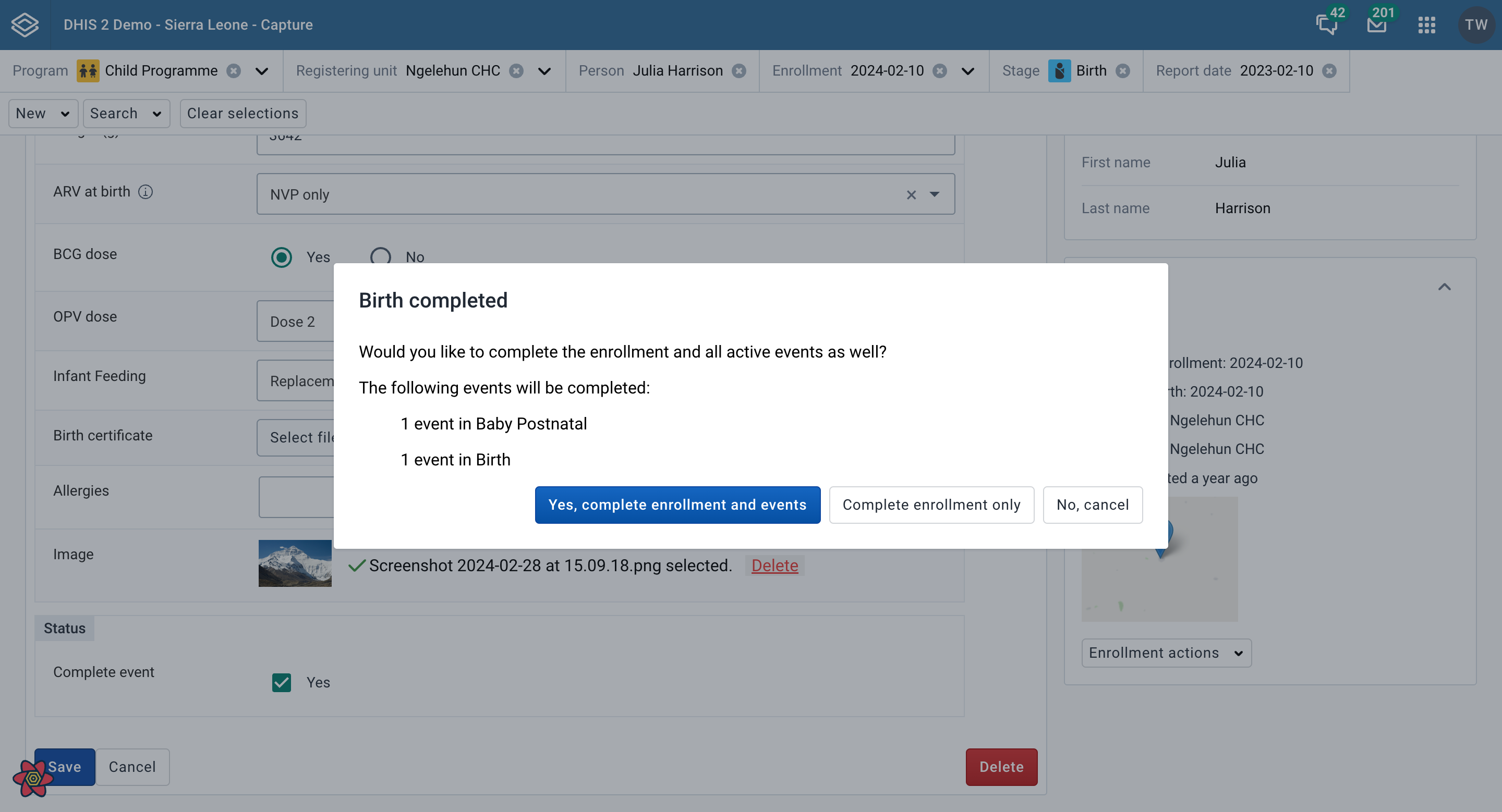
If this flag has been enabled for the stage in Stage details in Maintenance, a modal will show up after the user checks the Complete event checkbox and clicks save.
When the form is in the view mode the title of the page will appear as: Enrollment: View Event. You can see in the page all the information related to the event. Click the Edit event button to switch to the edit mode. This mode is bypassed for events that are scheduled.
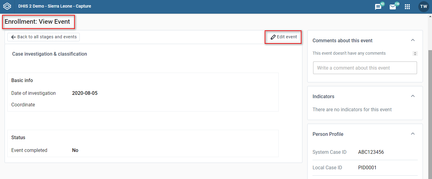
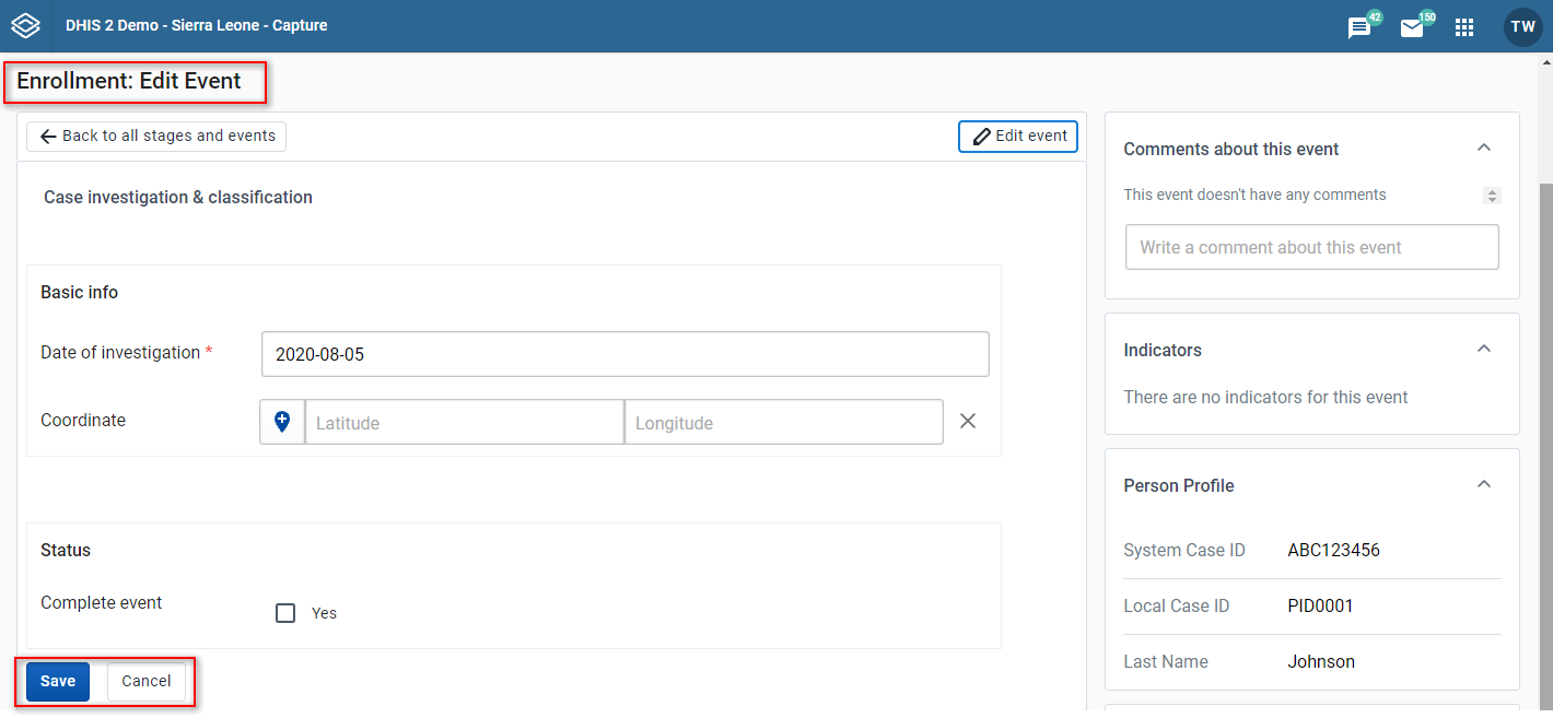
When the form is in the edit mode the title of the page will appear as: Enrollment: Edit Event. You can modify the event and click the Save button. Click the Cancel button to switch to the view mode without saving the changes. Scheduled events are are the exception and they are opened in edit mode directly, without the user having to click Edit event. Click the Cancel button to go back to the enrollment dashboard page without saving the changes.
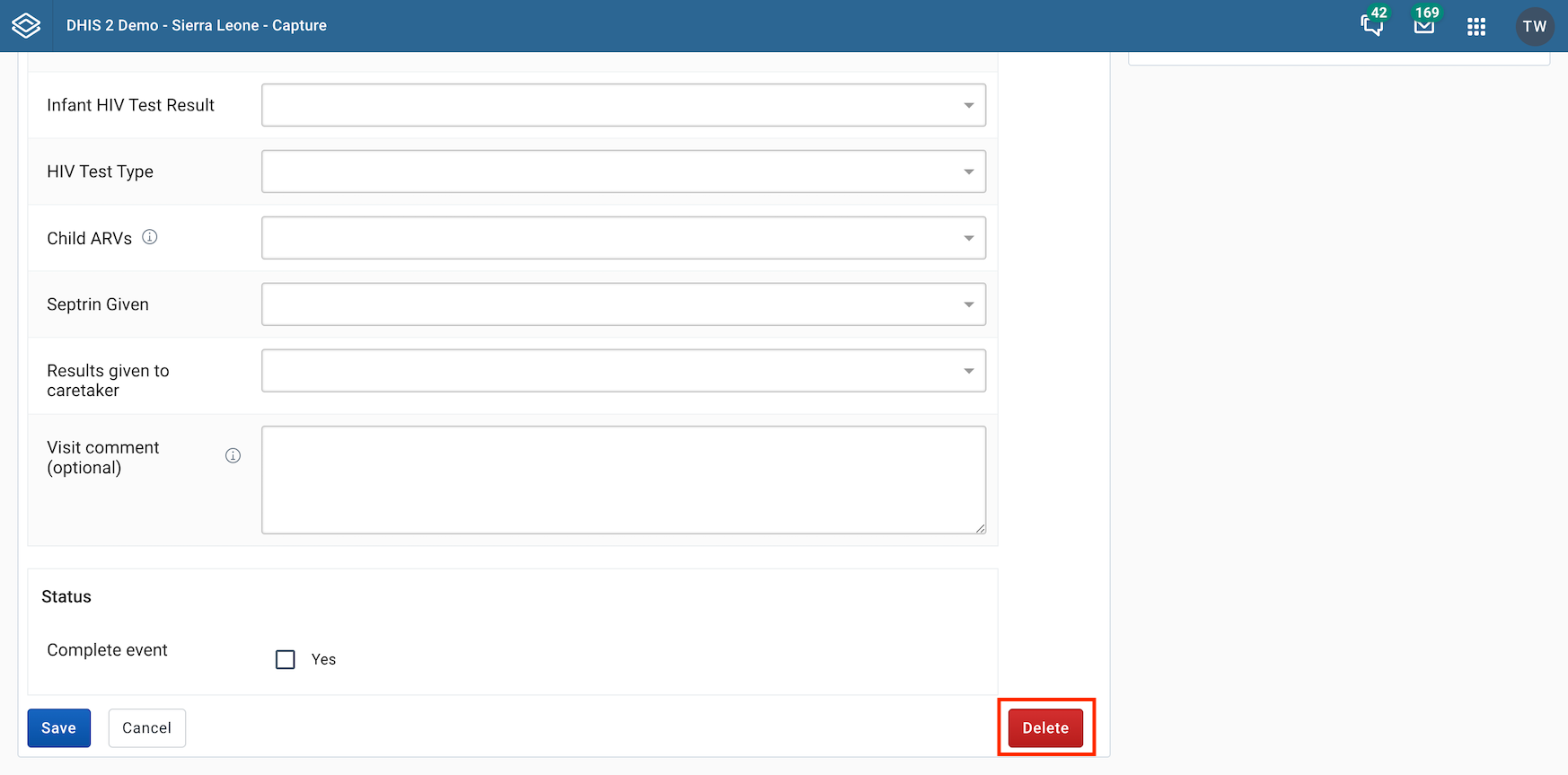
In this form you can also delete the event by clicking Delete button, a modal will appear to confirm if you want to delete this event. You will then be navigated back to Enrollment dashboard page.
The widgets seen in the right-hand column will display and function the same way as mentioned in the enrollment dashboard.
In View/Edit enrollment event page
In the right column you will find the assignee widget.
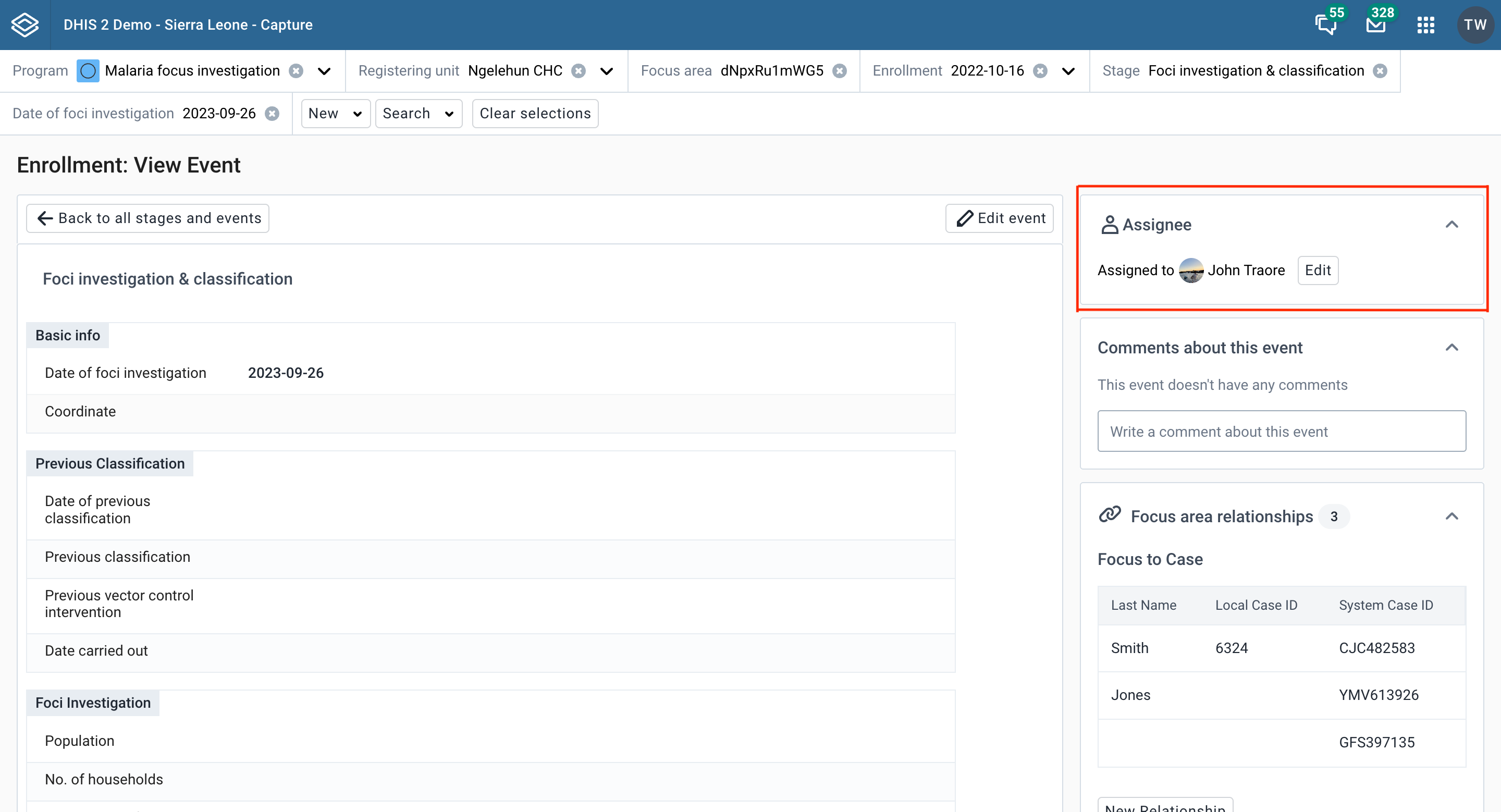
Click the Edit button, or the Assign button if the event is not currently assigned to anyone.
Search for and select the user you would like to reassign the event to. Click the Save button.
You can reach this page add event page by clicking in the New {stage event name} button in the overview page. In this page you can switch between different tabs: Report to add new event, Schedule to schedule an event and Refer to refer event. If you have unsaved changes in one tab and switch to another tab, there will be a warning displayed.
This is the form where you can modify the event details before saving. In the header you can see the stage name and icon.

If you enter the new event page with no stage selected, a list of available stages will be displayed. Select the stage you want to add a new event in by clicking the associated button. To navigate back to the enrollment overview, click the Cancel without saving-button

If this flag has been enabled for the stage in Stage details in Maintenance, a modal will show up after the user clicks the Complete button.
If this flag has been enabled for the stage in Stage details in Maintenance, a modal will show up after the user clicks the Complete button or checks the Complete event checkbox and clicks save. The user can choose the button Yes, create new event to navigate to the New Event page or No, cancel to navigate back to the enrollment dashboard. If there is only one possible stage available, the user will be taken directly to the New event workspace for that stage.
When reporting or scheduling an event, you can assign a user to it. This feature must be enabled per program stage in a tracker program by clicking the "Allow user assignment of events" check box.
You will find the assignee section near the bottom of the data entry page. Search for and select the user you would like to assign the event to. The assignee will be preserved when you save the event.

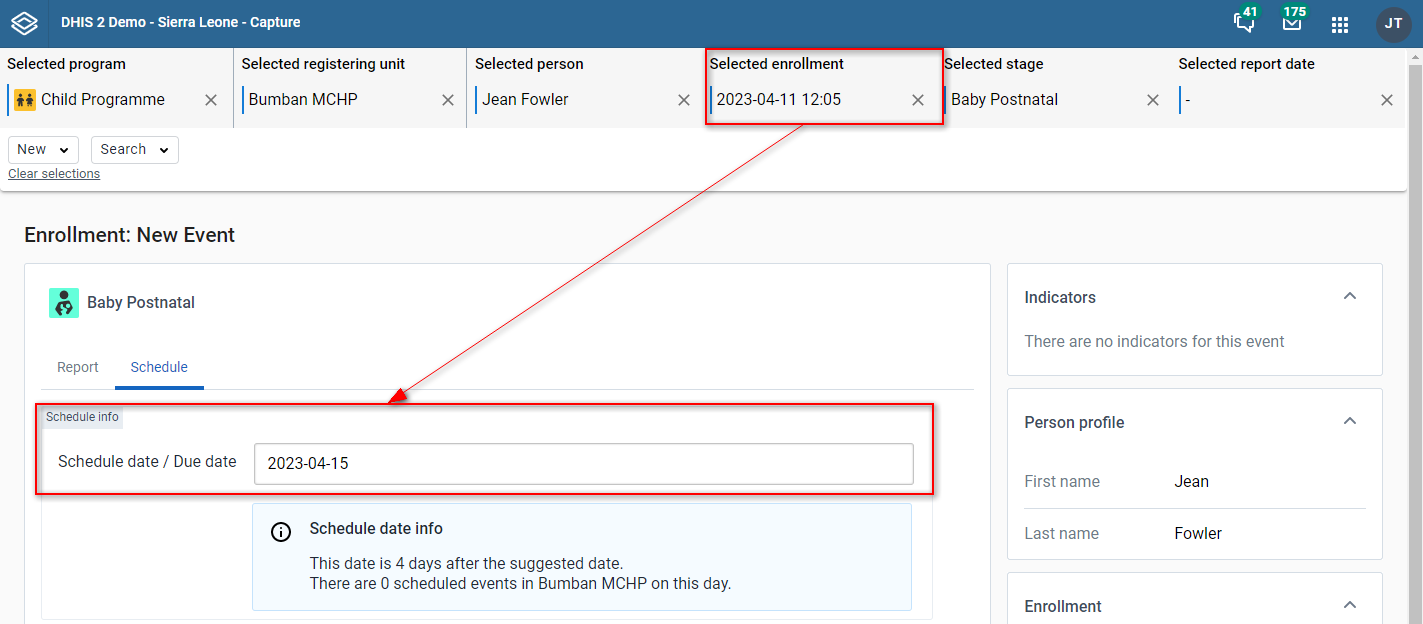
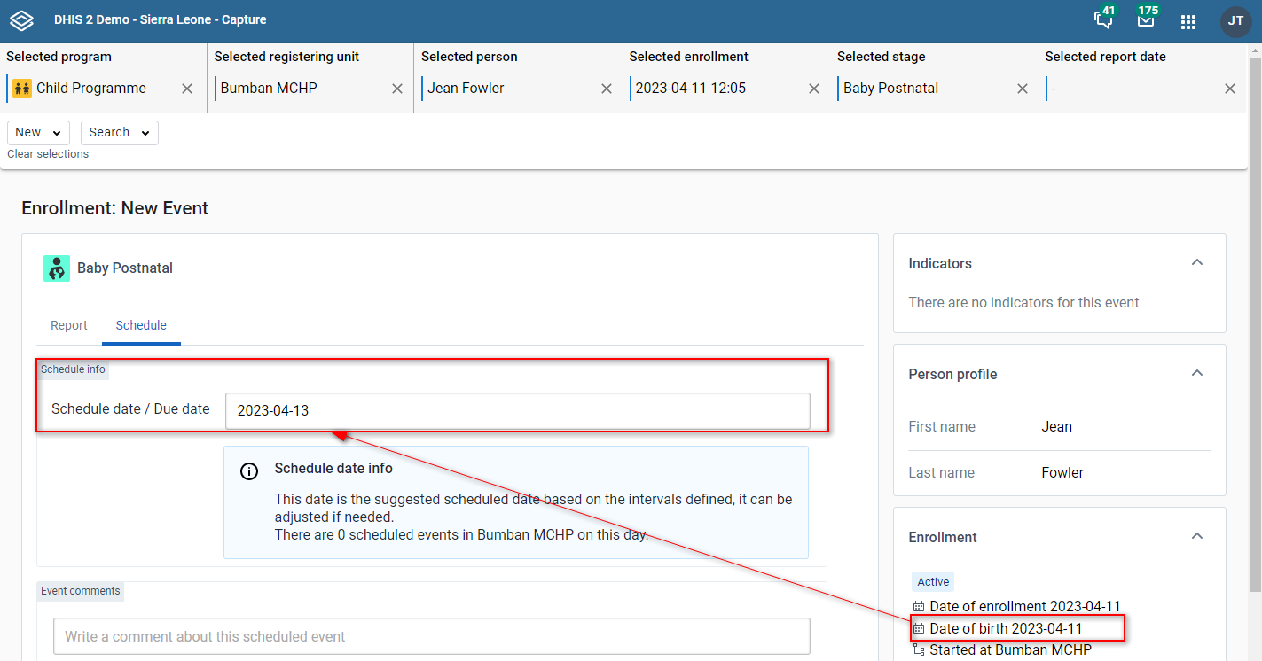
Instead of reporting an event the user can select to schedule an event for later. The form will open with a suggested scheduled date. This date is determined by a set of rules as explained below.
The suggested date for the first event of a program stage in an enrollment is always based on the enrollment date or the incident date (depending on the program configuration). The program stage configuration setting "scheduled days from start" will be added to the base date to cumpute the suggested date.
If a program stage has a default next scheduled date configured, the suggested date is the most recent next scheduled date. Below is an example of how this can work.
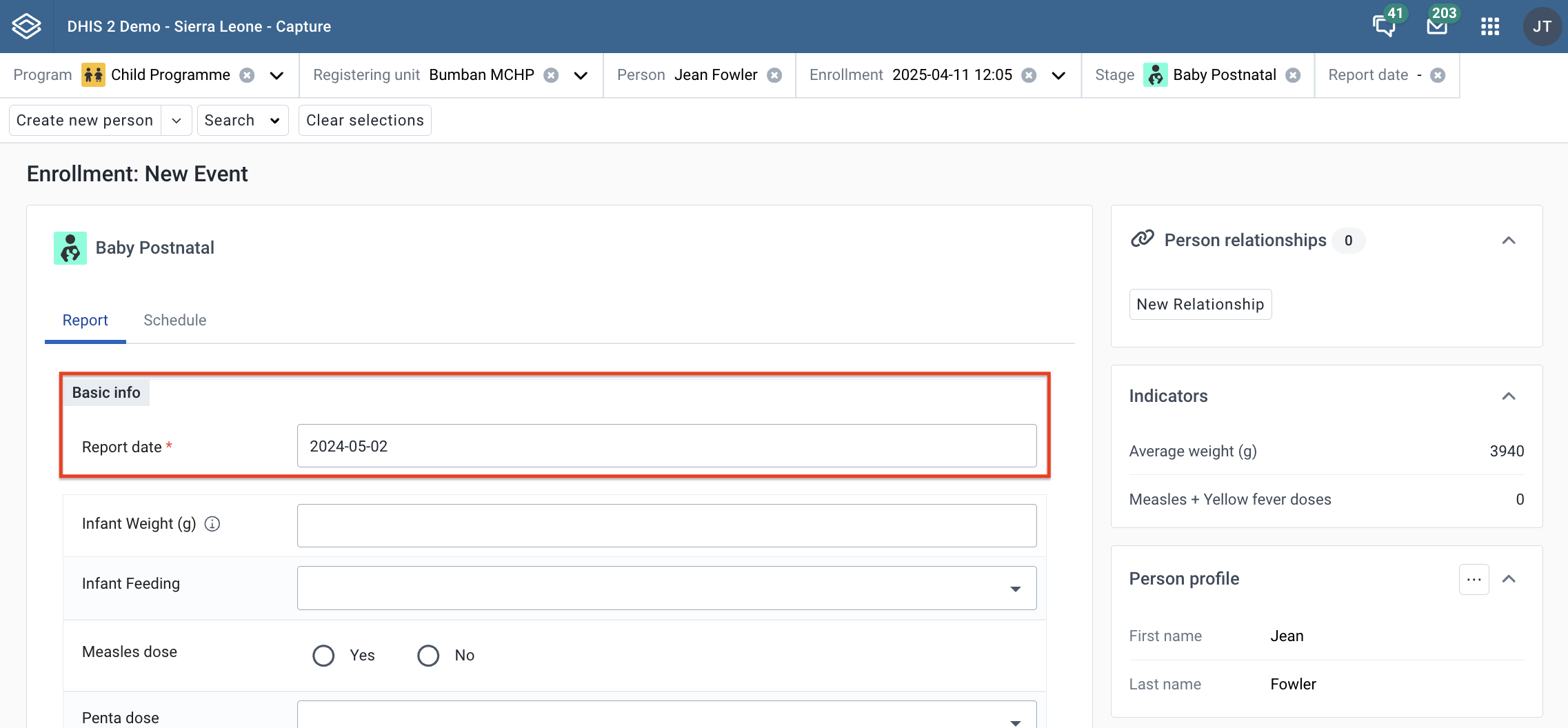
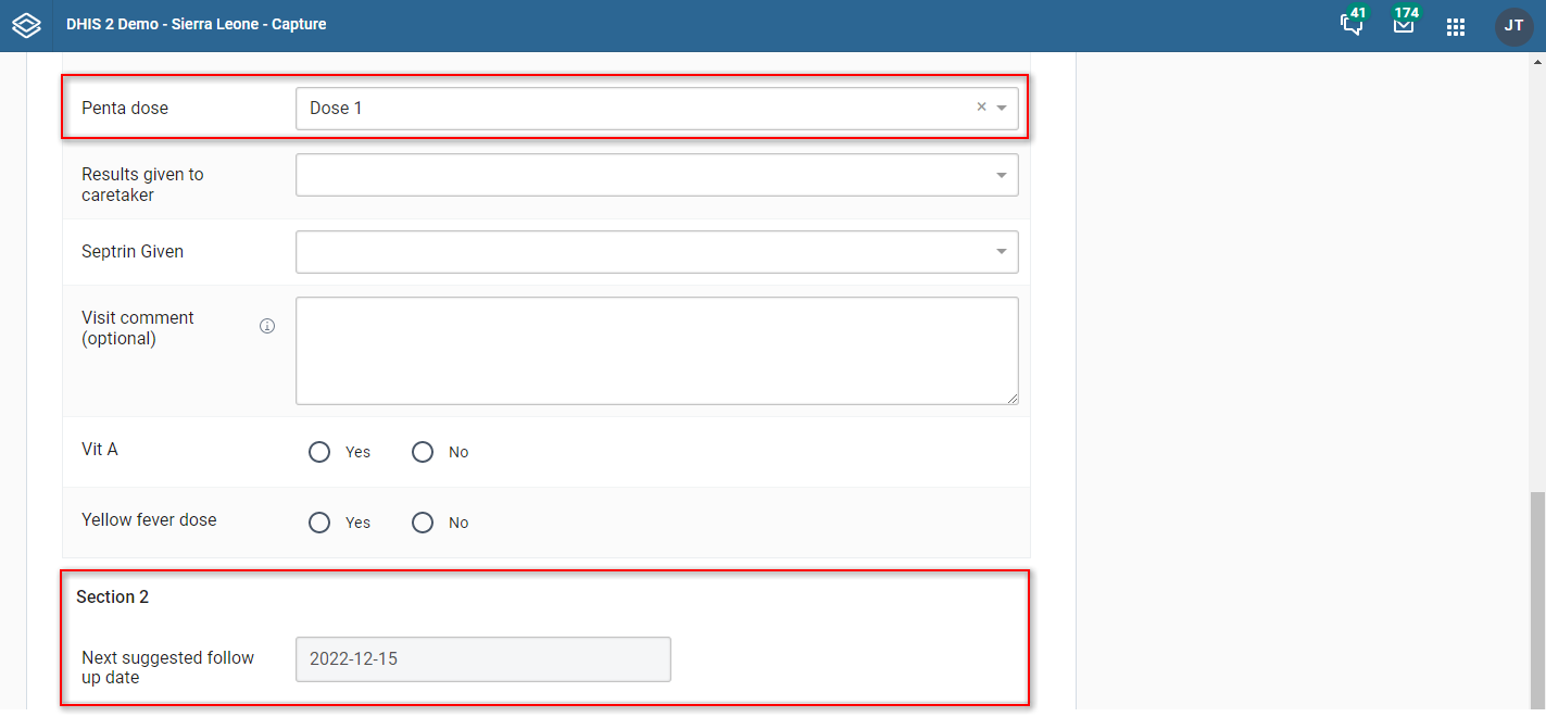
- A data element with value type date needs to be created and assigned to the particular program stage with access to future dates. The name of the data element could for example be: Next suggested follow up date. The program stage is configured to use the data element as default when scheduling a new event by assigning the data element to default next scheduled date.
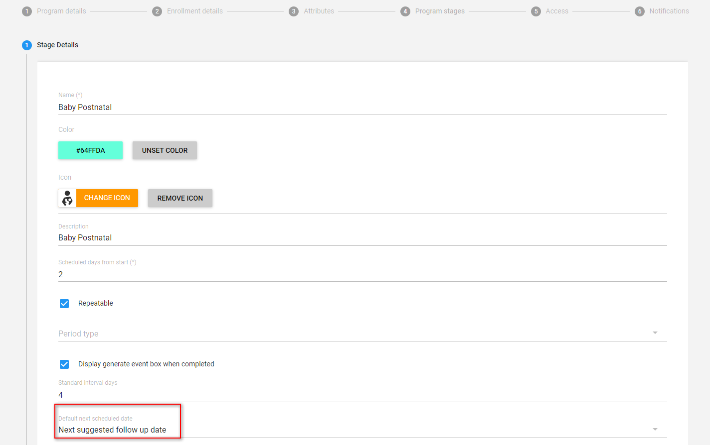
A program rule based on the data entered in the program stage, will determine how many days until the next suggested follow up will be. For example: A program rule with the following condition: #{penta_dose} == '1' (The program rule will trigger when the TEI has received Penta Dose 1), Assign value to the data element: next suggested follow up date with expression: d2:addDays(V{event_date}, '30') The number suggest how many days from event date the next scheduled event should be.
Open the Capture app and create a TEI. As long as Penta Dose has value Dose 1, the suggested next scheduled event is 30 days forward from event date. When scheduling a new event, the system will pick up from the data element as long it has value.
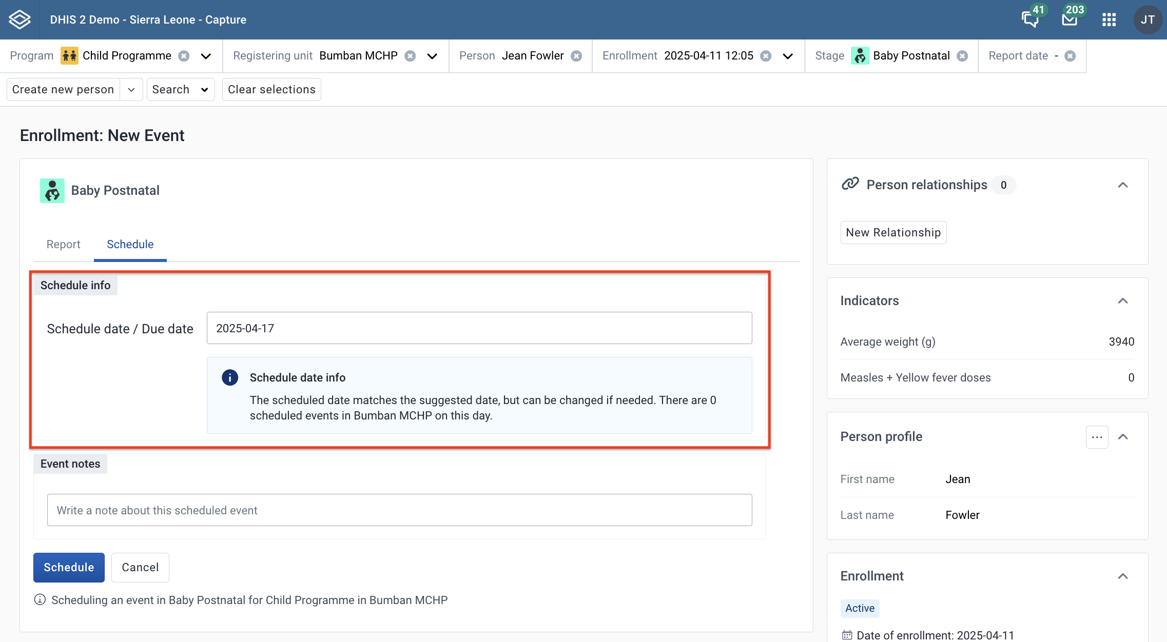
User can also find more information about how many events that scheduled on the same selected date or the interval of selected date and the suggested date from the information box.
Below the schedule date entry, user can choose to add a note to the scheduled event.
After clicking Schedule button, user will be navigated back to enrollment overview page.
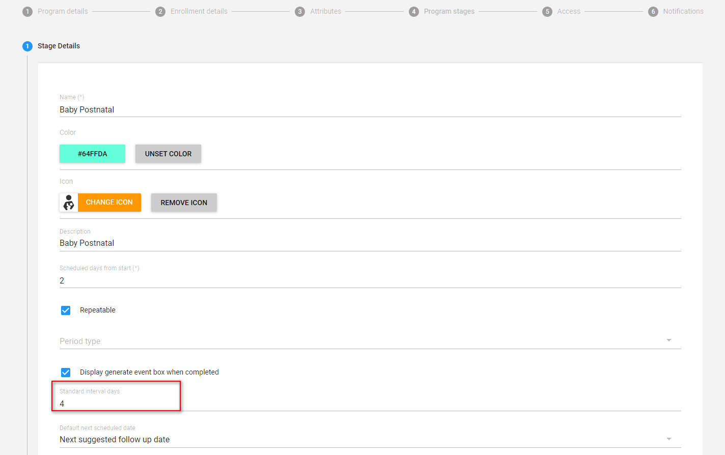

You can reach the program stage event list by clicking Go to full {stage event name} button in the overview page.
In this view you can see all events in a stage
In the header, you can see the stage name and icon

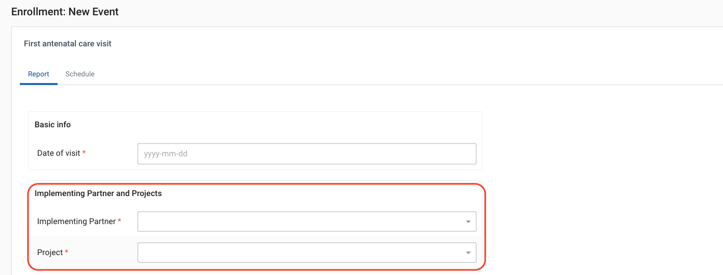
You can add segregation to your Tracker event data using attribute option combos. To get started, add a category combination to your Tracker program configuration.
The attribute option combo selector will be displayed when you are adding or changing/viewing Tracker events. Additionally, the selector will be displayed when enrolling if events are being auto-generated as part of the enrollment process.
Example from new Tracker event:
The Changelog feature provides a historical record of changes made to data for both events and Tracked Entities. Every time data is added, modified, or deleted, a record is stored in the changelog.
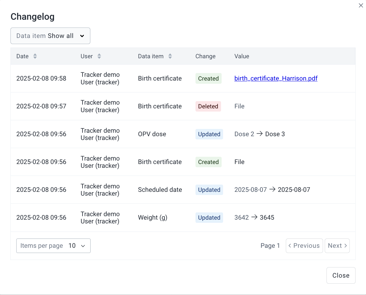
Sorting: Clicking the sorting icon next to a column header toggles between default, ascending, and descending order. By default, records are sorted by date (newest first). Sorting by user or data item is also available, but you can only apply one sorting option at a time.
Filtering: You can filter by a specific data item. You can only apply one filter at a time.
Note:
All data items are displayed in the filter dropdown, regardless of whether they have a changelog record.
Pagination: Displays 10 records per page by default, with options to adjust the number of records shown, up to 100 per page.
The Event Changelog tracks changes to data items within an event. These data items include event properties (e.g., report date, scheduled date, and geometry) and data elements.
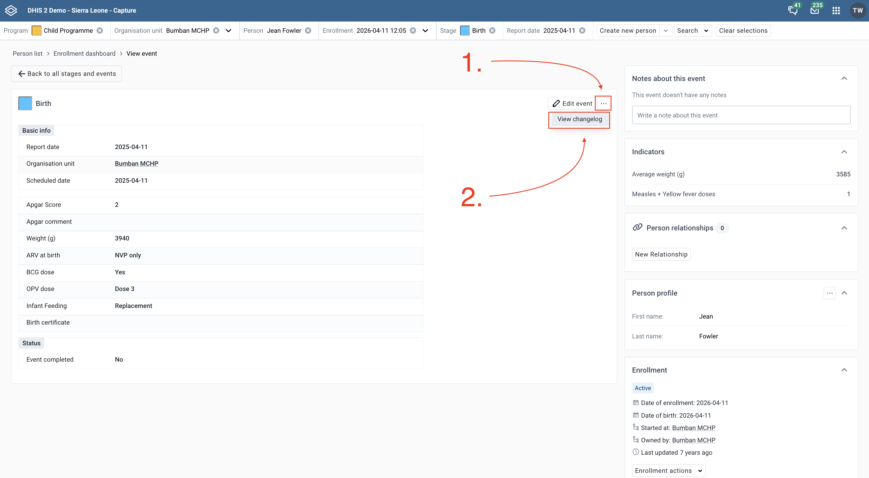
The tracked entity changelog tracks changes to attributes of a tracked entity within an enrollment.
Go to the Maintenance app and enable the Tracked Entity Instance Audit Log. 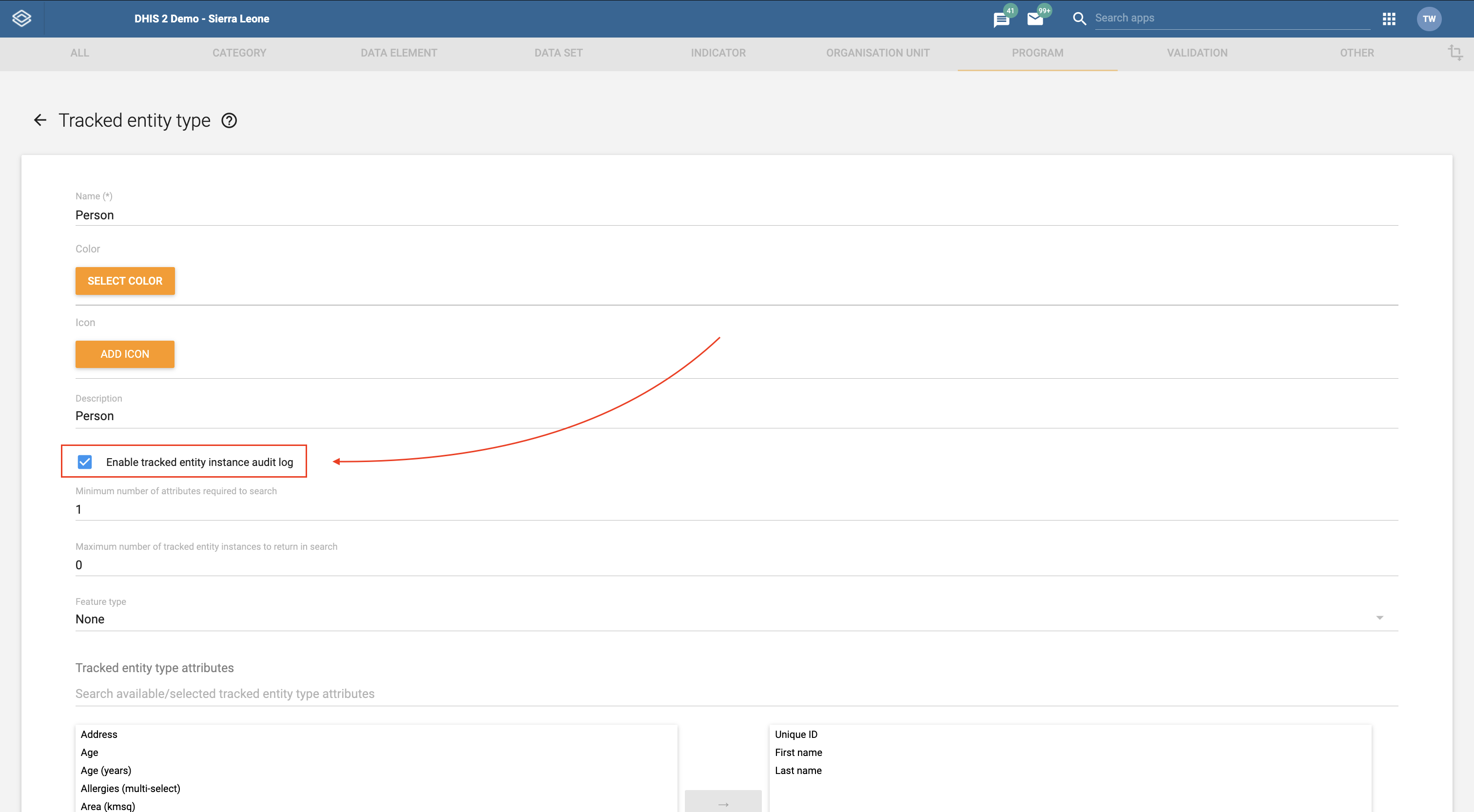
Open the enrollment dashboard in the Capture app.
Click View Changelog in the Tracked Entity Profile widget to open the changelog. 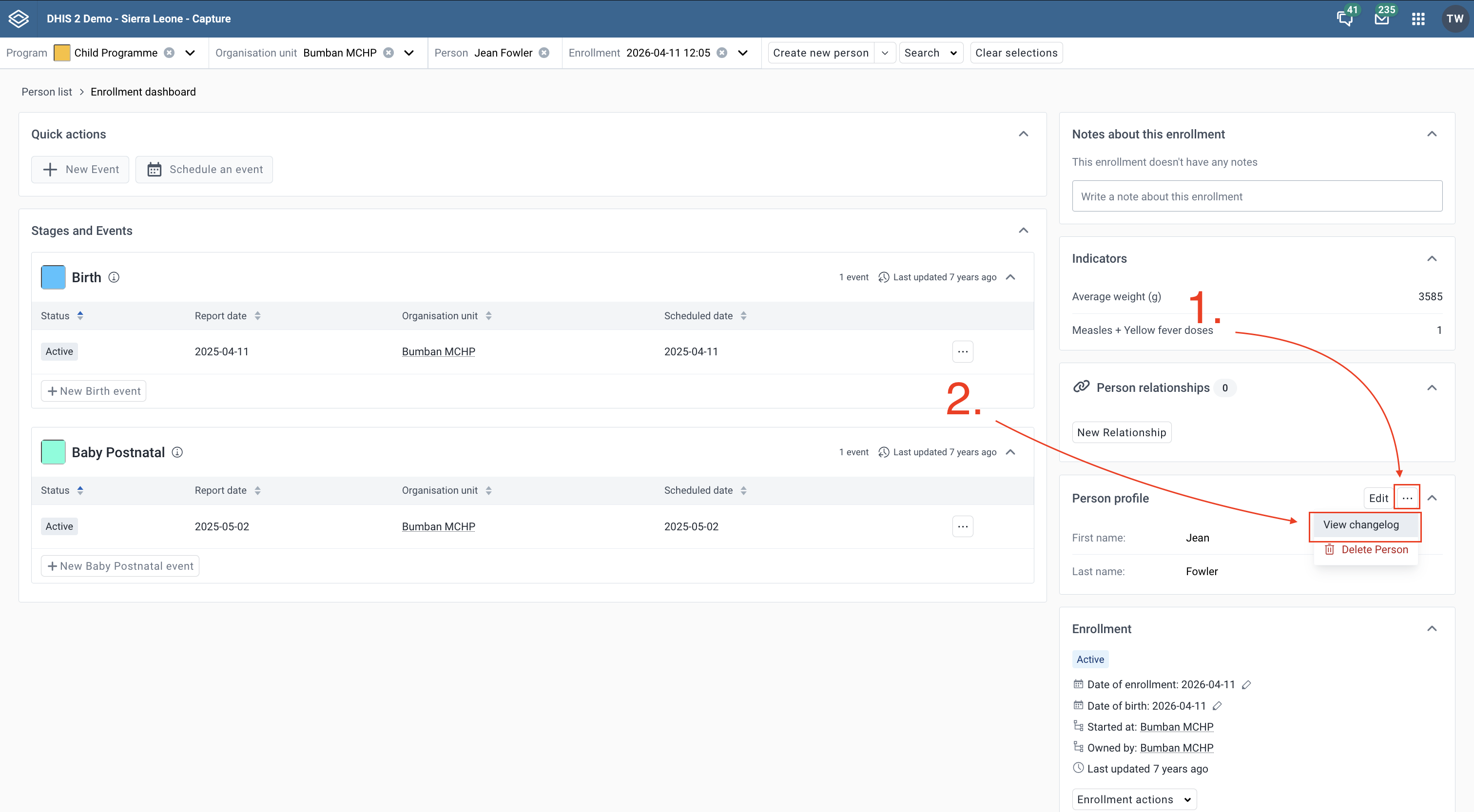
You can connect any two program stages via a relationship. To enable this feature, you can set up two program stages in the same program and link them with an event-event relationship. 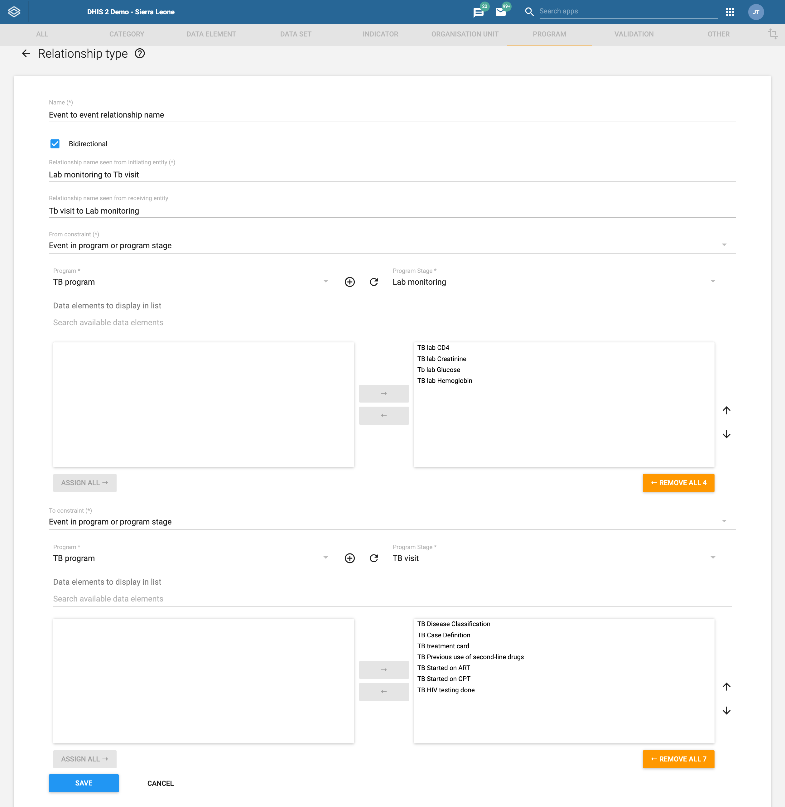
When opening the new event form, a widget called Actions - ${Relationship type name} will appear at the bottom of the page. From this widget, users can: 1. Schedule a new event by selecting a scheduled date and an organisation unit 2. Enter data for the linked event directly 3. Link to an already existing event.
When clicking Complete or Save without completing, the Capture app will create the current event, schedule the linked event and make sure that there is a relationship between them in the correct context. 
If the event is eligible for related stages but isn’t linked yet, a widget called Linked event will appear at the bottom of the page. From this widget, users can: 1. Schedule a new event by selecting a scheduled date and an organisation unit 2. Enter data for the linked event directly 3. Link to an already existing event.
The label of the action button will change based on the user's selections. When clicking Complete or Save without completing, the Capture app will create the current event, schedule the linked event and make sure that there is a relationship between them in the correct context. 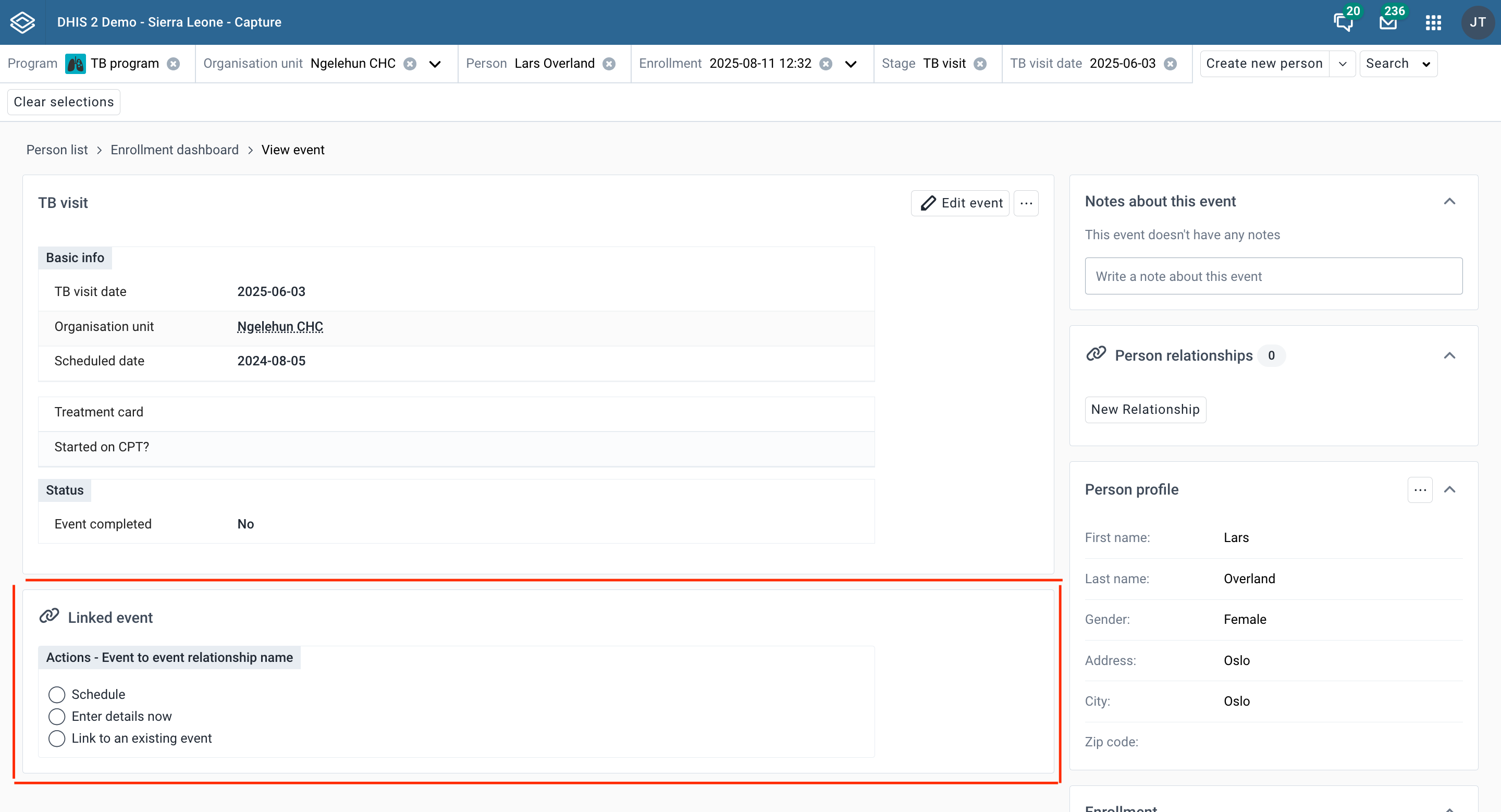
If the event is already linked, a Linked Event widget will appear at the top of the page. This widget allows users to view details of the linked event. 
Additionally, by clicking the Menu in the top-right corner, users can: 1. Unlink the linked event. 2. Unlink and delete the linked event. 
Enable the "First stage appears on registration page" flag in the Maintenance for the Tracker program. When opening the form to enroll a new tracked entity, a widget called Actions - ${Relationship type name} will appear at the bottom of the page. From this widget, users can: 1. Schedule a new event by selecting a scheduled date and an organisation unit 2. Enter data for the linked event directly
When clicking Save, the Capture app will enroll the tracked entity, create the event in the first stage, schedule the linked event and make sure that there is a relationship between them in the correct context. 
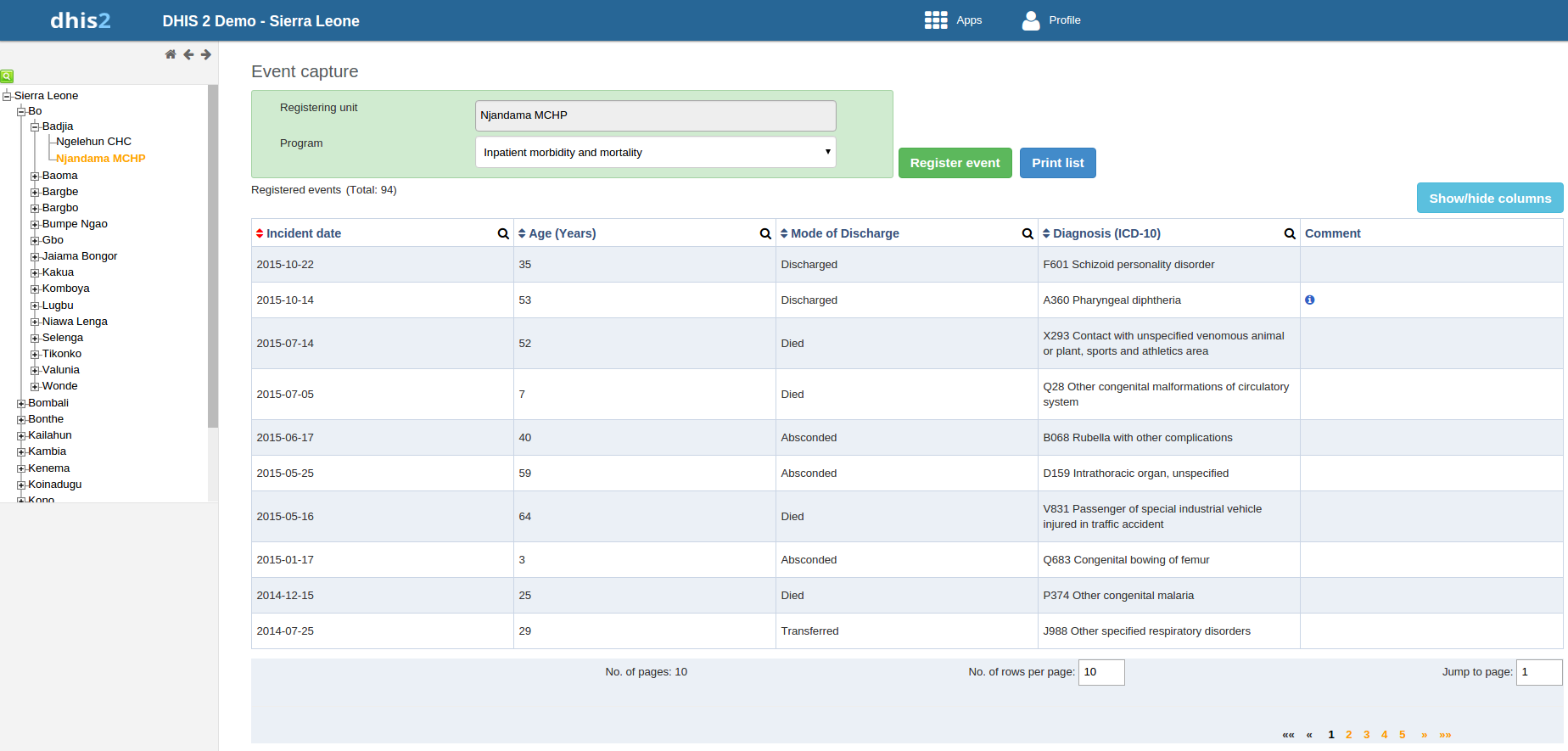
In the Event Capture app you register events that occurred at a particular time and place. An event can happen at any given point in time. This stands in contrast to routine data, which can be captured for predefined, regular intervals. Events are sometimes called cases or records. In DHIS2, events are linked to a program. The Event Capture app lets you select the organisation unit and program and specify a date when a event happened, before entering information for the event.
The Event Capture app works online and offline. If the Internet connectivity drops, you can continue to capture events. The events will be stored locally in your web browser (client). When connectivity has returned, the system will ask you to upload the locally stored data. The system then sends the data to the server where the data is stored.
Note
If you close the web browser while in offline mode, it is not possible to reopen a new web browser window and continue the working session. However the data will still be saved locally and can be uploaded to the server the next time the machine is online and the you have logged into the server.
You only see programs associated with the organisation unit you've selected and programs you've access to view through your user role.
Both skip-logic and validation error/warning messages are supported during registration.
When you close an organisation unit, you can't register or edit events to this organisation unit in the Event Capture app. You can still view and filter the event list and view the details of an event.
On-the-fly indicator expression evaluation is supported. If a program has indicators defined for it and the moment all values related to the indicator expression are filled, the system will calculate indicator and display the result.
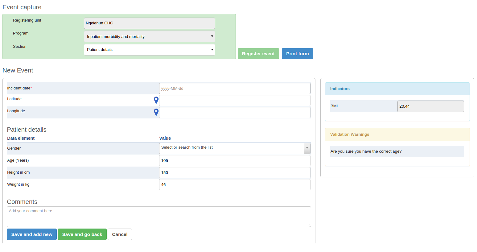
Sorting: this can be done by clicking the sorting icon of each column header. A red sorting icon implies the current sorting column. However, the sorting functionality works only within the page displayed. Currently, it is not possible to do sorting from serverside.
Filtering: this is done by clicking the small search icon shown to the right of each column header. Clicking them provides an input field to type a filtering criteria. The system starts applying the filter the moment a user starts to type. During filtering it is possible to define start and end dates for date type data elements and lower and upper limits for number types. Server side filtering is not-support at the moment.
Open the Event Capture app.
Select an organisation unit.
Select a program.
You'll only see programs associated with the selected organisation unit and programs you've access to through your user role.
Click Register event.
Select a date.
Fill in the required information.
If the program's program stage is configured to capture GPS coordinate, you can enter the coordinates in two ways:
Enter values directly in corresponding fields.
Choose a location in a map. The map option also displays polygons and points that are defined for organisation units.
Click Save and add new or Save and go back.
Note: Some data elements in an event might be mandatory (marked with a red star next to the data element lable). What this means is that all mandatory data elements must be filled in before the user is allowed to save the event. The exception to this is if the user has the authority called "Ignore validation of required fields in Tracker and Event Capture". If the user has this authority, the mandatory data elements will not be required to be filled in before saving and the red star will not be displayed next to the data element lable. Note that super user that have the "ALL" authority automatically have this authority.
Open the Event Capture app.
Select an organisation unit.
Select a program.
All events registered to the selected program show up in a list.
Click the event you want to modify and select Edit.
Modify the event details and click Update.
The Edit in grid function allows you to edit a selected event within the table but only those columns (data elements) visible in the grid. If you need more columns, use Show/hide columns to specify which columns should be displayed in the list.
Open the Event Capture app.
Select an organisation unit.
Select a program.
All events registered to the selected program show up in a list.
Click the event you want to modify and select Edit in grid.
Modify the event details.
Click on another event to close the edit mode.
You can share an event in edit mode via its web address.
Open the Event Capture app.
Open the event you want to share in edit mode.
Copy the URL.
Make sure that the URL contains "event" and "ou" (organisation unit) parameters.
Paste the URL in the sharing method of your choice, for example an e-mail or a message within DHIS2.
If you're not logged in to DHIS2 when you click the link, you'll be asked to do so and then taken to the dashboard.
Open the Event Capture app.
Select an organisation unit.
Select a program.
All events registered to the selected program show up in a list.
Click an event and select Audit history.
Open the Event Capture app.
Select an organisation unit.
Select a program.
All events registered to the selected program show up in a list.
Click an event and select Remove.
Click Remove to cocnfirm the deletion.
You can select which columns to show or hide in an event list. This can be useful for example when you have a long list of data elements assigned to a program stage. Once you've modified the layout, it's saved on your user profile. You can have different layouts for different programs.
Open the Event Capture app.
Select an organisation unit.
Select a program.
All events registered to the selected program show up in a list.
Click the Show/hide columns icon.
Select the columns you want to display and click Close.
Open the Event Capture app.
Select an organisation unit.
Select a program.
All events registered to the selected program show up in a list.
Click Print list.
Open the Event Capture app.
Select an organisation unit.
Select a program.
All events registered to the selected program show up in a list.
Click the Downlad icon and select a format.
You can download an event list in XML, JSON or CSV formats.
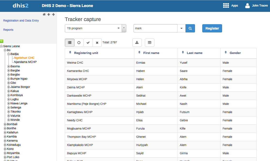
The Tracker Capture app is an advanced version of the Event Capture app.
Event Capture: handles single events without registration
Tracker Capture: handles multiple events (including single event) with registration.
You capture event data for a registered tracked entity instance (TEI).
You only see programs associated with the organisation unit you've selected and programs you've access to view through your user role.
The options you see in the search and register functions depend on the program you've selected. The program attributes control these options. The attributes also decide the columns names in the TEI list.
If you don't select a program, the system picks default attributes.
Both skip-logic and validation error/warning messages are supported during registration.
When you close an organisation unit, you can't register or edit events to this organisation unit in the Tracker Capture app. You can still search for TEIs and filter the search results. You can also view the dashboard of a particular TEI.
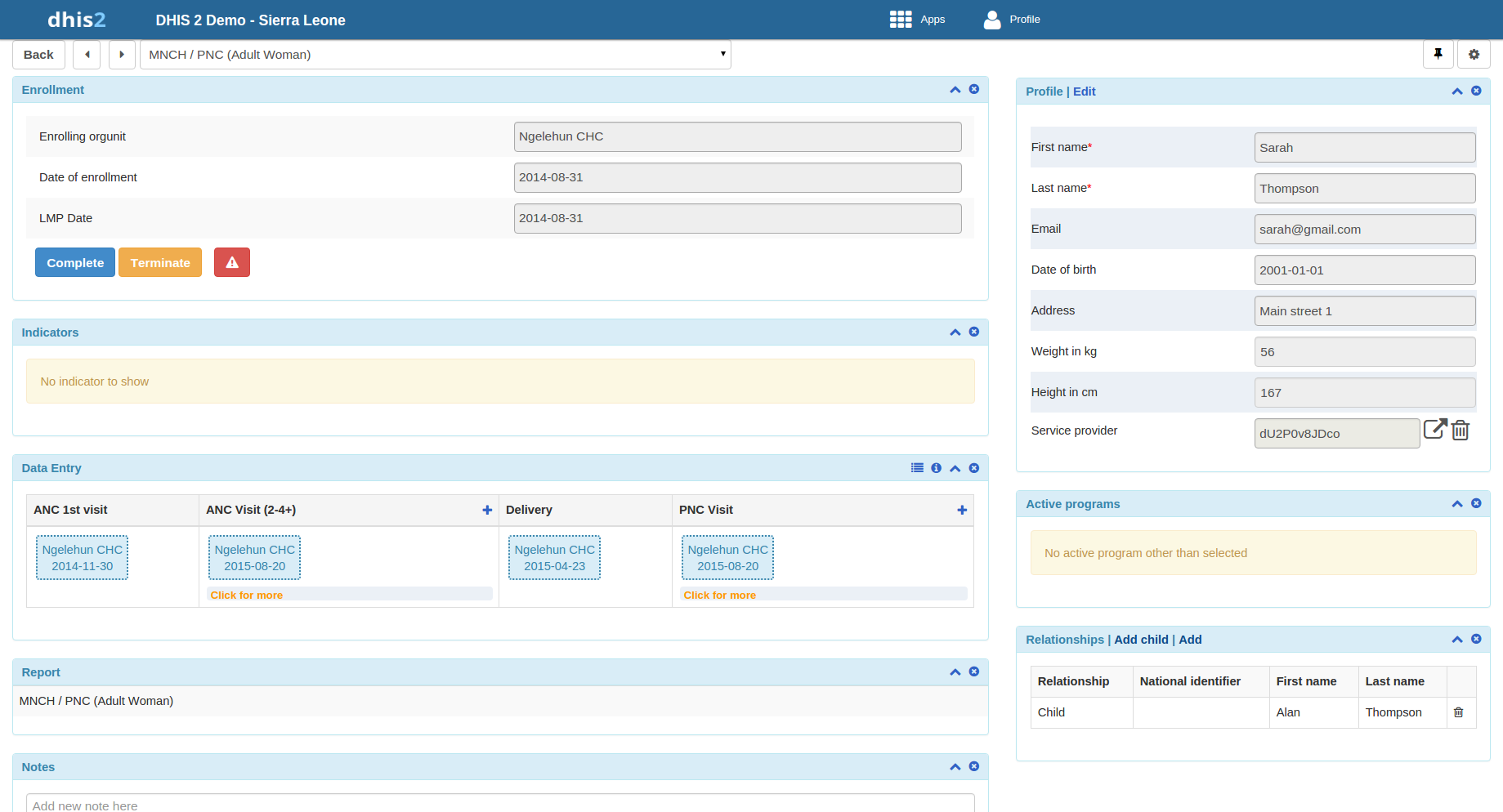
You manage a TEI from the TEI's dashboard in the Tracker Capture app.
The dashboard consist of widgets. Drag and drop the widgets to place them in the order and in the position you want.
Click the pin icon to stick the right column of widgets to a fix position. This is useful especially during data entry.
If you have many data elements or big form to fill in, stick the right widget column. Then all the widgets you've placed in the right column remain visible while you scroll in the data entry part.
Any indicator defined for the program you've selected will have its value calculated and displayed in the Indicators widget.
Navigation:
Back: takes you back to the search and registration page
Previous and next buttons: takes you to the previous or next TEI dashboard in the TEI search results list
Working process of Mother and child health program
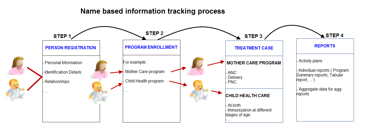
Create new or find existing TEI.
You can search on defined attributes, for example name or address.
Enroll TEI in a program.
Based on the services of the program by the time, the app creates an activity plan for the TEI.
The TEI is provided with various services depending on the program. All services are recorded.
Use information about the individual cases to create reports.
You can share a program selection on the "home screen.
Open the Tracker Capture app.
Select the program you want to link to.
Copy the URL.
Paste the URL in the sharing method of your choice, for example an e-mail or a message within DHIS2.
Note: If the program does not exist in the selected organisation unit (that is stored in the local cache) the system will instead select the first available program for that organisation unit. If the local cache is empty/clean and the root organisation unit of the current user does not have the specified program, the system will also here select the first available program for the root organisation unit.
You can share a TEI dashboard via its web address.
Open the Tracker Capture app.
Open the dashboard you want to share.
Copy the URL.
Make sure that the URL contains "tei", "program" and "ou" (organisation unit) parameters.
Paste the URL in the sharing method of your choice, for example an e-mail or a message within DHIS2.
If you're not logged in to DHIS2 when you click the link, you'll be asked to do so and then taken to the dashboard.
You can create a TEI and enroll that TEI to a program in one operation:
Open the Tracker Capture app.
In the organisation unit tree in the left hand pane, select an organisation unit.
Select a program.
Click Register.
Fill in the required information.
Both tracked entity type and program can be configured to use a feature type. This makes it possible to capture geometry for either the TEI or the enrollment. Supported feature type is Point and Polygon. Please see How to use geometry.
If the selected program is configured to display first stage during registration, all mandatory fields in the stage will have to be filled in. At the end of the stage you will also be asked if you want to complete the stage that you have entered data for. If you select Yes, the stage will have the status completed once saved. If you select No, the stage will have the status active.
If searching for program is configured, a background search will be performed on searchable fields to help you prevent registering duplicates. If there is any matching TEIs, a blue box will be displayed on the right side of the form with the possibility to view these matching TEIs.
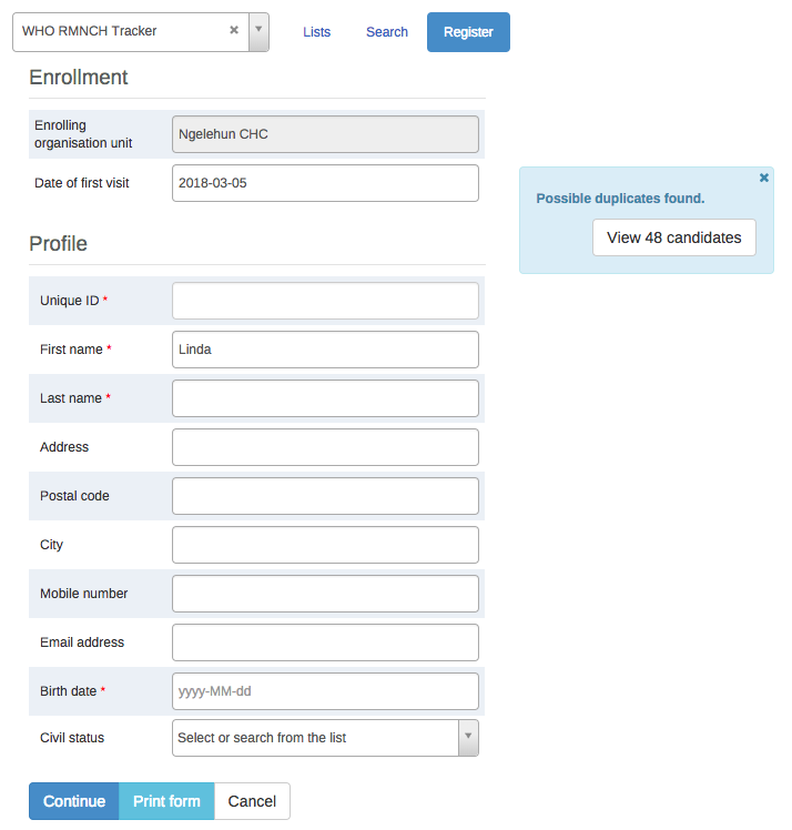
If there is any matching TEIs, click Continue to review possible duplicates before registering a new one.
If there is no matching TEIs, click Save and continue or Save and add new
Save and continue: completes the registration and opens the registered TEI's dashboard
Save and add new: completes the registration but stays on the same page. Use this option when you want to register and enroll one TEI after another without enter data.
Note: All mandatory attributes have to be filled in to be able to save. Mandatory attributes are marked with a red star next to the attribute label. If the user has the authority called "Ignore validation of required fields in Tracker and Event Capture" you will not be required to fill in the mandatory attributes and will not see the red star next to the attribute label. Note that super user that have the "ALL" authority automatically have this authority.
There are multiple ways to find a TEI: Using the "Lists" which is predefined lists in the current selection, or "Search" for global lookup.
Lists is used to find and display TEIs in the selected organisation unit and program.
Open Tracked Capture app
In the organisation unit tree in the left hand pane, select an organisation unit
Select a program
Click the "Lists" button if not already selected
If not configured, a set of predefined lists will be available:
Any TEI with any enrollment status
TEIs with an active enrollment of the current program
TEIs with a completed enrollment of the current program
TEIs with a cancelled enrollment of the current program

You can select which columns to show or hide in the lists for each program. This will be saved in your user settings.
Click the grid icon button
Check the columns you want to include
Click Save
There is also an option to create a custom working list with own filters. This can be used to create custom lists on the fly.
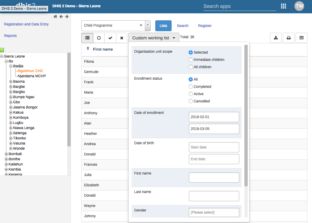
Lists can also be downloaded or printed.

If the program has any custom tracked entity filters associated with it, these will take the place of the four predefined lists mentioned above. The predefined lists will when well configured be an effective way to find or work with the data relevant for the user in that program.
Working lists can be defined with a wide variety of options, here are some examples:
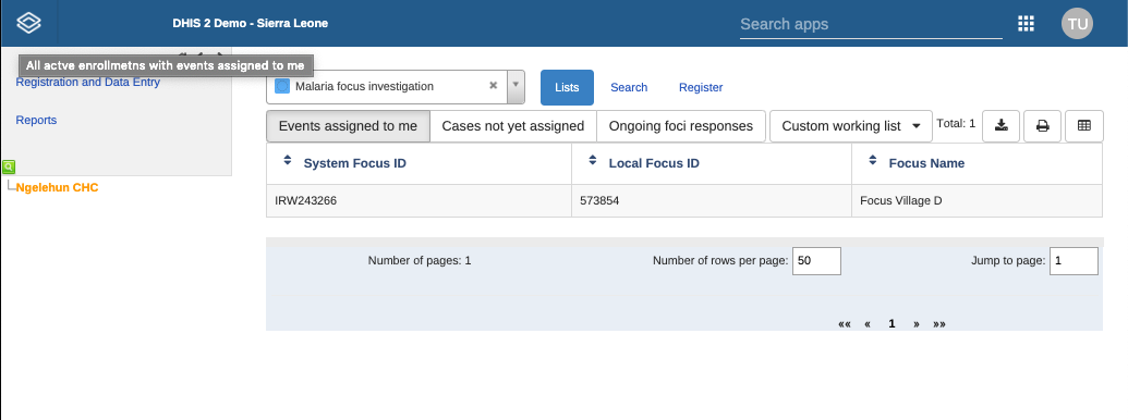
See the API documentation for a full list of functionality supported for these predefined tracked entity instance filters.
Search is used to search for TEIs in the organisation units the user has search access to. This can be used if you want to find a TEI, but you don't know which organisation unit or program the TEI was enrolled in. There are two ways of doing this: With and without a program context. Searchable fields needs to be configured. For configuring searching with program context, this is done individually for each program in the program maintenance app. For configuring searching without a program context, this is done individually for each tracked entity type in the tracked entity type maintenance app.
Searching without a program context:
Open Tracker Capture app
Click the Search button
Searchable fields will be displayed in groups. Unique attributes is only individually searchable. Non-unique attributes can be combined.
Fill in search criteria and click the search icon button.
Searching with a program context:
Open Tracker Capture app
Select an organisation unit which has the program you wish to search in
Select the program
Click the Search button
Searchable fields will be displayed in groups. Unique attributes is only individually searchable. Non-unique attributes can be combined.
Fill in search criteria and click the search icon button
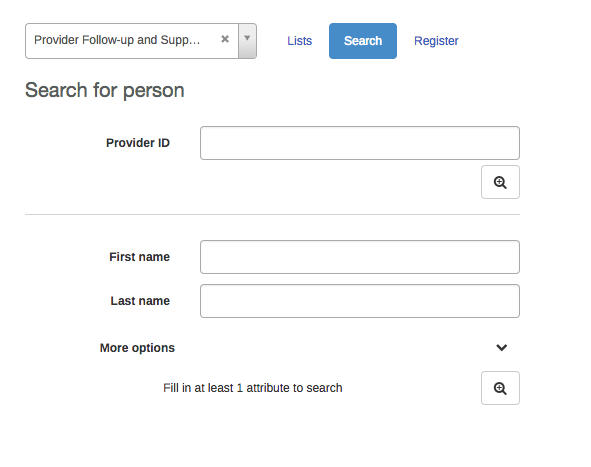
After the search has been done, you will be presented with the search result. Whats displayed depends on the outcome of the search.
For unique attribute search:
If no matching TEI found, you will get the possibility to open the registration form.
If the TEI was found in the selected organisation unit, the TEI dashboard will automatically open.
If the TEI was found in outside the selected organisation unit, you will get the possibility to open the TEI.
For non-unique attributes search:
If no matching TEI's found, you will get the possibility to open the registration form.
If matching TEI's found, you can either click on any TEI in the result list, or open the registration form.
If a too large number of matches was found, you will be prompted to refine your search criteria
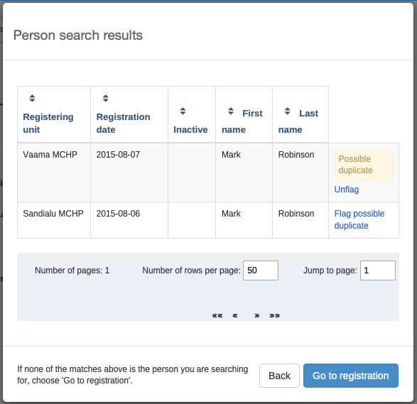
The search results have functionality for flagging tracked entity instances as possible duplicates, see next chapter.
When choosing to open the registration form, the search values will automatically be filled into the registration form.
When searching for tracked entity instances in the tracker capture app, the user will sometimes suspect that one or more of the search hits are duplicates of other tracked entity instances. The user has the option of clicking on the flag possible duplicate link in the rightmost column of the search result grid.
Tracked entity instances flagged in this way will be marked as "possible duplicate" in the DHIS2 database. The flag indicates that the tracked entity instance is/has a duplicate. The presence of such a flag is visible to the user in two places. One is the result list itself (in this example Mark Robinson is already flagged as a potential duplicate):
The other place is within the tracked entity instance dashboard:
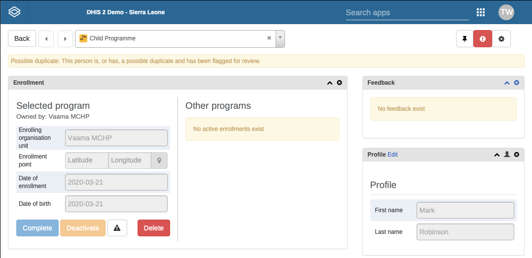
In addition to informing users about the tracked entity instance potentially being a duplicate, the flag will be used by the underlying system for finding and merging duplicates in coming versions of DHIS2.
If the program is configured with access level protected, and the user searches and finds tracked entity instances that is owned by organisation unit that the user does not have data capture authority for, the user is presented with the option of breaking the glass. The user will give a reason for breaking the glass, then gain temporary ownership of the tracked entity instance.
Open the Tracker Capture app.
Open an existing TEI dashboard.
Select a program.
In the Enrollment widget, click Add new.
Fill in the required information and click Enroll.
In a TEI dashboard, you enter event data in the Timeline Data entry or Tabular data entry widgets.
| Widget name | Description |
|---|---|
| Timeline Data entry | For data entry using either default or custom forms. Depending on program definition, in particular program stages, events will be displayed in a timely fashion. Clicking on any of them displays the corresponding data entry. If a stage needs new event, a plus icon is displayed for new event creation. To proceed with data entry, it is mandatory to have event date. Once an event date is specified it is not possible to change due date. The assumption is that by specifying event date, the event has already taken place. If the event hasn't occurred yet, it is possible to change due date - this is effectively doing nothing but rescheduling. The buttons at the bottom help to change the status of a selected event. Another key feature from this widget is addition of multiple notes for an event. Normally data recording is through data elements, however there are cases where it is necessary to record additional information or comments. This is where the notes section comes handy. However it is not possible to delete a note. The idea is notes are more like log books. Both skip-logic and validation error/warning messages are supported during data entry. Also included in the Timeline Data entry is the option to compare your data entry to previous entries. This can be enabled by clicking the "Switch to compare form" button (Two sheets of paper) in the top right corner of the Timeline Data entry widget. |
| Tabular data entry | For tabular-style data entry. The widget displays the list of program stages as left-hand side labels. Events will be listed in table for repeatable program stage, and allows for in-line edits of event data values. |
You can create an event for a TEI by:
Open the Tracker Capture app.
Open an existing TEI dashboard.
In the Timeline Data entry or Tabular data entry widget, click the +-button.
Select a Program stage and set a Report date.
Program stages can be configured to use a feature type. This makes it possible to capture geometry for an event. Supported feature type is Point and Polygon. Please see How to use geometry.
Click Save.
You can schedule an event for a future date by:
Open the Tracker Capture app.
Open an existing TEI dashboard.
In the Timeline Data entry or Tabular data entry widget, click the Calendar icon.
Select a Program stage and set a Schedule date.
Click Save.
Sometimes it might be necessary to refer a patient to a different Organisation unit. To refer a TEI:
Open the Tracker Capture app.
Open an existing TEI dashboard.
In the Timeline Data entry or Tabular data entry widget, click the Arrow icon.
Select a Program stage, Organisation unit and set a ****Report date****.
Click either One-time referral which will only refer TEI for one single event or Move permanently which will move TEI ownership to the selected Organisation Unit. Further access to the TEI will be based on the ownership organisation unit.
Some data elements in an event might be mandatory (marked with a red star next to the data element label). What this means is that all mandatory data elements must be filled in before the user is allowed to complete the event. The exception to this is if the user has the authority called "Ignore validation of required fields in Tracker and Event Capture". If the user has this authority, the mandatory data elements will not be required to be filled in before saving and the red star will not be displayed next to the data element label. Note that super user that have the "ALL" authority automatically have this authority.
Tracked entity type, program and program stage can be configured to use a feature type. This makes it possible to capture geometry for a TEI, program or event. Supported feature types are Point and Polygon.
Option 1: Fill in the latitude and longitude into the field.
Option 2: 1. Click on the map icon 2. Find the location you want by either searching or locating it on the map 3. Right-click on the location you want, and choose Set coordinate 4. Click Capture at the bottom
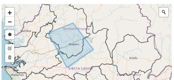
Polygons can also be deleted 1. Click the map icon 2. Click the trash can icon at the left side of the map, and select Clear all
In the Maintenance App a program stage can be configured to allow user assignment. If user assignment is enabled, you will be able to assign a user to an event.
The Enrollment widget gives access to information and functionality for the enrollment in the selected program.
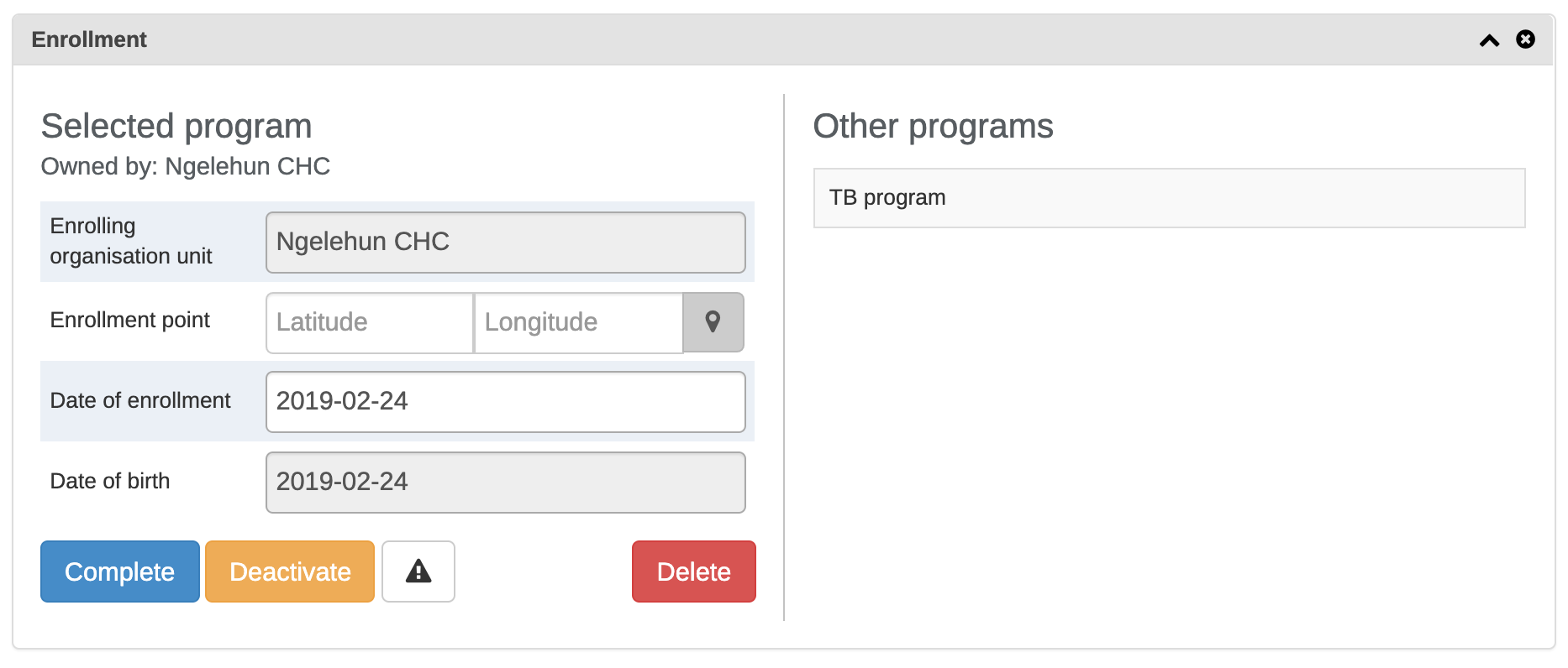
The current ownership of all enrollments in the selected program is displayed in the "Owned by" part of the enrollment widget. The ownership will always start out as the organisation unit that first enrolled the TEI into the given program.
Ownership can be different for a TEIS different programs, for example one clinic can follow up a patient in HIV, while another clinic follows up the same patient in MCH.
To update the ownership for a TEI/program combination, the user has to utilize the referral functionality and select the "Move permanently" option while referring.
A user that has capture access to the organisation unit that is the current owner of the TEI/Program will have write access to all enrollments for that TEI/Program combination. A user that has search access to the organisation unit that is the current owner will have access to search and find the TEI/Program combination.
If you deactivate a TEI dashboard, the TEI becomes 'read-only'. You can't enter data, enroll the TEI or edit the TEI's profile.
Open the Tracker Capture app.
Open an existing TEI dashboard.
In the Enrollment widget, click Deactivate.
Click Yes to confirm.
Open the Tracker Capture app.
Open an existing TEI dashboard.
In the Enrollment widget, click Activate.
Click Yes to confirm.
Open the Tracker Capture app.
Open an existing TEI dashboard.
In the Enrollment widget, click Complete.
Click Yes to confirm.
Open the Tracker Capture app.
Open an existing TEI dashboard.
In the Enrollment widget, click Reopen.
Click Yes to confirm.
Open the Tracker Capture app.
Open an existing TEI dashboard.
In the Profile widget, click the Audit history icon.
An enrollment note is useful to record information about for example why an enrollment was cancelled.
Open the Tracker Capture app.
Open an existing TEI dashboard.
In the Notes widget, type your note and click Add.
Open the Tracker Capture app.
Open an existing TEI dashboard.
In the Messaging widget and select SMS or E-mail.
Enter the required contact information.
If the TEI's profile contains an e-mail address or a phone number, these fields are filled in automatically.
Type a message.
Click Send.
You can use mark a TEI's enrollment for follow-up and then use this status as a filter when you create Upcoming events and Overdue events reports. This can be useful for example to monitor high-risk cases during a pregnancy program.
Open the Tracker Capture app.
Open an existing TEI dashboard.
In the Enrollment widget, click the Mark for follow-up icon.
You edit a TEI's profile or tracked entity attributes in the Profile widget.
Open the Tracker Capture app.
Open an existing TEI dashboard.
In the Profile widget, click Edit.
Modify the profile and click Save.
You can create a relationship from one TEI to another, for example linking a mother and a child together or a husband and a wife. Depending on how the relationship type is configured, the relative can inherit attributes.
Assume there are two programs: Antenatal care for the mother and Immunization for the child. If first name, last name and address attributes are required for both programs, it is possible to configure last name and address attributes as inheritable. Then during child registration, there is no need to enter these inheritable attributes. You can add them automatically based on the mother's value. If you want to have a different value for the child, you can override the automatically generated value.
Open the Tracker Capture app.
Open an existing TEI dashboard.
In the Relationships widget, and click Add.
Select a relationship type.
Search for the relative and select it. The search follows the same pattern as when searching for tracked entity instances from the tracker front page. Searches are by default covering the users search scope.
Select the tracked entity instance that matches the search criteria in the popup.
Click Save.
Note: If the relationship is a bi-directional relationship, the relationship will be displayed in the TEI that the relationship was created in and in the TEI that the relationship was linked to. Also, if the relationship is bi-directional, each end of the relationship will have a unique name that will be displayed in the relationship widget under the "Relationship" column.
You can share a TEI dashboard via its web address.
Open the Tracker Capture app.
Open the dashboard you want to share.
Copy the URL.
Make sure that the URL contains "tei", "program" and "ou" (organisation unit) parameters.
Paste the URL in the sharing method of your choice, for example an e-mail or a message within DHIS2.
If you're not logged in to DHIS2 when you click the link, you'll be asked to do so and then taken to the dashboard.
If you deactivate a TEI, the TEI becomes 'read-only'. Data associated with the TEI is not deleted.
Open the Tracker Capture app.
Open an existing TEI dashboard.
In the top right corner, click the  button > Deactivate.
Click Yes to confirm.
Open the Tracker Capture app.
Open an existing TEI dashboard.
In the upper top corner, click the button > Activate.
Click Yes to confirm.
Warning
When you delete a TEI, you delete all data associated with the TEI.
Open the Tracker Capture app.
Open an existing TEI dashboard.
In the top right corner, click the button > Delete.
Click Yes to confirm.
Open the Tracker Capture app.
Open an existing TEI dashboard.
Click the Settings icon, and select Show/hide widgets.
Select the widgets you want to show or hide.
Click Close.
You can save the dashboard's layout as default for a program.
Open the Tracker Capture app.
Open an existing TEI dashboard.
Click the Settings icon, and select Save dashboard layout as default.
If you are the administrator you have the option of locking the layout of the dashboard for all users.
Open the Tracker Capture app.
Open an existing TEI dashboard.
Organize the widgets to the desired layout and save it as default (see section above).
Click the Settings icon, and select Lock layout for all users.
Users will still be able to reorganize the widgets temporarily, but the layout will be reset to the admin's saved layout after page refresh. The remove widget buttons will be hidden when the dashboard layout is locked.
The top bar can be a helpful tool to see important data in a quick and easy way. To start using the top bar:
Open the Tracker Capture app.
Open an existing TEI dashboard.
Click the Settings icon, and select Top bar settings.
Click Activate top bar and click the data you would like to display in the top bar.
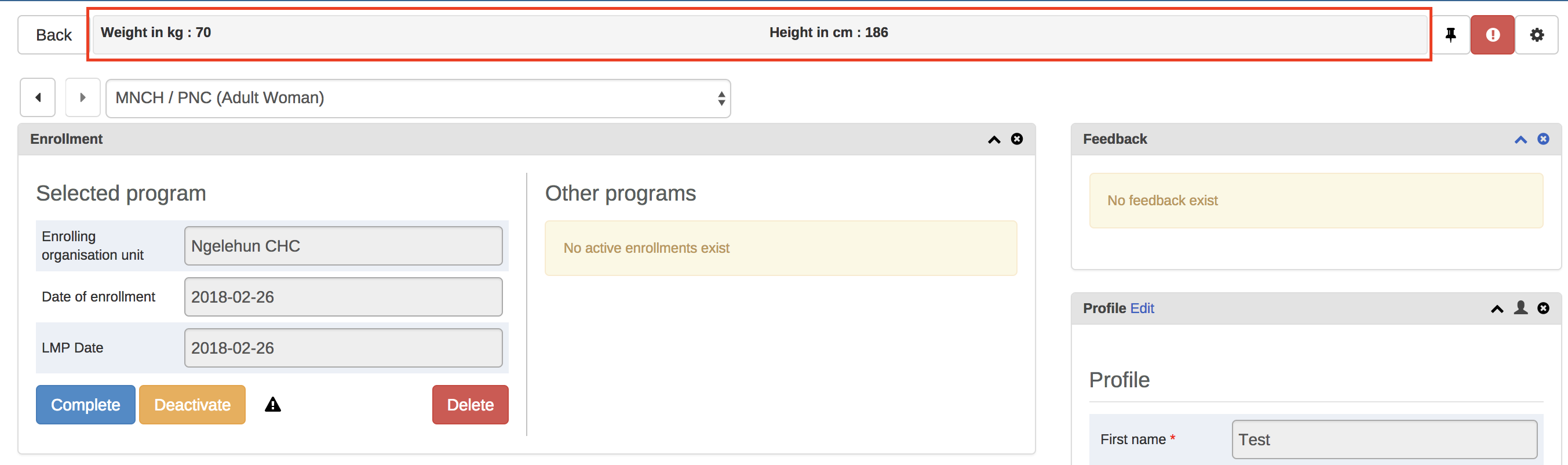
The Timeline Data Entry widget has 5 different table display modes that can be selected. The different options are: - Default form - Shows all data elements vertically.
Compare form previous - Shows the previous (repeatable) program stage next to the current selected program stage.
Compare form all - Shows all previous (repeatable) program stages next to the current selected program stage.
Grid form - Shows the data elements horizontally.
POP-over form - The same as Grid form, but when clicked the data elements are displayed in a pop-up.
To change the current display mode, click the second icon in the widgets top bar (see image below):
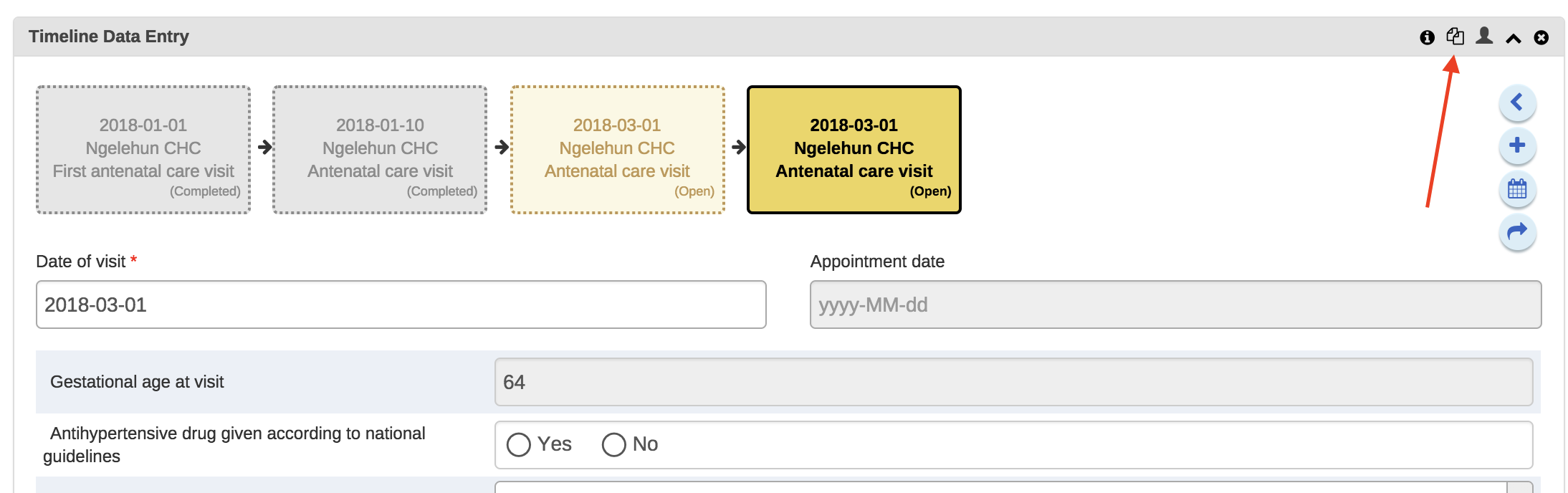
Once an option is selected the selection is stored for that specific program stage. This mean that you can have different table modes for the different program stages in a program.
Notes: 1. The Compare form options will function best if you have multiple repeatable events (of the same program stage) present. 2. The Grid form and POP-over form options are not selectable if the program stage has more than 10 data elements. 3. The icon in the widgets bar will change depending on the option you have selected.
Open the Tracker Capture app.
Click Reports.
Select a report type.
| Report type | Description |
|---|---|
| Program summary | A summary report for a particular program, organisation unit and time frame. The report consist of a list of TEIs and their records organised based on program stages. |
| Program statistics | A statistics report for a particular program. The report provides for example an overview of drop-outs or completion rates in a given time frame at a particular organisation unit. |
| Upcoming events | A tabular report showing tracked entity instances and their upcoming events for a selected program and time. You can sort the columns and search the values. Show/hide operations are possible on the columns. You can also export the table to Microsoft Excel. |
| Overdue events | A list of events for a selected program. The report displays a list of TEIs and their events that are not completed on time. You can sort the columns and search the values You can also export the table to Microsoft Excel. |
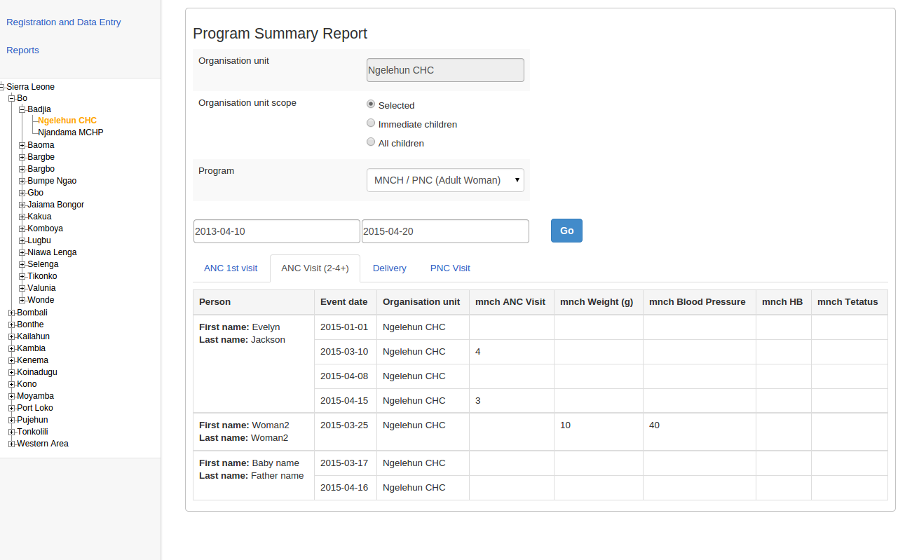
The summary report displays a list of TEIs and their records for "MNCH/PNC (Adult Woman)" program. The records are organized in the form of tabs where each tab is a program stage. The columns in the table are data elements which are configured to be displayed in reports under program stage definition.
DHIS2 has an optional feature that allows authorized users to approve data that has been entered. It allows data to be reviewed and approved at selected levels in the organisation unit hierarchy, so the approval follows the structure of the hierarchy from lower levels to higher levels.
Data is approved for a combination of (a) period, (b) organisation unit and (c) workflow. Data may be approved for the organisation unit for which it is entered, as well as for higher-level organisation units to which the data is aggregated. As part of system settings, you can choose the organisation unit level(s) at which data is approved. It can be approved at higher levels only after it has been approved for all that organisation unit's descendants at lower levels for the same workflow and period. When you approve a workflow, it approves data for any data sets that have been assigned to that workflow.
After a period, organisation unit and workflow combination has been approved, data sets associated with that workflow will be locked for that period and organisation unit, and any further data entry or modification will be prohibited unless it is first un-approved.
For example, the following diagram illustrates that data has already been approved for organisation units C and D, for a given period and workflow. It may now be approved for organisation unit B for the same period and workflow. But it is not ready to be approved for organization unit A. Before it can be approved for organisation unit A, it must be approved for B, and for any other children of organisation unit A, for that period and workflow.
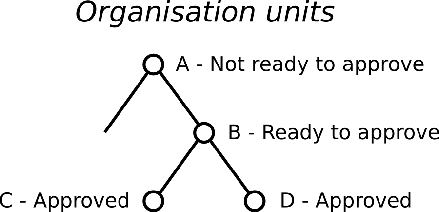
DHIS2 supports two different types of approval processes: either a one-step process where the data is approved at each level, or a two-step process where data is first approved and then accepted at each level. This is illustrated in the following diagram:
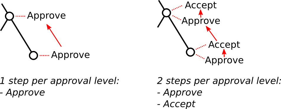
In the one-step process, data is approved at one level, and then approved at the next higher level. Until it is approved at the next higher level, it may be unapproved at the first level. (For example, if the data was approved my mistake, this allows the approver to undo their mistake.) Once the data is approved at the next higher level, it may not be unapproved at the lower level unless it is first unapproved at the higher level.
In the two-step process, data is approved at one level, and then the approval is accepted at the same level. This acceptance is done by a user who is authorized to approve data at the next higher level. Once the data is accepted, it may not be changed or unapproved unless it is first unaccepted.
The two-step process is not required by DHIS2. It is an optional step for a user reviewing data at the next higher level. It has the benefit of locking the acceptance from the level below, so reviewer does not have to worry that the data could be changing from below while it is being reviewed. It can also be used by the higher-level user to keep track of which lower-level data has already been reviewed.
Two-step process can be activated by checking Acceptance required before approval in SystemSettings app under General section.
To approve data, you must be assigned a role containing one of these authorities:
Approve data - You may approve data for the organisation unit(s) to which you are assigned. Note that this authority does not allow you to approve data for lower-levels below the organisation unit(s) to which you are assigned. This is useful to separate the users authorized to approve at one level from the users authorized to approve at levels below.
Approve data at lower levels - Allows you to approve data for all lower levels below the organisation units assigned to you. This is useful if, for example, you are a district-level user whose role includes approving the data for all the facilities within that district, but not for the district itself. If you are assigned this as well as the Approve data authority, you may approve data at the level of the organisation unit(s) to which you have been assigned, and for any level below.
Accept data at lower levels - Allows you to accept data for the level just below the organisation unit(s) assigned to you. This authority can be given to the same users as approve data. Or it may be given to different users, if you want to have some users who accept data from the level below, and a different set of users who approve data to go up to the next level above.
In the Maintenance app section under Data approval level you can specify the levels at which you want to approve data in the system. Click the Add new button on this page and select the organisation unit level at which you want approvals. It will be added to the list of approval settings. You may configure the system for approving data at every organisation unit level, or only at selected organisation unit levels.
Note that when you add a new approval level, you may optionally choose a Category option group set. This feature is discussed later in this chapter.
Also in maintenance under Data approval workflow, you can define the workflows that will be used for approving data. Each workflow can be associated with one or more approval levels. Any two workflows may operate at all the same approval levels as each other, some of the same and some different levels, or completely different levels.
If you want data for a data set to be approved according to a workflow, then assign the workflow to the data set when you add or edit the data set. If you do not want data for a data set to be subject to approval, then do not assign any workflow to that data set. For data sets that you want to approve at the same time as each other, assign them to the same workflow. For data sets that you want to approve independently, assign each data set to its own workflow.
Under System Settings -> Analytics, you can control what unapproved data (if any) will appear in analytics. See the "Analytics settings" section of this user guide. Note that users who are assigned to organisation units where data is ready for approval can alwyas view this data in analytics, as can users assigned to higher-level organisation units if they have the Approve data at lower levels authority or the View unapproved data authority.
If the option Hide unapproved data in analytics is enabled, data will be hidden from viewing by users associated with higher levels. When determining whether a data record should be hidden for a specific user, the system associates a user with a specific approval level and compares it to the level to which the data record has been approved up to. A user is associated with the approval level which matches the level of the organisation unit(s) she is linked to, or if no approvel level exists at that level, the next approval level linked to an organisation unit level below herself. A user will be allowed to see data which has been approved up to the level immediately below her associated approval level. The rationale behind this is that a user must be ablet to view the data that has been approved below so that she can eventually view and approve it herself.
Note that if the user has been granted the View unapproved data or the ALL authority she will be able to view data irrespective of the approval status.
Lets consider the following example: There are four organisation unit levels, with approval levels associated with level 2 and 4. User A at country level (1) gets associated with approval level 1 since the approval level exists at the same level as the organisation unit level. User B gets associated with approval level 2 since there is no approval level directly linked to her organisation unit level and approval level 2 is the immediate level below. User C gets associated with approval level 2. User D is below all approval levels which implies that she can see all data entered at or below her organisation unit level.

Using this example, lets consider some scenarios:
Data is entered at facility level: Only User D can see the data, as the data has not yet been approved at all.
Data is approved by User D at facility level: Data becomes visible to User C and User B, as the data is now approved at their level.
Data is approved by User C at district level: Data becomes visible to User A, as data is now approved at the level immediately below herself.
To approve data, go to Reports and choose Data Approval. When this report shows data that is configured for approval, it shows the approval status of the data in the report. The approval status will be one of the following:
Waiting for lower level org units to approve - This data is not yet ready to be approved, because it first needs to be approved for all the child organisation units to this organisation unit, for the same workflow and period.
Ready for approval - This data may now be approved by an authorized user.
Approved - This data has already been approved.
Approved and accepted - This data has already been approved, and also accepted.
If the data you are viewing is in an approval state that can be acted upon, and if you have sufficient authority, one or more of the following actions will be available to you on the Data Approval form:
Approve - Approve data that has not yet been approved, or that was formerly approved and has been unapproved.
Unapprove - Return to an unapproved state data that has been approved or accepted.
Accept - Accept data that has been approved.
Unaccept - Return to an unaccepted (but still approved) state data that has been accepted.
In order to unapprove data for a given organisation unit, you must have the authority to approve data for that organisation unit or to approve data for a higher-level organisation unit to which that data is aggregated. The reason for this is as follows: If you are reviewing data for approval at a higher organisation unit level, you should consider whether the data at lower organisation units are reasonable. If all lower-level data looks good, you can approve the data at the higher level. If some lower-level data looks suspect, you can unapprove the data at the lower level. This allows the data to be reviewed again at the lower level, corrected if necessary, and re-approved up through the organisation unit levels according to the hierarchy.
When defining an approval level, you specify the organisation unit level at which data will be approved. You may also optionally specify a category option group set. This is useful if you are using category option groups to define additional dimensions of your data, and you want approvals to be based on these dimensions. The following examples illustrate how this can be done within a single category option group set, and by using multiple category option group sets.
For example, suppose you define a category option group set to represent NGOs who serve as healthcare partners at one or more organisation units. Each category option group within this set represents a different partner. The category option group for Partner 1 may group together category options (such as funding account codes) that are used by that partner as a dimension of the data. So data entered by Partner 1 is attributed to a category option in Partner 1's category option group. Whereas data entered by partner 2 is attributed to a category option in Partner 2's category option group:
| Category option group set | Category option group | Category options |
|---|---|---|
| Partner | Partner 1 | Account 1A, Account 1B |
| Partner | Partner 2 | Account 2A, Account 2B |
Each partner could enter data for their accounts independently of the other, for the same or different workflows, at the same or different facilities. So for example, data can be entered and/or aggregated at the following levels for each partner, independently of each other:

Tip
You can use the sharing feature on category options and category option groups to insure that a user can enter data (and/or see data) only for certain category options and groups. If you don't want users to see data that is aggregated beyond of their assigned category options and/or category option groups, you can assign Selected dimension restrictions for data analysis, when adding or updating a user.
You can optionally define approval levels for partner data within any or all of these organisation unit levels. For example, you could define any or all of the following approval levels:
| Approval level | Organisation unit level | Category option group set |
|---|---|---|
| 1 | Country | Partner |
| 2 | District | Partner |
| 3 | Facility | Partner |
You can also define approval levels for different category option group sets. To continue the example, suppose that you have various agencies that manage the funding to the different partners. For example, Agency A funds accounts 1A and 2A, while Agency B funds accounts 1B and 2B. You could set up category option groups for Agency A, and Agency B, and make them both part of a category option group set called Agency. So you would have:
| Category option group set | Category option group | Category options |
|---|---|---|
| Partner | Partner 1 | Account 1A, Account 1B |
| Partner | Partner 2 | Account 2A, Account 2B |
| Agency | Agency A | Account 1A, Account 2A |
| Agency | Agency B | Account 1B, Account 2B |
Now suppose that at the country level, you want each partner to approve the data entered by that partner. Once this approval is done, you want each agency to then approve the data from accounts that are managed by that agency. Finally, you want to approve data at the country level across all agencies. You could do this by defining the following approval levels:
| Approval level | Organisation unit level | Category option group set |
|---|---|---|
| 1 | Country | |
| 2 | Country | Agency |
| 3 | Country | Partner |
Note that multiple approval levels can be defined for the same organisation unit level. In our example, Partner 1 would approve country-wide data at approval level 3 from category options Account 1A and Account 1B. Next, Agency A would approve country-wide data at approval level 2 from category options Account 1A (after approval by Partner 1) and Account 2A (after approval by Partner 2.) Finally, after approval from all agencies, country-wide data can be approved at approval level 1 across all category options. Note that approval level 1 does not specify a category option group set, meaning that it is for approving data across all category options.
This example is meant to be illustrative only. You may define as many category option groups as you need, and as many approval levels as you need at the same organisation unit level for different category option group sets.
If you have multiple approval levels for different category option group sets at the same organisation unit level, you may change the approval ordering in the Settings section, under System Approval Settings. Just click on the approval level you wish to move, and select Move up or Move down. If you have an approval level with no category option groups set, it must be the highest approval level for that organisation unit level.
The Data Approval app provides an intuitive interface to support the approval process in line with the configured approval workflows.
Start by selecting a workflow in the top left of the screen. If you only have access to a single workflow, it will be preselected for you.
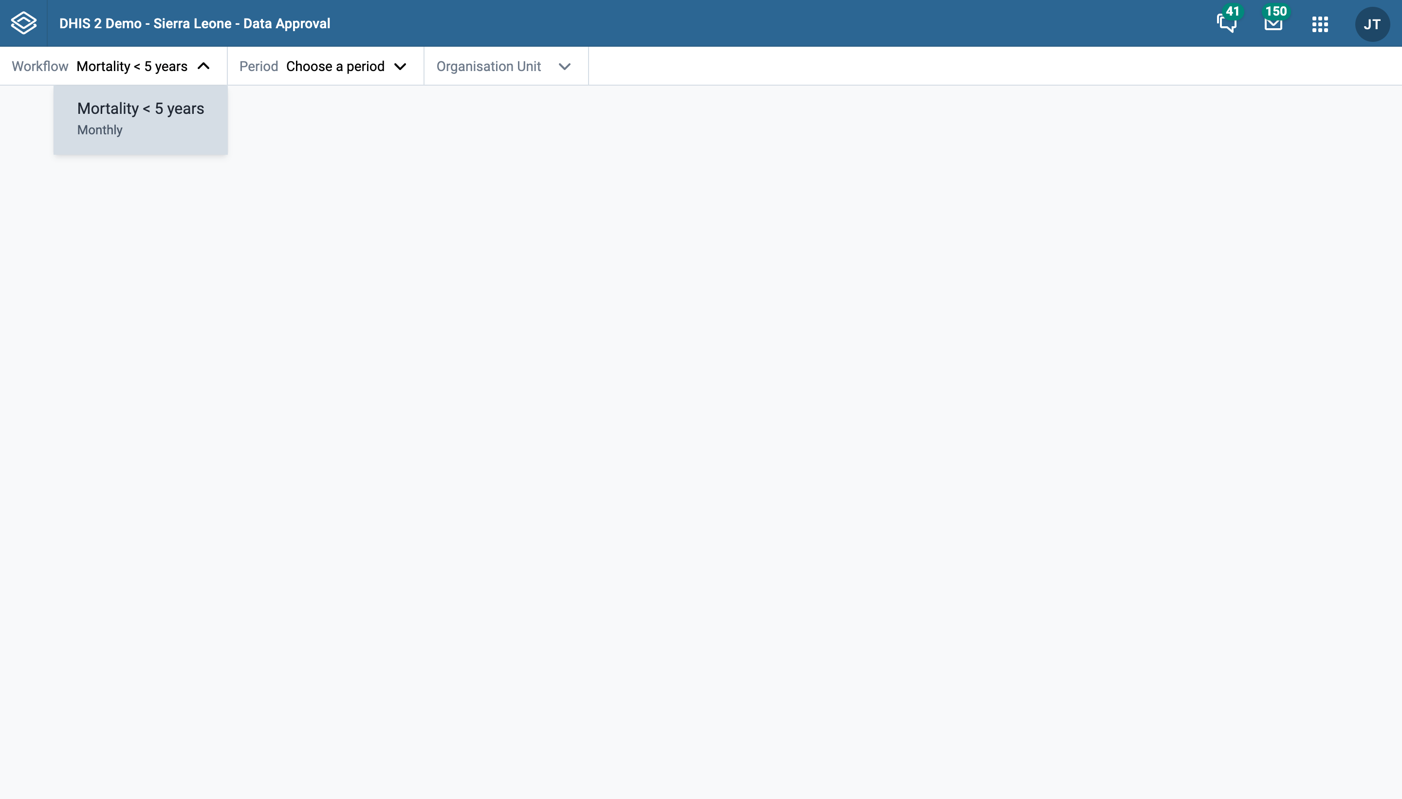
Proceed to select a period you would like to approve data for.
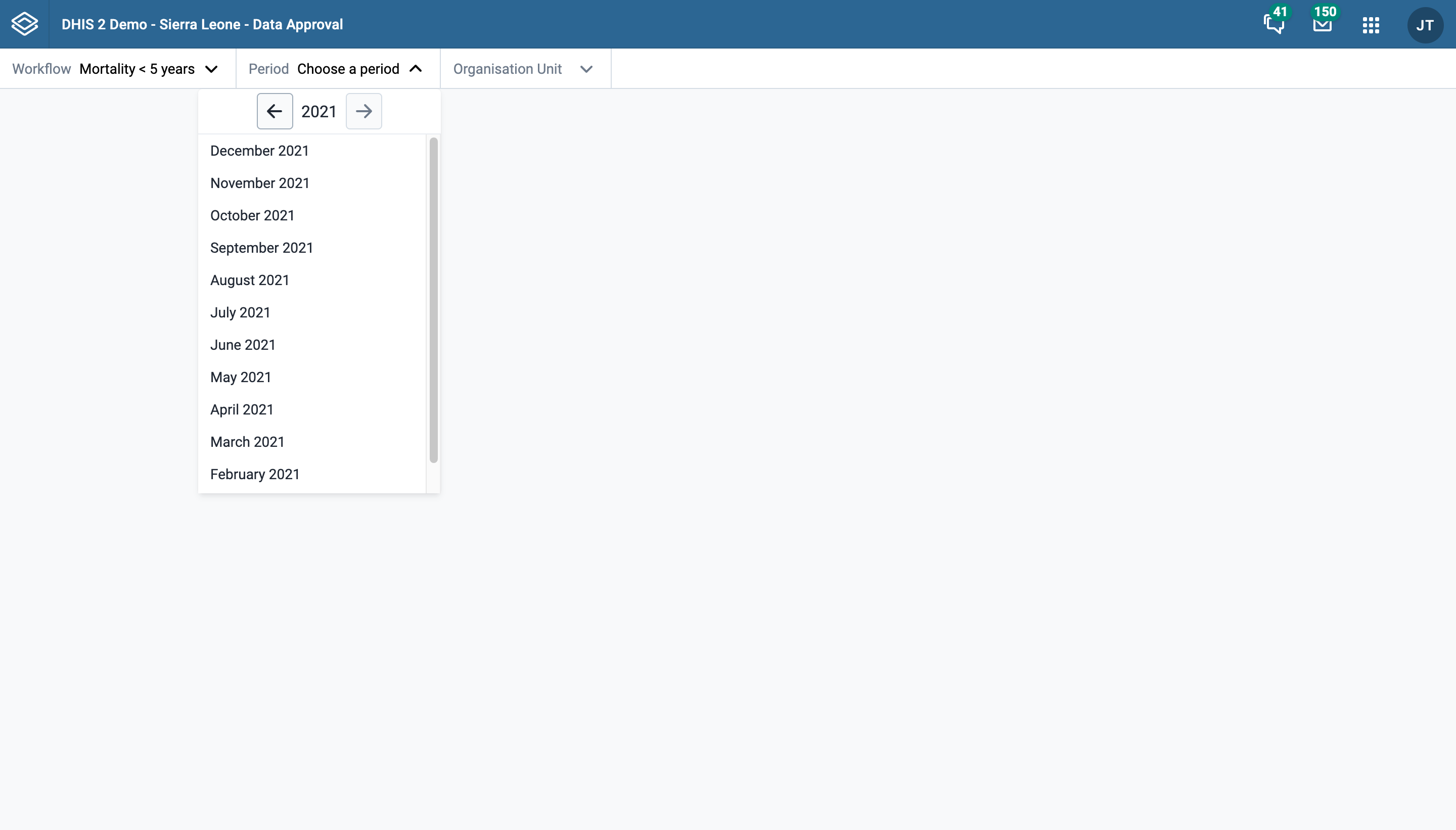
Finally, select an organisation unit you would like to approve data for. Each visible organisation unit in the tree is preceded with a status-icon. This icon serves as an indication of the actions available to your user profile for that organisation unit. In the screenshot below, "Badjia" is an organisation unit with status "ready for approval".
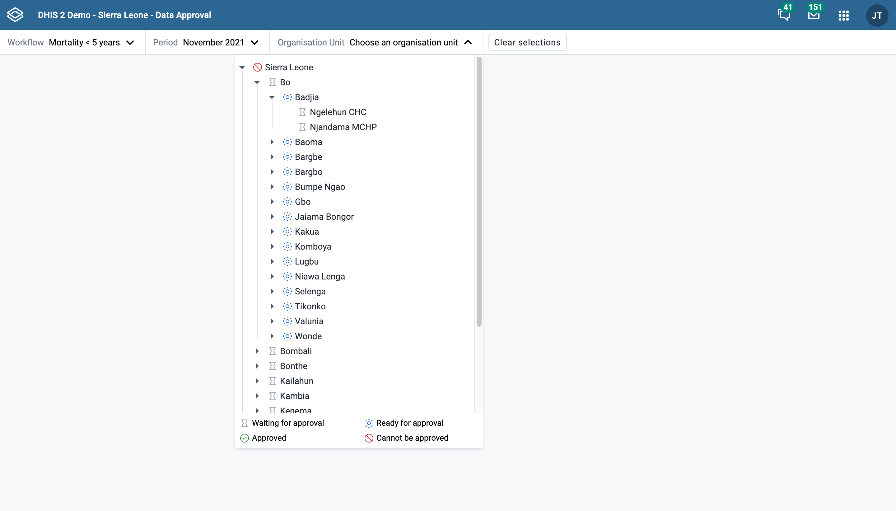
Once a workflow, period, and organisation unit have been selected, a "Clear selections" button will appear. This button can be used to quickly clear all three fields and start a fresh selection.
Once a workflow, period, and organisation unit have been selected, you can review the dataset reports for the datasets connected to the selected workflow. The data for each dataset is presented in a tab.
Datasets can have different period types than the workflow the are connected to. If this is the case, the approval app will show data for all the dataset-periods that end within the selected workflow period.
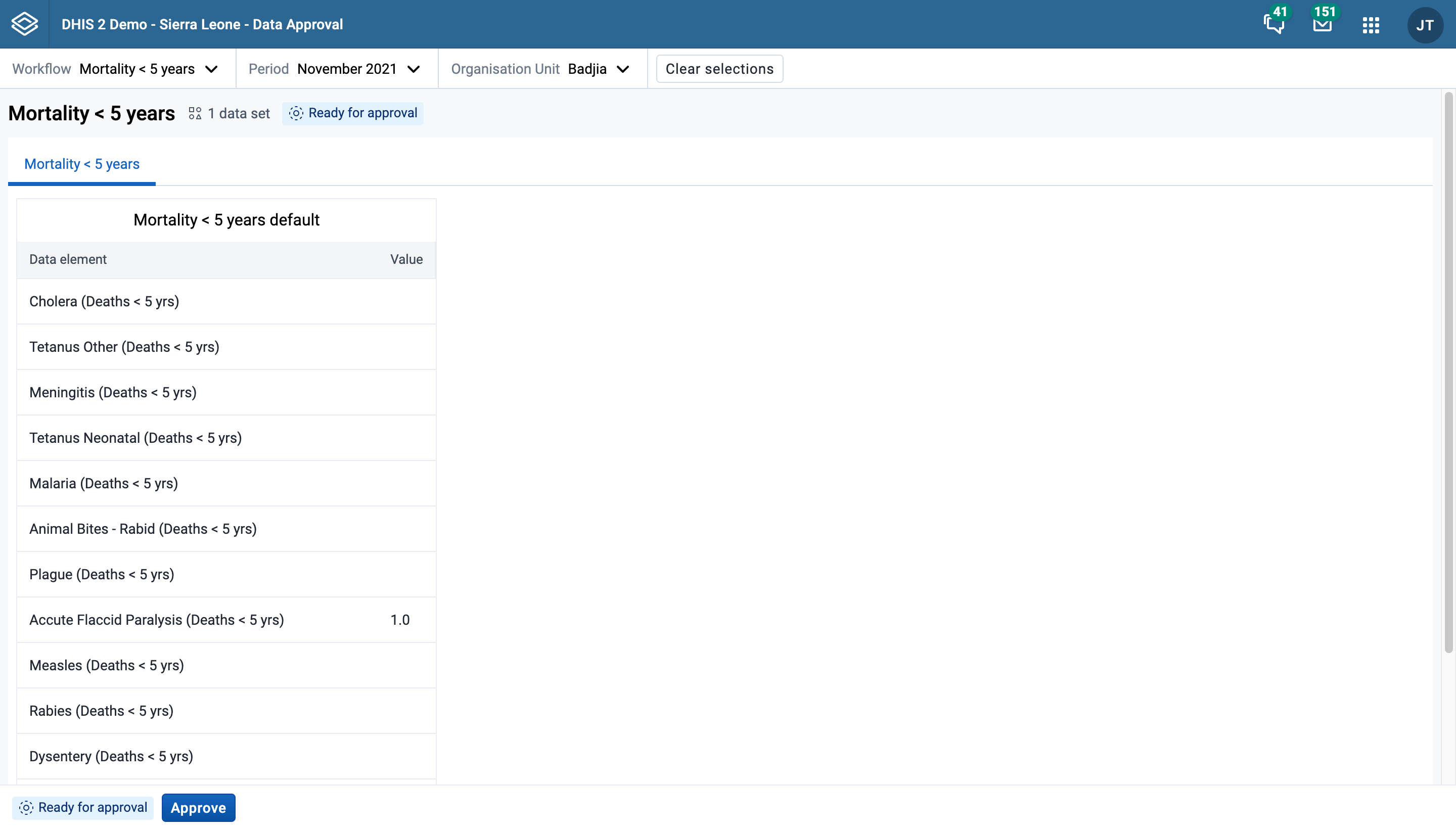
Once you have reviewed the data in the datasets, you can proceed to take an approval action. The following actions are available:
Which of these actions are available for a given workflow at a given moment in time depends on the type of actions which have been taken already at the current and other levels of the organisational hierarchy.
In the example above the "approve" action is available. When you choose the "Approve" action, you are presented with a confirmation dialog as displayed below which summarises the datasets you are approving. The workflow is not approved until you click "Approve" to confirm there. Other actions take effect immediately and do not have a confirmation step.
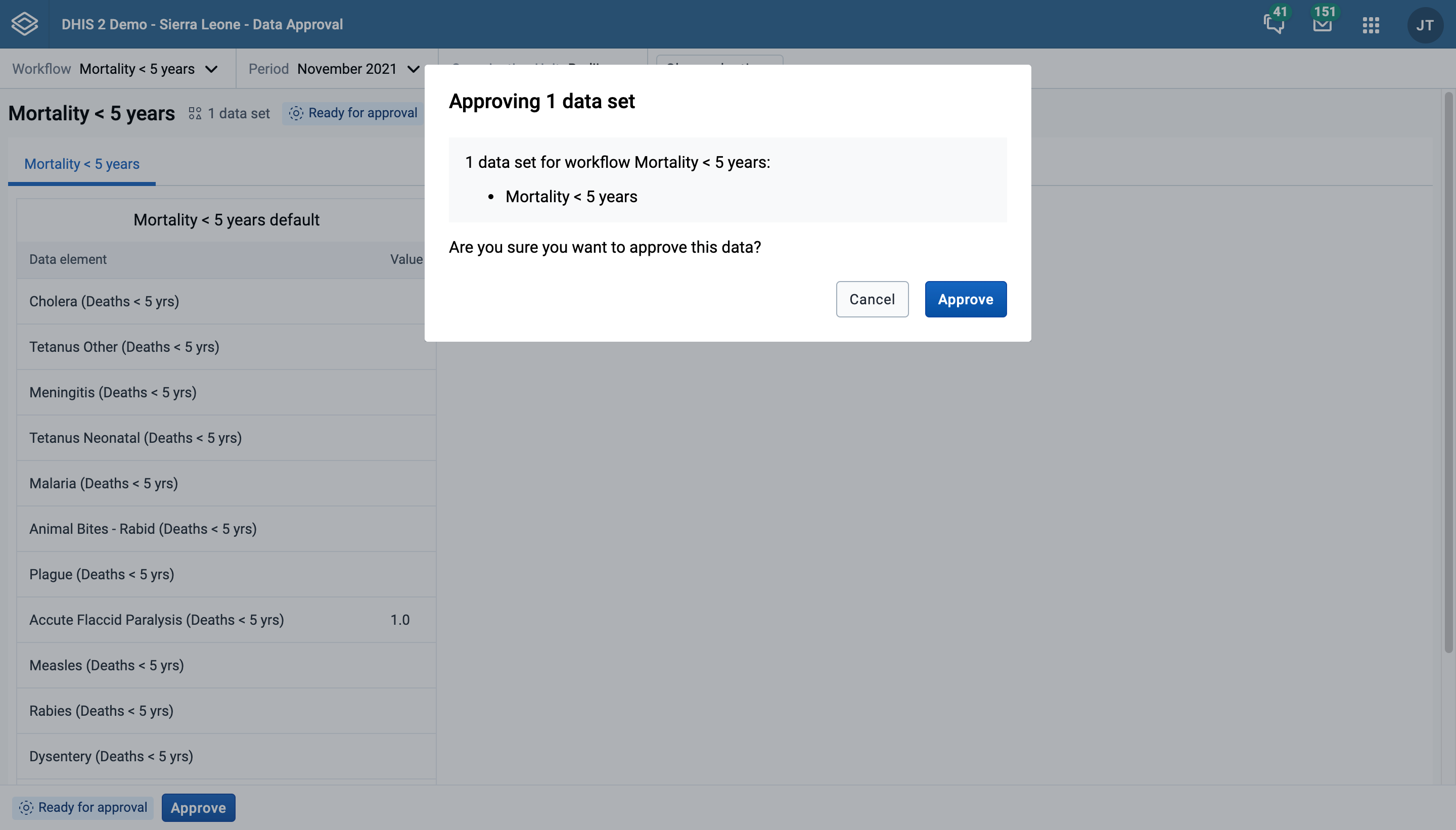
After taking one of the approval actions, in this case after confirming the approval, the workflow is updated immediately and you see a the new approval status.
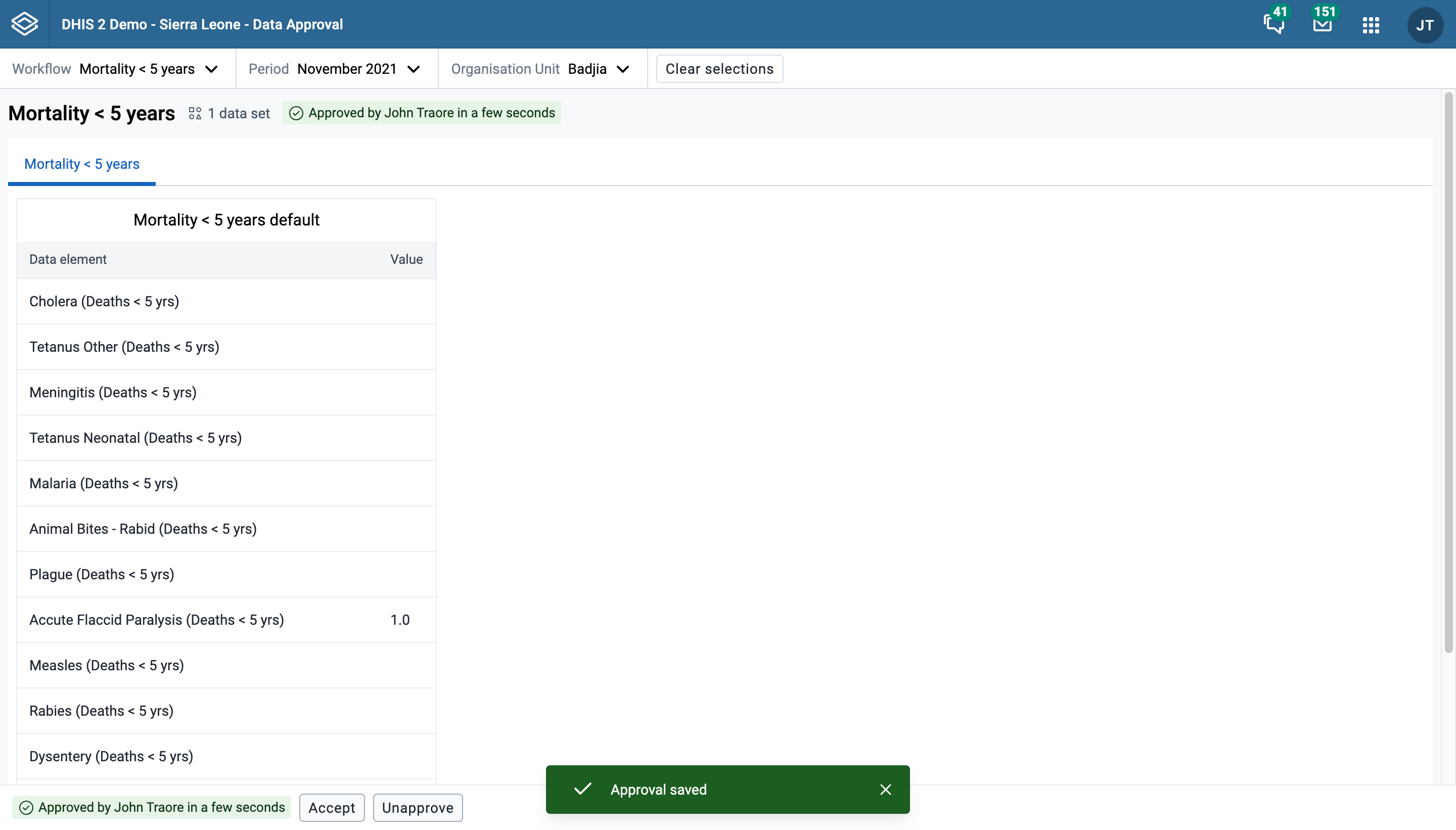
As shown in the image above, the approval status is displayed in two places:
These status tags may not always display the same information, because the have a slightly different meaning:
A workflow may be ready to be approved at a given organisation unit level, but you do not have the appropriate authority to do so.
The Dashboards app makes it possible to present a high level overview of your data, including displaying analytical objects such as maps, charts, reports, tables, and line lists, as well as displaying text-based information, resource links, plugins and app widgets.
Features of the Dashboards app include:
Dashboards have a title, description, dashboard items. The title and actions bar is at the top of the page under the header bar, and shows the title, a dropdown for searching and selecting dashboards, and actions that can be taken with the current dashboard. There is also a + button for creating a new dashboard.
The Dashboards app has two modes: view and edit/create. When you first log in to DHIS2, your most recently used dashboard will be displayed in view mode, if you are on the same computer as you were previously. If you are using a different computer or browser, then the first starred dashboard will be displayed. If there are no starred dashboards, then the first dashboard (alphabetically) will be displayed. Starred dashboards always show first in the dashboard list.
Below is a dashboard named "Antenatal Care", which has been populated with charts and maps:
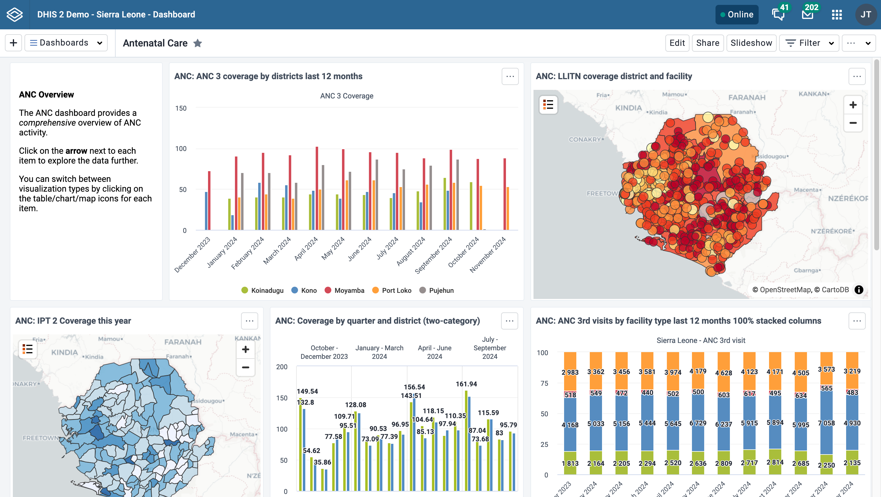
To adjust the Dashboards app to suit your needs, you can:
When viewing dashboards on small screens like mobile phones, the dashboard will adapt to the screen and show all items in a single column. Some options, including editing, filtering and sharing, will not be available.
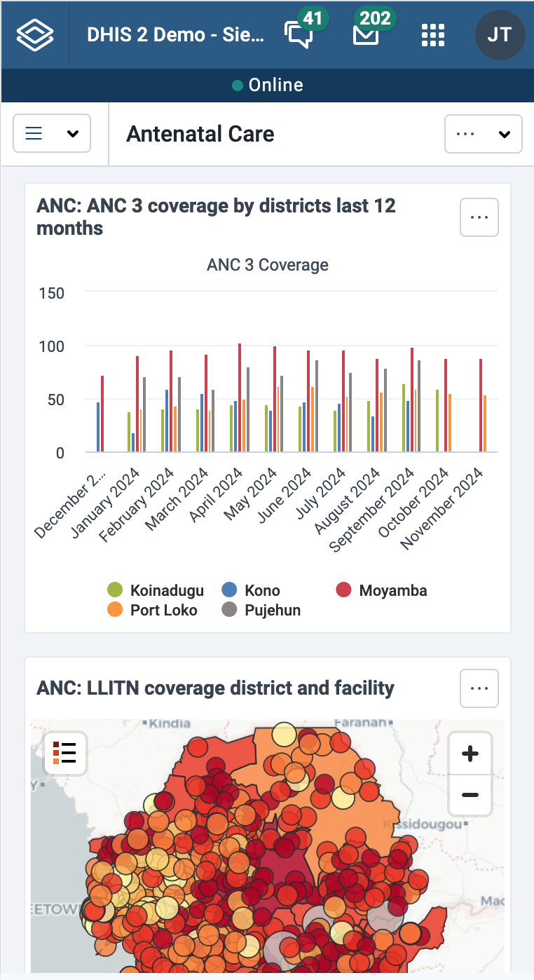
You can search for a specific dashboard using the search field available from the Dashboards dropdown selector in the title bar. The search is case insensitive, and as you type, the list of dashboards will be narrowed down to those that match your search text.

To create a new dashboard, click the + button in the upper corner of the title bar to enter create/edit mode:

To edit an existing dashboard, click the Edit button (you must have edit access to see this button):

In create/edit mode, you can add or change the dashboard title, description, dashboard code and dashboard items. If you do not add a title, the dashboard will automatically be titled "Untitled dashboard".
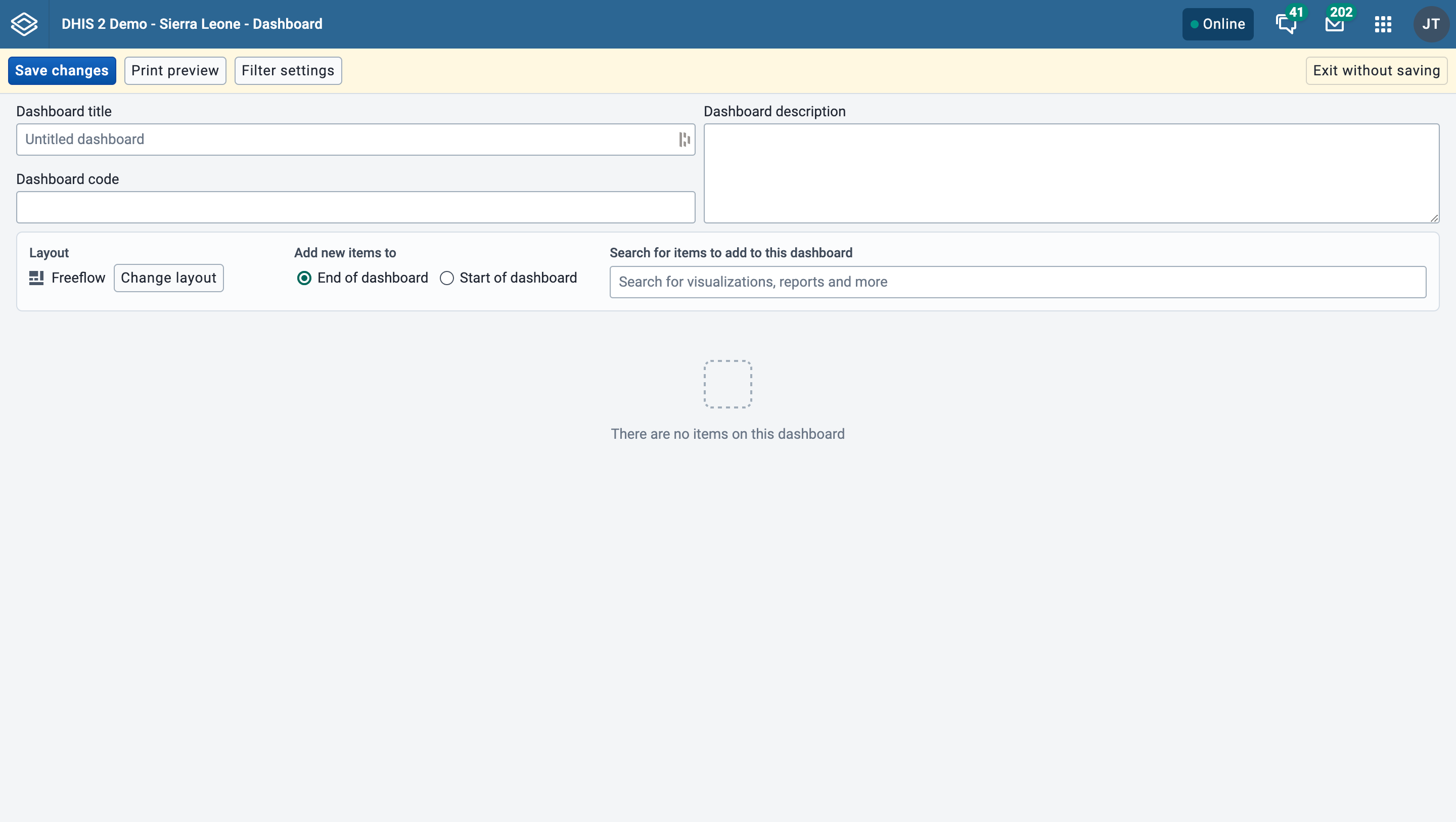
If the system has been configured to support embedded dashboards, then you will have the option of creating a regular (internal) dashboard or embedding a dashboard from an external source. See this section for more information.
Add items to the dashboard by searching for items using the Search for items to add to this dashboard dropdown selector. Item types are:
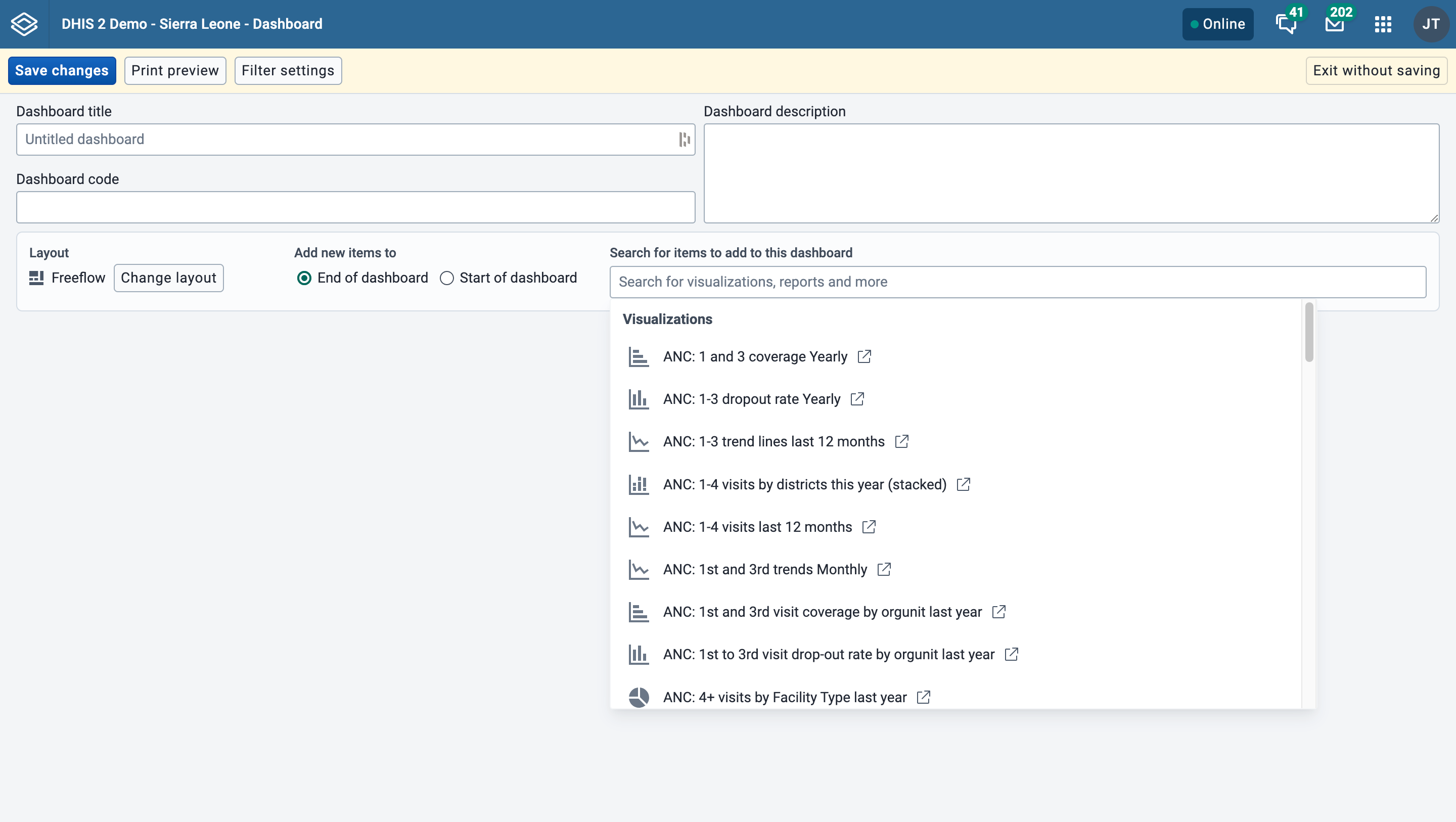
The list of items in the dropdown initially displays 10 visualizations (charts and tables), and 5 from each of the other categories, based on the search text you enter. To view more items, click on Show more, and the list for that type will be extended to 25 items. If you still do not find the item you want, try typing a more specific search text. Messages (Email), text boxes and spacer items can also be chosen from the list.
When adding items to the dashboard you can choose an overall layout by clicking on Change layout button. You can change this layout setting at any time.
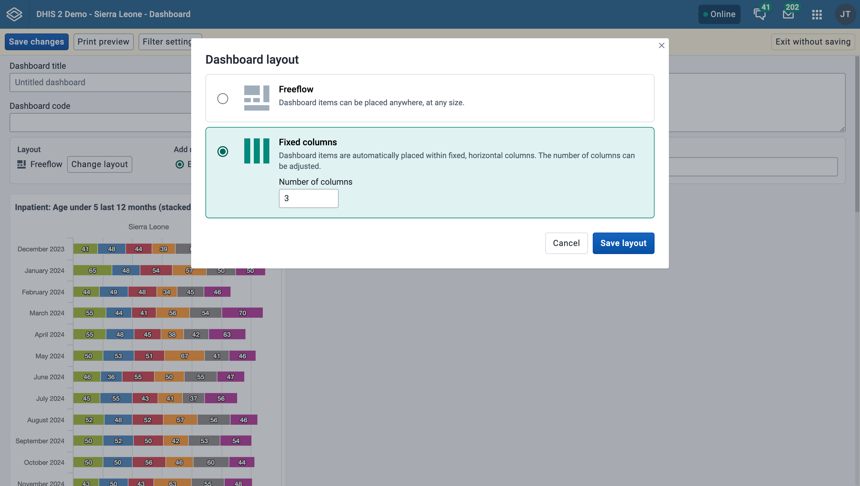
You can also configure whether newly added items are automatically placed at the start or end of the dashboard by choosing the desired option. This option can be changed at any time.
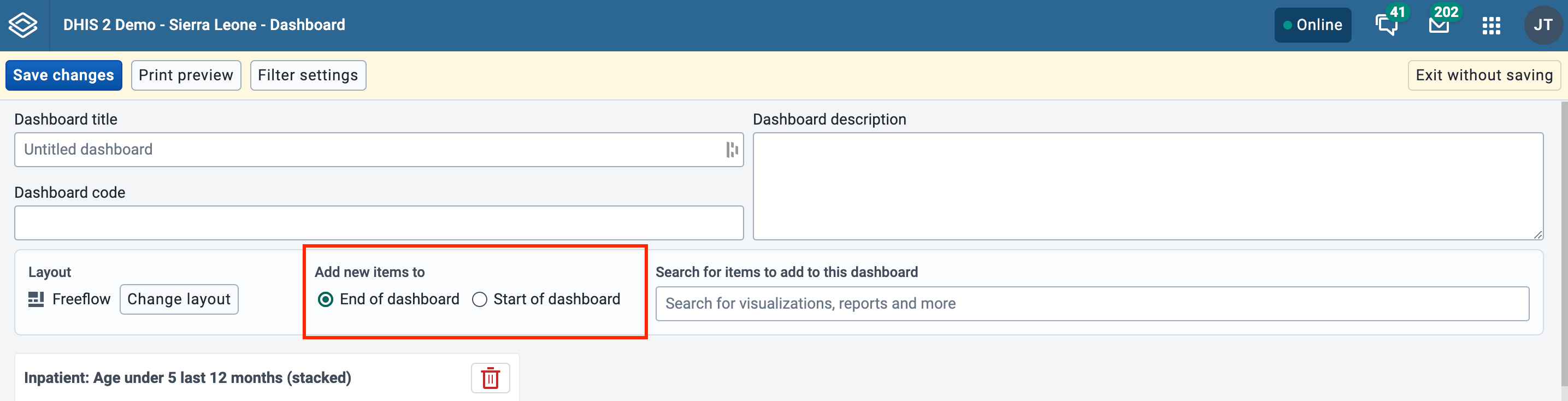
When adding items to the dashboard using Freeflow layout, they will "rise" upwards until they bump into another item. In order to force empty vertical space between items (like an empty row), you can add spacer items to the dashboard. They are only visible in edit/create mode. In view mode, they are not displayed, but take up the defined space.
Spacer in edit/create mode:
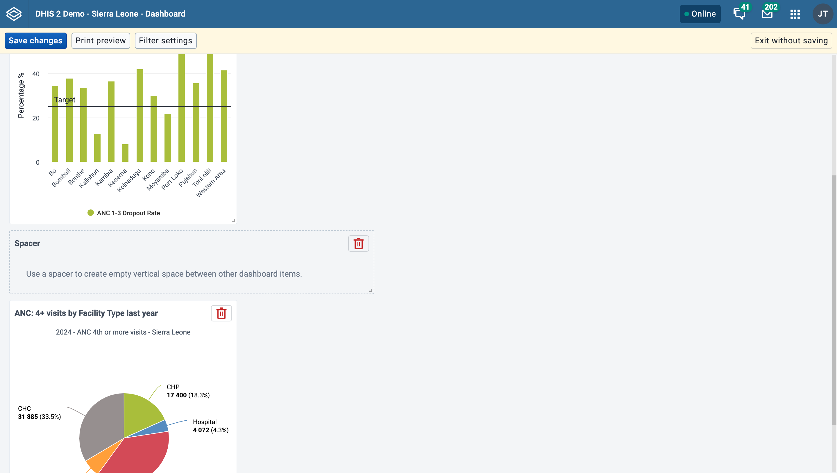
Spacer in view mode:
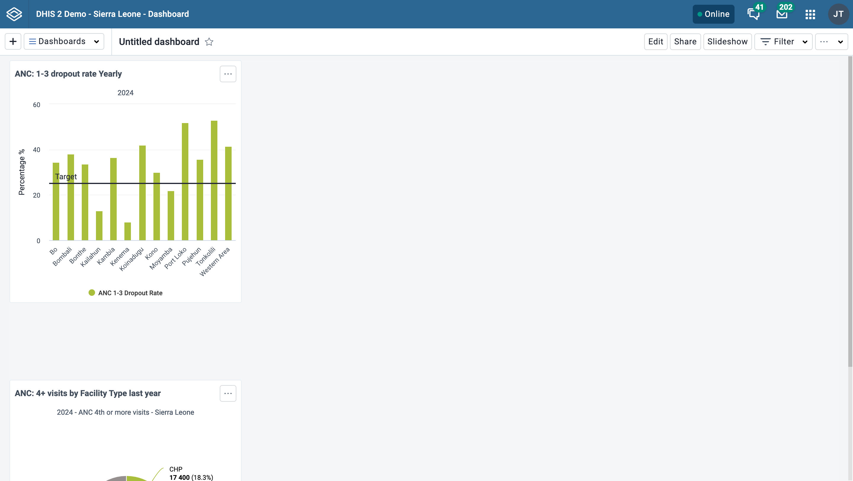
Remove items by clicking on the red trash can at the upper right of the item. Be aware that when you remove an item while in Freeflow layout, the items that are positioned below the removed item will "rise" upwards until they bump into an item above. in Fixed columns layout, the items will be adjusted to fill every column in the layout so there are no empty column slots.
In create/edit mode you will see the following buttons in the actions bar at the top of the page: Save changes, Print preview, Filter settings, Translate, Delete, and Exit without saving. The Translate and Delete buttons are only shown if you are editing an existing dashboard.
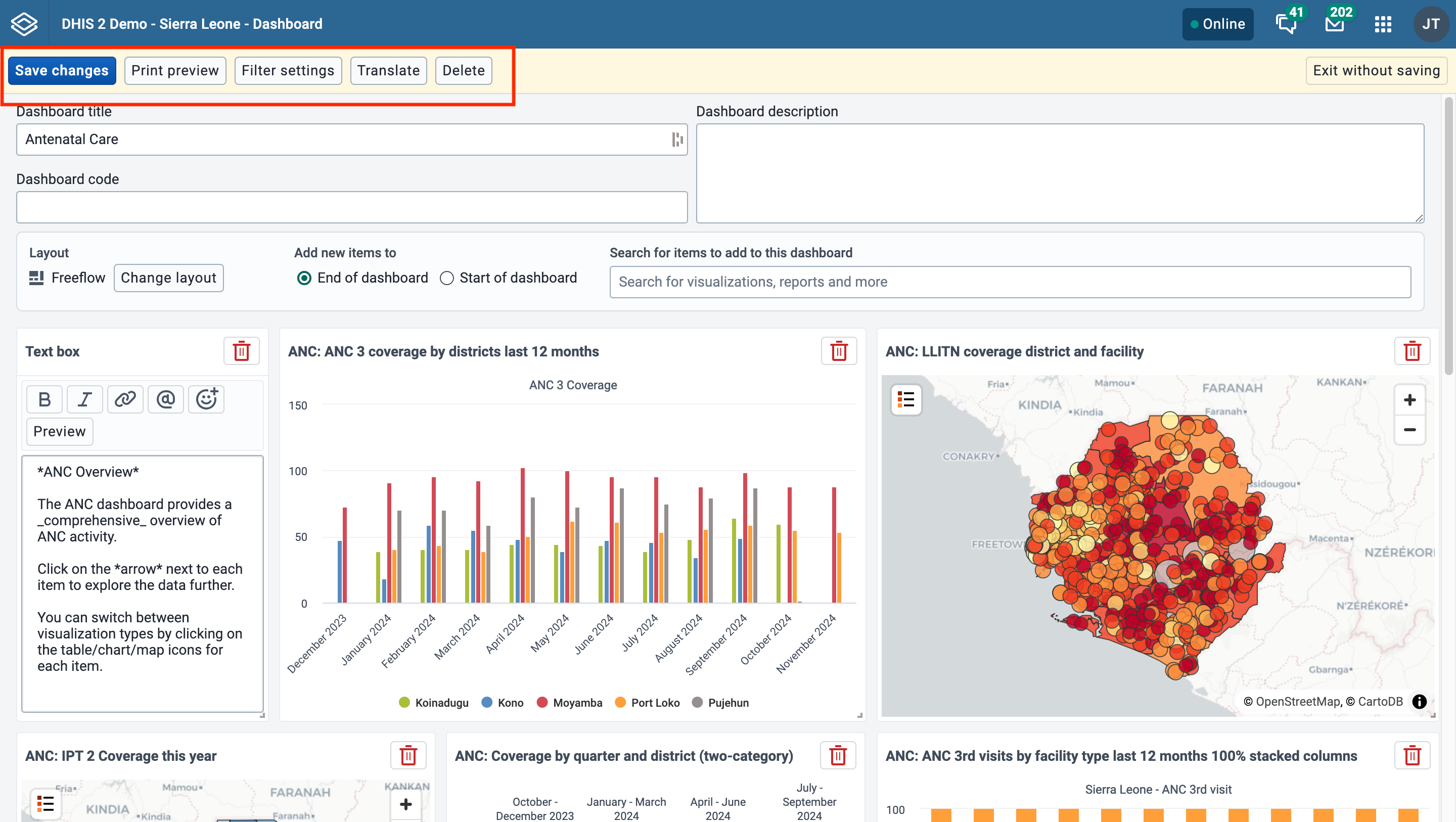
When creating or editing a dashboard, changes are saved when you click the Save changes button. If you don't want to save your changes, click the Exit without saving button. You will then be returned to view mode with the dashboard you were previously viewing.
Click on the Print preview button to view what the dashboard will look like when being printed with the Dashboard layout option.
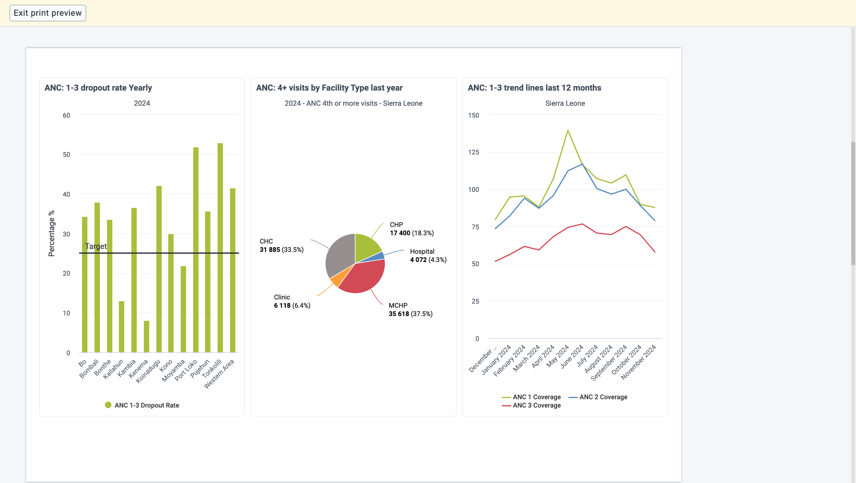
Click on Exit print preview to return to editing the dashboard.
Note that some items may be moved to the next page to avoid being split between two pages. Items may also be shortened to fit on one page. Items that are shortened show an info icon in the upper right corner of the item in preview. The info icon is not visible in the actual print.
By default, users will be able to filter dashboard items by any dimension defined in the DHIS2 instance. Dashboard filter settings can be edited for a dashboard by clicking on Filter settings.
To restrict available filters, you can click Only allow filtering by selected dimensions and select the filters you wish to allow on the dashboard. Period and Organisation Unit are selected by default but can be removed if desired. When the dashboard is viewed, users will only be able to choose from among the filters selected.

In order to save updates to filter settings, you need to first click Confirm to close the Filter settings dialog and then click Save changes to save the dashboard changes.

If you are editing an existing dashboard, then there will be a Translate button. Click on this button to open the Translation dialog, which provides a list of languages to translate to, and shows the original dashboard title and description. First choose the language you want to translate for, then fill in the dashboard name and description translation.
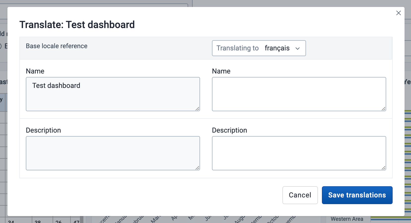
If you have access to delete the dashboard, then there will be a Delete button. When you click the Delete button, a confirmation dialog will first be displayed to confirm that you want to delete the dashboard.
If the system has been configured to support embedded (Superset) dashboards, and you start creating a new dashboard by clicking the + button, you will be presented with a choice:

If you choose the "External" option here and click "continue", you will be taken to a modal form where you can create an embedded dashboard:
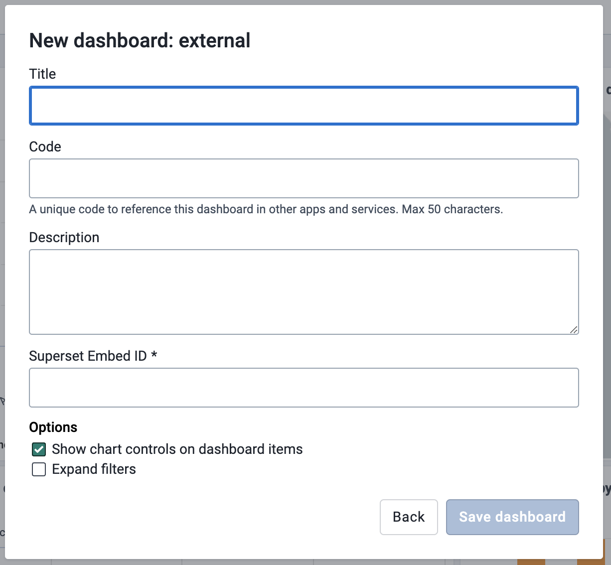
The "Title", "Code" and "Description" fields in this form are identical to the fields with the same names you see when creating a regular (internal) dashboard, but there are also some notable differences:
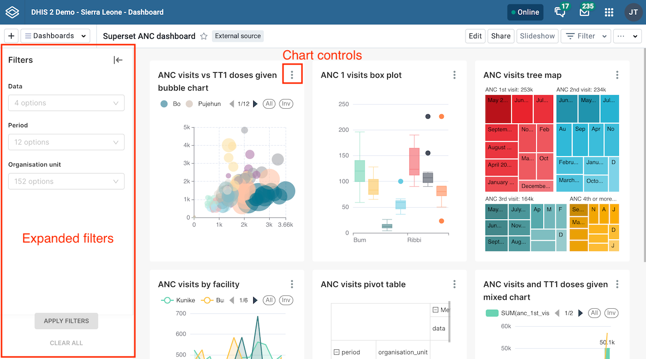
Once the dashboard is created, you can star/unstar, edit and share it. You can also show and hide the description and close the dashboard. It is not possible to show it in slideshow mode, filter it, or enter print view mode.
In order for the embedded Superset dashboards feature to work, the following prerequisites need to be met:
The following actions are available on the dashboard in view mode:
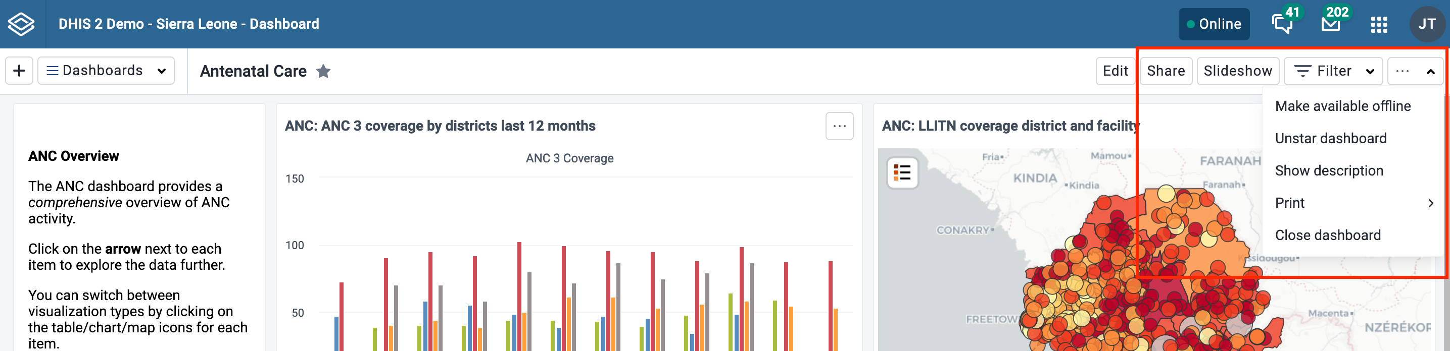
To toggle the description, open the ... menu and choose Show description (or Hide description). This setting will be remembered for all dashboards that you open. This setting applies to you, not other users.
Your starred dashboards are listed first in the list of dashboards for quick access. To star a dashboard, click on the star button to the right of the title. You can also toggle the star from the ... menu. When the star is “filled”, that means the dashboard is starred. Starring a dashboard only applies to you, not other users.
Applying filters to a dashboard change the data displayed in dashboard items containing visualizations. The filters are applied to each dashboard item in the same way: each added filter overrides the original value for that dimension in the original chart, table or map. It is possible to filter on Organisation Units and Periods, as well as dynamic dimensions, depending on the DHIS2 instance. You can apply multiple filters to the dashboard.
To add a filter, click on the Filter button and choose a dimension:

A dialog opens where the filter selection can be made.
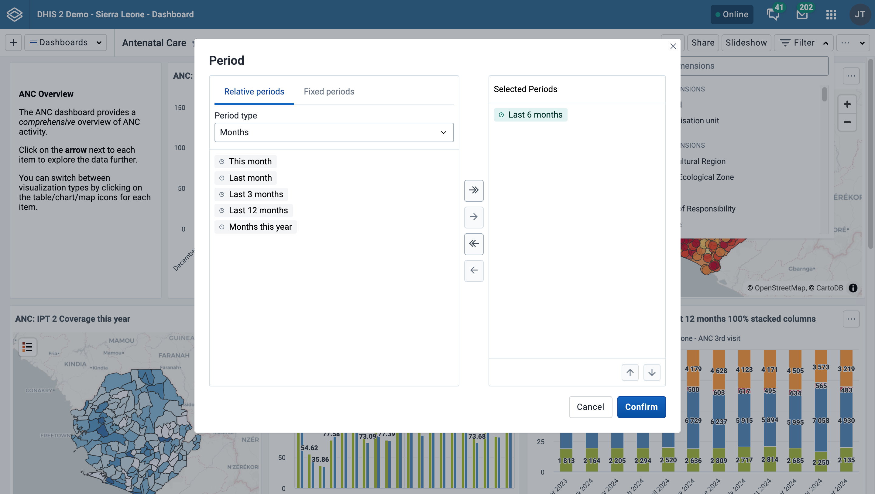
Click on Confirm in the dialog to apply the filter to the current dashboard.
Filters are not stored, so when switching to a different dashboard they are reset. Black filter badges appear above the dashboard items to indicate which filters have been applied to the dashboard's visualizations.
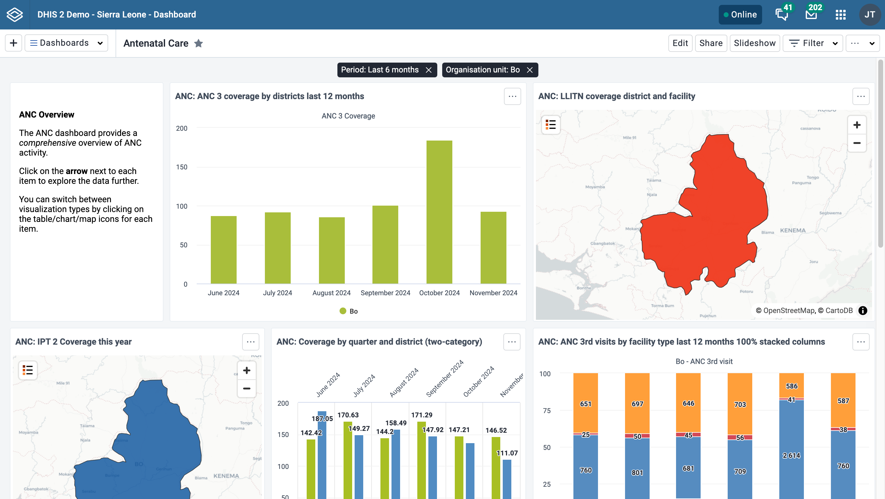
You can edit a filter by clicking on the filter badge to open the filter selection dialog. A filter can be removed by clicking on the Remove button on the badge. Whenever a filter is added, edited or removed, the dashboard items reload to show the updated data. The filter badges are always visible at the top of the page when scrolling the dashboard content.
By default, users are able to filter dashboard items by any dimension defined in the DHIS2 instance. To limit available filters, see Restricting dashboard filters.
The dashboard can be displayed in a slideshow by clicking on the Slideshow button. Once in slideshow mode, you'll find all the slideshow controls, including the manual navigation buttons, autoplay controls, and exit button in the slideshow control bar at the bottom of the page.

Slideshow control bar:

The slideshow can be autoplayed, or navigated manually.
When you enter the slideshow, it is paused. Click the play/pause button in the control bar to start the autoplay, and the slides will automatically advance according to the timing setting. A countdown bar is visible on the play/pause button while the slideshow is playing. Once the slideshow has reached the last slide, it will restart automatically. If 24 hours has passed since the slideshow began, a message stating as such will appear in the control bar, since data does not refresh during the slideshow and may be considered out of date for certain visualizations.
The autoplay controls include the play/pause button and the timing settings button. The user's most recent selected timing setting is remembered for the next time the slideshow is started.
You can also navigate the slides manually both when the slideshow is playing and paused. Use the manual navigation buttons or forward/back arrow keys on the keyboard to navigate through the slides. If the slideshow is playing, the timer resets when manually navigating, and the slideshow will automatically advance unless you click pause.
Exit the slideshow with the esc key or by pressing the exit button.
Any filters that are applied will be displayed in the slideshow control bar. Note that messages and spacer items are not displayed in the slideshow.
To make a dashboard available offline, choose the Make available offline option in the ... menu. This will cause a reload of the dashboard where requests to the server are recorded and saved in browser storage. Note that offline dashboards are only available on the computer and browser where you set it to offline. If you currently have a filter applied when requesting the dashboard be made available offline, a dialog will appear to confirm the removal of the filters.
Note that some dashboard items may not be displayed when offline. Specifically, third party plugins that have not implemented offline handling, as well as maps with Google Earth Engine layers will not be displayed when offline.
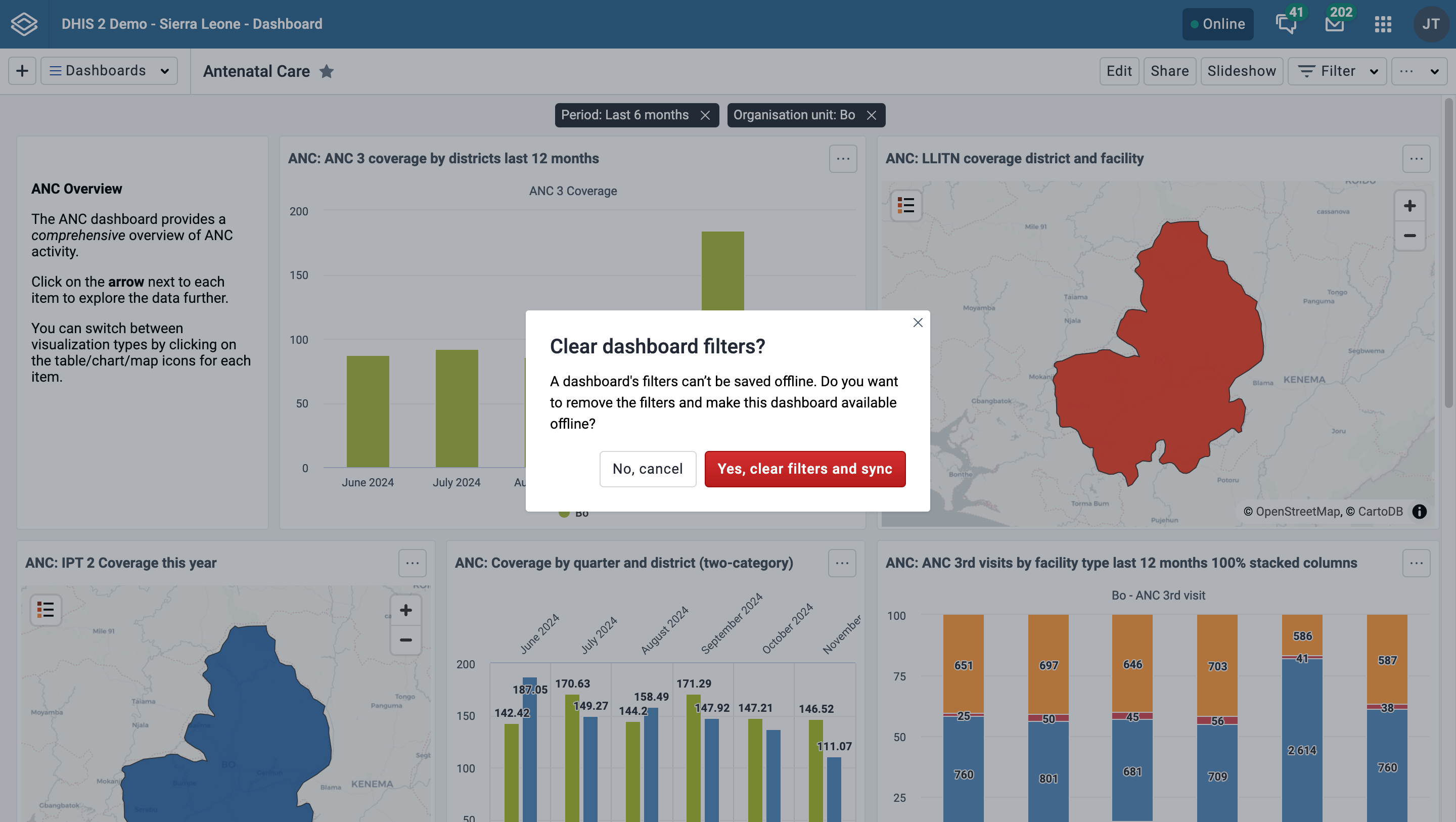
Dashboards that have been saved for offline display a tag next to the dashboard title showing the time it was saved. In the dashboard selector, an icon is displayed if the dashboard is available offline.
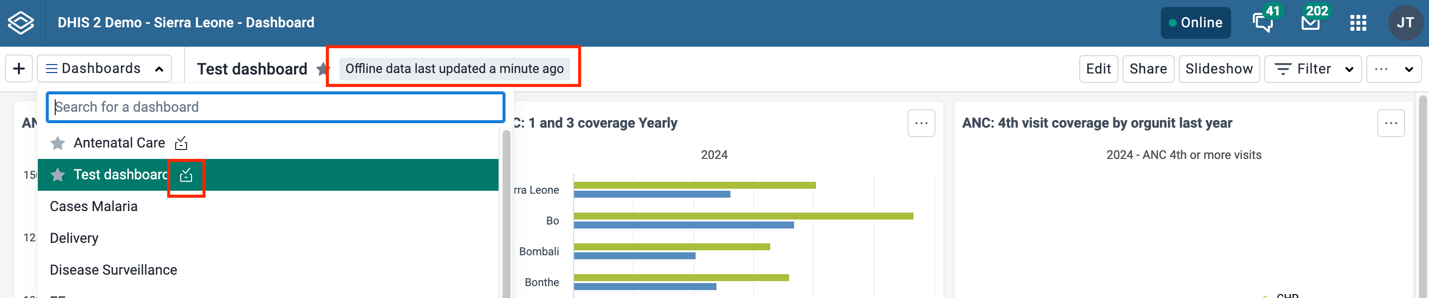
If the dashboard has been changed since you made it available offline, either by you or someone else, you'll need to choose Sync offline data now from the ... menu to save the latest version of the dashboard.
You can remove a dashboard from offline storaged by choosing Remove from offline storage in the ... menu.
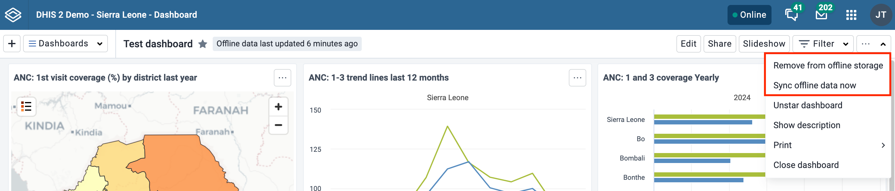
If you manually log out of the DHIS2 instance, all cached dashboards will be cleared and they will no longer be available offline.
If you are offline, any buttons or actions that require a connection to complete successfully are disabled. They will be re-enabled once connectivity is restored.
From the ... menu you can print the current dashboard. There are two styles of dashboard print: Dashboard layout and One item per page. For both styles, a title page is added that shows the dashboard title, description (if the Show description setting is enabled), and any applied dashboard filters.
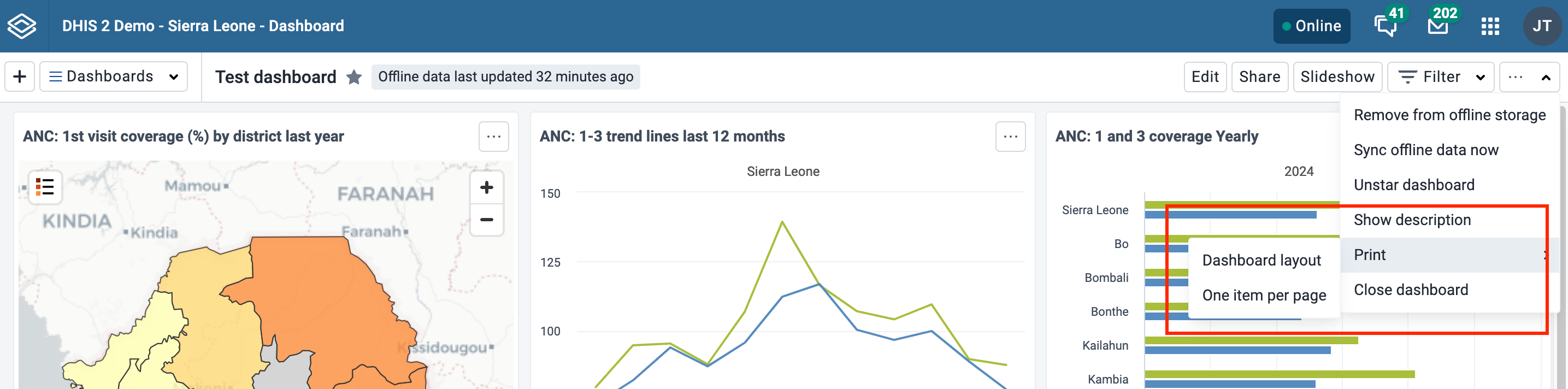
For best print results:
Dashboard layout print will approximate the dashboard layout as it is shown in the browser. Note that some adjustments may need to be made to the layout in order to prevent items being split onto multiple pages: items that would be cut off by a page break are moved to the next page, and items that are taller than one page are shortened to fit on one page.
Once in print mode, click on the Print button in the upper right to trigger the browser print functionality.
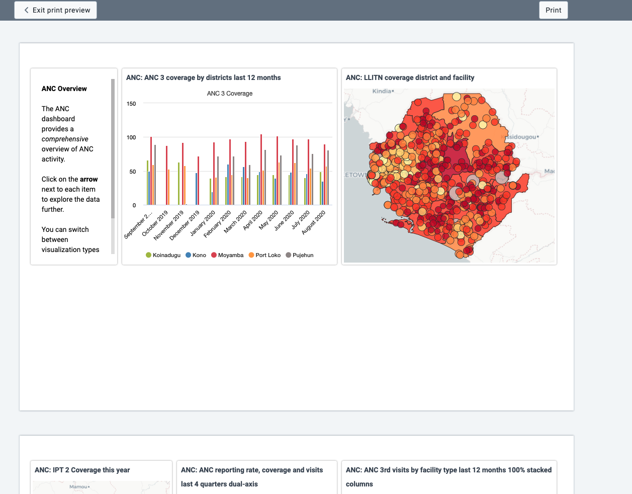
This style of print will print each dashboard item on a separate page, maximizing the use of the paper size.
Click on the Print button in the upper right to trigger the browser print functionality.
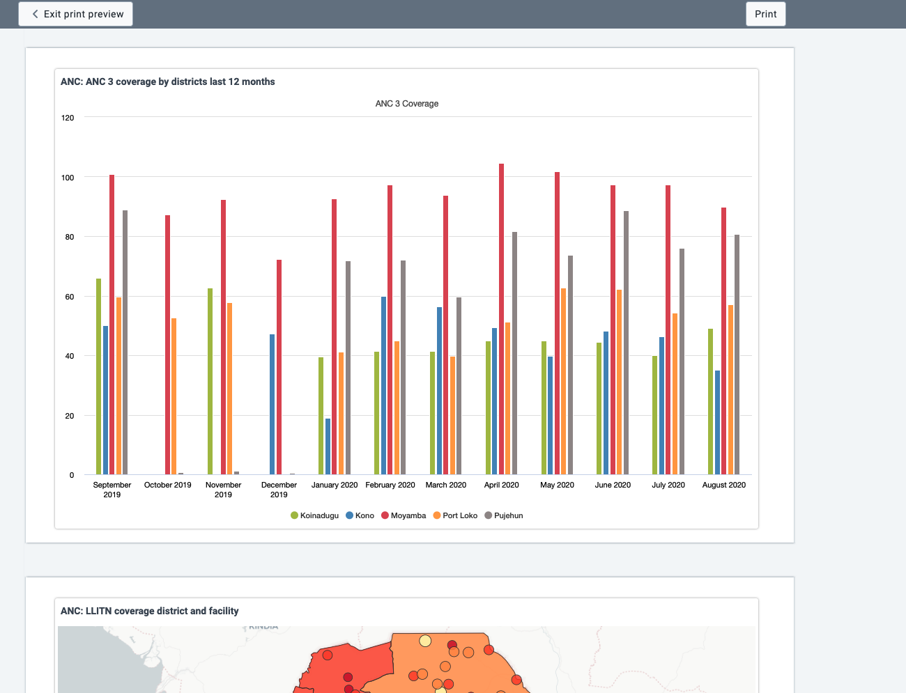
Dashboard items with charts, pivot table, maps, line lists, event reports and event charts may have an item menu button in the upper right corner of the item with additional viewing options, depending on the system settings that have been configured for the DHIS2 instance. If all the relevant system settings have been disabled by the DHIS2 instance, then there will not be an item menu button. Here are the possible item menu options:
It is possible to toggle the visualization view of charts, pivot tables and maps, and between event charts and reports. Click on the item menu button and choose the desired view (e.g., View as Table, View as Map, View as Chart):
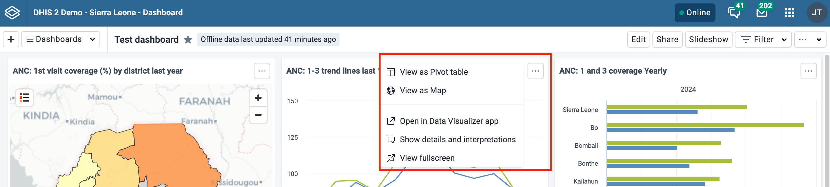
To view the chart, table, map or line list in fullscreen, click on the View fullscreen option. To exit fullscreen, you can either press esc key or click the exit button in the upper right corner of the fullscreen view. Note that you actually enter the slideshow in a paused state, and can then use the navigation bar or click the play button as described in the Slideshow section to navigate to other dashboard items in fullscreen.
To open the visualization in its corresponding app (e.g., Data Visualizer, Maps) click on the Open in [app name] app option.
You can write interpretations for charts, pivot tables, maps, line lists, event reports, and event charts by clicking on Show interpretations and details. The item will be expanded vertically underneath to show the description, interpretations and replies:
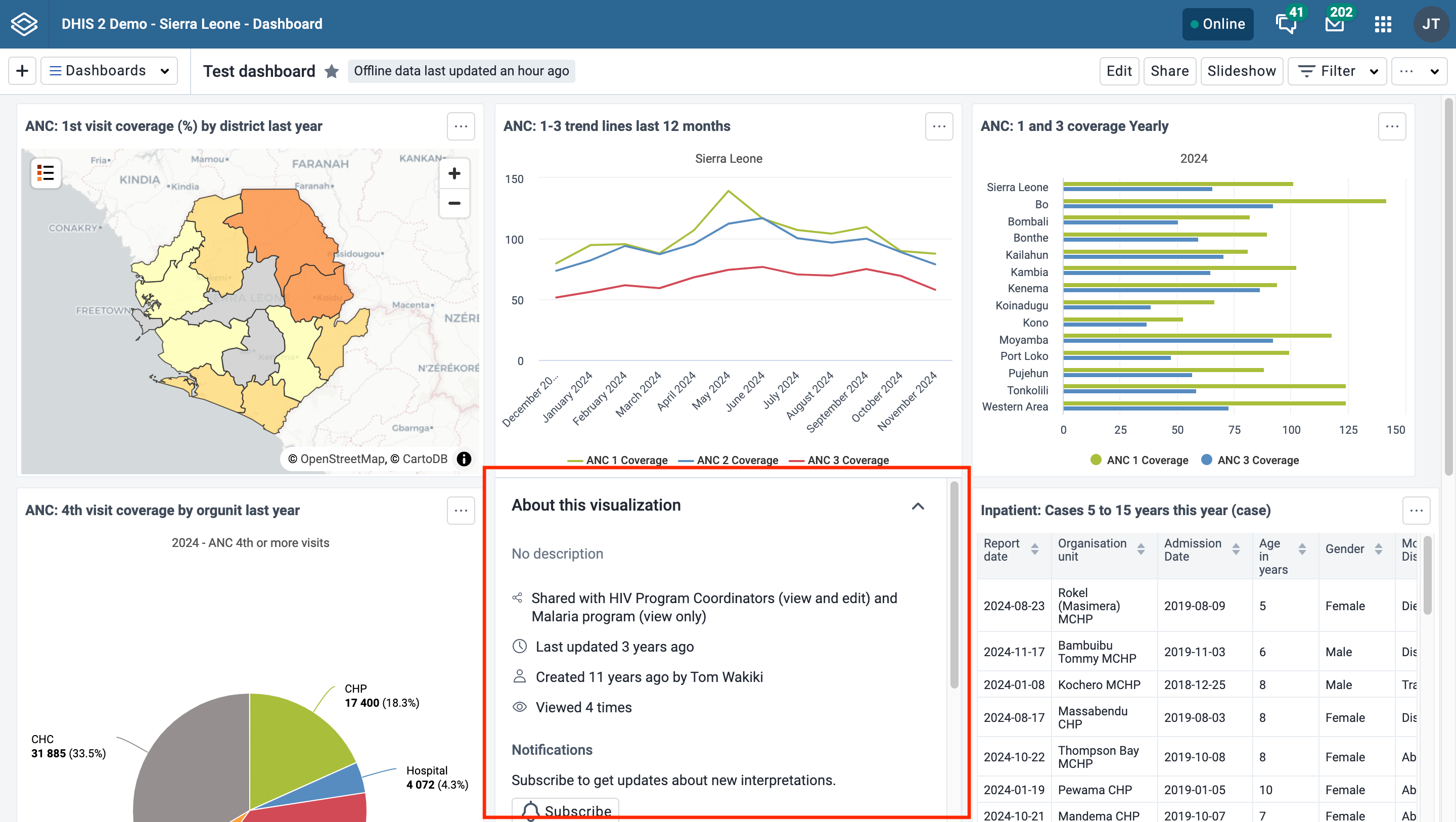
You can like an interpretation, reply to an interpretation, and add your own interpretations. You can edit, share or delete your own interpretations and replies, and if you have moderator access, you can delete others’ interpretations.
It is possible to format interpretation text with bold, italic by using the Markdown style markers * and _ for bold and italic respectively. The text field for writing new interpretations has a toolbar for adding rich text. Keyboard shortcuts are also available: Ctrl/Cmd + B and Ctrl/Cmd + I. A limited set of smilies is supported and can be used by typing one of the following character combinations: :) :-) :( :-( :+1 :-1. URLs are automatically detected and converted into a clickable link.
Interpretations are sorted in descending order by date, with the most recent shown on top. Interpretation replies are sorted in ascending order by date, with the oldest shown on top.
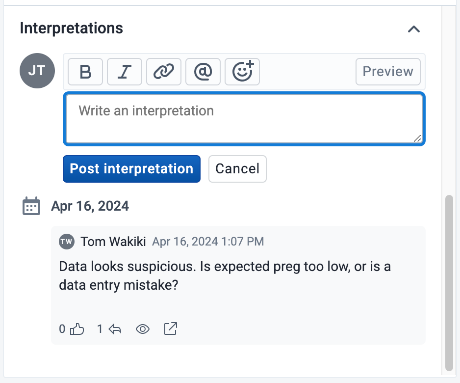
In order to share the dashboard with users and user groups, click on the Share button to the right of the dashboard title to display the Sharing and access dialog.
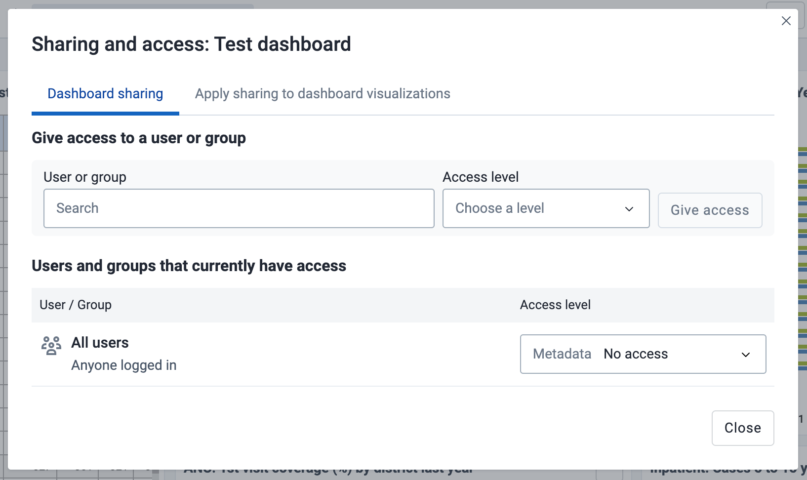
There are three levels of sharing permissions available for a dashboard:
No access
The user or user group cannot view or edit the dashboard. If they try to access the dashboard with the url, the Dashboards app will display the message "Requested dashboard not found".
View only
The user or user group can view the dashboard but cannot edit it.
View and edit
The user or user group can view and edit the dashboard. This level of sharing allows for all types of changes, including altering the layout, resizing and removing items, renaming and deleting the dashboard, etc.
All dashboards have the All users group set to No access by default. The All users group includes all logged-in users.
To share a dashboard with specific users and user groups, type the name in the input field, choose the desired access level and click on Give access.
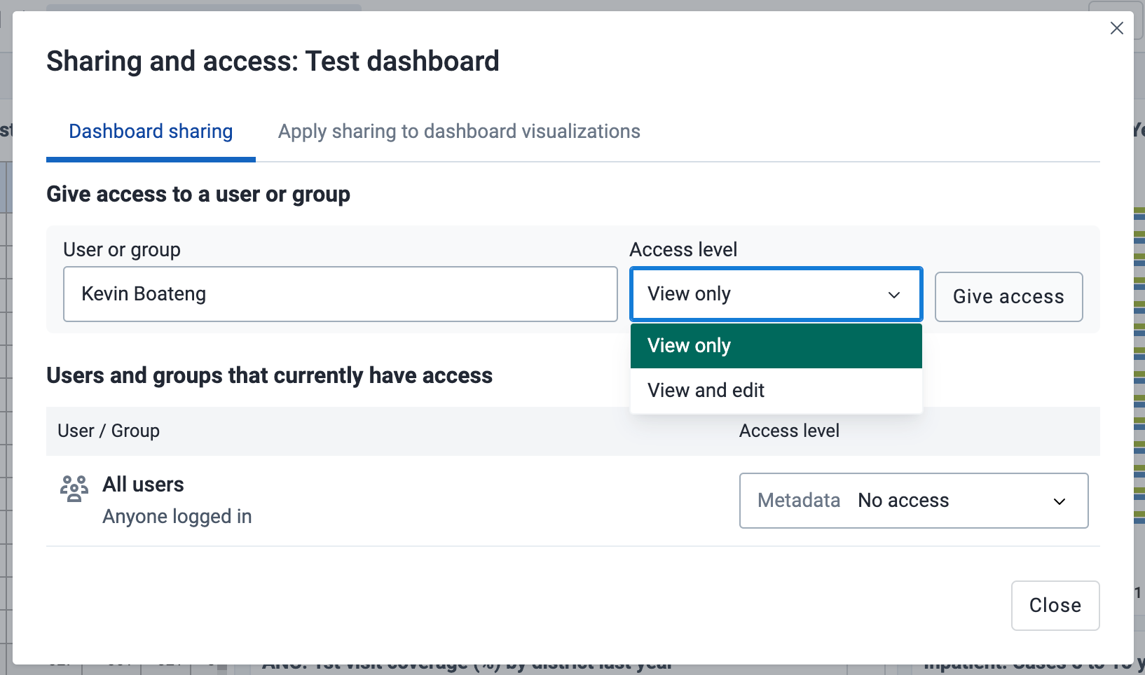
You can provide users with the url of the dashboard, allowing them to navigate directly to the dashboard. To get the dashboard url, just open the dashboard in view mode, and copy the browser url. For example, the url to the Antenatal Care dashboard in play.dhis2.org/dev is:
https://play.dhis2.org/dev/dhis-web-dashboard/#/nghVC4wtyzi
To ensure that all charts, maps and tables on the dashboard are shared with the chosen users and user groups, click on the Apply sharing to dashboard items button.
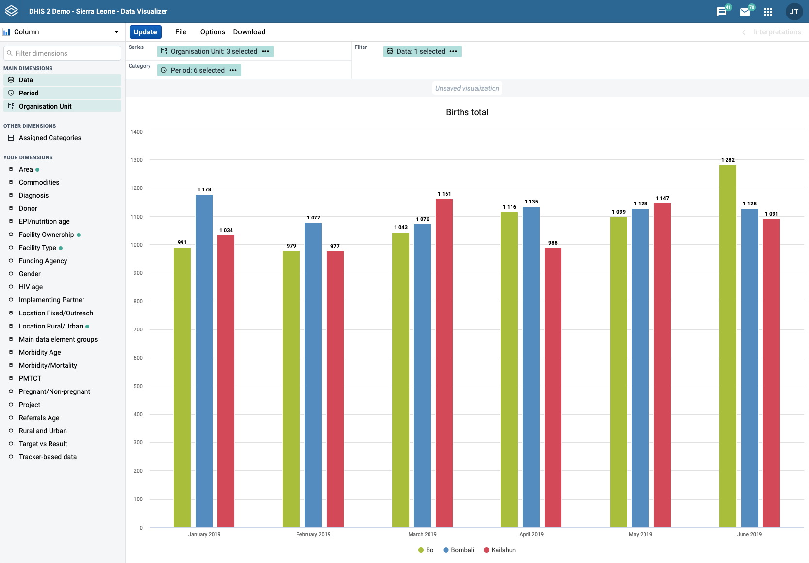
When you open the data-visualizer app from the dhis2 menu, you are presented with a blank slate and you can start creating your visualization right away.
Select the desired visualization type from the selector in the upper left corner. For each visualization type there is a brief description with suggestions about where to use the main dimensions in the layout.
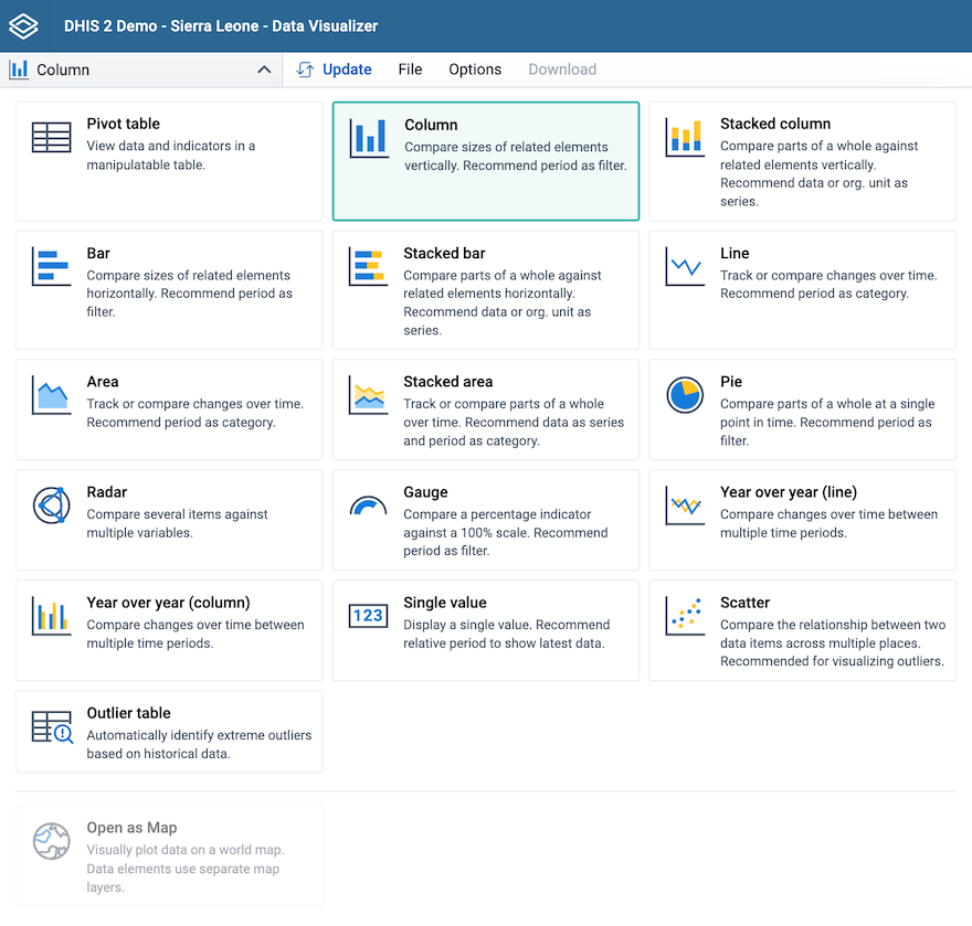
| Visualization type | Description |
|---|---|
| Column | Displays information as vertical rectangular columns with lengths proportional to the values they represent. Example: comparing performance of different districts. Layout restrictions: exactly 1 dimension as series, exactly 1 dimension as category. |
| Stacked column | Displays information as vertical rectangular columns, where bars representing multiple categories are stacked on top of each other. Example: displaying trends or sums of related data elements. Layout restrictions: same as Column. |
| Bar | Same as Column, only with horizontal bars. |
| Stacked bar | Same as Stacked column, only with horizontal bars. |
| Line | Displays information as a series of points connected by straight lines. Also referred to as time series. Example: visualizing trends in indicator data over intervals of time. Layout restrictions: same as Column. |
| Area | Is based on a line (above), with the space between the axis and the line filled with colors and the lines stacked on top of each other. Example: comparing the trends of related indicators. Layout restrictions: same as Column. |
| Stacked area | Same as Area, but the areas of the various dimension items are stacked on top of each other. Example: comparing the trends of related indicators. Layout restrictions: same as Area. |
| Pie | Circle divided into sectors (or slices). Example: visualizing the proportion of data for individual data elements compared to the total sum of all data elements. Layout restrictions: exactly 1 dimension as series, has no category. |
| Radar | Displays data on axes starting from the same point. Also known as spider chart. Layout restrictions: same as Column. |
| Gauge | Semi-circle which displays a single value, typically out of 100% (start and end values are configurable). Layout restrictions: exactly 1 dimension with exactly 1 item as series, data dimension is locked to series. |
| Year over year (line) | Useful when you want to compare one year of data to other years of data. Based on calendar years. Layout restrictions: period dimension is disabled. |
| Year over year (column) | Same as Year over year (line), only with columns. |
| Single value | Displays a single value in a dashboard friendly way. If the dimension displayed has an indicator type assigned, a % symbol or a string (per thousand, per hundred thousand, etc...) is appended to the value. If an icon is assigned to the dimension in the Maintenance app, it can be shown on the side of the value, the icon can be toggled in the Options panel. Layout restrictions: same as Gauge. |
| Pivot table | Summarizes the data of a more extensive table and might include sums, averages, or other statistics, which the pivot table groups together in a meaningful way. Layout restrictions: none. |
| Scatter | Scatter plots enable users to chart organisational units as points against two variables for a single fixed or relative period. Layout restrictions: exactly 1 item each as vertical and horizontal, data dimension is locked to vertical and horizontal, organisation unit is locked to points. |
| Outlier table | Displays a list of outliers based on historical data. Layout restrictions: organisation unit, period and data dimensions are locked to columns, no other dimensions can be added. |
From the dimensions menu on the left you can select the dimensions you want to show in your visualization, including data, period, organisation units and dynamic dimensions. These can be added by clicking on a dimension, by dragging and dropping a dimension to the layout area or by hovering over a dimension and using on its context menu (three dots).
Just like in the dimensions menu, in the layout area you can also change the selections by clicking on a dimension, dragging and dropping a dimension or by using a dimension's context menu (three dots).

A dimension refers to the elements that describe the data values in the system. There are three main dimensions in the system:
Data: Includes data elements, indicators, datasets (reporting rates), event data items, program indicators and calculations, describing the phenomena or event of the data.
NOTE: Clarification of display of reporting rates:
- If a report is expected but not yet submitted, then "0" will be displayed.
- If a report is not expected because the metadata (e.g. category option, OU) date is outside of the start-end date range, then no value is displayed. (e.g. "blank")
Data Visualizer is highly flexible in terms of allowing you to use these dimensions as series, categories and filter.
To select items for a dimension, open the dimension modal window by clicking on a dimension. This window will also be opened automatically when adding a dimension without selected items to the layout. Select which items to add to the visualization by double-clicking an item or by selecting an item with a single click and using the arrows in the middle. The order of appearance will be the same as the order in which they are selected. Selected items can be reordered by dragging and dropping them in the Selected section.
When selecting data items, there are different ways to filter the displayed items. By using the search field at the top, a global search by item name, id or code is performed across the currently selected Data Type. By selecting a Data Type from the dropdown, items can be filtered by type and subtype, where the subtype available depends on the selected data type. The name search and the type/subtype filtering can be combined as well for a more detailed filter. The type of each displayed item is indicated on the right and a corresponding icon is shown on the left of the item.
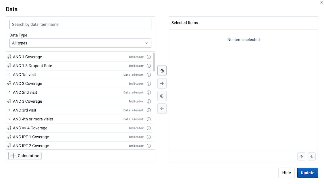
For data items that have an option set assigned it's possible to select specific options from the option set. For such data items, an icon is shown besides the data item name.
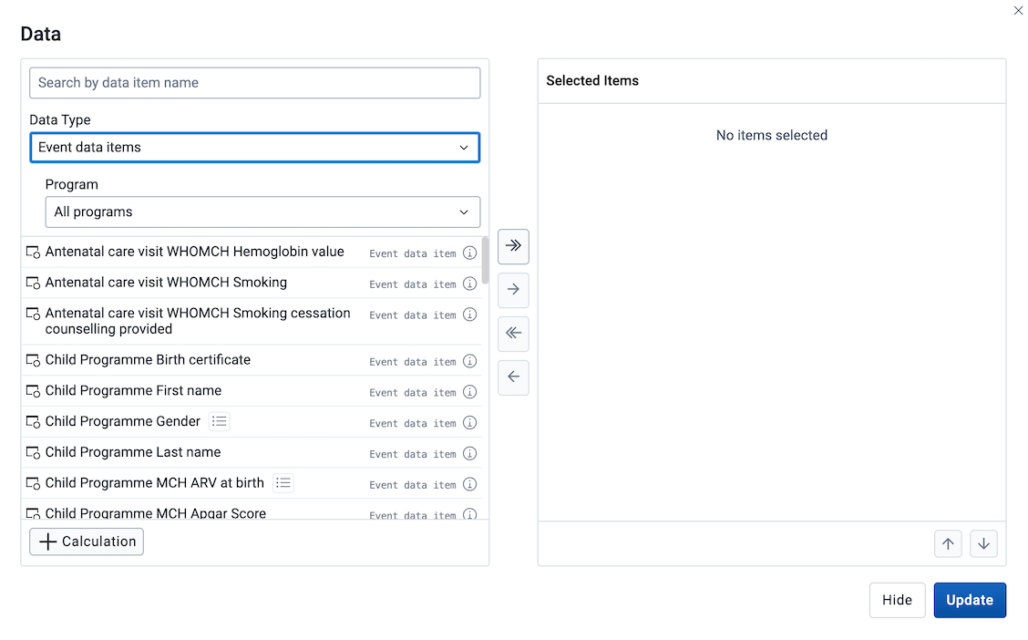
By clicking it the list of data items is replaced with the list of options from the option set. The selection of options is done in the same way as any other data item, by double clicking or using the transfer buttons. To exit the options mode, use the "Back to all items" button.
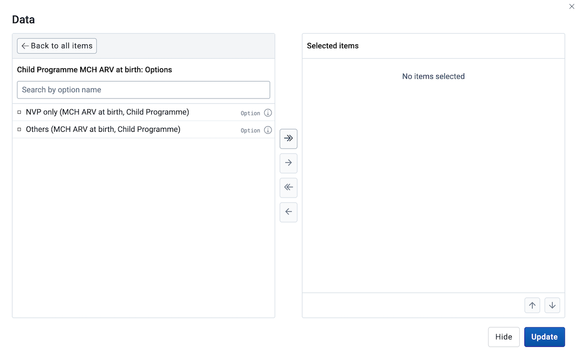
On the right of each data item there is an information icon that can be clicked and a table with relevant information is shown. The information displayed depends on the item's data type.
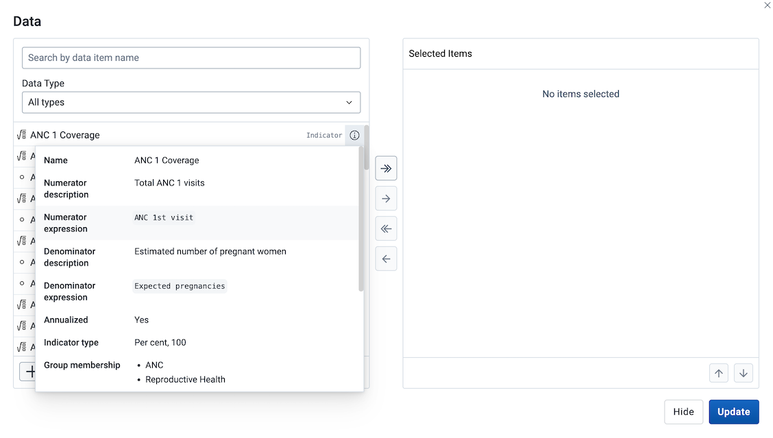
A new personal indicator, also known as a custom calculation, can be created by clicking the + Calculation button at the bottom-left of the Data modal. This will open the Calculation modal.
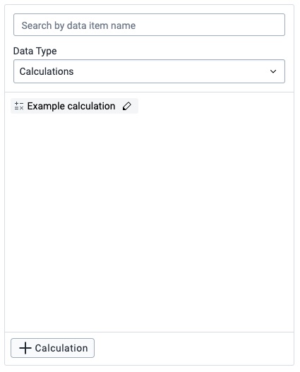
Previously created custom calculations can be found in the list of dimensions in the Data modal, either by scrolling, searching or using the Data Type filter Calculations. To edit a custom calculation, click the edit button (indicated by a pen icon) on the item itself.
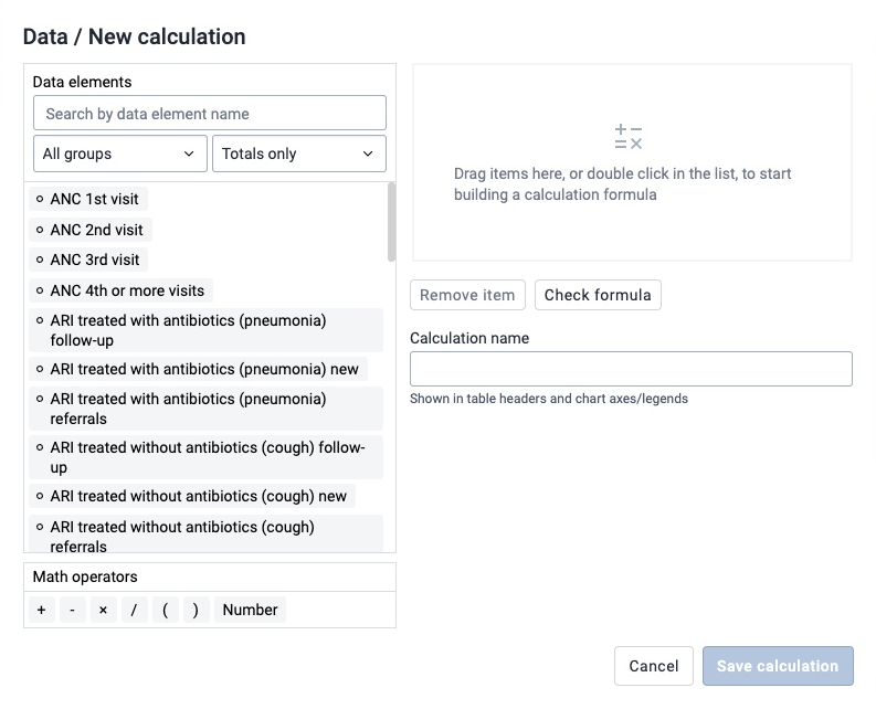
The Calculation modal has similar data element filters as seen in the Data modal, where items can be found by either scrolling, searching or filtering by groups. To add a data element or a math operator to the formula field (seen on the right), either double-click the item or drag it to the formula field.
Items in the formula field can be rearranged by drag-and-drop and removed by either double-click or by selecting an item and clicking the Remove item button.
All calculations require a name before saving.
The formula will be validated on save. Note that only valid formulas can be saved. The formula can also be validated on request by clicking the Check formula button.
When selecting a Period you have the option to choose between fixed periods and relative periods. These can also be combined. Overlapping periods are filtered so that they only appear once. For relative periods the names are relative to the current date, e.g. if the current month is March and Last month is selected, the month of February is shown in the visualization.
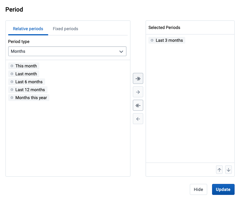
The organisation units dialog is flexible, offering essentially three ways of selecting organisation units:
Explicit selection: Use the tree to explicitly select the organisation units you want to appear in the visualization. If you right-click on an organisation unit you can easily choose to select all org units below it.
Levels and groups: The Level and Group dropdowns are a convenient way to select all units in one or more org unit groups or at specific levels. Example: select Chiefdom (level 3) to get all org units at that level.
Please note that as soon as at least one level or group has been selected the org unit tree now acts as the boundary for the levels/groups. Example: if you select Chiefdom (level 3) and Kailahun org unit (at level 2) in the tree you get all chiefdom units inside Kailahun district.
The user's organisation units:
User organisation unit: This is a way to dynamically select the org units that the logged in user is associated to.
User sub-units: Selects the sub-units of the user organisation unit.
User sub-x2-units: Selects the units two levels below the user organisation unit.
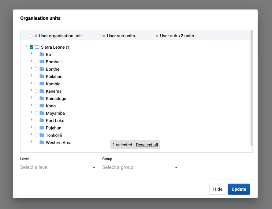
When selecting a dynamic dimension, either individual or all items can be selected. By default, the Manually select items option is selected, which allows for individual items to be picked out of a list, similar to how the Data and Period dimensions are selected above. To automatically select all items for a dimension, the Automatically include all items option can be selected. This will also include any additional items that are added in the future if the available dimension items are updated.
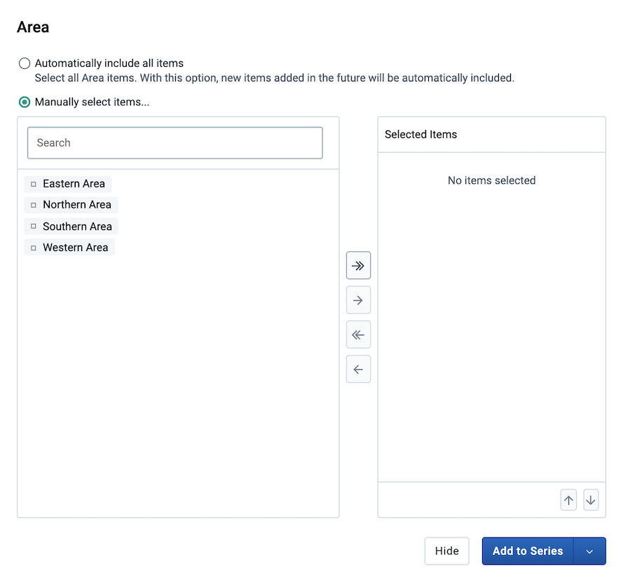
Most chart visualization types can show two categories. When switching from Pivot Table to Column, Bar, Area (and their stacked versions), or Line charts, the first two dimensions remain in Category while any additional dimensions are moved to Filter. The labels for the first dimension in Category are shown at the top of the chart, and the ones for the second dimension at the bottom. The resulting visualization is composed of separate charts, one for each item in the first dimension.
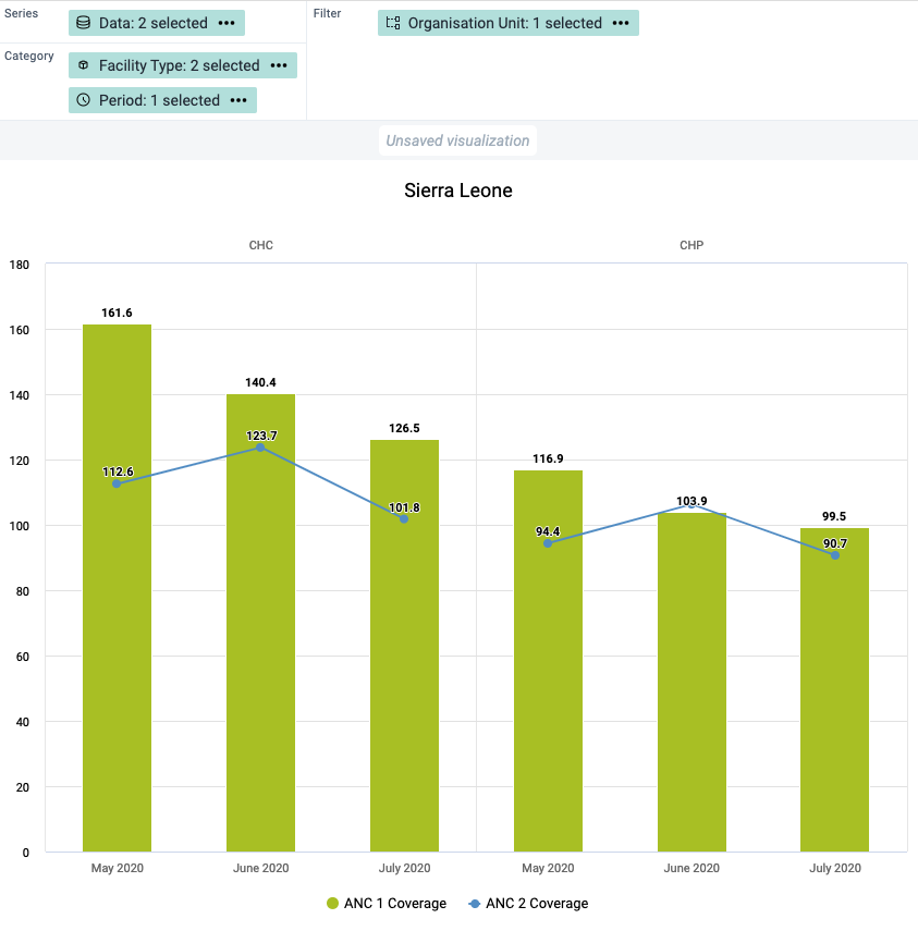
The display of a visualization can be changed by enabling/disabling and configuring several options. Each visualization type can have a different set of available options. The options are organised in tabs in the Options dialog and in sections within each tab.
Click Options to open the Options dialog.
Navigate the tabs in the dialog to see the available options.
Configure the desired options as required.
Click Update to apply the changes to the visualization.
| Option | Description |
|---|---|
| Data tab — Charts | |
| Stacked values add up to 100% | Displays 100 % stacked values in Stacked column and Stacked bar visualizations. |
| Cumulative values | Displays cumulative values in the visualization. Not available for Gauge, Pie, Single value, Scatter and Outlier table. |
| Hide empty categories | Hides the category items with no data from the visualization. Before first: hides missing values only before the first value After last: hides missing values only after the last value Before first and after last: hides missing values only before the first value and after the last value All: hides all missing values This is useful for example when you create Column and Bar visualizations. |
| Custom sort order | Controls the sort order of the values. |
| Skip rounding | Skips the rounding of data values, offering the full precision of data values. Can be useful for finance data where the full dollar amount is required. |
| Trend line | Displays the trend line that visualizes how your data evolves over time. For example if performance is improving or deteriorating. Useful when periods are selected as category. |
| Target line | Displays a horizontal line at the given domain value. Useful for example when you want to compare your performance to the current target. |
| Base line | Displays a horizontal line at the given domain value. Useful for example when you want to visualize how your performance has evolved since the beginning of a process. |
| Aggregation type | Defines how the data elements or indicators will be aggregated within the visualization. Some of the aggregation types are By data element, Count, Min and Max. |
| Only include completed events | Includes only completed events in the aggregation process. This is useful for example to exclude partial events in indicator calculations. |
| Max results (Outlier table only) | Sets the maximum number of rows to display in an Outlier table. The allowed range is 1 to 500. |
| Data tab — Pivot table | |
| Cumulative values | Displays cumulative values in the Pivot table. |
| Dimension labels | Shows the names of dimensions (e.g., Data, Period, Organisation unit) as column and row headers in the Pivot table. |
| Skip rounding | Skips the rounding of data values, offering the full precision of data values. Can be useful for finance data where the full dollar amount is required. |
| Column totals | Displays total values in a Pivot table for each column, as well as a total for all values in the table. |
| Column sub-totals | Displays sub-totals in a Pivot table for each dimension. If you only select one dimension, sub-totals will be hidden for those columns. This is because the values will be equal to the sub-totals. |
| Row totals | Displays total values in a Pivot table for each row, as well as a total for all values in the table. |
| Row sub-totals | Displays sub-totals in a Pivot table for each dimension. If you only select one dimension, sub-totals will be hidden for those rows. This is because the values will be equal to the sub-totals. |
| Hide empty columns | Hides empty columns from a Pivot table. This is useful when you look at large tables where a large portion of the dimension items don't have data in order to keep the table more readable. |
| Hide empty rows | Hides empty rows from a Pivot table. This is useful when you look at large tables where a large portion of the dimension items don't have data in order to keep the table more readable. |
| Aggregation type | Defines how the data elements or indicators will be aggregated within the visualization. Some of the aggregation types are By data element, Count, Min and Max. |
| Number type | Sets the type of value you want to display in a Pivot table: Value, Percentage of row or Percentage of column. The options Percentage of row and Percentage of column mean that you'll display values as percentages of row total or percentage of column total instead of the aggregated value. This is useful when you want to see the contribution of data elements, categories or organisation units to the total value. |
| Only include completed events | Includes only completed events in the aggregation process. This is useful for example to exclude partial events in indicator calculations. |
| Legend tab | |
| Use legend for chart colors | Applies a legend to the visualization items, which is a value-based color for each item. The legends themselves are configured in the Maintenance app. |
| Legend style (Pivot table and Single value only) | Controls where the color from the legend is applied, either to the text or the background. You can use this option for scorecards to identify high and low values at a glance. |
| Legend type | Controls which legend is applied.Use pre-defined legend per data item applies a legend to each data element or indicator individually, based on the legend assigned to each one in the Maintenance app.Select a single legend for entire visualization applies a single legend to all data items, chosen in a drop-down list of available legends. |
| Show legend key | Displays a key for the legend on the right side of the visualization, to indicate the value ranges and their respective color. If the visualization is added to a dashboard, this option can also be toggled from the top right corner of the dashboard item. |
| Axes tab | |
| Axis title | Type a title here to display a label next to the x or y axis. Useful when you want to give context information to the visualization, for example about the unit of measure.Auto generated from axis items provides a title based on the content of the axis.None removes the title. Custom allows you to type a custom title. |
| Axis range | Defines the maximum and minimum value that will be visible on the range axis. |
| Steps | Defines the number of ticks that will be visible on the range axis. |
| Decimals | Defines the number of decimals that will be used for range axis values. |
| Labels | Controls the text styling of the value labels shown on each axis. Font size, color and italic/bold variants can be customized. |
| Series tab | |
| Options for adding more axes and changing how different series are displayed are set in this tab. Please see a detailed description of how this works in the corresponding sections below. | |
| Style tab — Charts | |
| Value labels | Shows the values above the series in the visualization. |
| No space between bars/columns | Removes the space between the columns or bars in the visualization. Useful for displaying the visualization as an EPI curve. |
| Show series key | Shows a key for the series in the visualization, identifying each data series by color and name. The series key appearance can be customized using the text styling tool. |
| Digit group separator (Single value only) | Controls which character to use to separate groups of digits or "thousands". You can set it to Comma, Space or None. |
| Show data item icon (Single value only) | Toggles the icon visibility in the Single Value visualization. |
| Chart title | Controls the title that appears above the visualization.Auto generated uses the default title generated from the visualization's dimensions/filters.None removes the title. Custom allows you to type a custom title. |
| Chart subtitle | Controls the subtitle that appears above the visualization.Auto generated uses the default subtitle generated from the visualization's dimensions/filters.None removes the subtitle. Custom allows you to type a custom subtitle. |
| Color set | Controls the colors used in the chart. A list of available color sets is shown with a preview of the colors. There is also a "Mono patterns" option which uses colored patterns instead of solid colors. |
| Style tab — Pivot table Display density, Font size, Digit group separator and Display organisation unit hierarchy also apply to the Outlier table. | |
| Table title | Controls the title that appears above the visualization.Auto generated uses the default title generated from the visualization's dimensions/filters.None removes the title. Custom allows you to type a custom title. |
| Table subtitle | Controls the subtitle that appears above the visualization.Auto generated uses the default subtitle generated from the visualization's dimensions/filters.None removes the subtitle. Custom allows you to type a custom subtitle. |
| Display density | Controls the size of the cells in a Pivot table. You can set it to Comfortable, Normal or Compact. Compact is useful when you want to fit large tables into the browser screen. |
| Font size | Controls the size of a Pivot table text font. You can set it to Large, Normal or Small. |
| Digit group separator | Controls which character to use to separate groups of digits or "thousands". You can set it to Comma, Space or None. |
| Fix column headers to top of table | Freezes column headers in Pivot Tables so they are always visible when scrolling the table content. |
| Fix row headers to left of table | Freezes row headers in Pivot Tables so they are always visible when scrolling the table content. |
| Display organisation unit hierarchy | Shows the name of all ancestors for organisation units, for example "Sierra Leone / Bombali / Tamabaka / Sanya CHP" for "Sanya CHP". The organisation units are then sorted alphabetically which will order the organisation units according to the hierarchy. When you download a pivot table with organisation units as rows and you've selected Display organisation unit hierarchy, each organisation unit level is rendered as a separate column. This is useful for example when you create Excel pivot tables on a local computer. |
| Limit values tab | |
| Limit minimum/maximum values | Allows for the data to be filtered on the server side. You can instruct the system to return only records where the aggregated data value is equal, greater than, greater or equal, less than or less or equal to certain values. If both parts of the filter are used, it's possible to filter out a range of data records. |
| Parameters tab (Pivot table only) These settings control how the pivot table behaves when embedded as a standard report in the Reports app. They have no effect within Data Visualizer itself. | |
| Reporting period | Controls whether the user is prompted to enter a report period when creating a standard report in the Reports app. |
| Organisation unit | Controls whether the user is prompted to enter an organisation unit when creating a standard report in the Reports app. |
| Parent organisation unit | Controls whether the user is prompted to enter a parent organisation unit when creating a standard report in the Reports app. |
| Include regression | Includes a column with regression values in the Pivot table. |
| Include cumulative | Includes a column with cumulative values in the Pivot table. |
| Custom sort order | Controls the sort order of the values. |
| Top limit | Controls the maximum number of rows to include in a Pivot table. |
| Outliers tab (Scatter chart and Outlier table only) | |
| Outlier analysis (Scatter) | Enables outlier detection in a Scatter chart, highlighting data points that are markedly different from the rest of the data. When enabled, the outlier detection method and extreme lines options become available. |
| Outlier detection method (Scatter and Outlier table) | Outlier analysis is a process that involves identifying anomalous observations in a dataset. In Data Visualizer outliers are detected by first normalizing the data into a linear regression line and then analysing each point's distance from regression line. For Scatter charts, three methods are supported: Interquartile Range (IQR) is based on dividing a dataset into quartiles; Modified z-score is based on the Median Absolute Deviation (MAD). IQR and MAD are considered the two most common robust measures of scale. Standard z-score is based on standard deviation and is therefore considered less robust as it is greatly influenced by outliers. For Outlier table, Modified z-score and Standard z-score are supported. |
| Threshold factor (Scatter and Outlier table) | The number that the outlier thresholds are multiplied by. Controls the sensitivity of the threshold range. Default factors are 1.5 for IQR and 3 for z-scores. |
| Extreme lines (Scatter) | Marks data points at the extreme ends of the distribution as lines on the Scatter chart. Calculated as a percentage of the total values along an axis. Only available when Outlier analysis is enabled. |
| Extreme line % detection (Scatter) | The percentage threshold used to calculate which values are shown as extreme lines. Default is 1%. |
The following options can be customized using the text styling tool: Chart title, Chart subtitle, Show series key, Target line, Base line, Axis title and Labels for both horizontal and vertical axes. The text styling tool allows to choose a font size, color and italic/bold variants. It's also possible to choose the position of the text.

Assigned Categories is a composite dimension that represents associated category option combinations to the selected data element's category combination. This can be added by dragging the Assigned Categories dimension from the left side dimensions menu and into the visualization layout:
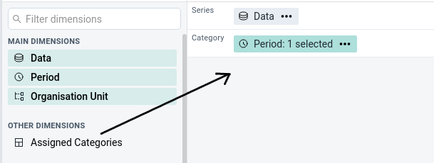
Another way of adding assigned categories is by accessing the Add Assigned Categories option from the Data dimension's context menu (not available for Gauge, Year over year or Single value).
When combining data with different measurement scales you will get a more meaningful visualization by having more than a single axis. For Column, Bar, Area and Line you can do so by clicking the Series tab in the Options dialog. If the option is disabled, make sure that the Data dimension is on the Series axis and that at least two items have been added.
Four axes are available, two on the left side (axis 1 and 3) of the chart and two on the right side (axis 2 and 4). Each axis has a different color and the chart items are going to be colored accordingly.
Note
When multiple axes are in use, the
Color setoption in theStyletab will be disabled. TheTarget lineandBase lineoptions are available on theAxestab per axis.
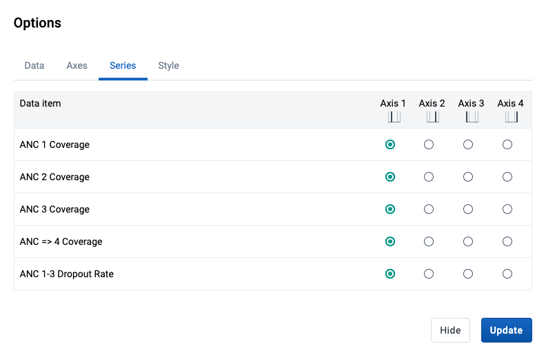
It's possible to combine a Column chart with Line items and vice versa. This is done by clicking the Series tab in the Options dialog and changing the Visualization type. This can also be combined with using multiple axes (as described in the section above).
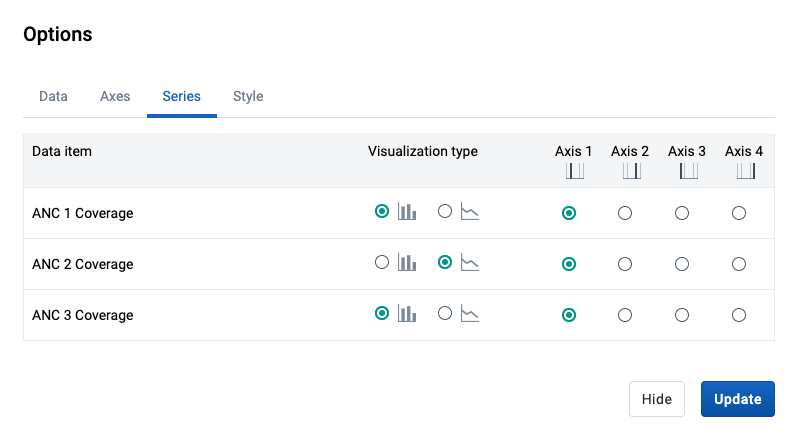
This results in a chart that combines the Column and Line types.

This feature is enabled for the Pivot Table, Column, Stacked column, Bar and Bar stacked visualization types and allows to drill in the data by clicking on a value cell / column / bar in the visualization. A contextual menu opens with various options.
You can drill the data by organisation unit, meaning navigating up and down the org unit tree. The data drill affects the current dimension selection in the layout area. The organisation unit dimension must thus be present on either the Columns / Series axis or the Rows / Category axis for the drill feature to be enabled.
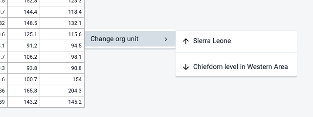
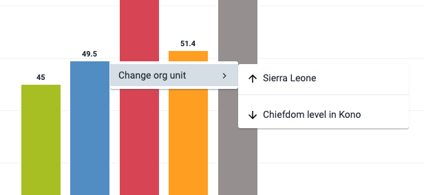
Saving your visualizations makes it easy to find them later. You can also choose to share them with other users or display them on a dashboard.
Click File > Open.
Enter the name of a visualization in the search field, or click the < and > arrows to navigate between different pages. The result can also be filtered by type and owner by using the corresponding menus in the top right corner.
Click the name of the one you want to open.
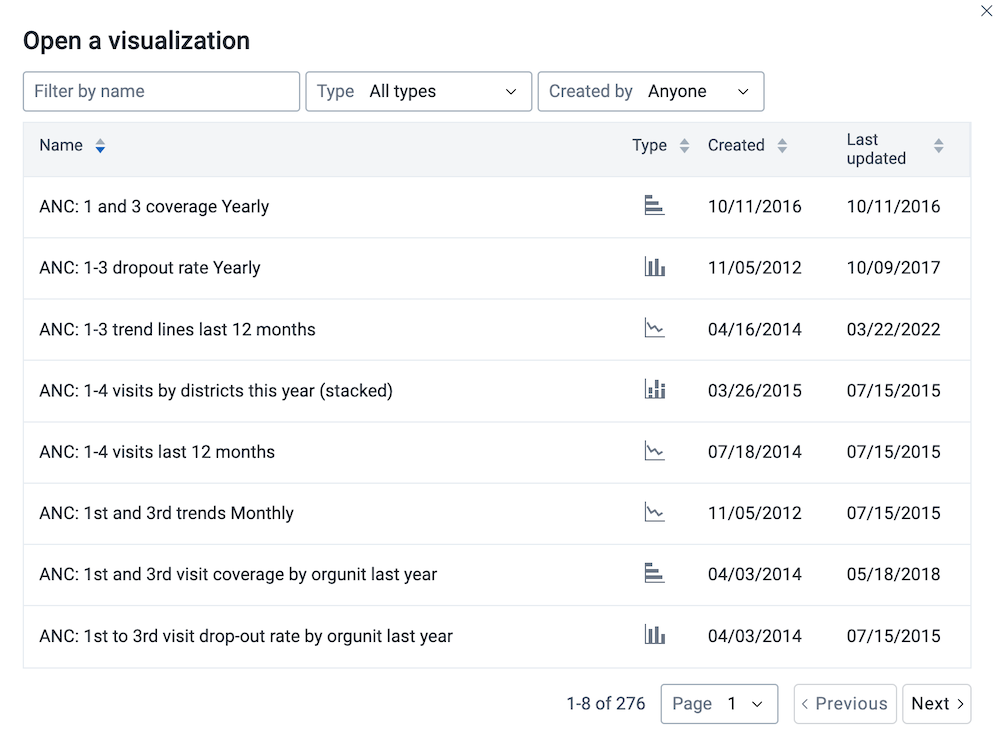
a) Click File > Save.
Enter a Name and a Description for your visualization.
Click Save.
Click File > Rename.
Enter the new name and/or description.
Click Rename.
Click File > Delete.
Click Delete.
Click File > Get Link.
The URL can be copied via the browser's context menu that opens when right clicking on the link.
When viewing a saved visualization, you can expand the interpretations on the right side by clicking on the Interpretations button in the upper right corner. The visualization description will also be shown. The description supports rich text format.
New interpretations can be added by typing in the text field in the bottom right corner. Other users can be mentioned with @username. Start by typing @ plus the first letters of the username or real name and a list of matching users will be displayed. Mentioned users will receive an internal DHIS2 message with the interpretation or comment. Interpretations can also be seen in the Dashboard app.
It is possible to format the text with bold, italic by using the Markdown style markers * and _ for bold and italic respectively (keyboard shortcuts are also available: Ctrl/Cmd + B and Ctrl/Cmd + I). A limited set of emojis is supported and can be used by typing one of the following character combinations: :) :-) :( :-( :+1 :-1. URLs are automatically detected and converted into a clickable link.
To view the visualization according to the date of a particular interpretation, click on the interpretation or its View button. This will regenerate the visualization with the relevant date, which is indicated next to the visualization title. Clicking on Back to all interpretations will regenerate the visualization with the current date.
To subscribe to the saved visualization, click the bell icon in the upper right corner. You will then receive internal messages whenever another user likes/creates/updates an interpretation in this saved visualization.
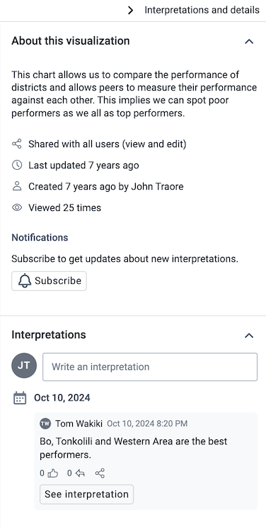
Sharing settings can be accessed by clicking File > Share. Change sharing settings for the user groups you want to modify, the available settings are:
Can edit and view: Can view and edit the visualization.
Can view only: Can only view the visualization.
No access: Won't have access to the visualization. This setting is only applicable to Public access and External access. (Note that to enable access to everyone, both Public access and External access must be set to allow view.)
New users can be added by searching for them by name under Add users and user groups.
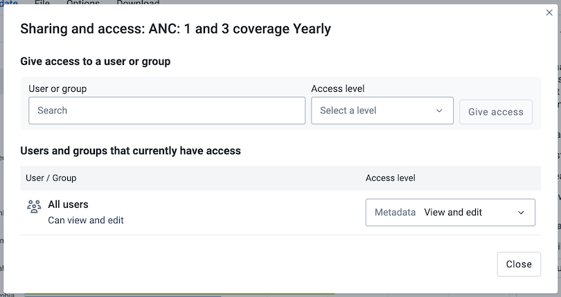
Visualizations can be downloaded using the Download menu. All visualization types support Graphics and Plain data source downloads, except for the Pivot table type, which can be downloaded as Table layout and Plain data source.
Graphics downloadDownloads an image (.png) or a PDF (.pdf) file to your computer.
Table layout downloadDownloads a Excel (.xls), CSV (.csv) or HTML (.html) file to your computer.
Plain data source downloadYou can download the data source of a visualization in JSON, XML, Excel, CSV, JXRML or Raw data SQL formats with different identification schemes (ID, Code, and Name). The data document uses identifiers of the dimension items and opens in a new browser window to display the URL of the request to the Web API in the address bar. This is useful for developers of apps and other client modules based on the DHIS2 Web API or for those who require a plan data source, for instance for import into statistical packages.
Available formats
| Format | Action | Description |
|---|---|---|
| JSON | Click JSON | Downloads JSON format based on the ID, Code or Name property. |
| XML | Click XML | Downloads XML format based on the ID, Code or Name property. |
| Microsoft Excel | Click Microsoft Excel | Downloads Microsoft Excel format based on the ID, Code or Name property. |
| CSV | Click CSV | Downloads CSV format based on the ID, Code or Name property. |
| XML data value set | Click Advanced > XML | Downloads the raw data values as XML, as opposed to data which has been aggregated along various dimensions. |
| JSON data value set | Click Advanced > JSON | Downloads the raw data values as JSON, as opposed to data which has been aggregated along various dimensions. |
| JRXML | Click Advanced > JRXML | Produces a template of a Jasper Report which can be further customized based on your exact needs and used as the basis for a standard report in DHIS 2. |
| Raw data SQL | Click Advanced > Raw data SQL | Provides the actual SQL statement used to generate the data visualization. You can use it as a data source in a Jasper report, or as the basis for a SQL view. |
To see how a visualization would look on map, select the Open as Map Visualization type after you're finished building your visualization.
The Line Listing app is a new app that replaces the line listing functionality in the Event Reports app, but also offers additional functionality.
NOTE
There will be a forward compatibility with the Event Reports app, which means that you can open the existing event reports of type line list in the Line Listing app, but you cannot save changes to them in the Line Listing app.
When you open the Line Listing app from the DHIS2 menu, you are presented with a blank slate, and you can start creating a line list.
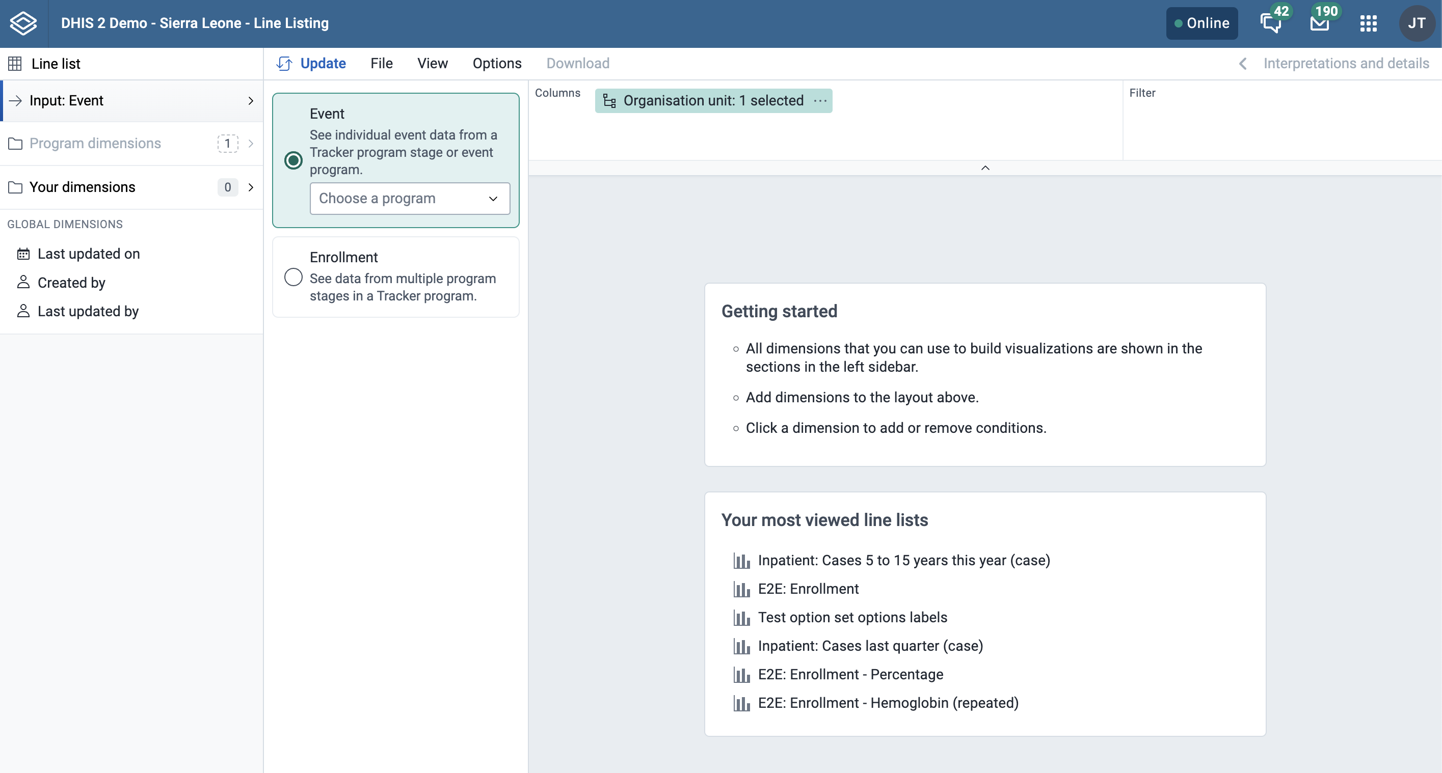
In the Line Listing app, you currently only have one type of selection which is Line list.
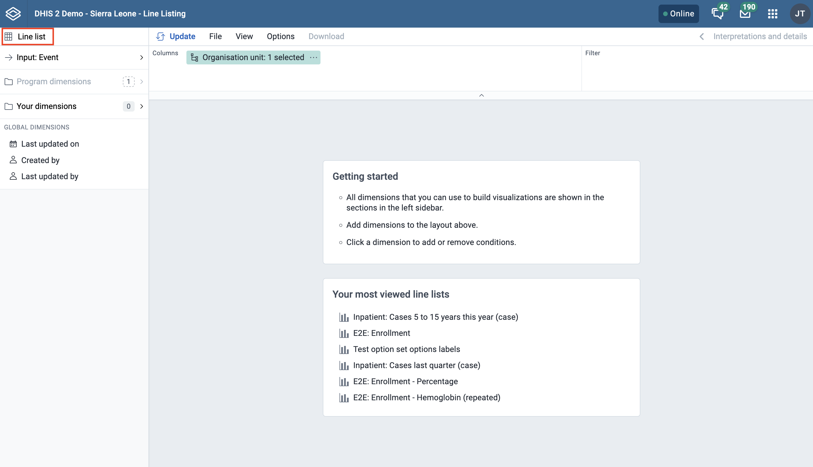
(This is the same as you see in the Event Reports app). When you open the Input tab you will see below two options:
(In the Event Reports app these are called data dimensions.)
The line list will always be based on event or tracker programs and you can do analysis on a range of dimensions. For programs with category combinations, you can use program categories and category option group sets as dimensions.
Tip
In the Line Listing app, all the dimensions related to a tracker or an event program are present in the program dimension component.
Choose a program
Select program: All the event and tracker programs will be visible in the drop down.
If you have selected the Event, then for tracker programs you need to select the program stage to get all the data elements, attributes for that particular stage. To be able to select data from multiple stages you need to select "Enrollment" as the input type.
If you select an event program you don’t have to select the stage (unlike the Event Reports app).
If you select Enrollment in the Input tab then all data elements associated with the program will be available from different stages within the program for the purpose of cross stage selection of data elements. Each data element will act as a dimension.
If you want to filter the data, by data elements, program attribute, program indicators, category, category option group set you can do so by clicking on the dropdown option.
There are multiple ways to add data elements to the layout. They can be added by hovering over the dimension and clicking the plus icon or by dragging and dropping a dimension straight to the layout area.
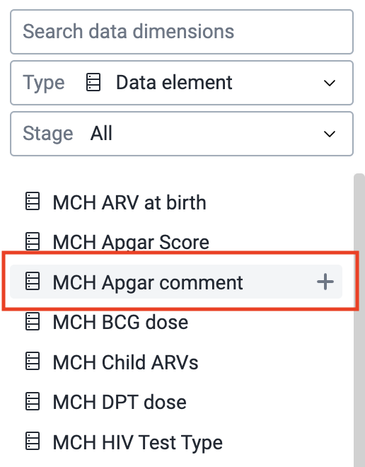
Alternatively, you can click on the respective data element and then choose to add it in column or filter as shown in below figure.
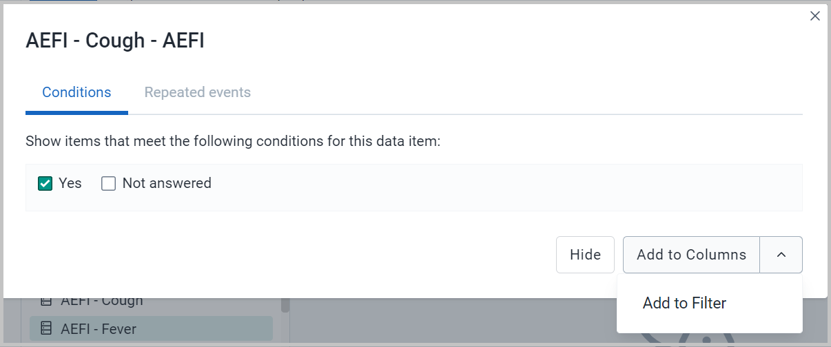
Each dimension can have criteria (filters). Data elements of the type option set allows for "in" criteria, where multiple options can be selected.
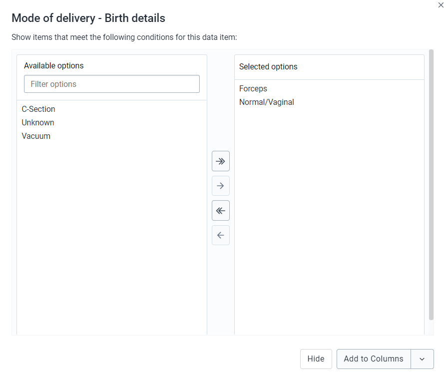
Numeric values can be compared to filter values using greater than, equal or less than operators. (Optional) For each data element, specify a filter with operators such as "greater than", "in" or "equal" together with a filter value.
Note
The enhancement in this feature is that you can add multiple conditions and there are also different operators which can be used. You can also filter by empty or not empty.
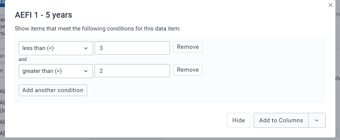
In the Line Listing app for BOOLEAN type data element, here in the analysis it will show “Yes”, ”No”, ”Not answered” instead of 0 and 1 as in the Event Reports app or the Data Visualizer app.
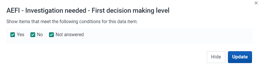
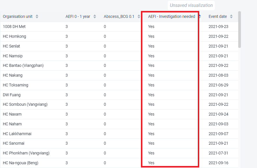
The line list will be displayed as a table with one row per event. Each dimension can be used as a column in the table or as a filter.
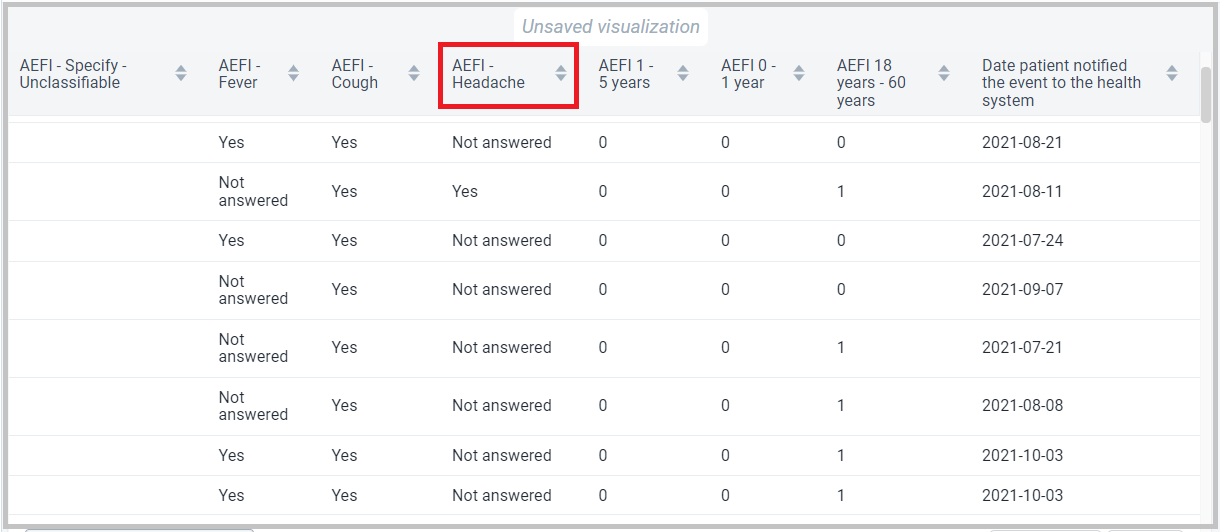
All Organisation Unit group sets are present under Your dimension component for further evaluation or analysis.
The organisation unit dialog is flexible, offering essentially three ways of selecting organisation units:
Levels and groups: The Level and Group dropdowns are a convenient way to select all units in one or more org unit groups or at specific levels. Example: select CH Mahosot (level 3) to get all org units at that level.
NOTE
Please note that as soon as at least one level or group has been selected the org unit tree now acts as the boundary for the levels/groups. Example: if you select CH Mahosot (level 3) and Vientiane Capital org unit (at level 2) in the tree you get all units inside that district._
The user's organisation units:
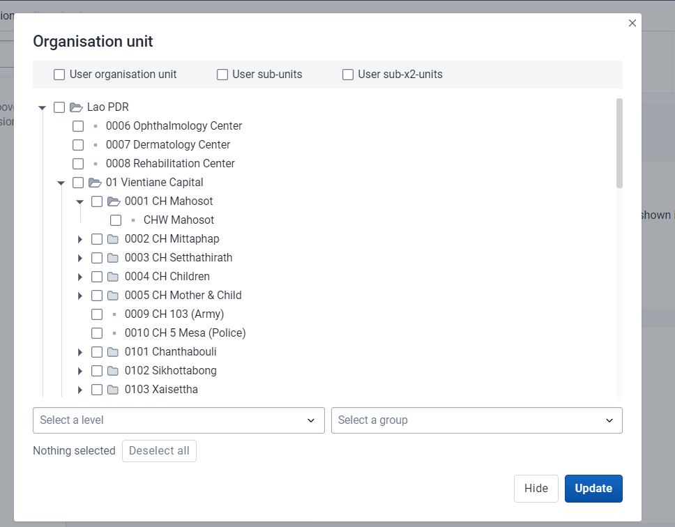
Filters data based on the event status: Active, Completed, Scheduled.
You can visualize the data for a particular event status
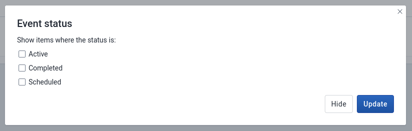
Filters data based on the program status: Active, Completed or Cancelled.
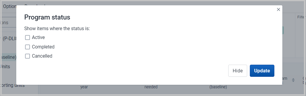
Will display the data based on who created the particular event.
This is a new feature in Line Listing app where you will be able to view the data on the basis of different time dimensions.
You can click on the above time dimension to visualize data on different period dimension, a window will open where you can select one or several periods.
You have three period options: relative periods, fixed periods and start/end dates. You can combine fixed periods and relative periods in the same table You cannot combine fixed periods and relative periods with start/end dates in the same table Overlapping periods are filtered so that they only appear once.
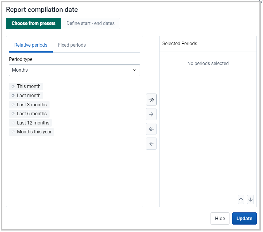
You can sort on all column headers
You can filter the specific column by directly clicking the data elements or attributes at the column and you will be able to sort the data values
Example
In the below screenshot, we have selected AEFI – Headache.
Once we click on AEFI – Headache we will get a dialog box where we need to select the option we want to filter out. In this we have selected “Yes” only.
Once we click on update, we will get the line list with only “Yes” under AEFI – Headache.
This is a new feature in the Line Listing app.
If the program stage has a data element in a repeatable event you can click on the data element and the window will open up where you will be able to see the Repeated event tab
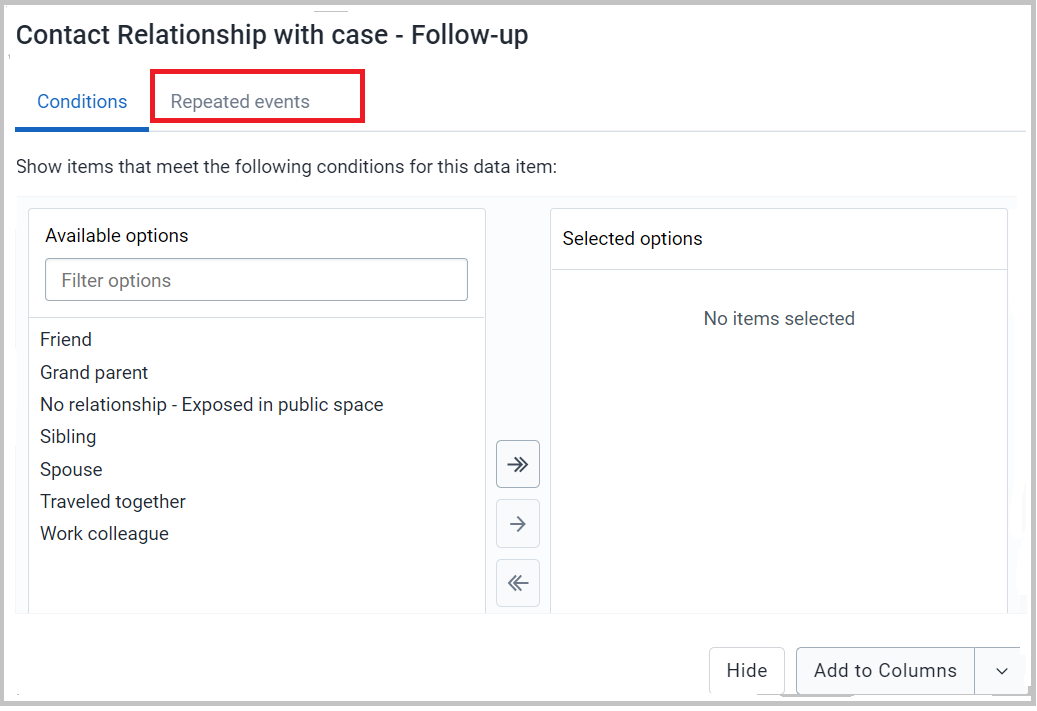
Then, you can define the most recent events and the oldest events you want in the output as displayed below.
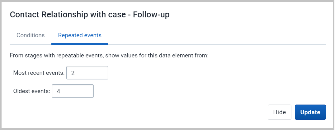
Once you click on update you will be able to visualize the events of this repeatable program stage as shown below.
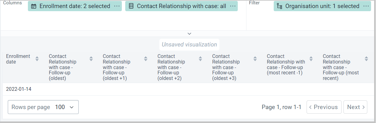
You can apply colors to a visualization by using the legend feature, which can be found under Options -> Legend
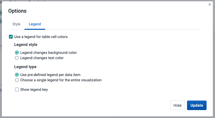
| Option | Description |
|---|---|
| Use a legend for table cell colors | Applies a legend to the visualization items, which is a value-based color for each item. The legends themselves are configured in the Maintenance app. |
| Legend style | Controls where the color from the legend is applied, either to the text or the background. You can use this option for scorecards to identify high and low values at a glance. |
| Legend type | Controls which legend is applied.Use pre-defined legend per data item applies a legend to each data element or indicator individually, based on the legend assigned to each one in the Maintenance app.Select a single legend for entire visualization applies a single legend to all data items, chosen in a drop-down list of available legends. |
| Show legend key | Displays a key for the legend on the right side of the visualization, to indicate the value ranges and their respective color. |
Below is an example of a line list with legend colors applied to the background, per data item.
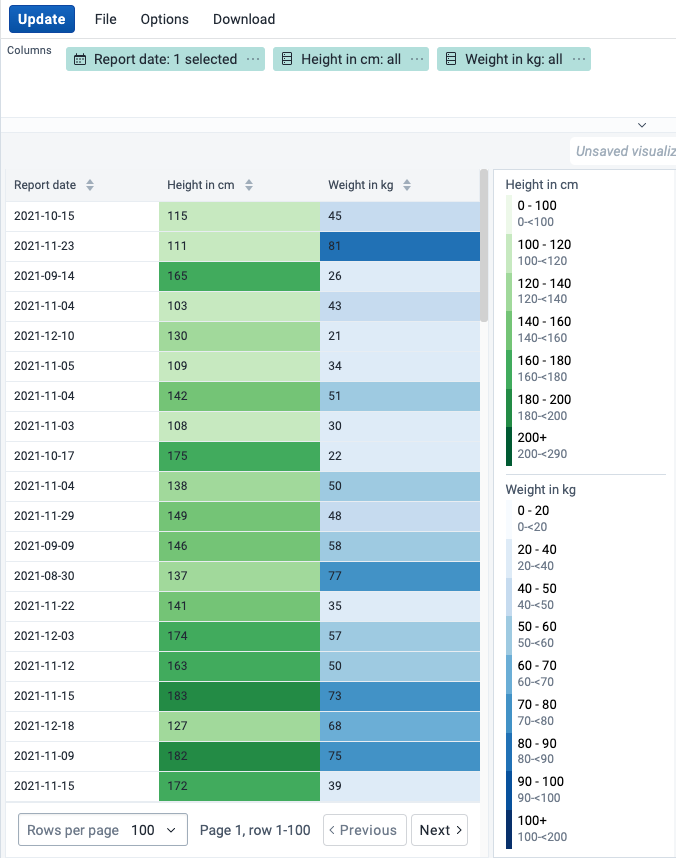
You can show the full hierarchy path for organisation units by enabling the Show organisation unit hierarchy option in Options -> Style. When this is enabled, sorting on the organisation unit column will sort the organisation units alphabetically starting from the top level.
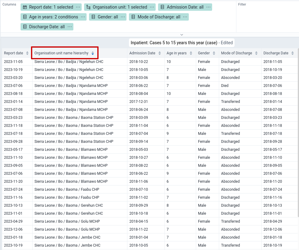
You can control how numeric values are formatted by toggling the Skip rounding option in Options -> Data. When this is enabled, the numeric values are not rounded and all decimals are shown. By default rounding is applied.
Below is an example of the same table with and without the option applied.
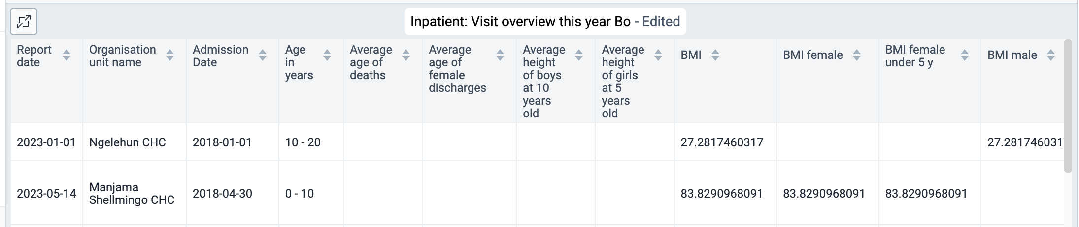
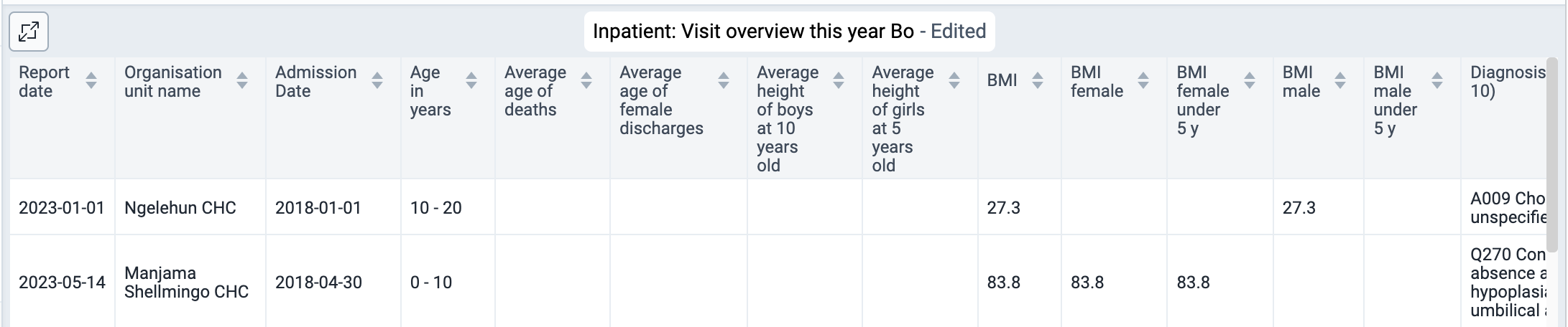
To allow more space for the line list itself, there are various ways to hide panels on the top and sides:
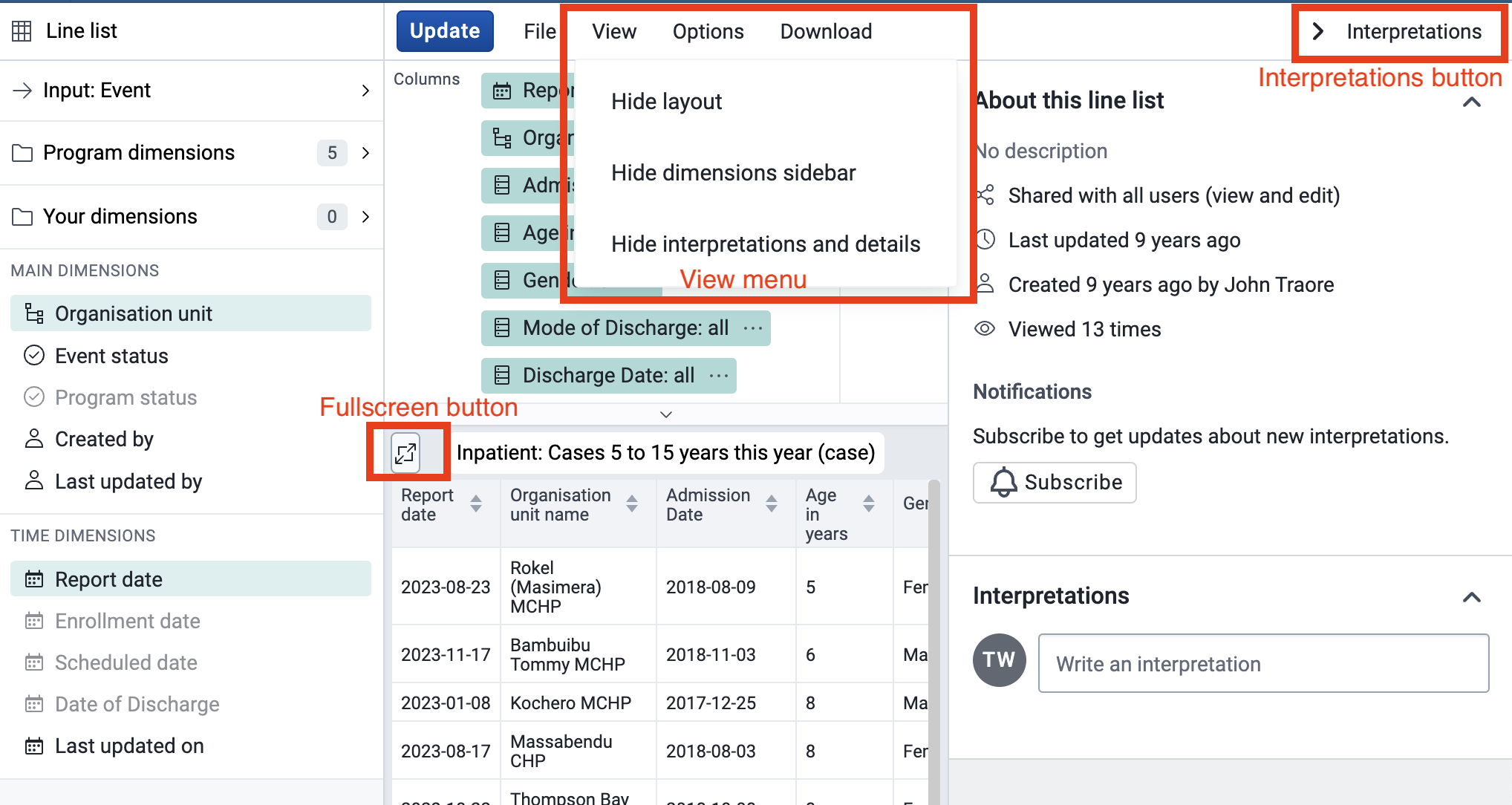
To provide more space for the content in the "Accessory Side Panel" it can be resized using the mouse as illustrated below:
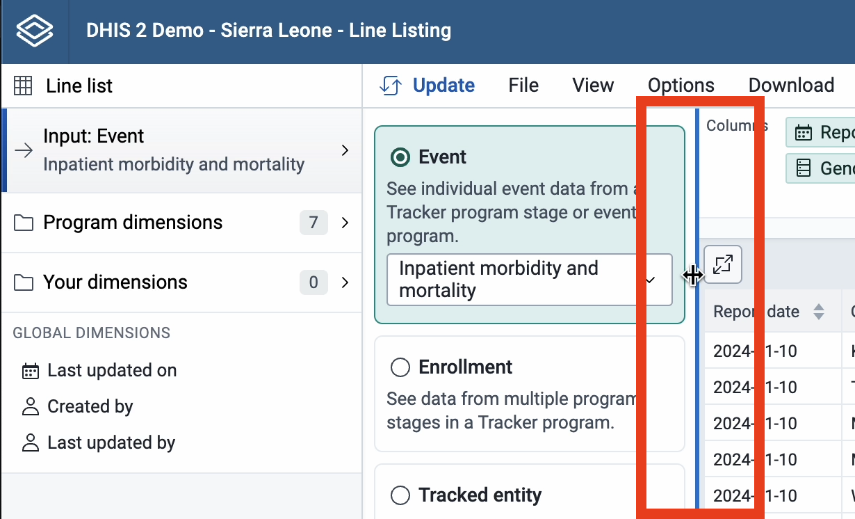
Resizing can also be done using the left/right arrow key on the keyboard. These keyboard shortcuts become active after giving focus to the resize-handle (by repeatedly hitting the tab key):
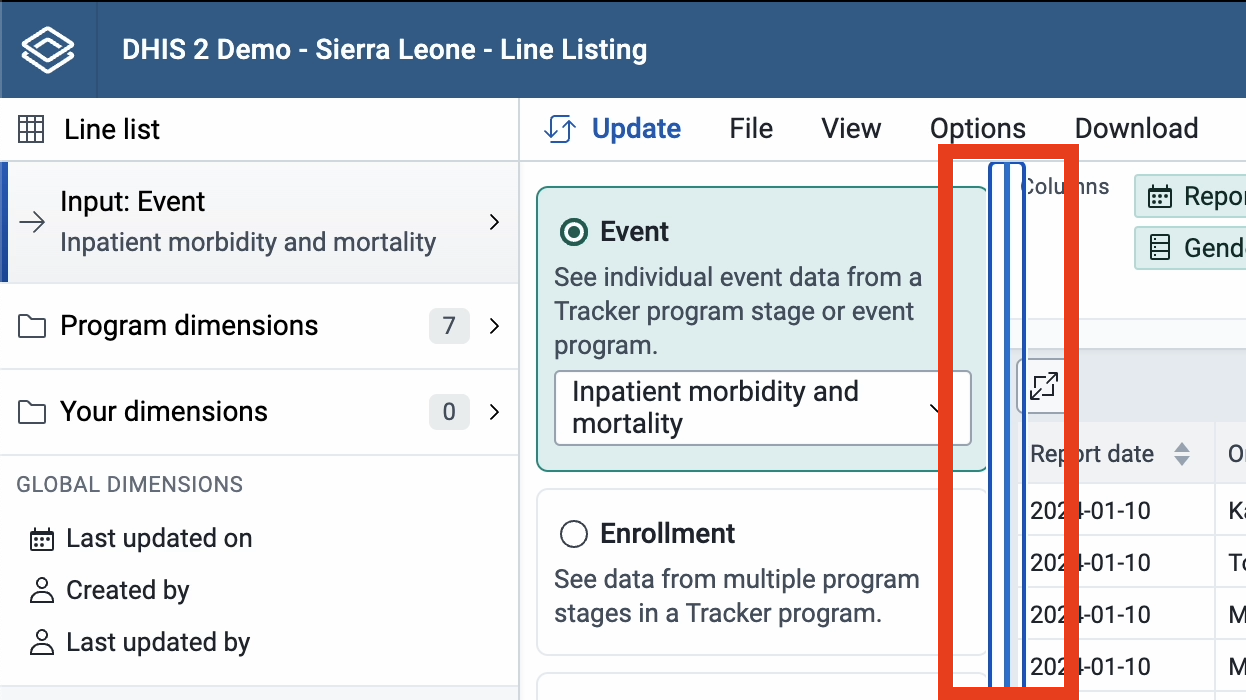
The "Accessory Side Panel" can be reset to its default width, by using the "View" menu or double clicking the resize-handle.

The Maps app was introduced in release 2.29 as a replacement for the original GIS app, offering a more intuitive and user-friendly interface. Since version 2.34, the mapping engine is based on WebGL technology, capable of showing thousands of features on a map simultaneously.
Note
The Maps app requires WebGL. Visit get.webgl.org to verify that WebGL is working in your browser or to troubleshoot display issues.
With the Maps app, you can overlay multiple layers and choose from different basemaps. Supported layer types include thematic maps, events, tracked entities, facilities, org unit boundaries, and Earth Engine data such as population, elevation, or climate indicators. You can label features, search and filter data, and save or share maps with other users, or download them as an image. Saved maps can be added to dashboards in the Dashboard app. Thematic layers also integrate with the Data Visualizer app, letting you open the same data as a chart.
Note
To use predefined legends in the Maps app, you need to create them first in the Metadata Management app.
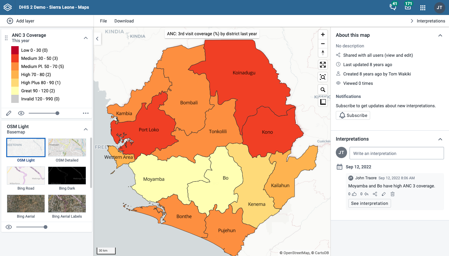
The layer panel on the left side of the workspace shows an overview of the layers for the current map:
As layers are added, using the (+) Add layer button, they are arranged and managed in this panel.
The basemap card is always shown at the bottom of the panel. See Basemaps for available options.
The small arrow button to the right of the layer panel, at the top, allows the panel to be hidden or shown.
Each layer is represented by a card in the panel. Along the top of the card are a grab handle for reordering layers with the mouse, the layer title, and an arrow to collapse or expand the card. The middle of the card shows the layer legend where applicable. Along the bottom of the card from left to right are:
An edit (pencil) button opens the layer configuration dialog.
An eye symbol toggles the visibility of the layer.
A slider modifies the layer transparency.
A more actions (three dots) button provides additional options, including showing or hiding the data table, downloading the layer data, duplicating the layer, and removing the layer.
The + and - buttons on the map allow you to zoom in and out of the map respectively. The mouse scroll wheel zoom is continuous, allowing you to fit the map perfectly to your content.
The rotate map button (triangle arrows) allows you to rotate and tilt the map to enhance the view of your data. Press and hold the button (or hold the Control key on your keyboard) while moving your mouse to change the map view. Click the button again to reset the view.
Fullscreen (four arrows) allows you to view the map in fullscreen. To exit fullscreen, click the button again or press the escape key on your keyboard.
Zoom to content (bounded magnifying glass symbol) automatically adjusts the zoom level and map center position to put the data on your map in focus.
Search (magnifying glass symbol) allows searching for and jumping to a location on the map.
The ruler button allows you to measure distances and areas on the map.
Right-click on the map to display the longitude and latitude of that location.
The File button near the top left allows you to open and save maps. See using the maps file menu for more detailed information.
The Download button next to the File button allows you to download the current map as a PNG image.
The Interpretations button at top right opens an interpretations panel on the right side of the workspace. See viewing interpretations for more information.
When you open the Maps app, you start with an empty map canvas and the default basemap selected. If a map is already open, start a new one using File > New. You can change the basemap at any time from the basemap card in the layer panel (see Basemaps).
To add a layer, click the (+) Add layer button in the top left. The layer selection dialog opens:
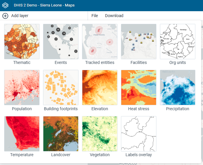
Available layer types are:
In addition, several layers may be provided by Google Earth Engine (such as population, elevation, or climate indicators) and other external services. Various Google Earth Engine layer sources are available if the Google Earth Engine API key has been set up (see documentation).
Note
The Maps app administrator can:
- Select the sources for Google Earth Engine layers available to other users via the Manage available layer sources button.
- Add external layer sources in the Maintenance app.
A basemap provides the background map on which your data layers are displayed. You can select and configure the basemap from the basemap card at the bottom of the layer panel.
The following basemaps are available by default:
If a Bing Maps or Azure Maps API key has been configured by a system administrator, four additional basemaps become available from each provider. Both providers offer the same four styles, prefixed with the provider name — for example, Bing Road and Azure Road:
A Maps app administrator can also add external basemaps via the Maintenance app. These appear in the basemap card alongside the default basemaps.
Basemap layers are represented by a card in the layer panel. The card shows the list of available basemaps with the current one highlighted. Controls at the bottom allow you to toggle the basemap visibility and adjust its transparency.
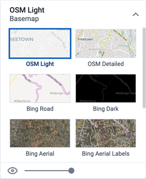
Note
Bing Maps is being retired. See the Bing Maps Blog for the retirement announcement. For migration to Azure Maps, consult the Bing Maps Migration Overview.
Thematic maps represent spatial variation of geographic distributions. They display aggregated data values for a selected data item (such as an indicator or data element), period and org unit level. Org units with coordinates and matching data values will appear on the map.
Note
You must generate the DHIS2 analytics tables to have aggregated data values available.
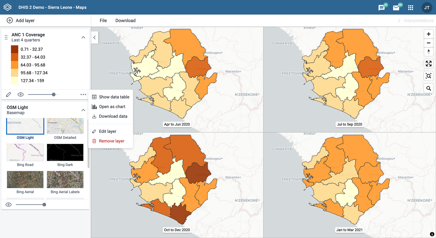
Thematic layers are represented by layer cards in the layer panel. The middle of the card shows a legend indicating the value ranges displayed on the layer. The more actions (three dots) button includes options to show or hide the data table, download the data, and open the data as a chart in the Data Visualizer app via Open as chart.
To create a thematic layer, choose Thematic on the Add layer selection. This opens the Thematic layer configuration dialog.

Select a data item.
Select a value from the Aggregation type field for the data values to be shown on the map. By default, "By data element" is selected. Alternative values are: Count, Average, Sum, Standard deviation, Variance, Min, Max. See also Aggregation operators.
Only show completed events: Includes only completed events in the aggregation process. This is useful when you want to exclude partial events in indicator calculations. Available for indicators, program indicators and event data items.
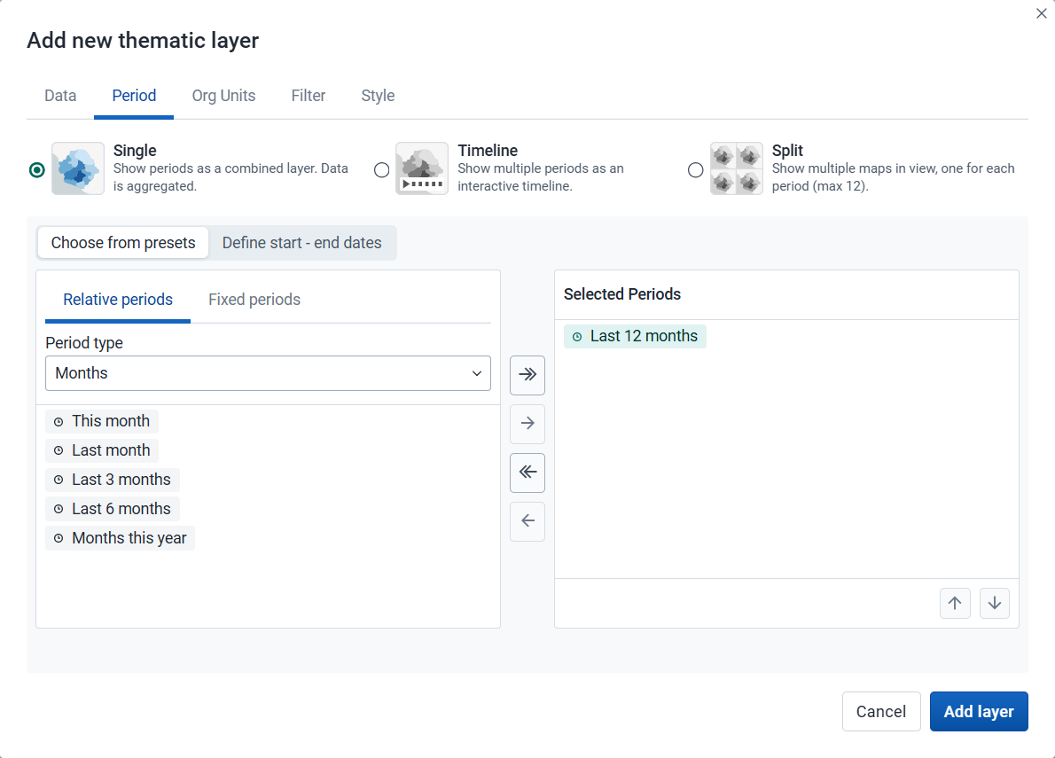
Select the time span over which the thematic data is mapped.
Period display mode: Select how the selected periods will be visualized on the map:
Single (default): Displays all selected periods as a single combined layer with aggregated data. Required when only one period is selected or when using start–end dates.
Timeline: Displays multiple periods as an interactive timeline ordered chronologically. Multiple timeline layers can be added to a map (they will all share the same periods).
Split: Displays multiple periods side by side for comparison. Supports up to 12 periods (including multi-period presets) and can only be combined with other split layers (they will all share the same periods).
After selecting a display mode, choose how to define the periods:
Choose from presets: Available for all display modes. You can combine one or more relative and fixed periods.
Relative period: Select Relative periods, then the Period type (Years, Months, etc.) and choose one or more relative periods, such as This year and Last year or Last 12 months. A default relative period for analysis can be set in the System Settings app.
Fixed period: Select Fixed periods, then choose the Period type (Yearly, Monthly, etc.) and choose one or more fixed periods, such as 2024 or January 2025 and February 2025.
Define start–end dates: Available only when the Single display mode is selected. Specify exact start and end dates. Both dates are inclusive and will be reflected in the outputs.

Select the org units you want to include in the layer. You can freely combine specific org units, org unit levels, org unit groups, and relative user org units (User organisation unit, User sub-units, User sub-x2-units). When user org units are selected, the map data will appear according to the assigned org units for each user in the org unit hierarchy.
Tip: Levels and groups act as filters within the org units you select - combining them will show only org units at those levels or in those groups that are descendants of your selected org units.
Use associated geometry: This dropdown will only show if there are any additional geometries available for your org units. This is typically used to show facility catchment areas.
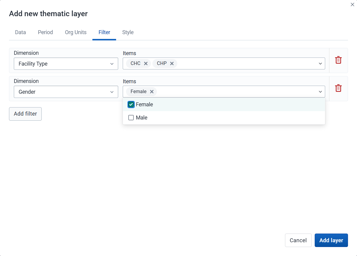
Click Add filter and select an available data item to add a new filter to the data set.
Select a data dimension from the dropdown box. You can reduce the number of dimensions shown by using the search field. Click the name to select a dimension.
When a dimension is selected you get a second dropdown with dimension items. Check the items you want to include in the filter.
Multiple filters may be added. Click the trash button on the right of the filter to remove it.
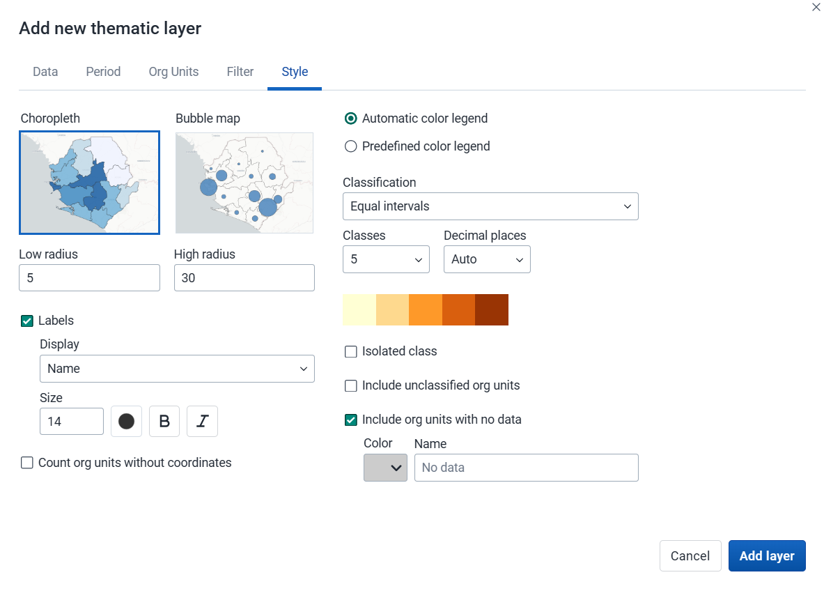
Select either Choropleth or Bubble map.
A choropleth map assigns a color to each org unit shape according to the data value. This is the recommended technique if the data is normalized (per capita).
A bubble map shows data values as proportional circles. Use this technique if the data is not normalized (absolute numbers). The circles are placed in the center of each org unit. Set the Low radius and High radius for the proportional circles. The circles will be scaled between low and high radius according to the data value. The radius must be between 0 and 50 pixels.
Show labels: Show org unit names and/or values on the layer. Select Name, Name and value, or Value. Font size, weight, style and color can also be modified.
Count org units without coordinates: Org units without map coordinates are counted and shown in a Data quality section of the legend. They also appear in the data table. These org units may or may not have data.
Select the legend type:
Automatic color legend: A legend is automatically created based on the classification method, number of classes and color scale you select. Set Classification to one of:
Decimal places: Number of decimal places shown in legend labels. Auto lets the app decide based on the data range, or choose a fixed value from 0 to 6 (also available for single color legends).
Isolated class: Define a value range (min–max) with a fixed color and optional label. Org units in that range are shown separately and excluded from automatic classification.
Predefined color legend: Select from the predefined legends.
Single color legend: Select the color of the bubbles or circles. Only available for bubble maps.
Include unclassified org units: Org units whose values fall outside all classification ranges are shown with a configurable color and label (default: "Unclassified").
Include org units with no data: Org units with no data value are shown with a configurable color and label (default: "No data").
Note: All legend items and their counts - including No data and Unclassified - only include org units with coordinates.
Note
Most classes use half-open intervals (
startValue ≤ value < endValue): a value sitting exactly on a boundary belongs to the upper class, not the one whose label ends there. The exceptions - where the upper bound is inclusive - are the last class, isolated classes, single-value classes, and clusters (natural breaks).If the exact class a boundary value belongs to matters for your analysis, use Show labels to overlay values directly on each feature. If it still matters after that, consider whether a different legend, maybe with more classes or higher decimal precision, is the right tool for the decision you are trying to make.
Click Add layer.
In the layer panel, click the edit (pencil) icon on the thematic layer card.
Modify the settings on any of the tabs as desired.
Click Update layer.
Thematic layers have a Show/hide data table option that can be toggled on or off from the thematic layer card.
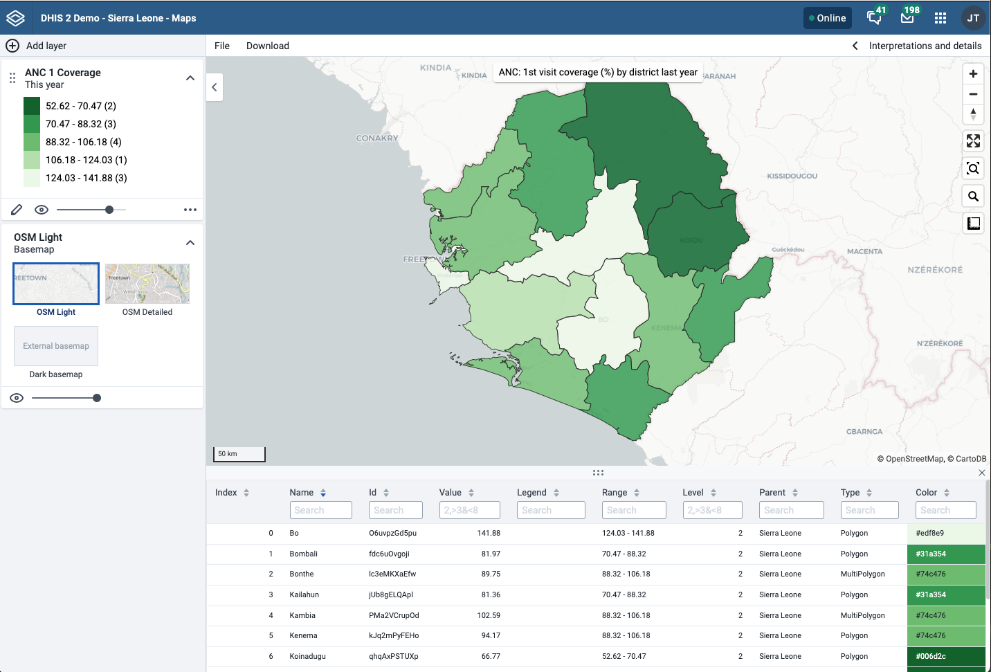
The data table displays the data associated with the thematic layer. Click the arrow buttons in a column header to sort by that column. Type in the filter fields below each column header to filter the displayed rows.
The name filter field is an effective way to search for individual org units.
For numeric columns, you can filter using comparison operators: >, <, >=, and <=. Use , for OR logic and & for AND logic — for example: 2,>3&<8 matches the value 2 or any value greater than 3 and less than 8.
Note
Data table filters are temporary and are not saved with the map.
You can open the org unit profile in three ways:
Click an org unit on the map, then click the View profile button in the popup.
Right-click one of the org units on the map, and select View profile from the menu.
Click an org unit row in the data table.
When there are visible org units on the map, you can easily navigate up and down in the hierarchy without changing the org unit selection.
Right-click one of the org units.
Select Drill up one level or Drill down one level.
The drill down option is disabled if you are on the lowest level or if there are no coordinates available on the level below. Likewise, the drill up option is disabled from the highest level.
To remove a thematic layer from the map, in the layer card to the left, click the more actions (three dots) icon and then click Remove layer.
The event layer displays the geographical location of events recorded in DHIS2 programs. While in thematic layers you can visualize event data aggregated to org unit level, with event layers you can display the individual events or cases when they have their own point or polygon coordinates. Alternative coordinate fields also let you plot events using locations other than the event itself, such as the org unit or enrollment location.
To display aggregated event statistics at the org unit level, use a thematic layer with event data items instead.
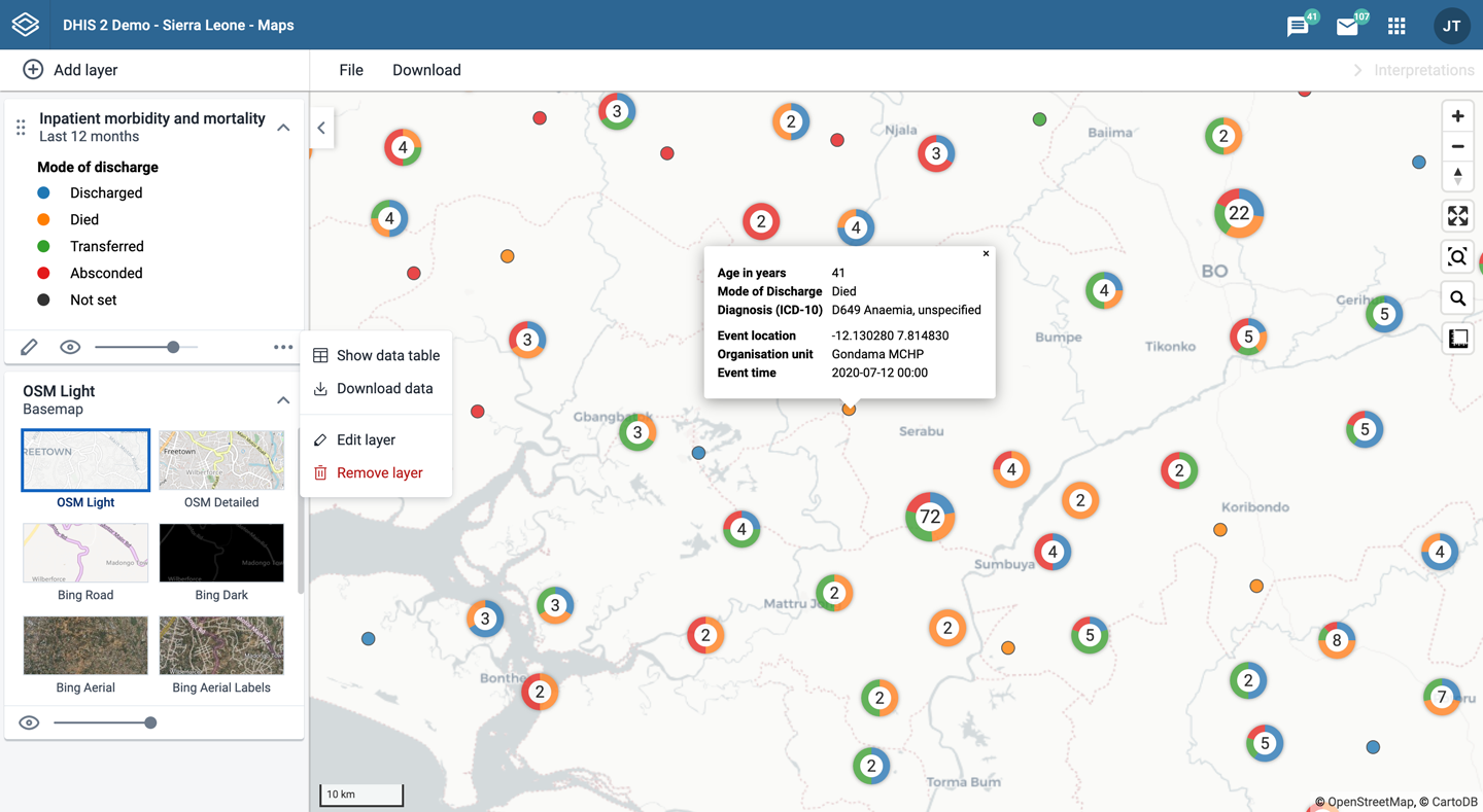
Event layers are represented by layer cards in the layer panel. The middle of the card shows a legend indicating the styling of the layer. The more actions (three dots) button includes options to show or hide the data table and to download the data in GeoJSON format.
To create an event layer, choose Events on the Add layer selection. This opens the Events layer configuration dialog.
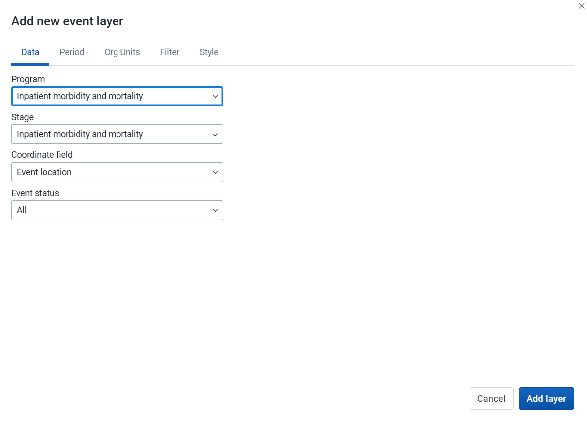
Select a program and then select a program stage. The Stage field is only shown once a program is selected.
If there is only one stage available for the selected program, the stage is automatically selected.
Select a value from the Coordinate field to determine which positions are displayed on the map. By default, "Event location" is selected. You can also choose "Org unit location". Depending on the selected program, additional options may include "Tracked entity location", "Enrollment location", and coordinate or org unit type data elements or attributes, such as "Household location" or "Referral facility". The number of events represented on the map may vary depending on the selected option and the availability of coordinates. When org unit location is used, polygons are represented by their centroids.
By default, all events with coordinates are shown on the map. Use the Event status field to only show events having one status: Active or Completed.

Select the time span for when the events took place. You can select either a fixed period or a relative period.
Relative period: Select one of the relative periods, for example This month or Last year. A default relative period for analysis can be set in the System Settings app.
Fixed period: Select Start/end dates and fill in a start date and an end date.
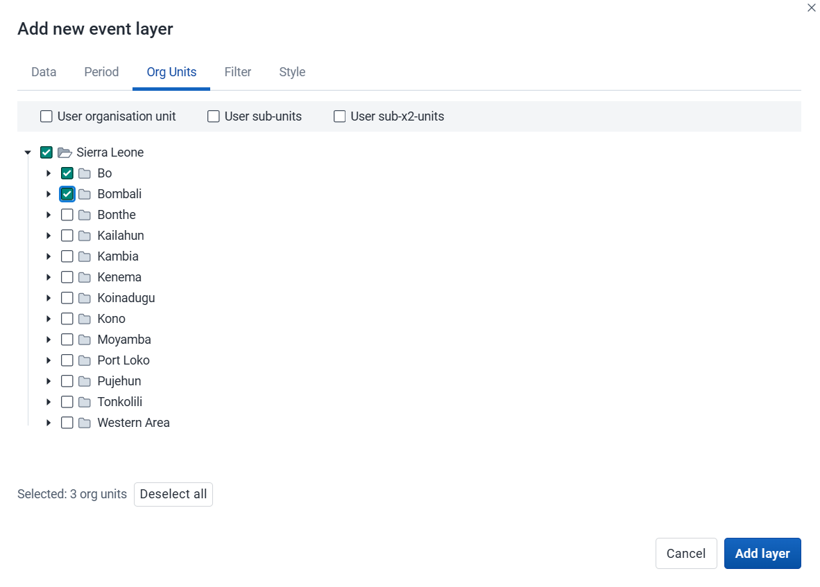

Click Add filter and select an available data item to add a new filter to the data set.
For data item of type option set, you can select any of the options from the dropdown box, or type to filter.
For data item of type number, you can select operators like equal, not equal, greater than or less than.
For data item of type boolean (yes/no), you can check the box if the condition should be true.
For data item of type text, select Contains (matches any value containing the search text) or Is exact (matches only identical values).
Multiple filters may be added. Click the trash button on the right of the filter to remove it.
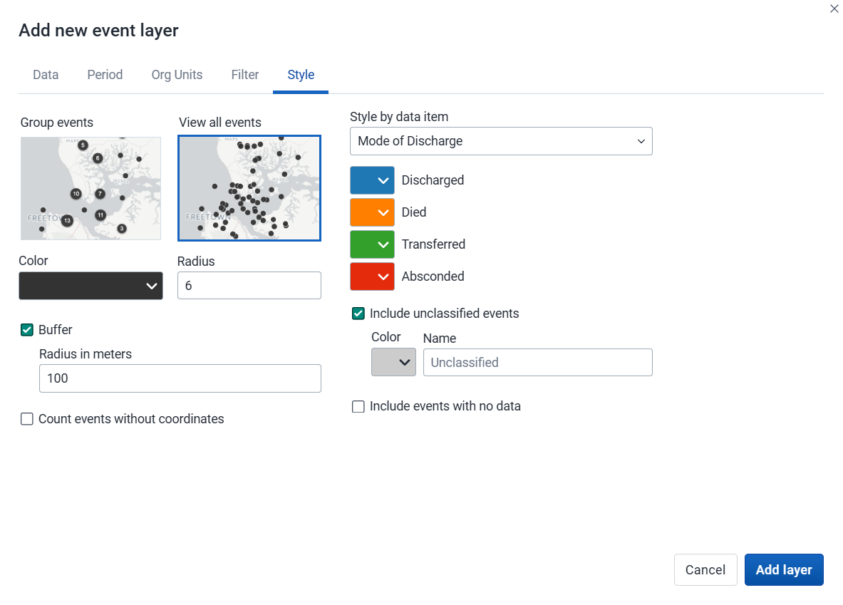
Select Group events to group nearby events (cluster), or View all events to display events individually.
Select a color and radius for the event or cluster points.
Select Show buffer to display a visual buffer around each event. The radius of the buffer can be modified here. Only available when View all events is selected.
Count events without coordinates: Events without coordinates are counted and shown in a Data quality section of the legend. They also appear in the data table. These events may or may not have data.
Select Style by data item (data element or attribute) to colorize the events according to a data value. If events are grouped, clusters are displayed as small donut charts showing the distribution of the data values. The available options vary for different data types:
Option sets: Select a color for each option in an option set. You can set default colors for an option in the Metadata Management app.
Numbers: You can style a numeric data item in the same way as thematic layers using automatic or predefined legends.
Booleans: Select a color for true/yes and another for false/no.
Include unclassified events: Events whose values fall outside all classification ranges are shown with a configurable color and label (default: "Unclassified").
Include events with no data: Events with no data value are shown with a configurable color and label (default: "No data").
Note: All legend items and their counts - including No data and Unclassified - only include events with coordinates.
Click Add layer.
In the layer panel, click the edit (pencil) icon on the event layer card.
Modify the settings on the Data, Period, Filter, Org units and Style tabs as desired.
Click Update layer.
Event layers have a Show/hide data table option that can be toggled on or off from the event layer card.
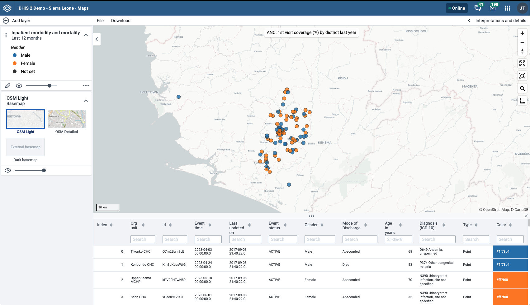
The data table displays the data associated with the event layer. Click the arrow buttons in a column header to sort by that column. Type in the filter fields below each column header to filter the displayed rows.
Additional columns appear for data elements configured to display in reports, and for any data item used to style the events — both the data value and the color can be filtered in those columns. Numeric columns support comparison operators: >, <, >=, and <=, with , for OR and & for AND logic — for example: 2,>3&<8.
Note
Data table filters are temporary and are not saved with the map.
If you have access to the selected program in the Metadata Management app, you can modify the information displayed in the event popup window.
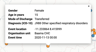
Open the Metadata Management app.
Select Programs.
Click the program you want to modify and select Data or the stage first then Data in the case of a Tracker program.
For every data element you want to display in the popup window, select corresponding Display in reports.
Click Save.
The raw data for event layers can be downloaded in GeoJSON format for more advanced geo-analytics and processing in desktop GIS software such as QGIS. The downloaded data includes all individual events as GeoJSON features, including attributes for each data element selected for Display in reports.
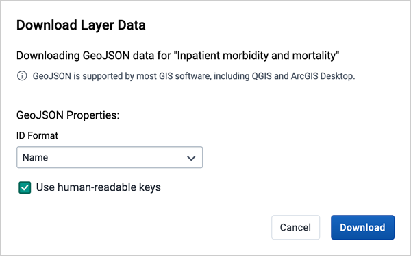
In the layer card to the left, click the more actions (three dots) icon and then click Download data.
Select the ID format to use as the key for data element values in the downloaded GeoJSON file:
Select whether or not to Use human-readable keys for other event attributes, such as Program Stage, Latitude, Longitude, Event Data, and Org Unit ID, Name, and Code. When this option is not selected, these values will be computer-friendly IDs instead of human-readable (translated) names.
Click the Download button to generate and download a GeoJSON file. The data will be requested from the DHIS2 server and processed by the maps application. This operation may take several minutes to complete.
Once the GeoJSON file has been downloaded, it can be imported into most standard GIS software.
Note
The downloaded data does not include style information as it is not natively supported by the GeoJSON format. Styles can optionally be recreated in external GIS applications using the attributes of each feature.
To remove an event layer from the map, in the layer card to the left, click the more actions (three dots) icon and then click Remove layer.
The tracked entity layer displays the geographical location of tracked entities registered in DHIS2. Tracked entities with associated point or polygon coordinates appear on the map.
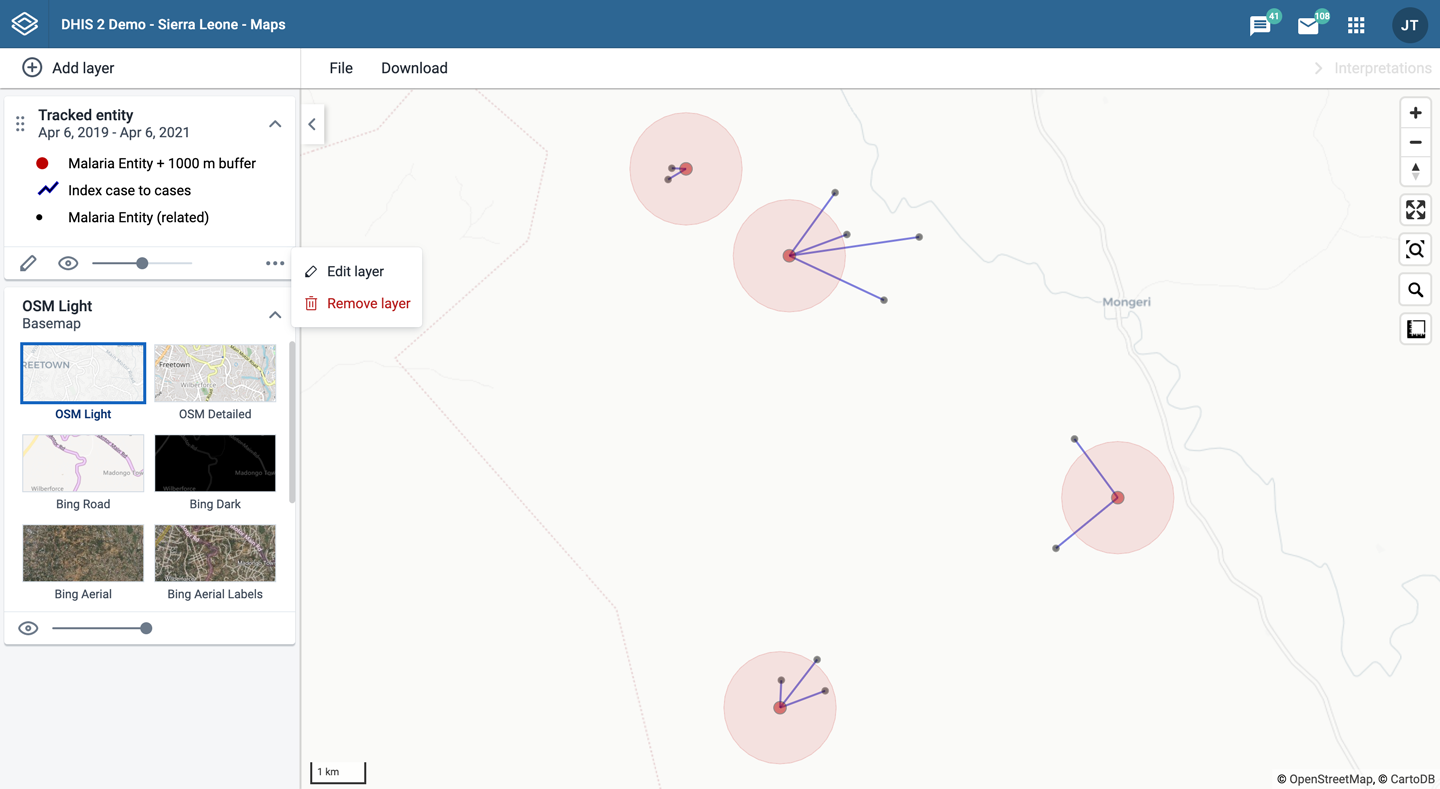
Tracked entity layers are represented by layer cards in the layer panel. The middle of the card shows a legend indicating the styling of the layer.
To create a tracked entity layer, choose Tracked entities on the Add layer selection. This opens the Tracked entity layer configuration dialog.
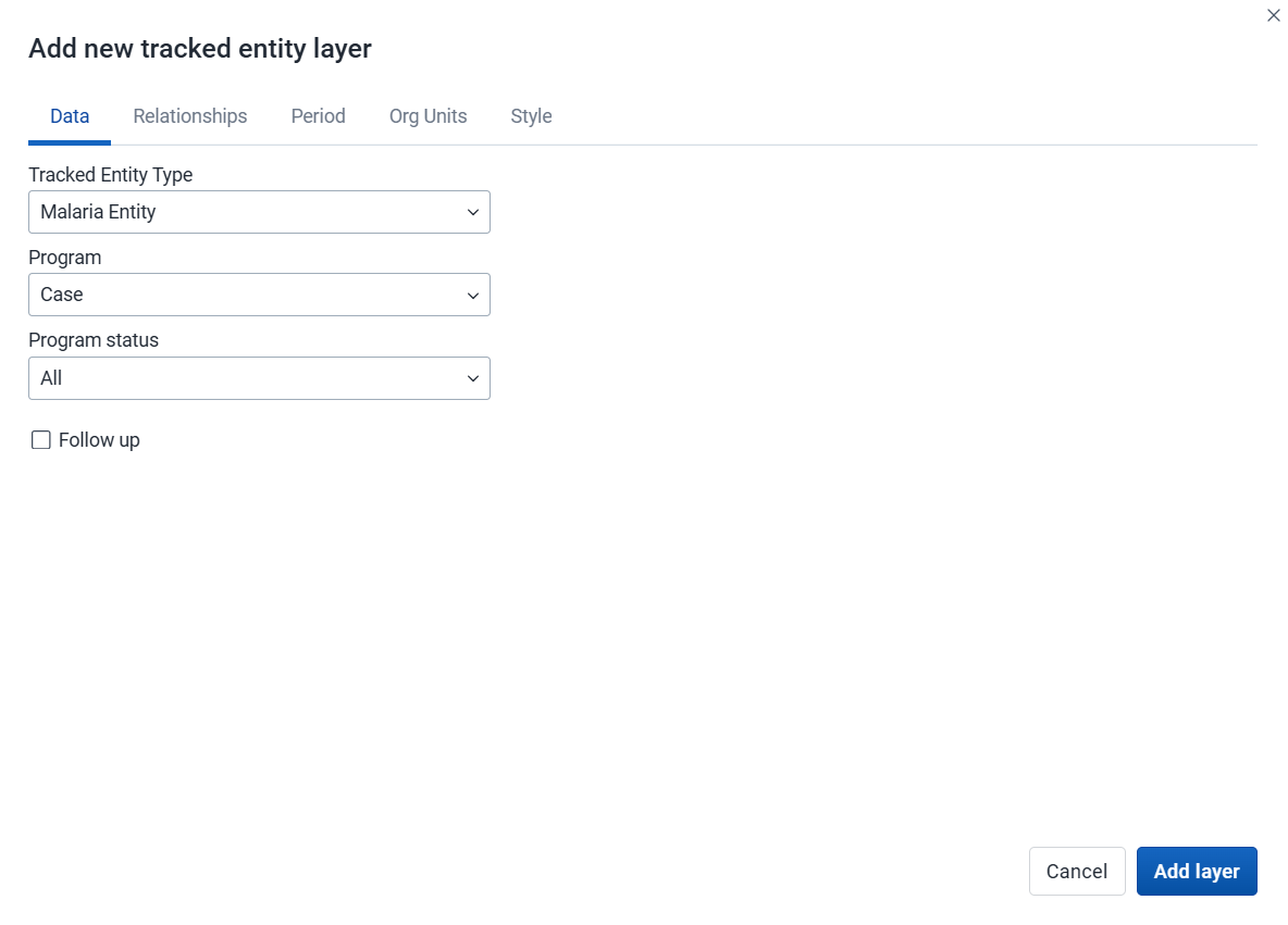
Select the Tracked entity type you want to show on the map.
Select a Program to filter tracked entities by enrollment.
Use the Program status field to select the enrollment status of tracked entities to include: All, Active, Completed, or Cancelled.
Filter by the Follow-up flag to include only tracked entities marked for follow-up.
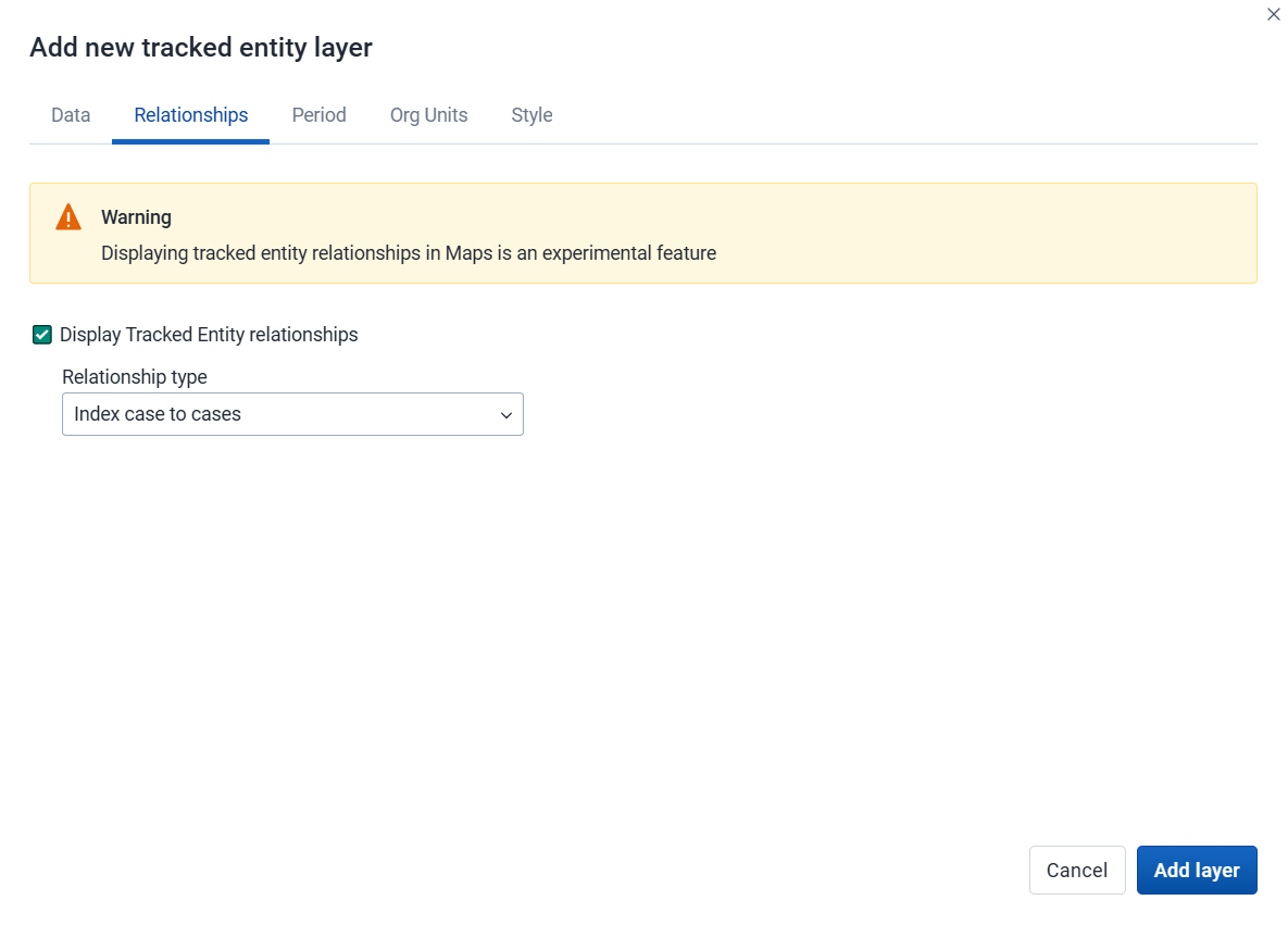
Caution
Displaying tracked entity relationships in Maps is an experimental feature.
Select the Display tracked entity relationships checkbox to show relationships on the map.
Select the Relationship type to display from the dropdown list. Only relationships defined for the selected tracked entity type are available.

If no program is selected, you can set start and end dates for when the tracked entities were last updated.
If a program is selected, you can set the period when tracked entities were last updated or when they were enrolled in the program.
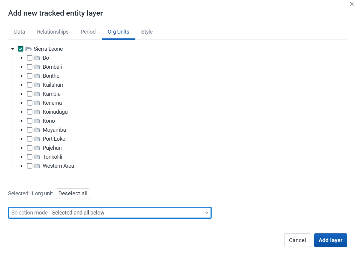
Select the org units you want to include in the layer. Only specific org units can be selected. A selection mode determines how the org unit tree is traversed:
Selected only: Include tracked entities belonging to selected org units only.
Selected and below: Include tracked entities in and right below selected org units.
Selected and all below: Include tracked entities in and all below selected org units.
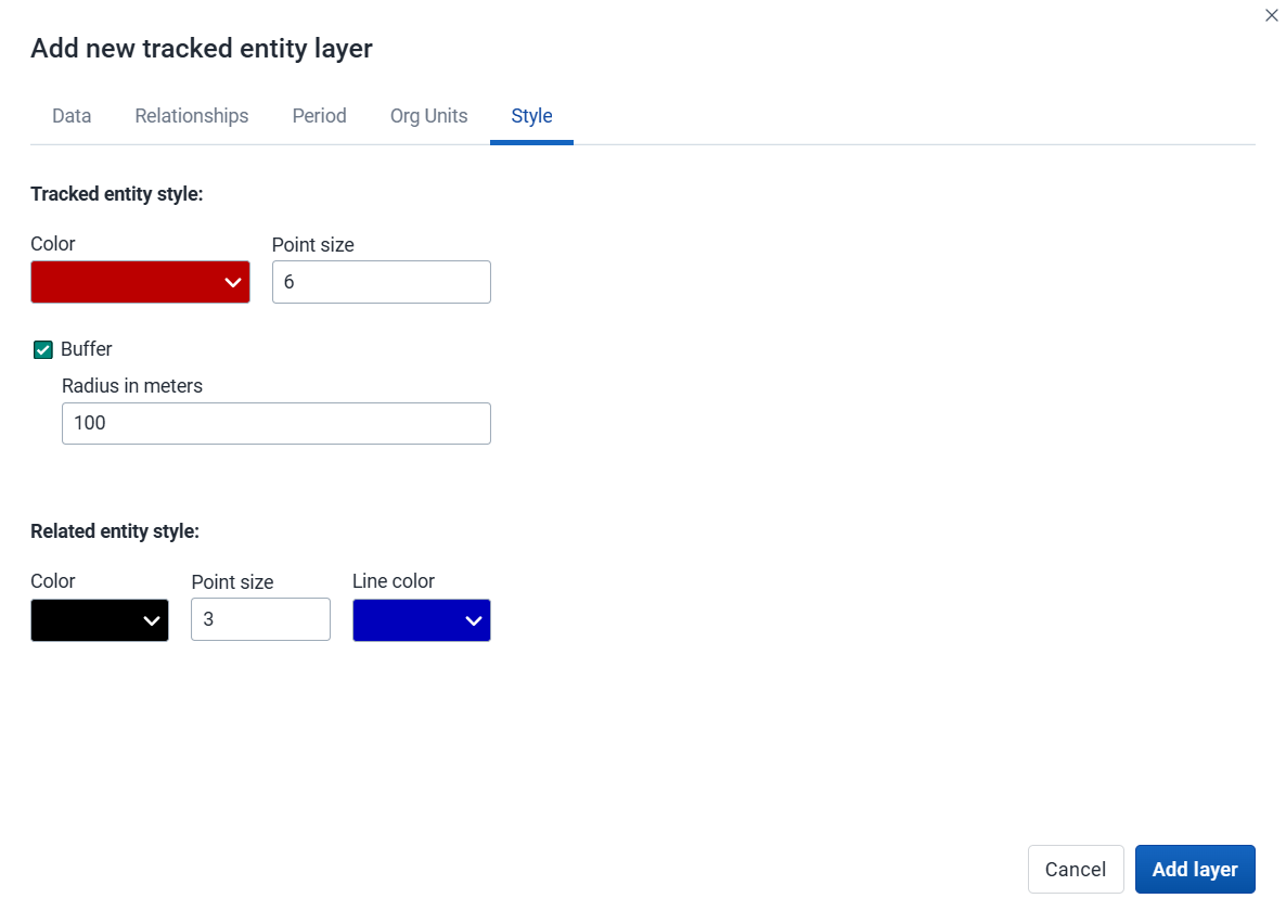
Select a Color for tracked entity points and polygons.
Select the Point size for the points.
Select Buffer to display a visual buffer around each tracked entity. The buffer distance in meters can be modified here.
If a relationship type has been selected on the Relationships tab, you can select a Color and Point size for related tracked entities and a Line color for the relationship lines.
Click Add layer.
In the layer panel, click the edit (pencil) icon on the tracked entity layer card.
Modify the settings on the Data, Relationships, Period, Org units and Style tabs as desired.
Click Update layer.
If you have access to the selected program in the Metadata Management app, you can modify the information displayed in the tracked entity popup window.
Open the Metadata Management app.
Select Program.
Click the program you want to modify and select Enrollment: Data.
For every attribute you want to display in the popup window, enable Display in list.
Click Save.
To remove a tracked entity layer from the map, in the layer card to the left, click the more actions (three dots) icon and then click Remove layer.
The facility layer displays icons representing types of facilities. Only point-type org units are shown - polygon org units such as districts or regions are not displayed.
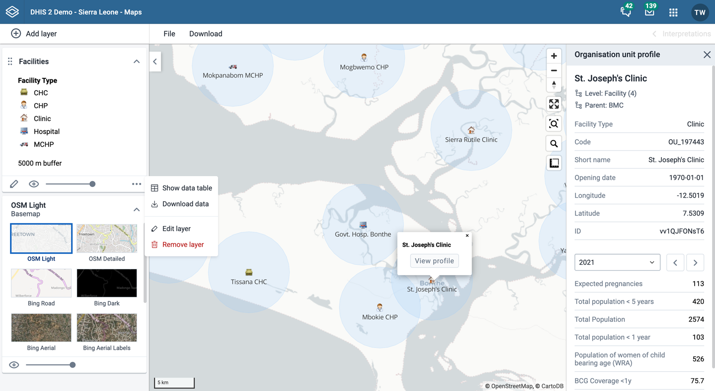
Facility layers are represented by layer cards in the layer panel. The middle of the card shows a legend indicating the group set representation. The more actions (three dots) button includes options to show or hide the data table and to download the data in GeoJSON format.
To create a facility layer, choose Facilities on the Add layer selection. This opens the Facility layer configuration dialog.
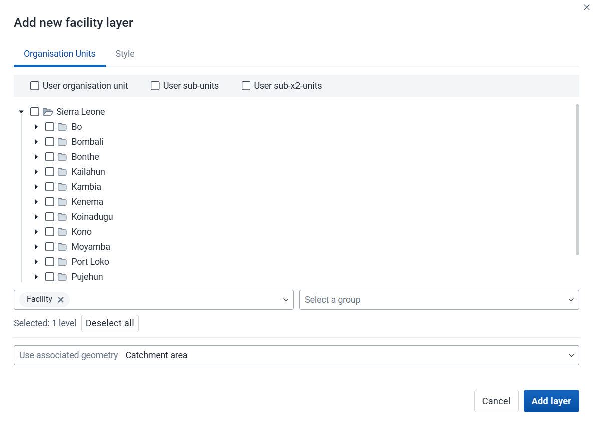
Select the org units you want to include in the layer. You can freely combine specific org units, org unit levels, org unit groups, and relative user org units (User organisation unit, User sub-units, User sub-x2-units). When user org units are selected, the map data will appear according to the assigned org units for each user in the org unit hierarchy. Only org units with a point location are displayed.
Tip: Levels and groups act as filters within the org units you select - combining them will show only org units at those levels or in those groups that are descendants of your selected org units.
The system administrator can set the default org unit level containing facilities in the System Settings app.
Use associated geometry: This dropdown will only show if there are any additional geometries available for your org units. This is typically used to show facility catchment areas.

Labels: Allows labels to be shown on the layer. Font size, weight and color can be modified here.
Buffer: Displays a visual buffer around each facility. The radius of the buffer can be modified here. Not available if associated geometry is used.
Count org units without a point location: Org units without point coordinates are counted and shown in a Data quality section of the legend. They also appear in the data table.
Facilities with a point location can be styled with an org unit group set using different icons. Select a group set from the list of org unit group sets defined for your DHIS2 instance. The system administrator can set the default org unit group set in the System Settings app.
Include unclassified org units: Org units not belonging to any group in the selected group set are shown with a configurable color and label (default: "Unclassified").
If no group set is selected, the facilities will be shown as filled circles. The color and radius can be changed.
Click Add layer.
In the layer panel, click the edit (pencil) icon on the facility layer card.
Modify the settings on the Org units and Style tabs as desired.
Click Update layer.
Facility layers have a Show/hide data table option that can be toggled on or off from the facility layer card.

The data table displays the data associated with the facility layer. Click the arrow buttons in a column header to sort by that column. Type in the filter fields below each column header to filter the displayed rows. The name filter field is an effective way to search for individual facilities.
Note
Data table filters are temporary and are not saved with the map.
You can open the org unit profile in three ways:
Click an org unit on the map, then click the View profile button in the popup.
Right-click one of the org units on the map, and select View profile from the menu.
Click an org unit row in the data table.
To remove a facility layer from the map, in the layer card to the left, click the more actions (three dots) icon and then click Remove layer.
The org unit layer displays the borders and locations of your org units. This layer is particularly useful if you are offline and don't have access to background maps.
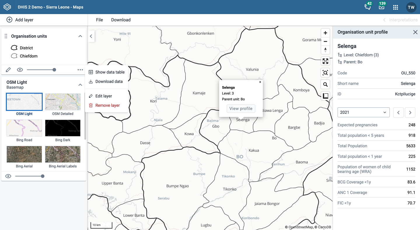
Org unit layers are represented by layer cards in the layer panel. The more actions (three dots) button includes options to show or hide the data table and to download the data in GeoJSON format.
To create an org unit layer, choose Org units on the Add layer selection. This opens the Org unit layer configuration dialog.
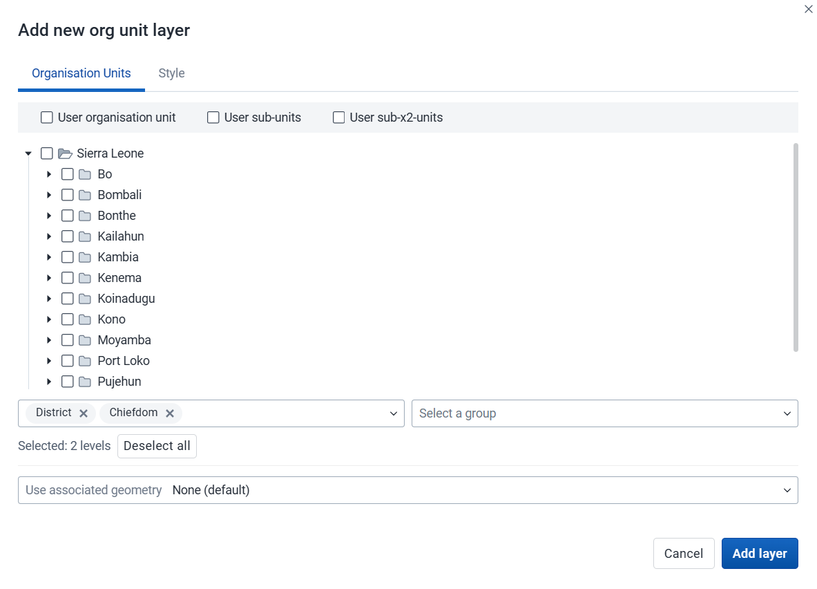
Select the org units you want to include in the layer. You can freely combine specific org units, org unit levels, org unit groups, and relative user org units (User organisation unit, User sub-units, User sub-x2-units). When user org units are selected, the map data will appear according to the assigned org units for each user in the org unit hierarchy.
Tip: Levels and groups act as filters within the org units you select - combining them will show only org units at those levels or in those groups that are descendants of your selected org units.
Use associated geometry: This dropdown will only show if there are any additional geometries available for your org units. This is typically used to show facility catchment areas.

Labels: Allows labels to be shown on the layer. Font style can be modified here.
Boundary color: Allows the boundary or outline color of the org units to be changed.
Point radius: Sets the base radius when point type elements, such as facilities, are presented on the org unit layer.
Count org units without coordinates: Org units without coordinates are counted and shown in a Data quality section of the legend. They also appear in the data table.
Org units with coordinates can be styled with an org unit group set using different colors. Select a group set from the list of org unit group sets defined for your DHIS2 instance.
Include unclassified org units: Org units not belonging to any group in the selected group set are shown with a configurable color and label (default: "Unclassified").
Click Add layer.
In the layer panel, click the edit (pencil) icon on the org unit layer card.
Modify the settings on the Org units and Style tabs as desired.
Click Update layer.
Org unit layers have a Show/hide data table option that can be toggled on or off from the org unit layer card.

The data table displays the data associated with the org unit layer. Click the arrow buttons in a column header to sort by that column. Type in the filter fields below each column header to filter the displayed rows. The name filter field is an effective way to search for individual org units.
The level column supports numeric filtering using comparison operators: >, <, >=, and <=, with , for OR and & for AND logic — for example: 2,>3&<8.
Note
Data table filters are temporary and are not saved with the map.
You can open the org unit profile in three ways:
Click an org unit on the map, then click the View profile button in the popup.
Right-click one of the org units on the map, and select View profile from the menu.
Click an org unit row in the data table.
When there are visible org units on the map, you can navigate up and down in the hierarchy without changing the org unit selection.
Right-click one of the org units.
Select Drill up one level or Drill down one level.
The drill down option is disabled if you are on the lowest level. Likewise, the drill up option is disabled from the highest level.
To remove an org unit layer from the map, in the layer card to the left, click the more actions (three dots) icon and then click Remove layer.
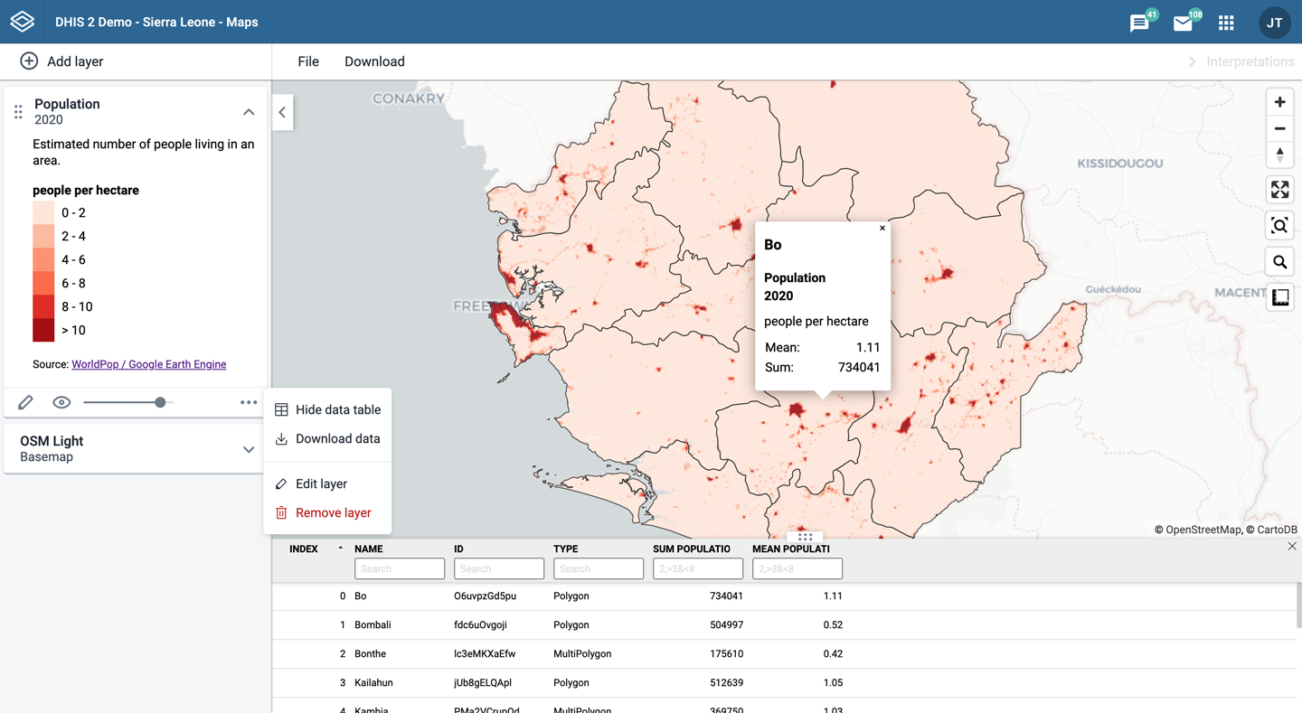
Google Earth Engine layers are enabled if a Google Earth Engine API key has been configured for your system. Contact your system administrator if you need access to these layers.
The layers from Google Earth Engine let you display and aggregate external data for your org units. Aggregated values can be viewed either in popups or in the data table.
Earth Engine layers are represented by layer cards in the layer panel. The more actions (three dots) button includes an option to show or hide the data table.
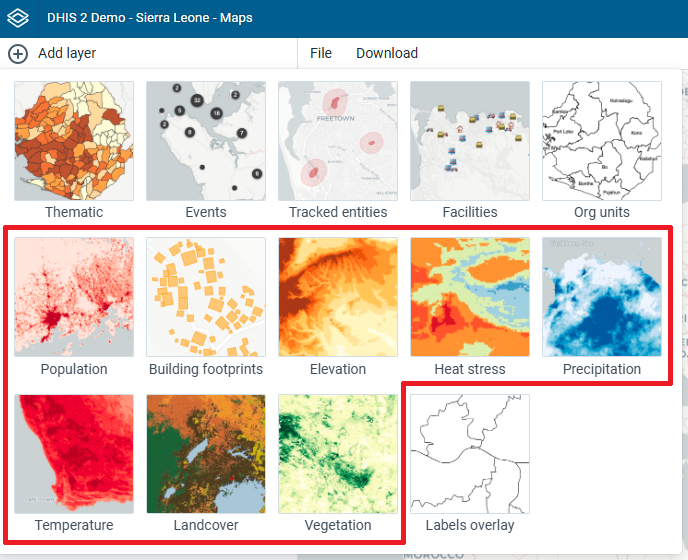
Note
The Maps app administrator can configure available layer sources.
The following layer sources are supported (sources marked with an asterisk "*" are available by default):
Population (group): Detailed population data from WorldPop. Estimates are provided annually and include current, historical, and projected population values. Available between 2015 and 2030.
Building footprints *: The outlines of buildings derived from high-resolution satellite imagery. Only for sub-Saharan Africa, South and Southeast Asia, Latin America and the Caribbean.
Elevation *: Elevation above sea level.
Heat stress (group): Universal Thermal Climate Index (UTCI), a measure of the thermal stress experienced by a person in a given environment. Available from 1950.
Humidity (group): Relative humidity is the amount of water vapour present in air. Available from 1950.
Precipitation (group): Accumulated water that falls to the surface. Combines model data with observations from across the world. Two sources are available:
Temperature (group): Temperature at 2m above the surface. Combines model data with observations from across the world. Available from 1950.
Land cover *: 17 distinct landcover types collected from satellites by NASA. Available yearly, between 2001 and 2022.
Vegetation: Normalized difference vegetation index (NDVI) and Enhanced Vegetation Index (EVI), used to quantify vegetation greenness. Collected from satellites by NASA. Available at 16-day intervals, from 2000.
To create an Earth Engine layer, choose the desired layer from the Add layer selection. This opens the layer configuration dialog.

Dataset (if within a data group):
Data subset:
Select the spatial aggregation methods to use when calculating values for the selected org units. This only affects results in popups and the data table (some options might not be available depending on the layer source).
Sum: Calculates the total number within each org unit. Recommended to use for the population layers.
Min: Returns the minimum value in the layer unit displayed below the selection. For population layers it will be the minimum people per hectare. For the elevation layer it will return the lowest elevation (meters above sea level).
Max: Returns the maximum value in the layer unit. For population layers it will be the maximum people per hectare. For the elevation layer it will return the highest elevation for each org unit.
Mean: Returns the mean value in the layer unit. For population layers it will be the mean people per hectare. For the precipitation layer it will be the mean rainfall in millimeters across the org unit.
Median: Returns the median value in the layer unit. For population layers it will be the median people per hectare. For the temperature layer it will be the median °C across the org unit.
Standard deviation: Returns the standard deviation value in the layer unit.
Variance: Returns the variance value in the layer unit.
Special cases:

Select the period type (if multiple sources are enabled for Heat stress, Precipitation, Temperature, or Vegetation).
Select the period for the data source. The available periods are set by the layer source. Some sources are only available at a single point in time.
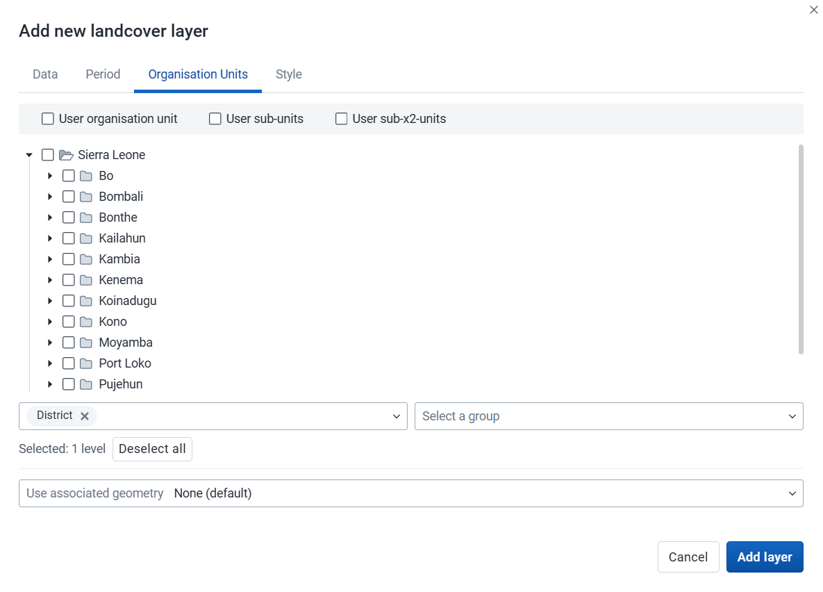
Select the org units where you want to see aggregated data values. You can freely combine specific org units, org unit levels, org unit groups, and relative user org units (User organisation unit, User sub-units, User sub-x2-units). When user org units are selected, the map data will appear according to the assigned org units for each user in the org unit hierarchy.
Tip: Levels and groups act as filters within the org units you select - combining them will show only org units at those levels or in those groups that are descendants of your selected org units.
Use associated geometry: This dropdown will only show if there are any additional geometries available for your org units. This is typically used to calculate values for facility catchment areas.
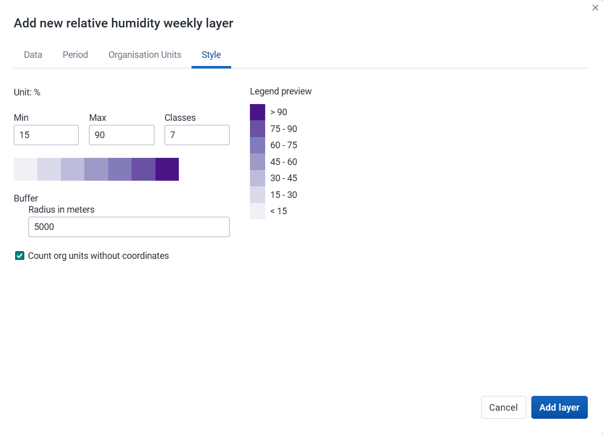
Adjust the legend Min, Max, number of Classes, and color map, as desired.
Buffer: If you select org units with a single point coordinate (facilities), you can set a radius buffer to calculate the data value within. A radius of 5000 meters will aggregate all values available within a 5 km distance from a facility. Buffer option is not available if associated geometry is used.
Count org units without coordinates: Org units without coordinates are counted and shown in a Data quality section of the legend. They also appear in the data table.
Click Add layer.
Click an org unit or facility on the map to see the aggregation result.
In the layer panel, click the edit (pencil) icon on the Earth Engine layer card.
Modify the settings on the Data, Period, Org units, and Style tabs as desired.
Click Update layer.
Earth Engine layers have a Show/hide data table option that can be toggled on or off from the layer card.

The data table displays all the aggregated values for the selected org units. Click the arrow buttons in a column header to sort by that column. Type in the filter fields below each column header to filter the displayed rows.
There is one column for each selected aggregation type. These numeric columns support comparison operators: >, <, >=, and <=, with , for OR and & for AND logic — for example: 2,>3&<8.
Note
Data table filters are temporary and are not saved with the map.
You can open the org unit profile in three ways:
Click an org unit on the map, then click the View profile button in the popup.
Right-click one of the org units on the map, and select View profile from the menu.
Click an org unit row in the data table.
To remove an Earth Engine layer from the map, in the layer card to the left, click the more actions (three dots) icon and then click Remove layer.
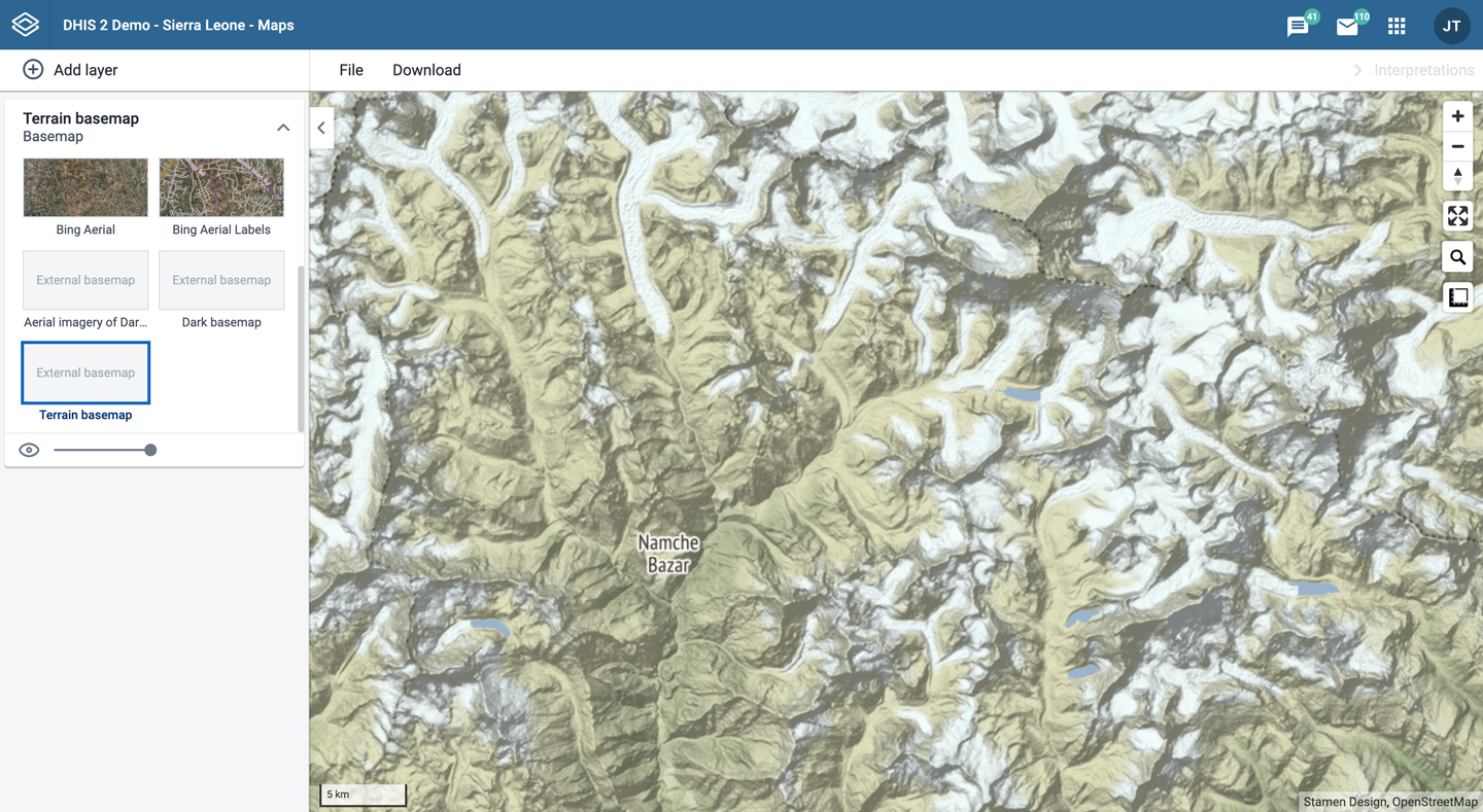
External map layers are represented as either basemaps or overlays.
Note
The Maps app administrator can add external map layers.
Basemaps
These are available in the basemap card in the layers panel and are selected as any other basemap.
Overlays
These are available in the Add layer selection. Unlike basemaps, overlays can be placed above or below any other overlay layers.
Overlay layers are represented by additional layer cards in the layer panel.
Along the top of the overlay card from left to right are:
A grab field to allow dragging and re-ordering layers with the mouse
The title of the external map layer
An arrow symbol to collapse or expand the overlay card
In the middle of the card is a legend if the layer has one.
Along the bottom of the overlay card from left to right are:
A slider for modifying the layer transparency
A delete icon to remove the layer from the current map
If you add a GeoJSON external layer to your map, you will have a few style choices:
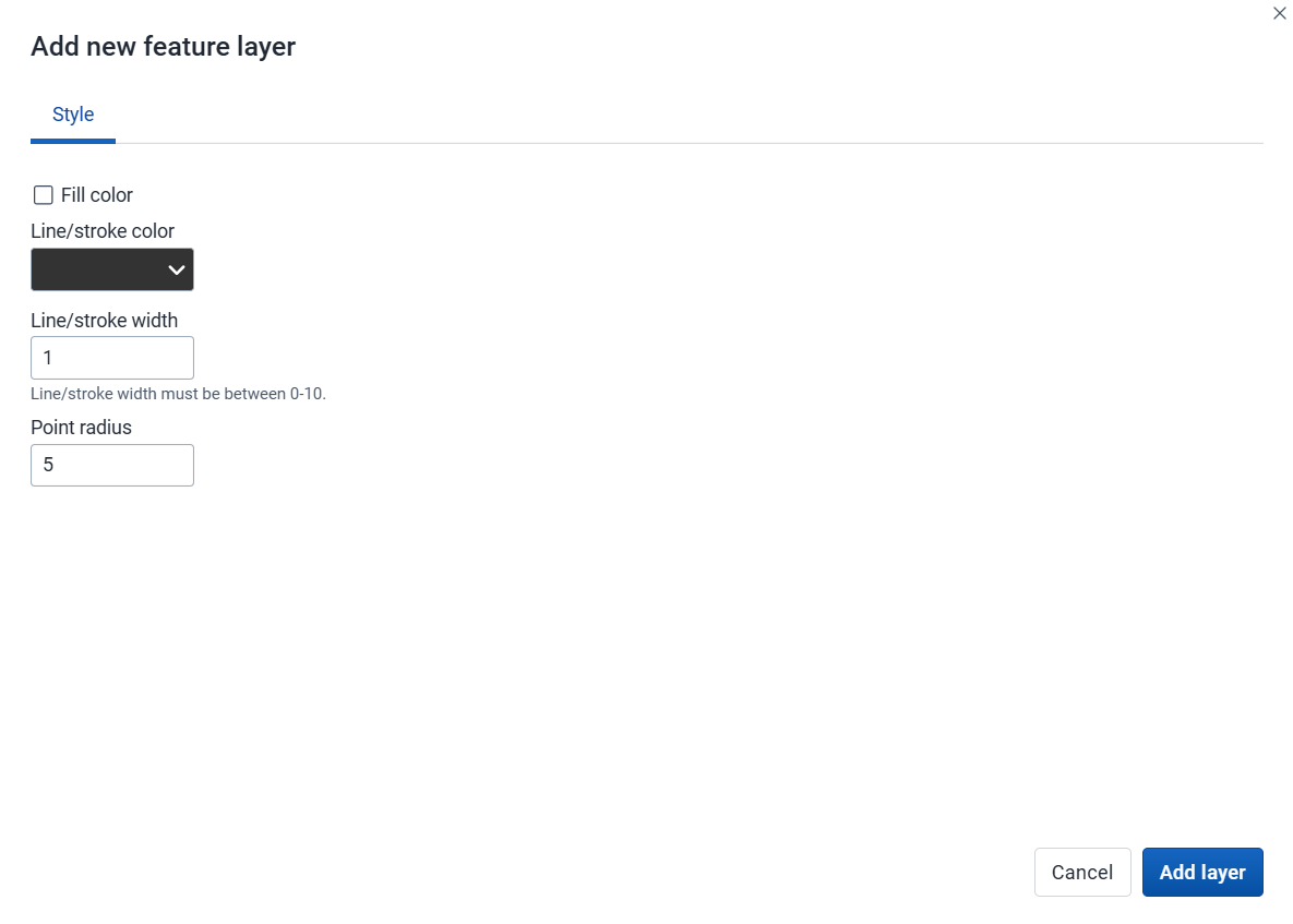
Once the GeoJSON layer is displayed, you can view its data table:
As with other layers, you can sort and filter the data. If you want to view the data for one row, click the row to open the Feature Profile:
The org unit profile shows detailed information about each org unit. You can open the profile from org unit layers, facility layers, thematic layers, and Earth Engine layers.
You can open the org unit profile in three ways:
Click an org unit on the map, then click the View profile button in the popup.
Right-click one of the org units on the map, and select View profile from the menu.
Click an org unit row in the data table.
The profile will show on the right side of the map. The profile content is set by the system administrator.
Use the File menu to manage your maps. Several menu items will be disabled until you open or save a map.
Saving your maps makes it easy to restore them later. It also gives you the opportunity to share them with other users as an interpretation or add them to a dashboard. You can save all types of layer configurations as a saved map.
Click File > New.
Note
This will discard the current map without saving.
Click File > Open. A dialog box opens with a list of maps.
Find the saved map you want to open. You can either use \< and > or the search field to find a saved map. The list is filtered on every character that you enter. You can filter the list by selecting Show all, Created by me or Created by others.
Click the name of the map you want to open.
When you have created a map it is convenient to save it for later use:
Click File > Save.
Enter a Name (required) and a Description (optional) the first time you save a map.
Click Save.
Click File > Save as...
Enter a Name (required) and a Description (optional) for the map.
Click Save.
Click File > Rename.
Enter a new Name and/or Description for your map.
Click Rename. The map is updated.
Click File > Translate.
Select the Locale (language) for your translation.
Enter a translated Name and Description. The original text will show below the field.
Click Save.
After you have created a map and saved it, you can share the map with everyone or a user group. To modify the sharing settings:
Click File > Share. The sharing settings dialog opens.
Give access to a user or group: In the text box, search for the name of the user or group you want to share your saved map with and select it.
Select the access level and click Give access.
Repeat the step to add more users or groups.
Users and groups that currently have access: For each user or group, choose the access level. The options are:
No access: The public won't have access to the map. This setting is only applicable to All users.
View only: Users can view but not edit the map.
View and edit: Users can view and edit the map.
Remove access: Remove the access for groups or individuals.
Click Close to close the dialog.
Click File > Get link. A link dialog opens.
Copy the link.
Click File > Delete. A confirmation dialog is displayed.
Click Delete to confirm that you want to delete the saved map. Your map is deleted and the layers are cleared from the view.
An interpretation is a description of a map for a given period. This information is also visible in the Dashboard app. Click Interpretations and details in the top right of the workspace to open the interpretations panel. The button is only available when the map has been saved.
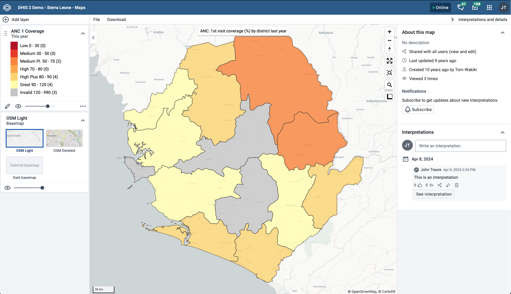
To view interpretations for relative periods, such as a year ago:
Open a saved map with interpretations.
Click Interpretations and details in the top right of the workspace to open the interpretations panel.
Click See interpretation. Your map displays the data and the date based on when the interpretation was created. To view other interpretations, click them.
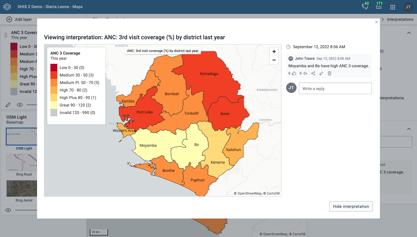
To create an interpretation, you first need to create a map and save it. If you've shared your map with other people, the interpretation you write is visible to those people.
Open a saved map.
Click Interpretations and details in the top right of the workspace to open the interpretations panel.
A text field appears where you can write an interpretation.
In the text field, type a comment, question or interpretation. You can also mention other users with '@username'. Start by typing '@' followed by the first letters of the username or real name, and a list of matching users will appear. Mentioned users will receive an internal DHIS2 message with the interpretation or comment. You can see the interpretation in the Dashboard app.
Click Post interpretation to save the interpretation.
Click an interpretation (see how to view an interpretation above).
Click the share icon below the interpretation. The sharing settings dialog opens.
Search for and add users and user groups that you want to share your map with, and set the access level. Click Give access.
Change the access level for the users you want to modify:
No access: The public won't have access to the map. This setting is only applicable to All users.
View only: Users can view but not edit the map.
View and edit: Users can view and edit the map.
Remove access: Remove the access for groups or individuals.
Click Close when sharing settings are updated.
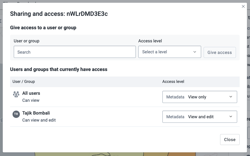
You can download your map as an image by clicking the Download button in the top menu.
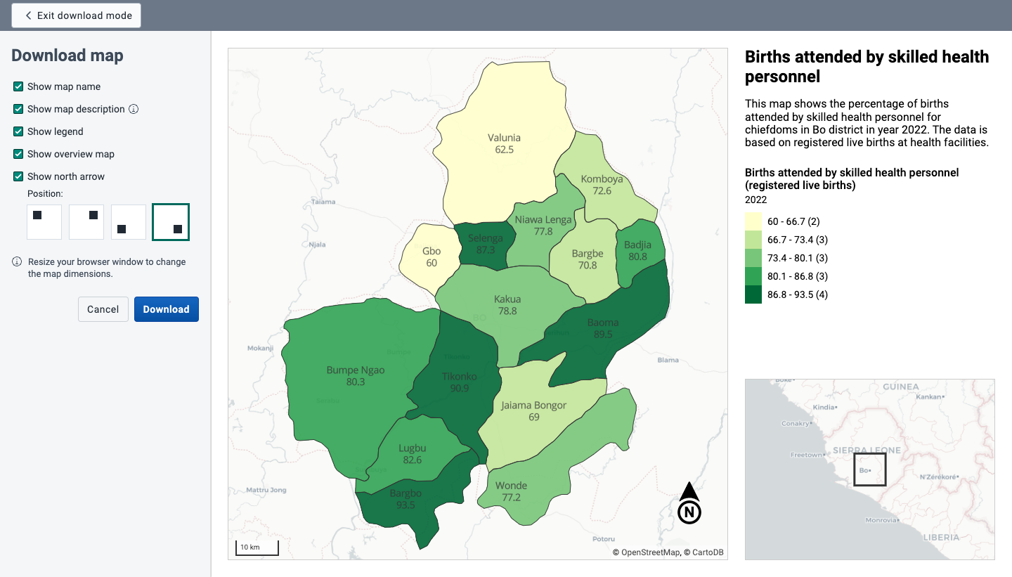
You will enter Download mode where you can adjust the map layout before you download the image. The left column gives you the following options:
Click Download to download your map.
Resize your browser window to change the map dimensions. You can also reposition both the main map and the overview map.
The place search function allows you to search for almost any location or address. This is useful to locate sites, facilities, villages or towns on the map.
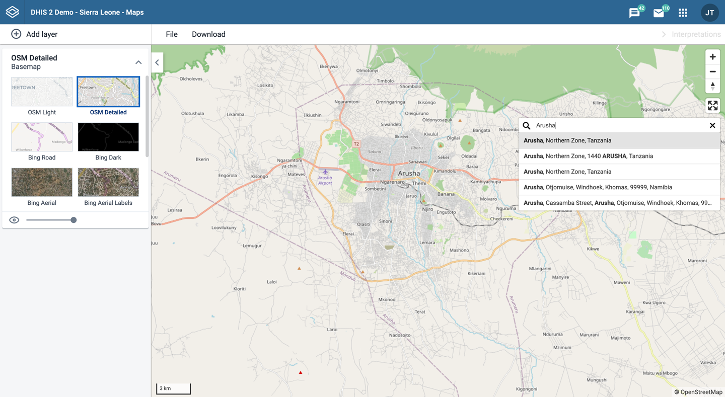
On the right side of the Maps window, click the magnifier icon.
Type the location you're looking for.
A list of matching locations appear as you type.
From the list, select a location. A pin indicates the location on the map.
In the upper left part of the map, put the cursor on the Measure distances and areas (ruler) icon and click Create new measurement.
Add points to the map.
Click Finish measurement.
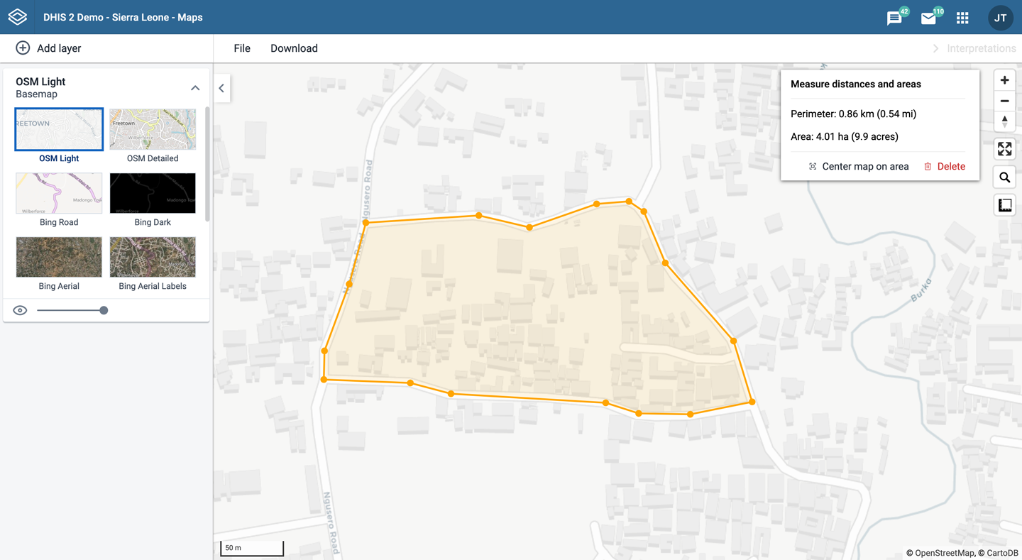
Right-click a point on the map and select Show longitude/latitude. The values are displayed in a popup window.
A Maps app administrator can be defined by the system administrator assigning the F_EXTERNAL_MAP_LAYER_PUBLIC_ADD authority.
The Maps app administrator is able to:
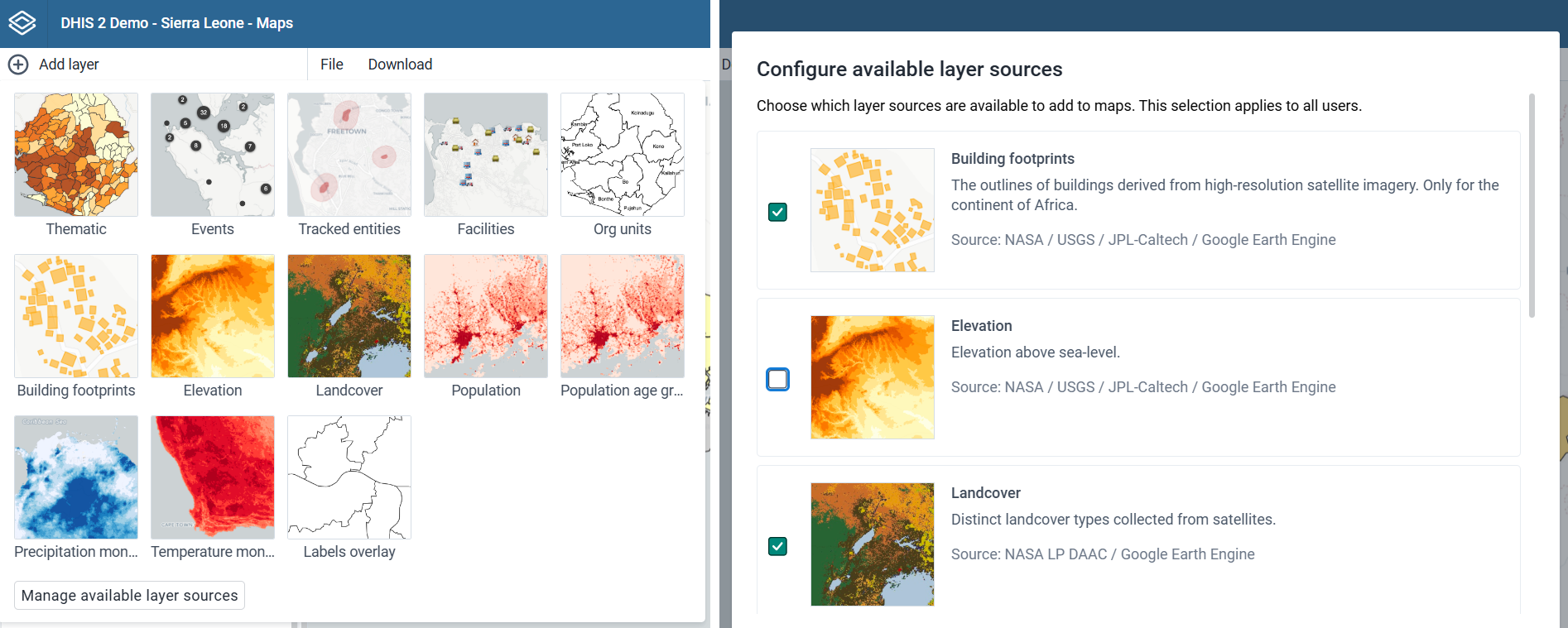
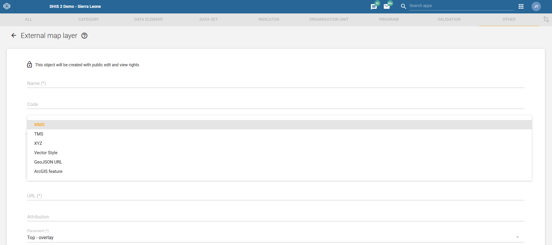
Configuration:
Settings:
Metadata management:
Training:
With the Pivot Table app, you can create pivot tables based on all available data dimensions in DHIS2. A pivot table is a dynamic tool for data analysis which lets you summarize and arrange data according to its dimensions. Examples of data dimensions in DHIS2 are:
data dimension itself (for example data elements, indicators and events)
periods (representing the time period for the data)
organisation hierarchy (representing the geographical location of the data)
From these dimensions you can freely select dimension items to include in the pivot table. You can create additional dimensions in DHIS2 with the group set functionality. This allows for different aggregation pathways, such as aggregation by "Partner" or facility type.
A pivot table can arrange data dimensions on columns, rows, and as filters. When you place a data dimension on columns, the pivot table will display one column per dimension item. If you place multiple data dimensions on columns, the pivot table displays one column for all combinations of the items in the selected dimensions. When you place a data dimension on rows, the pivot table displays one row per dimension item in a similar fashion. The dimensions you select as filters will not be included in the pivot table, but will aggregate and filter the table data based on the selected filter items.
Tip
You must select at least one dimension on columns or rows.
You must include at least one period.
Data element group sets and reporting rates can't appear in the same pivot table.
A pivot table can't contain more than the maximum number of analytic records which have been specified in the system settings. The maximum number of records could also be constrained by the maximum RAM which is available to your browser. You will be prompted with a warning if your requested table exceeds a particular size. From this prompt, you can either cancel the request or continue building the table. Consider making smaller tables instead of one table which displays all of your data elements and indicators together.
The Pivot Table app supports drill-down and up for periods and organisation unit. This means that you can for example drill down from yearly periods to quarters, months and weeks inside a pivot table. You can also drill down from the global organisation unit to countries, provinces and facilities.
Open the Pivot Table app.
In the menu to the left, select the dimension items you want to analyse, for example data elements or indicators.
Click Layout and arrange the data dimensions as columns, rows and filters.
You can keep the default selection if you want.
Click Update.
In this example, indicators are listed as columns and periods as rows.
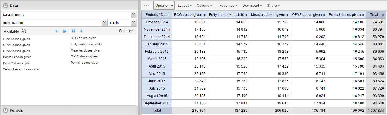
The left menu lists sections for all available data dimensions. From each section you can select any number of dimension items. As an example, you can open the section for data elements and select any number of data elements from the available list. You can select an item by marking it and clicking on the arrow in the section header or simply double-clicking on the item. Before you can use a data dimension in your pivot table you must at least select one dimension item. If you arrange a dimension as columns or rows but do not select any dimension items, the dimension is ignored.
You must choose at least one data dimension type to create a pivot table. The available types are described in this table:
| Data dimension type | Definition | Examples |
|---|---|---|
| Indicators | An indicator is a calculated formula based on data elements. | Coverage of immunization across a specific district. |
| Data elements | Represents the phenomenon for which data has been captured. | Number of malaria cases; number of BCG doses given. |
| Data sets | A collection of data elements grouped for data collection. You can select : * Reporting rates: the percentage of actual reports compared to the expected number of reports * Reporting rates on time: the reporting rates based on timely form submissions. A timely submission must happen within a number of days after the reporting period. * Actual reports: the actual number of reports * Actual reports on time: the actual number of reports based on timely form submissions. A timely submission must happen within a number of days after the reporting period. * Expected reports: the number of expected reports based on organisation units where the data set and the reporting frequency has been assigned. | Reporting rates for immunization and morbidity forms. |
| Event data items | A data element that is part of a program representing events that have been captured. | Average weight and height for children in a nutrition program. |
| Program indicators | A calculated formula based on data elements in a program representing events. | Average BMI score for children in a nutrition program. |
You can combine these dimensions to display for example aggregate data with reporting rates, or event data items together with program indicators, all in the same pivot tables. For the "data element" data dimension, you are also able to select "Totals" and "Details", which will allow you to view different category combination options together on the same pivot table.
For the period dimension you can choose between using fixed periods or relative periods. An example of a fixed period is "January 2012". To select fixed periods start by selecting a period type from the period type list. You can then select periods from the list of available periods.
Relative periods are periods relative to the current date. Examples of relative periods are "Last month", "Last 12 months", "Last 5 years". Relative periods can be selected by ticking the check-boxes next to each period. The main advantage of using relative periods is that when you save a pivot table favorite, it will stay updated with the latest data as time goes by without the need for constantly updating it.
For the organisation unit dimension you can select any number of organisation units from the hierarchy. To select all organisation units below a specific parent organisation unit, right click and click "Select all children". To manually select multiple organisation units, click and hold the Ctrl key while clicking on organisation units. You can tick "User org unit", "User sub-units" or "User sub-x2-units" in order to dynamically insert the organisation unit or units associated with your user account. This is useful when you save a pivot table favorite and want to share it with other users, as the organisation units linked with the other user's account will be used when viewing the favorite.
Dynamic dimensions can consist of organisation unit group sets, data element group sets, or category option group sets which have been configured with the type of "Disaggregation". Once the group sets have been configured, they will be come available in the pivot tables, and can be used as additional analysis dimensions, for instance to analyse aggregate data by Type of organisation unit or Implementing partner. Dynamic dimensions work the same as fixed dimensions.
Tip
Some dynamic dimensions may contain many items. This can cause issues with certain browsers due to the length of the URL when many dimension members are selected. A special "All" check box is available for dynamic dimensions, which allows you to include all available dimensions implicitly in your pivot table, without specifying each and every dimension member.
After selecting data dimensions it is time to arrange your pivot table. Click "Layout" in the top menu to open the layout screen. In this screen you can position your data dimensions as table columns, rows or filters by clicking and dragging the dimensions from the dimensions list to the respective column, row and filter lists. You can set any number of dimensions in any of the lists. For instance, you can click on "Organisation units" and drag it to the row list in order to position the organisation unit dimension as table rows. Note that indicators, data elements and data set reporting rates are part of the common "Data" dimension and will be displayed together in the pivot table. For instance, after selecting indicators and data elements in the left menu, you can drag "Organisation Unit" from the available dimensions list to the row dimension list in order to arrange them as rows in the pivot table.
After you have set up your pivot table you can click "Update" to render your pivot table, or click "Hide" to hide the layout screen without any changes taking effect. Since we in our example have selected both the period and organisation unit dimension as rows, the pivot table will generate all combinations of the items in these dimensions and produce a table like this:
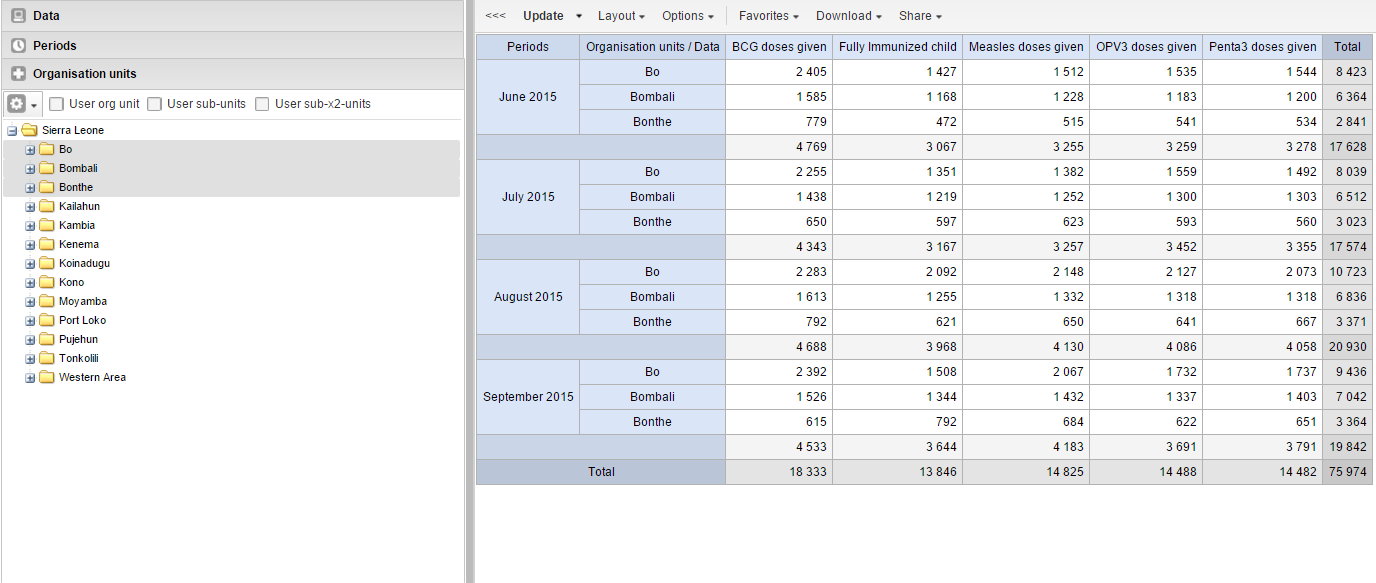
Open the Pivot Table app.
Create a new pivot table or open a favorite.
Click Options.
Set the options as required.
| Option | Description | |
|---|---|---|
| Data | Show column totals Show row totals | Displays total values in the table for each row and column, as well as a total for all values in the table. |
| Show column sub-totals Show row sub-totals | Displays subtotals in the table for each dimension. If you only select one dimension, subtotals will be hidden for those columns or rows. This is because the values will be equal to the subtotals. | |
| Show dimension labels | Shows the dimension names as part of the pivot tables. | |
| Hide empty rows | Hides empty rows from the table. This is useful when you look at large tables where a big part of the dimension items don't have data in order to keep the table more readable. | |
| Hide empty columns | Hides empty columns from the table. This is useful when you look at large tables where a big part of the dimension items don't have data in order to keep the table more readable. | |
| Skip rounding | Skips the rounding of data values, offering the full precision of data values. Can be useful for finance data where the full dollar amount is required. | |
| Aggregation type | The default aggregation operator can be over-ridden here, by selecting a different aggregation operator. Some of the aggregation types are Count, Min and Max. | |
| Number type | Sets the type of value you want to display in the pivot table: Value, Percentage of row or Percentage of column. The options Percentage of row and**Percentage of column** mean that you'll display values as percentages of row total or percentage of column total instead of the aggregated value. This is useful when you want to see the contribution of data elements, categories or organisation units to the total value. | |
| Measure criteria | Allows for the data to be filtered on the server side. You can instruct the system to return only records where the aggregated data value is equal, greater than, greater or equal, less than or less or equal to certain values. If both parts of the filter are used, it's possible to filter out a range of data records. | |
| Events | Include only completed events | Includes only completed events in the aggregation process. This is useful for example to exclude partial events in indicator calculations. |
| Organisation units | Show hierarchy | Shows the name of all ancestors for organisation units, for example "Sierra Leone / Bombali / Tamabaka / Sanya CHP" for Sanya CHP. The organisation units are then sorted alphabetically which will order the organisation units according to the hierarchy. When you download a pivot table with organisation units as rows and you've selected Show hierarchy, each organisation unit level is rendered as a separate column. This is useful for example when you create Excel pivot tables on a local computer. |
| Legend | Apply legend | Applies a legend to the values. This mean that you can apply a colour to the values. Select By data item to color the table cells individually according to each data element or indicator. You configure legends in the Maintenance app. |
| Style | Colors the text or background of cells in pivot tables based on the selected legend. You can use this option for scorecards to identify high and low values at a glance. | |
| Style | Display density | Controls the size of the cells in the table. You can set it to Comfortable, Normal or Compact. Compact is useful when you want to fit large tables into the browser screen. |
| Font size | Controls the size of the table text font. You can set it to Large, Normal or Small. | |
| Digit group separator | Controls which character to separate groups of digits or "thousands". You can set it to Comma, Space or None. | |
| General | Table title | Type a title here to display it above the table. |
| Parameters (for standard reports only) | Note You create standard reports in the Reports app. In the Pivot Table app you set which parameters the system should prompt the user for. | |
| Reporting period | Controls whether to ask user to enter a report period. | |
| Organisation unit | Controls whether to ask user to enter an organisation unit. | |
| Parent organisation unit | Controls whether to ask user to enter a parent organisation unit. | |
| Include regression | Includes a column with regression values to the pivot table. | |
| Include cumulative | Includes a column with cumulative values to the pivot table. | |
| Sort order | Controls the sort order of the values. | |
| Top limit | Controls the maximum number of rows to include in the pivot table. |
Click Update.
Saving your charts or pivot tables as favorites makes it easy to find them later. You can also choose to share them with other users as an interpretation or display them on the dashboard.
You view the details and interpretations of your favorites in the Pivot Table, Data Visualizer, Event Visualizer, Event Reports apps. Use the Favorites menu to manage your favorites.
Click Favorites > Open.
Enter the name of a favorite in the search field, or click Prev and Next to display favorites.
Click the name of the favorite you want to open.
Click Favorites > Save as.
Enter a Name and a Description for your favorite. The description field supports a rich text format, see the interpretations section for more details.
Click Save.
Click Favorites > Rename.
Enter the new name for your favorite.
Click Update.
An interpretation is a link to a resource with a description of the data at a given period. This information is visible in the Dashboard app. To create an interpretation, you first need to create a favorite. If you've shared your favorite with other people, the interpretation you write is visible to those people.
Click Favorites > Write interpretation.
In the text field, type a comment, question or interpretation. You can also mention other users with '@username'. Start by typing '@' plus the first letters of the username or real name and a mentioning bar will display the available users. Mentioned users will receive an internal DHIS2 message with the interpretation or comment. You can see the interpretation in the Dashboard app.
It is possible to format the text with bold, italic by using the Markdown style markers * and _ for bold and italic respectively. Keyboard shortcuts are also available: Ctrl/Cmd + B and Ctrl/Cmd + I. A limited set of smilies is supported and can be used by typing one of the following character combinations: :) :-) :( :-( :+1 :-1. URLs are automatically detected and converted into a clickable link.
Search for a user group that you want to share your favorite with, then click the + icon.
Change sharing settings for the user groups you want to modify.
Can edit and view: Everyone can view and edit the object.
Can view only: Everyone can view the object.
None: The public won't have access to the object. This setting is only applicable to Public access.
Click Share.
When you are subscribed to a favorite, you receive internal messages whenever another user likes/creates/updates an interpretation or creates/update an interpretation comment of this favorite.
Open a favorite.
Click >>> in the top right of the workspace.
Click on the upper-right bell icon to subscribe to this favorite.
Click Favorites > Get link.
Select one of the following:
Open in this app: You get a URL for the favorite which you can share with other users by email or chat.
Open in web api: You get a URL of the API resource. By default this is an HTML resource, but you can change the file extension to ".json" or ".csv".
Click Favorites > Delete.
Click OK.
To view interpretations for relative periods, such as a year ago:
Open a favorite with interpretations.
Click >>> in the top right of the workspace.
Click an interpretation. Your chart displays the data and the date based on when the interpretation was created.To view other interpretations, click them.
To download the data in the current pivot table:
Click Download.
Under Table layout, click the format you want to download: Microsoft Excel, CSV or HTML.
The data table will have one column per dimension and contain names of the dimension items.
Tip
When you download a pivot table with organisation units as rows and you've selected Show hierarchy in Table options, each organisation unit level is rendered as a separate column. This is useful for example when you create Excel pivot tables on a local computer.
Tip
You can create a pivot table in Microsoft Excel from the downloaded Excel file.
You can download data in the current pivot table in JSON, XML, Excel, and CSV as plain data formats with different identification schemes (ID, Code, and Name). The data document uses identifiers of the dimension items and opens in a new browser window to display the URL of the request to the Web API in the address bar. This is useful for developers of apps and other client modules based on the DHIS2 Web API or for those who require a plan data source, for instance for import into statistical packages.
To download plain data source formats:
Click Download.
Under Plain data source, click the format you want to download.
| Format | Action | Description |
|---|---|---|
| JSON | Click JSON | Downloads JSON format based on ID property. You can also download JSON format based on Code or Name property. |
| XML | Click XML | Downloads XML format based on ID property. You can also download XML format based on Code or Name property. |
| Microsoft Excel | Click Microsoft Excel | Downloads XML format based on ID property. You can also download Microsoft Excel format based on Code or Name property. |
| CSV | Click CSV | Downloads CSV format based on ID property. You can also download CSV format based on Code or Name property. |
| JRXML | Put the cursor on Advanced and click JRXML | Produces a template of a Jasper Report which can be further customized based on your exact needs and used as the basis for a standard report in DHIS2. |
| Raw data SQL | Put the cursor on Advanced and click Raw data SQL | Provides the actual SQL statement used to generate the pivot table. You can use it as a data source in a Jasper report, or as the basis for an SQL view. |
You can download data in CSV format directly without rendering the data in the web browser. This helps to reduce any constraints in the system settings that has been set with regards to the maximum number of analytic records. This lets you download much larger batches of data that you can use for later offline analysis.
To download data in CSV format without first rendering data in the web browser:
Click the arrow beside Update.
Click CSV to download the format based on ID property.
The file downloads to your computer.
Tip
You can also download CSV format based on Code or Name property.
Certain analysis-related resources in DHIS2, like pivot tables, charts and maps, can be embedded in any web page by using a plug-in. You will find more information about the plug-ins in the Web API chapter in the DHIS2 Developer Manual.
To generate a HTML fragment that you can use to display the pivot table in an external web page:
Click Embed.
Click Select to highlight the HTML fragment.
When you have made a pivot table you can switch between pivot table, chart and map visualization of your data.
Click Chart > Open this table as chart.
Your current pivot table opens as a chart.
If you want to visualize a small part of your pivot table as a chart you can click directly on a value in the table instead opening the whole table.
In the pivot table, click a value.
To verify the selection, hold the cursor over Open selection as chart. The highlighted dimension headers in the table indicate what data will be visualized as a chart.
Click Open selection as chart.
Click Chart > Open this table as map
Your current pivot table opens as a map.
In the pivot table, click a value.
A menu displays.
Click Open selection as map.
Your selection opens as a map.

With the Event Reports app you can analyse events in two types of reports:
Aggregated event reports: Pivot table-style analysis with aggregated numbers of events
By selecting Aggregated values from the top-left menu you can use the Event Reports app to create pivot tables with aggregated numbers of events. An event report is always based on a program. You can do analysis based on a range of dimensions. Each dimension can have a corresponding filter. Dimensions can be selected from the left-side menu. Similar to the pivot tables app, aggregated event reports may be limited by the amount of RAM accessible by the browser. If your requested table exceeds a set size, you will recieve a warning prompt asking whether or not you want to continue.
Individual event reports: Lists of events
By selecting Events from the top-left menu you can use the Event Reports app to make searches or queries for events based on a flexible set of criteria. The report will be displayed as a table with one row per event. Each dimension can be used as a column in the table or as a filter. Each dimension can have a criteria (filter). Data elements of type option set allows for "in" criteria, where multiple options can be selected. Numeric values can be compared to filter values using greater than, equal or less than operators.
Open the Event Reports app.
Select Aggregated values or Events.
In the menu to the left, select the meta data you want to analyse.
Click Layout and arrange the dimensions.
You can keep the default selection if you want.
Click Update.
An event report is always based on a program and you can do analysis based on a range of dimensions. For programs with category combinations, you can use program categories and category option group sets as dimensions for tables and charts. Each dimension item can have a corresponding filter.
Select data elements:
Click Data.
Select a program and a program stage.
The data elements associated with the selected program are listed under Available. Each data element acts as a dimension.
Select the data elements you need by double-clicking their names.
Data elements can be filtered by type (Data elements, Program attributes, Program indicators) and are prefixed to make them easily recognizable.
After selecting a data element, it is visible under Selected data items.
(Optional) For each data element, specify a filter with operators such as "greater than", "in" or "equal" together with a filter value.
Select periods.
Click Periods.
Select one or several periods.
You have three period options: relative periods, fixed periods and start/end dates. You can combine fixed periods and relative periods in the same chart. You cannot combine fixed periods and relative periods with start/end dates in the same chart. Overlapping periods are filtered so that they only appear once.
Fixed periods: In the Select period type box, select a period type. You can select any number of fixed periods from any period type. Fixed periods can for example be "January 2014".
Relative periods: In the lower part of the Periods section, select as many relative periods as you like. The names are relative to the current date. This means that if the current month is March and you select Last month, the month of February is included in the chart. Relative periods has the advantage that it keeps the data in the report up to date as time goes.
Start/end dates: In the list under the Periods tab, select Start/end dates. This period type lets you specify flexible dates for the time span in the report.
Select organisation units.
Click Organisation units.
Click the gearbox icon.
Select a Selection mode and an organisation unit.
There are three different selection modes:
| Selection mode | Description |
|---|---|
| Select organisation units | Lets you select the organisation units you want to appear in the chart from the organization tree. Select User org unit to disable the organisation unit tree and only select the organisation unit that is related to your profile. Select User sub-units to disable the organisation unit tree and only select the sub-units of the organisation unit that is related to your profile. Select User sub-x2-units to disable the organisation unit tree and only select organisation units two levels down from the organisation unit that is related to your profile. This functionality is useful for administrators to create a meaningful "system" favorite. With this option checked all users find their respective organisation unit when they open the favorite. |
| Select levels | Lets you select all organisation units at one or more levels, for example national or district level. You can also select the parent organisation unit in the tree, which makes it easy to select for example, all facilities inside one or more districts. |
| Select groups | Lets you select all organisation units inside one or several groups and parent organisation units at the same time, for example hospitals or chiefdoms. |
Click Update.
You can define which data dimension you want to appear as columns, rows and filters in the pivot table. Each data element appears as individual dimensions and can be placed on any of the axes.
Note
Data elements of continuous value types (real numbers/decimal numbers) can only be used as filters, and will automatically be positioned as filters in the layout dialog. The reason for this is that continuous number cannot be grouped into sensible ranges and used on columns and rows.
Click Layout.
Drag and drop the dimensions to the appropriate space.
Click Update.
You can customize the display of an event report.
Click Options.
Set the options as required. Available options are different between aggregated event reports and individual event reports.
| Option | Description | Available for report type | |
|---|---|---|---|
| Data | Show column totals | Displays totals at the end of each column in the pivot table. | Aggregated event report |
| Show column sub-totals | Displays sub-totals for each column in the pivot table. | Aggregated event report | |
| Show row totals | Displays totals at the end of each row in the pivot table. | Aggregated event report | |
| Show row sub-totals | Displays sub-totals for each row in the pivot table. | Aggregated event report | |
| Show dimension labels | Displays labels for dimensions. | Aggregated event report | |
| Hide empty rows | Hides empty rows in the pivot table. | Aggregated event report | |
| Hide n/a data | Hides data tagged as N/A from the chart. | Aggregated event report | |
| Include only completed events | Includes only completed events in the aggregation process. This is useful when you want for example to exclude partial events in indicator calculations. | Aggregated event report Individual event report | |
| Limit | Sets a limit of the maximum number of rows that you can display in the table, combined with a setting for showing top or bottom values. | Aggregated event report | |
| Output type | Defines the output type. The output types are Event, Enrollment and Tracked entity instance. | Aggregated event report | |
| Program status | Filters data based on the program status: All, Active, Completed or Cancelled. | Aggregated event report | |
| Event status | Filters data based on the event status: All, Active, Completed, Scheduled, Overdue or Skipped. | Aggregated event report | |
| Organisation units | Show hierarchy | Includes the names of all parents of each organisation unit in labels. | Aggregated event report |
| Style | Display density | Controls the size of the cells in the table. You can set it to Comfortable, Normal or Compact. Compact is useful when you want to fit large tables into the browser screen. | Aggregated event report Individual event report |
| Font size | Controls the size of the table text font. You can set it to Large, Normal or Small. | Aggregated event report Individual event report | |
| Digit group separator | Controls which character to separate groups of digits or "thousands". You can set it to Comma, Space or None. | Aggregated event report Individual event report |
Click Update.
You can download the data source behind an event report in HTML, JSON, XML, Microsoft Excel or CSV formats.
Click Download.
Under Plain data source, click the format you want to download.
| Format | Description |
|---|---|
| HTML | Creates HTML table based on selected meta data |
| JSON | Downloads data values in JSON format based on selected meta data |
| XML | Downloads data values in XML format based on selected meta data |
| Microsoft Excel | Downloads data values in Microsoft Excel format based on selected meta data |
| CSV | Downloads data values in CSV format based on selected meta data |
Saving your charts or pivot tables as favorites makes it easy to find them later. You can also choose to share them with other users as an interpretation or display them on the dashboard.
You view the details and interpretations of your favorites in the Pivot Table, Data Visualizer, Event Visualizer, Event Reports apps. Use the Favorites menu to manage your favorites.
Click Favorites > Open.
Enter the name of a favorite in the search field, or click Prev and Next to display favorites.
Click the name of the favorite you want to open.
Click Favorites > Save as.
Enter a Name and a Description for your favorite. The description field supports a rich text format, see the interpretations section for more details.
Click Save.
Click Favorites > Rename.
Enter the new name for your favorite.
Click Update.
An interpretation is a link to a resource with a description of the data at a given period. This information is visible in the Dashboard app. To create an interpretation, you first need to create a favorite. If you've shared your favorite with other people, the interpretation you write is visible to those people.
Click Favorites > Write interpretation.
In the text field, type a comment, question or interpretation. You can also mention other users with '@username'. Start by typing '@' plus the first letters of the username or real name and a mentioning bar will display the available users. Mentioned users will receive an internal DHIS2 message with the interpretation or comment. You can see the interpretation in the Dashboard app.
It is possible to format the text with bold, italic by using the Markdown style markers * and _ for bold and italic respectively. Keyboard shortcuts are also available: Ctrl/Cmd + B and Ctrl/Cmd + I. A limited set of smilies is supported and can be used by typing one of the following character combinations: :) :-) :( :-( :+1 :-1. URLs are automatically detected and converted into a clickable link.
Search for a user group that you want to share your favorite with, then click the + icon.
Change sharing settings for the user groups you want to modify.
Can edit and view: Everyone can view and edit the object.
Can view only: Everyone can view the object.
None: The public won't have access to the object. This setting is only applicable to Public access.
Click Share.
When you are subscribed to a favorite, you receive internal messages whenever another user likes/creates/updates an interpretation or creates/update an interpretation comment of this favorite.
Open a favorite.
Click >>> in the top right of the workspace.
Click on the upper-right bell icon to subscribe to this favorite.
Click Favorites > Get link.
Select one of the following:
Open in this app: You get a URL for the favorite which you can share with other users by email or chat.
Open in web api: You get a URL of the API resource. By default this is an HTML resource, but you can change the file extension to ".json" or ".csv".
Click Favorites > Delete.
Click OK.
To view interpretations for relative periods, such as a year ago:
Open a favorite with interpretations.
Click >>> in the top right of the workspace.
Click an interpretation. Your chart displays the data and the date based on when the interpretation was created.To view other interpretations, click them.
When you have made an event report you can open it as a chart:
Click Chart > Open this chart as table.
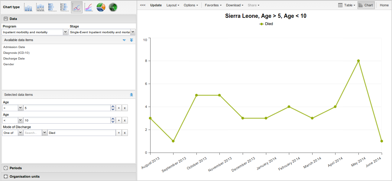
With the Event Visualizer app, you can create charts based on event data.
Open the Event Visualizer app and select a chart type.
In the menu to the left, select the meta data you want to analyse.
Click Layout and arrange the dimensions.
You can keep the default selection if you want.
Click Update.
The Event Visualizer app has eight different chart types, each with different characteristics. To select a chart type:
In Chart type, click the chart type you need.
| Chart type | Description |
|---|---|
| Column chart | Displays information as vertical rectangular columns with lengths proportional to the values they represent. Useful when you want to, for example, compare performance of different districts. |
| Stacked column chart | Displays information as vertical rectangular columns, where bars representing multiple categories are stacked on top of each other. Useful when you want to, for example, display trends or sums of related data elements. |
| Bar chart | Same as column chart, only with horizontal bars. |
| Stacked bar chart | Same as stacked column chart, only with horizontal bars. |
| Line chart | Displays information as a series of points connected by straight lines. Also referred to as time series. Useful when you want to, for example, visualize trends in indicator data over multiple time periods. |
| Area chart | Is based on line chart, with the space between the axis and the line filled with colors and the lines stacked on top of each other. Useful when you want to compare the trends of related indicators. |
| Pie chart | Circular chart divided into sectors (or slices). Useful when you want to, for example, visualize the proportion of data for individual data elements compared to the total sum of all data elements in the chart. |
| Radar chart | Displays data on axes starting from the same point. Also known as spider chart. |
Click Update.
An event chart is always based on a program and you can do analysis based on a range of dimensions. For programs with category combinations, you can use program categories and category option group sets as dimensions for tables and charts. Each dimension item can have a corresponding filter. You select dimension items from the left-side menu.
Select data elements:
Click Data.
Select a program and a program stage.
The data elements associated with the selected program are listed under Available. Each data element acts as a dimension.
Select the data elements you need by double-clicking their names.
Data elements can be filtered by type (Data elements, Program attributes, Program indicators) and are prefixed to make them easily recognizable.
After selecting a data element, it is visible under Selected data items.
(Optional) For each data element, specify a filter with operators such as "greater than", "in" or "equal" together with a filter value.
Select periods.
Click Periods.
Select one or several periods.
You have three period options: relative periods, fixed periods and start/end dates. You can combine fixed periods and relative periods in the same chart. You cannot combine fixed periods and relative periods with start/end dates in the same chart. Overlapping periods are filtered so that they only appear once.
Fixed periods: In the Select period type box, select a period type. You can select any number of fixed periods from any period type. Fixed periods can for example be "January 2014".
Relative periods: In the lower part of the Periods section, select as many relative periods as you like. The names are relative to the current date. This means that if the current month is March and you select Last month, the month of February is included in the chart. Relative periods has the advantage that it keeps the data in the report up to date as time goes.
Start/end dates: In the list under the Periods tab, select Start/end dates. This period type lets you specify flexible dates for the time span in the report.
Select organisation units.
Click Organisation units.
Click the gearbox icon.
Select a Selection mode and an organisation unit.
There are three different selection modes:
| Selection mode | Description |
|---|---|
| Select organisation units | Lets you select the organisation units you want to appear in the chart from the organization tree. Select User org unit to disable the organisation unit tree and only select the organisation unit that is related to your profile. Select User sub-units to disable the organisation unit tree and only select the sub-units of the organisation unit that is related to your profile. Select User sub-x2-units to disable the organisation unit tree and only select organisation units two levels down from the organisation unit that is related to your profile. This functionality is useful for administrators to create a meaningful "system" favorite. With this option checked all users find their respective organisation unit when they open the favorite. |
| Select levels | Lets you select all organisation units at one or more levels, for example national or district level. You can also select the parent organisation unit in the tree, which makes it easy to select for example, all facilities inside one or more districts. |
| Select groups | Lets you select all organisation units inside one or several groups and parent organisation units at the same time, for example hospitals or chiefdoms. |
Click Update.
You can define which data dimension you want to appear as series, category and filter. Each data element appears as individual dimensions and can be placed on any of the axes. Series and category panels can only have one dimension at the time.
Note
Data elements of continuous value types (real numbers/decimal numbers) can only be used as filters, and will automatically be positioned as filters in the layout dialog. The reason for this is that continuous number cannot be grouped into sensible ranges and used on columns and rows.
Click Layout.
Drag and drop the dimensions to the appropriate space. Only one dimension can be in each section.
Click Update.
You can customize the display of an event report.
Click Options.
Set the options as required.
| Option | Description | |
|---|---|---|
| Data | Show values | Displays values as numbers on top of each series. |
| Use 100% stacked values | Displays 100 % stacked values in column charts. | |
| Use cumulative values | Displays cumulative values in line charts. | |
| Hide n/a data | Hides data tagged as N/A from the chart. | |
| Include only completed events | Includes only completed events in the aggregation process. This is useful when you want for example to exclude partial events in indicator calculations. | |
| Hide empty categories | Hides the category items with no data from the chart. None: doesn't hide any of the empty categories Before first: hides missing values only before the first value After last: hides missing values only after the last value Before first and after last: hides missing values only before the first value and after the last value All: hides all missing values This is useful for example when you create column and bar charts. | |
| Trend line | Displays the trend line which visualizes how your data evolves over time. For example if performance is improving or deteriorating. Useful when periods are selected as category. | |
| Target line value/title | Displays a horizontal line and title (optional) at the given domain value. Useful for example when you want to compare your performance to the current target. | |
| Base line value/title | Displays a horizontal line and title (optional) at the given domain value. Useful for example when you want to visualize how your performance has evolved since the beginning of a process. | |
| Sort order | Allows you to sort the values on your chart from either low to high or high to low. | |
| Output type | Defines the output type. The output types are Event, Enrollment and**Tracked entity instance**. | |
| Program status | Filters data based on the program status: All, Active, Completed or Cancelled. | |
| Event status | Filters data based on the event status: All, Active, Completed, Scheduled, Overdue or Skipped. | |
| Axes | Range axis min/max | Defines the maximum and minimum value which will be visible on the range axis. |
| Range axis tick steps | Defines the number of ticks which will be visible on the range axis. | |
| Range axis decimals | Defines the number of decimals which will be used for range axis values. | |
| Range axis title | Type a title here to display a label next to the range axis (also referred to as the Y axis). Useful when you want to give context information to the chart, for example about the unit of measure. | |
| Domain axis title | Type a title here to display a label below the domain axis (also referred to as the X axis). Useful when you want to give context information to the chart, for example about the period type. | |
| General | Hide chart legend | Hides the legend and leaves more room for the chart itself. |
| Hide chart title | Hides the title (default or custom) of your chart. | |
| Chart title | Type a title here to display a custom title above the chart. If you don't enter a title, the default title is displayed. | |
| Hide chart subtitle | Hides the subtitle of your chart. | |
| Chart subtitle | Type a subtitle here to display a custom subtitle above the chart but below the title. If you don't enter a subtitle, no subtitle is displayed in the chart. |
Click Update.
After you have created a chart you can download it to your local computer as an image or PDF file.
Click Download.
Under Graphics, click PNG (.png) or PDF (.pdf).
The file is automatically downloaded to your computer. Now you can for example embed the image file into a text document as part of a report.
You can download the data source behind a chart in HTML, JSON, XML, Microsoft Excel or CSV formats. The data document uses identifiers of the dimension items and opens in a new browser window to display the URL of the request to the Web API in the address bar. This is useful for developers of apps and other client modules based on the DHIS2 Web API or for those who require a plan data source, for instance for import into statistical packages.
To download plain data source formats:
Click Download.
Under Plain data source, click the format you want to download.
| Format | Description |
|---|---|
| HTML | Creates HTML table based on selected meta data |
| JSON | Downloads data values in JSON format based on selected meta data |
| XML | Downloads data values in XML format based on selected meta data |
| Microsoft Excel | Downloads data values in Microsoft Excel format based on selected meta data |
| CSV | Downloads data values in CSV format based on selected meta data |
Saving your charts or pivot tables as favorites makes it easy to find them later. You can also choose to share them with other users as an interpretation or display them on the dashboard.
You view the details and interpretations of your favorites in the Pivot Table, Data Visualizer, Event Visualizer, Event Reports apps. Use the Favorites menu to manage your favorites.
Click Favorites > Open.
Enter the name of a favorite in the search field, or click Prev and Next to display favorites.
Click the name of the favorite you want to open.
Click Favorites > Save as.
Enter a Name and a Description for your favorite. The description field supports a rich text format, see the interpretations section for more details.
Click Save.
Click Favorites > Rename.
Enter the new name for your favorite.
Click Update.
An interpretation is a link to a resource with a description of the data at a given period. This information is visible in the Dashboard app. To create an interpretation, you first need to create a favorite. If you've shared your favorite with other people, the interpretation you write is visible to those people.
Click Favorites > Write interpretation.
In the text field, type a comment, question or interpretation. You can also mention other users with '@username'. Start by typing '@' plus the first letters of the username or real name and a mentioning bar will display the available users. Mentioned users will receive an internal DHIS2 message with the interpretation or comment. You can see the interpretation in the Dashboard app.
It is possible to format the text with bold, italic by using the Markdown style markers * and _ for bold and italic respectively. Keyboard shortcuts are also available: Ctrl/Cmd + B and Ctrl/Cmd + I. A limited set of smilies is supported and can be used by typing one of the following character combinations: :) :-) :( :-( :+1 :-1. URLs are automatically detected and converted into a clickable link.
Search for a user group that you want to share your favorite with, then click the + icon.
Change sharing settings for the user groups you want to modify.
Can edit and view: Everyone can view and edit the object.
Can view only: Everyone can view the object.
None: The public won't have access to the object. This setting is only applicable to Public access.
Click Share.
When you are subscribed to a favorite, you receive internal messages whenever another user likes/creates/updates an interpretation or creates/update an interpretation comment of this favorite.
Open a favorite.
Click >>> in the top right of the workspace.
Click on the upper-right bell icon to subscribe to this favorite.
Click Favorites > Get link.
Select one of the following:
Open in this app: You get a URL for the favorite which you can share with other users by email or chat.
Open in web api: You get a URL of the API resource. By default this is an HTML resource, but you can change the file extension to ".json" or ".csv".
Click Favorites > Delete.
Click OK.
To view interpretations for relative periods, such as a year ago:
Open a favorite with interpretations.
Click >>> in the top right of the workspace.
Click an interpretation. Your chart displays the data and the date based on when the interpretation was created.To view other interpretations, click them.
When you have made a chart you can open it as a pivot table:
Click Chart > Open this chart as table.
The reports app allows for canned, standard reports, data set reports, resources and org unit distribution reports.
You access the available reports by navigating to Apps->Reports. In the report menu in the left bar, click Standard Report. A list of all pre-defined reports will appear in the main window.
You run/view a report by clicking on the triple-dot icon of the report and then selecting "Create" from the contextual menu. If there are any pre-defined parameters, you will see a report parameter window where you must fill in the values needed for orgunit and/or reporting month, depending on what has been defined in the underlying report table(s). Click on "Generate Report" when you are ready. The report will either appear directly in your browser or be available as a PDF file for download, depending on your browser settings for handling PDF files. You can save the file and keep it locally on your computer for later use.
Dataset reports are printer friendly views of the data entry screen filled with either raw or aggregated data.
You can access data set reports from Apps->Reports.
A Criteria window will appear where you fill in the details for your report:
Dataset: The data set you want to display.
Report period: The actual period you want data for. This can be aggregated as well as raw periods. This means that you can ask for a quarterly or annual report even though the data set is collected monthly. A data set's period type (collection frequency) is defined in data set maintenance. First select the period type (Monthly, Quarterly, Yearly etc.) in the drop down next to Prev and Next buttons, and then select one of the available periods from the dropdown list below. Use Prev and Next to jump one year back or forward.
Use data for selected unit only: Use this option if you want a report for an orgunit that has children, but only want the data collected directly for this unit and not the data collected by its children. If you want a typical aggregated report for an orgunit you do not want to tick this option.
Report Organisation unit: Here you select the orgunit you want the report for. This can be at any level in the hierarchy as the data will be aggregated up to this level automatically (if you do not tick the option above).
When you are done filling in the report criteria you click on "Generate". The report will appear as HTML in a printer-friendly format. Use the print and save as functions in the browser to print or save (as HTML) the report.You can also export the data set report in Excel and PDF formats.
Access the reporting rate summary from the Apps->Reports menu. Reporting rate summaries will show how many datasets (forms) that have been submitted by organisation unit and period.
The reporting rate is calculation is based on complete data set registrations. A complete data set registration refers to a user marking a data entry form as complete, typically by clicking the complete button in the data entry screen, hereby indicating to the system that she considers the form to be complete. This is i.e. a subjective approach to calculating completeness.
The reporting rate summary will for each row show a range of measures:
Actual reports: Indicates the number of data entry complete registrations for the relevant data set.
Expected reports: Indicates how many data entry complete registrations are expected. This number is based on the number of organisation units the relevant data set has been assigned to (enabled for data entry).
Reporting rate: The percentage of reports registered as complete based on the number expected.
Reports on time: Same as actual reports, only reports registered as complete within the maximum number of days after the end of the reporting period. This number of days after reporting period can be defined per data set in the data set management.
Reporting rate on time: Same as percentage, only reports registered as complete on time used as numerator.
To run the report you can follow these steps:
Select an orgunit from the tree.
Select a data set.
Select a period type and a period from the list of available periods for that period type.
The report will then be rendered. Change any of the parameters above and click "Get report" again see the corresponding results.
The resource tool allows you to upload both files from your local computer to the DHIS server and to add links to other resources on the Internet through URLs. If cloud storage is configured for your system, resources will be saved there.
To create a new resource:
Open the Reports app and click Resource.
Click Add new.
Enter a Name.
Select a Type: Upload file or External URL.
Click Save.
You can access the Orgunit Distribution reports from the left side menu in the Apps->Reports.
Orgunit distribution reports are reports that show how the orgunits are distributed on various properties like type and ownership, and by geographical areas.
The result can be presented in a table-based report or in a chart.
Running a report:
To run a report first select an orgunit in the upper left side orgunit tree. The report will be based on orgunits located under the selected orgunit. The select the orgunit group set that you want to use, typically these are Type, Ownership, Rural/Urban, but can be any user-defined orgunit group set. The you can click on either Get Report to get the table-based presentation or Get chart to get the same result in a chart. You can also download the table-based report as Excel or CSV.
Within DHIS2 you can send messages and feedback messages to users, user groups and organisation units. When you send a feedback message, it is routed to a particular user group called the feedback recipient group. If you are a member of this user group, you have access to feedback handling tools. You can, for example, set the status of an incoming feedback to "Pending" while you are waiting for information.
In addition to the user-to-user and feedback messages, depending on your configuration the system will also send you system-generated messages. These messages could be triggered by different events, including system or background job failures and validation analysis results. Feedback handling tools are also available for validation results and the priority will be set to the importance of the validation rule violated.
To visit the app click message icon in header bar or find the Messaging app in the app search box.
Note
Messages and feedback messages are not sent to users' e-mail addresses, the messages only appear within DHIS2.
With 2.30 we introduced a new messaging app which offers a richer messaging experience. Specifically:
- Switch between list view and compact view by clicking the icon in the top right corner.
- The list view is simplistic and gives a good overview of all messages and is especially suited for feedback and validation messages.
- The compact view is a modern way of view messages where the user has more information in one view, hence viewing and replying several messages is easier.
The first screenshot in this section displays list view, while the screenshot in section Read a message displays the compact view.
A new search field is added which enables the user to search for messages. The search filters messages on different message attributes; subject, text and senders. This implies that you are able to narrow down the message conversation list by entering a search.
A auto refresh feature is added so that the app fetches new messages at a set interval, every 5 minutes. This feature is disabled by default.
For every message conversation you are able to add participants to the conversation. This is very useful if you want input on that particular conversation or if someone should also see the information. It is not possible to delete participants from a conversation.
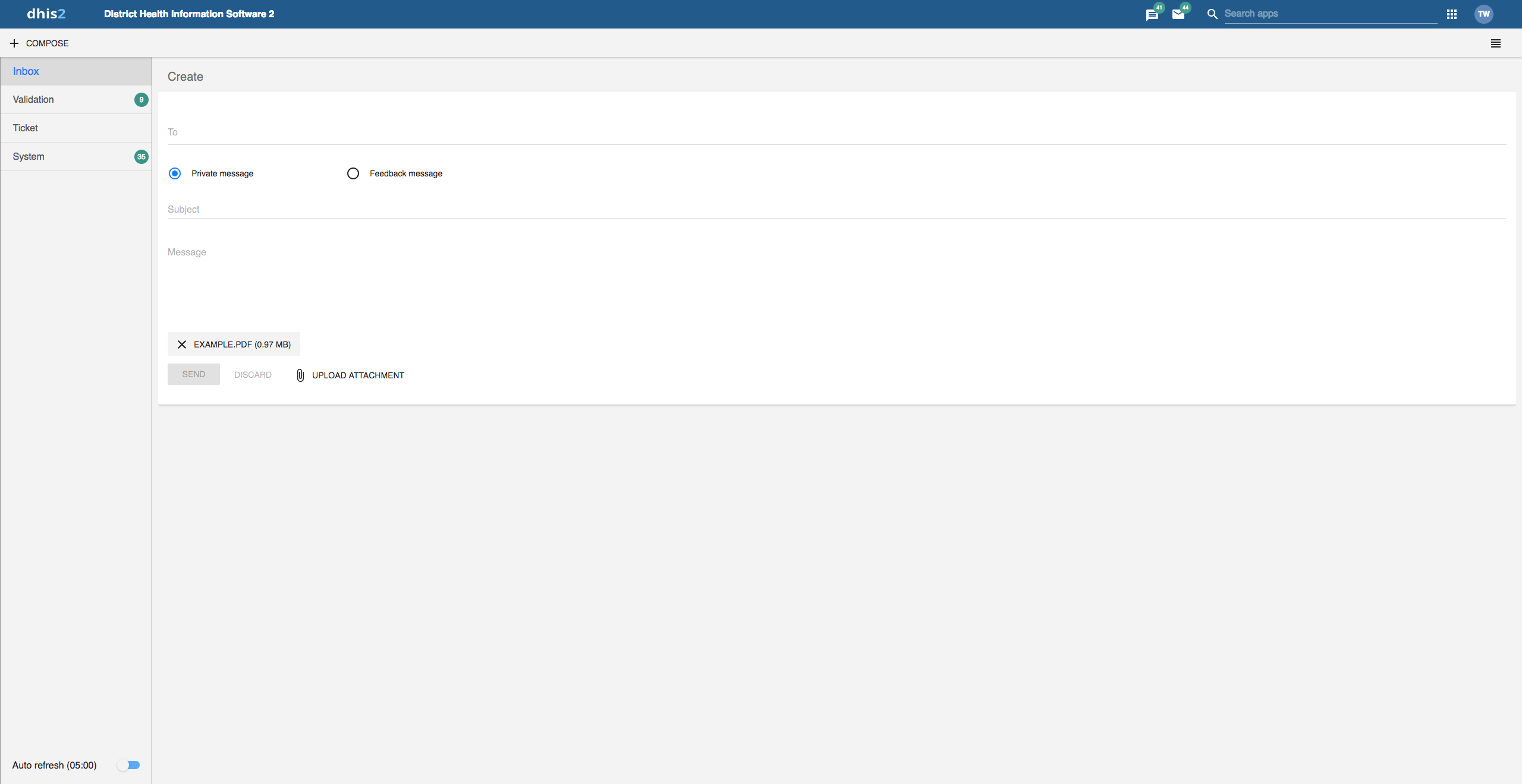
Click Compose.
Define who you want to receive the message. You can send a message to organisation units, users and user groups.
Type a subject and a message.
Click Send.
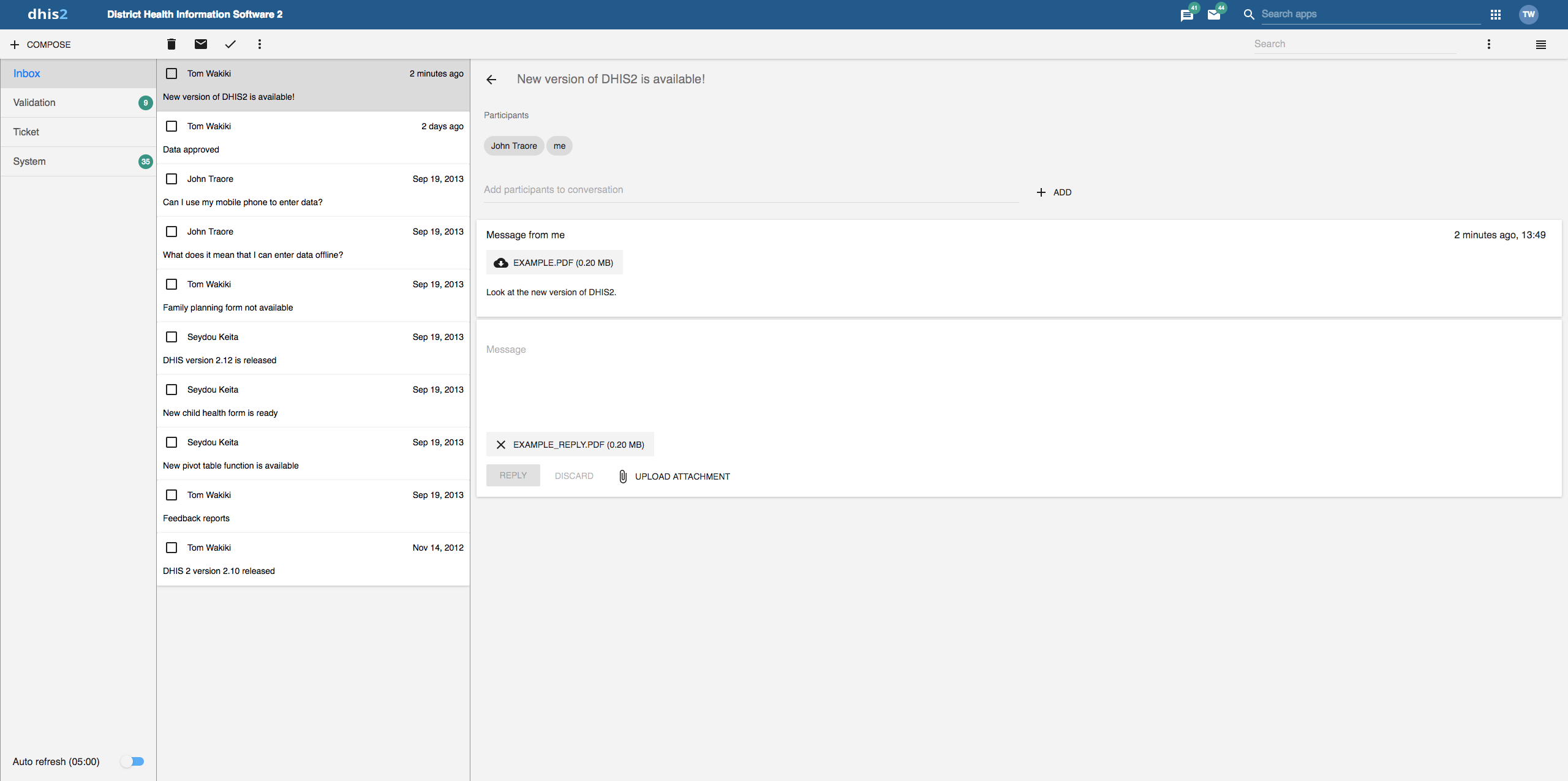
Select the appropriate message type to the left.
Click a message.
If the message is part of a conversation, you will see all messages in this conversation.
Follow the steps as for creating a message, only selecting Feedback message instead of entering recipients.
The message will be created as a feedback message and will appear in all of the specified users' Ticket folder.
With 2.31 we introduced attachments to messages. When creating or replying to a message conversation you have the possibility to add attachments. Currently there are no limitations to type or size of the file.
Note
You will only see feedback messages and have access to the extended handling tools if you are a member of the user group that is set up to handle feedback messages.
With the new app you manage extended tools for tickets and validation messages through the icon menu which appears when viewing a message or checking of messages in the conversation list.
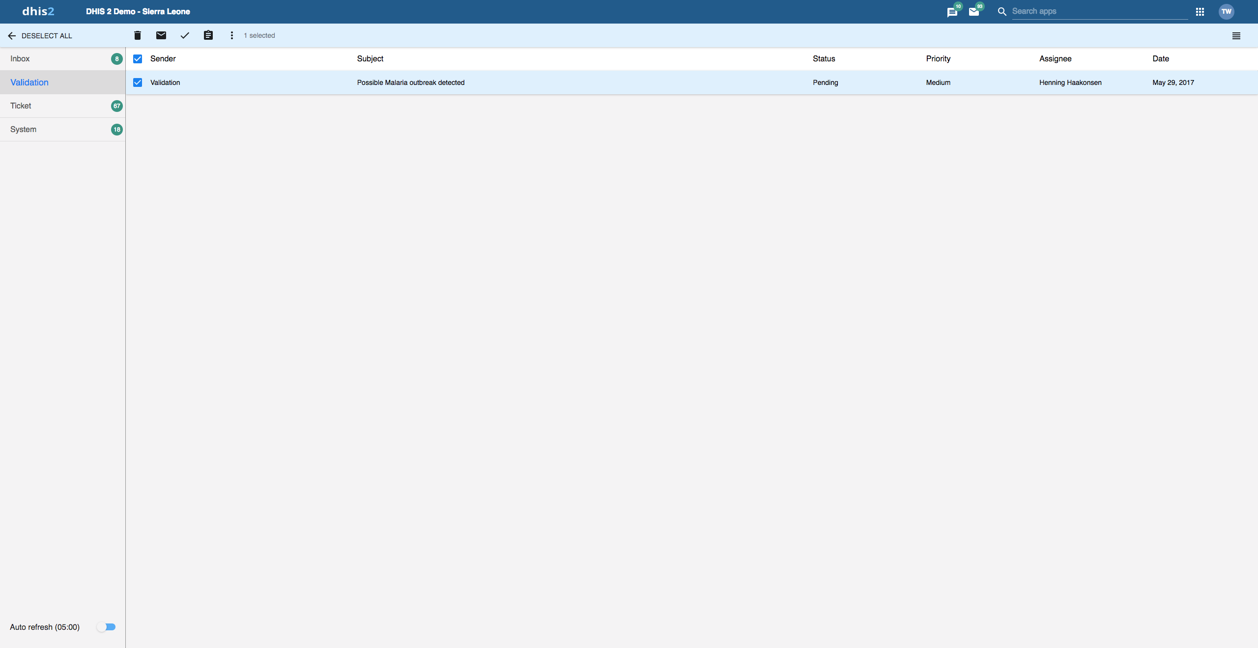

You will receive feedback messages to your Ticket folder and validation messages to your Validation folder. For feedback and validation messages you have the following options in addition to the messages options:
| Function | Description |
|---|---|
Priority | You can mark a feedback/validation message with different priorities: None, Low, Medium or High. Setting the priority makes it easier to keep track of which feedback message you need resolved first, and which feedback messages that can wait. |
Status | All feedback/validation messages get the status Open when created. To keep track of existing feedback messages, you can change the status to Pending, Invalid or Solved. You can filter feedback/validation messages based on their status with the two drop down menus in the internal header bar. |
Assigned to | You can assign a feedback message to any member of the user group that is set up to handle feedback messages. You can assign a validation message to any user in the system. - means that you haven't assigned a user to the feedback message. |
Internal reply | When you work in a feedback handling team you might want to discuss the feedback before sending an answer to the sender. You can keep this discussion in the same message conversation as the feedback itself. To send a reply that within the feedback handling user group, click INTERNAL REPLY. |
To configure the feedback message function, you must:
Create a user group (for example "Feedback message recipients") that contains all the users who should receive feedback messages.
Open the System Settings app and click General > Feedback recipients and select the user group you created in the previous step.
In Edit user profile, you can update personal information like your email address, mobile number, date of birth, profile picture, and more. These details are visible to others when you send messages. You can also provide account names for direct messaging services used by the system. If your email address is set and the system is configured to send emails, a Verify Email button will appear next to your email address.
If your email is set and email notifications are enabled, you can verify your email here. An unverified email will trigger a warning, and you may be restricted from certain actions that require verification.
In Edit user settings, you can change the display language of DHIS2 and the language of the database. The database language is the translated content of the metadata, such as data elements and indicators. You can also choose a display style, and enable or disable SMS and email notifications. If you wish to, you can choose to display a short name, such as "Joe" in the analysis modules, rather than your full name.
In Edit account settings, you can reset your password and set up 2-Factor Authentication (2FA). Depending on your system configuration, you can choose between methods like TOTP or email-based verification to complete the setup.
In the View full profile section, you find a summary of your profile details. This section includes a few fields that you cannot edit yourself, such as user roles and user organisation units.
In Manage personal access tokens you can view the existing personal access tokens, revoke existing tokens and generate new ones. Personal access tokens are an alternative to using passwords for authentication and useful for providing (restricted) access to scripts and external applications. Note that the values of newly generated personal access tokens are only visible right after generating.
In the About DHIS2 section, you find a list of details about the DHIS2 instance.
Two-Factor Authentication (2FA) is an extra layer of security for your DHIS2 account. When 2FA is enabled, you’ll need to provide a second verification method (in addition to your password) to access your account. The available methods for 2FA are:
Note: 2FA is highly recommended for added account security.
To enable or disable 2FA on your account, follow these steps:
Depending on your DHIS2 instance’s configuration, you may have one or both of the following 2FA options available:
The system will display the available 2FA options based on what has been configured by your administrator.
Tip: If both TOTP and email-based 2FA are available, you’ll need to choose which one to set up.
If you have not set up 2FA yet, you will be presented with the following flow:
If you choose to set up email-based 2FA, the following steps will apply:
Email Verification: If your email has not been verified yet, you will receive a warning informing you that you must first verify your email address before enabling email-based 2FA.
Enter the Code: After verifying your email, a code will be sent to your email address. Enter the code into the provided field on the 2FA settings page to complete the setup.
If you have already enabled 2FA, the system will show the current method that is set up. If the system allows both TOTP and email-based 2FA, you will see a radio button with your current selection (either TOTP or email). The option will be disabled, indicating your current 2FA method.
If you wish to disable 2FA, follow these steps:
Important Notes
Single 2FA Configuration at a Time: You can only have one method of 2FA enabled at a time (either TOTP or email). If both methods are available, you will be required to choose one to configure and use.
Email Verification Required for Email-based 2FA: Before enabling email-based 2FA, make sure your email address is verified. You won’t be able to set up email-based 2FA until this step is completed.
For detailed information on the 2FA setup for your system, refer to the system settings section or contact your DHIS2 administrator.