Vizualizujte statistiky využití
O aplikaci Použití Analytiky
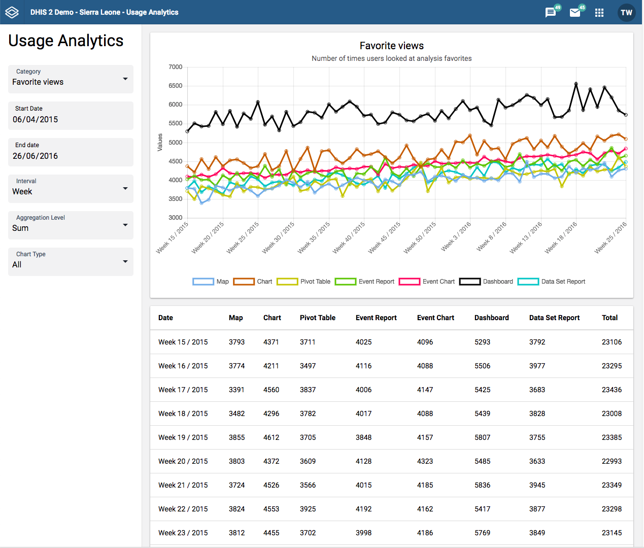
The Usage Analytics app lets you visualize statistics on how users are working with the Dashboard, GIS, Event Visualizer, Data Visualizer and Event Reports apps within DHIS2. With this statistics you can answers questions such as:
-
Kolikrát si lidé nahráli vizualizace a ovládací panely?
-
Kolik oblíbených vytvořili uživatelé?
-
Kolik uživatelů se přihlašuje a celkový počet uživatelů?
-
Jaké jsou nejsledovanější oblíbené položky?
Vytvořte graf analýzy využití
-
Otevřete aplikaci Použití Analytiky.
-
Vyberte Datum zahájení a Datum ukončení.
-
Vyberte Interval: den, týden, měsíc nebo rok.
-
Vyberte kategorii.
Existuje pět analytických kategorií:
-
Favorite views: Provides the number of times various types of favorites have been viewed, such as visualizations and dashboards, over time. This analysis lets you switch between all types of favorites, the total across all types and the average number of views.
-
Favorites: Provides the number of favorites which have been created and stored in the system over time.
-
Users: Provides the number of active as well as total number of users over time.
-
Top favorites: Shows the most viewed favorites in the system by type.
-
Data values: Provides the number of data values stored in the system over time.
-
-
Klikněte na Aktualizovat.