Použití aplikace Vizualizér událostí
O aplikaci Vizualizér událostí
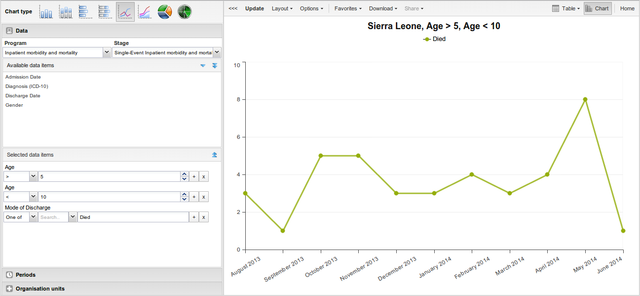
With the Event Visualizer app, you can create charts based on event data.
Vytvořte graf
-
Otevřete aplikaci Vizualizace Události a vyberte typ grafu.
-
V nabídce vlevo vyberte metadata, která chcete analyzovat.
-
Klikněte na Rozložení a uspořádejte dimenze.
Pokud chcete, můžete ponechat výchozí výběr.
-
Klikněte na Aktualizovat.
Vyberte typ grafu
The Event Visualizer app has eight different chart types, each with different characteristics. To select a chart type:
-
V Typ grafu klikněte na požadovaný typ grafu.
Chart types Chart type Description Column chart Displays information as vertical rectangular columns with lengths proportional to the values they represent.
Useful when you want to, for example, compare performance of different districts.Stacked column chart Displays information as vertical rectangular columns, where bars representing multiple categories are stacked on top of each other.
Useful when you want to, for example, display trends or sums of related data elements.Bar chart Same as column chart, only with horizontal bars. Stacked bar chart Same as stacked column chart, only with horizontal bars. Line chart Displays information as a series of points connected by straight lines. Also referred to as time series.
Useful when you want to, for example, visualize trends in indicator data over multiple time periods.Area chart Is based on line chart, with the space between the axis and the line filled with colors and the lines stacked on top of each other.
Useful when you want to compare the trends of related indicators.Pie chart Circular chart divided into sectors (or slices).
Useful when you want to, for example, visualize the proportion of data for individual data elements compared to the total sum of all data elements in the chart.Radar chart Displays data on axes starting from the same point. Also known as spider chart. -
Klikněte na Aktualizovat.
Vyberte položky dimenze
An event chart is always based on a program and you can do analysis based on a range of dimensions. For programs with category combinations, you can use program categories and category option group sets as dimensions for tables and charts. Each dimension item can have a corresponding filter. You select dimension items from the left-side menu.
-
Vyberte datové prvky:
-
Klikněte na Data.
-
Vyberte program a fázi programu.
Datové prvky spojené s vybraným programem jsou listed under Available. Each data element acts as a dimension.
-
Select the data elements you need by double-clicking their names.
Data elements can be filtered by type (Data elements, Program attributes, Program indicators) and are prefixed to make them easily recognizable.
After selecting a data element, it is visible under Selected data items.
-
(Optional) For each data element, specify a filter with operators such as "greater than", "in" or "equal" together with hodnotu filtru.
-
-
Vyberte období
-
Klikněte na Období.
-
Vyberte jedno nebo několik období.
Máte tři možnosti období: relativní období, pevná období a data zahájení/ukončení. Můžete kombinovat pevná období a relativní období ve stejném grafu. Nelze kombinovat fixní období a relativní období s datem začátku a konce ve stejném grafu. Překrývající se období jsou filtrována tak, aby se objevila pouze jednou.
-
Pevná období: V poli Vybrat typ období vyberte typ období. Můžete si vybrat libovolný počet fixních období z jakéhokoli typu období. Pevná období mohou být například „leden 2014".
-
Relative periods: In the lower part of the Periods section, select as many relative periods as you like. The names are relative to the current date. This means that if the current month is March and you select Last month, the month of February is included in the chart. Relative periods has the advantage that it keeps the data in the report up to date as time goes.
-
Start/end dates: In the list under the Periods tab, select Start/end dates. This period type lets you specify flexible dates for the time span in the report.
-
-
-
Vyberte organizační jednotky.
-
Klikněte na Organizační jednotky
-
Klikněte na ikonu ozubeného kolečka.
-
Vyberte režim výběru a organizační jednotku.
Existují tři různé režimy výběru:
Selection modes Selection mode Description Select organisation units Lets you select the organisation units you want to appear in the chart from the organization tree.
Select User org unit to disable the organisation unit tree and only select the organisation unit that is related to your profile.
Select User sub-units to disable the organisation unit tree and only select the sub-units of the organisation unit that is related to your profile.
Select User sub-x2-units to disable the organisation unit tree and only select organisation units two levels down from the organisation unit that is related to your profile.
This functionality is useful for administrators to create a meaningful "system" favorite. With this option checked all users find their respective organisation unit when they open the favorite.Select levels Lets you select all organisation units at one or more levels, for example national or district level.
You can also select the parent organisation unit in the tree, which makes it easy to select for example, all facilities inside one or more districts.Select groups Lets you select all organisation units inside one or several groups and parent organisation units at the same time, for example hospitals or chiefdoms.
-
-
Klikněte na Aktualizovat.
Vyberte sérii, kategorii a filtr
You can define which data dimension you want to appear as series, category and filter. Each data element appears as individual dimensions and can be placed on any of the axes. Series and category panels can only have one dimension at the time.
Note
Data elements of continuous value types (real numbers/decimal numbers) can only be used as filters, and will automatically be positioned as filters in the layout dialog. The reason for this is that continuous number cannot be grouped into sensible ranges and used on columns and rows.
-
Klikněte na Rozložení.
-
Drag and drop the dimensions to the appropriate space. Only one dimension can be in each section.
-
Klikněte na Aktualizovat.
Změňte zobrazení grafu
Můžete přizpůsobit zobrazení zprávy o události.
-
Klikněte na Možnosti.
-
Nastavte možnosti podle potřeby.
Chart options Option Description Data Show values Displays values as numbers on top of each series. Use 100% stacked values Displays 100 % stacked values in column charts. Use cumulative values Displays cumulative values in line charts. Hide n/a data Hides data tagged as N/A from the chart. Include only completed events Includes only completed events in the aggregation process. This is useful when you want for example to exclude partial events in indicator calculations. Hide empty categories Hides the category items with no data from the chart.
None: doesn't hide any of the empty categories
Before first: hides missing values only before the first value
After last: hides missing values only after the last value
Before first and after last: hides missing values only before the first value and after the last value
All: hides all missing values
This is useful for example when you create column and bar charts.Trend line Displays the trend line which visualizes how your data evolves over time. For example if performance is improving or deteriorating. Useful when periods are selected as category. Target line value/title Displays a horizontal line and title (optional) at the given domain value. Useful for example when you want to compare your performance to the current target. Base line value/title Displays a horizontal line and title (optional) at the given domain value. Useful for example when you want to visualize how your performance has evolved since the beginning of a process. Sort order Allows you to sort the values on your chart from either low to high or high to low. Output type Defines the output type. The output types are Event, Enrollment and**Tracked entity instance**. Program status Filters data based on the program status: All, Active, Completed or Cancelled. Event status Filters data based on the event status: All, Active, Completed, Scheduled, Overdue or Skipped. Axes Range axis min/max Defines the maximum and minimum value which will be visible on the range axis. Range axis tick steps Defines the number of ticks which will be visible on the range axis. Range axis decimals Defines the number of decimals which will be used for range axis values. Range axis title Type a title here to display a label next to the range axis (also referred to as the Y axis). Useful when you want to give context information to the chart, for example about the unit of measure. Domain axis title Type a title here to display a label below the domain axis (also referred to as the X axis). Useful when you want to give context information to the chart, for example about the period type. General Hide chart legend Hides the legend and leaves more room for the chart itself. Hide chart title Hides the title (default or custom) of your chart. Chart title Type a title here to display a custom title above the chart. If you don't enter a title, the default title is displayed. Hide chart subtitle Hides the subtitle of your chart. Chart subtitle Type a subtitle here to display a custom subtitle above the chart but below the title. If you don't enter a subtitle, no subtitle is displayed in the chart. -
Klikněte na Aktualizovat.
Stáhněte si graf jako obrázek nebo PDF
After you have created a chart you can download it to your local computer as an image or PDF file.
-
Klikněte na Stáhnout.
-
V části Grafika klikněte na PNG (.png) nebo PDF (.pdf).
The file is automatically downloaded to your computer. Now you can for example embed the image file into a text document as part of a report.
Stáhněte si zdroj dat grafu
You can download the data source behind a chart in HTML, JSON, XML, Microsoft Excel or CSV formats. The data document uses identifiers of the dimension items and opens in a new browser window to display the URL of the request to the Web API in the address bar. This is useful for developers of apps and other client modules based on the DHIS2 Web API or for those who require a plan data source, for instance for import into statistical packages.
Postup stažení formátů prostého zdroje dat:
-
Klikněte na Stáhnout.
-
V části Zdroj prostých dat klikněte na formát, který chcete stáhnout.
Available formats Format Description HTML Creates HTML table based on selected meta data JSON Downloads data values in JSON format based on selected meta data XML Downloads data values in XML format based on selected meta data Microsoft Excel Downloads data values in Microsoft Excel format based on selected meta data CSV Downloads data values in CSV format based on selected meta data
Spravujte oblíbené položky
Uložení grafů nebo pivotních tabulek mezi oblíbené položky usnadňuje jejich pozdější vyhledání. Můžete se také rozhodnout, zda je chcete sdílet s ostatními uživateli jako výklad nebo je zobrazit na hlavním panelu.
Podrobnosti a interpretace oblíbených položek si můžete prohlédnout v sekci Kontingenční tabulka, Vizualizér dat, Vizualizér událostí, Události Reporty. Ke správě oblíbených položek slouží nabídka Oblíbené.
Otevřete oblíbenou položku
-
Klikněte na Oblíbené > Otevřít.
-
Do vyhledávacího pole zadejte název oblíbené položky nebo klikněte na Předchozí a Další pro zobrazení oblíbených položek.
-
Klikněte na název oblíbené položky, kterou chcete otevřít.
Uložit oblíbené
-
Klikněte na Oblíbené > Uložit jako.
-
Zadejte Název a Popis pro vaši oblíbenou položku. Pole popisu podporuje formát RTF, další podrobnosti najdete v části interpretace.
-
Klikněte Uložit.
Přejmenujte oblíbenou položku
-
Klikněte na Oblíbené > Přejmenovat.
-
Zadejte nový název své oblíbené položky.
-
Klikněte na Aktualizovat.
Napište interpretaci pro oblíbené
Interpretace je odkaz na zdroj s popisem dat v daném období. Tyto informace jsou viditelné v aplikaci Ovládací panel. Chcete-li vytvořit interpretaci, musíte si nejprve vytvořit oblíbenou položku. Pokud jste svou oblíbenou položku sdíleli s dalšími lidmi, je vámi napsaná interpretace viditelná i pro tyto lidi.
-
Klikněte na Oblíbené > Napsat výklad.
-
Do textového pole zadejte komentář, otázku nebo výklad. Můžete také zmínit ostatní uživatele s '@username'. Začněte zadáním '@' plus první písmena uživatelského jména nebo skutečného jména a zmínka lišta zobrazí dostupné uživatele. Uvedení uživatelé obdrží interní zpráva DHIS2 s výkladem nebo komentářem. Můžete vidět výklad v aplikaci Ovládací panel.
Je možné formátovat text s tučným, kurzívou pomocí Značky stylu markdown * a _ pro tučné a kurzíva. K dispozici jsou také klávesové zkratky: Ctrl/Cmd + B a Ctrl/Cmd + I. A omezená sada smajlíků je podporována a lze je použít zadáním jednoho z nich následující kombinace znaků: :) :-) :( :-( :+1 :-1. URL jsou automaticky detekován a převeden na odkaz, na který lze kliknout.
-
Vyhledejte skupinu uživatelů, se kterou chcete sdílet své oblíbené položky, poté klikněte na ikonu +.
-
Změňte nastavení sdílení pro skupiny uživatelů, které chcete upravit.
-
Může upravovat a prohlížet: Objekt může zobrazit a upravovat každý.
-
Může pouze zobrazit: Objekt může zobrazit každý.
-
Žádné: Veřejnost nebude mít k objektu přístup. Toto nastavení platí pouze pro Veřejný přístup.
-
-
Klikněte na Sdílet.
Přihlaste se k odběru oblíbené položky
Jste-li přihlášeni k odběru oblíbených položek, dostáváte interní zprávy, kdykoli se jinému uživateli líbí/vytvoří/aktualizuje výklad nebo vytvoří/aktualizuje komentář k výkladu této oblíbené položky.
-
Otevřete oblíbenou položku.
-
Klikněte na >>> v pravém horním rohu pracovního prostoru.
-
Kliknutím na ikonu zvonku vpravo nahoře se přihlásíte k odběru této oblíbené položky.
Vytvořte odkaz na oblíbenou položku
-
Klikněte na Oblíbené > Získat odkaz.
-
Vyberte jednu z následujících možností:
-
Open in this app: You get a URL for the favorite which you can share with other users by email or chat.
-
Open in web api: You get a URL of the API resource. By default this is an HTML resource, but you can change the file příponu na „.json“ nebo „.csv“.
-
Odstranit oblíbenou položku
-
Klikněte na Oblíbené > Odstranit.
-
Klikněte OK.
Zobrazit interpretace založené na relativních obdobích
Zobrazení interpretací pro relativní období, například před rokem:
-
Otevřete oblíbené s interpretacemi.
-
Klikněte na >>> v pravém horním rohu pracovního prostoru.
-
Click an interpretation. Your chart displays the data and the date based on when the interpretation was created.To view other interpretations, click them.
Vizualizujte graf jako kontingenční tabulku
Když jste vytvořili graf, můžete jej otevřít jako kontingenční tabulku:
Klikněte na Graf > Otevřít tento graf jako tabulku.