Learner's Guide to Event Visualizer
What is this guide?
This guide contains all exercises and detailed steps to perform them related to the use of Event Visualizer. Please perform each of the exercises when prompted to by your instructors. This has now been updated.
Learning objectives for this session
The overall objective of this session is to use the DHIS2 event reports app to review tracker data. Detailed objectives include:
- Describe the functions of the event visualizer app
- Describe the event visualizer interface
- Create visualizations using tracker data
- Describe the limitations of event visualizer when working with tracker data
Exercise 1
Create the chart "EIR - BCG 0.05 ml dose by Location" (a chart using yes/no data elements)
- Chart Type : Column
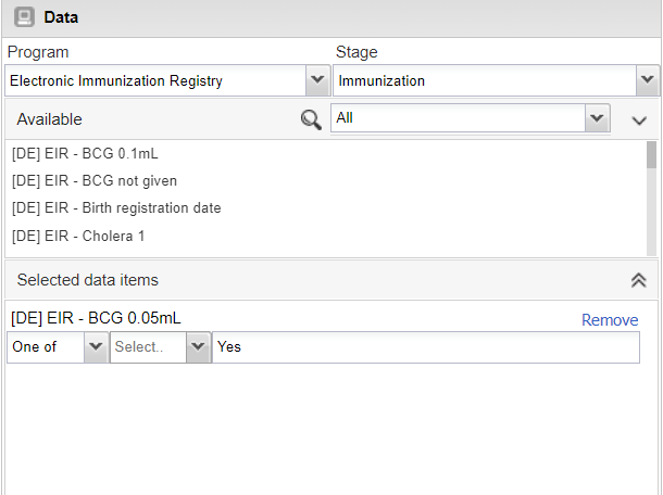
- Program : Electronic Immunization registry, Stage:Immunization
- Data : Data Element : BCG 0.05 mL
- Period : This Year
-
Org Unit : All level 3 OUs
-
Favorites -> New
- Select the program (Electronic Immunization Registry) and stage (Immunization)
- Note here again there is no enrollment output type , event visualizer is using the "event" output type by default; meaning all events in across all stages are counted in the totals being displayed
- Select the data (Data Element : BCG 0.05 mL)
- Select "Yes" only.
- Select the Period (This Year)
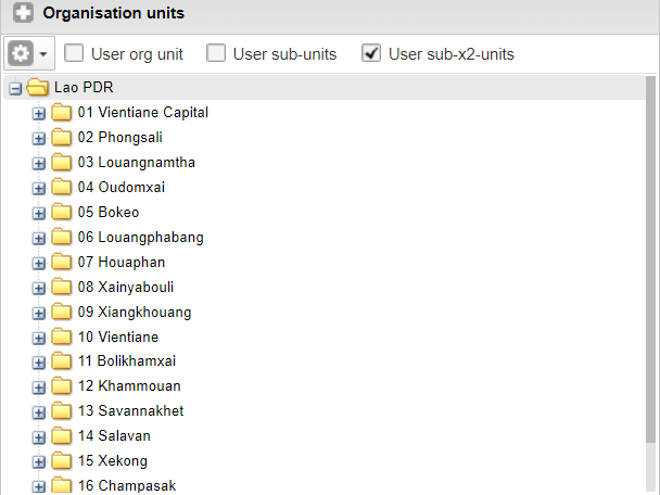
- Select the org unit (All provinces, or user sub-2units)

- Modify the layout

- Go to options and Hide all empty categories

Update the chart to review your output.

The chart is not sorted and does not have a title as is the case with the saved chart reviewed earlier. You can open up the options panel and add in these details.
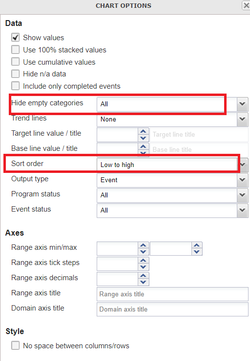
Then proceed to update your chart to view the final output.

Other features as a refresher
You can also show them how to save the chart using the favorites menu

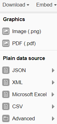
and download the chart
Exercise 2
Create a chart using option sets
- Chart Type : Stacked bar chart
- Program : Malaria case notification, investigation and response
- Stage: Case outcome
- Data items : MAL-CS - Outcome of illness
- Periods : This Year
- Org units : user sub-units
Layout :

After updating, this should be your final output:

You can quickly modify which options appear on the chart by filtering the data element in the data selection window

You can modify these options and update the chart to see how it affects what data is shown.
Exercise 3
Modify the chart "CBS - Measles Virus Detection - PCR"
Open the chart "CBS - Measles Virus Detection - PCR" Nothing so unique about this chart; however we can note that it using data from Stage 4 - Lab Results in the surveillance program. This stage is repeatable, and by default we are seeing all of the events in this program stage being displayed on the chart.
Rather then counting the total number of tests with these results, what if we wanted the number of unique people with these test results? In event reports, we were able to use the enrollment type output to both count enrollments as well as combine data from multiple stages in one list. We do not have that option here, but we can count the number of tracked entities.
Open the chart options and review the output type

We can see there are 3 options: 1. Event 2. Enrollment 3. Tracked Entity Instance
NB: Enrollment does not work as we can not pull data from multiple stages in event visualizer. It seems to be there incorrectly. Please ask the participant's to ignore this option.
Select the option "Tracked entity instance" and update the chart. You should see a a few less positive cases identified within this org unit when compared to the previous chart, as it is counting the number of TEI's uniquely, rather then counting the number of events matching the criteria of your filter(s).

Note: Why the different language between event reports and event visualizer regarding the output type? The Enrollment output type in event reports allows you to display information unique to an enrollment, as well as obtain data across an entire enrollment (meaning you can review data from multiple program stages together in the line list; and obtain unique counts via the pivot table). The "Tracked entity instance" output type in event visualizer is much more limiting. It does not allow you to pull data from multiple program stages; it just let's you count the number of unique tracked entities (in this case individual people) that meet the criteria you have set via your filters within a program stage 1 or more times. This can be useful but it is important to identify this distinction.