Learner's Guide to Dashboards
ما هو هذا الدليل؟
This guide contains all exercises and detailed steps to perform them related to the review of dashboards for the Design for Data Use Level 1 academy. Please perform each of the exercises when prompted to by your instructors
الأهداف التعليمية لهذه الجلسة
- Describe how to navigate the dashboard
- Demonstrate how to create and manage a dashboard
- Demonstrate how to add previously created tables, charts and maps to the dashboard
- Describe the concept of user org units as it applies to saved items in more detail
- Describe how to share dashboards, with an emphasis on how user org units can supplement sharing
Exercise 1 - Using Dashboards
Review the dashboard interface
We can use the “HIV national” dashboard to review the dashboard interface.

The top of the dashboard has the various dashboards the user has access to along with the search bar. Dashboards that have been “starred” appear first in the list of dashboards. You can ‘star’ the dashboard by using the star icon next to the name of the dashboard. You can also click on the “info” button to see a description of the dashboard.

The “more” button allows you to access several additional features, such as viewing the description and printing the dashboard.

You can use the search bar to find particular dashboards. You can also expand the list of dashboards by using the “Show More” button or dragging the bar to be wider and include more dashboard items.

Use the filter
Within the dashboard interface, we can decide which level of data we are seeing by using the filter. In the HIV National Dashboard, at the moment, all of the outputs are displaying data for for Lao. Select “Add filter” and “Organisation Unit” to apply an org unit filter. Select a province within the org unit filter and update the dashboard.

All of the outputs will be updated to use the filter that you have applied. You will also see a message at the top of the dashboard showing the filter you have applied.

We can add other filters to the dashboard as well. This includes a period or data dimension. This feature is very useful as it filters all of the items on the dashboard at once. For example, you could also add a filter for the period, only viewing the a specific month of data.

This will update all of the items on the dashboard to include data from the options you have filtered out only.

You can remove these filters by clicking on the “Remove” text next to the filter on the top of the dashboard.
Review how descriptions and interpretations are added to the dashboard
Select the chart HIV - HIV Cascade from the HIV National dashboard. When we save an item, we are asked for a description. This description appears in the panel within each app and can also appear within the dashboard item. It is recommended that all outputs have a description attached to them.
To show the description, select the menu icon for the dashboard item followed by “Show interpretations and details.”


You can also add interpretations directly on the dashboard. When making these interpretations, you can directly tag individuals in your comment. They will receive a notification in the messages app and e-mail if it is configured.

Review the interactivity of dashboard items
Dashboard items are meant to be interactive. This is true of charts, maps, and tables. De-select the male disaggregation on the chart HIV - HIV cascade by sex - last 12 months chart. This will cause those items to disappear. You can add it back in before proceeding. Hovering over items in the chart will also show a small description of the chart item.

Tables allow you to sort them within the dashboard. You can do this by selecting a column heading within a table.

While maps allow you to show the legend, hover over thematic layers to see a more detailed description of the item you are reviewing

Note that all items (maps, tables, charts) can now be viewed in full screen by using the menu option. This may be useful if you want to focus on a specific dashboard item. You can do this by selecting the “View fullscreen” option in the menu for a dashboard item.

Dashboard items also allow for you to change between different output types. View the chart HIV - HIV cascade by sex - last 12 months. You can change it to a table as an example.


Printing Dashboards
From version 2.35 onwards DHIS2 supports printing of dashboards. To perform this click on the ‘More’ button at the top of the dashboard next to the ‘Add filter’ button.
In the sub-menu that appears we have 2 options.

- Dashboard layout - will print in the same layout as it appears in the DHIS2 dashboard (eg: can have more than one dashboard item per row)
- One item per page - will print only one dashboard item per page and that item will occupy the entire page
Once you click on either of the options above, a print preview window will open. The following points are recommended for best print results. - Use Chrome, Firefox or Edge web browser - Wait for all dashboard items to load before printing - Use A4 landscape paper size and default margin settings in the browser print dialog
You will see a preview of the dashboard print out after selecting one of the print options

Once all the dashboard items are finished loading, click on the ‘Print’ button on the right top corner.
In the next window, select the printer you want as the ‘Destination’ and click on the ‘Print’ button on the bottom of the window. Note that this means you can also print to PDF if you would like.

Accessing Dashboards from a Mobile Device
From 2.36, dashboards can be accessed via a mobile device without any additional customization requirements. You can just log in via your mobile device using a mobile browser and the dashboard will adjust its layout to fit the items accordingly. Both portrait and landscape orientations are supported.
Making dashboards available offline
Dashboard can be made available to work offline. They will be stored in cache. As long as the person does not log out of DHIS2 while online/offline, they will be able to access the offline dashboard.
To save a dashboard offline select More -> Make available offline

The dashboard will download to your cache and you will see an indicator beside the name of the saved dashboard.

Now, if you go offline, you will be able to access this dashboard as long as you do not log out of DHIS2. You can even close the tab/browser as long as you have saved the link to access it next time.
If you no longer want the dashboard stored offline, you can turn this off via the menu

Exercise 2 - Creating Dashboards
Review slide 6-8 in the dashboards presentation as it will discuss the steps assoicated with creating a dashboard.
Create a new dashboard
To add a new dashboard, click on the “+” sign at the top of the dashboard page.
Add some dashboard items from the Immunization by searching for items with the prefix EPI

Review the filter settings
Note that there are now some additional options for managing the dashboard filter settings. As an example, you may want to remove the category filters or only include the category filters relevant for the dashboard items you have added. Do this by accessing “Filter settings” when creating or editing a dashboard.

From here, you can select which filters you want to include in the dashboard. This can help in reducing confusion as you can ensure that only filters that will work with the dashboard are included and can limit the options for the end-user based on the information you want them to see.

These changes get applied to the “Add filter” button after you have saved the changes for the dashboard you are working on.

When you are done, select “Save changes” to save the dashboard

Exercise 3 - Re-Using Dashboards Across Many Users
Review user org units
We can now review user organisation units and sharing.
Let us do this by reviewing one of the already available WHO dashboards (“Malaria Burden Reduction”)
You can open up one of these outputs to discuss this function. This example uses the output MAL - Reported malaria cases.

Review the organisation unit selection. In the example of the chart, the selection being made is the “User organisation unit.” If I am currently logged in as user which has access to the entire hierarchy, organisation unit is the the top level org unit. “User sub x2 units” would be Provinces for this particular user, as that would be 2 levels below their immediately assigned organisation unit. The user sub units can therefore be considered a “relative” org unit selection; being that it is relative to the org unit the user has been assigned to.

If you go back to the dashboard you can see this in the various outputs that are present; note that user organisation units have been selected for all of these outputs. You may want to discuss a couple of examples to reinforce this point.
Discuss sharing
Review slide 9 in the presentation: https://docs.google.com/presentation/d/1Fbg5utWr4SkUovy9aliPKdzDvvHAzRtCbxN6MyFo2eM/edit?usp=sharing
We have tried to create this dashboard so it can be re-used multiple times. In using user org units, the data a user sees should be dependent on the org units they are assigned. This allows you to make one dashboard that can be shared to many users at once, with all of these different users seeing different outputs.
In order to share a dashboard you need to open the sharing dialog via the “Share” button at the top of the dashboard. This will open the dialog for the dashboard.
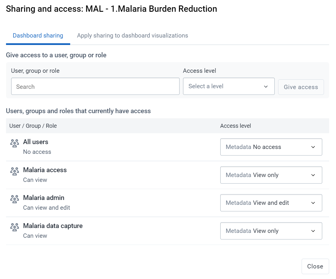
You can share items with either users or user groups. It is often more advantageous to share via a user group so you can share the item with many users at once. To add a user or user group, start typing their name in the search box, you will then see the name of the user or group appear. Select it to add it to the sharing dialog.

Before you add users/groups to the sharing settings for the dashboard, you can assign them different permissions (note: this can also be edited after they are given access)
- Can edit and view: Can both alter/edit the dashboard (rename, add/remove items, delete dashboard) as well as view the dashboard
- Can view: Can view the dashboard but can not make any changes.

Another import aspect of this is to ensure the items on the dashboard itself have been shared with the user groups you are sharing the dashboard with. If the visualizations (maps, charts, tables) are not shared, then the user may not be able to view the items on the dashboard correctly. Luckily, we can not apply sharing to all items on the dashboard from the dashboard itself by using the "Apply sharing to dashboard visualizations" tab.

By combining the concept of sharing with user org units, we can have one dashboard that can be re-used many times. As an example, we do not need to make outputs for every district; we can instead use the user org units feature combined with sharing to make one set of outputs that different different users can access to see their own data. We can review this concept in more detail. Clear your cache or open a new incognito window to log in as a different user.
Login as the malaria user
Username : malaria
Password : District1#
Review the same malaria dashboard that you were looking at before (Malaria Burden Reduction)
You will see it is displaying the country name of Lao in all of the visualizations now insted of the top level org unit.

This is due to the use of relative org units. You will also notice they only see the malaria dashboards; this is a result of sharing these dashboards and having this user being apart of the malaria access user group. You will see they can view the dashboards, but they can not edit them.